What is Interstellar Probe Patch?
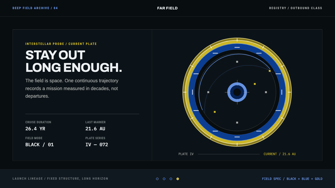
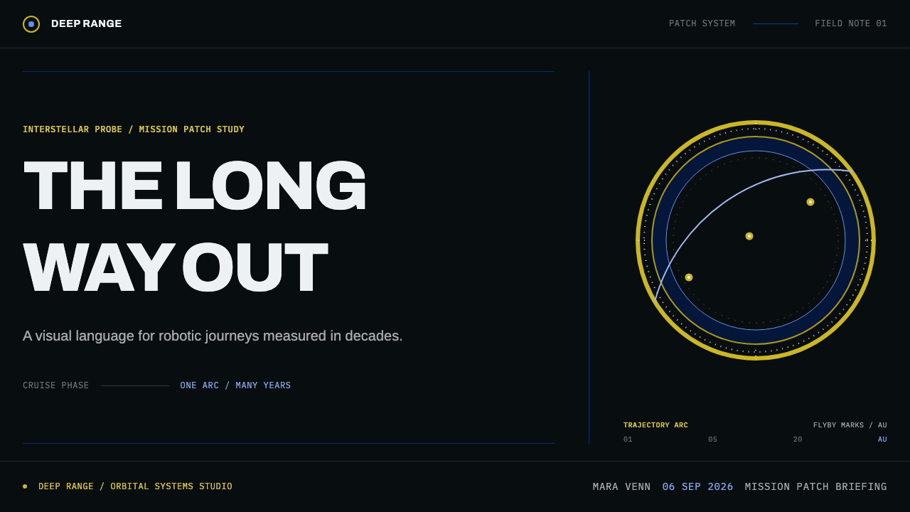
Interstellar Probe Patch makes the long cruise visible — a black field that is space itself, a blue ring carrying the mission name, and one hairline trajectory arc ticked in gold at every flyby.
Interstellar Probe Patch in brief
Interstellar Probe Patch is a design language drawn from the mission patches of NASA's deep-space robotic explorers. Its conventions run from Pioneer 10 in 1972 through Pioneer 11, Galileo, Voyager and New Horizons, including the Kuiper Belt extended mission, and into the concept study for an interstellar probe carried out from 2018 to 2021. Across half a century the badges share one rule: the field is black, because the black is not a background. It is space.
The contrast with crewed missions is the key to reading the style. Crewed patches tend to go white and red and carry the names of the astronauts, the curve of the Earth and a star for each crew member. Robotic deep-space patches carry none of that: no surnames, no Earth limb, no crew stars. The mission is a spacecraft alone, a long way out, and the patch has to say so with as little as possible.
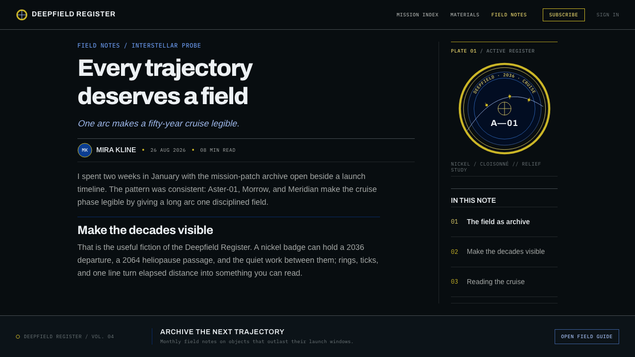
The structure is fixed and worth keeping. A bullion border frames the disc. A band running around the circumference carries the mission name. An inner field holds one hairline trajectory arc, ticked at each flyby. Set a collection of these discs in a grid and the missions read as a lineage. Shrink the same artwork to the scale of a lapel badge and it becomes a struck nickel piece with enamel set in wells between raised metal walls.
Where does Interstellar Probe Patch come from?
The roots lie in the United States, in the institutions that built and flew these spacecraft: NASA Ames, the Jet Propulsion Laboratory in Pasadena and the Johns Hopkins Applied Physics Laboratory in Laurel, Maryland. The earliest of the lineage is Pioneer 10 in 1972, and the line continues through Pioneer 11, Galileo, Voyager and New Horizons. Each of these missions was a single robotic craft sent on a journey of years or decades, and each needed an emblem that could stand for something that would be seen by almost no one while it was happening.
Mission patches have a heraldic character. They take the logic of a coat of arms or regimental badge and apply it to a program: a circular field, a border, a name and a small number of symbols, each chosen to be readable and meaningful. Deep-space patches follow that tradition but strip it down. With no crew to name and no home planet to wave at, the symbols shrink to the spacecraft's path and the places it passes. The trajectory arc, ticked at each flyby, is the whole narrative in one line.
Behind the individual patches stands the graphic discipline of the NASA Unified Visual System, the agency's modernist program of standards that brought a consistent logotype and clear rules to everything from spacecraft markings to documents. A patch for a deep-space mission lives in that climate. It must be legible at small size, reproducible in embroidery and metal, and consistent from one mission to the next. That consistency is why a grid of these discs reads as a family rather than as a pile of unrelated emblems.
The physical craft behind the badge matters too. Die-struck cloisonné badges are made by stamping a design into metal so that raised walls divide the surface into small wells, which are then filled with enamel. The result has thickness: color sits in recesses, edges catch light, the nickel or gold of the walls shows between fields. The style takes that object seriously. A recent concept study for an interstellar probe, led from the Johns Hopkins Applied Physics Laboratory, gives it a forward-looking edge, extending an old visual language to a mission whose destination lies beyond the heliosphere.
What defines the Interstellar Probe Patch look?
Black Is Space
The field is near-black by convention for deep-space robotic missions. It is not a backdrop behind the subject; it is the setting in which the mission takes place. That changes how the rest of the composition works: elements do not float on a background but travel through a medium, and empty areas are part of the meaning.
Bullion Border
A metallic rim encircles the disc, borrowing the look of bullion embroidery and the raised edge of struck metal. It contains the composition and gives the badge a clear outer contour, like the frame of a window. The border is bright against the black field and reads as a single continuous line of worked material.
The Name Band
The mission name runs around the circumference in a band, set in blue against the black. Lettering is clean, capitalized and evenly spaced, curving with the disc. The band separates the identity of the mission from the picture inside it, and it makes the badge legible from any rotation. The blue ring is one of the style's few chromatic notes.
The Trajectory Arc
One hairline arc crosses the inner field, and each flyby is marked with a small tick, in gold. It is the only narrative element: a spacecraft's path, with its encounters recorded as measured marks. The arc is thin, precise and unadorned. It makes the idea of cruising for years visible without adding planets, flames or portraits.
Lineage in a Grid
Because every patch shares the same anatomy, border, name band, inner field and arc, a set of them can be arranged in a grid by launch date and read as a family. Differences between missions then become visible: where the arc bends, how many ticks it carries, how the name is lettered. Consistency is what makes comparison possible.
Struck Metal, Enamel Wells
At badge scale the artwork becomes a struck nickel piece with enamel set in wells between raised metal walls. That means the style is allowed relief: thin raised divisions, color sitting in recesses, a sense of thickness. It is a controlled exception to flatness, meant to feel like a real object that someone could pin to a jacket, not a glossy vector illustration.
What Is Left Out
The omissions are as defining as the inclusions. No surnames, because there is no crew. No Earth limb, because the craft is already far from it. No stars counting crew members. White and red are reserved for crewed patches. What remains is one spacecraft, one path and the dark, and the discipline of leaving everything else out is the style's quiet emotional register.
Who shaped Interstellar Probe Patch?
James Modarelli is credited with the original NASA insignia, the round emblem with star, orbit and wing that every later NASA patch relates to in some way. His design established the agency's heraldic starting point: a circular field, a border and a small set of meaningful symbols. Mission patch heraldry, including the deep-space lineage here, grows out of that early vocabulary.
Richard Danne, with Bruce Blackburn, designed the graphic standards that became the NASA Unified Visual System, a rigorous modernist program for the agency's logotype, markings and documents. His relevance to the patch is indirect but strong: a culture in which consistency, legibility and reproducibility were treated as design values, which is the climate in which deep-space patches kept a fixed structure from mission to mission.
Bruce Blackburn was Danne's partner in the NASA graphics standards work. Together they showed that an organization with spacecraft, aircraft, documents and facilities could speak in one clear visual voice. For this style, the lesson is discipline: a patch that follows a known structure gains authority from that structure, and a lineage of patches gains meaning from the way each one rhymes with the others.
Ralph L. McNutt Jr. is a scientist at the Johns Hopkins Applied Physics Laboratory associated with the interstellar probe concept study of 2018 to 2021. His name marks the forward edge of the lineage: a mission concept that would carry the deep-space tradition beyond the places earlier craft have reached, and that gives this visual language a reason to be extended rather than only remembered.
How do you use Interstellar Probe Patch today?
Interstellar Probe Patch is best used for projects about long journeys, patient measurement and collective achievement: space and science communication, engineering milestones, research programs, expedition-style products and anything that benefits from a sense of lineage. It is a style of marks and ranks more than of surfaces, and it rewards content that can be reduced to a name, a path and a handful of events.
On slides, a cover can be a single black disc or a black field with a circular name band in blue, a thin gold-ticked arc across the middle and a small title. Content slides work as timelines: a hairline path with ticks for milestones, labeled in short capitals. Data slides suit trajectories, cumulative progress and event logs, where one fine line carries the story and marks are placed with precision. Keep the black generous.
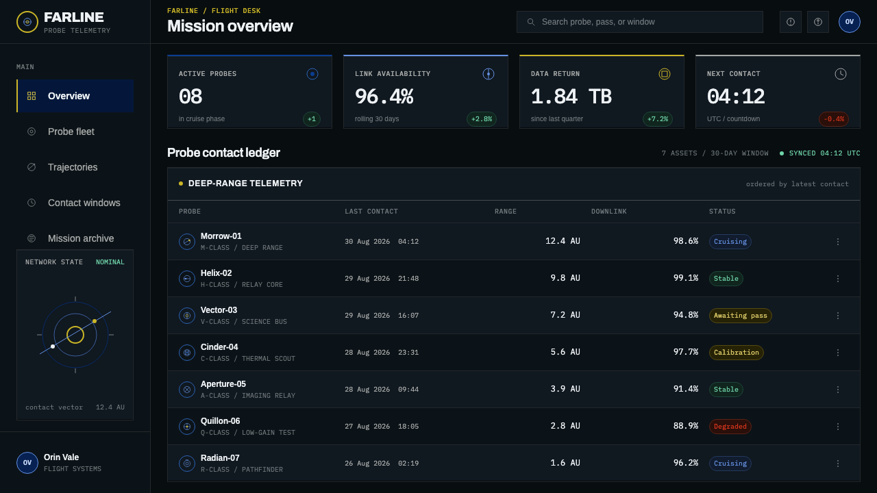
On the web, the style fits status pages, telemetry and operations dashboards, release histories, changelogs and long-running project trackers. Use a black ground, hairline rules, a single blue for labels and a single gold for milestones. Badges and achievement marks can be struck-metal discs with the standard anatomy, arranged in a grid by date. Pricing or plan pages can mark tiers as discs in a lineage, with the selected tier showing a gold tick on its arc.
For editorial and marketing work, it suits anniversaries, mission retrospectives, team identity, merchandise and stories of persistence. Long articles can use a circular insignia as a section marker, with timelines drawn as a thin arc. Marketing pages can open with one disc on black and a single sentence, letting scale and silence carry weight. The voice should be factual and specific: dates, distances and encounters, not hype.
A common mistake is to apply the crewed-mission look: white and red, a planet, a row of stars or personal names. These belong to another tradition and contradict the robotic one. Other mistakes include replacing the black field with a glittering starfield or gradient, adding multiple arcs, planets or flames until the single path disappears, and rendering the disc as glossy flat clip art without the structure of border, band and field. The restraint of one path, a few ticks and a lot of dark is the whole style.
Interstellar Probe Patch — FAQ
Why are deep-space robotic patches black?
Because the black is not a background; it is space. By convention, patches for missions such as Pioneer 10 and 11, Galileo, Voyager and New Horizons sit on a near-black ground, while crewed missions go white and red. The color tells you at a glance that this is a robotic craft traveling through the dark, and it makes the few marks on the disc, the name band, border and trajectory arc, stand out with great clarity.
Why are there no names, Earth or stars on these patches?
Those elements belong to crewed missions: surnames of astronauts, the curve of the Earth they depart from and stars representing the crew. A robotic deep-space mission has no crew and is already far from home, so the patch drops them. What is left is the spacecraft's path and the encounters along it, which is the only story the badge needs to tell.
What does the trajectory arc show?
It is a single hairline arc across the inner field, ticked at each flyby, which turns the mission into a visible path. It condenses years of travel into one line and a small number of marked events. In design terms it is also the style's only narrative element, so it should remain thin, precise and singular rather than multiplied or decorated.
Can it work on a light background?
The disc itself should stay black, because that black is its meaning. On a light page, treat the patch as an object, a black badge with its own border sitting on the surface, rather than inverting it. For a full interface, however, the dark ground is the natural choice, since it lets the name band, tick marks and metallic edges carry their intended contrast.
Where does this style struggle?
It struggles where warmth, humor or dense information is the goal: lifestyle products, children's content, text-heavy tools or anything that needs bright, friendly color. The hairline arc and fine ticks can also be lost at very small sizes, so use heavier simplifications for tiny uses. It is strongest when the subject is a journey, a record or a lineage.
Related design styles
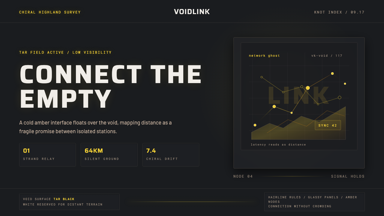 Death StrandingLonely connection, made visible. Amber HUD lines hover over a tar-black void.
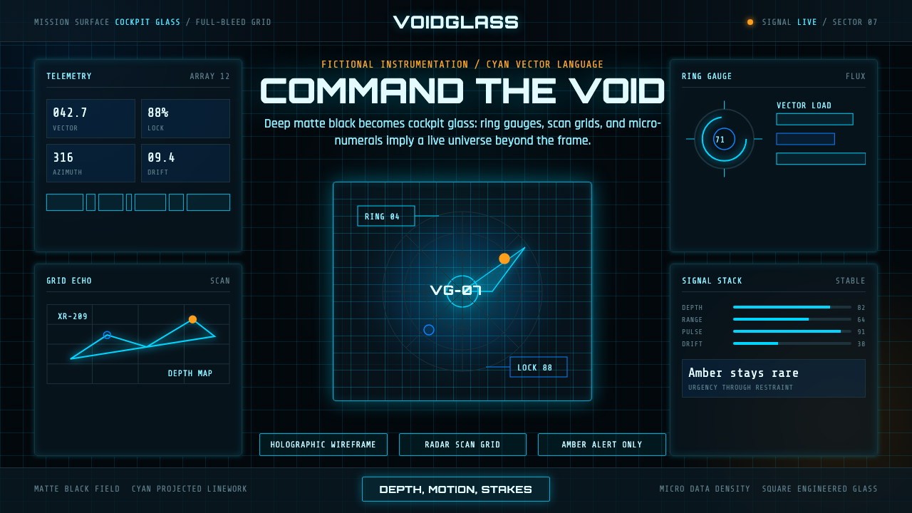 FUI Sci-Fi HUDBlack until it glows. Cyan wireframes, ring gauges, and radar grids sell live…
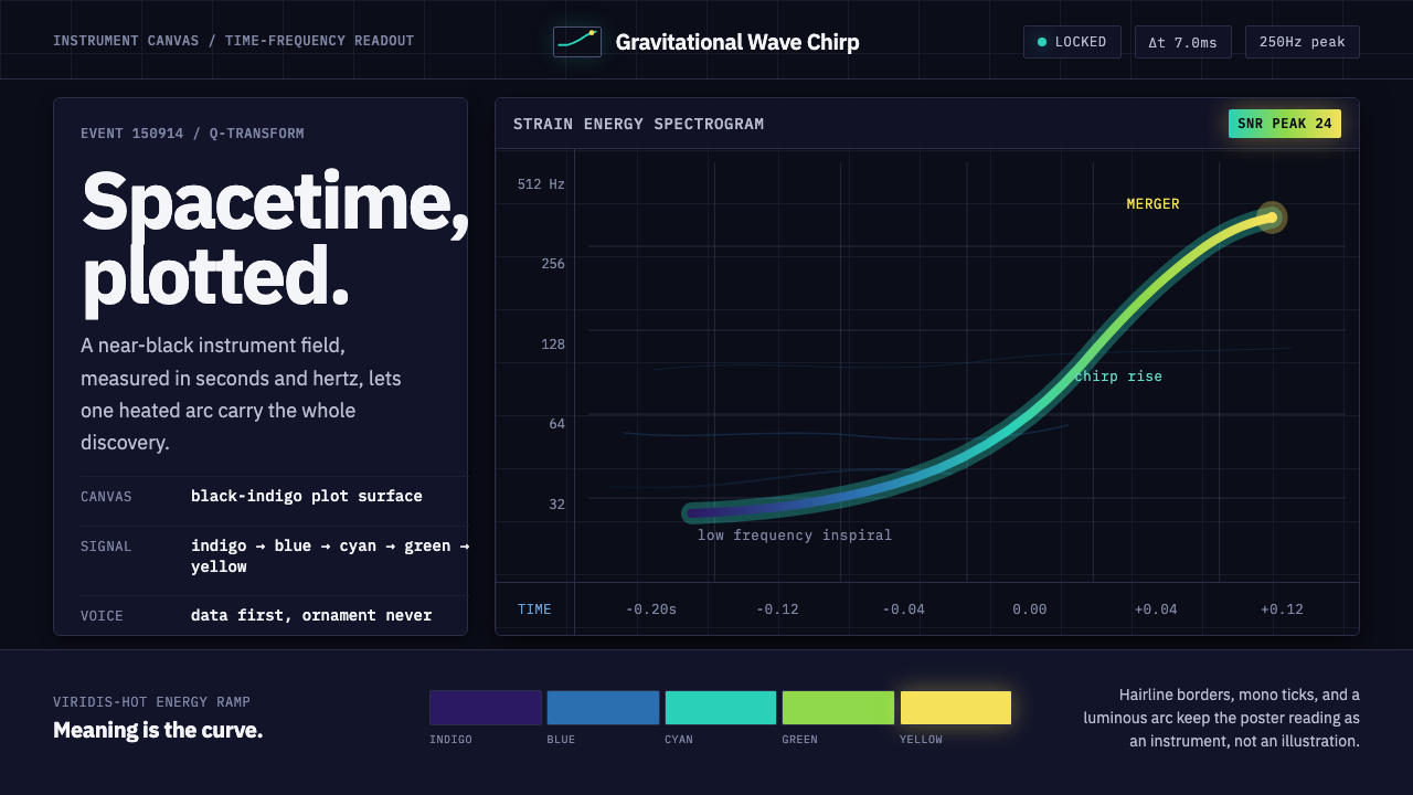 Gravitational Wave ChirpData makes the drama. Near-black grid, mono Hz ticks, and a viridis-hot chirp…
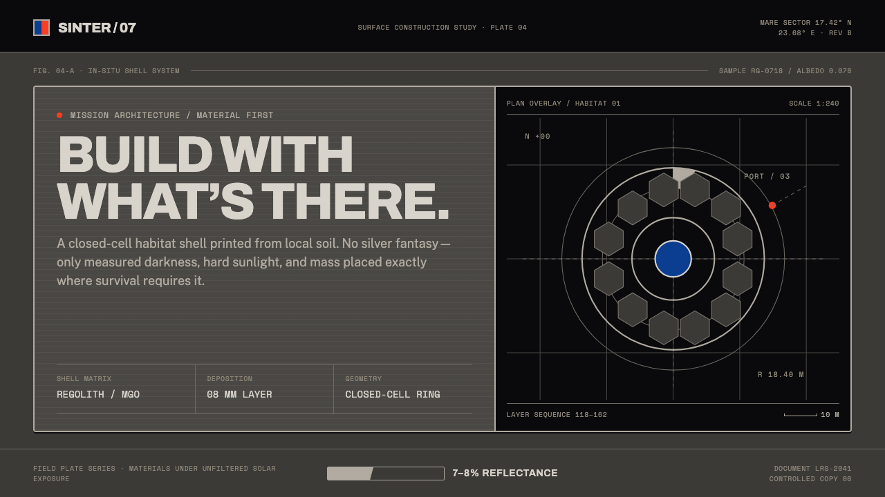 Lunar Regolith SettlementMoonlight without the myth. Regolith gray, hard terminators, and a strict tec…
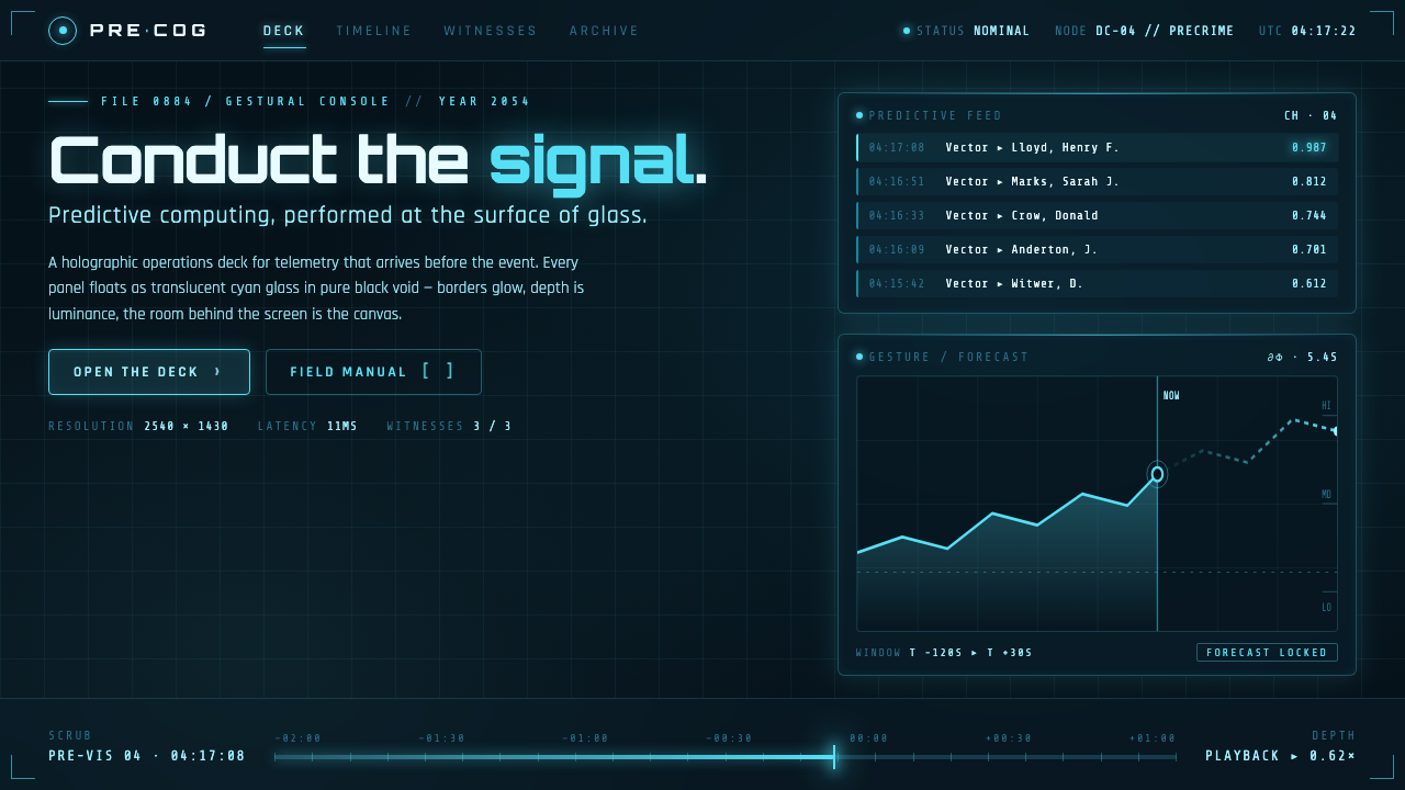 Minority Report Gestural UIPredictive computing, conducted on glass. Luminous cyan panels floating in pu…
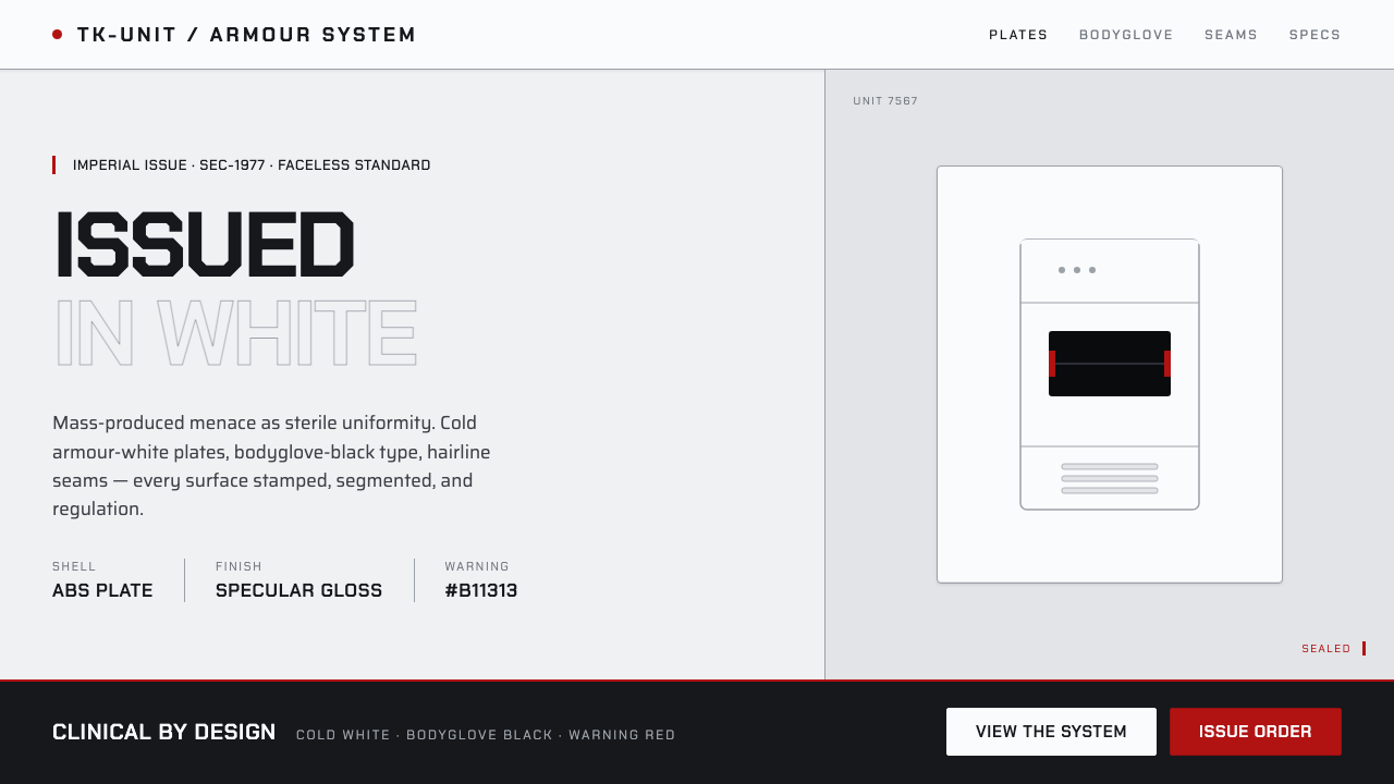 Stormtrooper Imperial WhiteMass-produced menace, sterile. Cold armour-white plates, bodyglove-black sten…