What is Stormtrooper Imperial White?
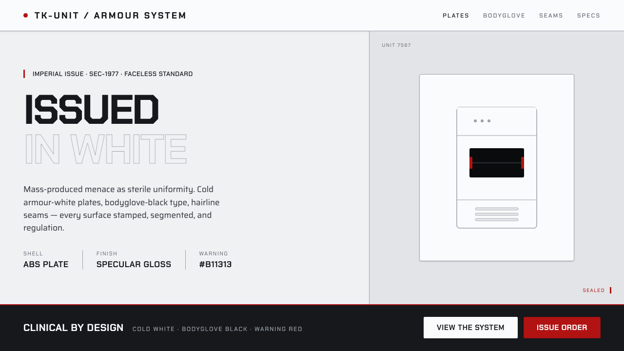
Stormtrooper Imperial White turns the cold certainty of mass-produced armour into an interface language: clinical white panels, black stencil-like type, and a warning signal used only when authority must become threat.
Stormtrooper Imperial White in brief
Stormtrooper Imperial White is a light design style built from the visual logic of Imperial stormtrooper armour in Star Wars. Its foundation is a cool, glossy armour-white field interrupted by bodyglove-black lettering, dark visor-like voids, narrow panel seams, stamped mechanical detail, and an exceptionally restrained warning red. The effect is not cheerful white space. It is institutional whiteness: clean enough to feel controlled, hard enough to feel anonymous.
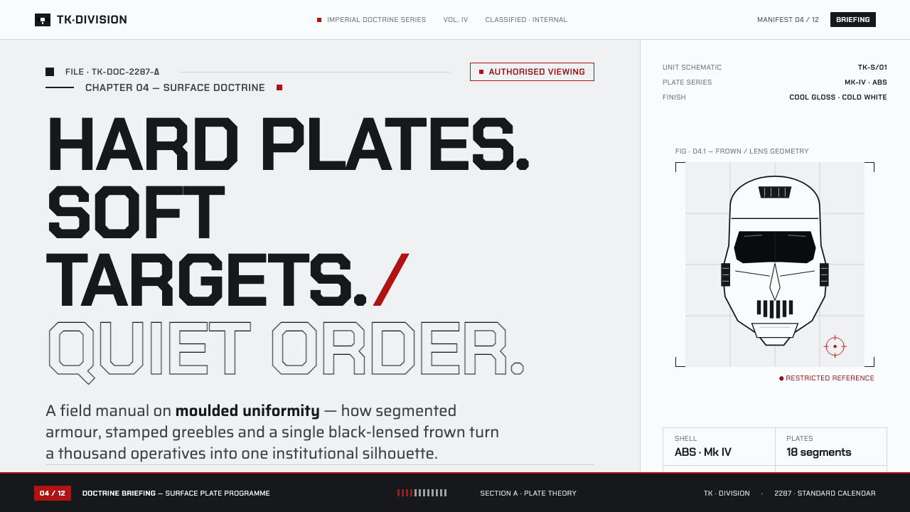
The style treats the screen as a moulded shell rather than an open canvas. Surfaces are divided into fitted plates, compartments, and measured strips. A seam is not decorative linework; it implies assembly, inspection, and the presence of a larger system beneath the visible surface. Black is similarly functional. It appears as a lens, aperture, label, stencil, or recess, concentrating attention with the visual force of the stormtrooper helmet’s dark frown.
Its emotional character comes from contrast between immaculate presentation and militarised purpose. The white is crisp, specular, and synthetic rather than soft, paper-like, or weathered. The black is compressed and decisive. Warning red is rare enough that it reads as a command, fault, restriction, or escalation. Used well, the style suggests a standardised force whose identity has been deliberately removed in favour of uniform procedure.
Where does Stormtrooper Imperial White come from?
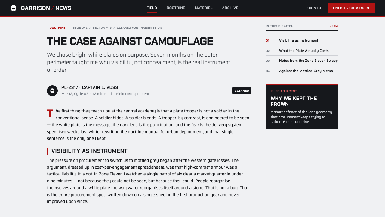
Stormtrooper Imperial White originates in the production design world of 1976–1977, culminating in Star Wars in 1977. Its source is not a historical graphic-design school but a screen costume system: bright white hard ABS plates worn over a black bodyglove, with segmented armour, dark lenses, a black frown-like face treatment, and small moulded greebles. The visual problem was unusually specific: portray a militarised force that looks manufactured in volume, faceless in operation, and immediately legible in silhouette.
Ralph McQuarrie conceived the stormtrooper design, and Andrew Ainsworth fabricated the armour for the 1977 film. Their result belongs to the broader visual atmosphere named in the source material: 1970s science-fiction production design, raygun-clean futurism, and military-uniform design. Those influences meet in an object that is futuristic without being delicate. Its forms are smooth but sectional, clean but not blank, and theatrical enough for cinema while retaining the authority of issued equipment.
Liz Moore is also named among the key figures associated with this origin. Together, the credited names situate the style in a collaborative production context spanning the United Kingdom and United States, including Elstree Studios and Pinewood. For contemporary designers, that production context matters: the look did not emerge from a palette alone. It emerged from costume, fabrication, silhouette, and the need to make one repeated unit read as part of an organised imperial machine.
When translated into digital work, the reference should remain armour rather than nostalgia. The goal is not to imitate a helmet literally or fill every surface with franchise imagery. It is to retain the source system’s visual grammar: plated white structure, black compression points, measured seams, repeated standards, and a rare signal of red. This preserves the original feeling of sterile mass production without reducing the style to themed decoration.
What defines the Stormtrooper Imperial White look?
Armour White
White is cool, bright, and glossy, carrying the feel of hard moulded plastic under crisp light. It should feel clinical and institutional, never creamy, handmade, weathered, or cozy. Large white fields establish the style’s authority before any accent is introduced.
Bodyglove Black
Black behaves like the exposed bodyglove beneath armour: a tight underlayer that sharpens every white plate around it. Use it for type, recessed fields, visual apertures, and compact labels. Its purpose is definition and pressure, not atmospheric darkness.
Segmented Panels
Surfaces are organised as fitted plates rather than floating cards. Narrow seams, inset zones, and stamped details imply assembly and standardisation. The divisions should remain precise and sparse; excessive framing turns disciplined armour into decorative machinery.
Stencil Typography
Typography is direct, compressed, and label-like. It should feel stamped onto equipment or printed onto a regulated uniform surface, with clear hierarchy and little flourish. Large identifiers can act as unit markings; supporting text should read like operational information.
Warning Red
Red is a rare interruption in an otherwise white-and-black system. Reserve it for alerts, prohibitions, irreversible actions, or a single decisive divider. If it spreads across ordinary controls, it stops reading as warning and becomes merely decorative color.
Sterile Gloss
Depth comes from plate overlap, recessed darkness, and crisp reflective edges rather than from soft, atmospheric rendering. The result should feel manufactured and inspectable. Dirt, patina, organic texture, and warm diffusion weaken the disciplined, faceless quality at the style’s core.
Who shaped Stormtrooper Imperial White?
McQuarrie conceived the stormtrooper design that gives this style its fundamental silhouette and visual logic. The crucial lesson from that conception is standardisation: white armour, dark facial recesses, and repeated segmented forms make a single figure read as part of a larger force.
Ainsworth fabricated the armour for Star Wars in 1977. His connection anchors the style in physical construction rather than abstract futurism: moulded plates, seams, hard surfaces, and the controlled relationship between an outer shell and its black underlayer.
Moore is named among the key figures associated with the stormtrooper origin. Her inclusion reinforces that this aesthetic belongs to collaborative screen production, where a recognisable visual system is created through coordinated design, making, and on-screen legibility.
How do you use Stormtrooper Imperial White today?
For presentation covers, Stormtrooper Imperial White works best as a controlled identification surface. Build the page from a broad armour-white field, one deep black title block or visor-like cutout, and a small red signal only when the subject calls for escalation. Let seams and sectional boundaries establish composition. Avoid busy illustrations; the cover should feel issued, inspected, and ready for use.
Content and data slides benefit from the style’s compartmental logic. Treat headings as equipment labels, body copy as regulated briefing text, and charts as panel-mounted instruments. Keep data marks sharp and limited in color, allowing black and white structure to carry most of the hierarchy. Red should identify an exception, threshold, or critical state rather than decorate every series.
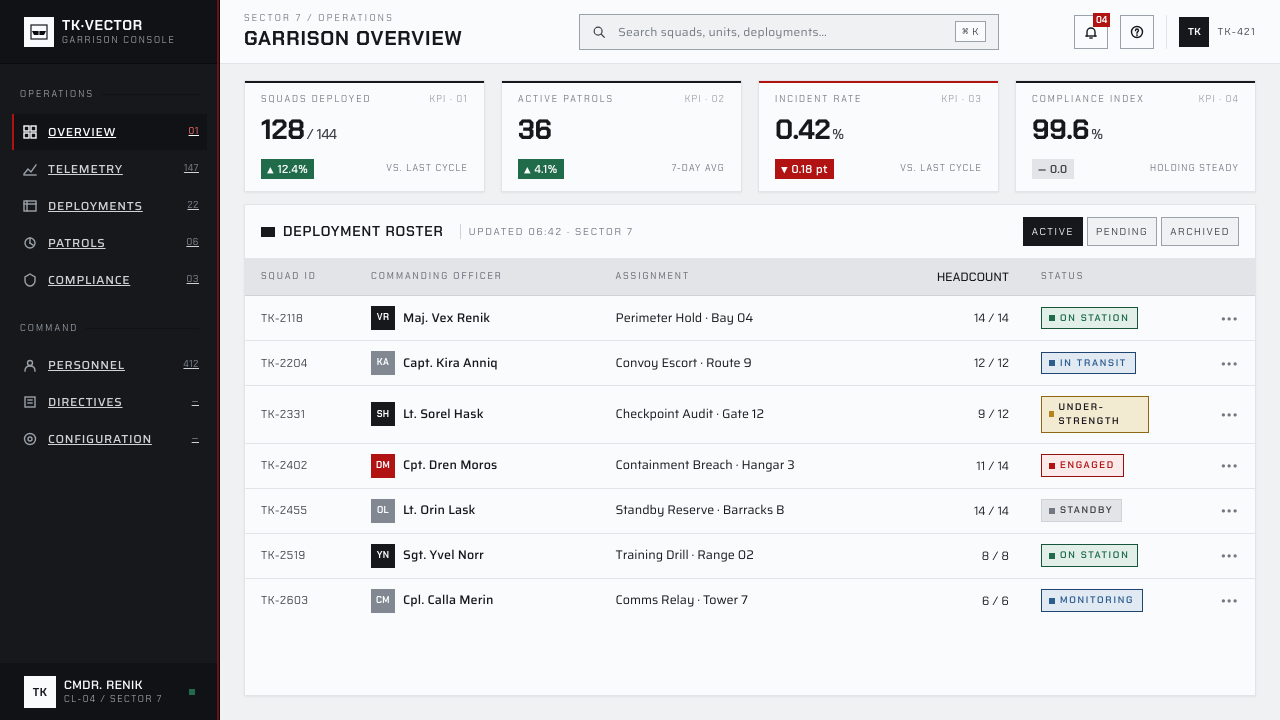
For web interfaces, the style is particularly effective for operational dashboards, control centers, monitoring products, security tools, and tightly governed pricing or account areas. Use pale plated surfaces to group information, black fields to define navigation and key status areas, and narrow seams to separate functions without making the interface feel soft. Interaction should feel deliberate and procedural rather than playful.
In editorial and marketing work, use the look to frame products or stories around precision, readiness, manufacturing, or disciplined systems. Large white sections can alternate with compact black information bands, while an occasional red notice creates a strong call to attention. The common mistake is turning the theme into costume decoration: helmet silhouettes, random mechanical marks, and red everywhere dilute the source. Preserve the tension by keeping surfaces clean, components repeated, and the warning color genuinely scarce.
Stormtrooper Imperial White — FAQ
Is Stormtrooper Imperial White simply a white-and-black sci-fi style?
No. Its identity depends on how white and black behave. White must read as cold, glossy, institutional armour; black must act as an underlayer, lens, recess, or stamped label. The system also relies on segmentation and repeated standardisation. A generic monochrome futuristic layout can be elegant, but without plated structure and controlled warning logic it will not carry this style’s mass-produced menace.
Can the style use photography or illustration?
Yes, but imagery should behave like a controlled component rather than an expansive scene. Crop it into a panel, isolate it against a clean field, or place it behind a dark visor-like treatment. Keep its material character crisp and technical. Warm lifestyle imagery, textured fantasy scenes, and loose illustrative decoration conflict with the sterile fabrication logic of the armour reference.
Why must warning red be used so sparingly?
Because red is the style’s break in discipline. Against armour white and bodyglove black, it carries an immediate sense of alert, restriction, or command. If it appears in routine buttons, decorative highlights, and ordinary labels, the interface loses its hierarchy. Scarcity gives the signal authority; repetition turns it into noise.
What products are a poor fit for this style?
It is a poor fit when warmth, intimacy, organic materiality, or personal expression are the main promise. Products centered on comfort, handmade craft, playful children’s experiences, or emotional softness may find its sterile authority alienating. The style works when the product can credibly speak in the language of procedure, inspection, control, or precision.
Related design styles
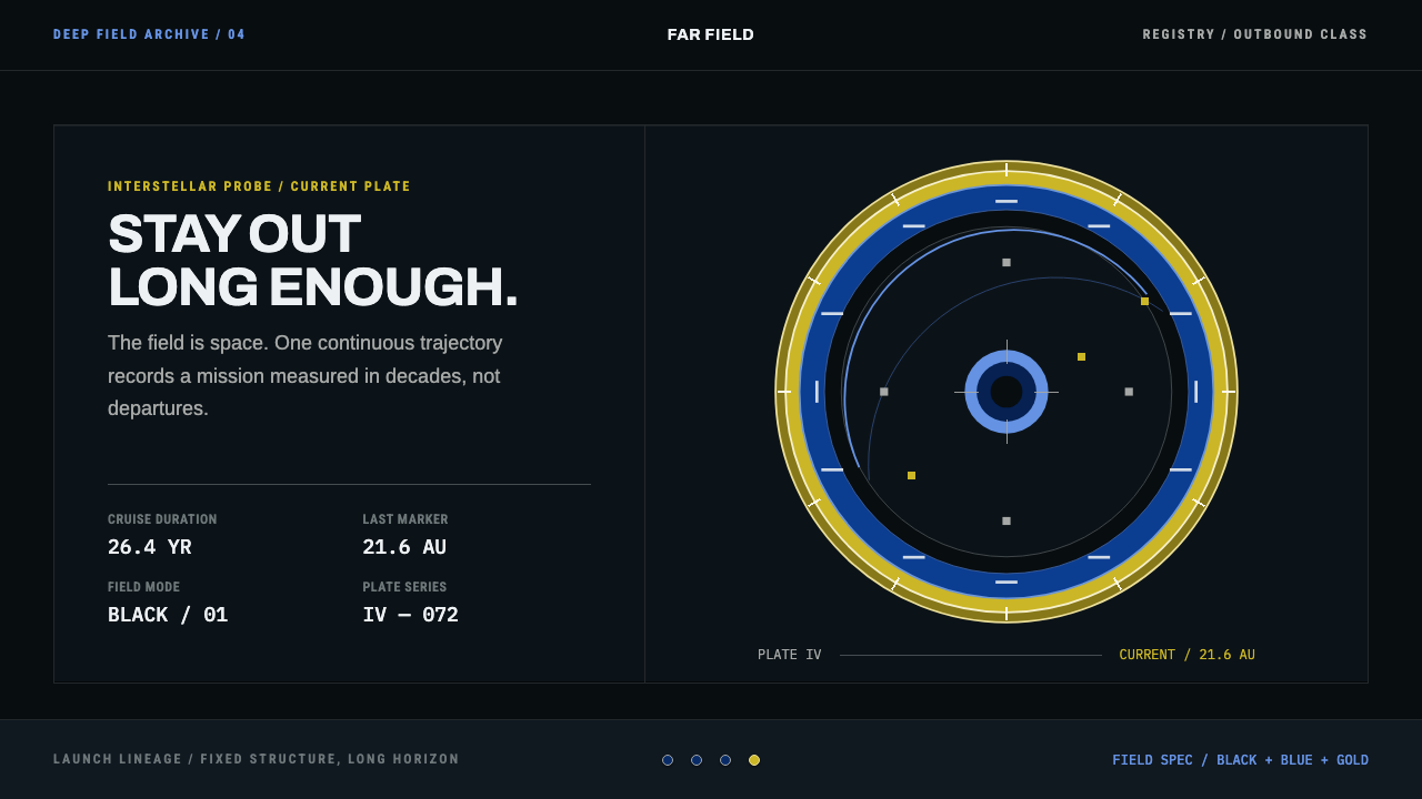 Interstellar Probe PatchCruise made visible. Black space, blue name rings, and a gold-ticked trajecto…
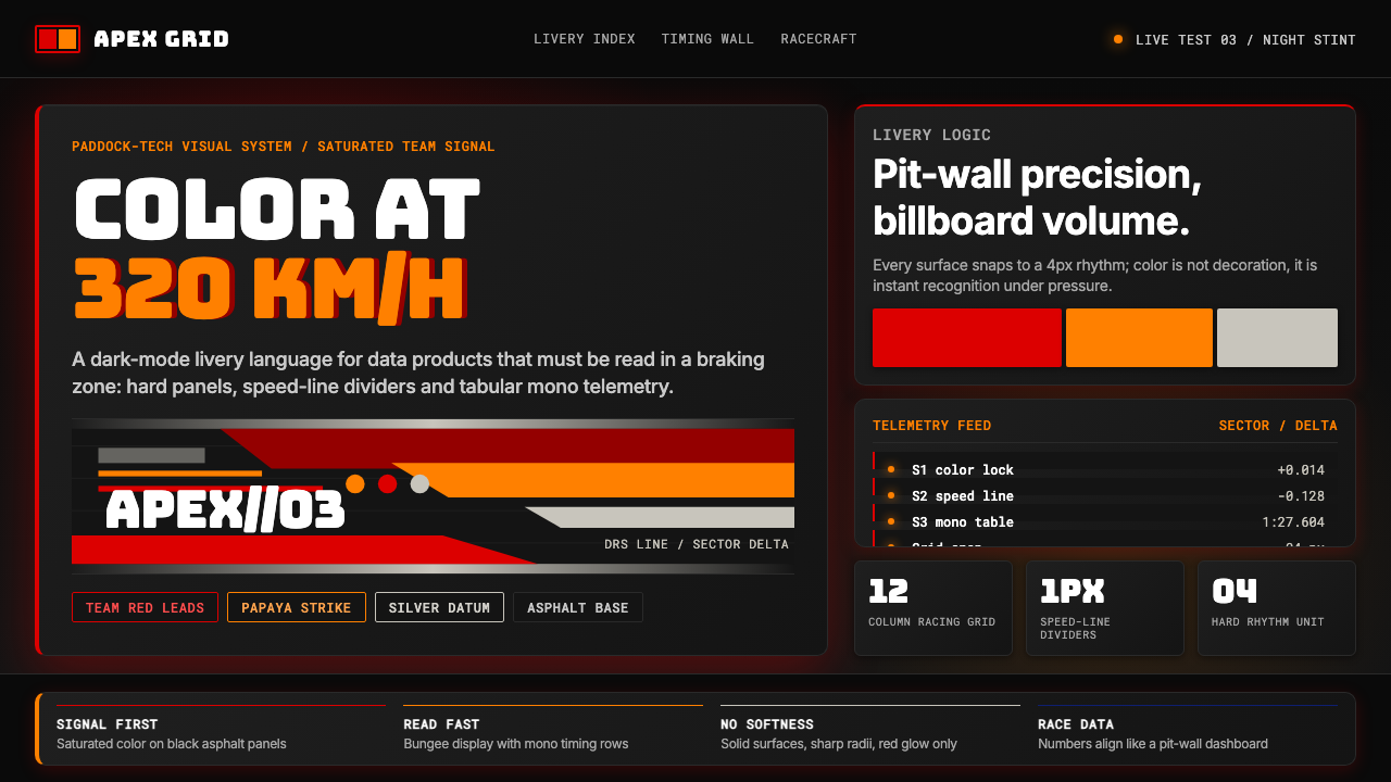 F1 Formula One LiverySpeed is legible. Ferrari red and papaya speed-lines cut through black teleme…
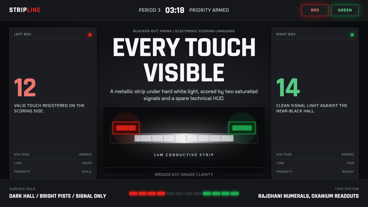 Fencing PisteTurns darkness into signal. Rajdhani HUD type frames a white piste and red-gr…
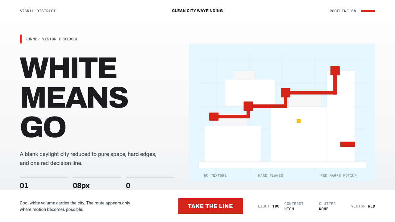 Mirror's Edge Clean CityWhite becomes motion. Cool daylight planes leave one signal-red route to comm…
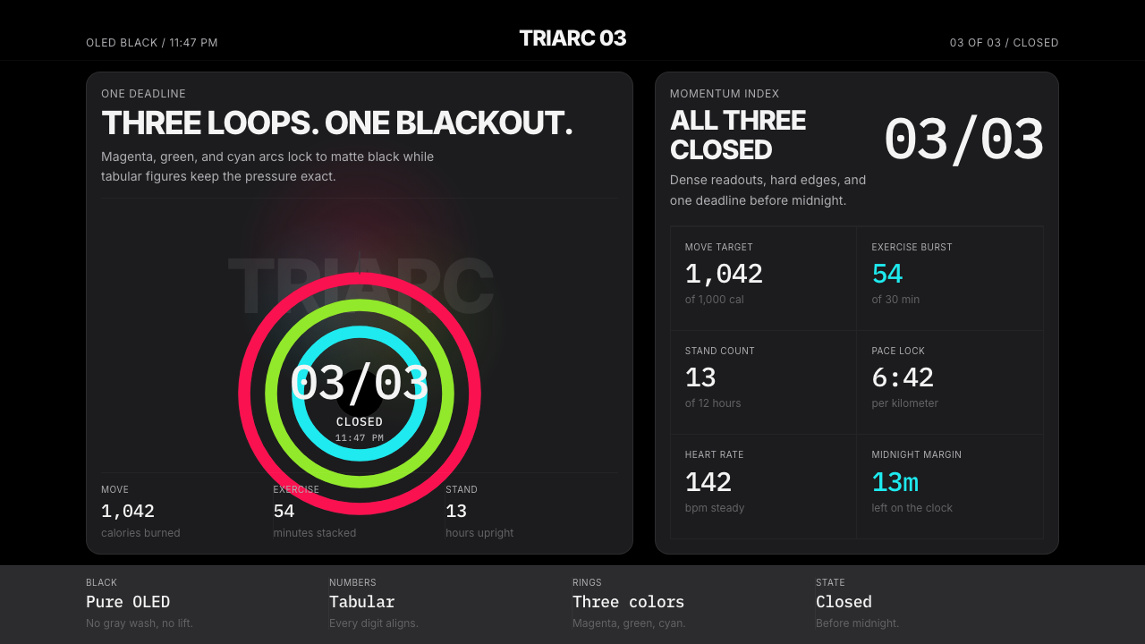 Apple Fitness Rings Closed (2024)Midnight feels exact. Magenta, green, and cyan rings lock onto OLED black.
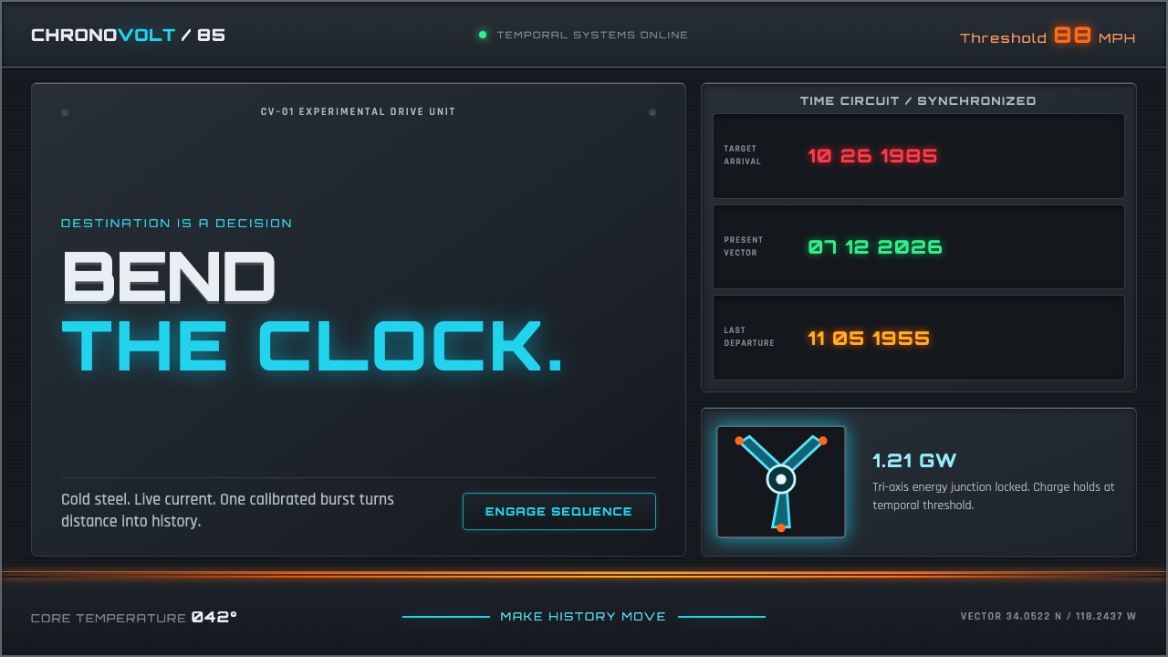 Back to the Future (1985)Cold steel, live current. Cyan circuits and orange trails turn the dashboard…