What is Back to the Future (1985)?
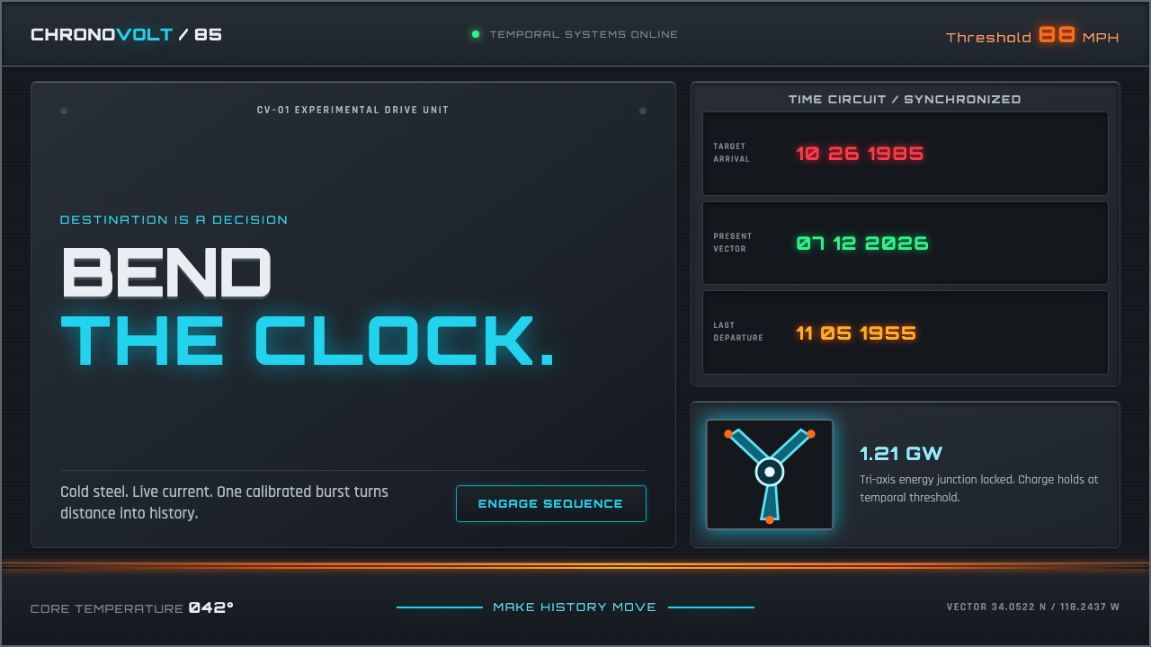
Cold steel meets live current: Back to the Future turns a dashboard into a time machine, where cyan circuitry and orange energy trails make every important action feel electrically inevitable.
Back to the Future (1985) in brief
Back to the Future is a dark interface language drawn from the instrument cluster of a time machine. Its central tension is physical and electrical: gunmetal panels, riveted seams, brushed-metal surfaces, and segmented LED readouts establish a machine built for use, while cyan circuits and orange trails interrupt that restraint with sudden, molten-looking energy. The result is not a generic futuristic screen. It feels like a control surface with a chassis, a charge, and a destination.
The style treats the dashboard as both an object and a narrative device. Information is not merely displayed; it appears to be routed through panels, readouts, indicators, and energized pathways. A quiet state should feel mechanical, orderly, and tactile. A meaningful state should feel as though the time circuits have just switched on. This contrast gives hierarchy an unusually direct emotional logic: passive information belongs to the steel body, while decisions and transitions belong to the current moving through it.
Visually, the system lives between industrial dashboard design and retro-futurism. Metal is never ornamental background texture alone; it implies enclosure, weight, and assembly. Neon is never an all-purpose decoration; it is the reaction inside the machine. Cyan suggests an active circuit or flux-capacitor pulse, while orange behaves like heat, velocity, or a trail left by discharged energy. Every illuminated element should appear to have a reason to exist.
Where does Back to the Future (1985) come from?
The style takes its name and primary imaginative frame from Back to the Future, released in 1985 in Hollywood. The machine's fictional first jump is also dated to that year, binding the interface to a very particular idea of time: not distant abstraction, but a present tense moment in which a machine is ready to cross a threshold. Its visual premise is therefore cinematic, but its usable vocabulary is dashboard-based.
Its source movements are 1980s Amblin sci-fi, retro-futurism, and industrial dashboard design. Together, these movements explain the coexistence of wonder and machinery. The sci-fi component supplies the sense of charged possibility; retro-futurism supplies the pleasure of imagined technology with visible parts; industrial dashboard design supplies the discipline of panels, seams, readouts, and controls that look as though they have jobs to perform.
The supplied key figures place Robert Zemeckis, Bob Gale, Ron Cobb, Andrew Probert, and Alan Silvestri around the source material. For a design system, their importance is best understood collectively rather than as a license to imitate isolated artifacts. The style draws on a coordinated world in which image, machine, motion, and atmosphere support the same idea: technology should feel assembled, energized, and on the edge of an event.
That origin makes the style more specific than a broad neon revival. It is not centered on endless digital space, smooth glass, or anonymous automation. Its future is built from cold metal, visible segmentation, and contained electrical discharge. The interface should preserve that tension: a hard, serviceable exterior carrying an improbable force inside it.
What defines the Back to the Future (1985) look?
Cold Chassis
Gunmetal panels and brushed-metal surfaces establish the base layer. They should feel assembled rather than painted on, with seams, joins, and riveted details used to suggest a protective enclosure. The surface is sober and industrial, creating enough visual mass that illuminated states can feel consequential instead of constantly decorative.
Live Current
Cyan circuitry is the system's most recognizable active signal. It should read as current passing through a route, not as broad atmospheric glow. Use it to connect states, emphasize a selected path, or mark a primary action. The effect works because the surrounding chassis remains comparatively quiet.
Orange Discharge
Orange trails provide the counterforce to cyan. Where cyan implies a stable energized circuit, orange implies heat, release, acceleration, or a trace of motion. It is strongest at moments of change: confirmation, forward movement, urgent status, or a decisive call to action. It should feel emitted by the system, never casually sprayed across it.
Segmented Readouts
Segmented LED-style displays make information feel measured by a machine rather than set as neutral text. Dates, counters, modes, destinations, and status labels can take on the character of instrument readings. Reserve this treatment for information that benefits from a dashboard voice; using it for every paragraph turns legibility into costume.
Panel Hierarchy
Information is grouped as modules within an instrument cluster. Framed regions, metal dividers, and restrained labels establish what belongs together before color intervenes. The hierarchy should be understandable in its unlit state. Light then acts as escalation: it says that a module is selected, armed, moving, or demanding attention.
Threshold Drama
The style is built around the instant before a jump. Motion trails, charged routes, and bright focal pulses should suggest imminent transformation rather than permanent chaos. This makes transitions, confirmations, and high-value actions especially suitable moments for spectacle, while routine browsing remains grounded in the machine's quieter material logic.
Who shaped Back to the Future (1985)?
Robert Zemeckis is named among the source material's key figures. Within this design language, the name anchors the cinematic identity from which the dashboard-and-time-machine premise is drawn.
Bob Gale is included among the key figures associated with the source material. The interface inherits a world-building premise in which time travel is communicated through specific controls, states, and destinations.
Ron Cobb appears in the supplied list of key figures. His inclusion helps locate the style within a coordinated machine-centered visual world rather than an abstract neon aesthetic.
Andrew Probert is named as a key figure in the source material. The design system's emphasis on chassis, panels, seams, and energized components belongs to this machine-focused frame.
How do you use Back to the Future (1985) today?
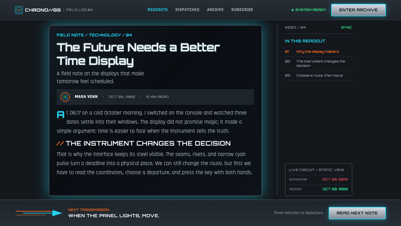
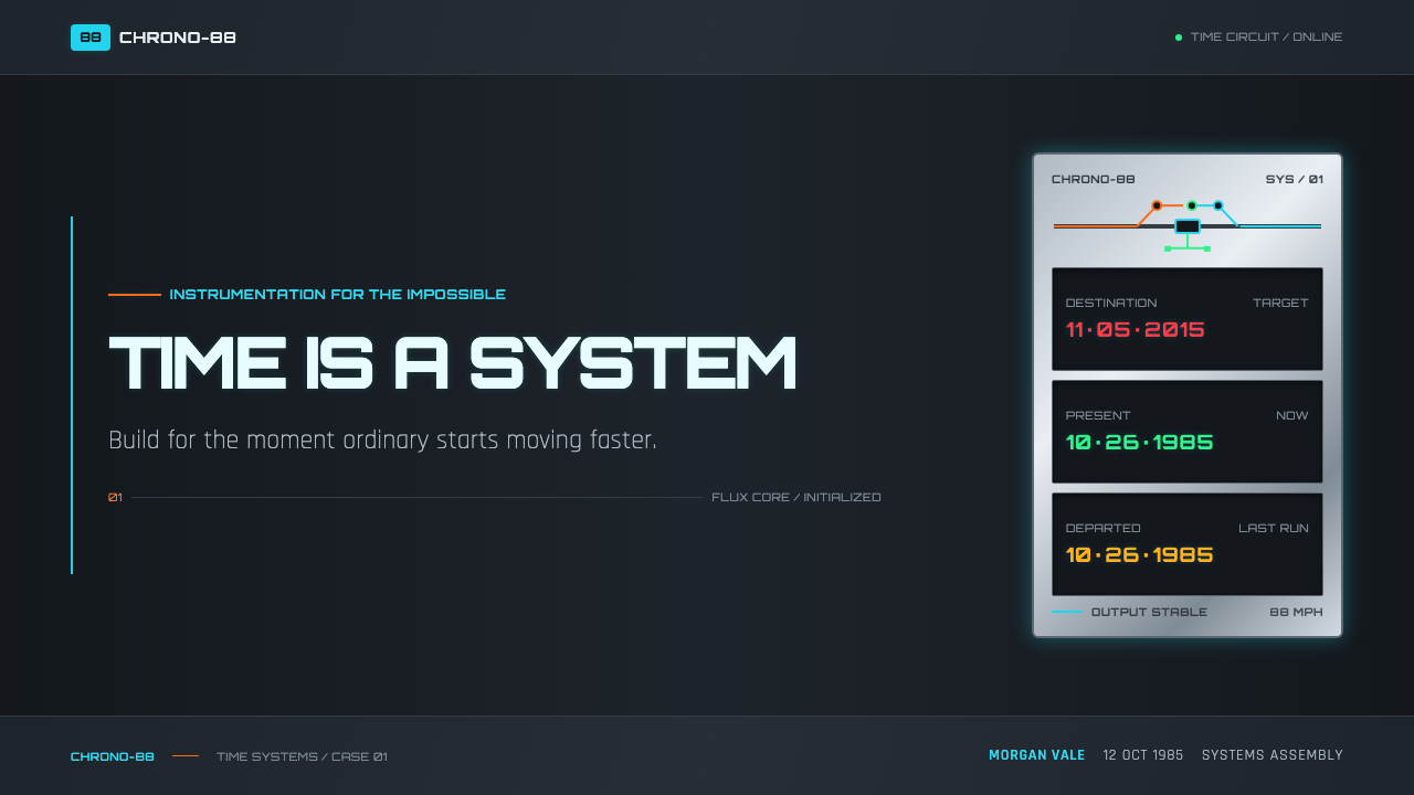
For presentation covers, use the time-machine premise as a single dramatic event. Set the title against a dark, metal-like field, then allow one cyan circuit path or orange discharge to lead toward it. The cover should feel like a powered control panel, not a collage of references. On content slides, return to the dashboard discipline: separate topics into clearly bounded modules, use restrained labels, and let one illuminated state identify the section currently in focus.
Data slides benefit when charts are treated as instrument readings. Keep the structural frame dark and mechanical, then use cyan for the active series or selected measure and orange for a threshold, exception, or moment requiring action. Segmented readouts work especially well for key totals, destinations, dates, and status changes. The goal is not to make every chart glow; it is to make the most consequential value feel like a signal detected by the machine.
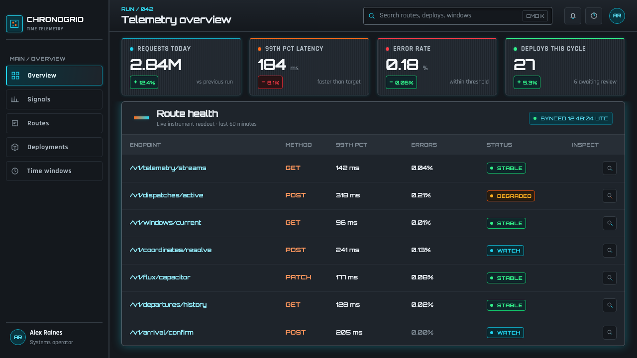
For web interfaces, the style is well suited to dashboards, monitoring tools, operations views, and pricing pages where status and decision-making matter. Build the screen from panel groups before introducing luminous accents. Navigation can behave like an instrument strip, with a selected destination receiving current while inactive destinations remain embedded in the chassis. In pricing, use the energy language sparingly around the recommended path or conversion action, so the page still feels trustworthy rather than theatrically urgent.
Editorial and marketing applications work best when they preserve the contrast between durable material and active energy. A long-form page can use dark panel headers, machine-like metadata, and a single energized route to lead readers from one section to the next. Campaign pages can stage a major call to action as a switching-on moment, while surrounding copy remains calm and physical. The atmosphere should imply that something powerful is contained, not that the entire page is exploding.
The common mistake is to reduce Back to the Future to neon on black. That loses the steel-and-current relationship that makes the style distinctive. If every border, label, number, and background glows, there is no longer a transition from dormant machine to active time circuit. Start with chassis logic, clear modules, and readable instrument hierarchy. Add cyan and orange only where the interface needs to signal charge, direction, velocity, or consequence.
Back to the Future (1985) — FAQ
Is this simply an eighties neon style?
No. Neon is only the visible reaction layer. The defining structure is the contrast between cold, assembled industrial surfaces and selectively energized circuitry. A screen with cyan and orange light but no panel logic, readout hierarchy, or mechanical enclosure may feel retro, but it will not carry the time-machine dashboard character.
How should cyan and orange be divided between interface states?
Treat cyan as a sustained active route: connection, selection, readiness, or an energized primary control. Treat orange as release or escalation: motion, heat, an urgent threshold, or a decisive transition. They work together because they imply different kinds of energy. If both colors carry every meaning equally, the system loses its electrical grammar.
Can the style support dense operational information?
Yes, provided the dashboard logic does the organizational work before visual effects are added. Dense information belongs naturally in panels, segmented readouts, grouped labels, and bounded modules. Reserve luminous effects for status changes and priority signals. That separation allows the screen to remain operationally legible while retaining the charged atmosphere of the theme.
Where does the style struggle?
It struggles where softness, calm neutrality, or intimate human warmth are the primary values. A machine-centered, high-tension interface can overwhelm reflective reading, gentle lifestyle communication, or products whose trust depends on visual quietness. It is strongest when the product genuinely benefits from signaling control, monitoring, movement, thresholds, or high-stakes action.
Related design styles
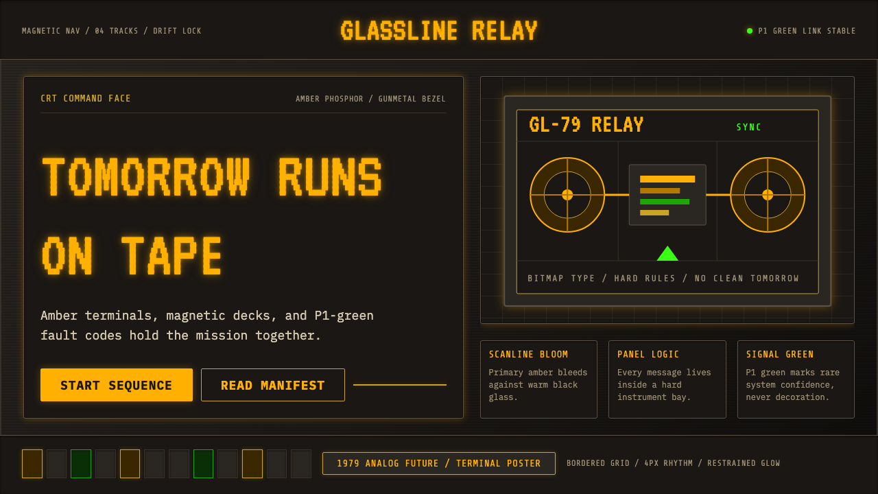 Cassette FuturismThe future hums in amber. VT323 glow, scanlines, and gunmetal grids make anal…
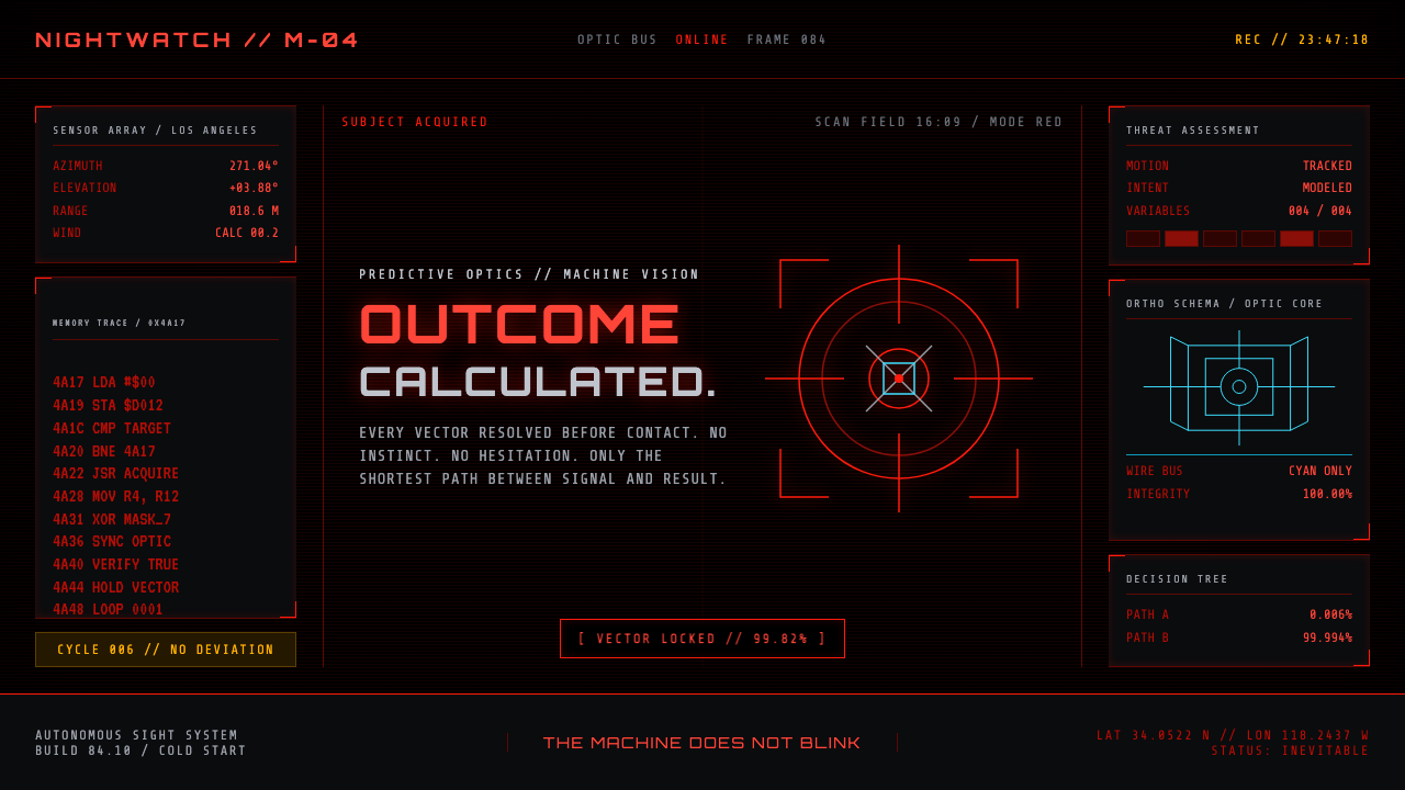 Terminator HUD (1984)The machine never blinks. Blood-red reticles and mono data burn across absolu…
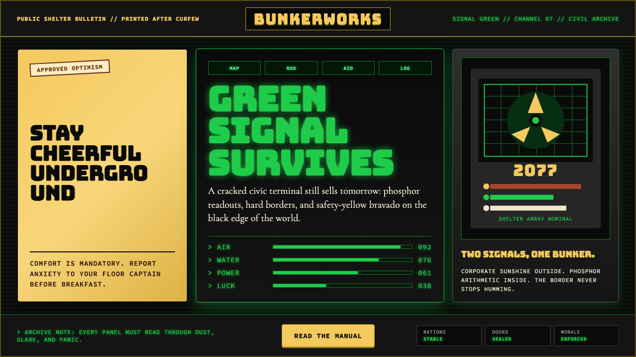 Fallout Vault-Tec Pip-BoyIrradiated optimism. Vault yellow and CRT green lock into a bordered bunker g…
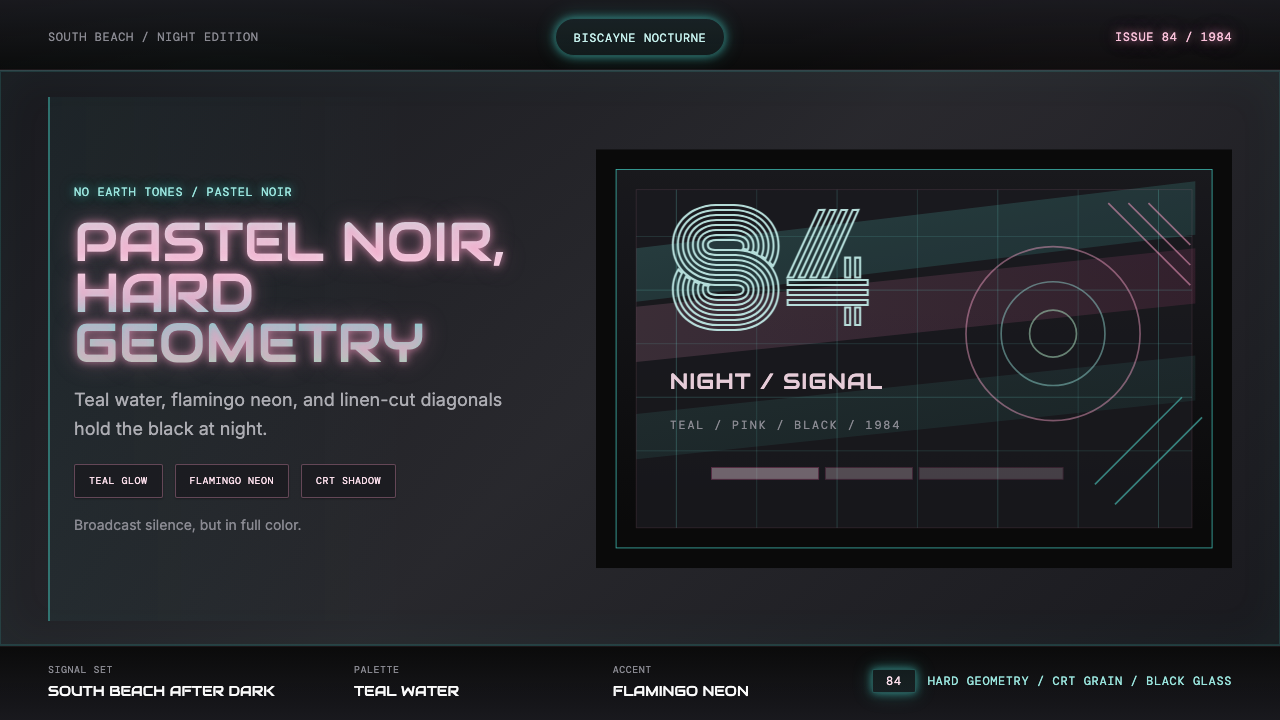 Miami Vice Pastel Teal (1984)Pastel noir, not nostalgia. Teal glow and flamingo pink slice black with geom…
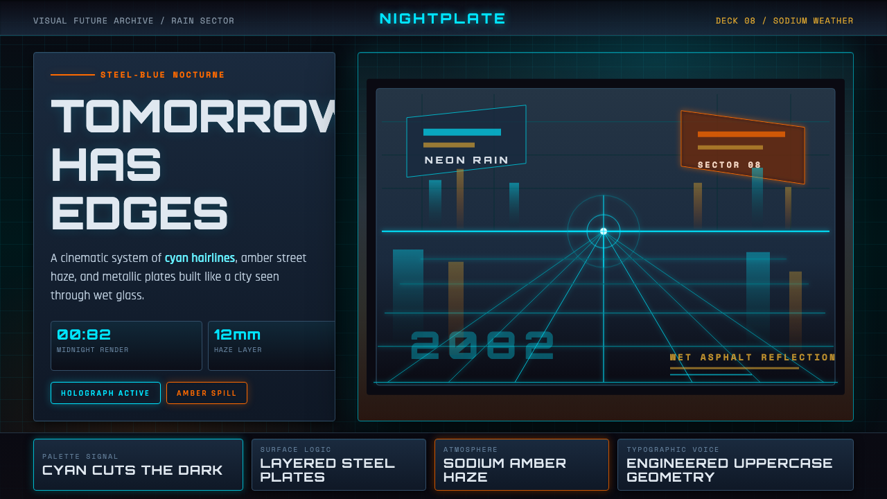 Retro-Futurism (Syd Mead)Tomorrow looks dangerous. Steel-blue night, neon cyan edges, and amber rain r…
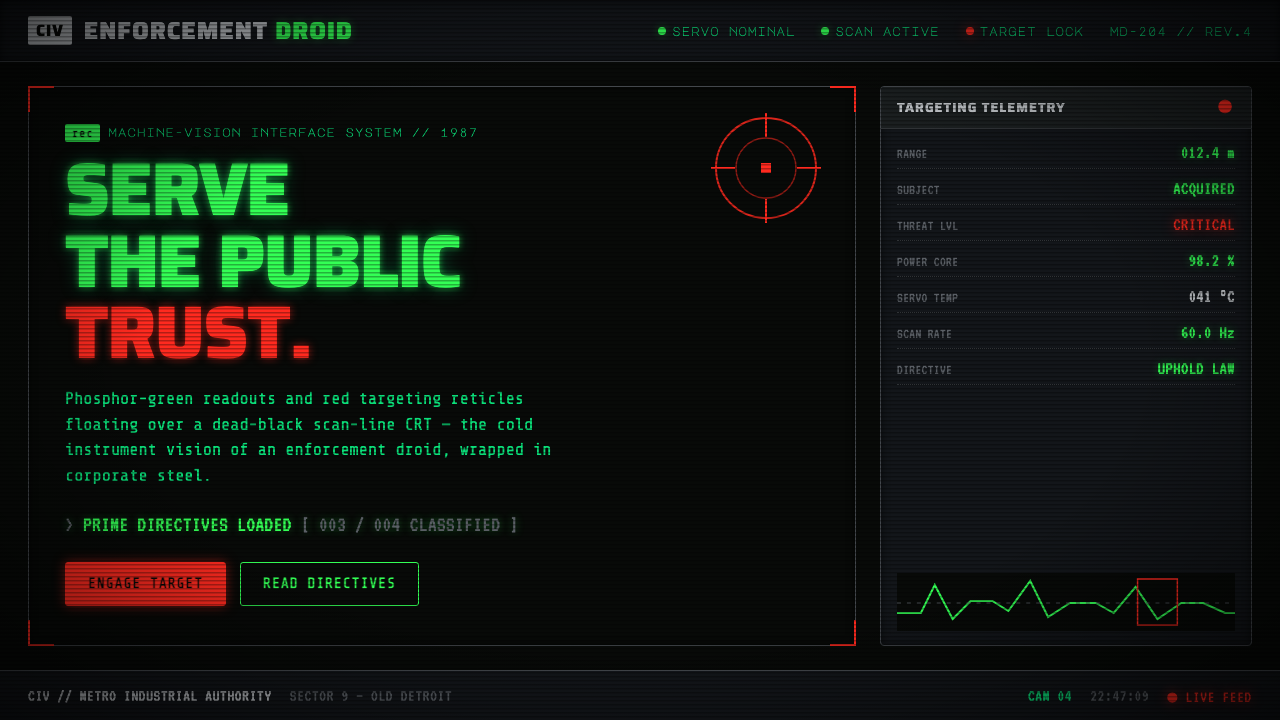 RoboCop (1987)Machine vision as interface. Phosphor-green readouts on dead-black CRT, red r…