What is Cassette Futurism?
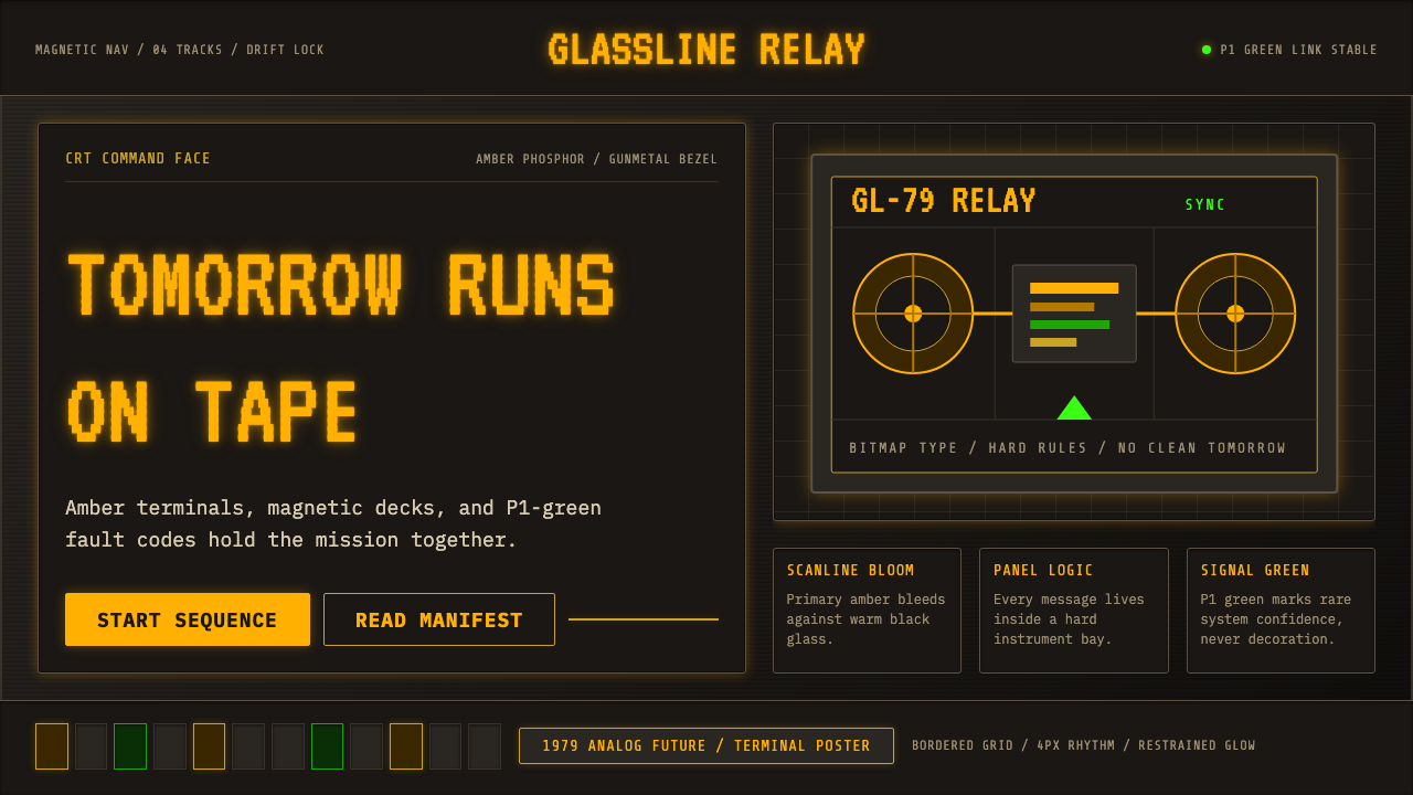
Cassette Futurism is the retro-future that never arrived — the 1979 vision of tomorrow built from amber phosphor, chunky toggle switches, and the quiet hum of magnetic tape. It is science fiction's most tactile aesthetic: a future imagined before personal computers, when the terminal was a window into something vast and slightly terrifying.
Cassette Futurism in brief
Cassette Futurism captures the visual imagination of late-1970s and early-1980s science fiction — a future conjured from CRT monitors glowing amber in the dark, banks of toggle switches set into putty-colored plastic consoles, reel-to-reel tape decks, and monochrome bitmap terminals. It is retrofuturism anchored not in the sleek chrome optimism of the 1950s but in the analog weight and institutional grayness of the late Cold War era.
The defining touchstone is the Nostromo's control room in Ridley Scott's 1979 film Alien, production-designed by Ron Cobb: a working spaceship with the grimy, functional aesthetic of an industrial trawler — nothing shining, nothing decorative, every surface built to be gripped and operated. This was science fiction that deliberately refused the antiseptic cleanliness of Stanley Kubrick's 2001. The technology felt heavy, present, and mortal.
Visually, the style is built on the inner surface of the screen rather than the beige casing around it. Warm near-black backgrounds carry glowing amber or phosphor-green text. Scanline bloom softens edges with a physical reminder of the cathode ray. Bitmap typefaces reduce letterforms to their minimal pixel-grid resolution. Gunmetal bezels, recessed grids, and blocky interface chrome give the digital surface an industrial mass that contemporary interfaces deliberately shed.
Where does Cassette Futurism come from?
The visual language of Cassette Futurism emerged not from any single design manifesto but from the practical constraints of 1970s Hollywood sci-fi production design. When Ridley Scott hired Ron Cobb and the design collective H.R. Giger for Alien in 1979, he asked them to build a future that felt used, lived-in, and industrial — a reaction against the pristine white corridors of 2001: A Space Odyssey (1968) that had set the dominant visual template for science fiction for more than a decade. Cobb's Nostromo interiors, crammed with physical toggle switches, cathode-ray terminals, amber readouts, and the kind of analog instrumentation you might find on an oil tanker, established what would become the core vocabulary.
The broader cultural context was the late Cold War and the era of the space shuttle. Real-world space hardware of the period — NASA Mission Control with its rows of phosphor-screen terminals, the military-green consoles of submarine command centers, the amber-lit radar rooms of NORAD — had a particular visual character: functional, institutional, and slightly ominous. Science fiction absorbed and amplified this aesthetic, treating it as the default grammar of near-future technology. Films including John Carpenter's Dark Star (1974), the original Star Wars (1977), and the early Terminator (1984) all shared variations of this palette and industrial texture.
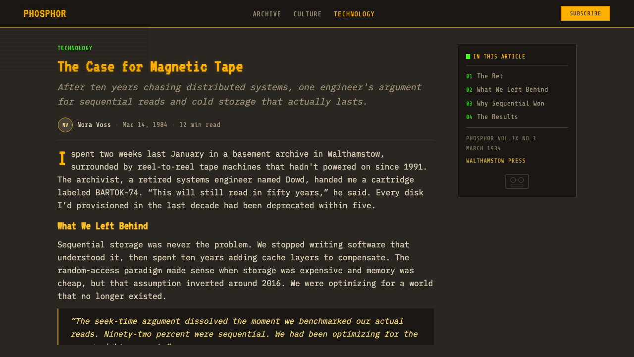
The amber monochrome CRT terminal was the defining artifact. Before color monitors became standard in the mid-1980s, the green phosphor (P1 coating) and amber phosphor (P3 coating) screens of minicomputers and early personal computers defined how digital information looked to most people who interacted with it. These terminals — made by companies like DEC, Lear Siegler, and Televideo — had a physical heft and glow that later LCD and LED displays never replicated. Cassette Futurism is in part an elegiac aesthetic, mourning the specific warmth and weight of a technology that disappeared quickly.
By the late 1990s and especially through the 2000s and 2010s, the aesthetic became explicitly nostalgic — absorbed by hacker culture, demoscene communities, independent game developers, and eventually mainstream graphic design and web UI work. The Fallout game series (from 1997 onward) canonized a particular version of it. Artists and designers began using the visual language not to imagine the future but to invoke a specifically 1979-era imagining of the future — a meta-layer of retrofuturism that is simultaneously nostalgic for the original source and aware of its own distance from it.
What defines the Cassette Futurism look?
Phosphor Glow and Background Warmth
The defining visual condition is warm-dark rather than cold-dark. The background is a deep, slightly warm near-black — not pure black, not gray, but the specific dark that a phosphor CRT produces by the light scattering slightly into adjacent pixels. Against this ground, text and interface elements glow with the characteristic amber of P3 phosphor or the slightly cooler yellow-green of P1. The glow is not clean: it blooms softly at the edges, suggesting the physical imprecision of electron-beam phosphorescence. This is entirely unlike the cool blue-black of contemporary dark mode interfaces.
Scanlines and Physical Texture
The scanline — the horizontal banding produced by the electron beam scanning line-by-line down a CRT face — is the signature texture of this aesthetic. Applied correctly, scanlines create a sense of visual weight and physical presence: the screen looks like a screen, not a window. They also give text and graphics a slight roughness that contemporary anti-aliasing eliminates entirely. In design application, scanline texture should feel like a consequence of the display technology, not a decorative overlay — when it looks like a striped filter dropped on top, it reads as pastiche rather than authentic.
Bitmap Typography
Letterforms in Cassette Futurism are defined by the pixel grid, not the curve. Early terminal fonts — designed to be legible at very low resolutions on a screen with inherent blur — are blocky, monospaced, and slightly uneven. The character shapes carry the geometry of constraint: stroke widths are uniform because they must be exactly one pixel wide, curves become staircase approximations, and diagonal strokes are visibly aliased. Monospacing — every character occupying the same horizontal advance — is not merely a convention here but a structural element, giving text the appearance of a machine readout rather than typeset prose.
Industrial Chrome and Gunmetal Structure
The hardware surrounding the screen contributes as much to the aesthetic as the screen itself. Bezels, panel borders, and structural divisions use a dark metallic gray — gunmetal, not silver — suggesting machined metal rather than cast plastic. This palette is deliberately unglamorous: it reads as functional, durable, military-adjacent. Interface elements — buttons, readout frames, grid overlays — share this industrial materiality. The contrast between the warm amber glow and the cool gunmetal frame is one of the aesthetic's most distinctive tensions, suggesting warmth trapped inside a cold machine.
Gridded Density and Information Mass
Cassette Futurism interfaces are dense, not minimal. The aesthetic assumes that a screen is a working surface for displaying operational data, not a space for quiet contemplation. Readouts, status indicators, grid coordinates, and auxiliary data crowd the periphery of the main content. This density is not clutter — it is intentional information mass, suggesting a system with many processes running simultaneously, monitored by someone who knows how to read all of it. Contemporary minimal UI design moves in exactly the opposite direction; this style's density is a deliberate counter-signal.
Monochromatic Restraint
The authentic cassette-futurism palette is rigorously limited: one phosphor color (amber or P1 green) on a warm near-black ground, with gunmetal and dark charcoal for structural elements. The absence of color variety is not a limitation but a feature — it evokes the hardware constraint of monochrome terminals and reads as disciplined, technical, and pre-commercial. A second accent color can appear sparingly for alert states or critical indicators — the red of an alarm light is always meaningful because it is the only departure from the monochrome system.
Analog Weight and Physical Presence
More than any other retrofuturism aesthetic, Cassette Futurism insists on physical mass. The imagined hardware is heavy — consoles designed to withstand the vibration of a ship's engine room, switches you can feel through gloves, panels that would require two people to lift. This physicality carries into the visual design: elements have visible borders, shadows suggest depth in bezels and recesses, and nothing feels weightless or hovering. The aesthetic is antithetical to contemporary card-based UI with its floating shadows and airy spacing — here, everything rests on something.
Who shaped Cassette Futurism?
Ron Cobb was the primary conceptual designer for the Nostromo spacecraft interiors in Ridley Scott's Alien (1979), and his work on that film established the visual grammar that defines Cassette Futurism. Working alongside H.R. Giger, Cobb was responsible for the functional, industrial elements of the ship — the control rooms, corridors, and crew spaces — and his design philosophy of 'used future' (a term he used explicitly) was the direct source of the aesthetic's defining character. Cobb also worked on other landmark sci-fi productions including Star Wars and The Abyss, consistently applying the principle that future technology should look like technology that has been worked with.
As director of Alien (1979) and later Blade Runner (1982), Ridley Scott presided over two of the most influential works of visual retrofuturism in cinema history. His production design philosophy — insisting on sets that felt lived-in, hardware that showed wear, and technology that felt heavy and functional rather than sleek — was transformative for how science fiction could look. Scott's collaborations with illustrators, production designers, and concept artists on both films produced visual worlds whose influence extended far beyond cinema into graphic design, UI design, game art, and popular visual culture.
Swiss artist Hans Ruedi Giger contributed the biomechanical design vocabulary of the alien organism and certain structural elements of the Nostromo to Alien (1979), earning an Academy Award for his work. While Cobb was responsible for the functional human-made spaces, Giger's contribution to the overall aesthetic was the sense that industrial technology could be simultaneously mechanical and organic, functional and threatening. His airbrush technique — producing surfaces that seemed to be simultaneously extruded, grown, and machined — added a textural darkness to the film's visual world that influenced not just Cassette Futurism but the broader genre of dark science fiction design.
DEC, the Massachusetts-based minicomputer manufacturer, produced the physical hardware — the VT100 and related terminal series — whose visual characteristics became the defining artifact of Cassette Futurism's source aesthetic. The VT100 (introduced 1978) was the first ANSI-standard video terminal and was used in universities, research institutions, government agencies, and corporations throughout the late 1970s and 1980s. Its amber or green phosphor screen, dark cabinet, and characteristic cursor blink defined how an entire generation thought about what a computer interface looked and felt like. The VT100 is the ghost inside every Cassette Futurism design.
The Fallout role-playing game series — beginning with the original 1997 game from Interplay and continuing with Bethesda's entries from 2008 onward — is the most significant single vehicle for popularizing Cassette Futurism as a conscious aesthetic choice in the twenty-first century. Fallout's version of the style blends the amber-terminal aesthetic with 1950s atomic-age optimism (Pip-Boy devices, Vault-Tec corporate graphics) to produce a distinctive hybrid that became the primary reference point for a generation of designers who grew up with the games. The franchise's reach — through games, merchandise, and the 2024 television adaptation — made Cassette Futurism legible to audiences who had never seen the original source films.
How do you use Cassette Futurism today?
Cassette Futurism is a context-specific style — it carries strong cultural associations with science fiction, hacking, retro computing, and post-apocalyptic aesthetics, and applying it requires that those associations serve the product rather than conflict with it. It works best for interfaces where the operator aesthetic is appropriate: developer tools, security dashboards, game UIs, CLI applications, or any product where the user is meant to feel like a technician in command of a system rather than a passive consumer of a service.
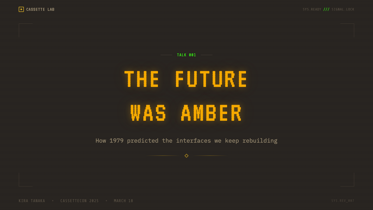
For presentation slides, the style works powerfully on cover and section-break slides where the atmospheric quality can be established without compromising readability. A cover slide benefits from a full warm-dark background, amber or phosphor-green headline text in a monospace typeface, and minimal supporting elements — a thin grid overlay, a scanline texture applied very lightly. Content slides should pull back from heavy atmospheric effects: reduce the scanline density, keep the primary text high-contrast amber on dark, and use simpler grid structures. Data visualizations in this style take on a radar or terminal-readout character — bar charts rendered as filled block glyphs, line graphs that resemble oscilloscope traces.
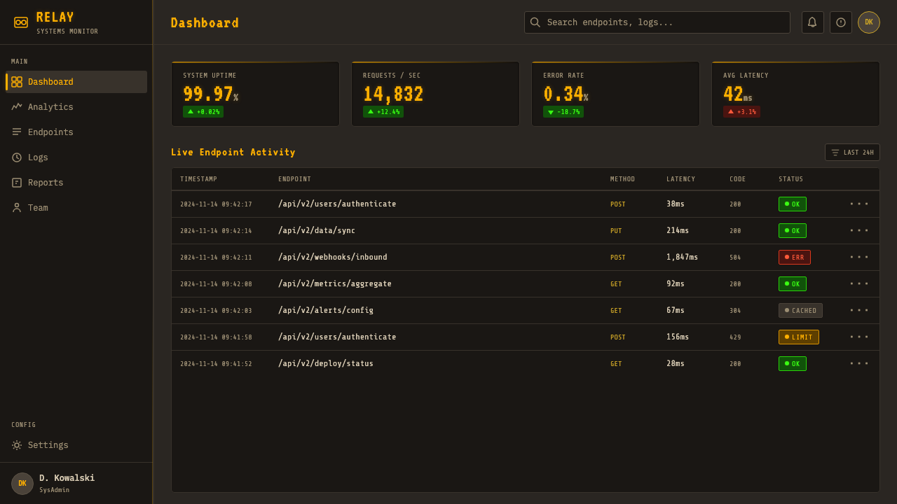
For web interfaces, Cassette Futurism is most credible in developer-facing or technically-positioned products: API documentation, monitoring dashboards, terminal emulators, database tools, and games. The approach requires discipline: a genuine dark background with warm undertones rather than pure black, monospace typography for code and data, bordered rather than floating UI components, and scanline or grid textures applied as actual CSS rather than image overlays. Navigation and action elements should feel like hardware controls — distinct, bordered, and with clear state changes rather than subtle hover effects.
For editorial and marketing work, the style is best used as a signal of technical credibility or countercultural positioning rather than as a full-system visual language. A dark terminal aesthetic for a product launch or announcement can read as sophisticated and insider if the execution is tight; it reads as costume if the rest of the product's visual language contradicts it. When using the style in a limited context — a hero banner, a feature section — commit to the full vocabulary within that section rather than blending it with flat-color contemporary design.
The most common mistake when applying Cassette Futurism is treating it as an excuse for low information quality. The original aesthetic was dense with meaningful data — every readout on the Nostromo's bridge was legible and purposeful. Contemporary applications often use the scanline texture and amber glow as decoration over content that is actually sparse, producing a contradiction: an interface that signals technical depth while delivering nothing. The second most common mistake is using the aesthetic on a product where the terminal-operator context is incongruous — a wellness app, a children's service, a food brand — where the industrial-military associations actively undermine the product's emotional goals.
Cassette Futurism — FAQ
What is the difference between Cassette Futurism and cyberpunk?
Cassette Futurism predates cyberpunk and is in some ways its visual ancestor, but the two aesthetics are distinct in character. Cassette Futurism draws from late-1970s institutional and industrial science fiction — the analog, heavy-hardware world of Alien and early military computing. Cyberpunk, emerging from literary sources (William Gibson's Neuromancer, 1984) and visual culture (Blade Runner, also 1982), is urban, neon-lit, network-connected, and compressed — it assumes a future of miniaturized technology and global information flows. Cassette Futurism is analog and isolated; cyberpunk is digital and networked. The color language reflects this: Cassette Futurism is monochrome amber or green on near-black; cyberpunk reaches for electric blues, magentas, and neon greens layered over darkness.
Can Cassette Futurism work on a light background?
Technically possible but aesthetically self-defeating. The phosphor glow — the central visual effect of the style — only exists in relation to a dark ground. On a light background, amber or green text becomes a color choice rather than an emission effect, and the entire depth of field that the style depends on collapses. Scanline textures on a light ground read as grid decoration rather than display physics. The industrial-metallic structural elements look out of place against light surfaces. If the project context requires a light interface, the Cassette Futurism aesthetic cannot be faithfully applied — it is one of the few design styles where the background luminosity is not a variable but a constraint.
How do I prevent Cassette Futurism from reading as parody or costume?
The line between authentic application and pastiche is drawn by intent and density. Parody Cassette Futurism uses the surface signals — scanlines, amber glow, blocky type — as decoration over otherwise conventional content; authentic application integrates those signals into the structural logic of the interface. Practically: the information architecture should feel terminal-like before any atmospheric effects are applied. Monospace type, bordered components, dense information display, and grid-structured layout should be the baseline — the phosphor glow and scanlines amplify what already exists structurally. When the atmosphere arrives before the structure, it reads as costume. Also important: the product context must genuinely suit the operator aesthetic. Cassette Futurism cannot be applied to a product that is fundamentally soft, warm, or consumer-emotional without the mismatch becoming legible.
Is there a right way to handle color in Cassette Futurism, given that it is so restricted?
The restriction is the discipline. The style works from a single phosphor color — amber or P1 green — as the entire positive space of the interface. Within that single color, all hierarchy is created through brightness variation (full glow for primary text, dimmer for secondary data, dim for grid lines), through the text-to-background contrast ratio, and through spatial density. A second accent color — typically a sharp warning red — should appear only for true alert states, never for decoration. The moment a third color enters the system, the terminal logic breaks and the interface starts to read as contemporary dark mode rather than authentic Cassette Futurism. The discipline of staying with one phosphor color forces a clarity of hierarchy that many multi-color interfaces never achieve.
How does Cassette Futurism relate to the current vaporwave and lo-fi aesthetics?
They share a family resemblance rooted in analog nostalgia and a reappraisal of pre-digital visual culture, but they diverge significantly in emotional register and formal vocabulary. Cassette Futurism is industrial, technical, and slightly ominous — its nostalgia is for heavy machinery and institutional seriousness. Vaporwave is consumerist, pastel, and dreamy — its nostalgia is for shopping mall muzak and early digital graphics in saturated purples and pinks. Lo-fi aesthetics are warm, domestic, and humanizing — grain and imperfection as comfort rather than threat. Cassette Futurism's relationship to its source material is also different: it is referencing a retrofuture (a past vision of the future) rather than a past present. This meta-temporal layer — nostalgic for a future that never arrived — gives it a specific melancholy that the other aesthetics do not share.
Related design styles
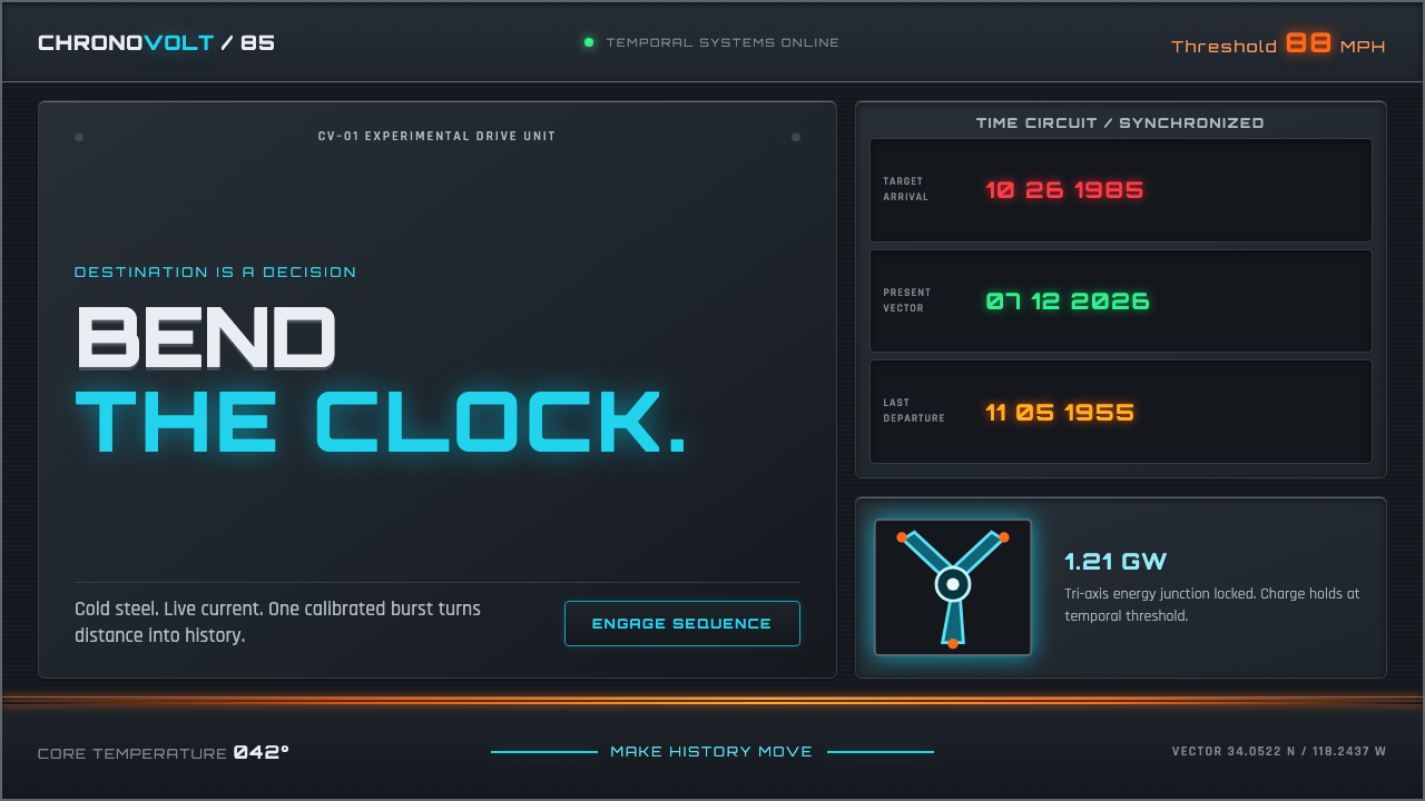 Back to the Future (1985)Cold steel, live current. Cyan circuits and orange trails turn the dashboard…
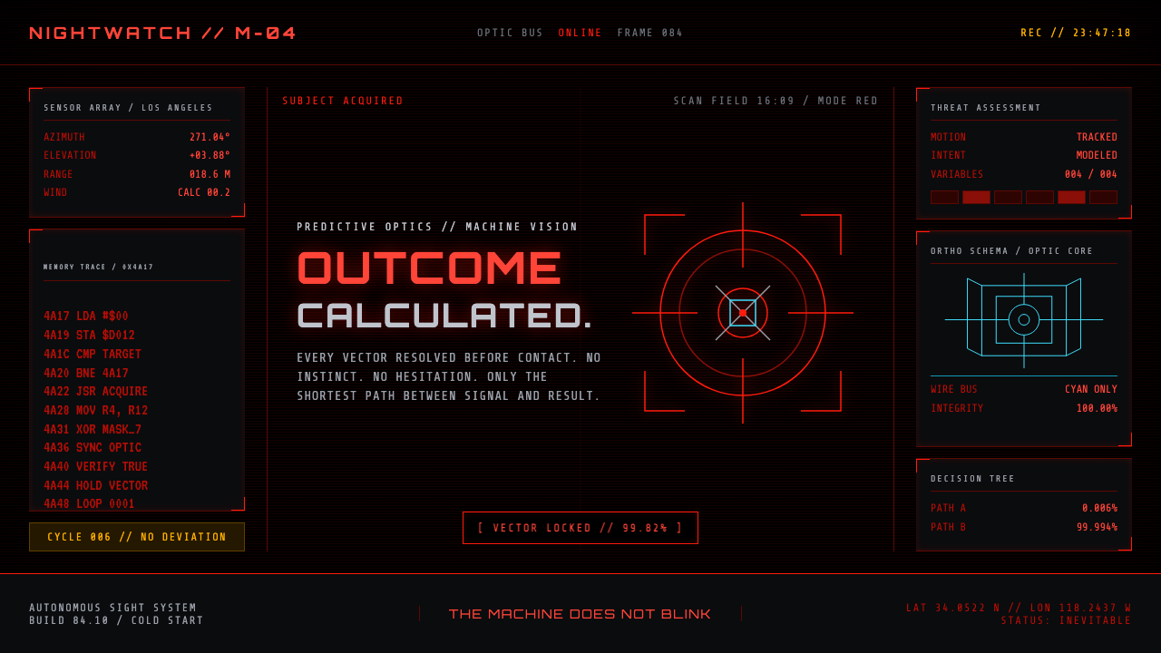 Terminator HUD (1984)The machine never blinks. Blood-red reticles and mono data burn across absolu…
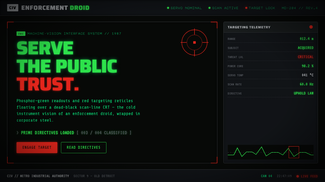 RoboCop (1987)Machine vision as interface. Phosphor-green readouts on dead-black CRT, red r…
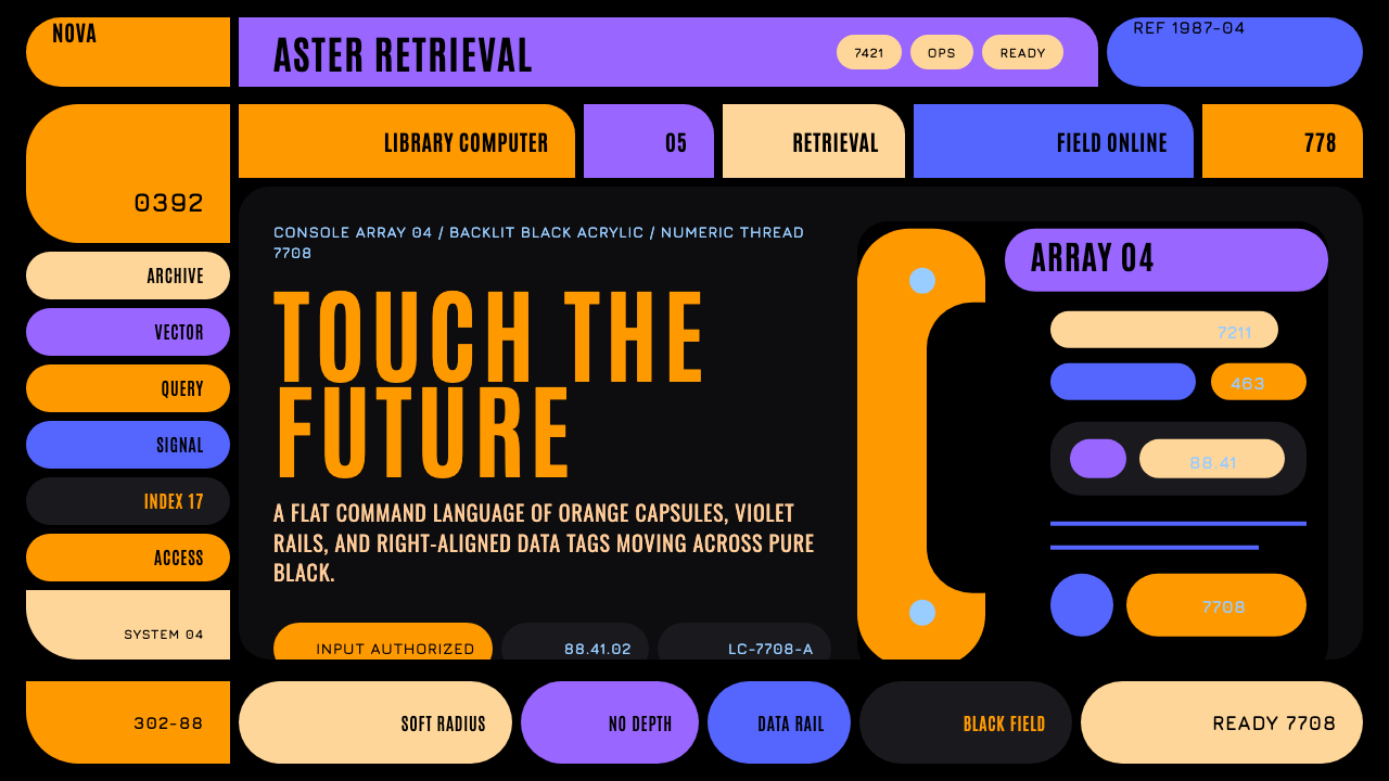 Star Trek LCARSFuture as flat command. Orange-violet elbows and Jura numbers glow on black.
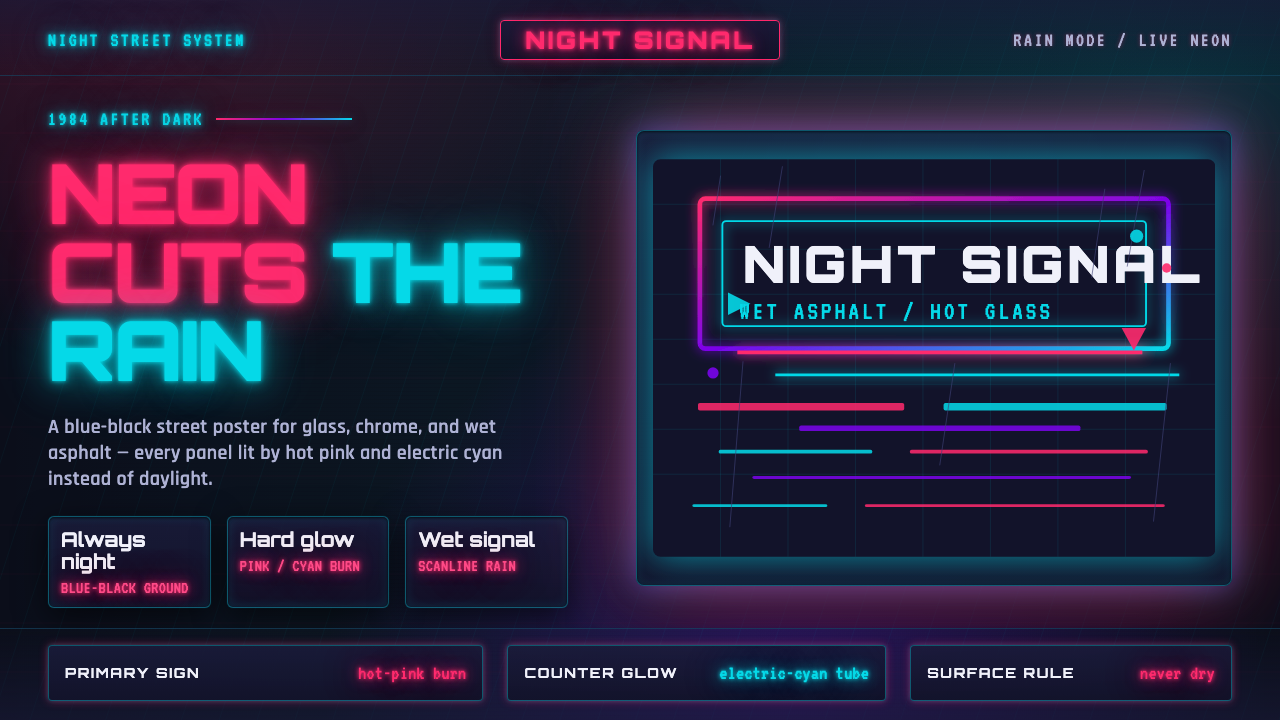 Tech-NoirAlways night. Blue-black asphalt reflects hot pink and electric cyan neon.
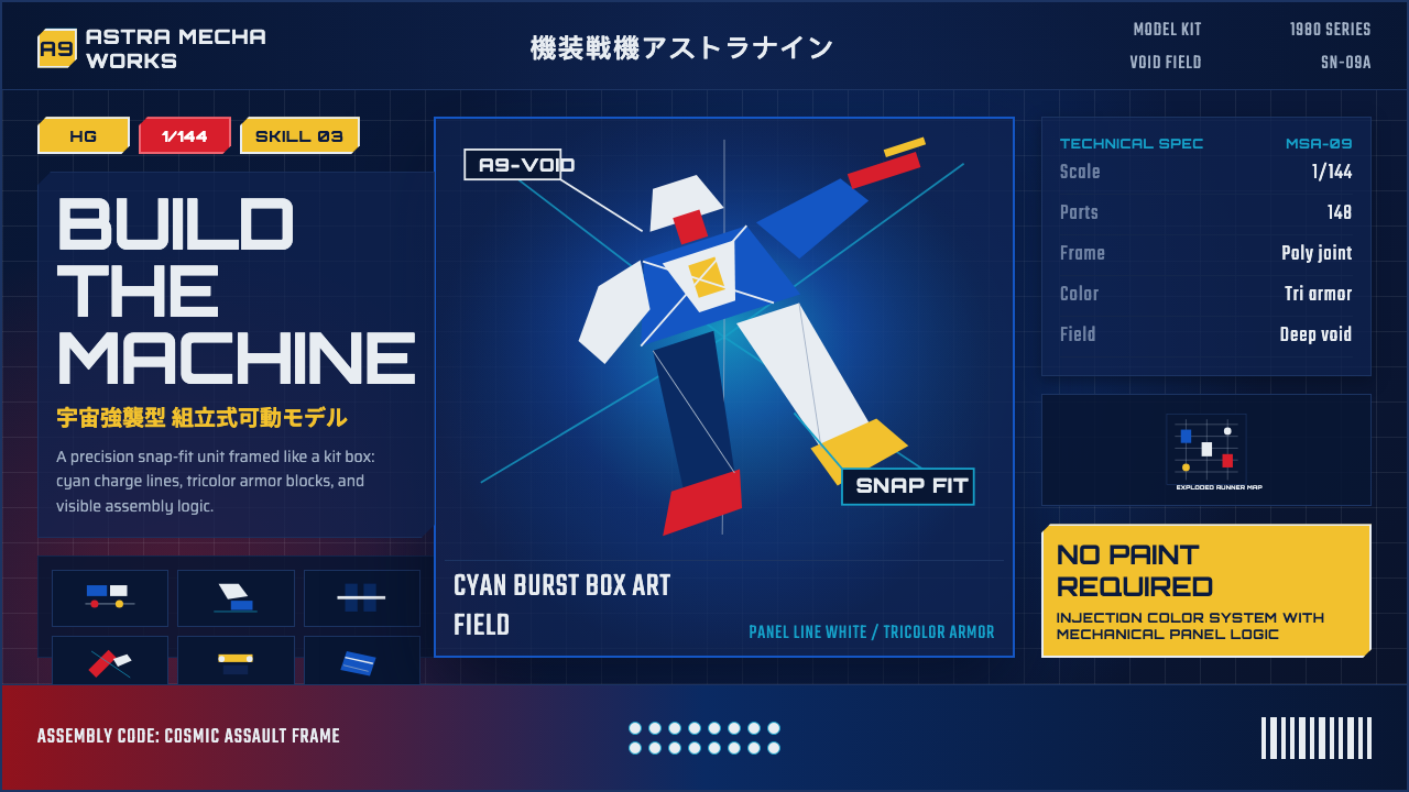 Gunpla Model BoxBuild-sheet drama. Cosmic navy, cyan burst, tricolor armor, and spec-panel gr…