What is Sega Dreamcast (1999)?什么是 Sega Dreamcast (1999)?
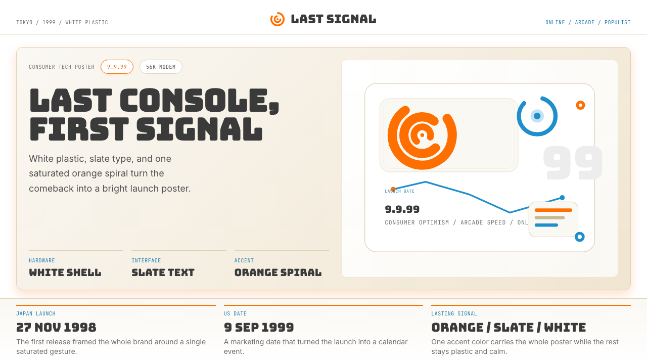
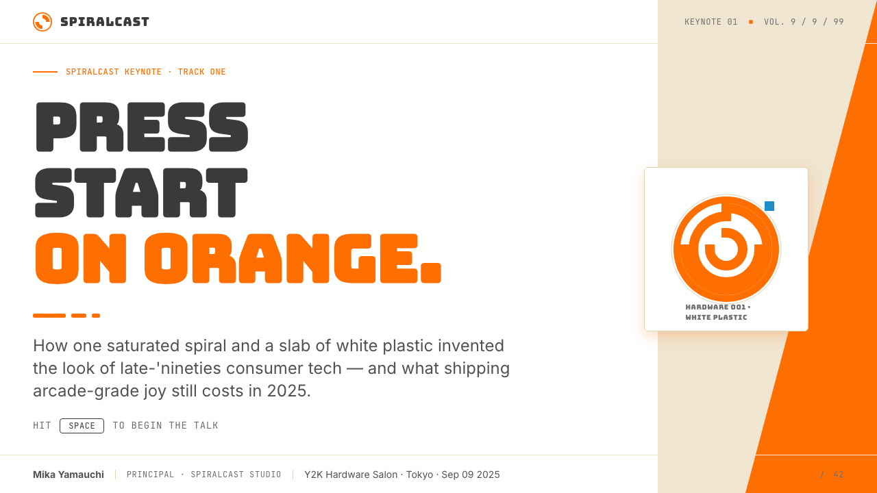
A saturated orange spiral on white plastic — the Dreamcast's visual identity captured the exact moment the world stood at the threshold of online gaming and Y2K optimism.白塑料上那枚饱和橙色螺旋,Dreamcast 的视觉身份定格了世界站在在线游戏与 Y2K 乐观主义门槛上的那一瞬间。
Sega Dreamcast (1999) in briefSega Dreamcast (1999) 速览
Sega Dreamcast (1999) is a design language born from a games console — Sega's last — that launched in Japan in 1998 and reached North America in 1999. Its visual identity is disciplined populism: pure white plastic surfaces, deep slate-grey type, a single saturated orange accent that carries all symbolic weight, and occasional cyan-blue echoes drawn from the console's distinctive cable color and online-era marketing campaigns.Sega Dreamcast(1999)是一套从游戏主机中生长出来的设计语言——那是世嘉最后一款主机,1998 年在日本上市,1999 年登陆北美。它的视觉身份是「克制的大众主义」:纯白塑料表面、深石板灰文字、一抹饱和橙色承担所有象征性重量,再辅以偶尔出现的青蓝色——来自主机标志性线缆颜色与在线时代营销物料的回响。
The aesthetic is consumer-cheerful and tech-confident without aspiring to luxury or industrial severity. Where the competing PlayStation adopted a cool grey minimalism and the Nintendo 64 leaned into toy-like primary colors, the Dreamcast chose white-field clarity with one loud accent — a visual grammar that reads as simultaneously optimistic and purposeful. The orange spiral logo is its most concentrated expression: a form that suggests motion, connectivity, and forward momentum.这套美学兼具消费级的愉悦感与科技的自信,却不追求奢华或工业冷峻。竞争对手 PlayStation 选择了冷调灰色极简,任天堂 64 偏向玩具般的三原色,而 Dreamcast 选择了白色底面的清晰感加一抹响亮的强调色——一套既乐观又目标明确的视觉语法。橙色螺旋 Logo 是这套语言最浓缩的表达:一个暗示运动、连接与向前动势的形态。
As a design reference, the Dreamcast palette belongs to the late-1990s wave of Y2K tech aesthetics — the conviction that the digital future was arriving and that it would be clean, bright, and slightly thrilling. It shares DNA with that era's internet-era product packaging, ISP installation discs, and early web portals, all of which reached for a similar combination of white space, high-contrast type, and one energizing accent color.作为设计参照,Dreamcast 色板属于 1990 年代末 Y2K 科技美学浪潮——一种相信数字未来正在降临、而它将是干净、明亮、略带兴奋感的信念。它与同时代互联网产品包装、ISP 安装光盘和早期门户网站共享基因,那个时代的设计者们都在追求相似的组合:白色空间、高对比度文字,以及一抹充满能量的强调色。
See the Sega Dreamcast (1999) design system查看 Sega Dreamcast (1999) 完整设计系统
Where does Sega Dreamcast (1999) come from?Sega Dreamcast (1999) 从何而来?
The Dreamcast was born from Sega's urgent need to recover from the commercial failure of the Saturn console in North America and Europe in the mid-1990s. Under the leadership of Hayao Nakayama and, for the North American launch, Bernie Stolar — who famously cancelled the Saturn's North American lifespan to clear the decks — Sega developed the Dreamcast on an accelerated timeline. The hardware team in Tokyo produced a machine built around an NEC PowerVR graphics chip and a Yamaha sound processor, while the marketing and identity teams worked to define a visual language that would signal a clean break from the Saturn era.Dreamcast 诞生于世嘉迫切需要从土星主机在 1990 年代中期北美和欧洲的商业失败中重建的背景之下。在中山隼雄的领导下,以及负责北美发布的伯尼·斯托拉(他曾果断叫停土星的北美生命周期以清理局面)的推动下,世嘉以加速时间线开发 Dreamcast。东京的硬件团队打造出一台基于 NEC PowerVR 图形芯片与雅马哈声音处理器的机器,而市场营销与品牌团队则致力于定义一套能够与土星时代彻底切割的视觉语言。
The console launched in Japan on November 27, 1998, under the slogan 'The Dreamcast is here.' The North American launch on September 9, 1999 — numerically rendered as 9/9/99 — was one of the most theatrical product launches in gaming history, generating over 225 million dollars in first-day sales. The marketing identity established at launch was built around that orange spiral on white: a visual grammar that appeared across hardware, software packaging, controller peripherals, the VMU memory card, and the console's startup screen. The identity was coherent and immediately recognizable, even for consumers who had never heard of the hardware specifications.主机于 1998 年 11 月 27 日在日本上市,以「Dreamcast 来了」为口号。1999 年 9 月 9 日(数字上写作 9/9/99)的北美上市是游戏史上最具戏剧性的产品发布之一,首日销售额超过 2.25 亿美元。发布时确立的营销身份以白色底面上的橙色螺旋为核心:这套视觉语法出现在硬件、软件包装、手柄外设、VMU 记忆卡以及主机开机画面上。这套身份连贯且辨识度极高,即便是从未了解过硬件规格的消费者也能一眼认出。
The Dreamcast was also the first home console to ship with a built-in modem as standard, and Sega's SegaNet online service shaped the marketing aesthetic: a sense of connectivity, openness, and the slightly euphoric feeling of 1999 internet culture. Cyan-blue, borrowed from the distinctive blue swirl of the console's cable, appeared as an accent color in advertising and launch materials — a nod to the network premise that made the hardware distinctive. Hidekazu Yukawa, Sega of Japan's then-executive vice president, became an unlikely face of the campaign in Japan, appearing in self-deprecating television advertisements that acknowledged the Saturn's failures directly.Dreamcast 同时也是第一款标配内置调制解调器的家用主机,世嘉的 SegaNet 在线服务深刻塑造了营销美学:一种连接感、开放感,以及 1999 年互联网文化略带欣快的氛围。借自主机线缆独特蓝色漩涡的青蓝色,作为强调色出现在广告与发布物料中——向使该硬件独树一帜的网络前提致意。时任世嘉日本执行副总裁汤川英一意外成为日本营销活动的代言面孔,在一系列自嘲式电视广告中直接承认了土星的失败。
The console was discontinued in March 2001, just over two years after its North American launch, as Sony's PlayStation 2 and the announced Xbox eroded its market position. But the aesthetic it established — white-field clarity, slate type, saturated orange, occasional cyan — became a touchstone for the Y2K design moment and has experienced sustained revival in retro-gaming culture, indie game marketing, and digital nostalgia design since the early 2010s. The Dreamcast's visual language is now treated as a coherent period style as distinctly recognizable as any design movement of its decade.主机于 2001 年 3 月停产,距北美发布仅略超两年,索尼 PlayStation 2 与已宣布的 Xbox 侵蚀了其市场地位。但它所建立的美学——白色底面的清晰感、石板灰文字、饱和橙色、偶尔的青蓝色——成为 Y2K 设计时刻的一块基石,自 2010 年代初以来在复古游戏文化、独立游戏营销与数字怀旧设计中持续复兴。Dreamcast 的视觉语言如今被视为一套连贯的年代风格,其辨识度不亚于其所在十年的任何设计运动。
What defines the Sega Dreamcast (1999) look?Sega Dreamcast (1999) 的视觉特征是什么?
Color色彩
The palette centers on a single saturated orange — warm, energetic, and unmistakable — set against pure white or very light off-white grounds. Deep slate grey handles all typographic and structural work, never black for body content, which keeps the palette feeling airy rather than stark. Cyan blue appears as a secondary accent, lighter and cooler in temperature than the orange, referencing online connectivity and appearing primarily in interface elements and marketing borders. The white ground is treated as a positive design element, not empty space — broad white fields give the orange room to resonate at full energy.色板以单一的饱和橙色为核心——温暖、充满能量、无可混淆——铺设于纯白或极浅的类白底面之上。深石板灰承担所有排版与结构性工作,正文内容从不使用纯黑,使整体色板保持通透而非生硬的感觉。青蓝色作为次级强调色出现,色温比橙色更轻、更冷,呼应在线连接感,主要出现在界面元素和营销边框中。白色底面被视为积极的设计元素而非空白空间——大面积白色底面给橙色留出以全能量共鸣的空间。
The Spiral Mark螺旋标志
The orange swirl logo is the aesthetic system's most iconic element — a continuous spiral that reads simultaneously as a letter D, a vortex, a loading indicator, and a signal of forward momentum. It is the single most reproduced element of the Dreamcast visual identity, appearing at hardware scale on the console lid, at thumbnail scale on software spines, and at monumental scale in launch advertising. Its function is both brandmark and emotional tone-setter: the form communicates speed and connectivity before any text is read.橙色漩涡 Logo 是这套美学体系最具标志性的元素——一条连续的螺旋线,同时读作字母 D、旋涡、加载指示器与向前动势的信号。它是 Dreamcast 视觉身份中被复现最多的元素,以硬件尺寸出现在主机盖板上,以缩略图尺寸出现在软件封面背脊,以巨幅尺寸出现在发布广告中。它既是品牌标志,也是情感基调的设定者:在任何文字被阅读之前,这个形态已经传递了速度与连接的信息。
Typography字体排印
The Dreamcast typographic system uses rounded, slightly condensed sans-serif letterforms — approachable but precise, avoiding both the cold neutrality of Swiss rationalism and the playfulness of toy-market type. Headlines are set large and confidently, often left-aligned with generous white space above and below. The slate-grey body type against white ground creates a softer, more consumer-friendly contrast than black on white, which positions the system as tech-confident rather than corporate-severe. Numerical elements — game titles, version numbers, connectivity indicators — are treated with the same weight and placement care as any headline.Dreamcast 的字体排印体系使用圆润、略微紧缩的无衬线字形——亲切而精确,既规避了瑞士理性主义的冷中性,也回避了玩具市场字体的嬉闹感。标题排布大而自信,通常左对齐,上下保有充裕留白。石板灰正文字体搭配白色底面创造了比黑底白字更柔和、更具消费级亲和力的对比,将这套系统定位为科技自信而非企业严肃。数字元素——游戏标题、版本号、连接状态指示符——与任何标题标题享有同等的字重与版面关注。
Surface and Form表面与形态
The console hardware established a design grammar of smooth white plastic with minimal surface articulation — no aggressive ridges, no vents used as decorative elements, no visible screw heads. This clean-surface logic carries into the two-dimensional visual system: flat color fields replace gradients, hard edges replace feathered borders, and interface elements read as clean geometric solids. The overall effect is consumer-optimistic — surfaces that look easy to keep clean, uncluttered, and ready for the future.主机硬件确立了一套光滑白色塑料、表面线条极简的设计语法——没有激进的棱线,没有作为装饰元素的散热孔,没有外露的螺丝头。这种干净表面的逻辑延伸至二维视觉系统:平面色块取代渐变,硬边取代羽化边框,界面元素呈现为干净的几何实体。整体效果是消费级的乐观主义——那种看起来容易保持整洁、不杂乱、为未来做好准备的表面感。
Grid and White Space网格与留白
Dreamcast-era materials use a loose but consistent grid that privileges open white space over information density. Content is set at comfortable scale with wide margins — a layout grammar that reads as generous rather than cramped. This was partly driven by console-era print production, where legibility at a glance from shelf distance mattered as much as close reading. In the UI of the console's menus and the SegaNet portal, the same principle applied: fewer elements per screen, each given sufficient breathing room to be identified quickly.Dreamcast 时代的物料采用宽松但一致的网格,优先考虑开放留白而非信息密度。内容以舒适的尺寸排布,留有宽阔页边距——一种读起来宽裕而非局促的版面语法。这部分源于主机时代的印刷生产现实,在货架距离一瞥间的可读性与近距离阅读同等重要。在主机菜单与 SegaNet 门户的界面中,同样的原则得以贯彻:每屏元素更少,每个元素都有足够的呼吸空间以便快速辨认。
Y2K OptimismY2K 乐观主义
The Dreamcast visual language carries a specific emotional temperature that distinguishes it from merely functional tech design. It is forward-pointing: the spiral suggests motion, the orange suggests energy, the white ground suggests possibility rather than emptiness. This emotional register — tech-confident, consumer-friendly, slightly euphoric about networked possibility — is the quality most sought by designers working in retro revival contexts. It reads as a period record of what the digital near-future felt like to ordinary consumers in 1999, before that optimism was complicated by the dot-com bust and the events of the early 2000s.Dreamcast 的视觉语言携带着一种特定的情感温度,将它与单纯的功能性科技设计区别开来。它指向前方:螺旋暗示运动,橙色暗示能量,白色底面暗示可能性而非空白。这种情感基调——科技自信、消费级亲和、对网络化可能性略带欣快——是在复古复兴语境中工作的设计师最追求的品质。它读作 1999 年普通消费者对数字近未来感受的一份年代记录,彼时那种乐观主义尚未被互联网泡沫破裂和 2000 年代初的种种事件所复杂化。
Software Packaging Coherence软件包装的一致性
Sega enforced a consistent packaging grammar across its first-party Dreamcast software library. GD-ROM cases followed a distinctive white-field layout with the Dreamcast logo and orange swirl occupying a fixed position, game title in slate-grey type at a consistent scale, and cover art contained within defined borders rather than bleeding to edge. This created a shelf-presence coherence unusual for the era — a row of Dreamcast titles had a visual rhythm that Sony and Nintendo packaging of the same period did not match. The packaging grammar is as much a part of the design legacy as the hardware identity.世嘉在其第一方 Dreamcast 软件库的包装上执行了一套一致的版面语法。GD-ROM 光盘盒遵循一种独特的白色底面版式,Dreamcast Logo 和橙色螺旋占据固定位置,游戏标题以石板灰字体以统一的尺寸排布,封面艺术被约束在明确的边框内而非出血至边缘。这创造了彼时不寻常的货架陈列一致性——一排 Dreamcast 游戏具有一种视觉节奏,是同时期索尼和任天堂包装所无法比拟的。这套包装语法与硬件身份一样,是这份设计遗产的重要组成部分。
See the Sega Dreamcast (1999) design system查看 Sega Dreamcast (1999) 完整设计系统
Who shaped Sega Dreamcast (1999)?谁塑造了 Sega Dreamcast (1999)?
Nakayama served as CEO of Sega Enterprises and was the driving force behind the company's console ambitions through the Mega Drive, Saturn, and Dreamcast eras. His decision to accelerate the Dreamcast's development timeline after the Saturn's commercial disappointment directly shaped the urgency and optimism embedded in the console's marketing identity. The 'Dreamcast is here' positioning — projecting confidence rather than apology after a failed generation — was a product of his organizational will. Nakayama stepped down from his CEO role shortly after the North American launch in 1999.中山隼雄曾任世嘉企业 CEO,是推动公司主机雄心贯穿 Mega Drive、土星和 Dreamcast 时代的核心力量。在土星商业失败之后,他决定加速 Dreamcast 的开发时间线,直接塑造了这款主机营销身份中蕴含的紧迫感与乐观主义。「Dreamcast 来了」的定位——在一个失败世代之后投射自信而非道歉——是他组织意志的产物。中山隼雄在 1999 年北美发布后不久辞去 CEO 职务。
Stolar joined Sega of America as president and COO in 1996, having previously served at Sony Computer Entertainment America during the original PlayStation launch. His controversial decision to discontinue active support for the Saturn in North America — famously declaring at E3 1997 that 'the Saturn is not our future' — was a deliberate effort to position the Dreamcast as a total reset. His tenure oversaw the 9/9/99 North American launch, and the visual and marketing identity he approved established the Dreamcast aesthetic in its most widely seen form. He was replaced as president of Sega of America in early 2000 as the console's sales trajectory became uncertain.斯托拉于 1996 年加入美国世嘉担任总裁兼首席运营官,此前曾在最初的 PlayStation 发布期间任职于索尼互动娱乐美国。他颇具争议的决定——在北美停止对土星的主动支持,在 1997 年 E3 上直言「土星不是我们的未来」——是将 Dreamcast 定位为彻底重启的有意之举。他的任期主导了 9/9/99 北美发布,他所批准的视觉与营销身份以最广为人知的形式确立了 Dreamcast 的美学。随着主机销售走势变得不确定,他于 2000 年初被替换出美国世嘉总裁职位。
Yukawa was executive vice president of Sega of Japan and became an unlikely pop-cultural figure through Sega's Japanese Dreamcast marketing campaign. In a series of television advertisements, he appeared as himself — a corporate executive who acknowledged the Saturn's failures and was subsequently humiliated or underestimated by rival platforms and the gaming public. The campaign's self-deprecating humor created significant brand warmth in Japan and demonstrated that the Dreamcast identity could accommodate emotional range, not just technical confidence. Yukawa's appearances became a minor cultural phenomenon and are remembered as a distinctive element of the console's Japanese launch marketing.汤川英一曾任世嘉日本执行副总裁,通过世嘉的日本 Dreamcast 营销活动意外成为流行文化人物。在一系列电视广告中,他以本人身份出镜——一位承认了土星失败、随后被竞争平台和游戏玩家群体羞辱或轻视的企业高管。这场活动的自嘲式幽默在日本创造了显著的品牌温度,并证明 Dreamcast 的品牌身份能够容纳情感的广度,而不仅仅是技术自信。汤川英一的出镜成为一个小型文化现象,并作为主机日本发布营销的独特元素被人记忆。
As the lead programmer and creative force behind Sonic Team, Naka's work on Sonic Adventure — the Dreamcast's flagship launch title in Japan — defined the public's first impression of the hardware's capabilities and the aesthetic of its software library. Sonic Adventure's character design, color philosophy, and kinetic visual energy were closely aligned with the console's own identity: saturated, forward-moving, and optimistic. Sonic Team's subsequent Dreamcast titles, including Jet Set Radio's cel-shaded visual revolution, extended the console's visual legacy beyond its hardware identity into the history of games as a design medium.作为 Sonic Team 的首席程序员与创意核心,中裕司在《索尼克大冒险》上的工作——Dreamcast 在日本的旗舰首发游戏——定义了公众对这款硬件能力与其软件库美学的第一印象。《索尼克大冒险》的角色设计、色彩理念与动态视觉能量与主机自身的身份高度契合:饱和、向前运动、充满乐观主义。Sonic Team 随后的 Dreamcast 作品,包括《街头涂鸦》卡通渲染的视觉革命,将主机的视觉遗产延伸至硬件身份之外,进入了游戏作为设计媒介的历史之中。
Suzuki was AM2's leader and creator of Shenmue, the Dreamcast's most ambitious and most expensive production. Shenmue's documentary-realist visual approach — detailed urban environments, facial expressions rendered at then-unprecedented fidelity, a commitment to mundane physical detail — represented a counterpoint to the console's orange-and-white marketing identity: here was Dreamcast software pushing toward photographic seriousness at the same moment the hardware was packaged in pop optimism. Suzuki's work established the Dreamcast as a platform with aesthetic range, not merely a cheerful consumer product.铃木裕是 AM2 的负责人,也是 Dreamcast 最雄心勃勃、制作成本最高的游戏《莎木》的创作者。《莎木》的纪录片写实主义视觉方式——精细的城市环境、以当时前所未有的还原度呈现的面部表情、对日常物理细节的执着——代表了主机橙白营销身份的对立面:在硬件以流行乐观主义包装的同一时刻,这款 Dreamcast 软件正在向摄影般的严肃性推进。铃木裕的工作确立了 Dreamcast 作为一个具有美学广度的平台,而不仅仅是一款愉快的消费产品。
How do you use Sega Dreamcast (1999) today?今天怎么用 Sega Dreamcast (1999)?
The Dreamcast aesthetic is among the more immediately accessible retro-revival styles available to contemporary designers, precisely because its grammar is so concentrated: white ground, slate type, saturated orange, occasional cyan, and one iconic spiral motif. Applying it correctly means understanding its emotional register — consumer-optimistic, tech-confident, slightly euphoric — and deploying those signals purposefully rather than decoratively.Dreamcast 美学是当代设计师可用的复古复兴风格中最易上手的之一,恰恰因为其语法如此浓缩:白色底面、石板灰文字、饱和橙色、偶尔的青蓝,以及一个标志性的螺旋母题。正确应用它意味着理解其情感基调——消费级乐观主义、科技自信、略带欣快——并有目的地而非装饰性地部署这些信号。
For presentation slides, the Dreamcast style works exceptionally well on cover pages and section dividers. A cover benefits from a large orange spiral or arc anchoring one corner of a white field, with the deck title in slate-grey type and a secondary label in a smaller weight. Content slides should commit to the white-ground discipline: generous margins, type set at comfortable reading size with no body text in pure black, and data visualizations treated as geometric solids colored with the orange and cyan palette. Avoid decorating every slide with the spiral — use it as a punctuation device at transitions and covers.在演示文稿中,Dreamcast 风格在封面页和章节分隔页上表现出色。封面适合用一个大型橙色螺旋或弧线锚定白色底面的某一角落,配以石板灰字体的标题和较小字重的副标题标签。内容页应当恪守白色底面原则:宽阔页边距,正文排布在舒适阅读尺寸,不使用纯黑正文字,数据可视化作为几何实体处理,以橙色和青蓝色板着色。避免在每张幻灯片上都装饰螺旋——将它作为过渡和封面处的标点符号使用。
For web interfaces and dashboards, the Dreamcast grammar is well-suited to products with a retro-gaming or Y2K positioning, community platforms, and any context where a warm, energetic tech aesthetic is preferable to Swiss neutrality. Define a clean column grid, hold the background to white or near-white, and reserve the saturated orange strictly for primary interactive states — active tabs, call-to-action buttons, progress indicators. Cyan can handle secondary states and borders. Interface components should have clear, confident edges rather than soft drop shadows; the visual language is tactile and physical, not glassy.对于网页界面和仪表板,Dreamcast 语法非常适合具有复古游戏或 Y2K 定位的产品、社区平台,以及任何温暖、充满能量的科技美学优于瑞士中性风格的场景。定义干净的列网格,保持背景为白色或近白色,将饱和橙色严格保留给主要交互状态——激活的标签页、行动号召按钮、进度指示符。青蓝色可以处理次级状态和边框。界面组件应有清晰、自信的边缘,而非柔和的投影;这套视觉语言是触感性的、物理性的,不是玻璃质感的。
For editorial and marketing contexts — particularly brand identities, campaign materials, and social cards for gaming, technology, or nostalgia-driven products — the style's poster quality is its primary asset. Full-width white fields with a large orange spiral or type mark create immediate impact at social media scale. Marketing hierarchies should follow the console-packaging grammar: one dominant orange element, one slate-grey headline, one secondary text level at noticeably smaller scale, and broad white breathing space around all of them. The cyan accent works well for callouts, tags, and bordered metadata.对于编辑和营销场景——尤其是游戏、科技或怀旧驱动产品的品牌识别、活动物料和社交媒体卡片——这种风格的海报品质是其主要资产。大面积白色底面配以大型橙色螺旋或字体标志,在社交媒体尺寸上能立即产生冲击力。营销层级应遵循主机包装语法:一个主导性橙色元素、一个石板灰标题、一个明显更小尺寸的次级文字层级,以及围绕所有元素的宽阔白色呼吸空间。青蓝色强调色适合用于引文标注、标签和有边框的元数据。
The most common mistake when applying this aesthetic is treating the orange as a color to be used at low saturation or mixed with warm tones for harmony. The Dreamcast orange works precisely because it is unapologetically saturated against a pure white ground — reduce its intensity and the whole system loses its characteristic energy. A secondary mistake is adding gradient fills or soft glow effects in the spirit of late-1990s web design; the Dreamcast aesthetic is actually flatter and more geometric than that era's typical web production, closer to its packaging and hardware than to its browser interfaces. Keep surfaces flat, edges hard, and let the orange do its full work.应用这套美学时最常见的错误,是将橙色以低饱和度使用或与暖色调混合以求和谐。Dreamcast 橙色之所以有效,恰恰因为它在纯白底面上毫不妥协地保持饱和——降低其强度,整套系统就会失去其特有的能量。另一个常见错误是以 1990 年代末网页设计的精神添加渐变填充或柔和发光效果;Dreamcast 美学实际上比那个时代的典型网页制作更平面、更几何,更接近其包装和硬件,而非其浏览器界面。保持表面平整、边缘硬朗,让橙色充分发挥作用。
See the Sega Dreamcast (1999) design system查看 Sega Dreamcast (1999) 完整设计系统
Sega Dreamcast (1999) — FAQSega Dreamcast (1999) · 常见问题
Is the Dreamcast style the same as general Y2K design?Dreamcast 风格等同于通用的 Y2K 设计吗?
Y2K design is a broad umbrella covering the visual culture of roughly 1997 to 2003, encompassing everything from translucent iMac plastics and chrome-bubble interfaces to the aggressive lens-flare aesthetic of early CGI advertising. The Dreamcast style is a specific, disciplined subset of that broader moment. It is notably flatter and more restrained than typical Y2K maximalism — fewer gradients, no chrome, no translucency — and its emotional register is optimistic rather than aggressive. Think of it as the Y2K aesthetic filtered through console-hardware industrial design: clean, purposeful, and oriented toward consumer accessibility rather than technical spectacle.Y2K 设计是一把宽泛的大伞,涵盖大约 1997 年至 2003 年间的视觉文化,包括从半透明 iMac 塑料和铬泡泡界面到早期 CGI 广告激进的镜头眩光美学等一切。Dreamcast 风格是那个更广泛时刻的一个特定的、克制的子集。它比典型的 Y2K 极大主义明显更平面、更克制——更少渐变,没有铬光泽,没有半透明——其情感基调是乐观的而非攻击性的。可以把它理解为经由主机硬件工业设计过滤的 Y2K 美学:干净、目标明确,面向消费级可及性而非技术奇观。
Can the Dreamcast aesthetic work for products that have nothing to do with gaming?Dreamcast 美学能用在与游戏完全无关的产品上吗?
Yes, with some calibration. The style's emotional register — forward-optimistic, tech-confident, consumer-friendly — translates well to technology products, community platforms, creative tools, and digital-native brands that want to signal accessible energy rather than corporate authority. It is particularly effective for brands targeting a demographic that grew up with the console, roughly those now in their thirties and forties. The gaming association is real but not inescapable; used at the level of palette and composition rather than explicit motif reference, the style reads as Y2K-optimistic technology design rather than as gaming nostalgia specifically.可以,但需要一些校准。这种风格的情感基调——向前乐观、科技自信、消费级亲和——可以很好地迁移至科技产品、社区平台、创意工具,以及希望传递可及性能量而非企业权威的数字原生品牌。它对于针对随这款主机成长起来的受众群体——大约是现在三四十岁的人——的品牌尤为有效。游戏的联想是真实的,但并非无法规避;若在色板和构图层面使用,而非明确引用母题,这种风格读作 Y2K 乐观主义科技设计,而非具体的游戏怀旧情绪。
How do you avoid the style looking like a joke or pastiche?如何避免这种风格看起来像是玩笑或拙劣模仿?
The key is structural commitment over surface decoration. Applying a spiral sticker and an orange color is pastiche; rebuilding a layout around the style's actual compositional logic — white-ground discipline, slate-grey type system, orange reserved for primary meaning-carrying elements only — is authentic application. Pastiche uses the motifs without the principles; authentic application uses the principles and earns the right to the motifs. Concretely: set your type in the Dreamcast register before adding any orange element, then ask whether the orange is doing structural or communicative work, not merely decorative work. If it is only decorative, remove it.关键在于结构性承诺,而非表面装饰。贴一个螺旋贴纸、用上橙色是拙劣模仿;依据这种风格实际的构图逻辑重建版面——白色底面原则、石板灰字体系统、橙色仅保留给承担主要意义的元素——才是真实的应用。拙劣模仿使用母题而不使用原则;真实应用使用原则,继而赢得使用母题的权利。具体而言:在添加任何橙色元素之前先用 Dreamcast 的基调排好文字,然后问自己这个橙色是否在做结构性或传达性工作,而不仅仅是装饰性工作。如果只是装饰,移除它。
Does the Dreamcast style work in dark-background contexts?Dreamcast 风格能用在深色底面场景中吗?
The canonical Dreamcast identity is light-ground — white hardware, white packaging, white marketing fields. A dark inversion is possible but requires care. On a dark or near-black ground, the saturated orange reads differently: it gains an aggressive, high-contrast pop that can easily overwhelm the rest of the composition. The solution is to reduce the orange's field coverage significantly when inverting — treat it as a small, precise accent rather than a bold anchor. The slate-grey type system also needs to become near-white for legibility, which changes the palette's overall emotional temperature from optimistic-open to something closer to dramatic or nocturnal. A dark Dreamcast variant can work well for gaming-adjacent contexts and after-hours product positioning, but it is a reinterpretation rather than a faithful application.标准的 Dreamcast 身份以浅色底面为基准——白色硬件、白色包装、白色营销底面。深色反转是可能的,但需要谨慎处理。在深色或近黑色底面上,饱和橙色的阅读感不同:它获得了一种攻击性的高对比度爆破感,容易淹没构图的其余部分。解决方案是在反转时显著缩小橙色的面积覆盖——将它视为小而精准的强调色,而非大胆的锚定元素。石板灰字体系统也需要变为近白色以保证可读性,这会将色板整体的情感温度从乐观-开放转变为更接近戏剧性或夜间感的东西。深色 Dreamcast 变体在游戏相邻场景和夜间产品定位中可以奏效,但它是一种重新诠释,而非忠实应用。
What are the clearest signs that Dreamcast-style application has gone wrong?Dreamcast 风格应用出错最明显的信号是什么?
Three diagnostic signals: first, orange appearing at low saturation or mixed with other warm tones — the palette depends on orange being unapologetically vivid against white, and any desaturation or mixing collapses the system's visual logic. Second, the spiral motif appearing multiple times on a single layout surface without a clear hierarchy — the spiral works as a singular accent, not as pattern wallpaper. Third, body text in pure black rather than slate grey — this hardness reads as editorial severity rather than consumer warmth, which shifts the emotional register away from the style's defining tone. Addressing these three signals will resolve the majority of Dreamcast-style application failures.三个诊断信号:第一,橙色以低饱和度出现或与其他暖色调混合——这套色板依赖于橙色在白色底面上毫不妥协地鲜艳,任何去饱和或混合都会使系统的视觉逻辑崩溃。第二,螺旋母题在单一版面上多次出现而没有明确层级——螺旋作为单一强调符号有效,而非作为图案壁纸。第三,正文使用纯黑而非石板灰——这种硬度读作编辑严肃性而非消费温度,将情感基调从这种风格的定义性气质上偏移开去。处理这三个信号将解决 Dreamcast 风格应用失败的绝大多数情况。
Related design styles相关设计风格
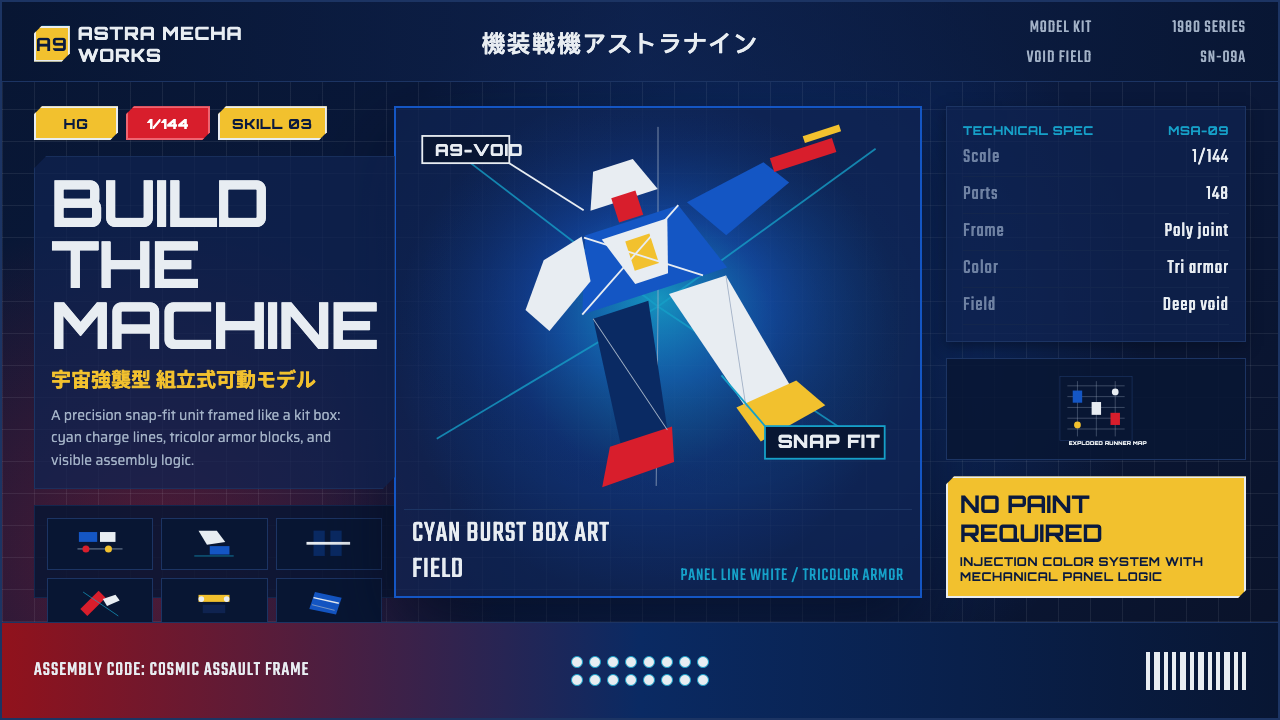 Gunpla Model BoxBuild-sheet drama. Cosmic navy, cyan burst, tricolor armor, and spec-panel gr…拼装说明般的戏剧感:宇宙蓝、青蓝爆光、三色装甲与参数网格。
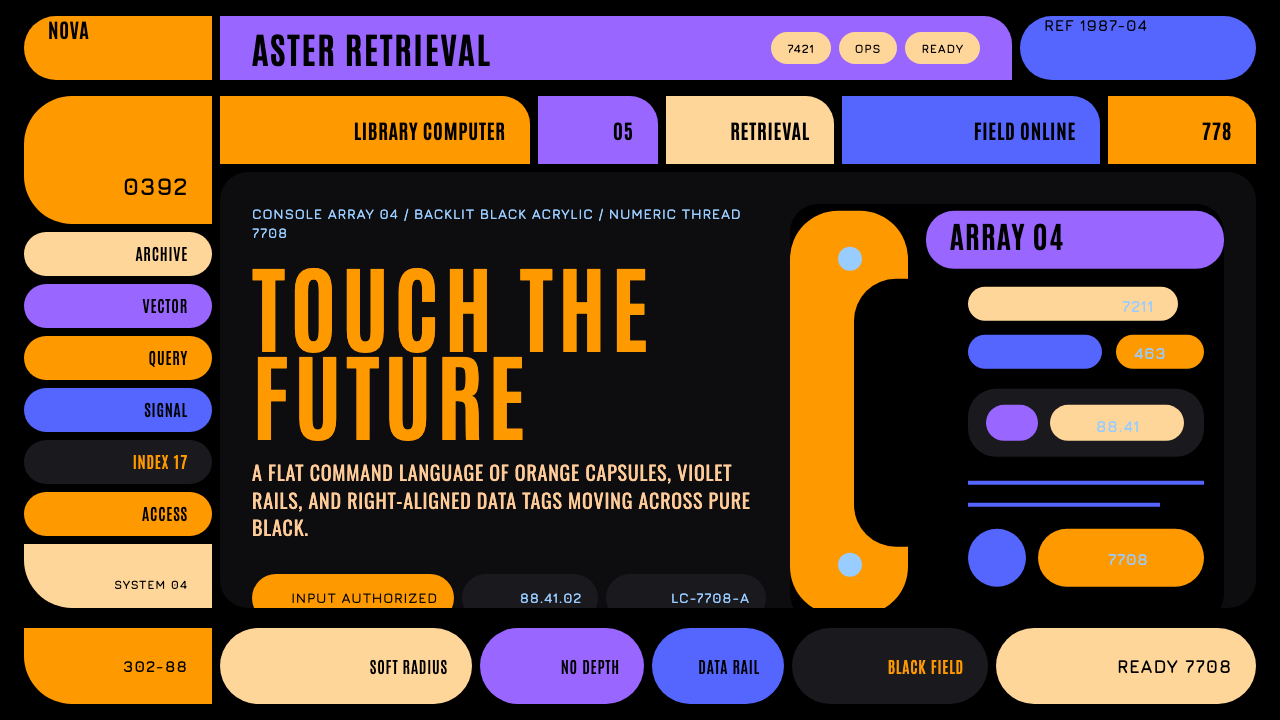 Star Trek LCARSFuture as flat command. Orange-violet elbows and Jura numbers glow on black.未来即平面指令:黑底橙紫弯肘与Jura数字发光。
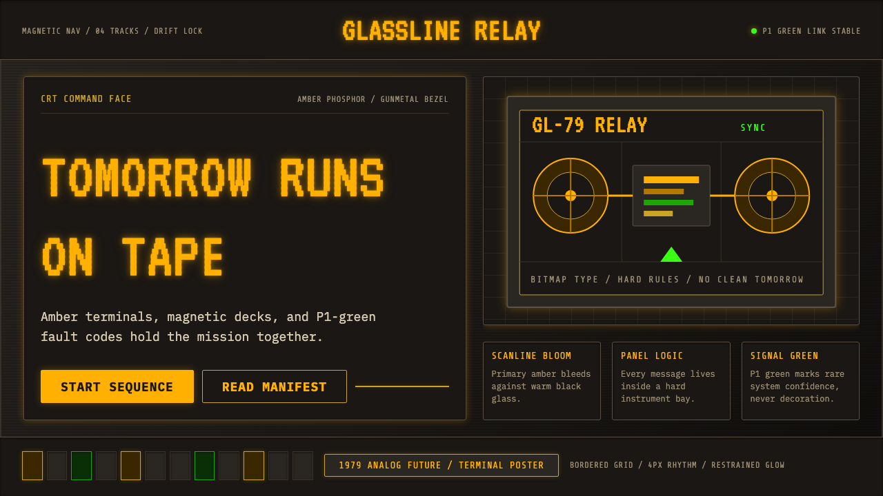 Cassette FuturismThe future hums in amber. VT323 glow, scanlines, and gunmetal grids make anal…未来在琥珀光里低鸣:VT323、扫描线与枪铁网格带出模拟重量。
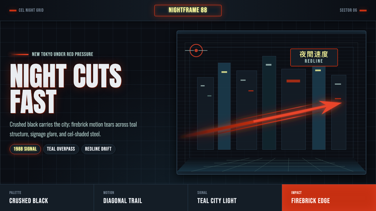 Akira Neo-TokyoNight moves fast. Firebrick trails cut crushed black, teal grids, and condens…黑夜疾驰。砖红光轨切开墨黑、青蓝网格与压缩招牌。
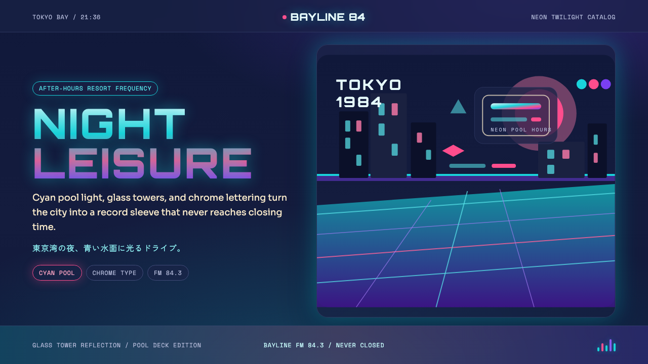 City Pop TokyoNeon leisure after dark. Cyan pool lines, chrome Orbitron, and pink-purple du…夜色霓虹的闲适。青蓝泳池线、镀铬字和粉紫暮光。
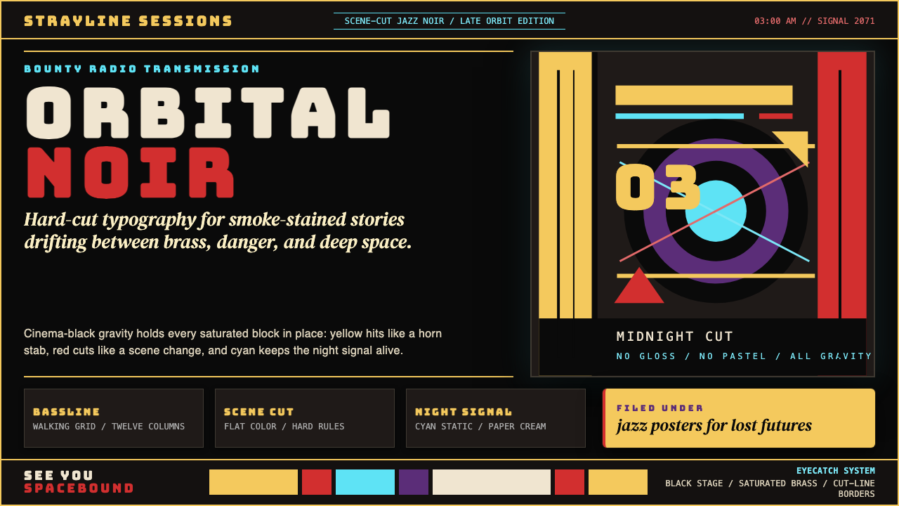 Cowboy Bebop Jazz-NoirCool at 3 AM. Bungee type, jazz yellow, red cuts, and cyan rules hit deep bla…凌晨三点的酷:黑底上 Bungee 字、爵士黄、红切线与青色规则。