What is City Pop Tokyo?
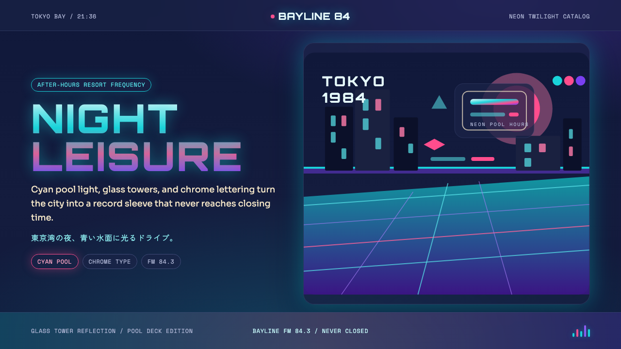
City Pop Tokyo is the visual grammar of bubble-economy Japan: saturated neon twilight, chrome lettering, cyan pool water, and palm silhouettes — a world that glows from within like an airbrushed record sleeve from 1984.
City Pop Tokyo in brief
City Pop Tokyo is a design style rooted in the album-cover illustration culture of late-1970s and 1980s Japan. During the height of the bubble economy, urban Japanese music — cosmopolitan, AOR-inflected, marketed to young white-collar professionals — generated a distinctive visual language through the work of illustrators like Hiroshi Nagai and Eizin Suzuki. Their compositions depicted leisure at its most aspirational: rooftop pools, convertibles on coastal highways, women in summer dresses against floodlit skylines. The color palette was warm and electric simultaneously — deep blue-purple dusk punctuated by turquoise, sunset pink, and the amber glow of city windows.
The style is fundamentally nocturnal and luminous. Where many design movements rely on light grounds and controlled contrast, City Pop Tokyo begins in darkness and works outward with light. The page or screen is a deep evening sky, and every element — lettering, architectural outline, decorative stripe, poolside reflection — is a source of its own contained radiance. Nothing is muddy or desaturated; the world exists in a perpetual hour of perfect summer dusk when the sky is still faintly purple and the city lights have just switched on.
In contemporary digital design, City Pop Tokyo has been revived and amplified by internet nostalgia culture — the same wave of appreciation that brought vaporwave and lo-fi aesthetics to global audiences. Its visual markers are now fluent shorthand for a very specific mood: cosmopolitan optimism, leisure without guilt, and a Tokyo that never stopped being 1984. Applied correctly, it is one of the few retro-inflected styles that feels genuinely transportive rather than merely ironic.
Where does City Pop Tokyo come from?
The term 'city pop' (シティ・ポップ) described a loose genre of Japanese popular music that flourished between roughly 1977 and 1989 — sophisticated, Western-influenced urban music made by artists including Tatsuro Yamashita, Mariya Takeuchi, Taeko Ohnuki, and Minako Yoshida. It was music for the new affluent Tokyo: people who commuted by train, ate at French restaurants, and spent weekends at coastal resorts. The album artwork created for this music was equally ambitious, commissioning original illustration from artists who blended American West Coast imagery — the California dream of endless summer — with the hyper-clean modernism of Japanese graphic design.
Hiroshi Nagai became the movement's defining visual artist. Beginning with his 1981 cover for Tatsuro Yamashita's 'Ride on Time,' Nagai developed a compositional language of almost uncanny consistency: deep cerulean skies, infinite blue ocean or pool water extending to a flat horizon, a single palm tree or architectural fragment as a vertical anchor, and an atmosphere of suspended, windless afternoon or early evening. His palette was built around the contrast between saturated cool blues and the warm sunset colors just above the horizon line — orange and pink bleeding into magenta and deep purple. The geometry of his work was clean and gridded, influenced by the hard-edge illustration style common in American advertising of the 1960s and 1970s.
Eizin Suzuki offered the complementary figure: where Nagai favored open landscape and stillness, Suzuki introduced speed and the city. His covers depicted women driving convertibles along coastal highways, the motion blur of a Tokyo expressway at night, the chrome and glass of an affluent urban life seen from inside a moving car. Suzuki's style was more tightly rendered and more explicitly commercial, drawing on the graphic precision of automotive advertising illustration. Together, Nagai and Suzuki established the visual poles of city pop imagery: the resort idyll and the metropolitan night cruise.
The broader cultural context was Japan's rapid economic expansion and the rise of a mass consumer middle class with genuine disposable income and aspirational Western tastes. The bubble economy — which peaked in the late 1980s before collapsing in 1991 — produced a specific psychology of abundance: the future felt not just possible but imminent and pleasurable. City pop's visual language encoded this psychology in color and light. When the bubble burst and Japan entered its 'Lost Decade,' the aesthetic became retrospectively charged with longing — a document of a specific optimism that had passed. This elegiac quality is inseparable from how the style is read today, including by audiences encountering it for the first time through internet platforms decades later.
What defines the City Pop Tokyo look?
Color and Light
City Pop Tokyo builds its palette from the spectrum of a Japanese summer twilight: deep indigo and navy at the top of the sky, transitioning through cerulean and electric cyan toward a horizon band of warm magenta, sunset orange, and rose pink. This gradient logic is essential to the style — it describes a sky that is both receding into night and still lit from below by the last traces of sun. On top of this atmospheric foundation, saturated neon accents appear: turquoise pool water, the electric glow of chrome lettering, the amber warmth of building windows. Nothing is pastel or muted; every color occupies the outer edge of its saturation range.
Nighttime Luminosity
Unlike most design systems that work with reflected light on a light ground, City Pop Tokyo is organized around emitted light against darkness. The background is almost always a deep, rich dark — a late-evening sky or a dark urban backdrop — and visual elements achieve their visibility by glowing rather than by sitting on a contrasting surface. This creates a particular atmosphere of contained magic: the scene is lit from within, not from above. Neon signs, reflective water surfaces, illuminated windows, and chrome highlights are all sources that justify the light in the composition.
Typography and Lettering
City Pop Tokyo typography is defined by the chromatic lettering that appears on the movement's most iconic album covers. Chrome — simulated through graduated highlight and shadow — was the signature technique: letterforms appeared to be made of polished metal, reflecting the sky and cityscape around them. Beyond chrome, the style uses bold geometric display type in high contrast against the dark ground. Japanese kana and kanji appear with equal authority, sometimes integrated directly into compositions alongside Latin characters. The feeling is confident, slightly futuristic, and deeply urban — type that belongs to a world of billboards and illuminated signage rather than books.
Iconic Motifs
Certain visual elements recur across City Pop Tokyo compositions with almost totemic regularity: the solitary palm tree silhouetted against a twilight sky; the infinity pool or rooftop pool extending toward a luminous horizon; the coastal highway seen from a moving vehicle; the chrome automobile hood or wing mirror; the low-angle view of a glass-and-steel urban skyline just after sunset; the lone woman in leisure dress, always relaxed and never acknowledging the viewer. These motifs are not decorative additions — they are the content of the style. Together they construct a vision of sophisticated urban leisure that is simultaneously Japanese and cosmopolitan, local and aspirationally global.
Composition and Space
City Pop Tokyo compositions are expansive and horizontal, strongly influenced by the landscape proportions of vinyl album artwork. Large areas of uninterrupted color — sky, water, road surface — create breathing room that makes accents read with great precision. The horizon line is typically placed low in the frame, giving the sky maximum vertical dominance. Elements are often arrayed in a clean left-to-right rhythm, with strong vertical accents (palm trees, buildings, chrome type) punctuating the horizontal sweep. Unlike the tight, gridded compositions of Bauhaus-derived styles, City Pop Tokyo uses space pictorially — the emptiness is not negative space in the design sense but atmospheric distance in the photographic sense.
Surface and Reflection
Water, glass, and chrome are the signature materials of City Pop Tokyo, and reflection is one of its primary compositional devices. A city skyline doubled in a rooftop pool, a palm silhouette echoed in a car's polished hood, the twilight sky reproduced in the face of an office tower — these reflections multiply and complicate the image, adding visual depth without introducing new visual elements. They also reinforce the style's emotional grammar of longing: the reflected world is a world glimpsed rather than fully possessed, like the affluence it depicted.
Mood and Register
The emotional register of City Pop Tokyo is pleasurable melancholy — the feeling of a perfect evening that is ending. It is not despairing but elegiac; not celebratory but quietly satisfied. This is a world where everything looks beautiful at exactly the right hour. The style conveys aspiration without anxiety, leisure without guilt, sophistication without coldness. It is this emotional specificity that distinguishes it from other retro-neon aesthetics like vaporwave, which tends toward disorientation and irony. City Pop Tokyo is sincere — it means its optimism, even when that optimism is tinged with knowledge that the moment will pass.
Who shaped City Pop Tokyo?
Nagai is the most influential visual artist associated with city pop, and his work established the style's canonical vocabulary. His first major city pop commission was the 1981 cover for Tatsuro Yamashita's 'Ride on Time,' and over the following decade he produced dozens of album covers whose compositions — infinity pools, palm trees, flat cerulean horizons — became so synonymous with the genre that they function today as visual shorthand for an entire cultural moment. Nagai was influenced by American hard-edge illustration and the West Coast imagery of the 1960s and 1970s, which he filtered through the compositional precision and color discipline of Japanese graphic arts. His work is now collected internationally and has been widely reproduced in the context of the post-2017 city pop revival.
Where Nagai was the painter of stillness and landscape, Suzuki was the illustrator of speed and metropolitan life. His covers for artists including Mariya Takeuchi depicted urban women in motion — driving convertibles, moving through night cities, inhabiting an affluent world of glass and chrome. Suzuki's technique was tighter and more commercially graphic than Nagai's, reflecting his background in automotive and fashion illustration. His work gave city pop its kinetic, street-level dimension: the feeling of the city as experienced from inside a moving car on a warm night.
Yamashita is city pop's defining musical figure and the artist whose cover art most directly established the visual vocabulary now associated with the genre. His collaborations with Hiroshi Nagai — beginning with 'Ride on Time' in 1981 — created the template that subsequent city pop releases emulated. Yamashita's music, sophisticated and emotionally nuanced, demanded album art of equivalent maturity, and Nagai's work delivered it. Yamashita's catalog experienced an extraordinary global revival beginning around 2017, driven by YouTube and streaming platform algorithms, introducing the entire aesthetic to international audiences who discovered the visual language alongside the music.
Takeuchi's 1984 album 'Variety' — and in particular the track 'Plastic Love,' which became a viral phenomenon decades after its release — became one of the key entry points through which international audiences discovered city pop. The album's cover art and the broader visual context of her work contributed to the aesthetic's global recognition. Takeuchi's role demonstrates something important about city pop's visual legacy: the music and the design are inseparable cultural objects, and the revival of one inevitably entails the revival of the other.
Less a person than a structural condition, Japan's bubble economy (roughly 1986–1991) is the essential context for understanding why city pop looks the way it does. The period saw extraordinary rises in asset prices and personal wealth, creating a consumer culture defined by genuine optimism about an affluent future. The design language of city pop — aspirational leisure, cosmopolitan references, the visual rhetoric of abundance — was a direct product of this psychology. When the bubble collapsed in the early 1990s, the aesthetic became retrospectively tinged with loss, which is inseparable from how it reads today. City Pop Tokyo is a document of a world that believed in its own prosperity, and its beauty carries the weight of that belief.
How do you use City Pop Tokyo today?
City Pop Tokyo is one of the most atmospherically specific styles in the contemporary design vocabulary — which means it transfers best to products where mood and immersion are primary goals, and where the target audience has either lived the original cultural moment or grown up romanticizing it. Applied correctly, it communicates sophistication, leisure, and a kind of optimistic nostalgia that is warmer than vaporwave and more specific than generic retro-neon. Applied carelessly, it can read as costume rather than language.
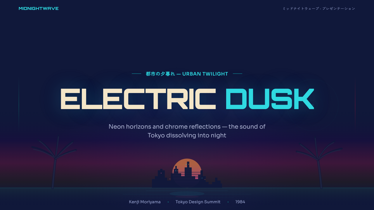
For presentation slides, City Pop Tokyo works powerfully on cover pages and section dividers where full-bleed atmospheric imagery is possible. A cover slide built on a deep indigo-to-magenta gradient sky, a palm silhouette at the left edge, and large chrome or high-contrast type for the title will immediately establish the style's emotional register. Content slides need more restraint: the gradient sky vocabulary can be reduced to a colored stripe or accent bar, with the majority of the slide in a dark but not fully black background for body text. Data visualization in this style uses electric cyan and neon pink as primary data colors against a dark ground — color functions as luminosity rather than category.
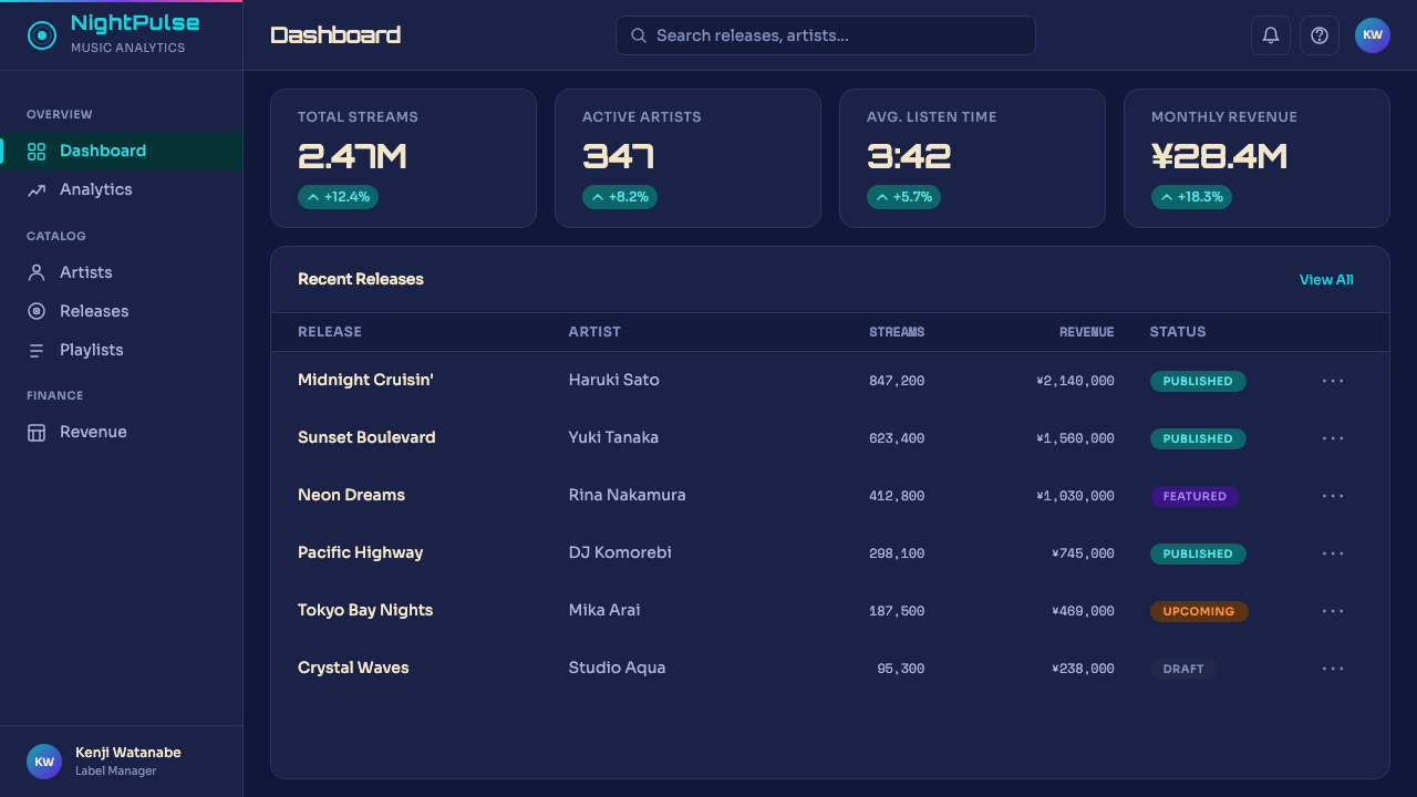
For web interfaces, City Pop Tokyo suits landing pages, portfolio sites, music or entertainment platforms, and premium consumer products where a nocturnal, aspirational aesthetic reinforces the brand promise. The approach: a dark background in deep indigo or navy, electric cyan as the primary interactive color, sunset pink-to-orange as a secondary accent, and white or very light type for readability. Hero sections benefit enormously from atmospheric gradient backgrounds — the sky vocabulary of the style — with imagery (if used) treated photographically, not illustratively. Navigation and UI chrome should be minimal: the interface recedes so the atmosphere can dominate.
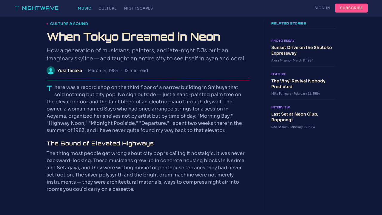
For editorial and marketing applications, the style suits cultural coverage — music, travel, food, lifestyle — where the goal is to evoke mood rather than communicate information density. A City Pop Tokyo editorial page might use full-bleed atmospheric imagery for openers, with body text set in white on dark or in near-black on a very pale warm ground for comfort. The characteristic motifs — palm silhouettes, chrome lettering, reflective surfaces — work as decorative elements in section headers or pull quotes, adding specificity without overpowering the editorial content.
The most common mistake when applying City Pop Tokyo is overloading the palette. The style depends on a hierarchy of chromatic temperature: cool indigo-blue forms the large spatial areas, warm pink-orange appears only at the horizon or in concentrated accent moments, and neon cyan is the punctuation rather than the field. When all three colors appear at equal weight across a composition, the sense of atmospheric depth collapses and the result reads as generic retro-neon rather than the specific world of city pop. A related mistake is using the style's full palette on a white or light background — the color logic of City Pop Tokyo is inextricable from its darkness. Without the dark ground, the colors lose their luminosity and the style loses its soul.
City Pop Tokyo — FAQ
How is City Pop Tokyo different from vaporwave?
The two aesthetics overlap in palette and in their relationship to 1980s Japanese consumer culture, but they have fundamentally different emotional registers. City Pop Tokyo is sincere and aspirational — it was produced within the cultural moment it depicts, by artists who genuinely shared its optimism. Vaporwave, which emerged in the 2010s, is ironic, deconstructive, and often deliberately alienating: it takes the imagery of late capitalism and distorts it into uncanniness. City Pop Tokyo celebrates; vaporwave interrogates. In practical design terms: City Pop Tokyo is warm, complete, and atmospheric; vaporwave is glitchy, fragmented, and detached. They should not be mixed if you want either to read with precision.
Does City Pop Tokyo work in light-background interfaces?
It works, but it requires significant adaptation and you should expect to lose some of the style's defining qualities. The luminous-glow effect — which is central to the aesthetic's emotional impact — depends entirely on colors being read against darkness. On a light background, the same palette reads as pastel rather than neon, and the sense of depth and atmosphere largely disappears. A light-ground adaptation that works: use a very pale warm cream as the background, reserve the style's signature colors for accent elements only (headings, borders, interactive states), and use photographic imagery of the original subject matter to carry the atmospheric weight. This is City Pop Tokyo as reference rather than direct translation, and that is often the more successful approach in utility-focused interfaces.
What imagery works best with City Pop Tokyo, and what should I avoid?
Photography works well when it is period-appropriate in mood — twilight cityscapes, coastal landscapes, poolside scenes, nighttime streets — and processed to emphasize the style's color vocabulary: strong magenta-to-indigo sky tones, saturated reflections, rich shadow detail. Contemporary photography that has been color-graded toward the aesthetic can work. Original illustration in the Nagai-Suzuki tradition works exceptionally well if done with genuine craft. What to avoid: stock photography with natural daylight coloring, any imagery that is soft, green-toned, or muted, and clipart-style illustration that cannot carry the chromatic and atmospheric weight the style requires. The single most damaging addition is imagery that introduces organic green — grass, foliage, natural landscape — as it immediately breaks the artificial twilight-and-neon grammar.
Is City Pop Tokyo appropriate for corporate or B2B design contexts?
Rarely, and with significant caveats. The style's core associations — leisure, nostalgia, aspirational pleasure, Tokyo-specific cultural reference — are difficult to square with the trust, clarity, and authority signals that most B2B and enterprise contexts require. There are edge cases where it works: a creative agency, a music technology platform, a consumer app targeting the demographic that grew up with city pop's revival, or any brand that has deliberately positioned leisure and cultural sophistication as core values. Outside those cases, applying City Pop Tokyo to a SaaS dashboard or a corporate services site will create a register mismatch that signals either cultural confusion or a lack of design intentionality. The style works when the product's values are already aligned with its emotional vocabulary.
How does the 1984 date in the style name function — is this style locked to a specific moment?
The 1984 date is an anchor rather than a limit. It marks the peak of the city pop visual moment — the year Mariya Takeuchi's 'Variety' appeared, the year Hiroshi Nagai's compositional language had fully matured, the midpoint of the bubble economy's most confident phase. Evoking it is an act of precision: you are not referencing 'Japanese retro' in general but a very specific window of cultural optimism. In practice, the style is not locked to period-accurate reproduction. What the 1984 date signals is the emotional and aesthetic coordinates: the warmth of the palette, the sincerity of the aspiration, the specific quality of a world that believed the future was a beautiful place to live. Contemporary work in this style uses those coordinates to create that feeling in the present tense, not to simulate a historical artifact.
Related design styles
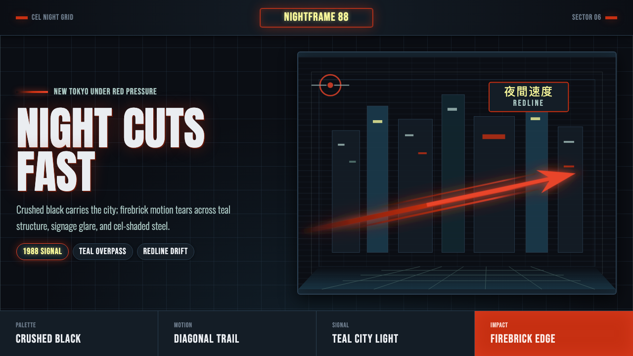 Akira Neo-TokyoNight moves fast. Firebrick trails cut crushed black, teal grids, and condens…
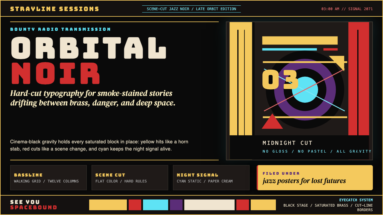 Cowboy Bebop Jazz-NoirCool at 3 AM. Bungee type, jazz yellow, red cuts, and cyan rules hit deep bla…
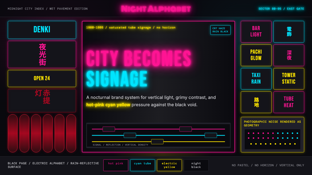 Tokyo Shinjuku Neon (1980)Night turns into alphabet. Hot pink, cyan, and yellow stack as glowing vertic…
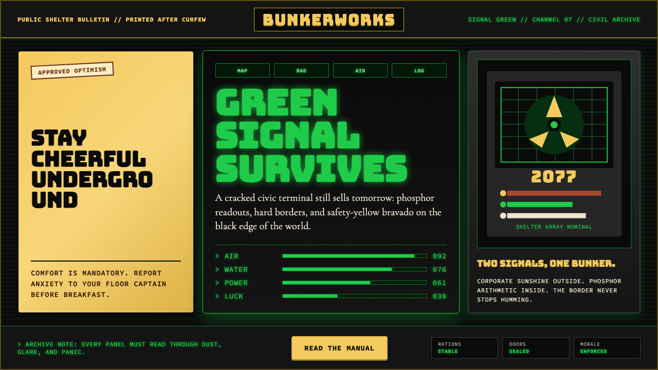 Fallout Vault-Tec Pip-BoyIrradiated optimism. Vault yellow and CRT green lock into a bordered bunker g…
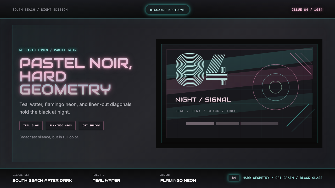 Miami Vice Pastel Teal (1984)Pastel noir, not nostalgia. Teal glow and flamingo pink slice black with geom…
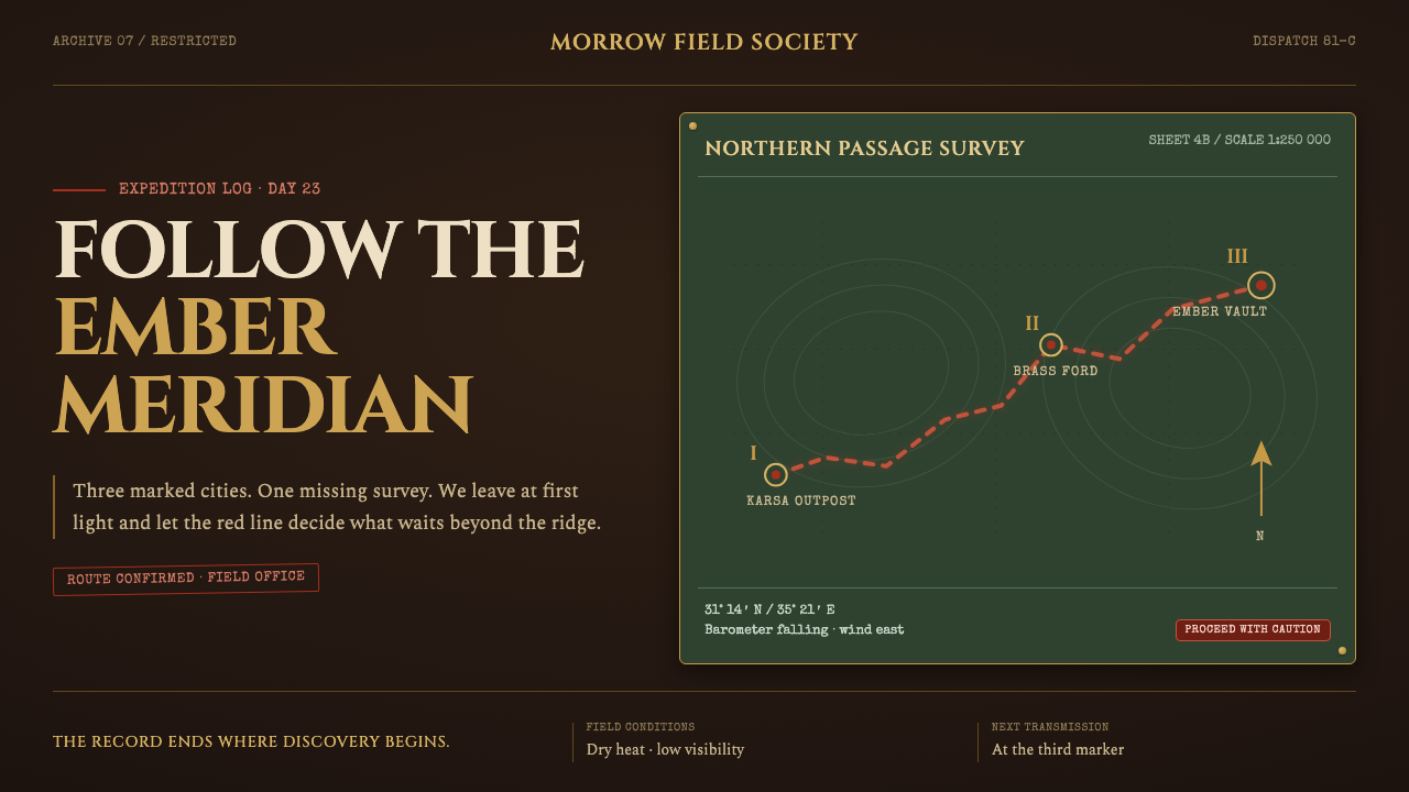 Raiders Expedition (1981)Adventure stays mid-journey. Red routes cross saddle leather under tarnished…