What is Stellaris (Galaxy Map)?
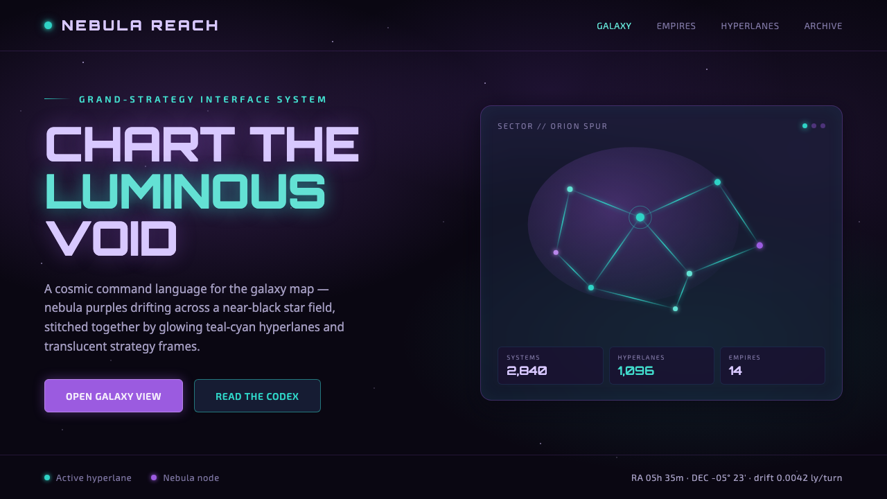
Stellaris turns the galaxy into an instrument panel — a near-black void where violet nebulae set the atmosphere and cyan routes make strategy visible.
Stellaris (Galaxy Map) in brief
Stellaris is Paradox’s 4X grand-strategy galaxy simulation, built around the experience of steering an interstellar empire through a procedurally generated galaxy. Its signature visual space is the galaxy map: a vast, near-black star field crossed by luminous teal-cyan hyperlanes, with nebula purples and violets spreading quietly through the background.
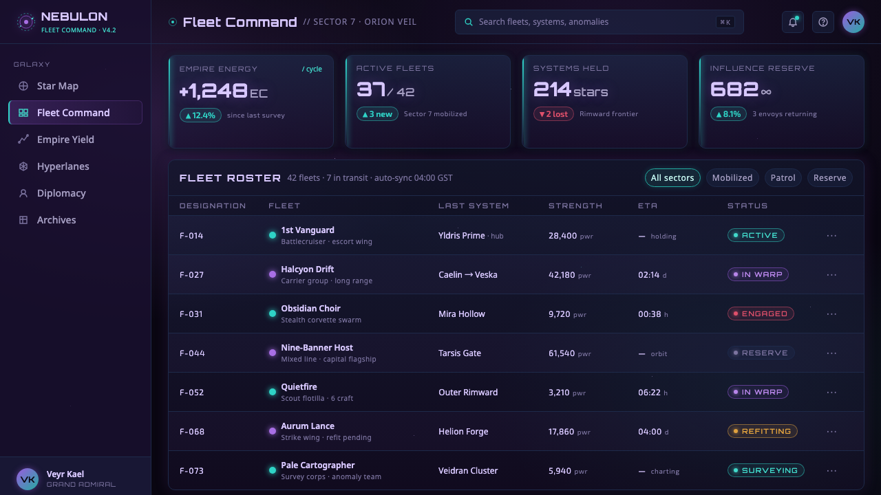
The design language is grand without becoming loud. Dark-blue translucent interface frames float over the map, enclosing empire controls while leaving the cosmic field visible beneath them. Nodes and arcs turn distant systems into a readable network, so the interface feels less like a stack of windows and more like a command layer suspended in space.
Its mood depends on contrast and restraint. The background supplies depth and silence; violet establishes cosmic atmosphere; cyan marks connection, movement, and strategic relevance. Typography and spacing should therefore remain composed and legible, giving luminous routes and system nodes room to carry the visual drama.
Where does Stellaris (Galaxy Map) come from?
Stellaris launched in 2016 and belongs to the lineage of 4X grand-strategy interface design. Its visual problem is unusually specific: the system must make an enormous, procedurally generated galaxy feel navigable while preserving the sense of scale that gives space-empire strategy its appeal. The galaxy map resolves that tension through a dark field, luminous routes, and a clear network of nodes and arcs.
The design originates in Western Europe, specifically Stockholm, Sweden, where Paradox Development Studio developed the game. That context matters less as a national style than as an institutional one: the interface is shaped by the needs of a grand-strategy simulation, where systems, connections, and empire controls must coexist without flattening the atmosphere of the world being governed.
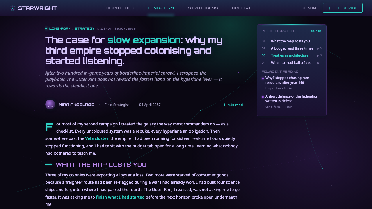
Across the galaxy-map interface, function and fiction reinforce one another. Hyperlanes are not merely decorative lines; they visualize how systems are connected. The translucent dark-blue frames are not opaque application chrome; they behave like instruments laid over a navigational chart. Violet nebulae provide environmental scale, while cyan luminosity separates actionable structure from the surrounding void.
The contemporary galaxy-map expression referenced by this design system belongs approximately to the 2022–2024 period. It distills the mature visual character of Stellaris into a reusable language: near-black space, nebula purples, cool translucent panels, and glowing teal-cyan connections. The result is quietly grand rather than aggressively futuristic, with atmosphere always subordinated to strategic readability.
What defines the Stellaris (Galaxy Map) look?
Void and Atmosphere
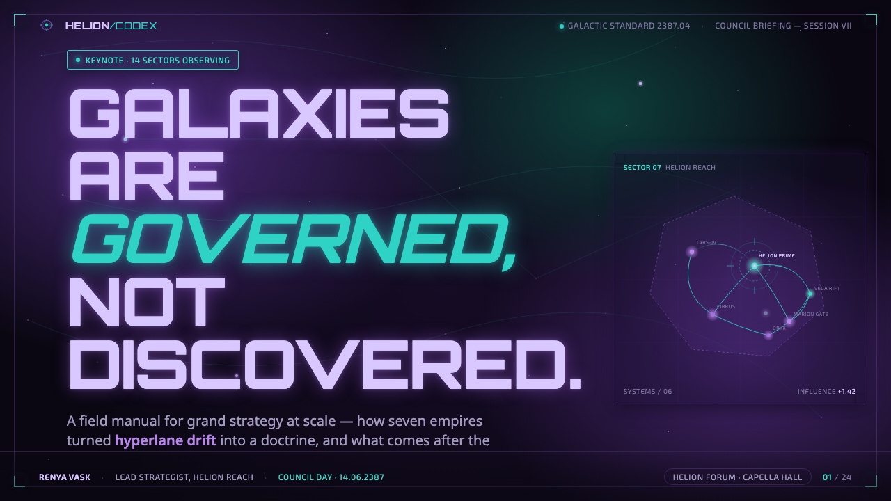
The base is a near-black cosmic field, never a flat ordinary black. It should feel deep enough to contain distance, with violet and purple nebulae drifting through it as atmospheric masses. This dark foundation creates a quiet visual room in which every luminous route, node, and control can register with precision.
Luminous Connections
Teal-cyan hyperlanes are the clearest active signals in the system. Their glow should be controlled rather than hazy, with enough radiance to suggest movement across the map while retaining a clean path. Connections belong to the structure of the interface: they explain relationships, direction, and navigable space.
Translucent Panels
Dark-blue frames sit above the galaxy without fully concealing it. Their translucency preserves the relationship between command and environment, making controls feel embedded in the map rather than detached from it. Borders and surfaces should be quiet, allowing the luminous network beneath them to remain part of the composition.
Node-and-Arc Structure
The visual grammar is network-based. Systems appear as nodes, while hyperlanes form arcs that connect them into a navigable field. This structure gives the interface an analytical quality without making it feel bureaucratic: information is organized as a living constellation of relations rather than as isolated lists.
Cool Hierarchy
Hierarchy comes from luminosity, contrast, and atmospheric separation rather than warm decorative color. Cyan is reserved for routes and active relationships; violet belongs to the surrounding cosmic field; dark blue supports panels and controls. Typography should be calm, with emphasis created through scale, spacing, and brightness.
Quiet Grandeur
The defining emotional quality is restrained scale. The canvas should feel larger than the immediate controls, with generous dark space around key signals and enough separation between interface groups to prevent visual crowding. Grandeur comes from the relationship between small precise marks and an immense surrounding field.
Who shaped Stellaris (Galaxy Map)?
The Paradox Development Studio design team established the galaxy-map expression in the context of a procedurally generated 4X grand-strategy simulation. Its contribution is a visual system that makes interstellar navigation legible while preserving the cold, spacious atmosphere of empire-scale play.
The Paradox Interactive UI team shaped the layer that floats above the galaxy: translucent dark-blue frames, empire controls, and a hierarchy that keeps command information readable without severing it from the cosmic map beneath.
4X grand-strategy interface design provides the functional movement behind the style. It treats the map as a field of systems and relationships, requiring controls, routes, and strategic information to share one coherent visual environment.
The space-empire galaxy-map visual language supplies the thematic vocabulary: near-black space, nebula purples, luminous cyan routes, and dark translucent instrumentation. Together, these elements make strategic mapping feel atmospheric rather than merely administrative.
How do you use Stellaris (Galaxy Map) today?
For presentation slides, use the galaxy map as the compositional field. A cover can place a restrained title or empire identifier in a dark, open area while a luminous route or nebula mass supplies directional energy elsewhere. Content slides should keep the same atmospheric ground and use panels only where information needs containment. Data slides benefit from node-and-arc diagrams, with cyan reserved for active relationships and violet used to establish context.
For web interfaces, the style suits dashboards, strategy tools, monitoring surfaces, and pricing pages that need a sense of systems operating across a large field. Keep the main canvas near-black, let dark-blue translucent panels float above it, and use teal-cyan as a scarce signal for selected states, active routes, or meaningful connections. Pricing tiers can be treated as distinct command modules, while the surrounding space remains quiet enough for comparison.
For editorial and marketing work, Stellaris works best when the page behaves like a navigational chart rather than a conventional brochure. Give headlines room to command the void, use violet atmospheric blocks to separate sections, and introduce cyan through rules, pathways, or small points of emphasis. Marketing copy should feel precise and controlled; the visual promise is not spectacle alone, but a calm view over a complicated system.
For cover, content, and data systems alike, typography should remain cool and highly legible. Use a restrained sans-serif voice, strong contrast between heading and supporting text, and generous separation around groups. Avoid filling every dark area with stars or glow. The style depends on an apparent emptiness that lets the important route, node, label, or control become visible at a glance.
The common mistake is turning the theme into generic neon space art. Excessive glow, constant gradients, crowded star fields, and unrestricted purple-cyan decoration weaken the command quality. Another mistake is making panels fully opaque, which cuts the interface off from the map. The system is strongest when atmosphere stays quiet, cyan remains purposeful, and every frame appears to float within the same continuous void.
Stellaris (Galaxy Map) — FAQ
Is Stellaris style the same as generic cyberpunk neon?
No. Both may use darkness and luminous color, but Stellaris is quieter and more structural. Its cyan belongs to routes and relationships, while violet establishes the cosmic field. Generic cyberpunk often treats glow as atmosphere everywhere; this system treats luminosity as information. The difference is whether light decorates the interface or explains how the interface works.
Can the style work without a galaxy map?
Yes, if the replacement retains the same logic of a dark field, translucent command layers, and luminous connections. A dashboard can use linked states, a pricing page can use structured modules, and an editorial page can use pathways between sections. What must remain is the relationship between a large quiet environment and a small set of precise signals.
Why should the panels remain translucent?
Translucency preserves the central fiction that the controls are instruments laid over a living navigational field. It lets nebula color and route light remain perceptible behind the interface, so command information and cosmic context occupy the same visual world. Fully opaque panels may improve separation, but they turn the design into an ordinary application shell and weaken its sense of scale.
How much purple and cyan should be used together?
They should have different jobs. Violet and purple belong primarily to atmospheric masses, background fields, and contextual separation. Teal-cyan should identify connections, active routes, or other meaningful signals. If both colors are applied indiscriminately to every label, border, and decoration, the hierarchy collapses. Their contrast is powerful because their responsibilities are distinct.
What products benefit most from this visual language?
It is strongest for products that organize complex systems: dashboards, strategic planning tools, monitoring interfaces, analytical products, and pricing experiences built around comparison. It can also support editorial or marketing work that wants a sense of cool intelligence and scale. It is less suitable when warmth, softness, or tactile richness is the main promise. The style should serve a product that wants to feel composed, expansive, and quietly powerful.
Related design styles
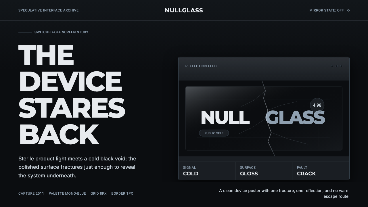 Black MirrorSterile tech turns accusatory. Screen-black, cold Montserrat, and a single gl…
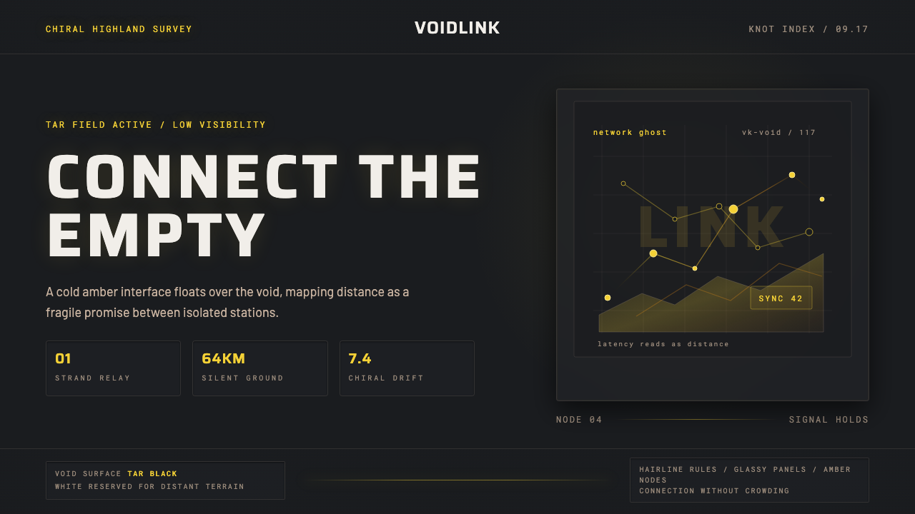 Death StrandingLonely connection, made visible. Amber HUD lines hover over a tar-black void.
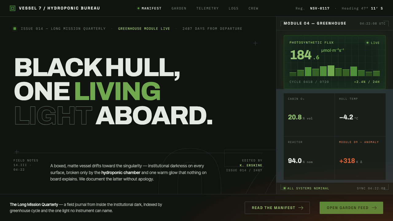 High Life (2018)Institutional dark, one living light. Matte-black hull, hydroponic green, one…
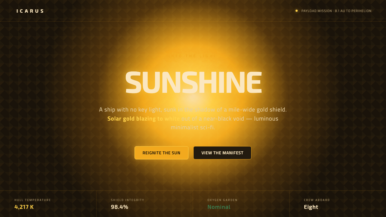 Sunshine (2007)Ship with no key light. Solar gold blooms to white from near-black void — squ…
 Appleseed (Olympus)Polished future, not noir. Cyan HUD glow and chrome panels float over teal tw…
 DestinyLuminous restraint. White-gold rings orbit charcoal plates in clean grotesk t…