What is Black Mirror?
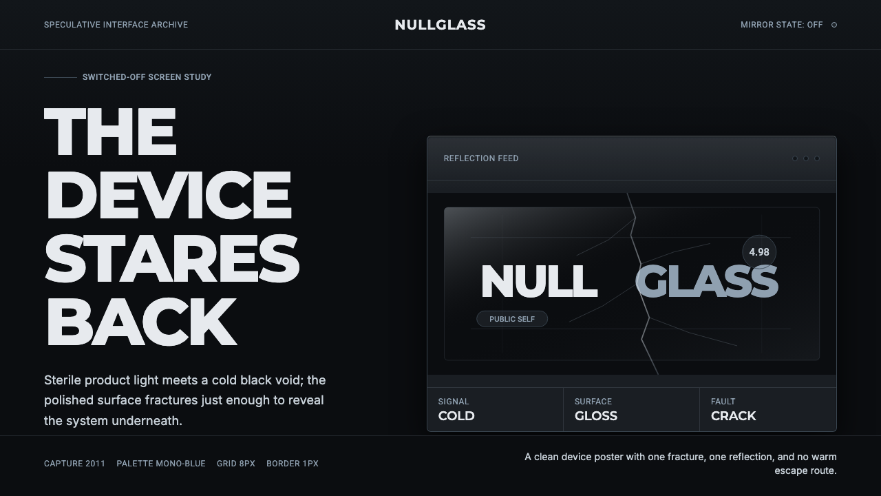
Black Mirror named itself after the one screen every gadget becomes the moment you turn it off — and built a whole visual language out of that dead, reflective black.
Black Mirror in brief
Black Mirror is a design system built around a single, deliberately unsettling idea embedded in its own title: a smartphone, television, or computer monitor, switched off, becomes a black mirror — a glossy dark surface that reflects the viewer back at themselves rather than showing them anything. The system takes that literal household object and turns it into an entire visual grammar of coldness, reflection, and quiet menace.
The starting point is the glossy white, ultra-minimal aesthetic of consumer tech-product design — the kind of clean device photography and interface chrome associated with premium smartphones and software. Black Mirror inverts that register rather than rejecting it outright: the same glassy surfaces and geometric restraint are kept, but the palette is pushed to near-black and near-monochrome, so that the crisp cleanliness that normally reads as friendly and aspirational instead reads as sterile, surveillant, and cold.
The system's signature visual event is damage: a single hairline crack running through an otherwise flawless glass or screen surface, most famously across the show's own wordmark in its title sequence, as though the logo itself were a pane of glass that has just been struck. That crack is the whole thesis of the show made visual — technology that looks perfect and behaves as though it has already begun to fail us.
Where does Black Mirror come from?
Black Mirror was created by British writer and broadcaster Charlie Brooker, who developed it as an anthology series in which each episode is a self-contained story with its own cast, setting, and premise, unified only by a recurring interest in the unintended consequences of near-future technology. The first two series and a Christmas special aired on Channel 4 in the United Kingdom beginning in December 2011, positioning the show initially as a British satirical drama in the vein of Brooker's earlier television criticism and commentary work.
The title itself is a direct reference to the dead black screen of a switched-off device — a television, a phone, a monitor — glossy enough to throw back a faint reflection of the person looking at it. Brooker has described the choice as capturing something already latent in modern life: we surround ourselves with screens that are, in their inert state, small black mirrors, and the show's project is to imagine what those devices reveal about us once fully switched on and woven into daily behavior.
Annabel Jones, Brooker's longtime producing partner, co-created and executive-produced the series from its first episode onward, and was central to shaping its tonal range — moving between bleak satire, psychological horror, and, in episodes such as San Junipero, unexpected warmth. The show's identity was never purely dark for its own sake; the range of tone across episodes is part of why the visual system needs to carry both cold dystopian menace and moments of stark emotional clarity within the same restrained palette.
In 2015, Netflix acquired the rights to produce Black Mirror going forward, and the show's third series, released in 2016, moved it decisively into an international, big-budget production context, including the widely discussed episode Nosedive, which imagined a near-future society governed by a mutual five-star social rating system layered as a flat, saccharine interface directly over the character's field of vision. The title sequence and identity work, including the signature cracked-glass wordmark, was developed by the British studio Painting Practice, whose job was to compress the show's whole thesis — polished technology concealing an underlying fracture — into a few seconds of opening titles.
What defines the Black Mirror look?
Color
The palette sits almost entirely in black, with white type providing the only strong contrast and a narrow range of cool blue-gray used sparingly for reflective panels and secondary surfaces. Warm color is essentially absent; any accent color that does appear tends to be treated as an alarm signal or an intrusion — a flat, saccharine UI color breaking into an otherwise monochrome frame — rather than as a decorative choice.
Reflective, Glossy Surfaces
Every surface behaves like glass or polished screen rather than matte material: a faint reflection, a soft glint of light along an edge, a sense that the viewer's own presence is implicated in the image. This glossiness is inherited directly from consumer tech-product photography, but pushed dark enough that the reflections read as ominous rather than aspirational — a showroom lit for menace instead of desire.
The Crack
A single hairline fracture running across an otherwise perfect surface is the system's defining motif — most iconically through the show's own wordmark, as though the logo were a pane of struck glass. The crack should appear as an isolated, deliberate event rather than generalized damage or shatter: one clean line of failure interrupting an otherwise flawless plane.
Cold Geometric Typography
Type is set in a cold, tightly-constructed geometric sans — letterforms with even strokes and minimal warmth, closer to a device's system font than to any expressive display face. White type on black ground does most of the communicative work, with type used more as an interface element than as editorial ornament: precise, evenly spaced, and unemotional.
Flat Overlay UI
Where interface chrome appears — ratings, notifications, status readouts — it is rendered flat and graphic, layered directly over the dark base like an overlay rather than integrated into the environment. This overlay UI is often deliberately cheerful or saccharine in isolation, and it is exactly that mismatch between a bright, friendly interface and a cold, threatening context that gives the system its satirical edge.
Negative Space & Isolation
Compositions favor a single subject or object surrounded by a large field of near-black negative space, rather than dense, busy arrangements. This isolation mirrors the show's recurring theme of individuals cut off within their own technology, and it also does structural work: with so little competing visual information, a single crack, reflection, or accent color carries disproportionate weight.
Who shaped Black Mirror?
Brooker created Black Mirror as an anthology series, drawing on his background as a television critic and satirist to give each standalone episode a sharp, often bleakly comic perspective on the unintended consequences of near-future technology. He wrote or co-wrote the majority of episodes across the show's run and remained its defining creative voice as it moved from a modest Channel 4 production to an internationally distributed Netflix series.
Jones co-created the series with Brooker and served as executive producer throughout its run, shaping the balance between the show's cold satirical episodes and its more emotionally warm entries. Her producing role was central to sustaining the show's tonal range across a large number of standalone stories with wildly different casts and settings.
This London-based title design studio created the show's title sequence and identity system, including the signature shattered-glass treatment of the Black Mirror wordmark. Their work compresses the show's central premise — glossy technology concealing an underlying fracture — into a few seconds of opening titles, giving every episode a consistent visual frame regardless of its individual story or setting.
Director Owen Harris helmed several of the show's most acclaimed and emotionally distinct episodes, including Be Right Back and San Junipero, the latter winning an Emmy for its unusually warm, nostalgic tone within an otherwise cold anthology. His work demonstrates the range the visual system needs to support — the same restrained, screen-and-reflection-driven grammar had to accommodate both dystopian menace and genuine tenderness.
How do you use Black Mirror today?
Black Mirror works best as a system for signaling technological unease, scrutiny, or critique — anywhere a brand or piece of content wants to suggest that something clean and modern is not quite trustworthy. It is a poor fit for anything that needs to feel warm, reassuring, or purely celebratory, because the entire visual grammar is built to make polish look suspicious rather than comforting.
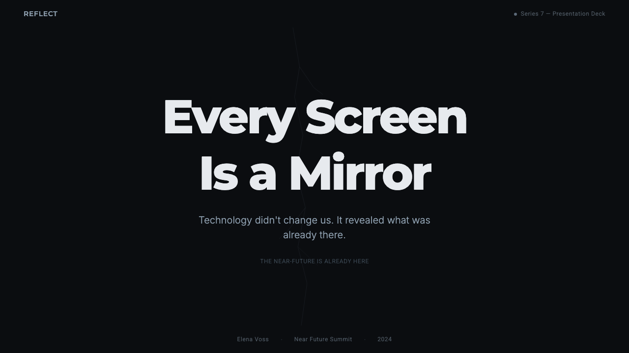
On a presentation cover slide, the system rewards a single dark, glossy field with one small, deliberate flaw — a crack, a glitch line, a fractured wordmark — carrying the whole visual statement, with the title set in cold, evenly-spaced white type. Content slides should keep backgrounds near-black throughout and use a narrow band of cool blue-gray, not warm color, to differentiate sections; overlay-style callout boxes, treated like a flat notification layered on the dark ground, work well for pull-quotes or key statistics. Data slides can borrow the flat-overlay-UI motif directly — numbers presented like a rating or status readout stamped onto a dark screen, which reads as pointed and slightly unsettling rather than neutral.
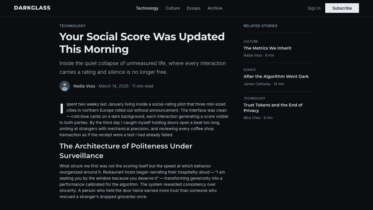
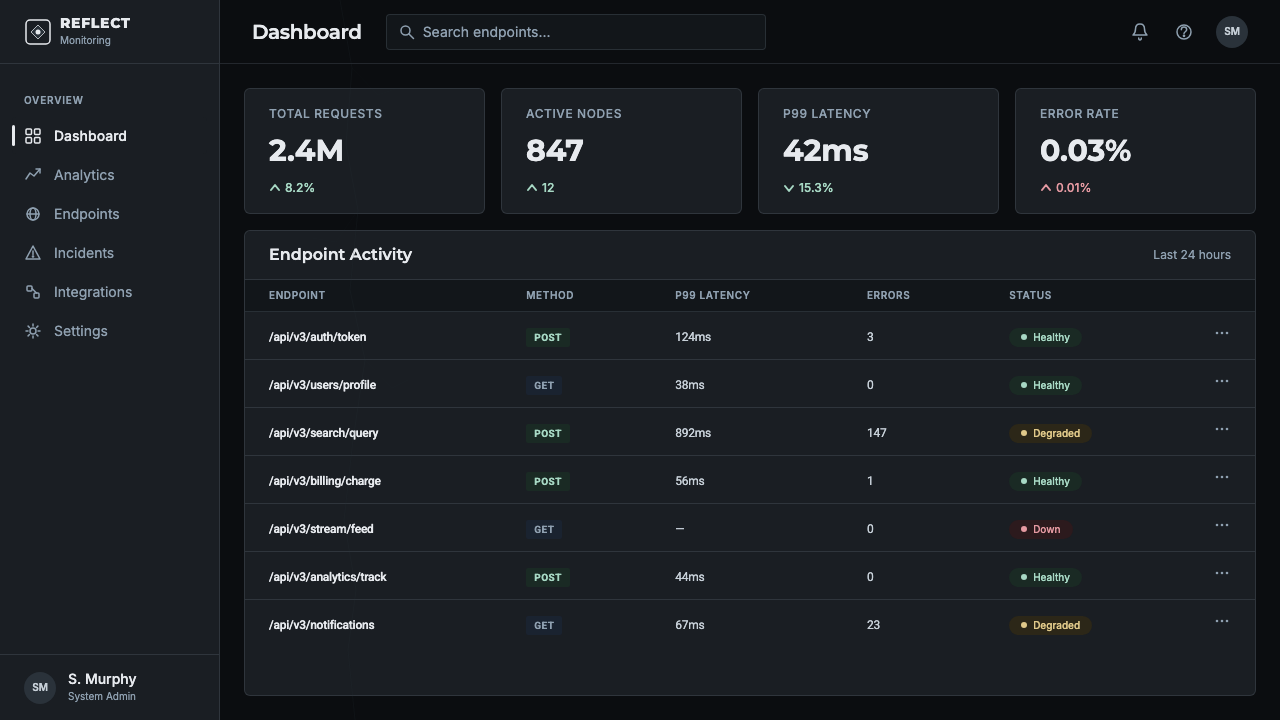
For web interfaces, this system suits products that traffic in surveillance, security, risk, or critique of technology itself — a privacy tool, a security dashboard, an essay platform about technology's social effects. Dashboards benefit from the reflective-glass treatment on card surfaces and a single crack or fracture motif reserved for error or alert states, so it retains meaning rather than becoming decorative. Pricing pages should stay disciplined: near-black ground, white type, and a single cool accent color for the recommended tier, resisting the temptation to warm up the palette to make the page feel more inviting, since warmth undercuts the entire premise.
In editorial and marketing contexts, the system suits critical or investigative content about technology, privacy, and social media, where a cold, glossy, slightly ominous tone reinforces the argument being made. Full-bleed marketing sections work well alternating a near-black frame with a single flat, saccharine UI-style callout, letting the visual mismatch between friendly interface and cold context do rhetorical work the way it does across the show itself.
The most common mistake is treating this as generic 'dark mode' styling and losing the specific motifs that make it Black Mirror rather than any other dark UI — the reflective glass quality, the single deliberate crack, and the tension between a cold monochrome base and a flat, cheerful overlay. A second common mistake is overusing the crack motif until it becomes decorative texture rather than a singular, meaningful event; the system depends on that fracture being rare and pointed, appearing once, in exactly the place it matters most.
Black Mirror — FAQ
Is Black Mirror the same as generic 'cyberpunk' or 'dark tech' styling?
No. Cyberpunk styling typically layers neon color, dense signage, and visible grime onto a futuristic city, signaling a chaotic, lived-in dystopia. Black Mirror is the opposite in temperature: clean, sparse, near-monochrome, and unsettling precisely because so little is visibly broken. The menace comes from sterility and reflection rather than clutter and neon, closer to a showroom than a slum.
Does every application of this style need the cracked-glass motif?
No, and overusing it weakens it. The crack works because it is rare and specific — a single deliberate fracture in an otherwise perfect surface. Many applications of the system can rely entirely on the near-black palette, reflective glass quality, and cold typography without ever introducing an actual crack; the fracture motif is best reserved for a genuine focal moment, such as a title, a key alert, or a single hero visual.
Can this style work for a warm, consumer-friendly brand?
Generally not without significant compromise. The system's entire rhetorical power comes from making clean, modern surfaces feel suspicious, which is the opposite of what a warm consumer brand wants. It is far better suited to products whose value proposition genuinely involves scrutiny, security, or critique — anywhere skepticism toward technology is the point rather than a liability.
Why is white-on-black type so central to this system?
Because it mimics the literal object the show is named after — a dark screen with a single point of light or information — and because high contrast on a near-black ground reads as clinical and instrument-like rather than decorative. Reversing that to dark type on a light ground removes the specific 'switched-off device' association that anchors the entire system, leaving only generic minimalism behind.
How does this system handle color when a brand needs at least one accent hue?
The strongest approach treats any accent color as an intrusion rather than a decoration — something that feels slightly alarming or out of place against the cold monochrome base, echoing the way flat, cheerful interface elements appear in the show itself. A single cool, muted hue used sparingly for functional purposes, such as an active state or a critical alert, stays consistent with the system; broad, evenly-applied warm color does not.
Related design styles
 StellarisQuietly grand cosmic command UI. Nebula purples on near-black void, teal-cyan…
 Death StrandingLonely connection, made visible. Amber HUD lines hover over a tar-black void.
 EVE OnlineCold cockpit luxury. Cyan glass panels float over a black nebula void.
 Blade Runner 2049Noir with tectonic weight. Orange dust, cyan hairlines, and monumental Inter…
 Dead Space IshimuraLast light in the dark. Near-black rust cut by aqua holographic panels.
 DevsEngineering turns sacred. Near-black void, sodium gold, and a centered dimple…