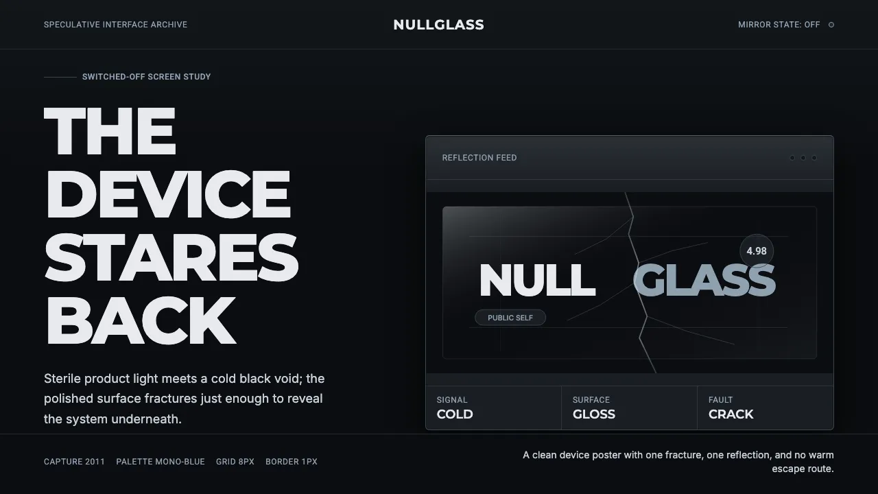
About Black Mirror
Black Mirror takes its name and look from the dark glossy screen that every device becomes when it switches off — the black mirror that reflects us back. Glossy white tech-product minimalism is cracked open to reveal that void: the wordmark shatters as if behind broken glass.
The system is cold, near-monochrome, and sterile. A single hairline crack splits the screen, reflective panels glint in blue-gray, and episodes like Nosedive layer a flat social-rating UI over the black. White-on-black type carries the dystopian satire.
- Origin
- Western Europe (United Kingdom)
- Era
- 2011–now (Channel 4 / Netflix anthology, premiered 2011)
- Key figures
- Charlie Brooker · Painting Practice · Annabel Jones
- Movements
- Glossy tech-product minimalism · Dystopian satire · Cracked-glass title design
Black Mirror design spec
Colors
Typography
The other 11 sections — buttons, cards, spacing, motion, techniques and more — open once you unlock. Download the DESIGN.md or send it to your AI in one click. Unlock once, yours forever.
Sign up nowStyles similar to Black Mirror
Also inspired by film, games & music, with a close feel.
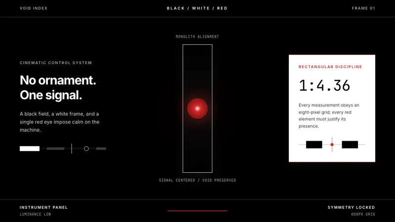 2001 — A Space OdysseyAbsolute restraint. Black void, white monolith geometry, one HAL-red signal.
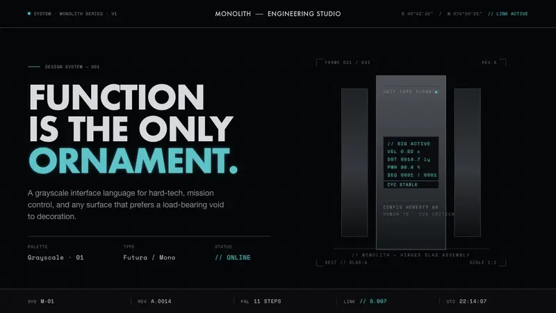 Interstellar TARSIf Mies built a robot. Brushed-aluminum grays on deep-space black, lit by one cold cyan readout.
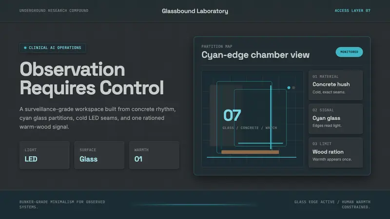 Ex MachinaClinical control, made visible. Concrete gray, cyan glass, LED seams, one wood accent.
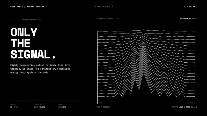 Pulsar CP1919 Stacked PlotPure signal becomes a totem. Stacked white pulse lines rise through a true-black void.