What is EVE Online (New Eden neocom)?
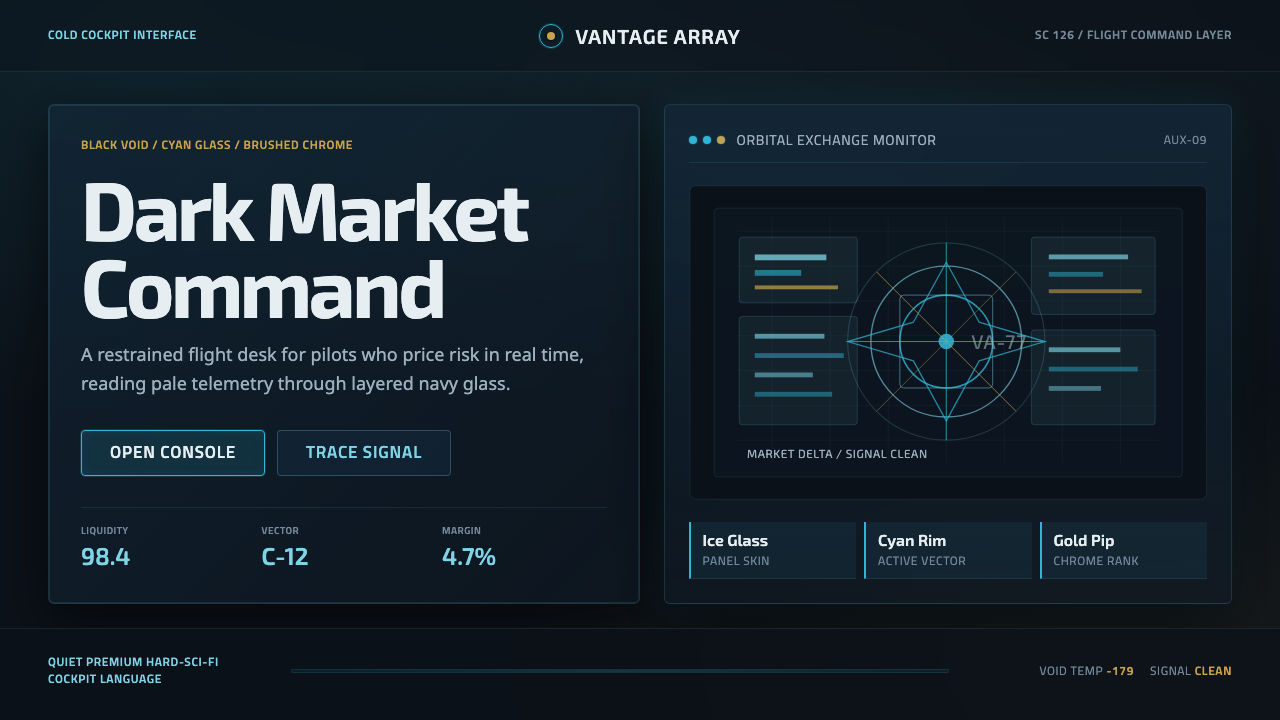
EVE Online turns interface design into cold cockpit luxury — cyan glass, pale telemetry, and restrained metallic accents suspended over the unknowable dark of New Eden.
EVE Online (New Eden neocom) in brief
The New Eden neocom is the interface language of EVE Online, CCP Games’ hard-science-fiction sandbox MMO. It combines semi-transparent dark-navy panels, pale text, fine cyan highlights, and occasional brushed-metal gold over a black space backdrop crossed by nebula gradients. Rather than separating the game world from its controls, the system makes menus, instruments, and data windows feel like equipment inside a capsuleer’s cockpit.
Its defining quality is restraint. Cyan does not flood the screen; it identifies active controls, selected objects, system feedback, and important boundaries. Gold appears even more sparingly, bringing the ceremonial weight associated with Amarr metalwork or the polished finish of capsuleer machinery. Most of the interface remains dark, quiet, and translucent, allowing information to appear luminous without becoming theatrical.
The result is both luxurious and severe. Layers of glass suggest advanced technology, yet the near-black void keeps the experience austere. Dense information is presented as telemetry rather than decoration, while the surrounding nebula supplies atmosphere and depth. The neocom therefore feels less like a themed website and more like a disciplined operating environment built for an immortal pilot managing ships, markets, routes, and risk.
Where does EVE Online (New Eden neocom) come from?
EVE Online began in 2003 as a persistent science-fiction universe developed by CCP Games in Reykjavík, Iceland. Its interface had to serve an unusually demanding sandbox: players were not merely steering spacecraft but navigating a continuous world of trade, conflict, travel, and long-term strategic decisions. That functional burden encouraged a visual identity based on instruments and information systems rather than cinematic ornament. The interface became part cockpit, part command terminal, and part window into the social and economic machinery of New Eden.
The neocom developed within the tradition of Western European hard-science-fiction interface design. Black space, cold illumination, technical typography, and layered instrumentation supplied a credible setting for spaceship operations. Yet the design avoided the crude industrial aggression common to many military interfaces. Its dark glass and polished accents introduced a quieter kind of prestige: technology designed for a capsuleer whose consciousness can outlive any single ship. This premise explains why the interface can feel both operationally serious and subtly luxurious.
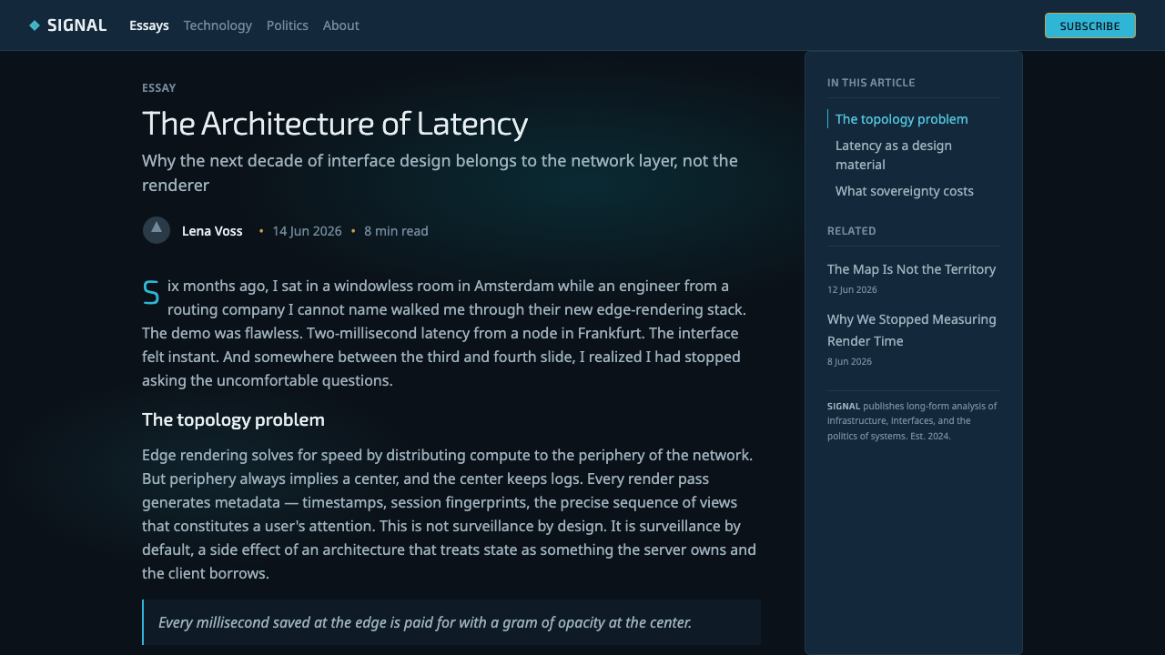
Redesign work during the 2010s refined the neocom into a more coherent dark-glass system. The New Eden UI design team and the neocom redesign team organized panels, navigation, status feedback, and color schemes around a cold cyan identity. Semi-transparency allowed windows to remain visibly connected to the space scene beneath them, while pale text and restrained edge illumination preserved legibility. Multiple color schemes expanded the system without abandoning its central logic: darkness carries the information field, cyan carries interaction, and metallic color appears as a rare accent.
The visual language recognizable from roughly 2014 through 2022 strengthened this balance between atmospheric immersion and practical density. Nebula gradients gave the void chromatic depth; refined panels floated above it without pretending to be physical windows; brushed-metal Amarr gold provided a selective counterpoint to the cyan. Across these changes, CCP’s teams preserved the essential fiction that the player is operating through a sophisticated capsule interface. The style evolved, but its authority continued to come from consistency, controlled luminosity, and the belief that every visible layer belongs to the machinery of New Eden.
What defines the EVE Online (New Eden neocom) look?
Color
The palette begins with a black space void and deep navy interface glass. Pale text forms the readable surface, while cold cyan marks focus, activity, and technological energy. Cyan is concentrated rather than ambient: a selected row, active control, or important boundary may glow, but the surrounding panel remains subdued. Brushed-metal gold appears rarely, carrying Amarr ceremony and capsuleer prestige. Nebula gradients belong mainly to the world behind the interface, preventing the functional layer from becoming excessively colorful.
Typography and Data
Typography is pale, compact, and instrument-like. The hierarchy comes from brightness, scale, grouping, and placement rather than expressive display lettering. Labels behave like cockpit annotations; numbers and status terms read as telemetry. Dense information is acceptable because it supports the fantasy of operating a complex ship, but density must be organized into calm blocks with clear alignment. Headings should remain controlled, since oversized promotional type would break the impression of a professional operating system.
Dark Glass
Panels appear as dark translucent panes suspended above space. Their transparency is atmospheric rather than decorative: it keeps the user aware of the universe beyond the interface while separating information into manageable layers. The glass should feel tinted and substantial, never milky or fragile. Boundaries are established with restrained lines, faint tonal shifts, and selective cyan illumination. Too much blur, reflection, or glossy spectacle turns the style into generic futurism and weakens its operational discipline.
Layering and Depth
Depth comes from overlapping panes, differentiated opacity, and the immense contrast between nearby data and distant space. Foreground controls are crisp; secondary panels recede; nebulae remain environmental and unreachable. The system does not imitate ordinary desktop windows stacked on a wallpaper. Instead, it suggests several information planes projected within a cockpit. Each additional layer must have a clear functional rank, because uncontrolled stacking quickly obscures both the scene and the data.
Controlled Luminosity
Light behaves as system feedback. Cyan edges, active marks, and selected states appear energized against the dark field, while inactive information remains pale or muted. The contrast creates precision without requiring every element to glow. Large luminous areas are exceptional and should indicate genuine importance. This economy makes a small active signal feel immediate and valuable; when illumination is applied everywhere, the cockpit loses hierarchy and becomes a field of undifferentiated neon.
Metallic Restraint
Gold is not a competing primary color. It enters as brushed metal, capsuleer chrome, or an Amarr-inflected ceremonial accent. Its warmth is powerful precisely because the surrounding system is cold. Used around a title, emblem, premium state, or decisive control, it can suggest rank and engineered luxury. Repeated across ordinary cards or navigation, however, it becomes decoration and erodes the neocom’s quiet authority.
Cockpit Coherence
Every component should appear to belong to one vessel-wide operating environment. Buttons, tables, tabs, maps, warnings, and charts may serve different purposes, but they share the same dark material, restrained illumination, and compact informational rhythm. Decorative science-fiction motifs that cannot be explained as controls or instrumentation should be removed. Coherence is what transforms a collection of dark widgets into a believable capsuleer interface.
Who shaped EVE Online (New Eden neocom)?
The founders of CCP Games established EVE Online as a persistent science-fiction sandbox in 2003. That foundational choice shaped the demands placed on its visual system: the interface had to support an enduring universe of navigation, conflict, commerce, and player decision-making rather than a short sequence of scripted encounters. The neocom’s command-terminal character follows directly from the scale and continuity of that original New Eden concept.
The New Eden UI design team developed the broader interface language through which players encounter the universe. Its contribution lies in making dense systems feel native to the fiction: information panels become cockpit instruments, pale text becomes telemetry, and the space scene remains perceptible behind operational layers. The team’s work holds atmosphere and utility together, ensuring that immersion does not require sacrificing the clarity needed for a complex sandbox MMO.
The neocom redesign team refined the interface during the 2010s, consolidating navigation, panels, color schemes, and feedback around a coherent dark-glass identity. Cold cyan became a disciplined interaction signal rather than a general decorative wash, while translucency connected foreground information to the world behind it. The redesign established much of the refined, cockpit-like visual character associated with EVE Online from roughly 2014 through 2022.
How do you use EVE Online (New Eden neocom) today?
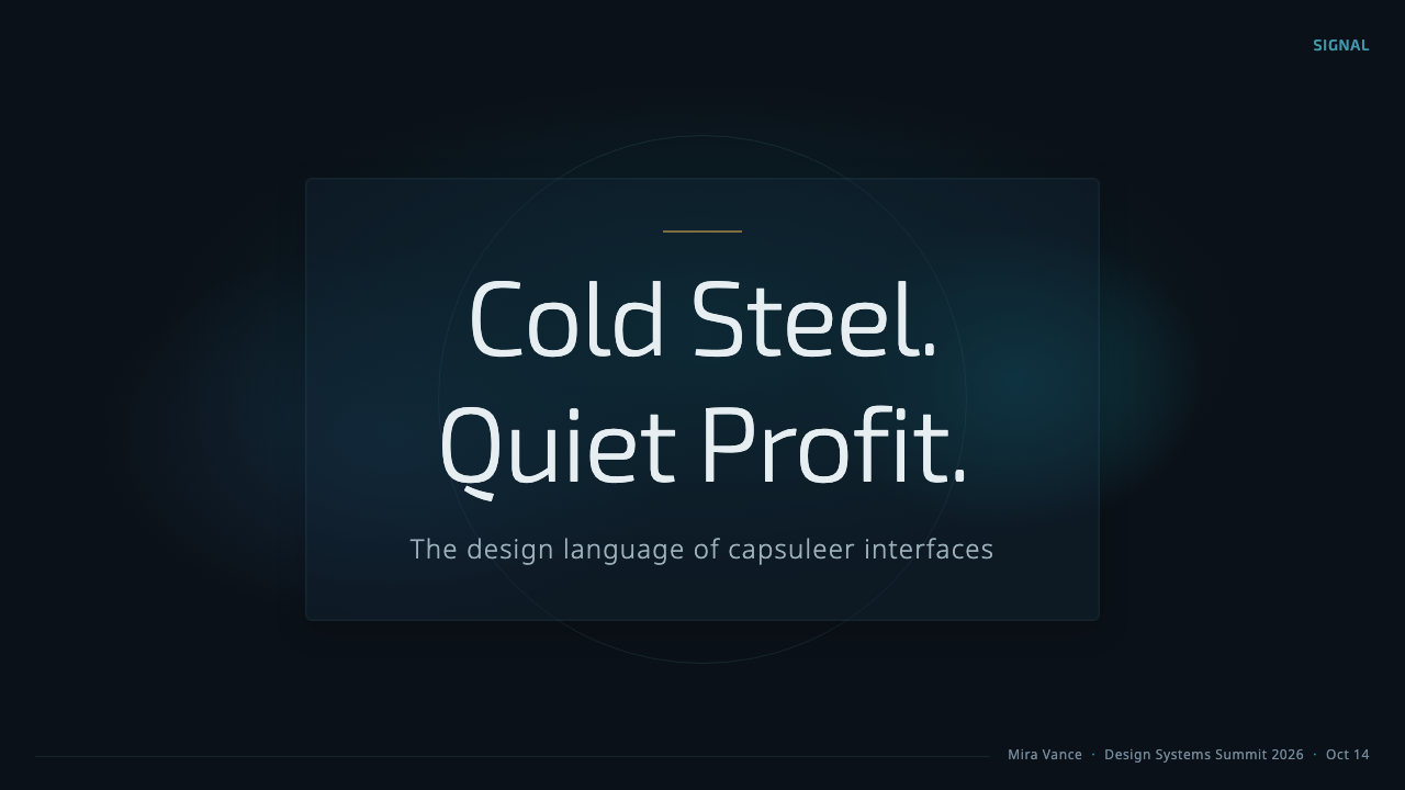
For presentation slides, the style works best when the deck behaves like a capsuleer briefing rather than a decorated game poster. A cover can place a restrained cyan title and a small metallic accent over a black nebula field, with one translucent panel carrying the subtitle or mission context. Content slides should use dark-glass sections with pale text, disciplined alignment, and enough empty darkness to separate information groups. The visual hierarchy should feel like an instrument panel: immediate status first, supporting explanation second, atmospheric imagery last.
Data slides are especially compatible with the neocom because charts can be treated as telemetry. Cyan can identify the active series or principal result, pale neutral tones can carry comparison data, and gold can mark a rare strategic threshold or premium category. Tables should be calm and compact, with selection and warning states expressed through controlled luminosity rather than heavy decoration. Nebula imagery belongs behind the data and should remain quiet enough that plotted forms, labels, and relationships stay unmistakable.
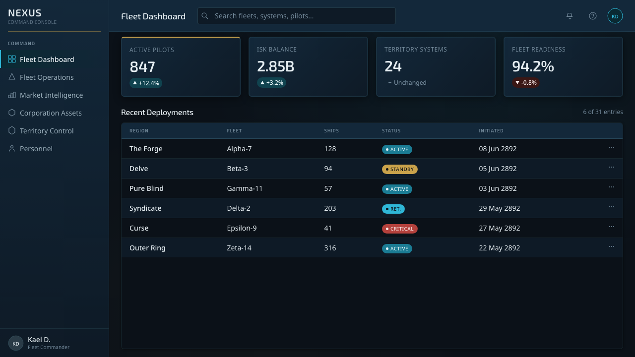
For web interfaces, the language suits analytical dashboards, trading products, infrastructure consoles, and pricing pages that need a sense of technical authority. Navigation can resemble a compact command rail, while cards become translucent navy panes floating over a near-black environment. Pricing tiers should be differentiated through hierarchy and selective accenting, not through competing fields of saturated color. Active controls may carry cyan illumination; a premium or elevated tier may receive a restrained metallic-gold cue. Readability must remain stronger than atmosphere.
Editorial and marketing layouts benefit from the contrast between cosmic scale and precise information. An article can open with a wide nebula image, then place text in dark translucent fields whose pale typography feels like a classified briefing. Marketing sections can alternate between open voids and denser cockpit panels, using cyan to guide the reader from proposition to evidence to action. Product screenshots, maps, or diagrams should be integrated as functional displays rather than framed as decorative pictures. Gold is most effective at a decisive moment, such as a final invitation or elevated status.
The common mistake is reducing the style to black backgrounds, glowing cyan borders, and arbitrary science-fiction decoration. Excessive neon, blur, glass reflections, metallic trim, or animated-looking detail produces visual noise and destroys the expensive restraint of the neocom. Another error is making every panel equally luminous, which removes status hierarchy and exhausts the eye. Begin with darkness and pale information, introduce cyan only where the system is active, and reserve gold for moments whose importance genuinely justifies warmth and prestige.
EVE Online (New Eden neocom) — FAQ
Is the New Eden neocom simply a glass interface on a space background?
No. Its identity comes from the relationship among glass, information, and fictional purpose. The translucent panes keep the space environment present, but they are organized like operational instruments rather than decorative overlays. Pale typography carries dense telemetry, cyan identifies active states, and darkness creates hierarchy. A generic glass interface may imitate the material, yet without disciplined data structure and cockpit coherence it will not feel like New Eden.
Why is cyan so important to the style?
Cyan provides the cold technological signal that connects the many dark panels into one system. Against navy glass and black space, it is immediately visible without needing a large area. Its effectiveness depends on scarcity: it can indicate selection, focus, activity, or a meaningful boundary while quieter information remains pale. If cyan becomes a continuous glow across every component, it stops communicating state and turns into generic neon decoration.
How should Amarr gold be used without weakening the cold palette?
Treat gold as a material and a rank signal, not as a second luminous theme. It works when it resembles brushed metal or capsuleer chrome and appears around a rare emblem, elevated state, decisive control, or ceremonial heading. The surrounding interface should remain predominantly dark and cyan-led. Because gold is warm, even a small appearance can carry considerable authority; repeating it across routine controls removes that distinction.
Can the neocom language support dense dashboards without becoming unreadable?
Yes, because information density is native to the cockpit premise, but density must be structured. Group related values into stable panes, align labels and readings consistently, keep inactive information pale or muted, and reserve stronger cyan contrast for current focus. Transparency should connect the interface to its environment without allowing the nebula to compete with text. The goal is not emptiness; it is controlled complexity in which every signal has a recognizable rank.
What kinds of products are best suited to this aesthetic?
The style is strongest for products that benefit from technical authority, persistent monitoring, and an atmosphere of advanced operations: analytical dashboards, trading systems, infrastructure consoles, strategy tools, and premium science-fiction experiences. It is less natural for products whose central values are sunlight, softness, domestic warmth, or casual friendliness. The neocom can be adapted beyond games, but its coldness should reinforce the product’s purpose rather than merely supply a fashionable dark surface.
Related design styles
 Death StrandingLonely connection, made visible. Amber HUD lines hover over a tar-black void.
 Cassini Saturn ImagingDeep space feels exact. Butterscotch Saturn floats in black with fine tan rin…
 DestinyLuminous restraint. White-gold rings orbit charcoal plates in clean grotesk t…
 Elite DangerousOne amber instrument. Star-orange wireframes, mono numerics, and black-glass…
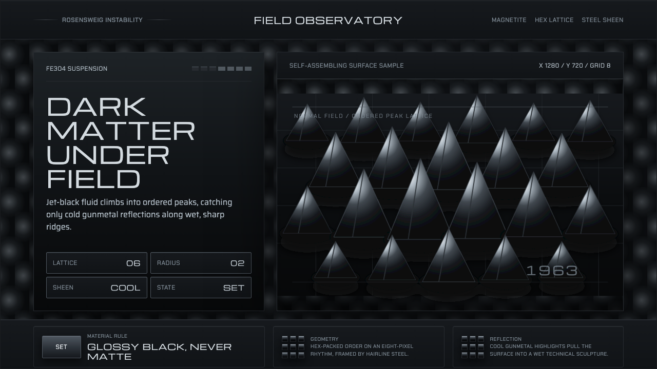 Ferrofluid Spike FieldPhysics turns sculptural. Jet black peaks, steel sheen, hex order.
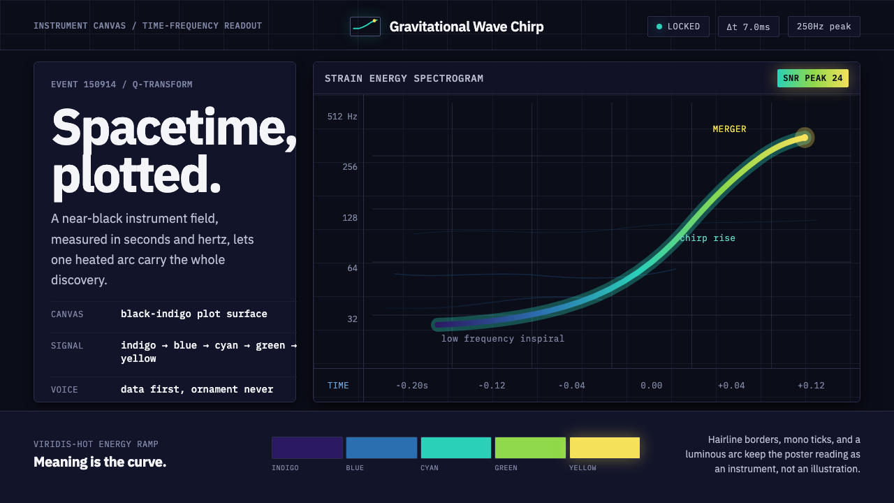 Gravitational Wave ChirpData makes the drama. Near-black grid, mono Hz ticks, and a viridis-hot chirp…