What is Ferrofluid Spike Field?
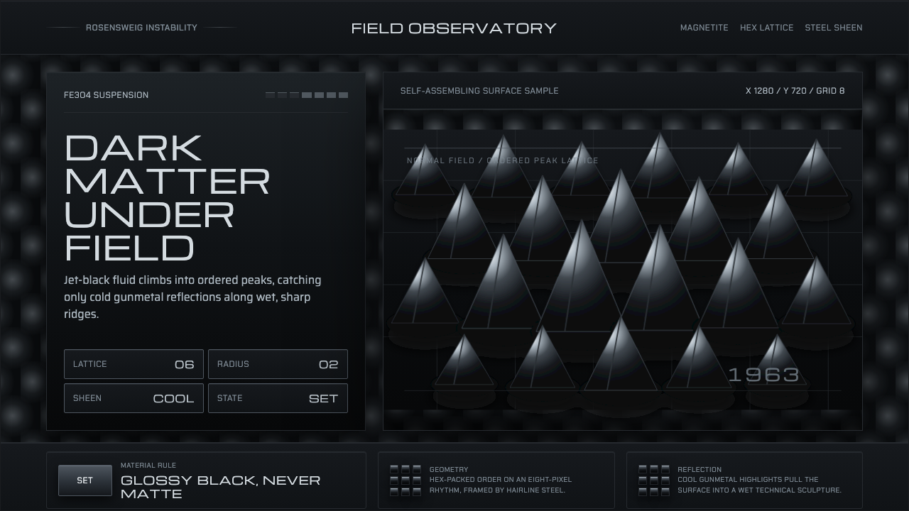
Ferrofluid Spike Field turns magnetism into sculpture — near-black peaks, steel-blue reflections, and an ordered surface that seems to assemble itself under an invisible force.
Ferrofluid Spike Field in brief
Ferrofluid Spike Field is a dark visual language derived from ferrofluid under magnetic force. A suspension of surfactant-coated Fe3O4 nanoparticles rises into the Rosensweig instability, producing a field of glossy conical spikes arranged in a hexagonal order. The result is not a decorative pattern applied to a surface; it is a material event made visible.
Its atmosphere is wet, dense, and physically charged. The body of the interface stays near black, while cool gunmetal and steel-blue reflections travel across the peaks. Deep valley shadows separate each form, and sharp specular highlights make the surface feel oily, metallic, and caught between liquid and solid.
The aesthetic depends on restraint. The tonal range remains tightly confined to cool grays, with no warm detour and no soft visual comfort. Every peak is both an object and a signal of the field acting through the material. The composition therefore feels ordered without becoming static, sculptural without becoming ornamental.

Where does Ferrofluid Spike Field come from?
The material foundation of Ferrofluid Spike Field begins with ferrofluid, invented at NASA in 1963. The invention established the essential visual paradox that later display culture would repeatedly return to: a liquid that can be organized by an external field into visible, precise, and highly dramatic forms.
During the 1960s and 1970s, the Rosensweig instability gave this material language its characteristic silhouette. Under magnetic influence, the fluid does not simply flatten or gather; it rises into a repeating field of peaks. The hexagonal order is important because it makes the phenomenon feel self-assembling rather than manually arranged.
The style belongs intellectually to magnetohydrodynamics and materials science, but its contemporary expression also belongs to kinetic science-art. It treats a physical process as an image system: force becomes geometry, reflection becomes surface information, and instability becomes a disciplined visual rhythm.
Around 2015, this language entered display culture as a recognizable atmosphere for interfaces and visual identities. Its global character reflects its path from NASA origin to contemporary materials-research and science-art communities. Ferrofluid Spike Field is therefore neither historical decoration nor pure fantasy; it is a translation of observable physics into a controlled digital surface.
What defines the Ferrofluid Spike Field look?
Color
The palette is near black, anchored by cool grays and metallic gunmetal. Steel blue appears through reflection rather than as a flat decorative field. Warm hues are excluded because they would weaken the sense of magnetic coldness and material density. Color should feel discovered on the surface, not painted over it.
Surface
The surface reads as wet, glossy, and slightly oily. Specular highlights travel over the peaks, while darker recesses suggest depth between them. The finish is neither polished luxury nor natural stone; it is a fluid caught in a precise physical condition, where shine is evidence of form.
Geometry
The dominant form is the sharp conical spike. Peaks rise from shared valleys and repeat across the field, creating a surface that is simultaneously organic and geometric. The cone is not used as an icon or ornament; it is the visible consequence of magnetic force acting through a suspended material.
Order
Hexagonal organization gives the field its underlying discipline. The pattern should feel generated by a system rather than arranged by hand, with repetition softened by differences in reflection, height, and shadow. Order is present in the structure, while variation keeps the material alive.
Contrast
Contrast comes from the meeting of almost-black mass and narrow metallic highlights. It is concentrated rather than theatrical: a small glint can define an entire ridge, while a deep valley can make neighboring peaks feel taller. The visual hierarchy is carried by light, shadow, and edge sharpness.
Kinetic Tension
Although the field may be presented as a still image, it should imply movement held in suspension. The peaks suggest rising, pulling, and self-assembly under an unseen force. The interface feels paused at the most legible instant of an ongoing physical process, not frozen into lifeless symmetry.

Who shaped Ferrofluid Spike Field?
Stephen Papell is identified with the invention of ferrofluid at NASA in 1963. His place in the story gives the style its material starting point: a suspension whose behavior could turn invisible physical force into a visible and controllable surface.
Ronald Rosensweig is associated with the Rosensweig instability, the phenomenon that gives ferrofluid its field of rising spikes under magnetic influence. His name is therefore embedded in the style's central image: liquid becoming an ordered, pointed, and highly legible structure.
NASA represents the institutional origin of ferrofluid in the approved history of the style. The connection matters because it keeps the aesthetic tied to applied materials research and physical problem-solving, even when the later expression becomes atmospheric, editorial, or digital.
How do you use Ferrofluid Spike Field today?
For presentation covers, Ferrofluid Spike Field works best as a dark field with the title emerging against the near-black mass. A cropped cluster of peaks can occupy the visual center or rise from an edge, while the title remains clear through controlled contrast. The cover should feel like a material specimen under observation, not like a generic technology backdrop.
Content and data slides should use the spike field as a structural atmosphere rather than a competing illustration. Keep information areas calm and legible, then let metallic highlights or a narrow steel-blue accent identify the active section. Charts and diagrams can echo the hexagonal order through repeated forms, but the data must remain more readable than the texture.
For web interfaces, the style suits dashboards, monitoring tools, scientific products, and pricing pages that want to communicate physical intelligence and controlled complexity. Near-black surfaces establish the environment, cool gray text carries hierarchy, and reflective accents can distinguish active states or important values. Panels should feel dense and material, while spacing between them preserves the sense of an organized field.
Editorial and marketing work can use the language to frame materials research, magnetism, engineering, or experimental products. Large atmospheric images support opening spreads and campaign moments, while narrow reflective details can mark section changes or product features. The strongest applications let the physical metaphor carry the message: force, structure, response, and transformation.
The common mistake is treating the style as a black interface with random metallic effects. Unrelated gradients, warm highlights, excessive gloss, or evenly scattered spikes destroy the logic of the field. The design needs a near-black body, cool reflection, sharp peaks, deep valleys, and an underlying hexagonal order. Surface drama should reveal structure, never replace it.

Ferrofluid Spike Field — FAQ
Is Ferrofluid Spike Field meant to look realistic or abstract?
It sits between the two. Its authority comes from a recognizable physical phenomenon, but the interface is not required to document a laboratory scene. The peaks, reflections, and valleys can be composed for clarity and atmosphere, provided they preserve the feeling of magnetic force acting through a glossy suspended material.
Can the style use colors outside cool gray and steel blue?
The approved language is deliberately narrow: near black, cool gray, gunmetal, and steel blue reflections. A warm palette would change the material reading and weaken the sense of magnetic coldness. If another color appears, it should be treated as a rare informational signal, never as a competing atmosphere.
Why is the hexagonal order important?
The hexagonal order distinguishes the field from a random collection of spikes. It suggests that the material is organizing itself under a governing force. Repetition creates the system, while differences in peak height, shadow, and reflection keep the surface from feeling mechanically stamped.
Does the style suit light-background layouts?
Its strongest expression is dark because the near-black body, deep valleys, and cool highlights depend on concentrated contrast. A light application can work as an editorial inversion or specimen-like presentation, but it should retain the material vocabulary of sharp peaks, metallic reflection, and organized force rather than becoming a generic pale geometric style.
Related design styles
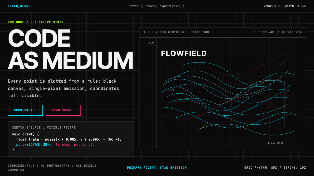 Processing / GenerativeCode becomes image. Cyan hairlines trace black-grid flowfields with mono coor…
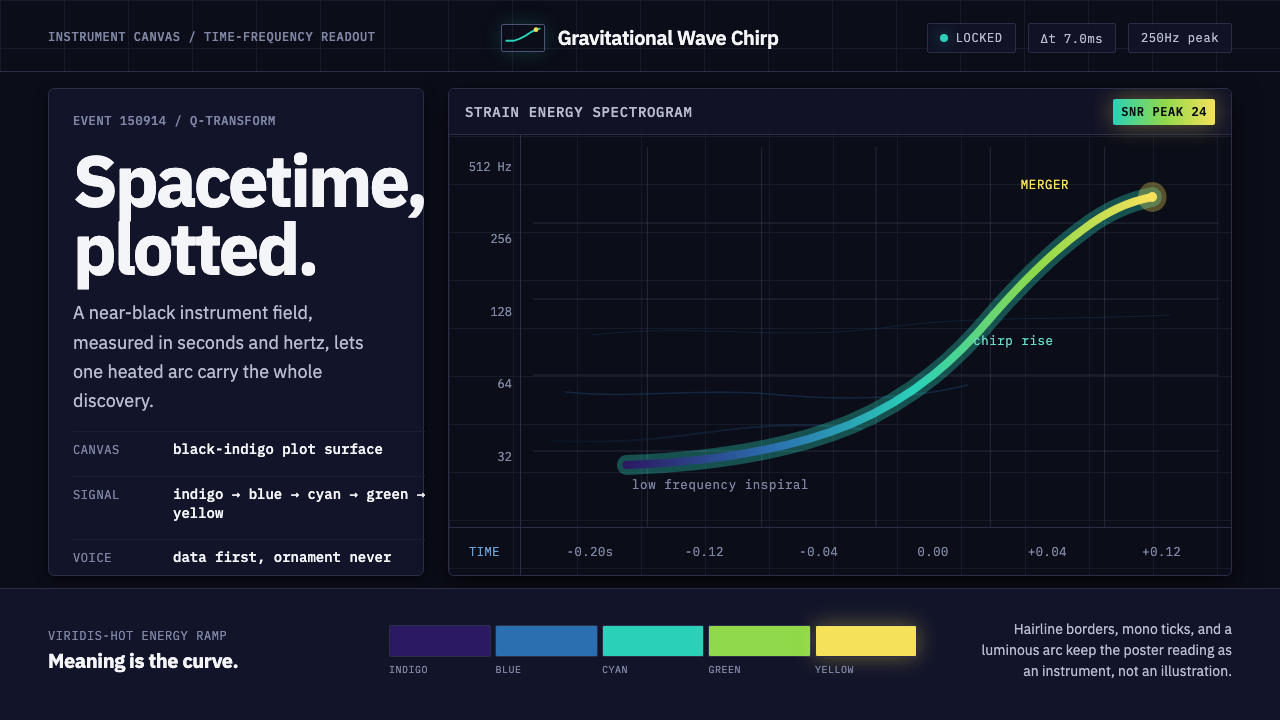 Gravitational Wave ChirpData makes the drama. Near-black grid, mono Hz ticks, and a viridis-hot chirp…
 Minority Report Gestural UIPredictive computing, conducted on glass. Luminous cyan panels floating in pu…
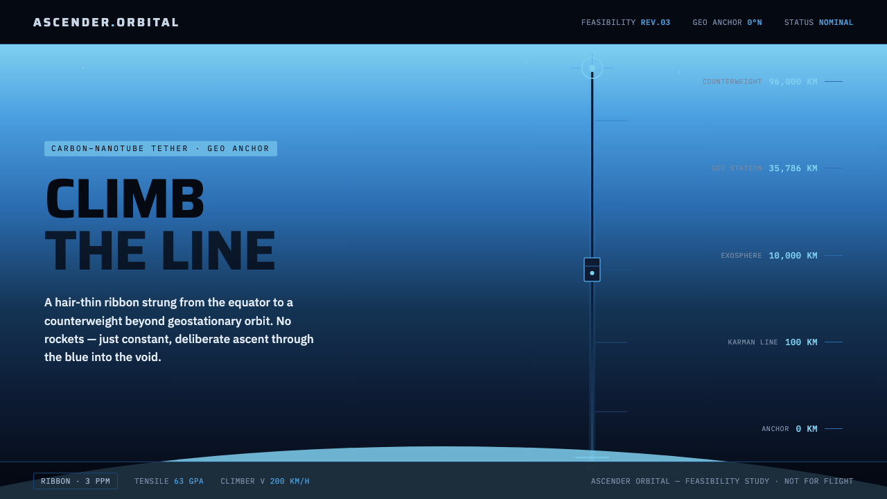 Space ElevatorClimb the line, no rockets. Carbon ribbon rises through atmosphere blue into…
 Cassini Saturn ImagingDeep space feels exact. Butterscotch Saturn floats in black with fine tan rin…
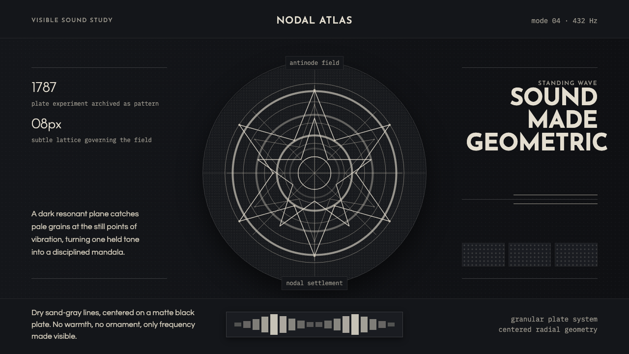 Cymatics Standing WaveSound becomes geometry. Sand-gray nodal rings settle on a dark resonant plate.