What is Space Elevator?
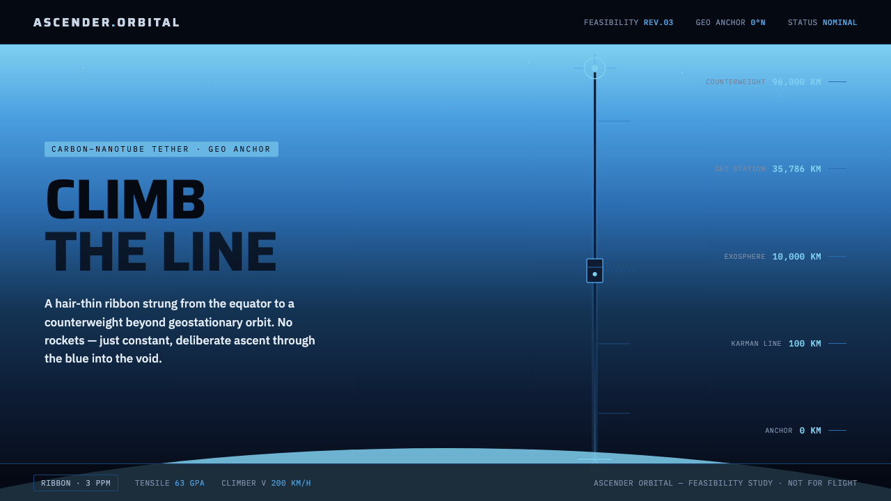
Space Elevator turns ascent into a line: a carbon-dark tether leaves Earth’s blue limb, crosses the atmosphere, and disappears into a measured black void.
Space Elevator in brief
Space Elevator is orbital-tether concept art presented as a feasibility-study rendering. Its signature image is a slim dark carbon ribbon rising from the curved blue limb of Earth, passing through atmospheric blue, and continuing toward a counterweight station in black space. The design is futuristic, but its mood is governed by engineering precision rather than cinematic spectacle.
The visual system makes vertical ascent the primary organizing idea. Near-black grounds establish the void; a blue atmospheric gradient provides the only major transition; the tether supplies a continuous axis; and schematic labels turn the image into an explanation. The result is both vertiginous and controlled. It suggests enormous scale through restraint, allowing a single thin line to carry the drama of the entire composition.
Space Elevator is immediately recognizable because image and information behave as one system. The Earth arc is not merely a background, the gradient is not merely atmosphere, and the callouts are not decoration. Each element explains the imagined structure. Condensed technical sans-serif type, cross-section details, and sparse annotations make the page feel like a study prepared for inspection rather than a poster designed only to impress.
Where does Space Elevator come from?
The concept reaches back to Konstantin Tsiolkovsky in 1895, which gives the style an unusually clear historical anchor. Its visual language therefore begins not with an invented fantasy world but with a speculative engineering proposition: a structure that makes ascent legible as a continuous connection between Earth and orbit. The tether is the idea made visible, and the line becomes more important than any vehicle.
The approved lineage also includes Arthur C. Clarke, whose presence broadens the concept from an isolated mechanism into a durable image of the future. In this design tradition, futurism is not expressed through cluttered machinery or ornamental technology. It is expressed through a clean vertical relationship, a distant station, a curved planet, and the question of whether an extraordinary structure can be rendered with ordinary graphic clarity.
The NASA feasibility study of 2003 gives the style its strongest contemporary frame. The phrase feasibility study matters aesthetically: it implies cross-sections, measurements, callouts, material logic, and a willingness to show the structure as a problem to be examined. Space Elevator concept art borrows that attitude. It does not conceal uncertainty beneath spectacle; it makes the imagined system feel diagrammable, inspectable, and open to analysis.
The movement vocabulary is described by carbon-nanotube megastructure futurism and space-engineering concept art. Its region is global and internet-born, which helps explain its hybrid character: scientific visualization, speculative architecture, interface design, and editorial diagramming can coexist within the same system. The final language is not tied to a local craft tradition. It is a shared visual shorthand for an immense technical proposition viewed from Earth into the void.
What defines the Space Elevator look?
Void and Ground
Near-black space is the foundational ground, not an empty backdrop. It gives the tether maximum authority and allows the atmospheric blue to read as a contained zone rather than a general glow. The darkness should feel deep, quiet, and stable. Stars, texture, and decorative cosmic detail are unnecessary because the void gains its force from what it refuses to show.
The Tether Line
The carbon ribbon is deliberately slim, dark, and continuous. Its visual authority comes from persistence rather than thickness. It should remain readable against the blue atmospheric field while nearly merging with the black beyond it. Any interruption, ornamental bend, or competing line weakens the central metaphor: ascent is a single committed trajectory.
Atmospheric Transition
Blue does the work of separating Earth from space. It begins as the curved planetary limb and thins into an atmospheric field before fading toward void. The transition should feel directional and spatial, not painterly. Blue is a structural layer that establishes altitude, distance, and the boundary between the inhabited world and the unknown beyond it.
Schematic Typography
Condensed technical sans-serif type gives the system its documentary voice. Letterforms should feel economical, legible, and comfortable beside diagrams. Headings can be assertive, but they should retain the discipline of labels and instrument readouts. Typography organizes the imagined apparatus; it should never compete with the tether through expressive display treatment.
Callouts and Cross-Sections
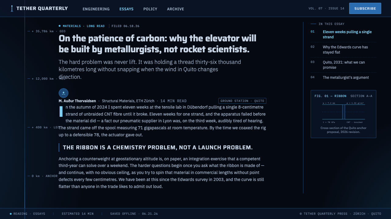
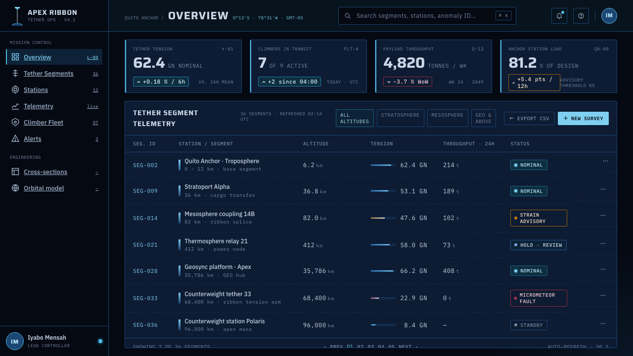
Information appears as callouts, cross-sections, directional markers, and concise technical notes. These devices make the image feel inspectable. A label should point to a meaningful junction, material, or change in altitude, while a cross-section should reveal structure rather than provide ornamental complexity. The visual rhythm comes from evidence distributed around the main line.
Scale and Vertigo
The style creates vertigo through proportion and distance. A small Earth curve can support a long ascent; a remote counterweight can make the tether feel almost immeasurable. The composition should preserve this tension between human-scale annotation and planetary-scale structure. When every object is equally prominent, the sense of altitude collapses.
Who shaped Space Elevator?
Tsiolkovsky anchors the concept at 1895, giving the visual system a point of origin that predates contemporary space imagery. His place in the lineage is represented through the continuous tether: an audacious connection rendered as a clear structural proposition. The style honors that origin by making the idea readable before making it spectacular.
Clarke represents the cultural durability of the space-elevator image. Within this design language, the future is not a vague fantasy but a scene that can be named, diagrammed, and contemplated. His presence supports the system’s balance between imagination and technical sobriety: wonder remains, but it is given a line, a station, and a visible direction.
Edwards is tied to the feasibility-study era named in the source material, and therefore to the style’s most important attitude: speculative structures should be presented as systems open to examination. His place in the visual lineage appears through cross-sections, callouts, material emphasis, and the refusal to hide the proposition behind generic science-fiction spectacle.
How do you use Space Elevator today?
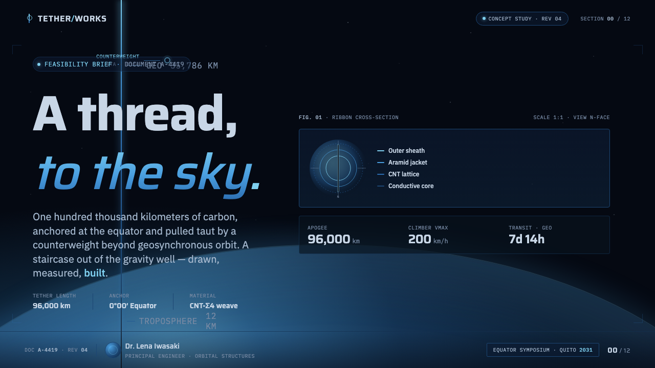
For presentation work, let the cover behave like a mission plate: near-black ground, the blue curve of Earth entering at an edge, and the tether rising toward a title with condensed technical authority. Content slides should use cross-sections, callouts, and short explanatory blocks rather than decorative illustration. Data slides can treat charts as system diagrams, using altitude, direction, and connection as the organizing logic. The audience should feel that every page advances an investigation.
For web interfaces, the style suits dashboards and pricing pages that want to communicate infrastructure, scale, or technical confidence. A dashboard can use the atmospheric gradient to separate operating zones, with dark panels behaving like instrument surfaces and blue accents identifying active routes or system states. A pricing page can frame tiers as stages along an ascent, but the hierarchy must remain immediate: labels, benefits, and actions should be clearer than the metaphor.
For editorial and marketing work, Space Elevator supports launch stories, research reports, technology explainers, and campaigns about ambitious systems. Use the tether as a recurring vertical motif across covers, section openers, diagrams, and pull quotes. Editorial layouts benefit from generous dark fields and disciplined annotation; marketing pages can use the Earth arc as an entry point, then lead the eye upward through a sequence of increasingly sparse sections.
The common mistake is to turn the style into generic neon science fiction. Excessive glow, star fields, ornamental spacecraft, multiple competing gradients, and thick luminous lines all weaken the concept. The system works when the void remains dominant, the blue atmosphere has a clear purpose, the tether stays thin and continuous, and every label explains a relationship. Its drama comes from feasibility under impossible scale, not from visual noise.
Space Elevator — FAQ
Is Space Elevator a science-fiction style or an engineering style?
It is a deliberate combination of both, but engineering governs the expression. The subject is futuristic, while the visual treatment comes from feasibility studies, cross-sections, callouts, and material logic. If the page feels like a movie scene first and a system explanation second, it has drifted away from the style. The strongest version preserves wonder through precision.
Must every Space Elevator layout use a black background?
The near-black space ground is the clearest and most characteristic choice because it establishes the void and gives the tether authority. A lighter adaptation can work for diagrams or documents, but it should preserve the essential relationships: a distinct Earth curve, an atmospheric blue transition, a dark continuous tether, and technical annotation. Changing the ground should not erase the ascent logic.
How can the atmospheric gradient remain technical rather than decorative?
Give the gradient a spatial job. It should separate the planetary limb from the void, indicate a change of altitude, or guide attention along the tether. Keep its direction coherent and avoid adding unrelated color transitions. The moment the gradient becomes a general glow behind every object, it stops explaining atmosphere and starts behaving like decoration.
Does this style suit every kind of product or brand?
No. Space Elevator is strongest for technical tools, infrastructure products, research communication, educational interfaces, and brands that want to signal ambition through disciplined systems thinking. It is less suitable when warmth, softness, organic texture, or immediate emotional comfort are central to the experience. The style asks the audience to inspect a proposition, so it works best when the product also rewards attention and analysis.
Related design styles
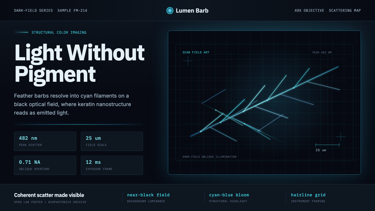 Feather MicroscopyPhysics glows in the dark. Cyan filaments and mono scale bars cut a black ima…
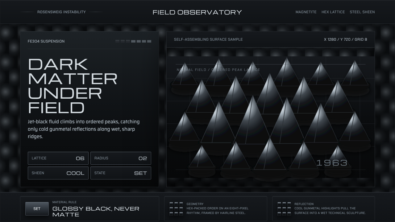 Ferrofluid Spike FieldPhysics turns sculptural. Jet black peaks, steel sheen, hex order.
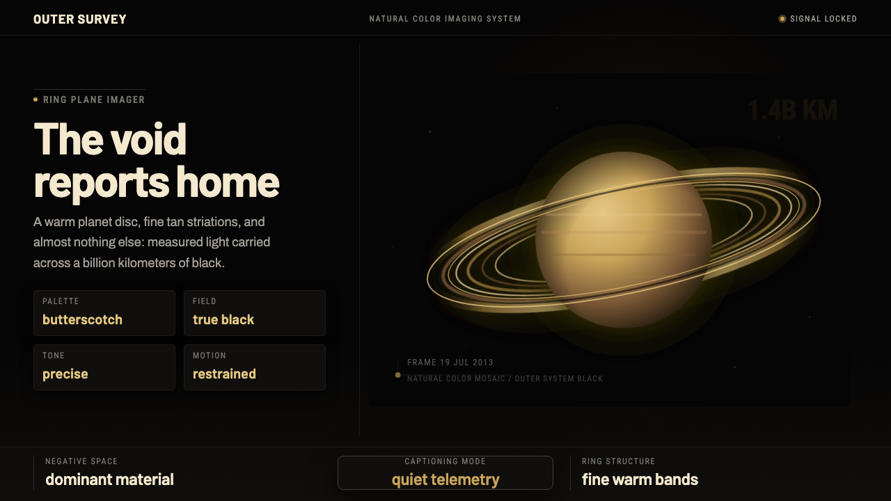 Cassini Saturn ImagingDeep space feels exact. Butterscotch Saturn floats in black with fine tan rin…
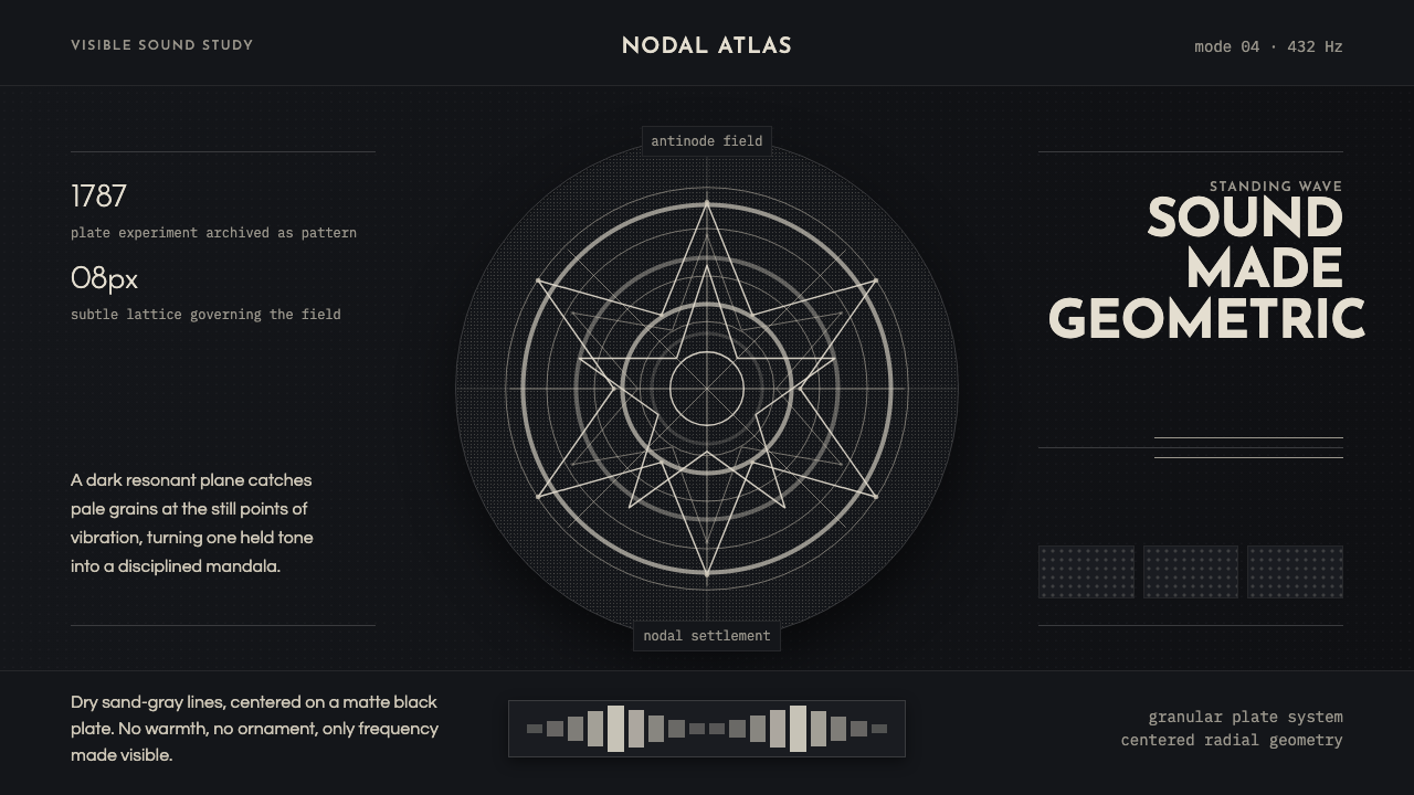 Cymatics Standing WaveSound becomes geometry. Sand-gray nodal rings settle on a dark resonant plate.
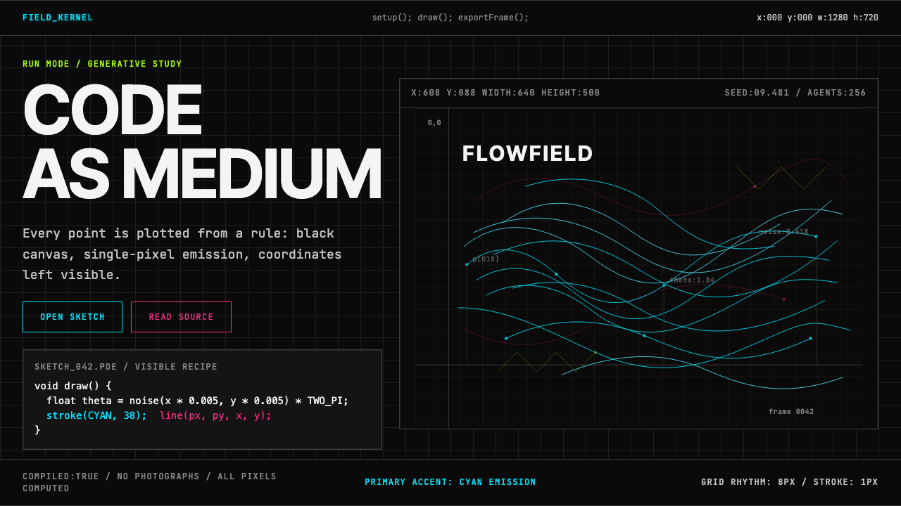 Processing / GenerativeCode becomes image. Cyan hairlines trace black-grid flowfields with mono coor…
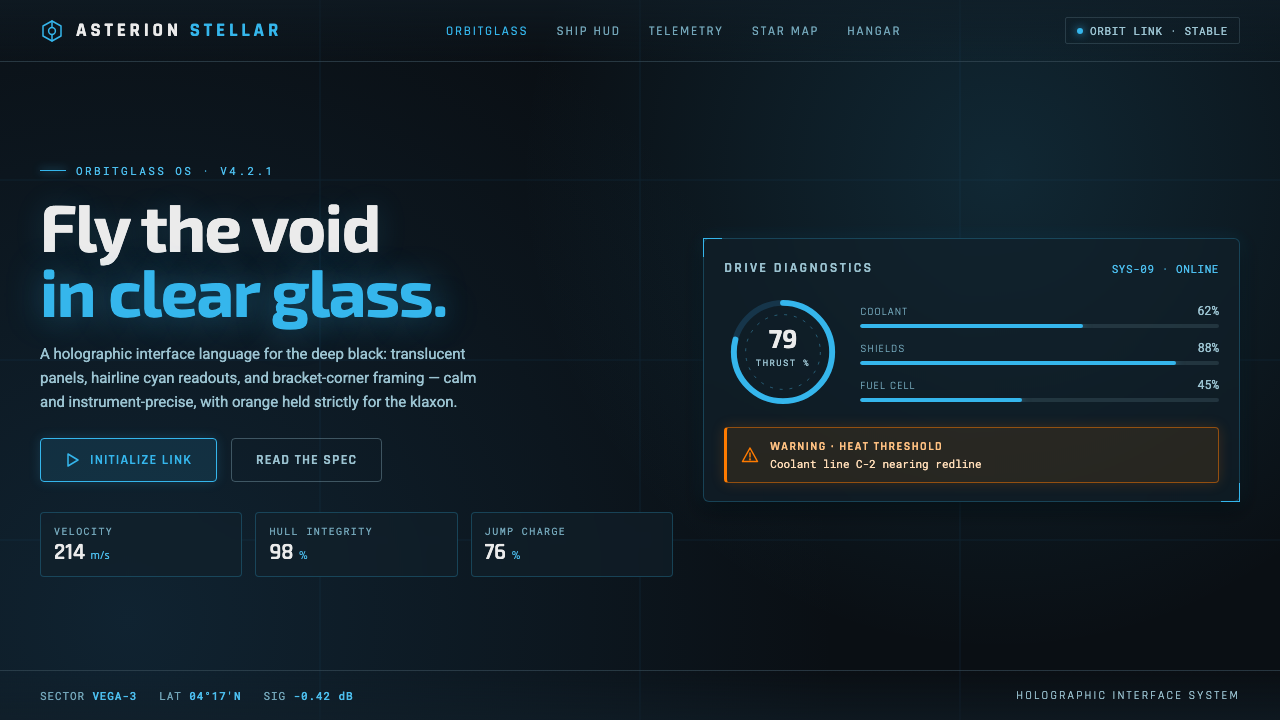 Star CitizenDisciplined holographic HUD. Cyan readouts on glass over a black void, orange…