What is Dead Space Ishimura?
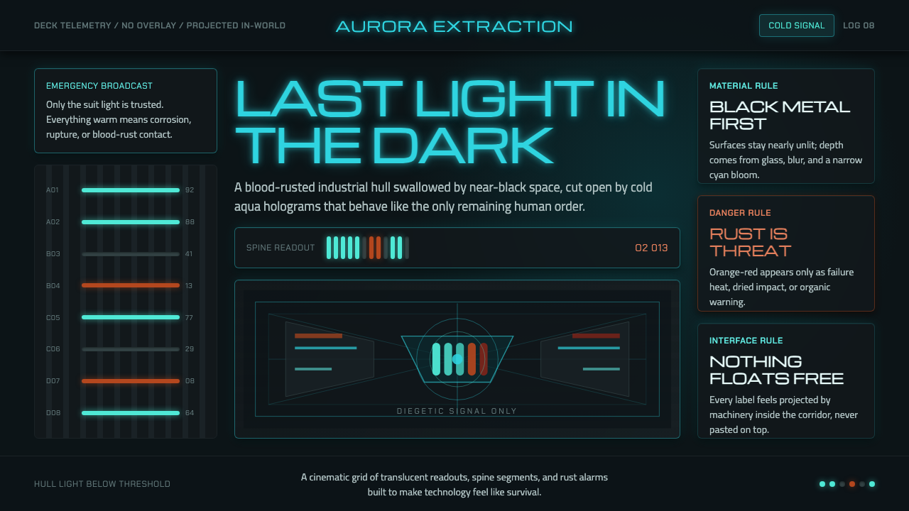
Dead Space Ishimura turns industrial ruin into a horror instrument — near-black steel, dried blood, and cold aqua light tracing the last fragile boundary between technology and decay.
Dead Space Ishimura in brief
Dead Space Ishimura is a space-horror visual language built around sustained contrast rather than sudden lighting effects. Its world is a dying industrial ship interior: nearly black corridors, rusted metal, dried blood, damaged machinery, and pockets of cold technological light. The visual system never lets the darkness become neutral. Blackness feels occupied by threat, while every illuminated surface appears temporary, clinical, and vulnerable.
The palette expresses two opposing temperatures. Rust-orange and dried-blood red belong to organic decay, injury, warning, and the physical evidence of catastrophe. Aqua-cyan belongs to technology, safety, information, and the last surviving trace of human order aboard the USG Ishimura. Neither side fully wins. The horror comes from seeing clinical systems continue to function inside a place that is visibly dying.
Its defining interface principle is diegetic design. Health, ammunition, and stasis information are not placed in a detached screen overlay; they appear as aqua-cyan holographic readouts within the three-dimensional world, especially through Isaac Clarke’s RIG suit. The result is a visual language where interface, costume, environment, and narrative occupy the same space. Nothing feels pasted on. Every signal seems to belong to the ship’s failing machinery.

Where does Dead Space Ishimura come from?
Dead Space was released in 2008, and the visual language of Dead Space Ishimura is deliberately frozen in that period rather than refreshed through a contemporary redesign. This matters because the aesthetic depends on a specific tension: the ship is technologically advanced enough to project information into space, yet materially exhausted enough to be coated in rust, blood, darkness, and industrial wear. The future is not clean. It is mechanical, enclosed, and failing.
The source material places the work in Redwood City, California, United States, and names Glen Schofield, Visceral Games, and Electronic Arts among its key figures. Within the visual system, their association marks a deliberate convergence of creative authorship, studio production, and a larger release context. The style is therefore not an isolated decorative treatment. It is a unified world-building decision applied across the ship, the suit, the interface, and the emotional rhythm of the horror.
Three movements define the visual lineage supplied for the theme: space horror, diegetic interface design, and industrial science fiction. Space horror provides the isolation and hostile darkness. Industrial science fiction provides the exposed machinery, hard surfaces, corrosion, and utilitarian atmosphere. Diegetic interface design binds the two together by ensuring that information belongs to the physical world rather than floating above it as an external control layer.
The central invention is not a single color or special effect but a relationship between systems. Aqua-cyan light makes information legible without making the environment feel safe; rust and blood make the ship feel wounded without turning every surface into spectacle. The visual language becomes most convincing when these elements remain in conflict: technology continues to communicate while the material world around it decays. That unresolved conflict is the foundation of the Ishimura mood.
What defines the Dead Space Ishimura look?
Near-Black Atmosphere
The ground is not ordinary black but an almost lightless industrial darkness. It should feel dense, enclosed, and materially present, as though the ship absorbs illumination rather than reflecting it. Near-black surfaces allow every working signal to become consequential. A small aqua readout can carry the emotional weight of a beacon because the surrounding darkness refuses to offer casual visibility.
Rust and Blood
Rust-orange and dried-blood red are not decorative accents. They are evidence. They mark corrosion, injury, warning, and the conversion of an engineered environment into an organic nightmare. These warm notes should appear as stains, traces, damaged surfaces, or urgent signals rather than as cheerful blocks of color. Their power comes from appearing to belong to the ship’s history.
Aqua-Cyan Technology
Aqua-cyan is the color of information that still works. It identifies health, ammunition, stasis, and other readable signs without becoming a general-purpose highlight. Its sharp, clinical character should feel electrically precise and slightly alien against rusted metal. The color represents safety only provisionally: it is a functioning system inside an unsafe world.
Diegetic Interface
Information should appear to inhabit the scene. Readouts belong to the RIG suit, machinery, doors, or holographic projections rather than to a separate overlay. This creates continuity between action and interpretation: the user does not leave the world to read the system. The interface is part of the fiction, and its visibility can therefore become part of the suspense.
Industrial Wear
Surfaces should communicate use, pressure, and neglect. Metal is not presented as a pristine science-fiction material; it is scratched, stained, darkened, and burdened by its own machinery. Industrial detail works best when it supports orientation and mood at once. A damaged panel can guide the eye, establish danger, and suggest the ship’s history without explanatory text.
Clinical Horror
The visual language is frightening because its technology remains orderly. Aqua displays are crisp, signals are legible, and systems continue to report conditions while the surrounding environment collapses. This contrast avoids theatrical chaos. Horror emerges from a precise instrument continuing to function inside an imprecise and contaminated reality.

Who shaped Dead Space Ishimura?
Glen Schofield is named in the source material as a key figure associated with Dead Space Ishimura. His place in the attribution anchors the theme to a specific act of creative authorship: the decision to make industrial darkness, bodily decay, and functioning technology operate as one sustained visual argument rather than as disconnected horror effects.
Visceral Games is identified as a key studio connected to the theme. Its association represents the production context in which space horror, industrial science fiction, and diegetic interface design were unified into a single environment. The important lesson for designers is systemic consistency: the suit, ship, signals, and damage language must feel as though they belong to the same failing machine.
Electronic Arts is also named among the key figures associated with the source material. In the context of this style, that attribution places the visual language within a released work rather than treating it as an abstract mood board. The aesthetic succeeds because its darkness, color signals, and interface logic are coordinated across a complete world.
How do you use Dead Space Ishimura today?
For presentation slides, use the Ishimura language to separate cover, content, and data roles without breaking the world. A cover can begin in near-black with a single aqua-cyan signal cutting through the darkness, while a content slide should let rust, blood, and machinery establish context around restrained information. Data slides work best when readings are treated as equipment outputs: cyan marks active systems, rust marks damage or risk, and the dark field keeps every comparison severe and legible.
For web interfaces, the style suits dashboards, diagnostics, monitoring tools, and pricing pages that need to feel operational rather than decorative. Keep the main field nearly black, use aqua-cyan for active states and readable system feedback, and reserve rust-orange or dried-blood red for warnings, damage, or urgent change. Panels should feel like ship components: dense, bordered, and embedded in a larger system. Avoid making every control glow, because indiscriminate illumination destroys the hierarchy of the darkness.
For editorial and marketing work, the style is strongest when the page feels like a recovered document from a failing machine. Use dark fields, restrained technical labels, narrow information zones, and occasional aqua signals that appear to reveal rather than decorate. Rust and blood tones can mark evidence, damage, or narrative escalation. Marketing pages benefit from the contrast between a controlled clinical message and a surrounding atmosphere that suggests contamination, isolation, or mechanical exhaustion.
For product launches, game-related content, and cinematic campaigns, let the interface carry part of the storytelling. A status readout, equipment label, or holographic marker can serve as both navigation and world-building. The most convincing compositions keep the text calm and the environment threatening: readable information sits inside a field of darkness, while material wear supplies emotional pressure. This allows atmosphere to accumulate without relying on constant spectacle.
The common mistake is treating the theme as a generic neon-on-black style. Bright aqua everywhere, polished panels, decorative glitch effects, and equal emphasis on every warning will produce a futuristic interface but not Dead Space Ishimura. The system needs opposition: aqua must remain scarce enough to mean information, rust must feel like evidence rather than ornament, and the near-black environment must retain enough silence for each signal to matter.

Dead Space Ishimura — FAQ
Is Dead Space Ishimura simply a dark sci-fi style?
No. Darkness is only its foundation. The defining system is the contrast between near-black industrial decay, rust and blood, and aqua-cyan information that remains clinically functional. Without the conflict between failing material reality and precise technology, the result becomes generic dark science fiction rather than Ishimura.
Why should the interface be diegetic?
Because the theme depends on continuity between the user and the world. When health, ammunition, and stasis information appear through the RIG suit or another physical projection, the user never has to leave the scene to understand the system. Information becomes part of the fiction, and its visibility can carry suspense.
Can the style use warm colors beyond rust and blood?
It can, but the warm range should remain tied to material evidence, danger, or decay. The source language does not treat warm color as friendly atmosphere. Warmth should feel contaminated, wounded, or urgent. If warm tones become broad decorative fields, the central opposition between organic ruin and clinical technology loses force.
How can a dashboard use the style without becoming hard to read?
Treat aqua-cyan as an information signal, not as a glow applied to every surface. Keep the surrounding field quiet and near-black, organize content into clear equipment-like zones, and reserve rust or blood tones for warnings and damaged states. Legibility comes from hierarchy and contrast, while atmosphere comes from restraint.
What makes the horror feel clinical rather than chaotic?
The systems remain precise while the world around them deteriorates. Readouts stay legible, signals retain a controlled aqua character, and information continues to report conditions inside an environment marked by rust, blood, and darkness. The horror comes from order persisting where order should no longer be possible.
Related design styles
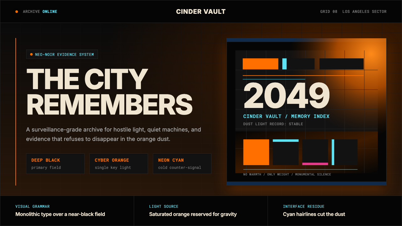 Blade Runner 2049Noir with tectonic weight. Orange dust, cyan hairlines, and monumental Inter…
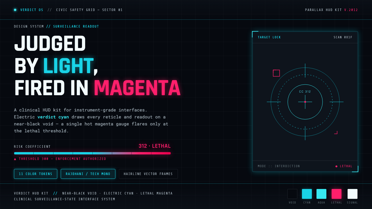 Psycho-PassA surveillance HUD. Cyan reticles on a near-black void; magenta flares only a…
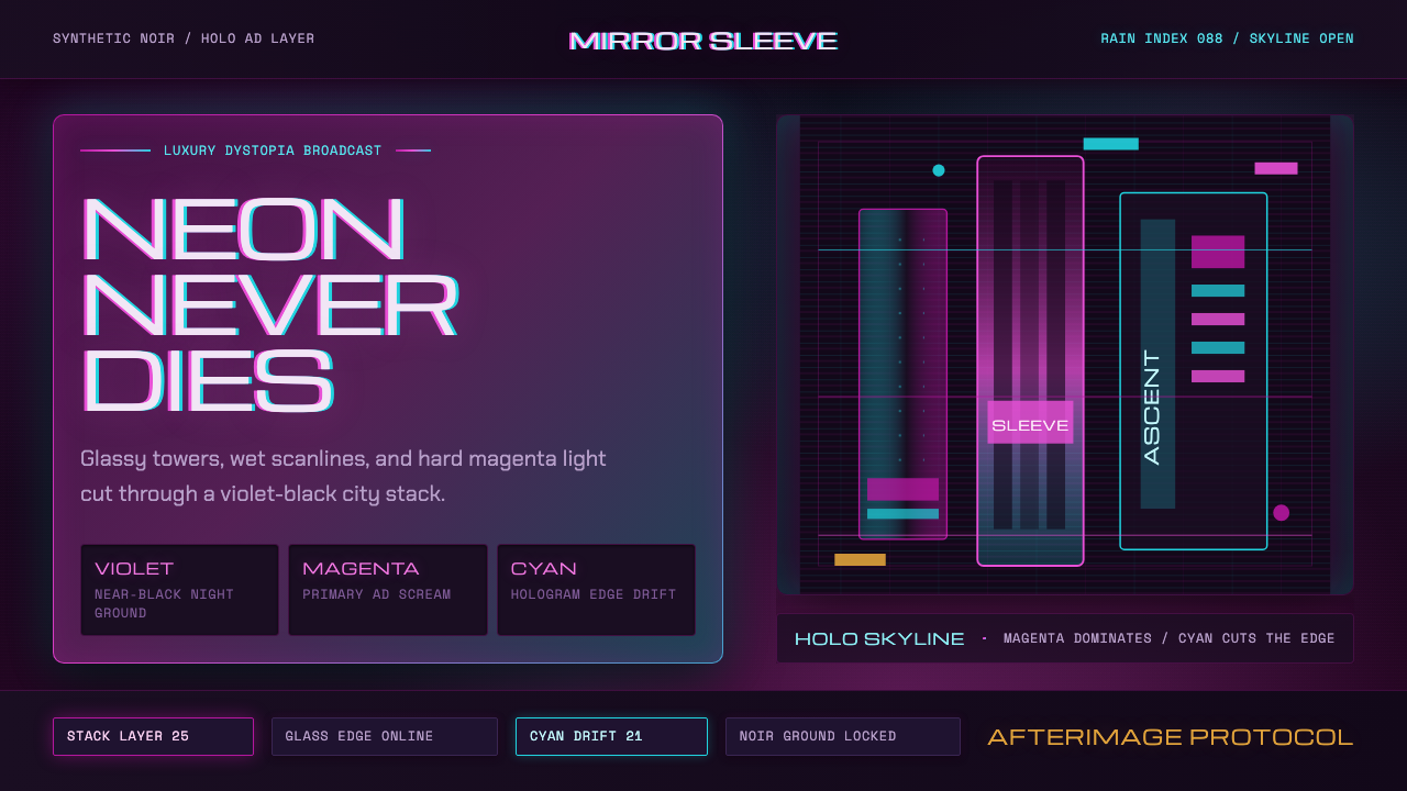 Altered CarbonNeon screams off noir. Magenta glass, cyan scanlines, and stacked vertical si…
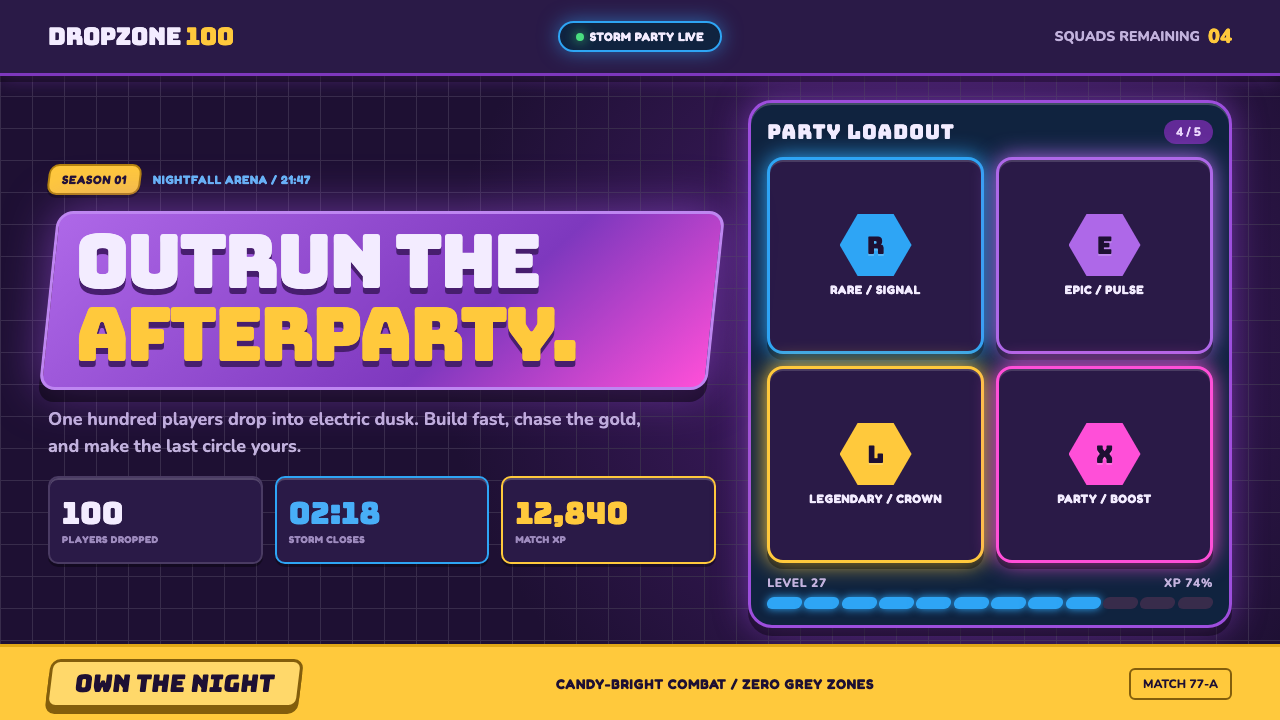 Fortnite (2017 Battle Royale)Battle royale becomes a neon party. Chunky caps and rarity glows electrify st…
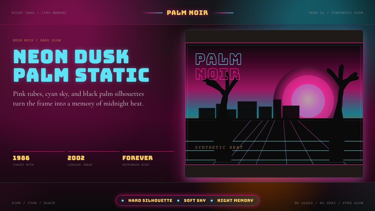 GTA Vice City (2002)Neon-noir nostalgia. Pink-cyan dusk, chunky type, and palm silhouettes.
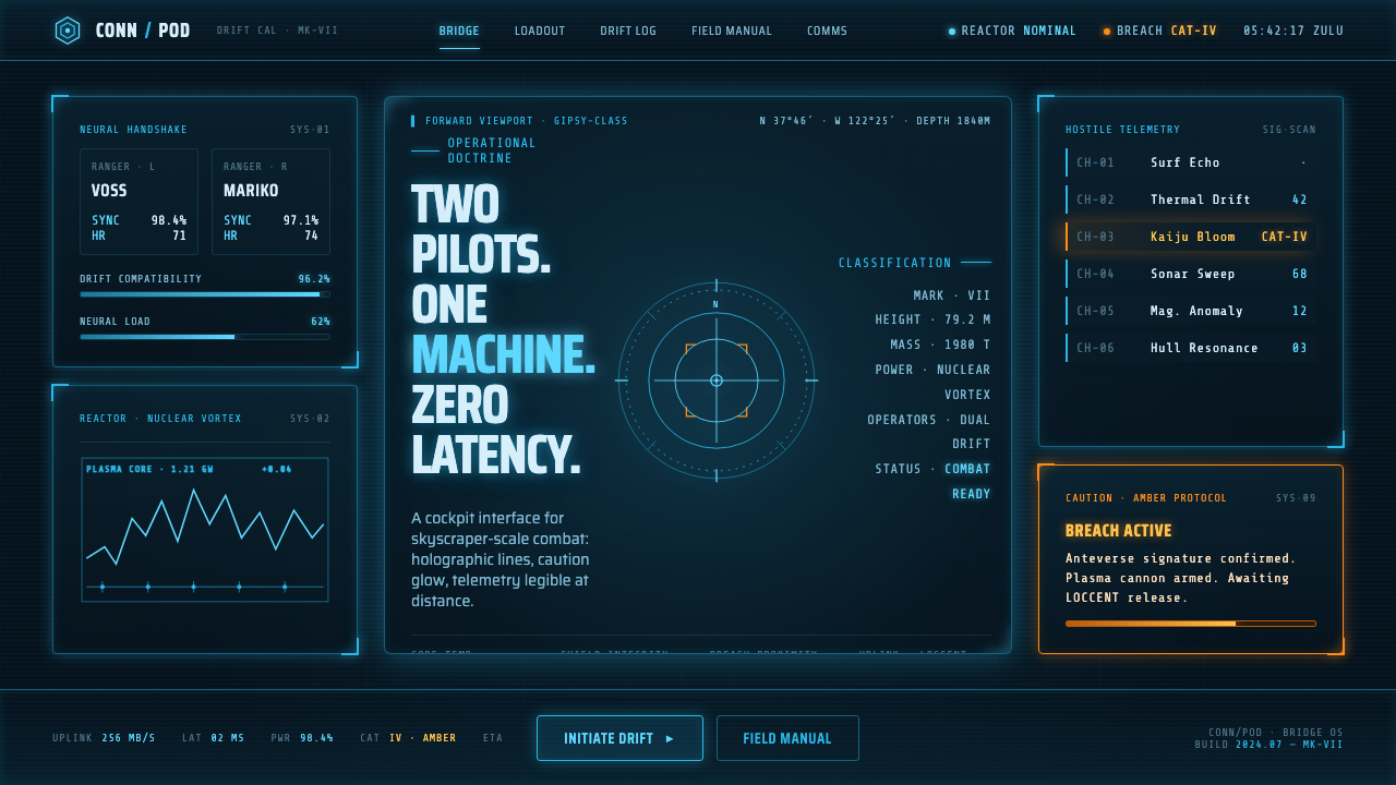 Pacific Rim Jaeger HUDTwo pilots, one machine. Faded Corsair-cyan holograms on near-black steel, am…