What is Altered Carbon?
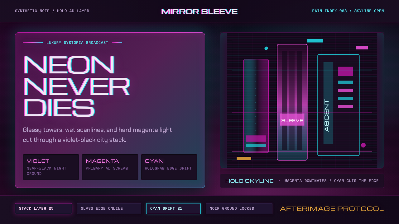
Magenta and holo-cyan scream off a rain-slick, near-black night — a 25th-century cyberpunk noir where luxury and decay share the same glowing glass.
Altered Carbon in brief
Altered Carbon (2018) is a design system drawn from Netflix's cyberpunk noir series of the same name, which imagines a 25th-century world where consciousness can be digitized and transferred between bodies, and where towering, rain-soaked megacities are wrapped in ceaselessly mutating holographic advertising. Its visual identity fuses two lineages: the amber-and-cyan dystopian palette established by Blade Runner, and an over-stimulated, hologram-saturated glow pushed decisively toward magenta and violet.
The defining move of this style is the ground itself: a near-black, violet-tinted night, chosen specifically so that neon color has something to scream against. Nothing in this system is pastel or muted — every accent color is saturated, glowing, and slightly unstable, as if it might flicker or shift at any moment. This is luxury dystopia rather than gritty street-level cyberpunk: the poverty and grime of classic cyberpunk imagery are present, but wrapped in a veneer of opulent, over-produced holographic spectacle.
Surfaces behave like glass and glowing signage rather than matte print: panels have luminous edges, buttons read as neon outlines rather than filled shapes, and text can carry a chromatic glitch or scanline quality that suggests a hologram slightly failing to render cleanly. The overall mood is decadent, atmospheric, and unsettled — beauty built on top of rot.

Where does Altered Carbon come from?
Altered Carbon debuted on Netflix in February 2018, adapted from Richard K. Morgan's 2002 novel of the same name. The story is set roughly 360 years in the future, in a world where human consciousness can be stored on a digital 'stack' implanted at the base of the skull and transferred between different bodies, called 'sleeves' — a premise that allows the wealthy to purchase effective immortality while the poor cycle through cheap, disposable bodies. This class divide between the eternally young rich and the mortal poor became the series' central visual and thematic organizing principle.
The show's production design team, led by production designer Carey Meyer, set the story primarily in Bay City — a drowned, towering future version of San Francisco where the wealthy elite live in floating towers above a perpetual cloud layer while the poor exist in the flooded, crowded streets below. This vertical class stratification directly echoes the visual structure established by Ridley Scott's 1982 Blade Runner, widely regarded as the founding text of cinematic cyberpunk noir, with its own rain-soaked megacity of towering advertisements and moral ambiguity.
Where Altered Carbon's design departs from its Blade Runner lineage is in cinematographer Neville Kidd's color treatment. Blade Runner's iconic look leaned on amber and cyan as its two dominant hues — warm sodium-lit interiors against cool blue-tinted exteriors. Kidd and the Altered Carbon team pushed this palette decisively toward magenta and violet, reflecting the show's 25th-century setting in which holographic advertising technology has advanced far beyond Blade Runner's analog neon signage into fully immersive, ever-shifting projected imagery — an aesthetic evolution meant to feel like Blade Runner's world several centuries further into an even more saturated, technologically maximalist future.
Production designer Lisa Bolan and the visual effects teams worked to make the city's holographic advertising feel alive and mutating rather than static — billboards that shift form and color continuously, suggesting a world so saturated with projected media that the boundary between architecture and advertisement has effectively dissolved. This combination of noir moral atmosphere, class-stratified megacity structure, and hyper-saturated holographic color established Altered Carbon as a distinct evolution within the broader Blade Runner-descended cyberpunk noir tradition.
What defines the Altered Carbon look?
Color
The palette centers on saturated magenta and violet, with holo-cyan as a secondary accent, all set against a near-black, violet-tinted night ground. Warmer amber notes may appear in interior or intimate settings as a nod to the style's Blade Runner lineage, but the dominant temperature leans cool and electric rather than warm.
Ground and Contrast
The ground is never a soft or muted dark — it is a near-black night with a subtle violet tint, chosen specifically to maximize how aggressively neon colors read against it. Nothing in the system should soften toward gray or pastel; the contrast between glowing accent and dark ground is the entire mechanism of the style.
Neon Outline and Glow
Buttons and interactive elements read as neon outlines with luminous edges rather than solid filled shapes — glass and glowing signage rather than matte print. This treatment should extend to panel borders and card edges, giving surfaces the quality of illuminated glass rather than opaque material.
Scanline and Glitch
Text and imagery can carry a chromatic glitch or fine scanline quality, suggesting a hologram or projected advertisement that is not rendering with perfect stability. This should be applied selectively as an atmospheric accent, not so pervasively that it undermines legibility.
Vertical Signage
Compositions favor tall, stacked vertical elements — echoing the towering megacity architecture and its stacked advertising signage — over wide horizontal layouts. Text blocks and navigation can be organized in tall, narrow columns reminiscent of vertical neon signs.
Rain-slick Reflectivity
Surfaces should suggest wet, reflective glass and streets rather than dry matte materials — subtle reflections and light bleed evoke the rain-soaked cityscape at the heart of the style's noir atmosphere.
Luxury-Decay Tension
Every element should carry a tension between opulence and decay — a glowing, expensive-looking surface with a hint of grime or instability underneath. This is what distinguishes the style from a purely glamorous or purely gritty aesthetic: it holds both at once.

Who shaped Altered Carbon?
Production designer for Altered Carbon who built Bay City as a vertically stratified megacity — floating towers for the wealthy above a perpetual cloud layer, flooded streets for the poor below — establishing the class-divided spatial structure that underpins the show's entire visual world.
Cinematographer who took the Blade Runner-derived amber-and-cyan palette and pushed it decisively toward magenta and violet, reflecting the show's more technologically advanced, hologram-saturated 25th-century setting and giving Altered Carbon its distinct color identity.
Worked on the visual design of Bay City's holographic advertising, making billboards and signage feel alive and continuously mutating rather than static, reinforcing the sense of a world where architecture and advertisement have effectively merged.
How do you use Altered Carbon today?
Applying this style well starts with committing to the near-black, violet-tinted ground as non-negotiable — the entire neon-glow mechanism depends on darkness to scream against, and any lightening of the base undermines the effect.
For presentation slides, the style makes a striking cover treatment with a tall vertical accent block in magenta or holo-cyan against the near-black ground, title type rendered with a neon-outline or subtle glitch quality. Content slides should keep body text high-contrast and legible against the dark ground, reserving glow and glitch effects for headlines and section markers rather than dense text blocks.
For web interfaces, the style suits entertainment, gaming, or nightlife-adjacent products where atmosphere and mood are more important than clinical clarity — dashboards can use neon-outline buttons and glowing card borders, with holo-cyan reserved for primary actions and magenta for secondary accents or alerts. Navigation elements can borrow the vertical-signage motif, organized as tall stacked labels rather than a horizontal bar.
For editorial and marketing contexts, the style rewards full-bleed dark sections punctuated by a single glowing vertical accent, with captions or credits set in high-contrast type against the near-black ground. Rain-slick reflective imagery — wet streets, glass towers — reinforces the noir atmosphere without requiring literal photography of the source material.
A common mistake is treating this as generic neon-on-black without the specific magenta-and-violet lean that distinguishes it from Blade Runner's amber-and-cyan lineage — losing that color shift makes the style read as a different, older cyberpunk tradition. Another mistake is overusing glitch and scanline effects until legibility suffers; the style depends on selective, atmospheric application, not pervasive noise.

Altered Carbon — FAQ
How does this style differ from the classic Blade Runner amber-and-cyan look?
Both share a rain-soaked megacity structure and noir moral atmosphere, but Altered Carbon pushes its palette decisively toward magenta and violet rather than staying with amber-and-cyan, reflecting its more technologically advanced, hologram-saturated 25th-century setting. Think of it as Blade Runner's world several centuries further into an even more maximalist, over-stimulated visual future.
Why does the style insist on a violet-tinted near-black ground instead of pure black?
A pure, neutral black reads as flat and print-like. The subtle violet tint suggests atmospheric light pollution from the city's own holographic advertising bleeding into the night sky — the ground itself carries a faint trace of the neon world it belongs to, rather than being a neutral void.
Can this style be adapted for a lighter, daytime setting?
It resists this strongly. The entire mechanism depends on darkness as the canvas against which neon color reads as emitted glow rather than printed pigment. A daytime adaptation would need to abandon the glow-outline treatment entirely and would likely lose the identity that makes the style recognizable as Altered Carbon rather than generic magenta branding.
What kind of typography suits the neon-outline treatment?
Clean, geometric sans-serif faces work best, since the glow and outline treatment itself provides visual drama — an already-decorative or script-like typeface would compete with the neon effect rather than support it. Tall, condensed proportions also pair naturally with the style's preference for vertical signage.
Does this style suit calm, minimal product contexts, or does it require drama?
The style is inherently maximalist and dramatic — its entire logic depends on saturated glow against darkness, which resists calm minimalism. It works best in contexts where atmosphere, mood, and a sense of nocturnal spectacle are desired values: entertainment platforms, gaming, nightlife branding. It struggles where clinical calm or daytime approachability is the goal.
Related design styles
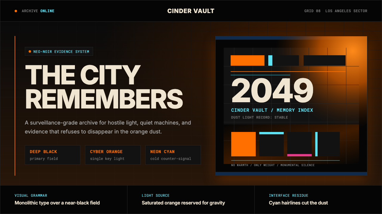 Blade Runner 2049Noir with tectonic weight. Orange dust, cyan hairlines, and monumental Inter…
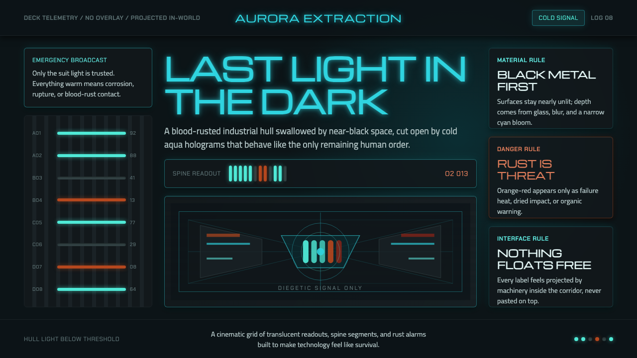 Dead Space IshimuraLast light in the dark. Near-black rust cut by aqua holographic panels.
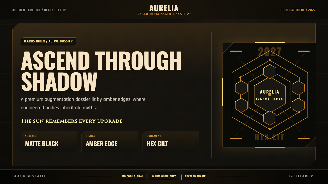 Deus Ex: Human RevolutionDystopia wears gold. Near-black panels glow with amber bevels and hex motifs.
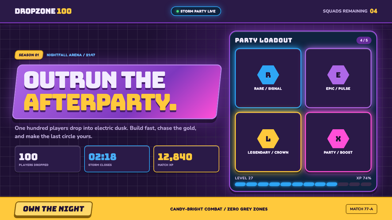 Fortnite (2017 Battle Royale)Battle royale becomes a neon party. Chunky caps and rarity glows electrify st…
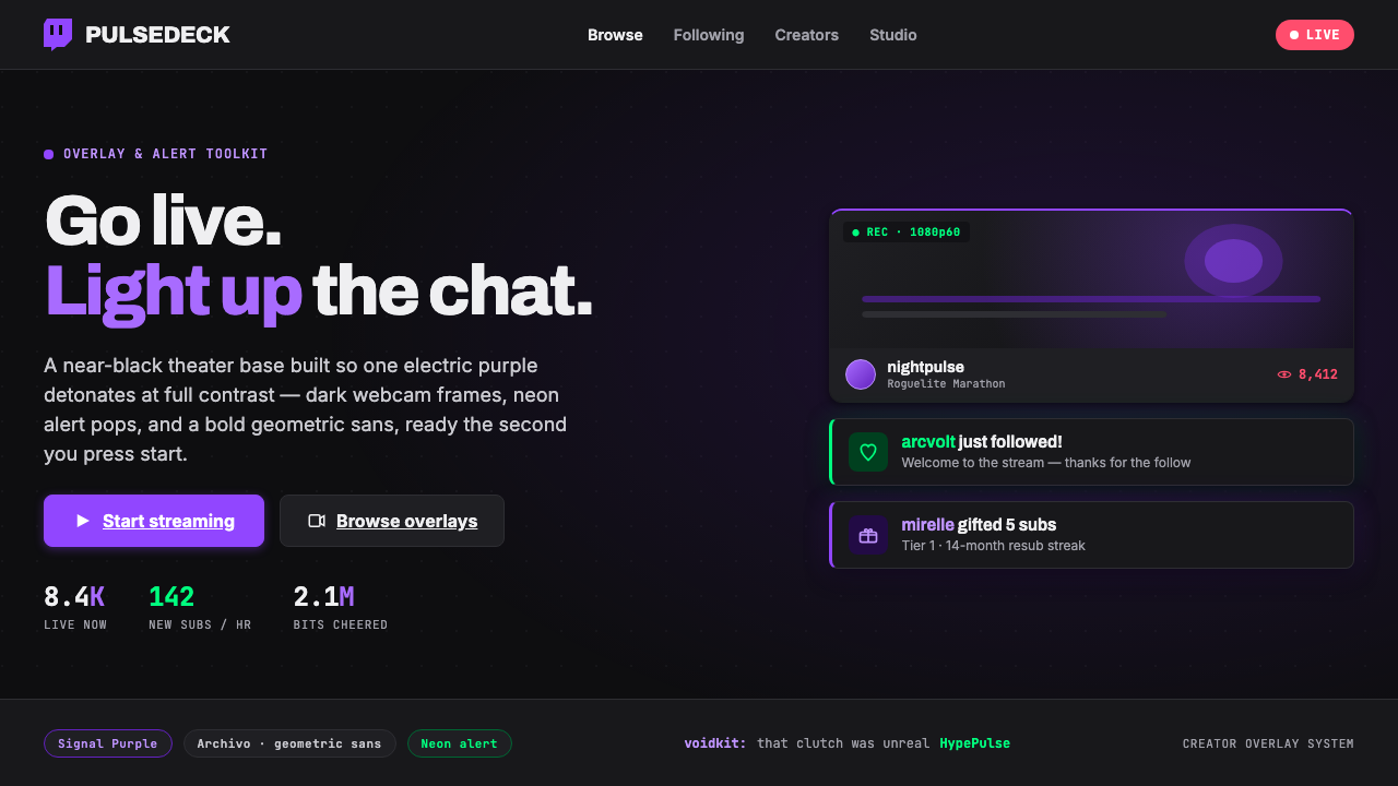 Twitch Streamer OverlayNear-black theater base, one electric purple. Dark webcam frames, neon alert…
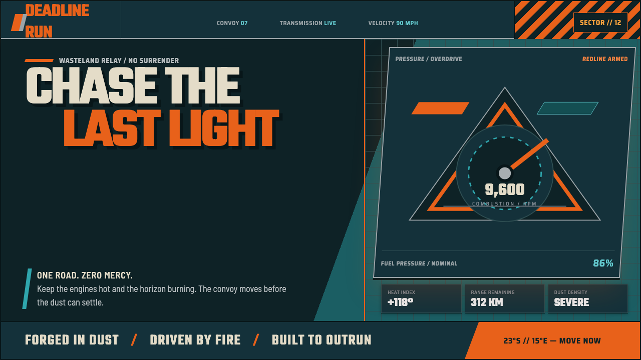 Mad Max Fury Road (2015)Built to roar. Molten saffron cuts through petrol teal, riveted grids, and ha…