What is Twitch Streamer Overlay?
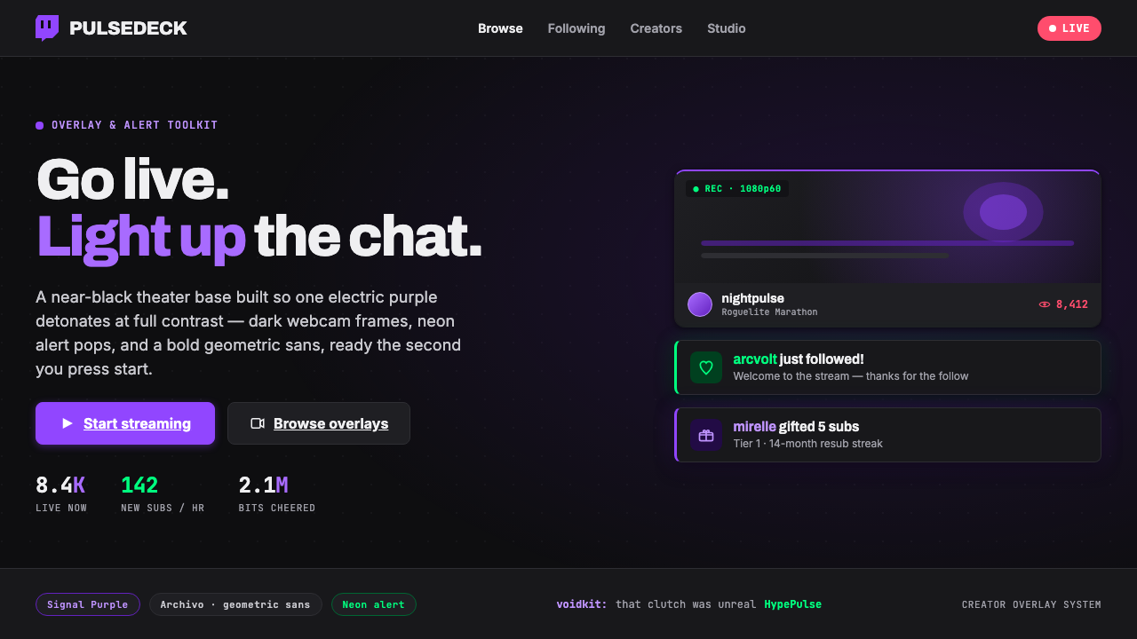
Twitch Streamer Overlay turns the live stream into a dark theater: the audience sees the broadcast through layered panels, electric purple signals, and alerts built to interrupt without losing the show.
Twitch Streamer Overlay in brief
Twitch Streamer Overlay is the visual language associated with live-streaming creator culture on Twitch: a near-black stage, deep interface panels, webcam frames, animated-feeling alert moments, pixel-flavored emotes, and bold geometric sans-serif type. It is not a single fixed template so much as a recognizable operating system for a live screen. The design has to hold a game, a host, chat, activity prompts, supporter acknowledgements, and changing audience energy at once. Darkness creates the container; a vivid purple accent makes important actions and events immediately legible.
The style is built around contrast and interruption. Most of the screen remains quiet, dark, and structurally organized so that an alert, subscription prompt, or creator callout can arrive with real force. Purple is the primary connective signal across controls and calls to action, while an occasional neon-green accent can mark a special alert state. These bright moments do not replace the dark system beneath them; they depend on it. The visual effect is closer to lit equipment in a venue than to a conventional white-page interface.
Since the 2019 Twitch rebrand, Roobert has been central to the typographic impression: mono-linear, geometric, direct, and sturdy enough to survive rapid attention shifts. Its presence gives the overlay a branded digital confidence without asking the viewer to decode ornate display lettering. The result is a look that feels native to the dominant live-streaming platform: dense with possible activity, visibly tuned for gaming culture, yet organized around a limited set of surfaces and signals rather than uncontrolled visual noise.
Where does Twitch Streamer Overlay come from?
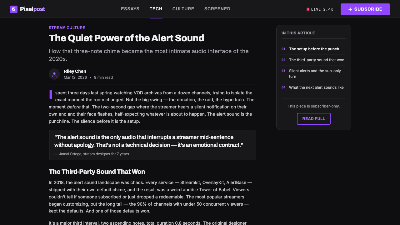
The overlay emerged with Twitch-era creator culture, beginning in the broader period from 2011 to the present. Live streaming changed the screen from a finished piece of media into an active venue. A creator was no longer presenting only a game or video; the broadcast also had to make room for a face camera, audience response, supporter activity, channel identity, and moments of recognition. The overlay became the frame that lets all of those live functions coexist around the central stream.
Its visual environment is global and internet-native, centered on Twitch.tv, the Amazon-owned platform. That setting explains the priority given to dark surfaces and emphatic signaling. Streams are often watched for long stretches and may contain bright, fast-moving game footage, so the surrounding interface needs to recede while still making interactive moments unmistakable. The near-black theater base answers both needs: it reduces visual competition around the content and gives a single vivid accent maximum presence.
Twitch’s 2019 rebrand gave this ecosystem a more coherent typographic and brand foundation. Roobert, from the Displaay foundry, became the key typeface associated with the refreshed identity. Its mono-linear geometric construction suits labels, controls, callouts, and title-scale statements without pulling the broadcast toward nostalgia or luxury. The brand purple provides continuity from platform interface to creator-facing prompts, helping an overlay feel connected to Twitch even when every channel’s content and personality differs.
The style also belongs to the overlap of dark-UI product design and gamer overlay subculture. Pixel emotes, framed cameras, alert pops, and high-saturation signals come from a medium where the interface is not hidden entirely: it is part of the performance. Yet the best overlays do not treat every region as an advertisement. They establish a dark stage first, then let participation become visible in controlled bursts. That balance is the culture’s core design problem and the reason the visual language remains so recognizable.
What defines the Twitch Streamer Overlay look?
Theater Darkness
The base is near-black rather than merely dark gray, creating the sensation that the content sits inside a theater or control-room environment. Dark surfaces are layered so webcam frames, information bars, and surrounding modules remain distinguishable without demanding equal attention. The darkness is functional: it gives game footage and creator presence room to breathe, reduces distraction around a busy stream, and makes bright signals feel intentional rather than decorative.
Electric Purple Signal
One electric purple carries the identity of the system. It is most effective when reserved for subscribe-oriented calls to action, selected states, key labels, and the edges or moments that need immediate recognition. Against the theater base, purple reads as illumination rather than fill. Repeating it with discipline creates continuity across a screen full of changing content; spreading competing bright colors across every panel weakens the signal it is meant to provide.
Geometric Sans Typography
Roobert establishes the characteristic voice: mono-linear, geometric, and confident without becoming ornamental. Use type to separate live priorities clearly: the stream title, immediate alert, channel label, and supporting metadata should never sound equally loud. Large, forceful headings can announce a moment; compact labels can keep utility information present at the edges. The typography should feel like interface chrome with personality, not like a decorative gaming logo pasted over content.
Framed Live Surfaces
Webcam and information areas appear as dark framed panels, giving the stream a visible stage architecture. A frame should clarify ownership and protect readability, not turn every element into a heavy box. The most useful panels separate enduring regions from transient content: the host camera, channel information, chat-adjacent utilities, and support areas. Their edges should be crisp and deliberate, while the internal content remains visually quieter than the live image or alert currently deserving focus.
Neon Event Pops
Alerts are the style’s theatrical punctuation. They arrive as a distinct bright event against a stable dark field, often using purple and, for occasional special emphasis, neon green. Their visual role is to recognize participation: a subscription-oriented prompt, a support moment, or another live activity that deserves acknowledgement. Because an alert interrupts the screen, it should be compact in message, unmistakable in hierarchy, and visually related to the system rather than styled as a separate promotional banner.
Pixel Culture and Controlled Saturation
Pixel emotes supply the gamer and community dimension of the style. They introduce small bursts of character into an otherwise engineered system, reminding viewers that the screen is social rather than purely technical. High-saturation accents work best as those bursts: a reaction, a status, a reward, or a celebratory alert. If every icon, border, and panel is equally neon, the overlay loses both hierarchy and the dark-stage calm that makes a live moment feel significant.
Who shaped Twitch Streamer Overlay?
Emmett Shear is one of the key figures named in the origin of Twitch’s live-streaming creator economy. Within this visual story, the platform matters because it made live participation central to the screen: a creator’s broadcast is accompanied by audience activity, channel identity, and recurring prompts for engagement. The overlay language developed to make those simultaneous signals legible without displacing the stream itself.
Justin Kan is also identified as a key figure in Twitch’s origin. The significance of that origin for design is not biography for its own sake, but the medium it helped establish: a global live environment where interface and content appear together. This condition favors a visual system with a stable dark frame, a clear branded accent, and compact event signals that can respond to audience activity in public view.
Displaay is the foundry associated with Roobert, the geometric mono-linear typeface emphasized in Twitch’s 2019 rebrand. Roobert gives the system a consistent typographic tool for channel labels, action prompts, alerts, and informational hierarchy. Its importance is practical as well as visual: a live interface needs lettering that remains direct and recognizable while the viewer’s attention shifts between motion, chat, creator presence, and platform activity.
How do you use Twitch Streamer Overlay today?
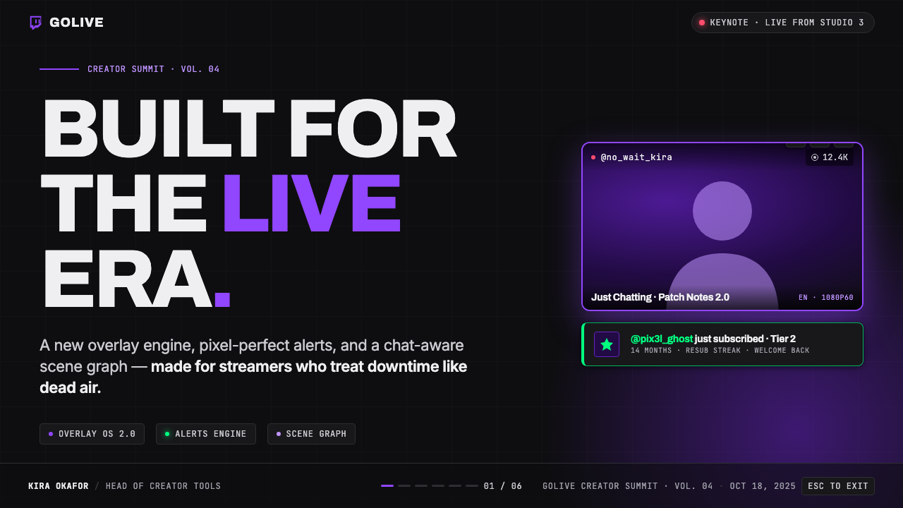
For presentation slides, use the overlay language as an event-stage system rather than as a literal stream mockup. A cover slide can place the title in bold geometric type on a near-black field, with one electric-purple structural accent and a restrained framed region for a subtitle or speaker detail. Content slides should retain the same dark theater base, using panels only where they clarify categories or discussion modules. The visual question is always whether an element is stage architecture or merely another box.
Data slides benefit from the style when they distinguish ambient context from the current signal. Keep supporting labels and explanatory notes subdued on dark surfaces, then use purple to direct attention toward the decisive series, callout, or active state. An occasional neon-green cue can identify an exceptional event, but it should remain exceptional. Charts should feel integrated into the overlay’s screen logic: direct labels, crisp separation, and an obvious path from summary to detail rather than a crowded collection of luminous decorations.
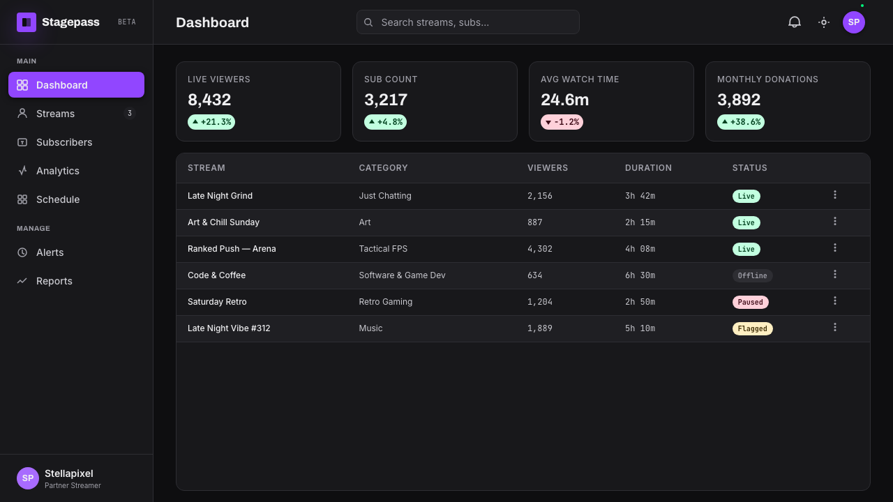
For web interfaces, Twitch Streamer Overlay works especially well for creator dashboards, channel-management tools, subscriber experiences, and pricing or upgrade pages where activity and hierarchy need to feel immediate. Build the page as a sequence of dark surfaces with a clear distinction between persistent navigation, content panels, and live-status signals. Purple should make actions and selected states easy to locate. On pricing pages, use it to give the primary decision a single confident focal point rather than outlining every option with equally forceful emphasis.
For editorial and marketing work, treat the look as a visual translation of live energy. A campaign page can open with a near-black hero, bold type, one purple signal, and a framed media region, then move through content in quieter dark sections. Creator stories can use webcam-like framing as a recurring editorial device, while pixel emotes or alert motifs can appear sparingly as community markers. The common mistake is confusing live-stream energy with permanent intensity: covering every surface with neon, heavy outlines, and alert treatment leaves no visual silence. The dark base must stay dominant so the important moment can actually pop.
Twitch Streamer Overlay — FAQ
Is a Twitch Streamer Overlay just a dark gaming interface?
No. Dark UI is one component, but the defining idea is live-stage hierarchy. The overlay coordinates a stream, creator presence, prompts, supporter recognition, emotes, and changing activity on one screen. Its dark base is useful because it lets those functions coexist, while electric purple and occasional alert accents specify what needs attention now. A generic dark game interface can be quiet and cinematic; an overlay must also be legible in public, real-time interaction.
Why should purple be used so selectively?
Purple works because the near-black theater base gives it unusual contrast and because it connects the design to Twitch’s visual identity. If it becomes the default fill for every panel, button, border, and label, it stops functioning as a signal. Reserve it for actions, selected states, subscription-oriented prompts, and the few visual moments that should feel lit. The restraint makes the screen more recognizable and makes each purple appearance more useful.
Can this style work without a webcam frame?
Yes. The webcam frame is a recognizable live-stream component, not the sole requirement. A creator dashboard, alert page, or pricing experience can retain the style through the near-black base, layered dark surfaces, geometric sans-serif hierarchy, and electric-purple action signal. When a webcam is absent, use framing around another meaningful live region, such as a media preview, channel-status module, or activity feed. The frame should represent a role in the broadcast system, not a decorative empty rectangle.
When is neon green appropriate?
Use it as an occasional alert accent, not as a second permanent brand color. It is valuable when a live event needs to feel distinct from the normal purple action system: a special status, a celebratory interruption, or an unusually urgent recognition moment. Because it is highly visible against the dark base, even a small use can dominate a screen. If green appears constantly beside purple, the overlay loses the disciplined single-accent logic that gives it its Twitch-like clarity.
Related design styles
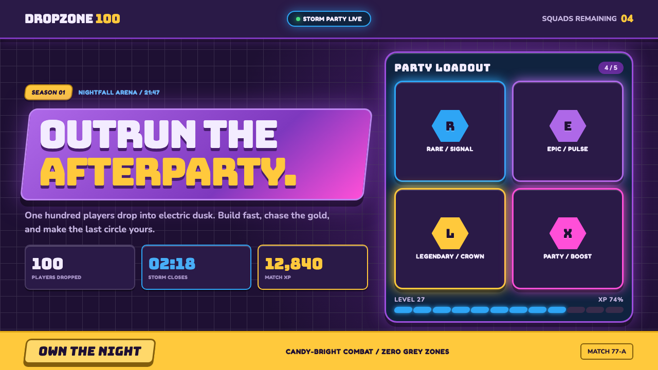 Fortnite (2017 Battle Royale)Battle royale becomes a neon party. Chunky caps and rarity glows electrify st…
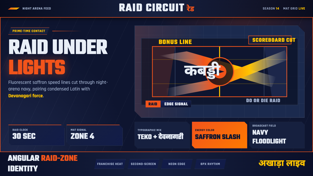 Pro Kabaddi LeagueBroadcast electricity. Saffron slashes, navy court grids, and Devanagari type…
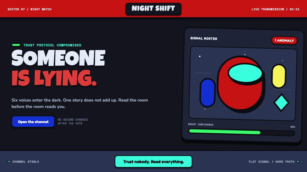 Among Us (crewmate space)Trust is ready to break. Loud capsule colors cut through a navy void with har…
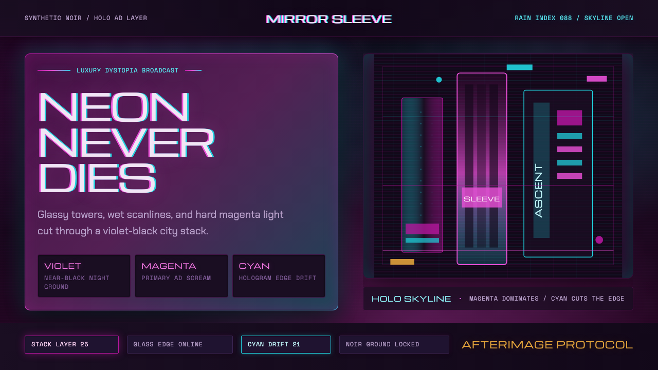 Altered CarbonNeon screams off noir. Magenta glass, cyan scanlines, and stacked vertical si…
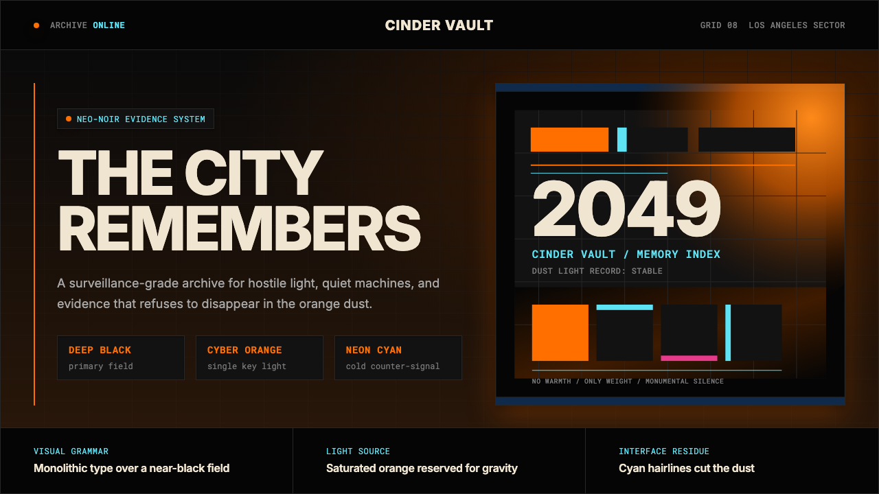 Blade Runner 2049Noir with tectonic weight. Orange dust, cyan hairlines, and monumental Inter…
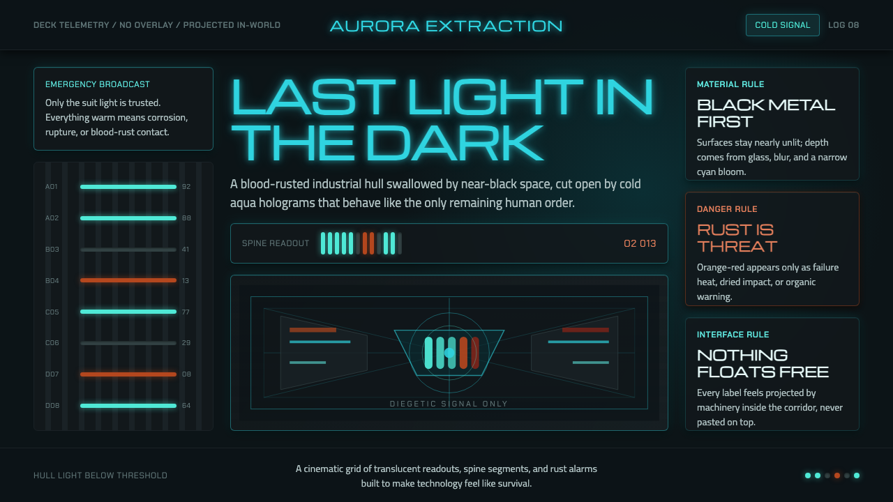 Dead Space IshimuraLast light in the dark. Near-black rust cut by aqua holographic panels.