What is Among Us (crewmate space)?
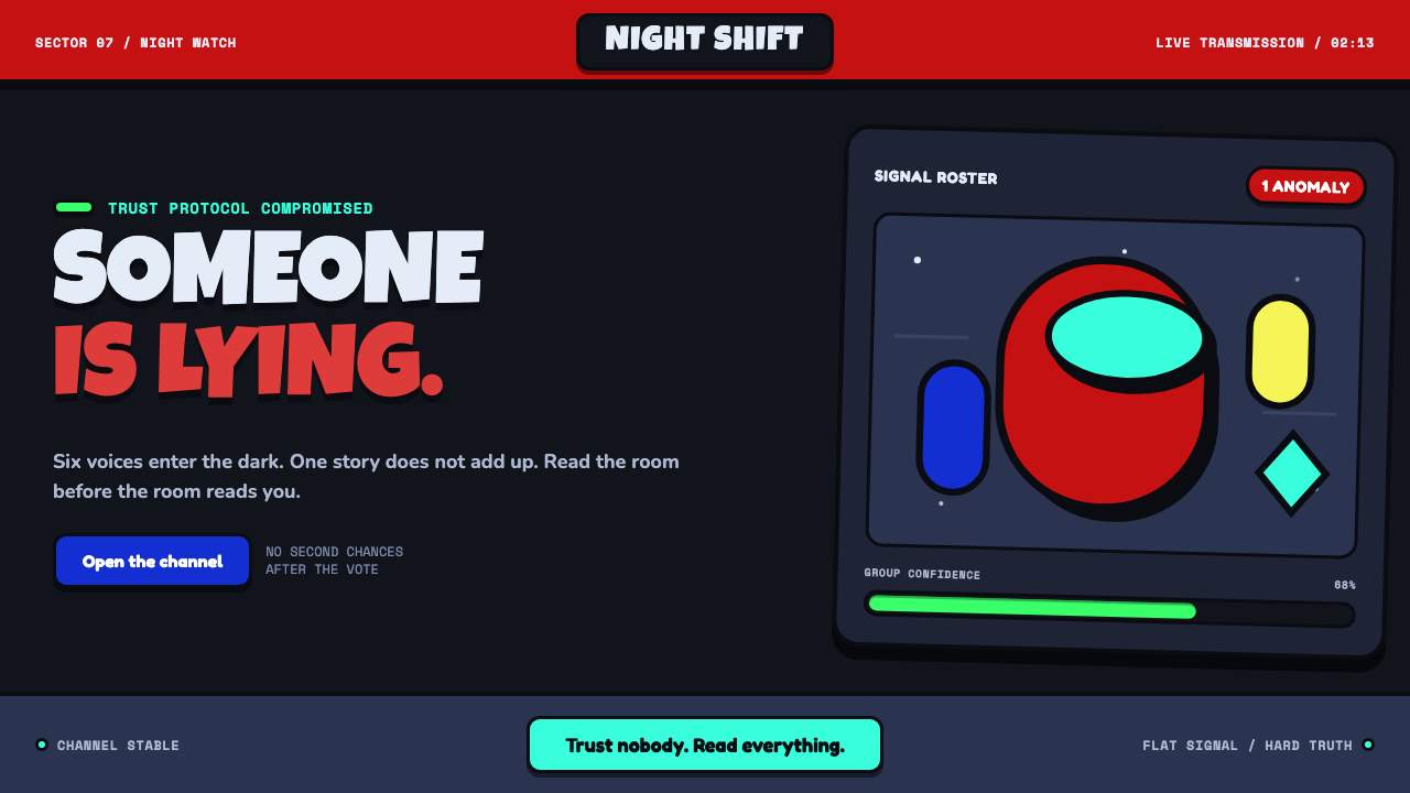
Among Us turns suspicion into interface: loud capsule colors, thick outlines, and hard shadows make every player look readable just before they become a suspect.
Among Us (crewmate space) in brief
Among Us is a dark, flat-cartoon game aesthetic built around social deduction: a group of crewmates shares a damaged spacecraft, while the possibility of deception sits inside every interaction. Its visual language is deliberately immediate. Bean-shaped astronauts in loud costume colors float against a near-black navy void, where thick outlines separate every object from the background and hard, unblurred shadows make flat components feel physically placed without becoming realistic. The result is playful on first contact and tense on second glance.
One capsule silhouette organizes nearly the entire system. It appears in the crewmate body, button bodies, player chips, vents, vote cards, and other compact interface elements. Repetition gives the style an unusually strong internal logic: even when a screen contains tasks, players, navigation, warnings, and status information, it still feels like one small world. Rounded forms soften the threat of accusation, while the surrounding dark space keeps the mood unsettled.
Color does much of the narrative work. The supplied palette is described as twelve unmixed, playground-bright colors, with red associated with the imposter, blue with crewmates, and green with task progress. These colors do not aim for naturalism or atmospheric subtlety. They act as fast identifiers in a social system where the user must distinguish people, states, and risks at a glance. Among Us therefore treats trust as an interface condition: visible, fragile, and always liable to be overturned.
Where does Among Us (crewmate space) come from?
Among Us was released in June 2018 in Redmond, Washington, USA. Its supplied origin context places it within indie game UI, the social-deduction genre, flat cartoon game design, and later pandemic-era meme culture. Those categories explain the style's unusually concentrated visual priorities. It has to support a game about reading other people while leaving enough room for ambiguity that no single visual signal settles the social question.
The social-deduction setting gives the interface its central tension. Players need to recognize a crewmate quickly, remember a color, notice a status change, and enter a vote or task interaction without losing the larger atmosphere of doubt. Rather than solving this with dense realism, the visual system reduces characters and controls to bold, highly repeatable signs. A crewmate is not a detailed space-suit illustration; it is a capsule body, a visor, an outline, a costume color, and a place in a group.
The supplied material describes the game as exploding in mid-2020 during the pandemic. In that context, its compressed-screen readability became part of its identity. The style was built to be understood instantly across a Discord screen-share: high-contrast silhouettes, clear color separation, simple forms, and almost no surface effects that could disappear when viewed at reduced fidelity. What might otherwise look like an intentionally simple cartoon language becomes a practical communication system for shared remote play.
Its visual vocabulary also aligned naturally with meme culture. The crewmate silhouette is simple enough to be recognized when isolated, repeated, dressed differently, or placed in a new situation. Yet it remains specific enough to carry the game's emotional premise: someone in this familiar-looking group may be lying. That combination of reproducibility and suspicion is why the aesthetic can feel both friendly and accusatory. It is a flat cartoon world whose strongest dramatic device is not an illustration, but a recognizable shape placed next to another recognizable shape.
What defines the Among Us (crewmate space) look?
Capsule Silhouette
The bean-shaped crewmate is the master form. Its rounded capsule logic extends beyond the character into buttons, chips, vents, and vote cards, making the interface feel coherent before the user reads any label. The silhouette is compact, friendly, and easy to identify in a crowd, but its repetition also supports the game's premise: visually similar figures must be socially distinguished.
Color as Identity
Loud, unmixed costume colors carry identity and state rather than atmosphere. Red, blue, and green are given explicit narrative associations in the supplied material, while the broader set of bright colors keeps individual players distinguishable. Color should arrive as a clear categorical signal, not as a subtle tonal wash. In this system, a player color is evidence, memory aid, and dramatic trigger.
Thick Cartoon Outlines
Heavy outlines define the object boundary everywhere that recognition matters. They prevent loud colors from dissolving into the navy void and keep shapes legible when screens are compressed or shared remotely. The outline is not a decorative finish applied after the fact. It is the structural edge that lets characters, controls, and props retain their cartoon certainty against a dark environment.
Hard Shadow
Shadows are hard-edged and unblurred, with no attempt to simulate soft ambient light. They create separation and tactile placement while preserving the flat-vector character of the art. A hard shadow reads as another deliberate shape, not as realism. This makes the interface feel cut out, stacked, and game-like: clear enough for action, stylized enough for play.
Navy Void
The near-black navy background functions as more than a dark theme. It is the vacuum around a derelict ship and the negative space that gives bright crewmates their force. Because the field is visually quiet, colored bodies, white labels, warning states, and structural outlines can all arrive with immediate contrast. The darkness holds the mood of isolation while the cartoon forms keep it accessible.
Flat Vector Discipline
The style excludes gradients, gloss, and realistic rendering. Surfaces remain flat; forms are explained by contour, color, and hard shadow instead of reflected light or texture. This restraint is crucial to its instant readability. Every component answers the same visual question directly: what is this, who does it belong to, and what state is it in?
Who shaped Among Us (crewmate space)?
Marcus Bromander is listed in the supplied origin material as one of the key figures associated with Among Us. Within the approved account, the name belongs to the group connected to a visual language that combines indie game UI, social deduction, and flat cartoon design.
Forest Willard is named in the supplied material as a key figure for Among Us. The source situates the work in a compact, highly legible game-design system shaped for social interaction, remote shared viewing, and the rapid recognition of player identity.
Amy Liu appears among the key figures in the approved source material. That material connects Among Us to the 2018 release in Redmond and to the later mid-2020 pandemic-era cultural moment in which its clear crewmate silhouette became especially recognizable.
Gary Porter is listed as a key figure in the supplied Among Us origin record. The approved context identifies the work with flat cartoon game design and pandemic-era meme culture, two settings in which a simple repeatable shape can carry both humor and suspicion.
How do you use Among Us (crewmate space) today?
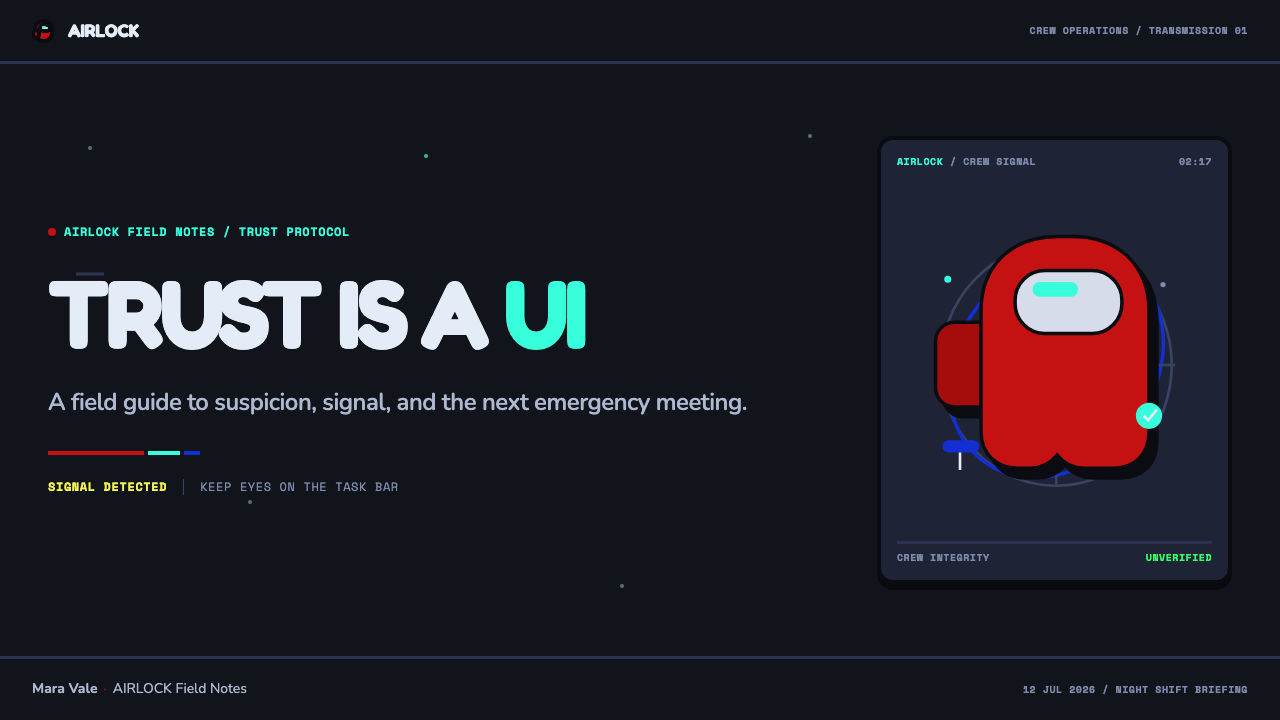
For presentation covers, use the style as a compact social drama rather than as generic space decoration. Let a single capsule figure or a small cluster of differently colored figures occupy a dark field, then give the title the same visual certainty as the characters: direct, high-contrast, and clearly separated from surrounding space. On content slides, repeat capsule-ended labels and hard-shadow panels to organize sections. Keep supporting copy concise, because the style is strongest when the audience can scan the hierarchy as quickly as it can identify a player.
For data slides, translate the system's identity logic into categorical diagrams. Distinct bright colors can separate groups, statuses, or stages, while a task-like green can signal completion or forward movement when that meaning remains consistent throughout the deck. Use thick boundaries and flat fills to make charts read like game objects rather than polished business ornaments. The dark field should provide contrast and focus, not become a decorative starfield competing with the data.
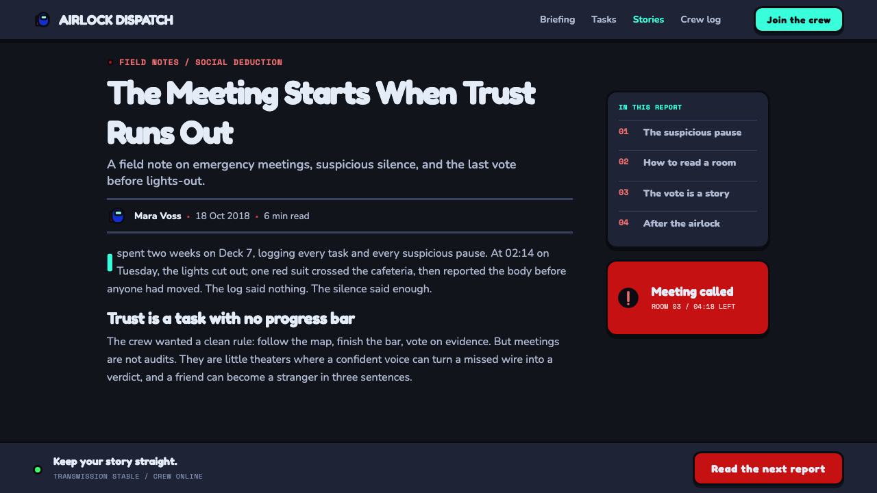
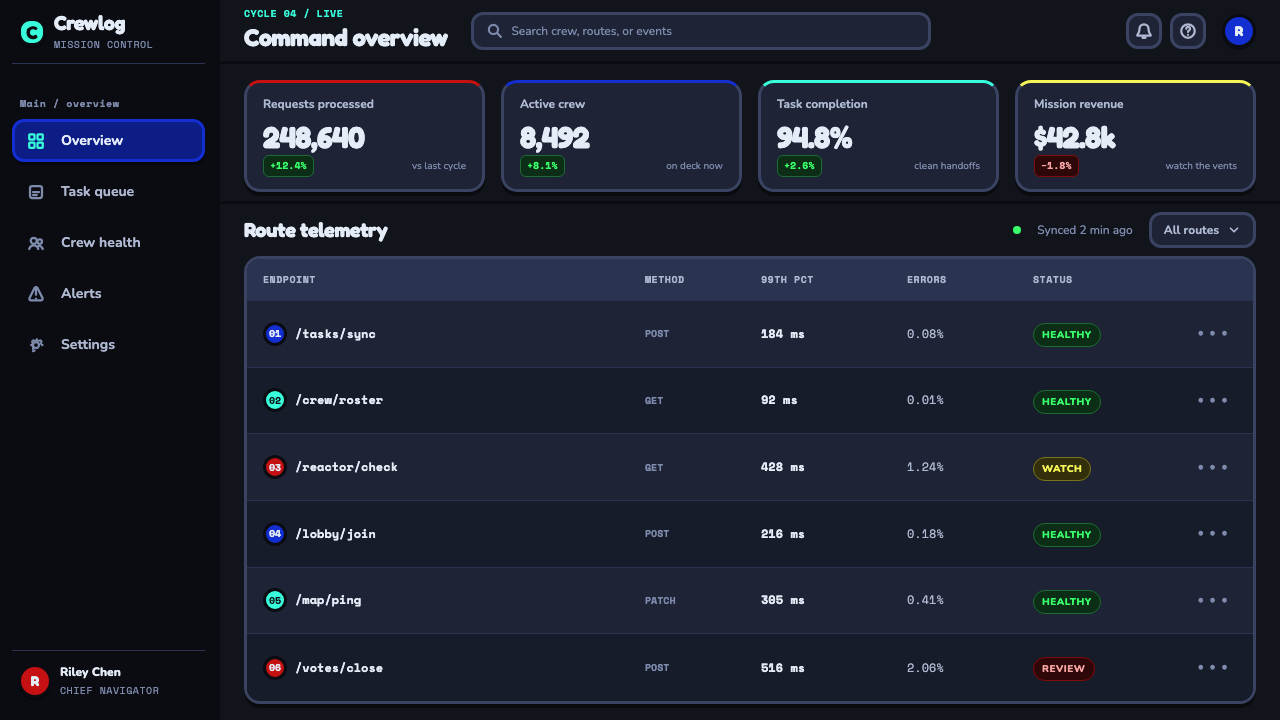
For web interfaces, Among Us works best in dashboards, collaborative rooms, onboarding flows, status pages, and pricing comparisons that benefit from obvious state changes. Use the capsule as the recurring container for player identity, progress, choice, and action. A dark navy environment, bright categorical accents, white or pale text, strong outlines, and hard shadow can produce an interface that feels energized without requiring visual complexity. Important actions should look like objects one can recognize instantly, not quiet text links hidden in the interface.
For editorial and marketing work, use the aesthetic to frame a story of participation, uncertainty, or group behavior. A feature page can alternate a dark, quiet background with bright character-like modules, using short call-outs that resemble vote prompts or status cards. Social posts can isolate one crewmate-like capsule or a suspiciously separated group, then let a direct headline supply the narrative turn. The graphic language is especially useful when the message involves teamwork, accountability, collaboration, or a playful warning that something does not add up.
The most common mistake is to treat the style as a collection of random bright colors and space icons. Its real coherence comes from constraints: one repeated capsule form, categorical color meaning, thick outlines, hard shadows, and a deep quiet field around the action. Adding glossy surfaces, soft atmospheric shadows, dense cosmic imagery, or many unrelated rounded components weakens that logic. The goal is not to make a screen look like outer space; it is to make identity and suspicion legible with the speed of a game callout.
Among Us (crewmate space) — FAQ
Is the Among Us look simply a dark cartoon style?
No. The dark cartoon treatment is only one layer. Its defining system combines a near-black navy field, a repeated capsule silhouette, loud categorical colors, thick outlines, and hard unblurred shadows. These choices work together to make players and states readable under social pressure. Remove the identity logic and the repeated form, and a dark cartoon interface may look adjacent to the style without carrying its distinctive tension.
Why are hard shadows more appropriate than soft shadows here?
Hard shadows preserve the flat-vector premise while still separating components from the dark background. They read as deliberate graphic shapes, matching the thick outlines and simple fills. Soft shadows introduce a more atmospheric, realistic lighting model that conflicts with the supplied style's rejection of blur, gloss, and gradients. The hard version keeps the interface playful, decisive, and readable in compressed shared viewing.
Can this style work for a serious dashboard?
Yes, when the product benefits from immediate state recognition and a clear sense of participation. The capsule containers, categorical color signals, bold boundaries, and dark field can make ownership, progress, warnings, and group activity easy to scan. It is less suitable when the product needs a quiet institutional tone or when too many categories must be shown at once. The style works best when its playfulness reinforces, rather than distracts from, the operational meaning.
How should color be assigned in an Among Us-inspired interface?
Assign colors to identities, statuses, or actions and keep those assignments stable. The supplied material explicitly connects red with the imposter, blue with crewmates, and green with task progress, demonstrating the principle: color should help users remember what a thing means. Bright colors are strongest when each has a job. Using them indiscriminately as decoration reduces the rapid recognition that the system depends on.
What should be avoided when adapting the aesthetic?
Avoid realism added for polish: gradients, glossy highlights, blurred shadows, and textured space imagery all dilute the supplied visual language. Also avoid making every object a different rounded form. The style depends on one dominant capsule family, not generic softness. Finally, do not make every bright color equally important. The visual system becomes clearer when color, outline, and placement each communicate a specific state or relationship.
Related design styles
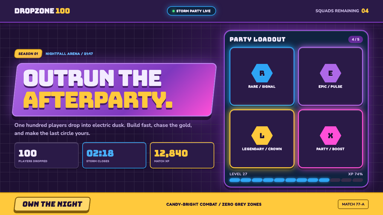 Fortnite (2017 Battle Royale)Battle royale becomes a neon party. Chunky caps and rarity glows electrify st…
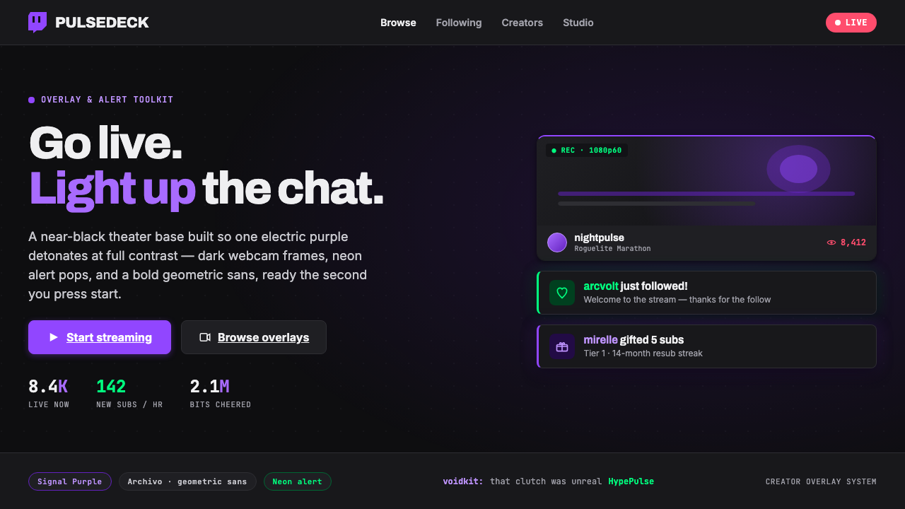 Twitch Streamer OverlayNear-black theater base, one electric purple. Dark webcam frames, neon alert…
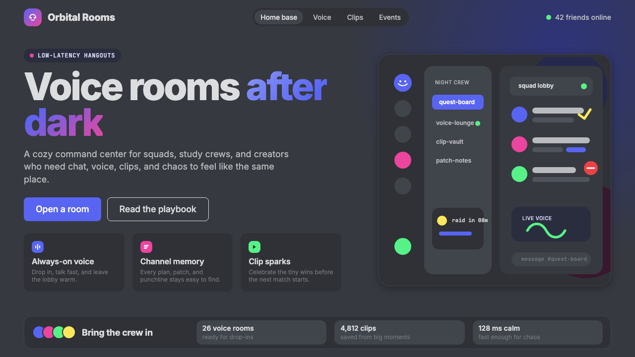 Discord 2024Blurple cozy. Charcoal grounds, illustrated characters — every surface says '…
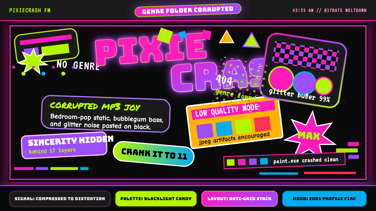 Hyperpop 100 gecs (2019)Cute chaos detonates. Blacklight candy, Bungee type, and pixel trash collide.
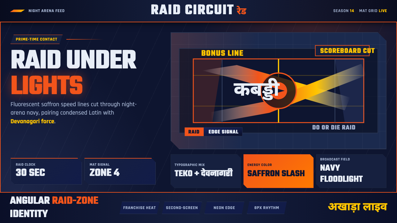 Pro Kabaddi LeagueBroadcast electricity. Saffron slashes, navy court grids, and Devanagari type…
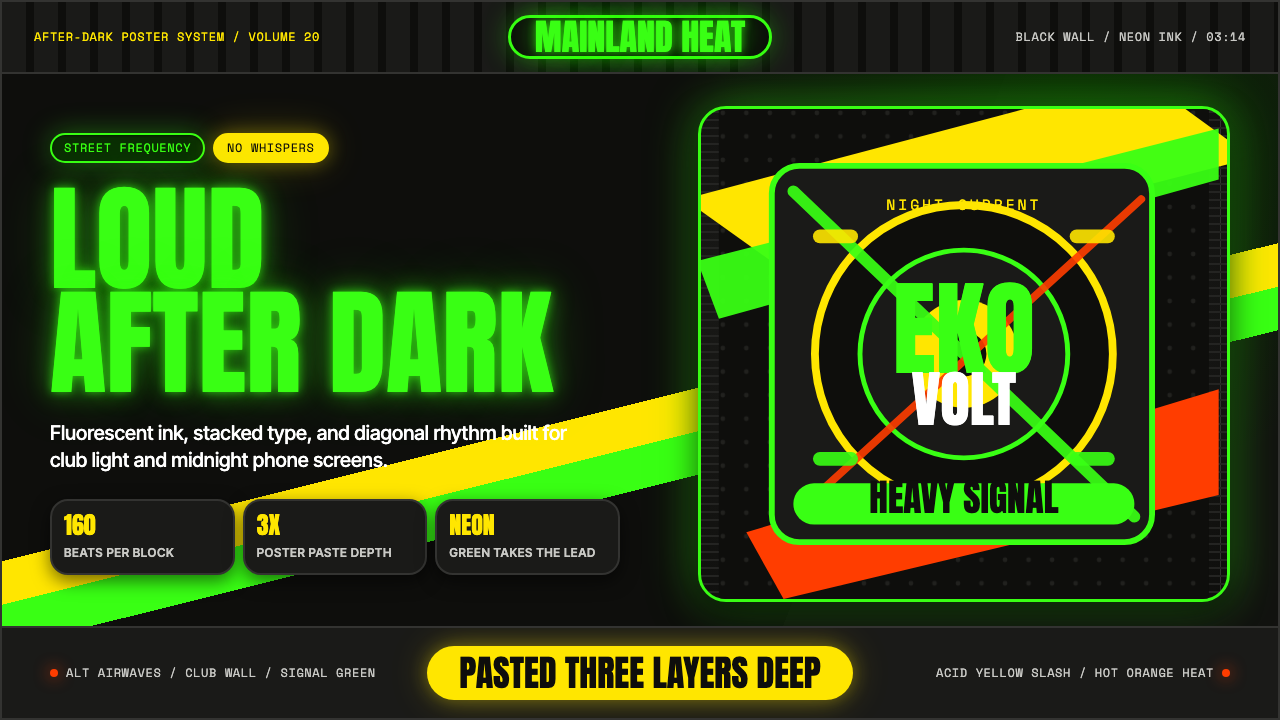 Afrobeats LagosLoud after dark. Neon green type and yellow diagonals hit black like pasted s…