What is Fortnite (2017 Battle Royale)?
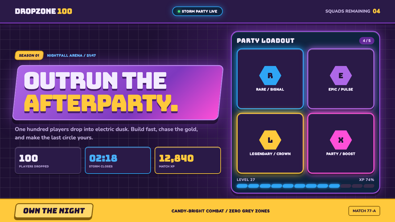
Fortnite Battle Royale turned the battle royale into a neon party: chunky capitals, rarity glows, and storm-purple dusk make competition feel celebratory.
Fortnite (2017 Battle Royale) in brief
Fortnite Battle Royale is the visual language associated with the game’s 2017 launch: a war zone rendered as an exuberant nighttime playground. Its world is candy-bright rather than muddy, stylized rather than naturalistic, and charged by the contrast between cheerful objects and an approaching violet storm. A floating purple bus, carried by a rainbow balloon, establishes the premise immediately. This is a dangerous game world, but it refuses the usual visual seriousness of danger.
The style joins toon-shaded stylized 3D with the urgency of free-to-play battle royale and the constant legibility demands of a live-service game UI. Surfaces feel like bright molded plastic; forms are broad, chunky, beveled, and marked by firm outlines. The palette is built around electric purple and toy blue, then energized by treasure gold and llama pink. The result is not realism softened by color. It is a deliberately heightened world in which every material, reward, and warning needs to read at a glance.
Its interface is as central to the style as its environment. Fat condensed capitals appear on angled banners, rarity is communicated through glowing hexagonal badges, and progress is expressed through segmented neon bars. The yellow Victory Royale screen functions as a ceremonial climax: a single, unmistakable reward image after the confusion of the match. Fortnite’s visual system makes status, threat, loot, progress, and victory feel like parts of the same lively spectacle.
Where does Fortnite (2017 Battle Royale) come from?
Fortnite Battle Royale launched on September 26, 2017, during a period identified with the emergence of free-to-play battle royale and live-service game UI. Its origin is tied to Cary, North Carolina, USA, and to a launch-era visual proposition that made battle royale immediately distinguishable from a conventional military game. Instead of presenting survival as grim endurance, it framed the match as a brightly staged event whose danger is visible, legible, and exciting.
The 2017–2018 era matters because the style is not merely an arrangement of colors or a collection of interface ornaments. It belongs to an experience organized around an enclosing storm, collectible rarity, visible progression, and an emphatic victory state. The storm-purple dusk supplies pressure and atmosphere; the saturated built world supplies energy and contrast. The interface must keep up with that tempo, delivering fast signals without abandoning the playful tone of the world around it.
The source movements behind the style are toon-shaded stylized 3D, free-to-play battle royale, and live-service game UI. Together they explain its unusual combination of visual softness and competitive clarity. Toon-shaded forms permit exaggerated, toy-like objects. Battle royale requires immediate distinctions among danger, equipment, and reward. Live-service UI makes progress and rarity continuously visible. The system therefore favors large forms, strong silhouettes, outlined objects, glowing badges, and progress indicators that read as celebratory graphics rather than neutral administration.
Tim Sweeney, Darren Sugg, and Donald Mustard are identified as key figures for this origin. Within the available material, their names belong to the same 2017–2018 Battle Royale context: a Cary-based visual identity in which purple storm gloom and saturated plastic joy are not opposites to reconcile, but the two conditions that make each other more vivid.
What defines the Fortnite (2017 Battle Royale) look?
Storm-Purple Atmosphere
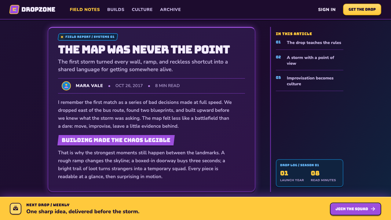
Purple dusk is the style’s emotional stage. The violet storm wall brings urgency and a sense of enclosure, while the rest of the world remains theatrically bright. Purple is not used as a quiet background neutral; it is an active atmospheric force that makes yellow rewards, blue objects, and pink accents appear more electric. The key contrast is cheerful saturation against gathering gloom.
Chunky Stylized Form
Objects are chunky, beveled, and outlined. Their forms favor broad planes and strong silhouettes over fine naturalistic detail, producing a world that feels constructed from molded, durable play materials. This softness of form does not weaken readability. On the contrary, bevels and outlines separate objects from their surroundings and help every item maintain a recognizable presence amid visual activity.
Saturated Plastic Joy
The palette rejects dust, grime, and muted realism. Electric purple and toy blue establish the main field, while treasure gold and llama pink punctuate important moments. Color behaves like a reward system as much as an atmospheric system: it identifies value, raises excitement, and turns utility into spectacle. The intended feeling is bright synthetic delight, never weathered authenticity.
Angled Banner Typography
Fat condensed capitals are stamped onto angled banners, giving text the force of an announcement rather than a passive label. The compressed uppercase construction feels loud, physical, and immediate. Diagonal banner shapes extend that energy through the layout, making headings appear to enter the scene rather than simply sit above it. Typography is a gameplay signal and a celebratory prop at once.
Rarity as Glow
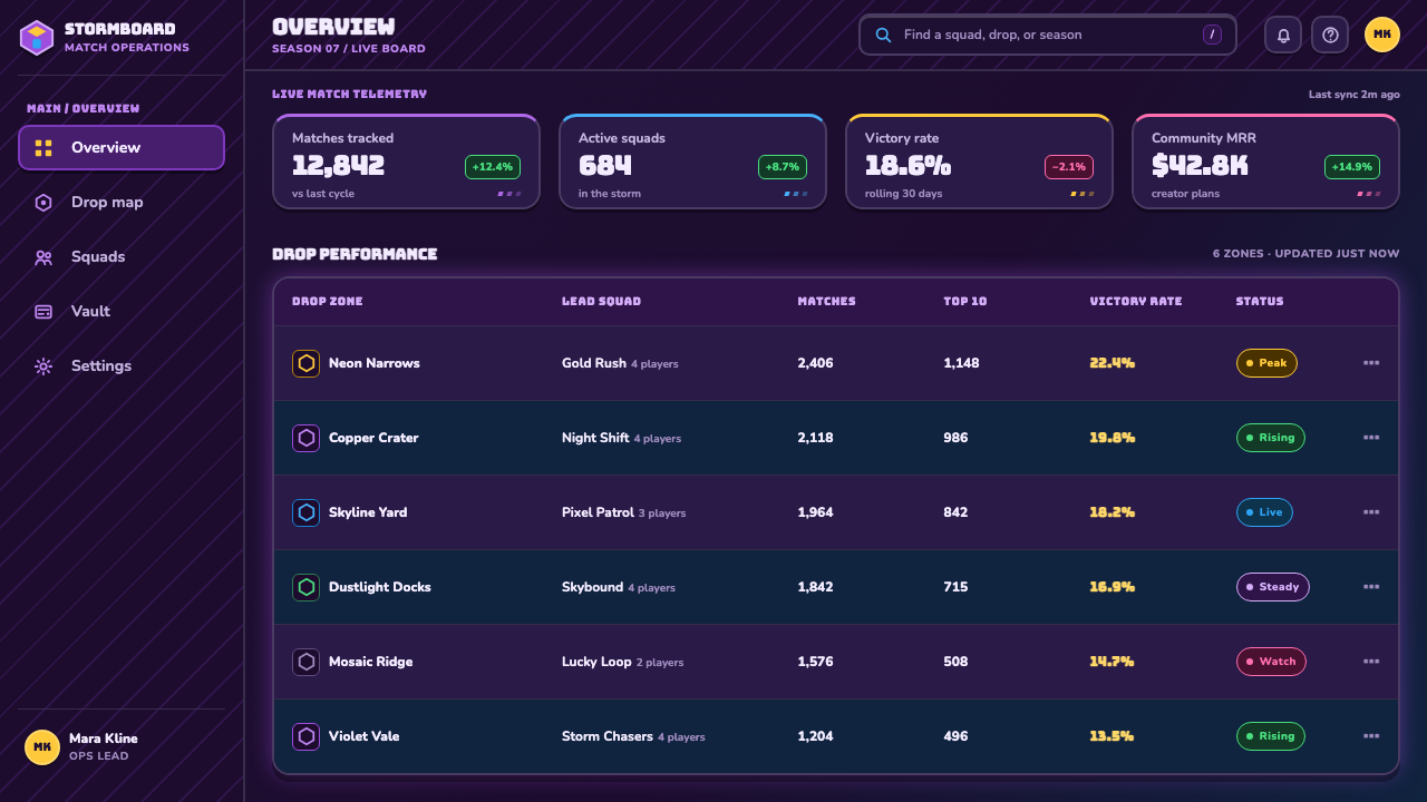
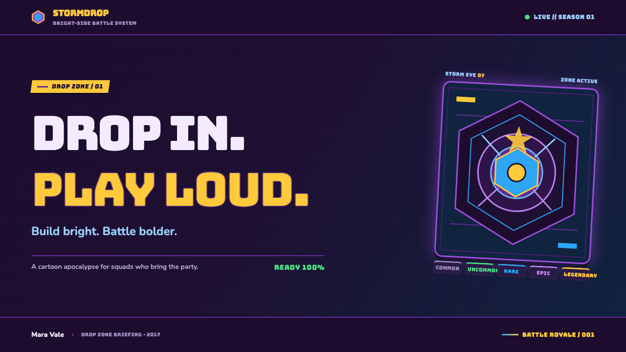
Rarity is expressed through hexagonal badges that glow from grey toward gold. The badge is more than a container for an item category: its geometric frame and luminous treatment make value feel collectible and ceremonial. The progression from subdued grey to gold supplies an intuitive visual ladder, while the glow turns classification into anticipation. A player does not merely read rarity; they feel its promise.
Segmented HUD Rhythm
Neon health and XP bars divide continuous status into visible segments. This creates a rhythm of accumulation, loss, and recovery that belongs naturally to a game HUD. Segmentation makes the interface feel engineered and energetic, while glow prevents it from becoming austere. Progress remains practical information, but it is presented as a moving part of the party-like visual world.
Victory as Ceremony
The yellow Victory Royale splash is treated as sacred visual punctuation. After the storm, movement, loot, and status signals of a match, victory arrives as a concentrated and unmistakable declaration. Its purpose is emotional as well as informational: it confirms success, creates a memorable final image, and preserves the style’s central idea that competition can culminate in spectacle rather than solemnity.
Who shaped Fortnite (2017 Battle Royale)?
Tim Sweeney is identified in the provided material as a key figure of Fortnite’s 2017–2018 Battle Royale origin. His inclusion places him within the Cary, North Carolina context from which this neon, storm-lit visual identity emerged.
Darren Sugg is named as a key figure in the supplied Battle Royale origin material. Within that account, he belongs to the launch-era context where stylized 3D, free-to-play battle royale, and live-service UI were brought into one highly recognizable visual system.
Donald Mustard is listed as a key figure for Fortnite’s 2017–2018 Battle Royale era. The available material associates that era with the game’s defining contrast: candy-bright stylized forms and a violet storm wall closing over nighttime dusk.
How do you use Fortnite (2017 Battle Royale) today?
For presentation covers, use the Fortnite Battle Royale language as a high-energy announcement system. Set a concise title in chunky condensed capitals on an angled banner, then establish the scene with a deep storm-purple field and a limited burst of toy-bright accents. A large outlined object or hexagonal reward shape can act as the focal point. The cover should feel like the opening moment of an event: loud, playful, and immediately directional rather than densely explanatory.
Content slides work best when treated as readable HUD panels rather than as decorative posters. Use strong outlined containers, clear text groups, and banner-like section labels to separate ideas. Let one saturated accent identify the active topic while the broader storm-toned field holds the composition together. The visual goal is quick recognition under pressure: headings should announce, supporting copy should remain calm enough to scan, and decorative energy should reinforce the hierarchy rather than compete with it.
For data slides, translate categories into rarity and progress signals. Hexagonal markers can distinguish groups, segmented bars can express completion or change, and a gold highlight can reserve attention for a primary result. The Fortnite approach is especially effective when data needs to feel active and reward-oriented, such as progress toward a launch, engagement milestones, or a competitive comparison. Keep the chart’s structure direct; the glow and saturated accents should clarify importance, not disguise the underlying information.
In web UI, this style suits dashboards, game-adjacent products, rewards programs, launch pages, and pricing experiences that benefit from immediate hierarchy and exuberant feedback. A storm-dark surface can contain bright outlined cards, rarity-inspired badges, and visible progress strips. Navigation can use condensed uppercase labels and angled active states, while reward or upgrade moments receive the strongest gold and glow treatment. The interface should retain the essential HUD quality: status is always available, but never visually inert.
For editorial and marketing work, use the style to turn ordinary announcements into event-like moments. Campaign headers, feature launches, and community updates can pair stormy backdrops with bright plastic-looking shapes, outlined imagery, and a single celebratory highlight. The common mistake is to add every glow, every bright hue, and every badge at once. Fortnite’s energy comes from a controlled contrast between storm gloom and selected rewards; if every element shouts, rarity, hierarchy, and victory lose their force.
Fortnite (2017 Battle Royale) — FAQ
Is the Fortnite Battle Royale style simply a dark neon style?
No. The dark storm atmosphere is essential, but it exists to heighten a more unusual quality: saturated plastic joy. A generic neon-dark treatment may feel sleek, futuristic, or moody. Fortnite Battle Royale needs chunky stylized forms, outlines, angled banners, readable HUD signals, and reward-driven gold highlights. Its darkness is the pressure around the party, not the party’s main subject.
Why are outlines and bevels so important in this visual language?
They make stylized objects feel physical while keeping them easy to recognize. The source material describes everything as chunky, beveled, and outlined; together, those qualities prevent the candy-bright palette from dissolving into visual noise. Outlines preserve silhouette, while bevels suggest molded volume without requiring naturalistic realism. The result feels robust, toy-like, and immediately readable.
How should rarity be represented in a Fortnite-inspired interface?
Use a visible badge system rather than relying on small text alone. The provided language uses glowing hexagonal rarity badges that progress from grey to gold. What matters is not copying a badge mechanically, but preserving the principle: rarity should have a stable geometric container, a clear visual ladder, and enough luminous emphasis to feel rewarding before the user reads the label.
Can this style work for information-heavy dashboards?
Yes, provided the HUD discipline remains stronger than the decorative impulse. Segmented bars, outlined panels, badge categories, and condensed headings can make status-heavy information easy to scan. The danger is turning every metric into a reward splash. Keep ordinary information quiet enough to read, then reserve the strongest glow, gold, and banner treatment for changes, achievements, or decisions that genuinely deserve priority.
What is the most common mistake in applying the style?
Mistaking saturation for the entire system. Bright purple, blue, pink, and gold are memorable, but they work because they are organized by storm atmosphere, rarity, progress, and victory. If every panel glows and every object uses the same intensity, the interface loses its reward hierarchy. Build the contrast first: stormy pressure as the field, bright color as the signal, and gold as the concentrated moment of payoff.
Related design styles
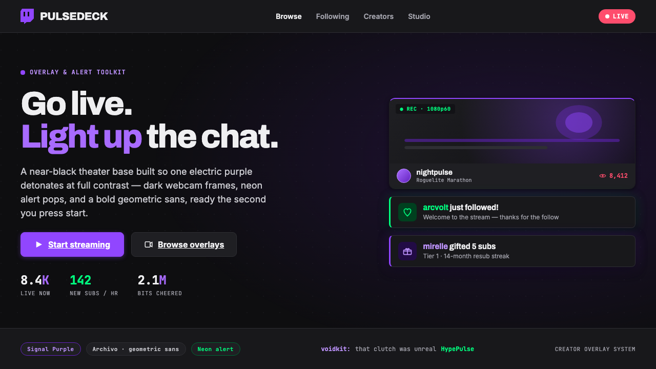 Twitch Streamer OverlayNear-black theater base, one electric purple. Dark webcam frames, neon alert…
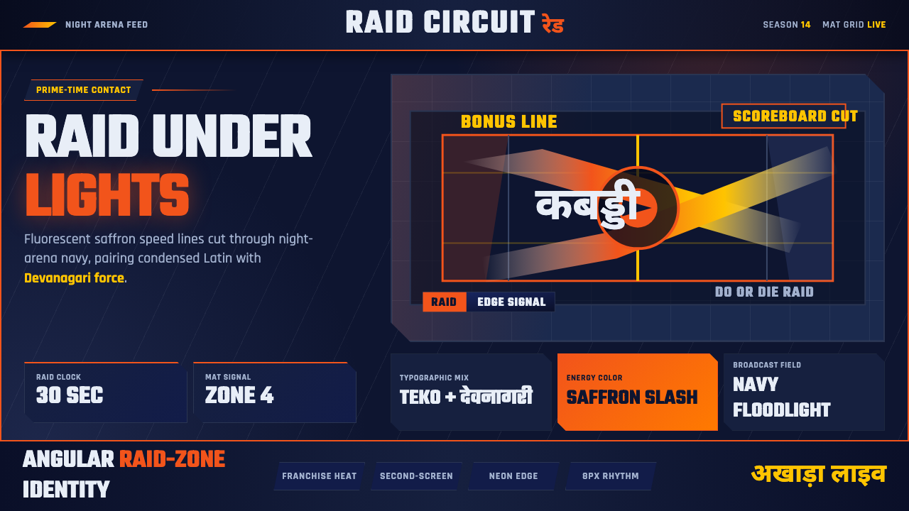 Pro Kabaddi LeagueBroadcast electricity. Saffron slashes, navy court grids, and Devanagari type…
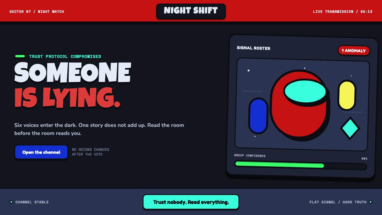 Among Us (crewmate space)Trust is ready to break. Loud capsule colors cut through a navy void with har…
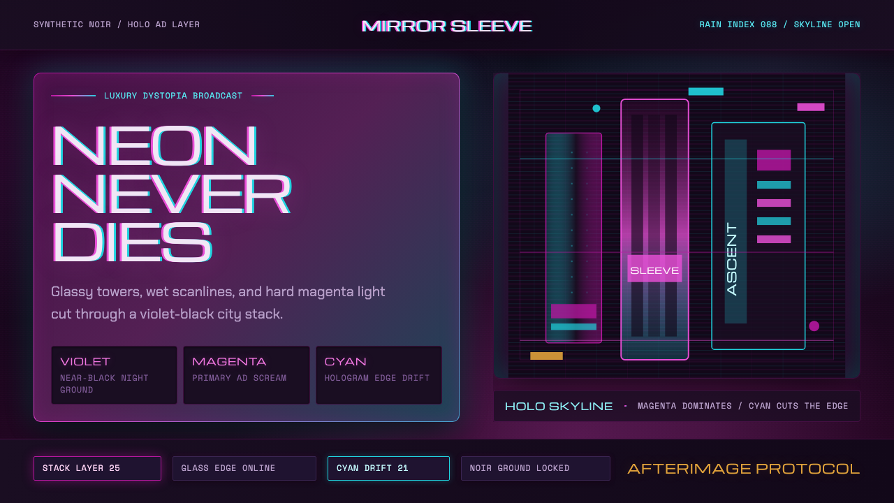 Altered CarbonNeon screams off noir. Magenta glass, cyan scanlines, and stacked vertical si…
 Blade Runner 2049Noir with tectonic weight. Orange dust, cyan hairlines, and monumental Inter…
 Dead Space IshimuraLast light in the dark. Near-black rust cut by aqua holographic panels.