What is Hyperpop 100 gecs (2019)?
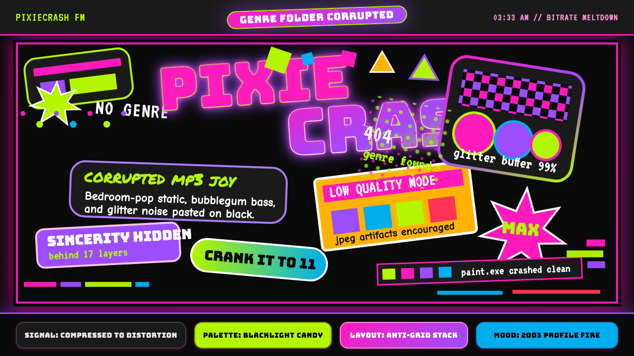
Hyperpop is the sound of a corrupted MP3 made visible — blacklight candy, pixel trash, and Y2K nostalgia cranked so far past eleven that the dial snaps off.
Hyperpop 100 gecs (2019) in brief
Hyperpop is a visual and musical aesthetic born from the internet's most overcrowded, over-compressed, and deliberately broken corners. Where earlier digital aesthetics tried to use technology to approximate elegance, hyperpop inverts the ambition entirely: the glitch is the point, the compression artifact is the decoration, the chaos is the composition. It is an aesthetic that treats damage as style.
Visually, hyperpop draws on a specific slice of early-2000s internet culture — the AOL profile, the Neopets page, the DeviantArt signature banner — and amplifies every element to the point of near-illegibility. Pure black backgrounds hold a cacophony of candy-saturated color: neon pink, electric blue, screaming lime, hot orange. Sparkle overlays, star and heart clip art, and intentional JPEG compression artifacts stack on top of each other without hierarchy or grid discipline. The typefaces lean toward the decorative and exaggerated — chunky display lettering, novelty script fonts, outlined and drop-shadowed wordmarks that look lifted from a trampoline-park sign.
The aesthetic is fundamentally ironic and self-aware. It does not confuse itself with bad taste; it celebrates bad taste as a form of cultural memory and subcultural solidarity. Fans of the music and the visual world it created understand the references — Lisa Frank sticker books, CD-ROM loading screens, flip-phone ringtone menus — and the aesthetic functions as a shared code among people for whom the early internet was formative. This ironic nostalgia separates hyperpop from accidental kitsch: every excess is deliberate, every collision is choreographed.
Where does Hyperpop 100 gecs (2019) come from?
The immediate spark for Hyperpop as a named phenomenon was the May 2019 release of *1000 gecs* by 100 gecs — a duo formed by Dylan Brady and Laura Les. The album ran twenty-three minutes and compressed ska, EDM, pop-punk, and Soundcloud emo into a single overdriven, pitch-shifted, deliberately overproduced mass. Critics who tried to file it into an existing genre found that every adjacent category rejected it. The album sleeve and promotional imagery matched the sonic chaos: saturated candy colors, crude digital collage, and a visual language that looked like a Geocities page discovered by someone who had never heard of white space.
But 100 gecs arrived at the destination of a longer journey. The aesthetic's DNA includes PC Music, a London-based label and collective founded by A.G. Cook in 2013, which had spent the mid-2010s developing a hyper-compressed, hyper-bright pop idiom that featured pitched-up vocals, advertising-jingle structures, and visual identities borrowed from corporate graphic design pushed to hallucinatory extremes. SOPHIE, the Scottish producer and artist, was central to this lineage — her work explored a materialist, synthetic physicality in both sound and visual presentation, and her influence on hyperpop's chromatic intensity and willingness to distort the human voice into something inhuman is foundational.
The visual genealogy runs deeper still. The Lisa Frank aesthetic — the school-supplies brand that sold leopards in electric pink and holographic unicorns in turquoise to American children from the 1980s through the 2000s — is a direct ancestor of hyperpop's candy-saturated palette. So is the DIY culture of early internet personal pages: the animated GIF, the tiled background image, the visitor counter, the elaborate cursor trail. These were the visual tools available to ordinary people who wanted to express personality online before design software was accessible and before social platforms enforced aesthetic uniformity. Hyperpop treats this pre-platform internet as a lost paradise of creative freedom.
Spotify's decision in August 2020 to launch an official "Hyperpop" playlist accelerated the aesthetic's spread dramatically. What had been a small internet subculture became a named genre overnight, and a generation of bedroom producers — many of them LGBTQ+ teenagers for whom the aesthetic's queer inflection was inseparable from the music — adopted both the sound and the visuals. Artists like Charli XCX, Dorian Electra, and later hyperpop-adjacent acts extended the visual system into music videos, merchandise, and social media presences that brought the aesthetic to mainstream awareness while maintaining its original sense of ironic overload.
What defines the Hyperpop 100 gecs (2019) look?
Color
The hyperpop palette is defined by maximum saturation against a pure black ground. Colors do not harmonize — they compete. Neon pink, electric blue, acid green, and hot orange appear simultaneously, often at equal visual weight, creating an effect closer to a blacklight poster than to any conventional color theory. Contrast is extreme: light colors punch against dark fields with no intermediate tones to ease the transition. The absence of neutrals is intentional; beige, gray, and muted tones are associated with the design establishment that hyperpop aesthetics reject.
Typography
Hyperpop typography favors display-weight letterforms that are visually heavy, often outlined, drop-shadowed, or given chromatic fill effects. Novelty and decorative typefaces — chunky rounded letterforms, exaggerated script fonts, condensed display faces — are preferred over neutral or editorial choices. Multiple typefaces often appear in the same composition without a clear hierarchical logic, contributing to the sensation of visual overload. Text is frequently treated as a graphic element rather than a communication device: rotated, layered over imagery, or broken across multiple lines without conventional line-break logic.
Texture and Artifact
Intentional digital damage is a core characteristic. JPEG compression artifacts — the blocky discoloration that appears when an image file is saved at low quality too many times — are embraced rather than corrected. Glitch effects that simulate corrupted video signals, scan lines, or data corruption appear as decorative elements. Sparkle, star, and glitter PNG overlays add a physical scrapbook quality. The net effect is a layered surface that looks assembled, not designed — as if the composition were a screenshot of a screen of a screenshot.
Density and Anti-Hierarchy
Hyperpop compositions reject the editorial principle of visual hierarchy. There is no clear primary element that the eye should settle on first; everything competes for attention simultaneously. Negative space is minimal to nonexistent. Elements overlap, crowd, and occlude each other. This density is not a failure of composition but an aesthetic value in itself: the feeling of too much, of being surrounded and overwhelmed, mirrors the sonic character of the music and the experience of scrolling through a heavily personalized early-internet page.
Cuteness and Menace
A distinctive tonal quality of hyperpop aesthetics is the simultaneous presence of extreme cuteness and an edge of unsettlement. Hearts, stars, cartoon animals, and rainbow gradients coexist with imagery that is slightly off — faces too symmetrical, smiles too wide, objects positioned just outside the range of normal spatial logic. The visual language of children's media is borrowed and then inflected with something that does not quite belong there. This uncanny quality — kawaii pushed one step too far — is one of the most identifiable and difficult to replicate signatures of the style.
Ironic Brand Referencing
Hyperpop visual culture is saturated with references to specific consumer brands and internet platforms from the early-2000s era — not in an advertising sense but as nostalgic shorthand. The visual conventions of AOL Instant Messenger, Lisa Frank product design, early Adobe Photoshop tutorials, and Windows XP default wallpaper are all source material. These references function differently from pastiche: they are not reproduced faithfully but are distorted, layered, and juxtaposed until the original context collapses into pure feeling.
Dark Ground
Unlike most pop aesthetics that default to white or light backgrounds, hyperpop is fundamentally a dark-ground aesthetic. Pure black is the canonical background — it maximizes the luminous intensity of the saturated colors laid over it and evokes the blacklight-poster effect central to the movement's visual identity. A hyperpop composition on a white ground loses most of its character; the dark field is not a neutral container but an active contributor to the aesthetic effect.
Who shaped Hyperpop 100 gecs (2019)?
The Missouri-based duo crystallized hyperpop as a named aesthetic with their 2019 debut album, which fused incompatible genre references into a unified sonic and visual identity. Their visual output — album art, merchandise, music videos — established the central coordinates of the style: black backgrounds, candy palettes, pixel collage, and a graphic sensibility that treats compression damage as a design asset. Brady and Les are not primarily visual artists, but the visual world they assembled around their music became as influential as the recordings themselves.
The founder of PC Music label and a key architect of the sonic and aesthetic infrastructure that hyperpop built upon. Cook's work in the early-to-mid 2010s established hyper-compressed, hyper-bright pop as a viable and coherent artistic direction, and the label's visual identity — corporate pastels pushed to sickly extremes, clipart used without irony — was essential pre-history for the hyperpop aesthetic. He later produced and collaborated widely across the hyperpop ecosystem, including with Charli XCX and 100 gecs themselves.
The Scottish producer and artist (1986–2021) was one of the most formally inventive figures in the PC Music lineage, and her influence on hyperpop's relationship to the synthetic, the artificial, and the posthuman is hard to overstate. Her work treated the processed and manufactured as aspirational rather than deficient — plastic, glass, and metal as beautiful materials rather than substitutes for organic warmth. This philosophy informed hyperpop's embrace of digital distortion and artificial-looking color as features rather than bugs.
The British pop artist became one of the most visible ambassadors for the hyperpop aesthetic in mainstream contexts, particularly through her collaborations with 100 gecs and PC Music artists and her 2020 quarantine album *how i'm feeling now*, which was made entirely in collaboration with fans during lockdown and whose visual and sonic identity was deeply hyperpop-inflected. Her later work, including the cultural phenomenon surrounding her 2024 album *Brat*, demonstrated the aesthetic's durability and its ability to influence mainstream commercial design.
Not a music artist but a product designer whose company produced school supplies and stationery for American children from the 1980s onward using an extreme candy-saturated palette of neon and holographic colors applied to imagery of animals, rainbows, and fantasy creatures. Lisa Frank's visual language is the most direct aesthetic ancestor of hyperpop's chromatic approach — the specific combination of pure black grounds, maximum saturation, and cute animal imagery that defines hyperpop's look has clear roots in Frank's product designs, which hyperpop artists have cited explicitly as formative influences.
How do you use Hyperpop 100 gecs (2019) today?
Hyperpop is among the most challenging historical aesthetics to apply in professional design contexts, precisely because its defining characteristics — visual overload, intentional damage, anti-hierarchy — are the opposite of most professional design conventions. Applying it successfully requires understanding that its excesses are structural choices, not decorative additions, and that diluting those excesses typically produces a result that is neither hyperpop nor anything else.
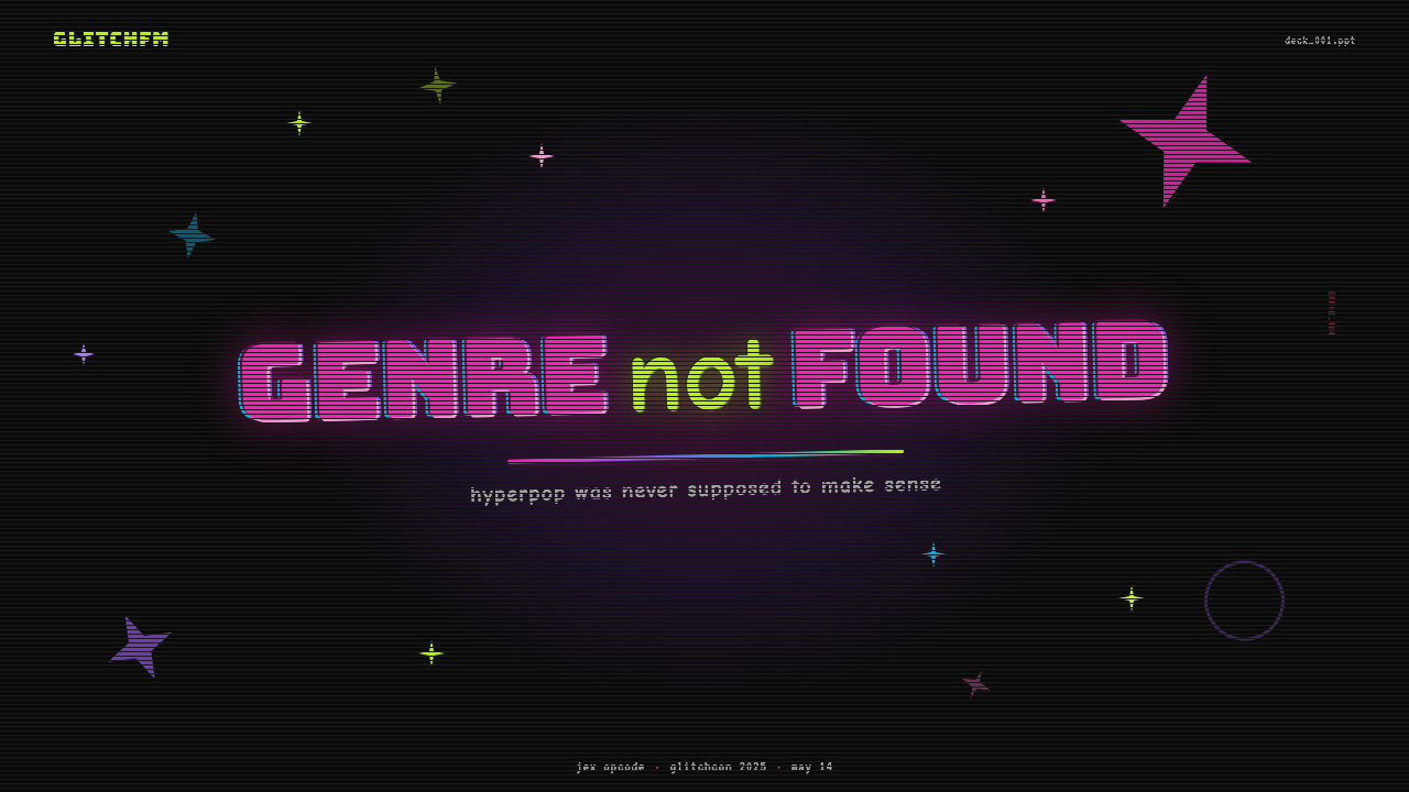
For presentation slides, hyperpop works best when the deck itself is the message — launches, drops, or announcements for brands targeting younger audiences who are fluent in the aesthetic's references. A cover slide built in this register might use a pure black background, a headline in a heavy outlined typeface with a drop shadow in a contrasting neon, and a cluster of small decorative elements — stars, sparkles, small emoji-adjacent shapes — scattered asymmetrically rather than aligned. Content slides in a hyperpop deck work against conventional wisdom: resist the urge to clean up and simplify. Data slides can incorporate glitch-style visual treatments around chart areas while keeping the chart data itself legible. The key discipline is knowing which elements carry information and protecting their readability while letting the surrounding visual field be noisy.
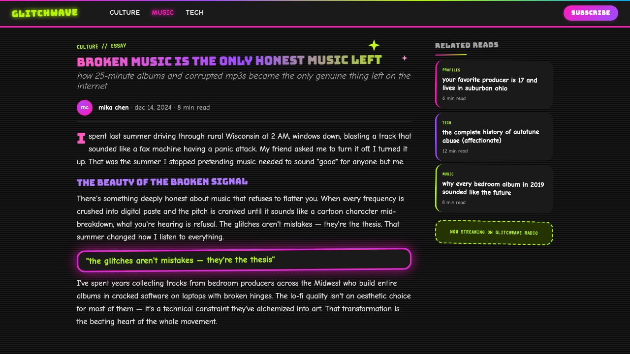
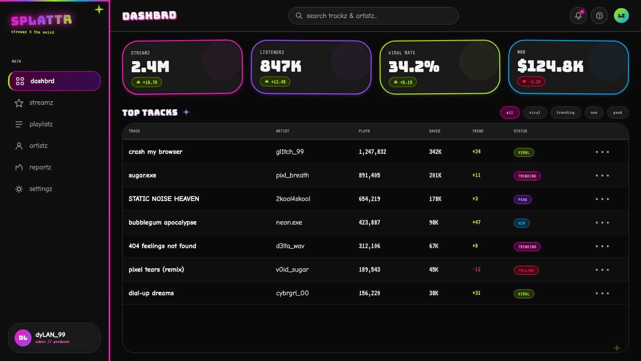
For web interfaces and dashboards, direct hyperpop is rarely appropriate, but its tonal qualities — high contrast, dark ground, vibrant accent color — translate into a dark-mode interface language that is more commercially viable. A dashboard that uses a near-black background, selects one or two saturated accent colors for data highlights and interactive states, and uses heavy display type for key metrics borrows from hyperpop's visual energy without its density. This approach works well for creative-industry tools, music and entertainment platforms, and gaming-adjacent applications where the cultural references of the aesthetic are understood positively.
For editorial and marketing work, hyperpop is most effective in short-form visual contexts: social media graphics, event posters, merchandise, and digital advertising targeting audiences who know the codes. A hyperpop-inflected event poster for a music or fashion event might use the full toolkit: black ground, overlapping text in multiple neon colors, sparkle overlays, and deliberately crude digital collage. For longer-form editorial work, a lighter reference is usually more effective — leading with the dark ground and saturated accent, borrowing the display typography sensibility, but holding back on the density and artifact elements that would make sustained reading uncomfortable.
The most common mistake when applying hyperpop aesthetics is treating it as merely a color palette choice — taking the neon colors but applying them to an otherwise conventional layout structure. The palette divorced from the density, the dark ground, and the anti-hierarchy produces something that looks like a generic tech startup with unusual color choices, not hyperpop. The second most common mistake is adding glitch elements as pure decoration without grounding them in the compositional logic of the style. Glitch in hyperpop is not applied as a finishing texture; it is built into the composition from the start as an equal participant with type and image.
Hyperpop 100 gecs (2019) — FAQ
Is hyperpop the same as vaporwave or Y2K aesthetics?
They share ancestry — all three draw on early internet visual culture — but their emotional registers are quite different. Vaporwave is melancholic and spacious: pastel gradients, Greek sculpture, empty mall interiors, and a pervading sense of loss. Y2K revival is aspirational and chrome-inflected: shiny surfaces, metallic gradients, and futurism gone slightly wrong in an optimistic direction. Hyperpop is chaotic, dense, and irony-saturated: maximum color, minimum negative space, and an embrace of digital damage that neither vaporwave nor Y2K shares. The shared DNA is early internet nostalgia; the emotional content and compositional logic are distinct.
Can hyperpop aesthetics be applied to a serious or professional context?
With significant modulation, yes. The full hyperpop toolkit — maximum density, JPEG artifacts, sparkle overlays, anti-hierarchy — is incompatible with most professional contexts because it undermines the visual cues that signal competence and reliability. However, the aesthetic's underlying qualities (high contrast, dark ground, saturated accent color, bold display typography) can be extracted and applied at lower intensity to create interfaces and documents that read as energetic and contemporary rather than corporate and neutral. The work is in knowing which elements to keep and which to leave behind.
How do I avoid making hyperpop-inspired work look like a generic dark theme?
Generic dark themes use desaturated dark backgrounds, muted accent colors, and maintain conventional visual hierarchy. Hyperpop inverts all three: the black is absolute (not dark gray), the accent colors are at maximum saturation (not muted), and the hierarchy is deliberately disrupted rather than maintained. The other distinguishing markers are density and texture: a dark theme is spacious and clean; hyperpop is crowded and layered. If your composition has consistent negative space and no overlapping elements, it is a dark theme. Adding even one layer of sparkle overlays, a JPEG-artifact texture, or a deliberately mis-scaled type element pushes it into hyperpop territory.
Is hyperpop a passing trend or does it have lasting design relevance?
As a named subculture, hyperpop peaked as a music genre around 2020–2022 and has since dispersed into adjacent aesthetics. But the visual principles it crystallized — the legitimacy of digital damage as aesthetic material, the viability of anti-hierarchical density, the ironic relationship to consumer nostalgia — have absorbed into a broader internet-native visual culture that continues to evolve. Designers working with youth-oriented brands, creative industries, and digital-native platforms will find hyperpop's sensibility useful not as a period style to replicate but as a set of compositional permissions that expanded what professional design could accommodate.
What is the relationship between hyperpop aesthetics and LGBTQ+ visual culture?
Hyperpop has a significant and explicit relationship with LGBTQ+ communities, particularly trans and nonbinary artists and audiences. Many of the defining artists in the genre — including Laura Les of 100 gecs and SOPHIE — are trans women, and the aesthetic's embrace of the artificial, the distorted, and the deliberately non-normative has been read as a form of visual queerness: a rejection of the naturalizing assumptions embedded in design conventions that privilege smoothness, harmony, and the organic. This is not a coincidence or a secondary feature of the aesthetic. For many practitioners and audiences, the aesthetic's refusal of conventional beauty standards is inseparable from its cultural meaning.
Related design styles
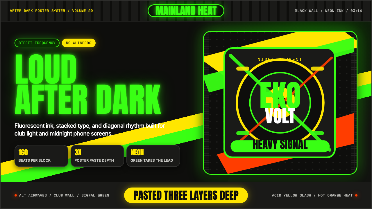 Afrobeats LagosLoud after dark. Neon green type and yellow diagonals hit black like pasted s…
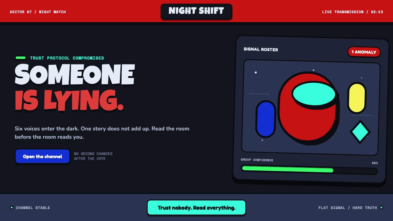 Among Us (crewmate space)Trust is ready to break. Loud capsule colors cut through a navy void with har…
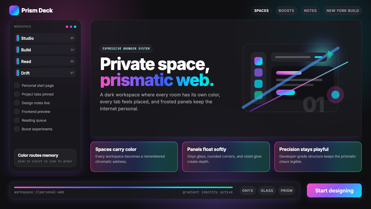 Arc Browser Prismatic (2023)Color is architecture. Pink-violet-cyan ribbons glow over onyx glass and roun…
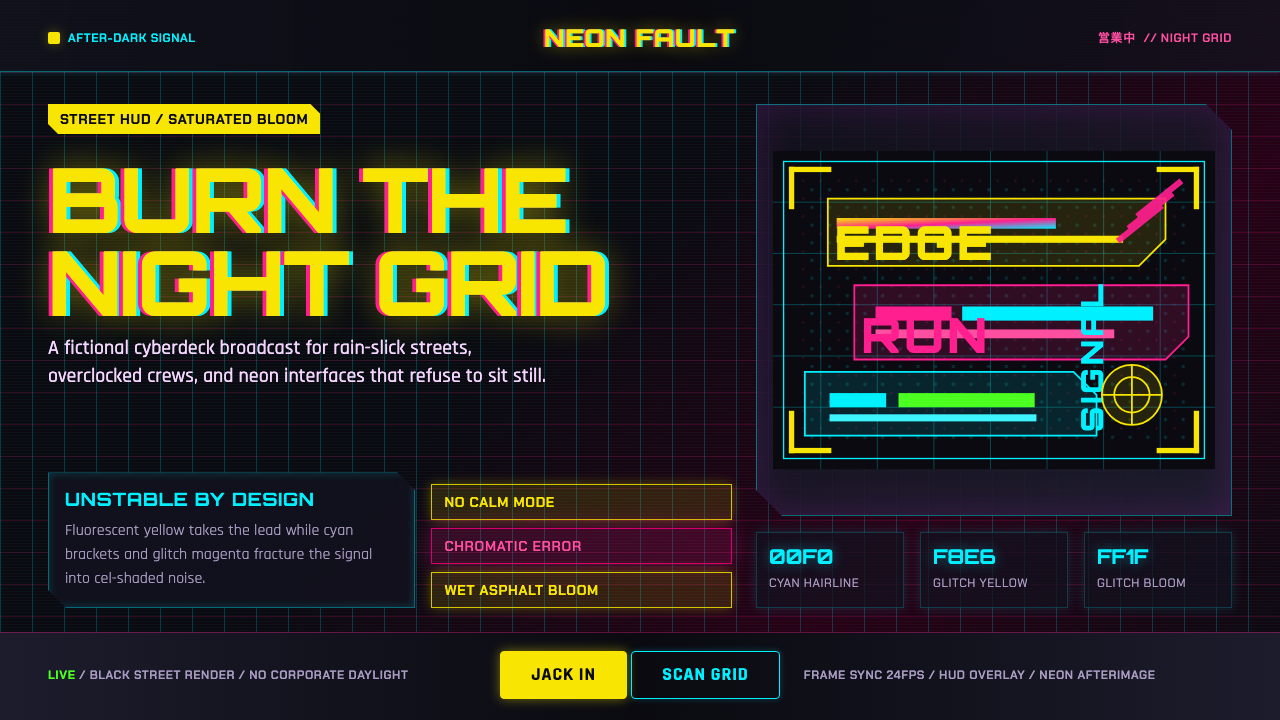 Edgerunners NeonNeon overload. Fluorescent yellow, cyan HUD grids, and magenta glitches burn…
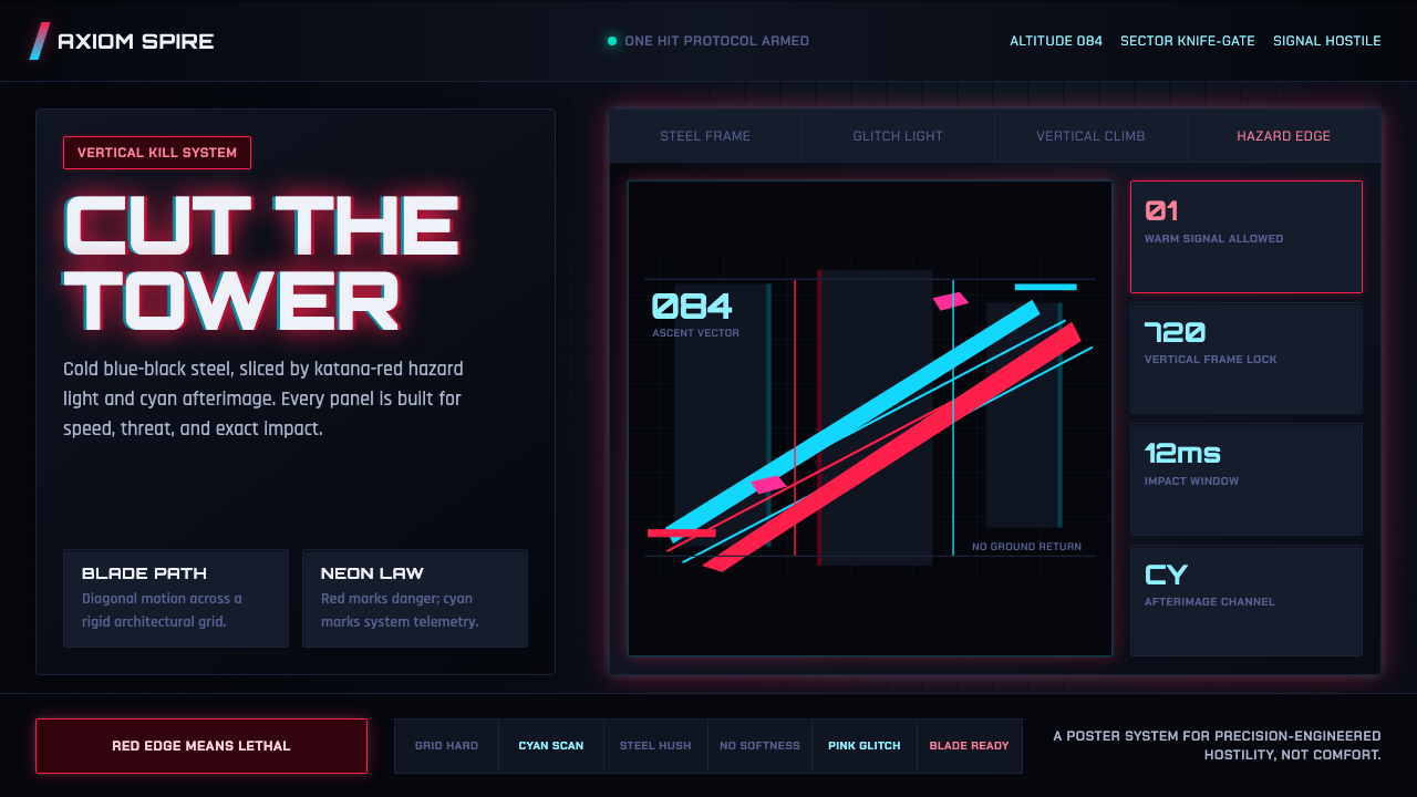 Ghostrunner Dharma TowerHostile precision at speed. Blue-black steel grids cut by red neon and cyan g…
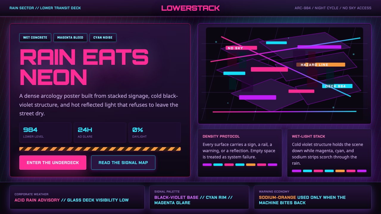 The Ascent ArcologyNeon suffocates the dark. Magenta and cyan signage stacks over wet black-viol…