What is Deus Ex: Human Revolution?
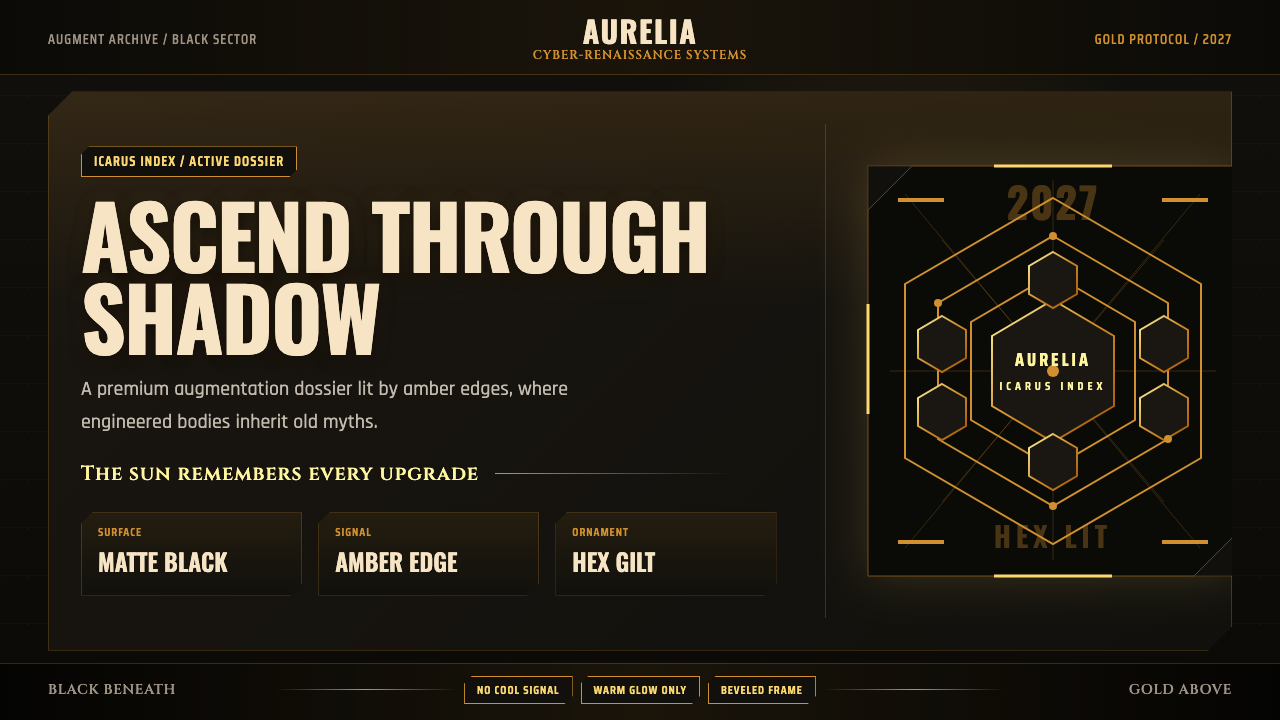
Deus Ex: Human Revolution makes dystopia gleam — a cyber-Renaissance world where restrained gold promises transcendence while near-black surfaces conceal its cost.
Deus Ex: Human Revolution in brief
Deus Ex: Human Revolution is a visual style derived from the 2011 game and its near-future 2027 setting. Its defining idea is a deliberate black-and-gold dualism: gold represents hope, sunlight, and the Icarus myth, while black embodies the dystopian reality beneath those aspirations. The contrast is therefore more than a recognizable palette. It is a narrative system in which every illuminated edge suggests possibility and every dark plane implies danger, secrecy, or compromise.
Art director Jonathan Jacques-Belletête described a cyber-Renaissance fusion rather than conventional neon cyberpunk. Renaissance ornament and the symbolic grandeur of gold meet industrial bevels, matte augmentation panels, and repeated hexagonal motifs. The result feels simultaneously ceremonial and engineered: surfaces can resemble precious objects at one moment and machine housings at the next. Human ambition, mechanical enhancement, and historical myth occupy the same visual language.
The aesthetic is warm, muted, and controlled. Near-black fields dominate, while amber-gold light catches edges, traces interfaces, and reveals selected details. Cool blue illumination and indiscriminate neon are excluded. Darkness is not empty background, and gold is not decorative luxury; each is an active part of the composition. The style succeeds when illumination feels scarce enough to matter.
Where does Deus Ex: Human Revolution come from?
The style was established for Deus Ex: Human Revolution, released in 2011 by Eidos Montreal in Canada and associated with Square Enix. Its fictional setting looks toward 2027, but its visual identity does not present the future as a clean break from history. Instead, it brings Renaissance revival imagery into contact with cyberpunk, transhumanist, and biopunk science fiction. The future appears as an argument built from old ambitions and new machinery.
Jonathan Jacques-Belletête's art direction supplied the central visual synthesis. Renaissance ornament offered references to human aspiration, idealized form, and the cultural authority of gold. Industrial chamfered design supplied the opposing vocabulary: beveled housings, hard joins, engineered panels, and machine-like surfaces. Combining them produced a world in which technology can appear elevated and beautiful without ever becoming innocent.
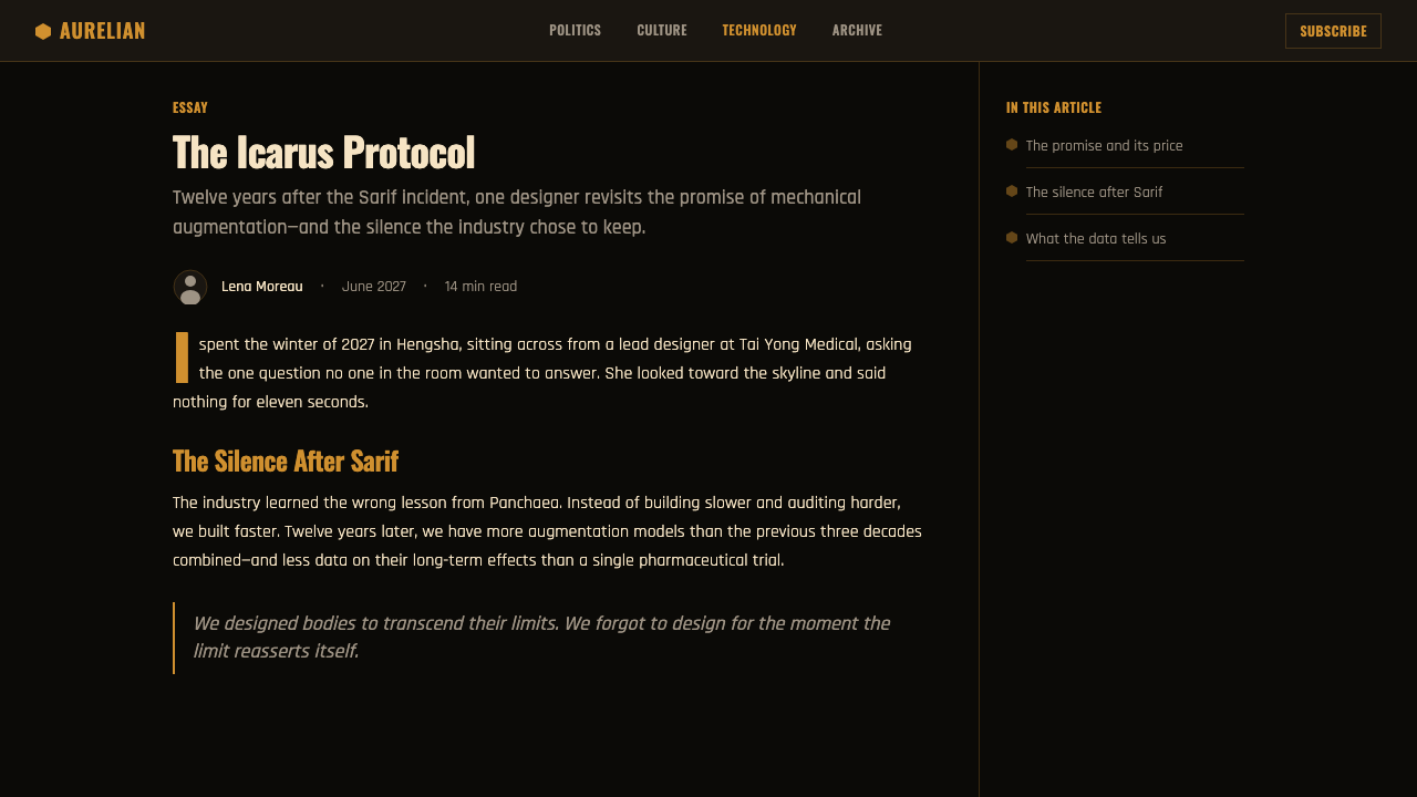
The Icarus myth gives the gold its thematic charge. Gold evokes the sun and the hope of human ascent, while black reveals the dystopia beneath that promise. This structure suits a transhumanist story because enhancement can be read in opposite ways at once: as liberation from bodily limits and as entry into a darker system. The aesthetic refuses to resolve that tension. Its beauty attracts the eye even as its darkness warns against easy belief.
Mary DeMarle's narrative role belongs beside the visual direction because the style is inseparable from storytelling. Eidos Montreal shaped the work as a unified fictional environment, while Square Enix carried the released game to its audience. The resulting identity became distinctive by declining the most familiar cyberpunk shorthand. Rather than cool neon abundance, it chose warm edge-light, near-black mass, and symbolic restraint.
What defines the Deus Ex: Human Revolution look?
Black-and-Gold Dualism
Near-black is the environmental foundation, while amber-gold marks aspiration, energy, and revelation. The colors should not be distributed evenly. Darkness occupies the field; gold appears where meaning concentrates. This imbalance turns contrast into narrative hierarchy. If gold spreads across every surface, it loses its association with hope and illumination. If black lacks depth and presence, the dystopian half of the system disappears.
Warm Edge-Light
Illumination follows contours rather than flooding entire planes. Warm amber catches a bevel, outlines an augmentation panel, or draws attention along an interface path. The glow remains muted and intentional, never becoming an electric haze. This produces a sense that light is embedded within engineered objects or narrowly admitted from beyond them. Edges become both construction details and narrative signals.
Cyber-Renaissance Ornament
Renaissance influence enters through ceremonial proportion, ornamental suggestion, and the symbolic grandeur of gold rather than through literal historical reconstruction. These cues are fused with mechanical panels and industrial seams. Ornament should feel absorbed into the object, as if culture and machinery were manufactured together. Applied as a detached decorative layer, it becomes costume; integrated with structure, it creates the intended historical-futurist tension.
Industrial Chamfers
Chamfered edges make interfaces and objects feel machined rather than softly molded. Corners appear cut, reinforced, or articulated into separate planes, allowing gold light to collect along their boundaries. This vocabulary gives even static compositions a sense of assembly and mechanical purpose. Curves can exist, but the dominant impression should remain faceted, constructed, and prepared to withstand use.
Hexagonal Motifs
Hexagons trace augmentation panels and provide a recurring bridge between biological transformation and engineered order. They work best as restrained patterns, cropped fields, or localized structural markers. Repetition suggests systems and modularity, while the angular form echoes the surrounding chamfers. When hexagons cover every available area, the motif stops carrying information and becomes generic science-fiction texture.
Matte Mechanical Surfaces
Dark panels are predominantly matte, allowing illuminated edges and gold details to remain legible without turning the world into polished luxury. The restrained surface treatment makes augmentation feel functional and bodily, not merely ornamental. Selective gleam can identify an important seam or object, but broad gloss weakens the atmosphere by making black reflective rather than dense. Material contrast should serve revelation.

Who shaped Deus Ex: Human Revolution?
As art director, Jacques-Belletête established the cyber-Renaissance synthesis at the center of the game's identity. His direction joined Renaissance ornament and symbolic gold with industrial bevels, dark mechanical planes, and controlled amber illumination. The achievement was not simply selecting black and gold, but defining why they coexist: aspiration above, dystopia beneath.
DeMarle represents the narrative side of a style whose visual choices carry thematic meaning. The tension between human aspiration and dystopian consequence gives the black-and-gold system its purpose. Her place among the key figures underscores that the aesthetic should be understood as storytelling infrastructure, not as a detachable interface skin.
The Canadian studio created the game and its near-future 2027 world as a coherent visual environment. Its identity brought cyberpunk, Renaissance revival, transhumanist science fiction, biopunk, and industrial chamfered design into a single system. The studio's work made the fusion consistent enough to operate across spaces, machinery, augmentation, and interface imagery.
Square Enix is part of the game's public production and release identity. Its association with the 2011 release situates the style as a designed language made for a complete commercial work rather than an isolated concept study. The resulting visual identity reached audiences as an integrated part of the game's dystopian world.
How do you use Deus Ex: Human Revolution today?
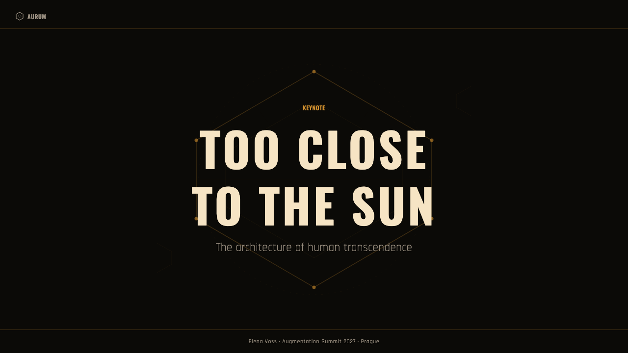
For presentation covers, begin with a dominant near-black field and a limited amber-gold intervention: an illuminated chamfer, a cropped hexagonal structure, or a narrow path of light. The title should feel embedded in the composition rather than placed over decorative scenery. Content slides need calmer surfaces, clear dark panels, and selective gold cues for hierarchy. Preserve empty darkness around important statements so that illumination retains dramatic force.
Data slides should translate the style's narrative contrast into information structure. Use near-black as the stable field, muted gold for the principal series or decisive finding, and quieter dark variations for context. Hexagonal framing can group related measures, while beveled dividers can define sections without becoming ornamental borders. Avoid making every mark luminous. When all data glows equally, the viewer loses both hierarchy and the sense of controlled revelation.
For dashboards and pricing interfaces, treat gold as a scarce indicator of agency: the selected state, the recommended tier, the consequential action, or the status requiring attention. Matte dark panels can separate modules, while chamfered corners and warm edge-light establish the mechanical character. Pricing cards should differ through hierarchy and emphasis rather than through a carnival of accent colors. Controls must remain readable before they become atmospheric.
Editorial and marketing layouts benefit from the style's ability to frame ambition and consequence. Use large dark fields for reflective passages, gold-edged callouts for pivotal claims, and hexagonal motifs only where they reinforce a theme of enhancement or systems. Marketing pages can alternate dense black sections with restrained illuminated moments, creating a rhythm of concealment and disclosure. Product imagery should feel integrated into the same warm, shadowed world.
The common mistake is reducing the style to black backgrounds, bright gold text, and a wallpaper of hexagons. That produces generic luxury science fiction and discards the cyber-Renaissance argument. Authentic application depends on restraint: gold must signify hope, power, or discovery; black must carry dystopian weight; bevels must describe engineered construction; ornament must merge with machinery. Cool neon accents, excessive glow, broad gloss, and arbitrary decoration weaken the identity.
Deus Ex: Human Revolution — FAQ
Is this style simply a black-and-gold version of cyberpunk?
No. Its distinction lies in the cyber-Renaissance fusion and in the symbolic opposition between gold and black. Gold refers to hope, the sun, and the Icarus myth; black exposes the dystopia beneath. Industrial bevels, matte augmentation panels, and hexagonal motifs connect those ideas to machinery. Without that historical and narrative structure, the palette becomes generic futuristic luxury.
Why is cool blue neon inappropriate for the aesthetic?
The visual identity deliberately rejects the cool neon convention associated with much cyberpunk imagery. Its illumination is warm amber-gold, muted, and purposeful. Introducing prominent cool blue changes both atmosphere and symbolism: the world begins to feel electrically futuristic rather than solar, mythic, and morally divided. Small departures may create a different hybrid, but they no longer express the source style faithfully.
How should gold be used without making the result look luxurious?
Use gold as light, structure, and meaning rather than as a blanket finish. Let it catch chamfers, trace selected panels, identify consequential actions, or reveal a focal detail. Keep surrounding surfaces matte and near-black so gold reads as scarce illumination. Broad polished expanses make it decorative wealth; narrow, controlled appearances preserve its links to hope, power, and dangerous aspiration.
Are hexagons required in every composition?
No. Hexagons are a recurring motif, especially around augmentation panels, but repetition is useful only when it supports engineered order or transformation. They can appear as cropped pattern fields, structural frames, or small markers. Omitting them is preferable to using them as indiscriminate wallpaper. Black-and-gold dualism, warm edge-light, and industrial construction carry more of the style's identity.
What kinds of products suit this visual language best?
It suits experiences involving technology, systems, enhancement, consequential choice, or a tension between progress and control. Dashboards, analytical presentations, pricing pages, speculative editorial work, and dramatic marketing can all use its strong hierarchy. It is less natural for contexts that depend on cheerful openness or abundant softness, because its darkness and symbolic restraint introduce seriousness, secrecy, and moral ambiguity.
Related design styles
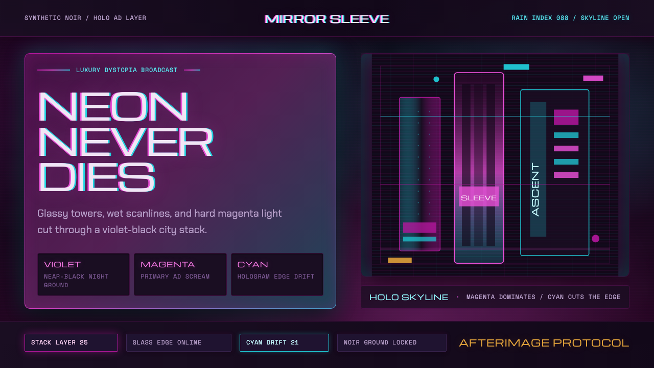 Altered CarbonNeon screams off noir. Magenta glass, cyan scanlines, and stacked vertical si…
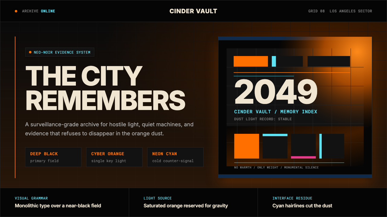 Blade Runner 2049Noir with tectonic weight. Orange dust, cyan hairlines, and monumental Inter…
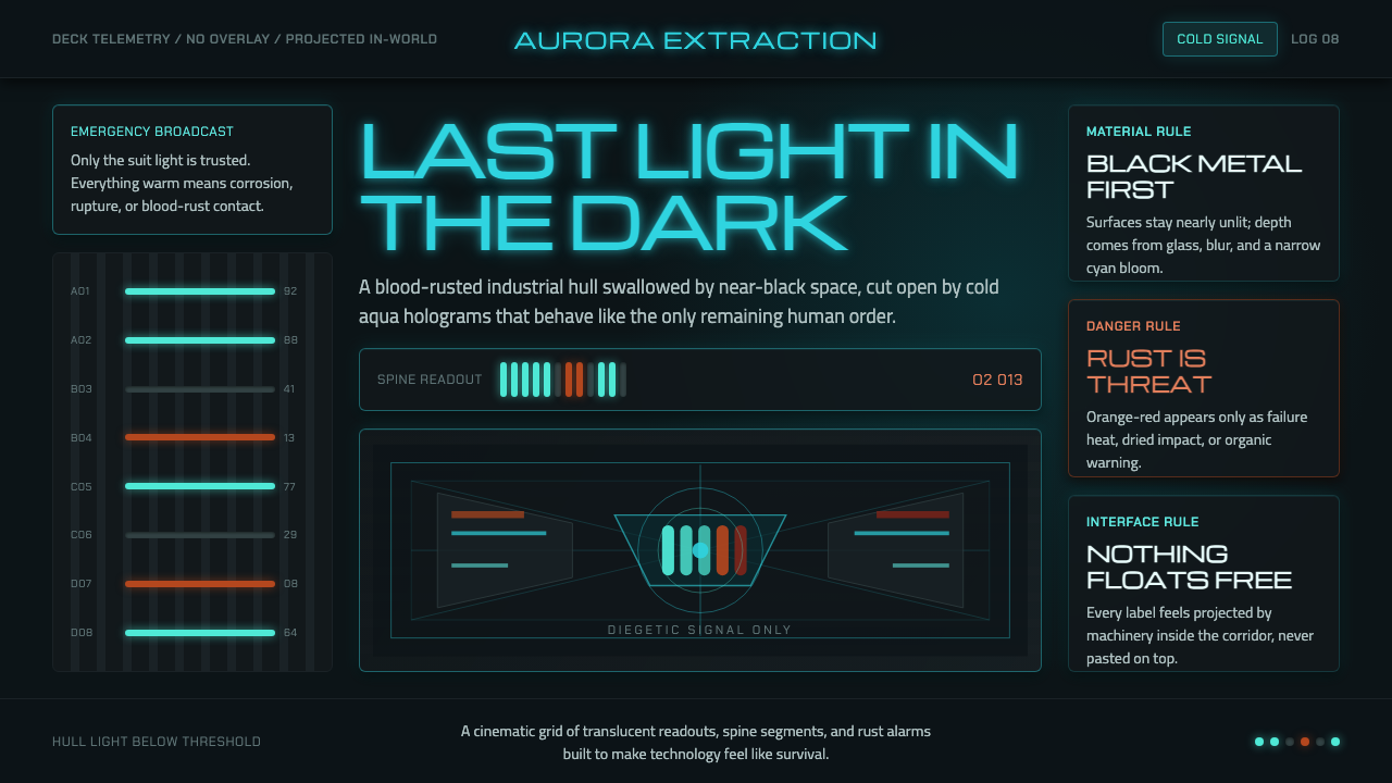 Dead Space IshimuraLast light in the dark. Near-black rust cut by aqua holographic panels.
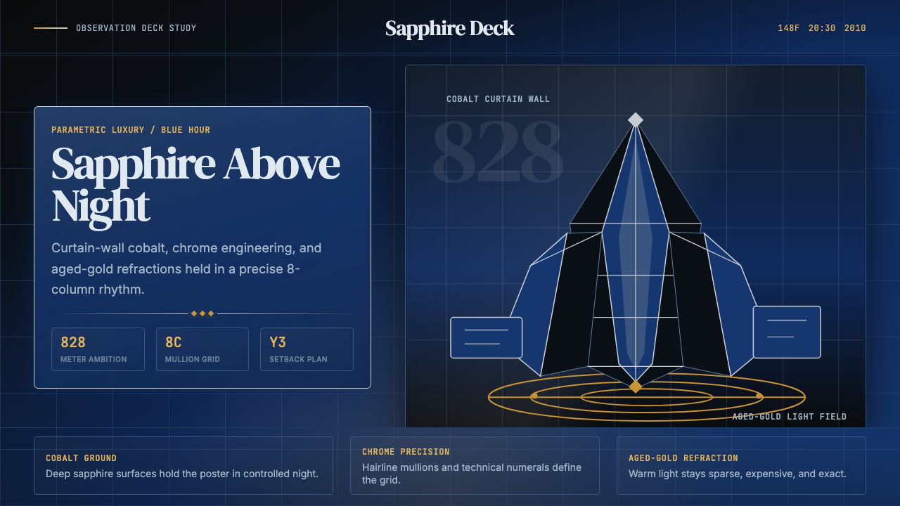 Emirati Burj Khalifa Sapphire (2010)Commanding height, controlled light. Sapphire glass, chrome grid, aged-gold g…
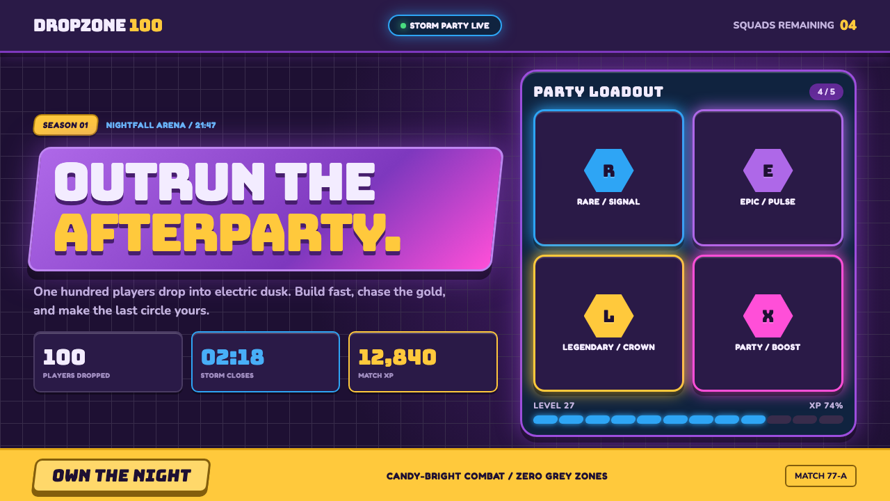 Fortnite (2017 Battle Royale)Battle royale becomes a neon party. Chunky caps and rarity glows electrify st…
 Mass Effect N7Cold military futurism. Cyan HUD grids on near-black glass, cut by one red st…