What is Sunshine (2007)?
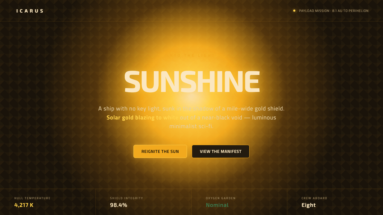
Sunshine turns darkness into a source of illumination — a near-black spacecraft, a solar gold that burns toward white, and one impossible green garden suspended inside the void.
Sunshine (2007) in brief
Sunshine (2007) is Danny Boyle’s hard-science-fiction vision of the Icarus II, a spacecraft traveling toward a sun so powerful that ordinary illumination becomes almost irrelevant. The ship has no key light: its hull disappears into the deep shadow cast by a vast gold sun-shield, while the sun itself appears as a blinding bloom at the edge of perception. The result is not a bright futuristic world but a visual system built from extreme absence and extreme radiance.
The design language is a strict gold-on-black grammar. Near-black establishes the void, the hull, and the interior spaces; solar gold marks the heat shield, reflective surfaces, and protective suits; pure white is the point at which gold becomes too intense to remain material. This contrast gives every visible object unusual authority. A surface is not merely lit. It either survives the darkness, catches the sun, or disappears into it.
Sunshine also introduces a controlled contradiction. The ship’s rectilinear interiors are clean, severe, and almost Kubrickian, while the oxygen garden contains the only deliberate green interruption in the scheme. That green is not an additional decorative accent. It is a reminder that life exists inside an engineered vessel, and its rarity makes it more powerful than a larger multicolor palette would be.
Where does Sunshine (2007) come from?
The film’s origin point is a futuristic mission set in 2057, but the design system is rooted in the film’s 2007 production context and its Western European, specifically British, lineage. Sunshine belongs to a post-Kubrick hard-science-fiction tradition: it treats the future as an engineered environment rather than a playground for decorative invention. Machinery, architecture, protection, and light are made to feel consequential because the visual world refuses excess.
The central image is the Icarus II without a key light. This decision reorganizes the usual language of space travel. Instead of evenly illuminated corridors and readable spacecraft surfaces, the ship is divided between concealment and exposure. The sun-shield becomes both functional equipment and the dominant visual event: a tessellated gold-leaf heat shield that catches the solar blaze while the rest of the vessel remains submerged in shadow.
The interiors develop the complementary half of the system. Against the overwhelming exterior light, the ship presents clean rectilinear rooms with a Kubrickian severity. Straight planes, controlled openings, and uncluttered surfaces create a sense of order that is almost institutional. This is not nostalgic retro-futurism. It is luminous minimalism under pressure, where every line appears to belong to the ship’s purpose and every empty area reinforces the scale of the surrounding void.
The oxygen garden supplies the system’s single chromatic breach. Its green does not dissolve the gold-and-black structure; it proves why the structure matters. The garden is the visual evidence of habitation, respiration, and continuity within a mission dominated by heat, metal, and darkness. Together, the near-black world, the solar bloom, the gold shield, the gold-plated suits, and the isolated green establish Sunshine as a meeting point between post-Kubrick hard science fiction and luminous minimalist sci-fi.
What defines the Sunshine (2007) look?
Near-Black Ground
Near-black is the structural ground of Sunshine. It represents the deep shadow around the ship, the unlit hull, and the visual emptiness of space. It should feel absorbing rather than merely dark, allowing illuminated objects to appear as events. Black is not a neutral backdrop here; it is the pressure that gives gold and white their intensity.
Solar Gold
Gold is the material signature of the sun-facing world. It appears on the tessellated heat shield and the gold-plated spacesuits, linking protection with exposure. The color should feel metallic, heated, and almost dangerous. Its strongest use is not as a broad decorative field but as a concentrated reflection that seems capable of burning through the surrounding darkness.
Gold to White
Solar gold does not remain at a single intensity. At the edge of the solar bloom it blazes toward white, creating a visual scale from reflective material to overwhelming light. This transition should be treated as an atmospheric event, not a decorative gradient. Gold belongs to the shield and suit; white belongs to the instant when the sun exceeds the language of surface and becomes pure radiance.
Rectilinear Space
The interiors are clean, rectilinear, and controlled. Their geometry recalls a Kubrickian seriousness without becoming ornate or retro. Walls, corridors, openings, and equipment should read as deliberate planes within a larger machine. The visual authority comes from alignment, repetition, and emptiness rather than from decorative detail.
Squared Typography
Typography should carry the squared Eurostile quality named by the source material: geometric, technical, and restrained. Letterforms need to feel engineered for a spacecraft rather than selected for personality. Wide spacing, firm alignment, and compact blocks support the system, while excessive softness, ornamental contrast, or expressive display lettering weakens its hard-science-fiction character.
The Green Exception
Green belongs to one place only: the oxygen garden. Its scarcity is the point. Used everywhere, green becomes a normal accent and the system loses its narrative tension. Kept within a living, enclosed environment, it becomes an unmistakable sign of oxygen, growth, and human continuity inside a world otherwise governed by blackness and solar gold.
Who shaped Sunshine (2007)?
Danny Boyle is named as the creator of Sunshine’s hard-science-fiction vision. In this design language, that vision is expressed through the Icarus II, the absence of a key light, the near-black world, and the severe contrast between solar gold and white. Boyle’s place in the source material anchors the system conceptually: the aesthetic is not generic space decoration but a disciplined interpretation of a mission shaped by the sun.
Alwin Küchler is listed among Sunshine’s key figures in the approved source material. His inclusion belongs to the film’s broader creative constellation, from which the gold-on-black visual system is drawn. The resulting style depends on a unified world: shadow, reflective protection, rectilinear interiors, and the isolated green of the oxygen garden must feel like parts of one engineered environment.
Mark Tildesley is also named as a key figure associated with Sunshine. Within this reference system, that association reinforces the importance of designed space. Sunshine is remembered through its ship as much as through its premise: clean rooms, controlled planes, the gold shield, and the void around them. Its future feels credible because the environment is treated as a complete visual language rather than a collection of props.
How do you use Sunshine (2007) today?
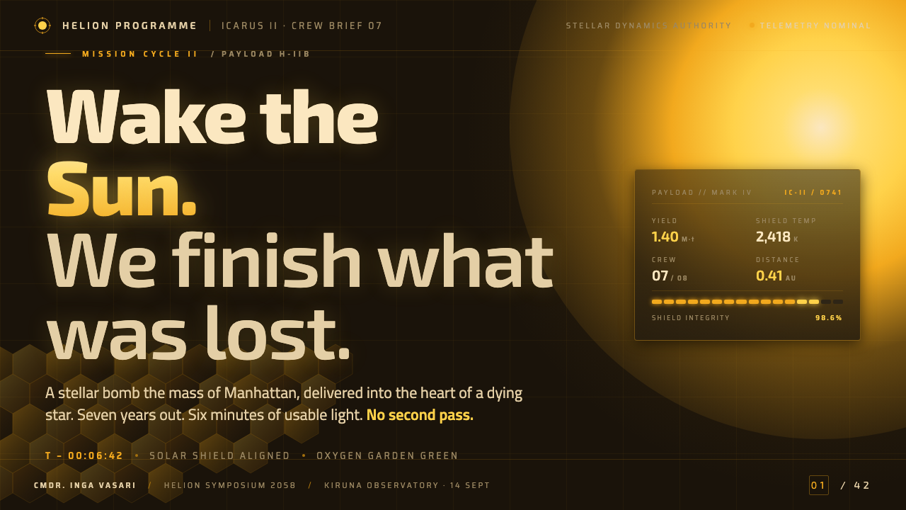
For presentation slides, Sunshine works best when the cover behaves like a signal emerging from darkness. Use a near-black field, a restrained squared title, and one concentrated solar-gold form that appears to catch or emit light. Content slides should preserve large areas of visual silence, with rectilinear panels and disciplined alignment. Data slides can treat charts as mission readouts: gold marks the active or critical element, white marks maximum intensity, and near-black contains the information without competing with it.
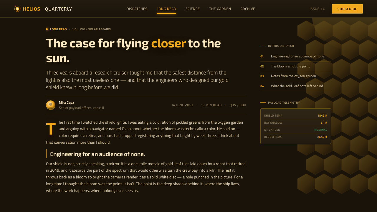
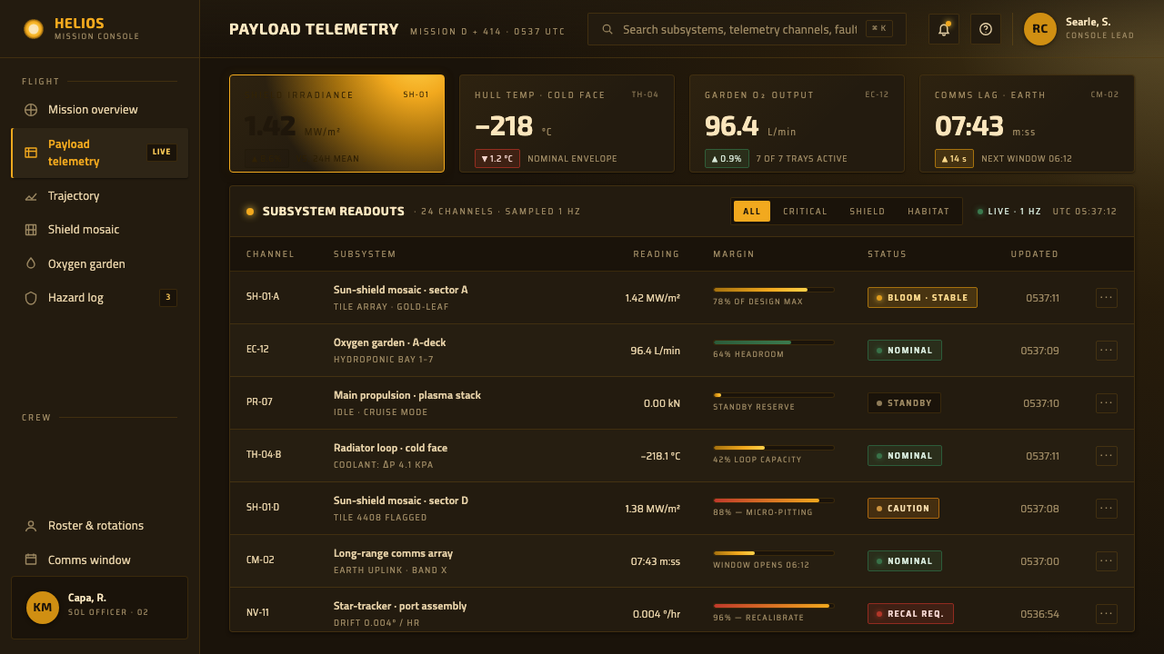
For web interfaces, the style suits dashboards, monitoring tools, and pricing pages that need to feel technical, consequential, and highly focused. Near-black can establish the application environment, while solar gold identifies primary actions, active states, or the most important metric. White should be reserved for decisive information rather than used as a general decorative highlight. Panels should feel like clean ship compartments, with firm boundaries and clear alignment instead of soft, ambient layering.
For editorial and marketing work, Sunshine supports a strong contrast between atmospheric opening imagery and severe informational structure. A feature article can begin with a near-black field and a solar-gold headline, then move into clean rectilinear sections with generous darkness around the text. Marketing pages can frame a product as precise, durable, and built for hostile conditions. Gold-plated surfaces, shield-like panels, and the suggestion of a distant solar bloom are more appropriate than generic stars, neon space effects, or crowded futuristic ornament.
For a brand presentation, the oxygen garden offers a precise way to introduce humanity without dissolving the system. Green should appear only where the content concerns life, sustainability, recovery, or an enclosed living environment. Its appearance should feel like a discovery rather than a recurring brand accent. This restriction makes the green memorable and prevents the interface from drifting into a conventional dark palette with several unrelated highlights.
The common mistake is to interpret Sunshine as permission to use black backgrounds, gold gradients, and random science-fiction decoration everywhere. The system depends on scarcity and hierarchy: shadow must remain genuinely deep, gold must feel concentrated and solar, white must represent intensity, and green must remain exceptional. Adding neon colors, soft atmospheric glow, busy interface chrome, or multiple expressive typefaces turns the design into generic futurism and erases the severe luminous minimalism that defines it.
Sunshine (2007) — FAQ
Is Sunshine a bright or a dark design style?
It is dark in its ground and bright in its events. The spacecraft, hull, and surrounding world are dominated by near-black shadow, while the sun appears as solar gold that can blaze toward white. The style depends on this opposition. If everything is bright, the solar bloom loses authority; if everything is black, the gold loses its role as an active source of meaning.
Why is the oxygen-garden green used so sparingly?
Because the green represents life inside an environment otherwise defined by void, heat, metal, and shadow. The source material describes it as the single green element that breaks the gold-and-black scheme. Keeping it in that role makes it legible as oxygen, growth, and continuity rather than as a general accent color. Repeating it across buttons, charts, or decoration would remove its narrative force.
Can the style work without a solar-gold image?
Yes, but the hierarchy must still express the same logic. A near-black ground should dominate, while a concentrated warm metallic accent carries the sense of reflected solar energy and protective material. White can mark moments of maximum intensity. Without the literal sun-shield or solar bloom, the design needs especially clear restraint, because unrelated gold decoration would make the system feel ornamental rather than engineered.
How is Sunshine different from generic futuristic design?
Generic futuristic design often accumulates signals of technology: glowing lines, multiple neon colors, complex interface details, and decorative space imagery. Sunshine is more disciplined. It uses the absence of a key light, the near-black void, the solar-gold shield, the squared Eurostile quality, and the clean rectilinear interiors as a closed visual grammar. Its future feels credible because each element belongs to the same mission environment.
Related design styles
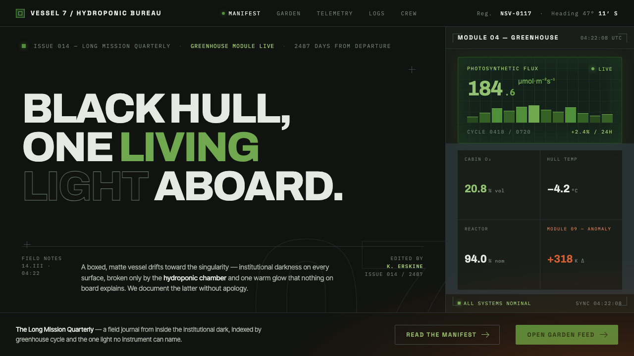 High Life (2018)Institutional dark, one living light. Matte-black hull, hydroponic green, one…
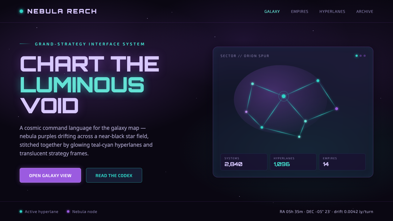 StellarisQuietly grand cosmic command UI. Nebula purples on near-black void, teal-cyan…
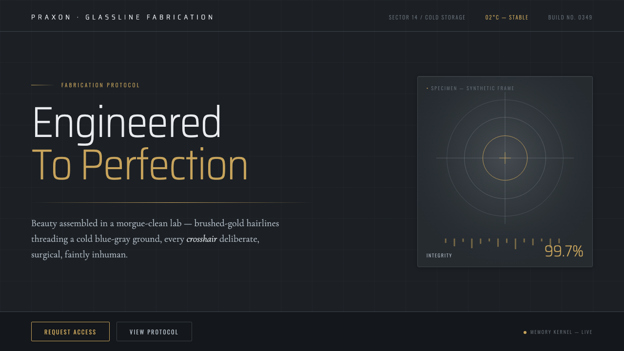 Westworld (Delos)Beauty engineered in a morgue-clean lab. Cold blue-gray ground, brushed-gold…
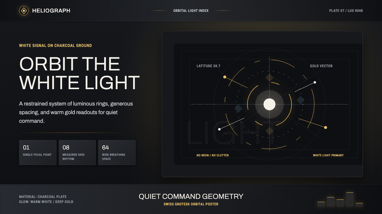 DestinyLuminous restraint. White-gold rings orbit charcoal plates in clean grotesk t…
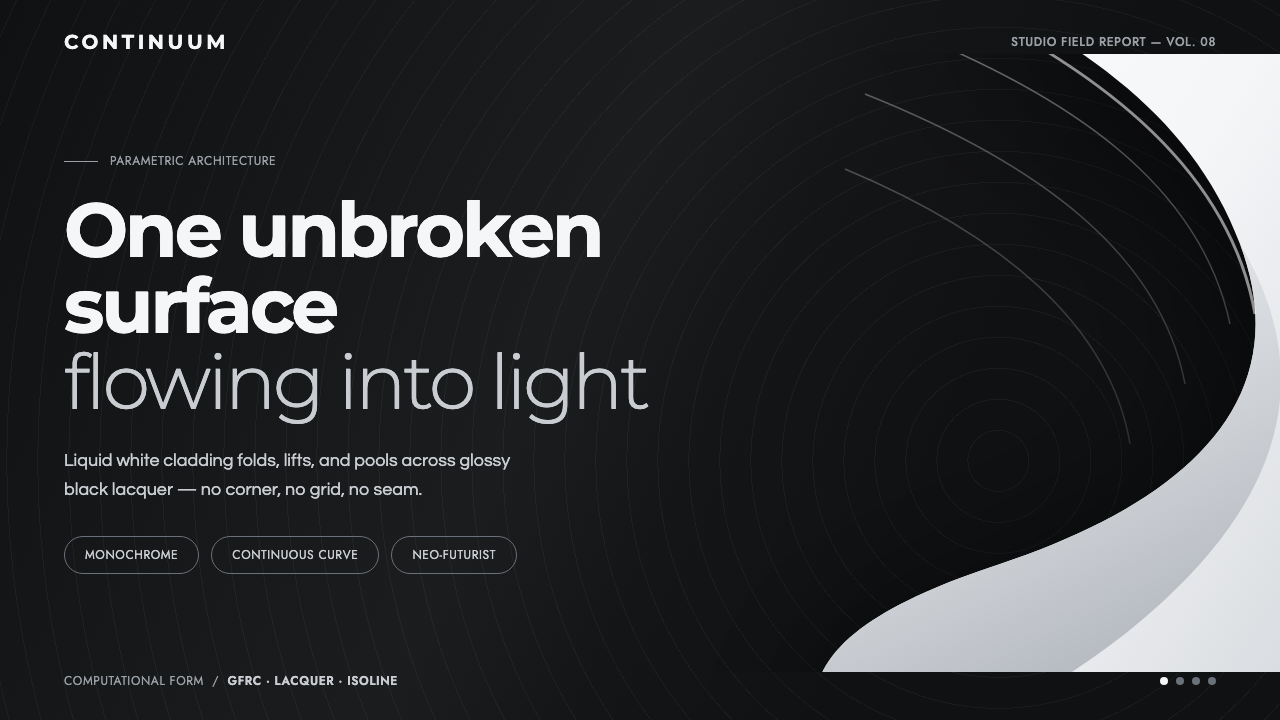 Parametricism (Zaha Hadid)Architecture as one unbroken surface. A liquid-white swoop floats on glossy b…
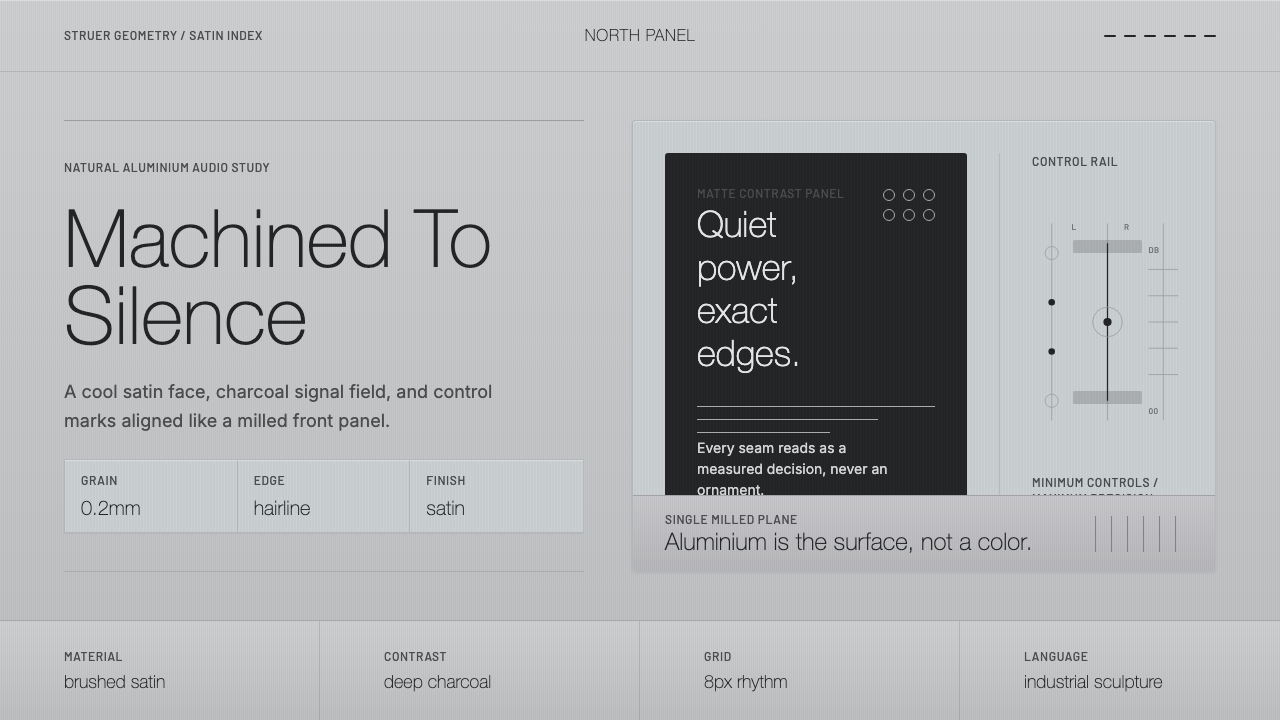 Bang & Olufsen AluminiumQuiet luxury, machined flat. Satin aluminium grain, hairlines, thin charcoal…