What is Westworld (Delos)?
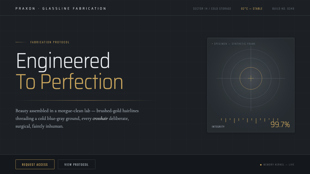
Westworld’s Delos aesthetic turns fabrication into a ritual: blue-gray sterility, brushed-gold precision, and a luxury so controlled it feels faintly inhuman.
Westworld (Delos) in brief
Westworld (Delos) is a futuristic cinematic interface style drawn from HBO’s 2016 series, especially the host-fabrication laboratories operated by Delos. Its visual language combines clinical minimalism with quiet luxury: pale walls and brushed concrete sit beneath a cold blue-gray cast, while milk-white fabrication vats and restrained gold details introduce a sense of engineered value rather than decorative opulence.
The style’s tension is its defining quality. It is clean enough to resemble a laboratory, but too composed to feel merely industrial. Delos spaces and interfaces imply that every object has been measured, catalogued, and made intentional. Hairline dividers, crosshair-like marks, thin title treatments, and isolated fields of information all suggest a system that sees people as records, specimens, or products in process.
Its retrofuture character prevents the result from becoming generic technology minimalism. Player-piano line art and Americana-inflected mechanical motifs add a quiet historical undertone to the sterile future. The aesthetic is therefore not simply futuristic or luxurious: it is the visual language of an institution that makes living things with immaculate confidence, then presents that act as ordinary operations.
Where does Westworld (Delos) come from?
The aesthetic originates in HBO’s Westworld, which premiered in 2016 and was created by Jonathan Nolan and Lisa Joy. Within the series, Delos provides the fictional corporate setting for host fabrication, allowing its design language to operate as both world-building and argument. The spaces must communicate technical capability, wealth, secrecy, and emotional distance at the same time.
The source material places the style in a North American, HBO-era vision of the future, where clinical minimalism intersects with Apple-style product aesthetics. The result is not cluttered science fiction. Instead of crowded control rooms or visibly improvised machinery, the Delos language favors reduced surfaces, controlled illumination, and objects presented with the calm certainty usually associated with premium products.
Nathan Crowley and Ray Larabie are named among the key figures associated with this source material, alongside Nolan and Joy. Their presence is useful for understanding why the style feels like a complete system rather than a single set: architecture, title language, interface-like line work, and the visual treatment of fabrication all move in the same direction.
A second source of identity is retrofuture player-piano Americana. The player-piano reference introduces delicacy, repetition, and programmed performance into an otherwise laboratory-clean environment. That combination is central to Delos: a future presented through pristine systems, yet haunted by older ideas of automation, entertainment, and controlled human behavior.
What defines the Westworld (Delos) look?
Cold Clinical Ground
The foundation is a cold blue-gray atmosphere over white walls and brushed concrete. It reads as sanitary, quiet, and controlled rather than cozy. The goal is not darkness for drama, but a cool neutrality that makes bodies, tools, and information appear observed under institutional light.
Milk-White Fabrication
Milk-white vats and pale surfaces soften the laboratory without making it warm. They evoke immersion, incubation, and controlled biological production. White is treated as material presence, not blank emptiness: it carries the uncanny implication that a living form can be manufactured in a perfectly clean process.
Brushed-Gold Precision
Gold appears as a restrained accent, often with the character of brushed metal rather than jewelry. It introduces value, calibration, and ceremonial refinement without breaking the clinical discipline. Used sparingly, it makes the environment feel proprietary and expensive, as if each component belongs to a private research system.
Hairline Information
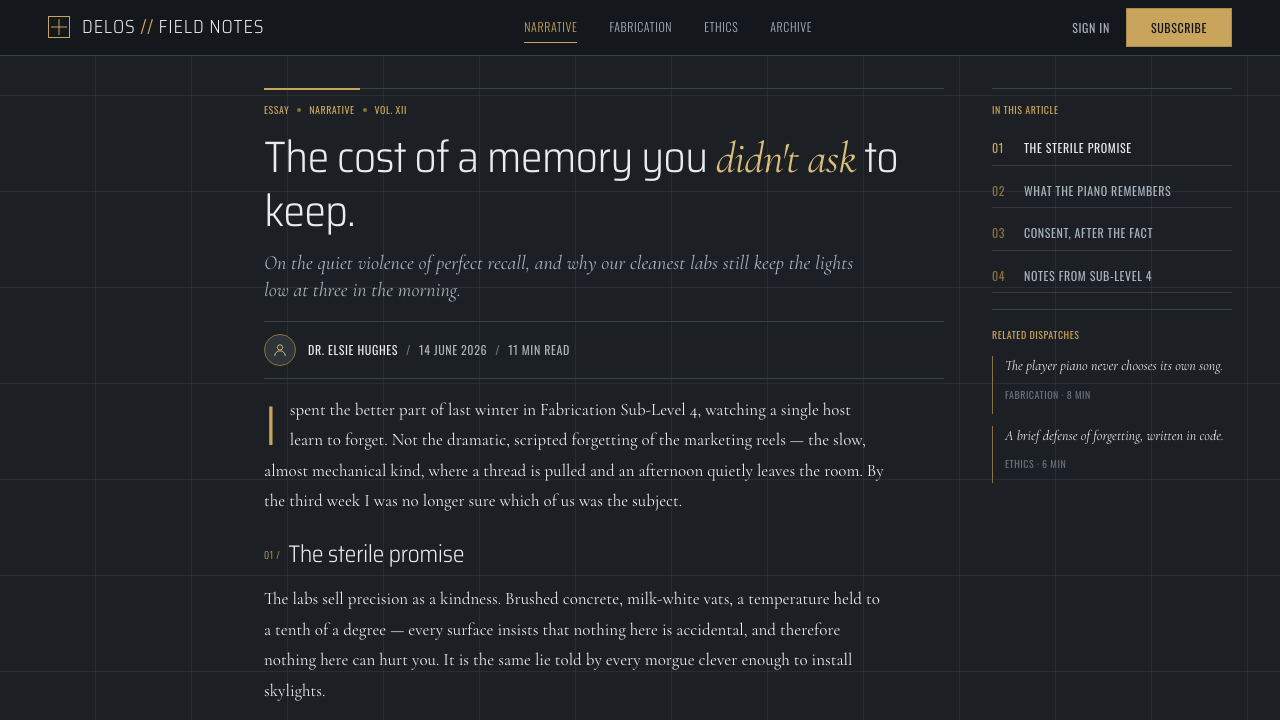
Thin rules, measured dividers, and crosshair-like guides organize the composition. These marks should feel surgical rather than decorative. They frame information, imply exact placement, and make even empty space look monitored. The line is never merely a border; it is evidence of a system at work.
Thin Elegant Titles
Titles are elegant and restrained, avoiding loud display gestures. Their delicacy creates contrast with the authority of the surrounding system: language appears composed, classified, and almost clinically detached. Hierarchy comes from spacing, isolation, and compositional calm rather than aggressive visual noise.
Retrofuture Line Art
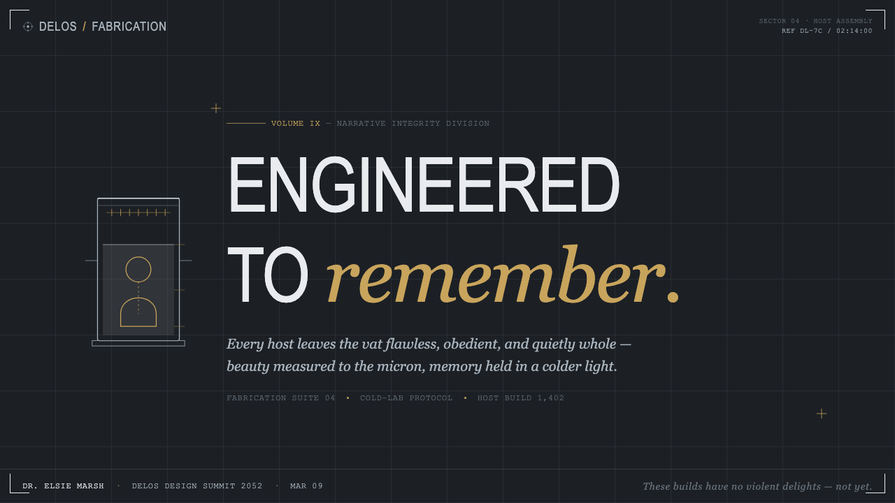
Player-piano-like line art introduces a mechanical, archival quality. It suggests notation, programmed movement, and the translation of organic action into a repeatable sequence. In this style, line drawings work best as technical traces or quiet motifs, never as playful illustration.

Who shaped Westworld (Delos)?
Jonathan Nolan is named as a key figure in the source material and as a creator of HBO’s Westworld. For the Delos aesthetic, that authorship matters because the visual system is inseparable from the series’ future-facing corporate world: immaculate, highly organized, and uneasy about the human consequences of control.
Lisa Joy is likewise identified as a key figure and creator of the series. The Delos language benefits from being read as narrative design, not decoration: its calm surfaces and refined restraint make the fabricated world feel plausible precisely because it refuses to announce its own menace.
Nathan Crowley appears among the key figures in the approved source material. In a style guide context, the name anchors attention on the spatial side of the Delos system: brushed concrete, pale walls, fabrication environments, and luxury expressed through restraint rather than visual abundance.
Ray Larabie is named among the source material’s key figures. His inclusion points to the importance of typography within the aesthetic: thin titles, controlled letterform presence, and text that feels engineered into the environment rather than layered on after the fact.
How do you use Westworld (Delos) today?
For presentation covers, use the Delos mood to establish authority through restraint. Begin with a cold, spacious ground, a single isolated title, and one brushed-gold or milk-white structural accent. A quiet crosshair, line-art instrument, or finely ruled frame can suggest controlled investigation. Keep the composition sparse enough that the title feels processed by the page rather than merely placed on it.
Content and data slides benefit from the style’s disciplined hierarchy. Treat sections as laboratory panels: clear labels, fine separators, ample negative space, and information grouped with an almost archival calm. Charts should read as measured instruments rather than colorful decoration. The strongest approach is to let one pale field, one cool dark field, and one restrained metallic accent establish the system.
For web interfaces, Delos works especially well for dashboards, research platforms, premium account areas, and analytical tools. Use the cold ground to create focus, then organize panels with precise dividers and deliberate alignment. Status information, profiles, and data records can adopt the language of catalogued specimens, but essential actions must remain clear enough that the atmosphere never interferes with usability.
For editorial and marketing work, the style is effective when a brand needs to communicate precision, exclusivity, speculative technology, or premium research. Long-form pages can use thin section titles, quiet line motifs, and generous breathing room to build tension gradually. Marketing imagery should feel observed or fabricated rather than casually photographed; avoid anything that introduces spontaneous warmth or everyday clutter.
The common mistake is confusing Delos with generic dark luxury. Heavy black surfaces, loud metallic effects, crowded futuristic HUDs, and aggressive sci-fi ornament all break the spell. The style depends on cold cleanliness and controlled scarcity. Gold is a hairline signal, not a spectacle; line art is a technical echo, not decoration; and the unsettling quality comes from composure, not visual excess.
Westworld (Delos) — FAQ
Is Westworld (Delos) simply a dark-mode Apple aesthetic?
No. Apple-style product aesthetics are one influence named in the source material, particularly in the reduced surfaces and premium restraint. Delos adds clinical sterility, fabrication imagery, cold blue-gray lighting, brushed-gold precision, and an explicitly unsettling relationship to engineered bodies. It should feel less like a consumer device and more like the private infrastructure that could manufacture one.
Why are brushed-gold accents important?
They prevent the laboratory from becoming anonymous. Against cool concrete, white walls, and blue-gray light, brushed gold signals ownership, investment, and calibrated luxury. The accent should remain quiet because its purpose is to make the system feel expensive and proprietary, not to turn the interface into a glamorous object.
Can this style be used for a consumer-facing product?
Yes, but selectively. It suits products that benefit from precision, research, exclusivity, or speculative technology. Consumer flows still need warmth where trust, reassurance, or accessibility matter. Use the Delos language for framing, data views, premium areas, and campaign moments, while keeping everyday actions direct and legible.
How should imagery be handled?
Treat imagery as evidence within a controlled system. The approved source material emphasizes host-fabrication laboratories, milk-white vats, player-piano line art, and surgical precision. Images or diagrams should therefore feel catalogued, isolated, or technically observed. Casual lifestyle photography, exuberant illustration, and expressive collage work against the deliberate distance of the style.
What makes a Delos-inspired layout feel unsettling rather than merely minimal?
The unease comes from immaculate control. Leave space, but make it feel measured. Use thin rules, crosshair-like alignment, and calm titles, but make them imply classification and procedure. Pair clinical surfaces with one refined gold signal and a retrofuture mechanical trace. The result should suggest that nothing is accidental, including the apparent absence of emotion.
Related design styles
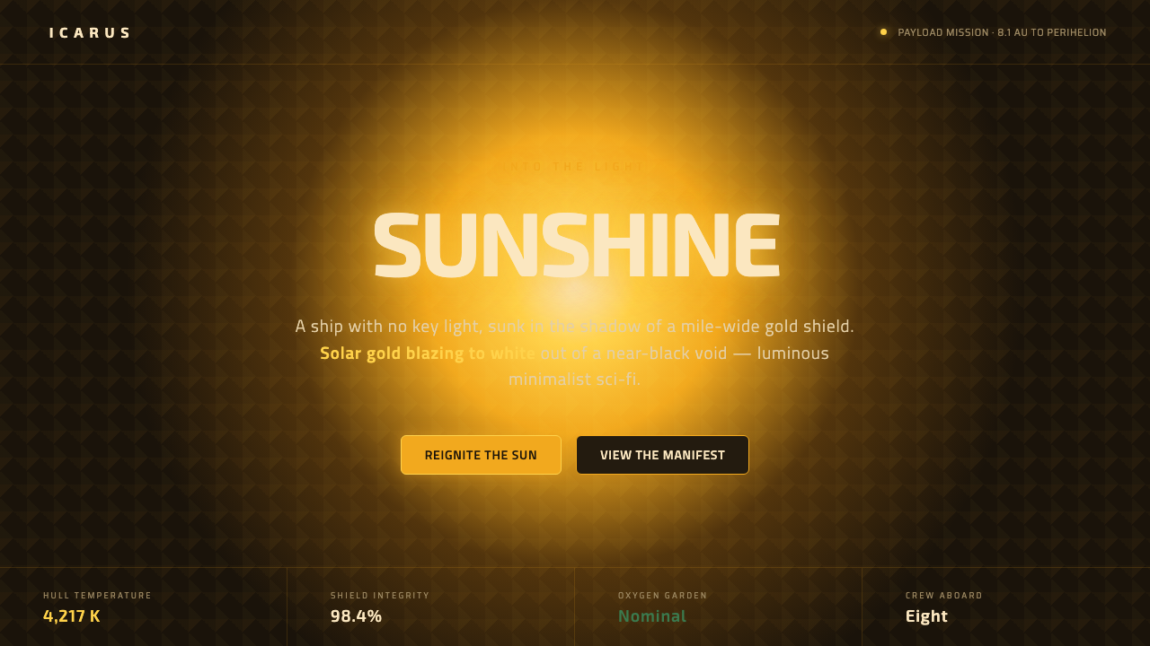 Sunshine (2007)Ship with no key light. Solar gold blooms to white from near-black void — squ…
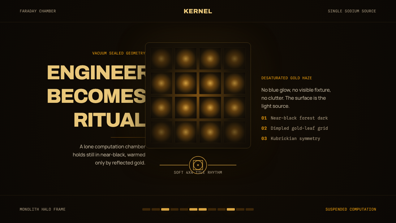 DevsEngineering turns sacred. Near-black void, sodium gold, and a centered dimple…
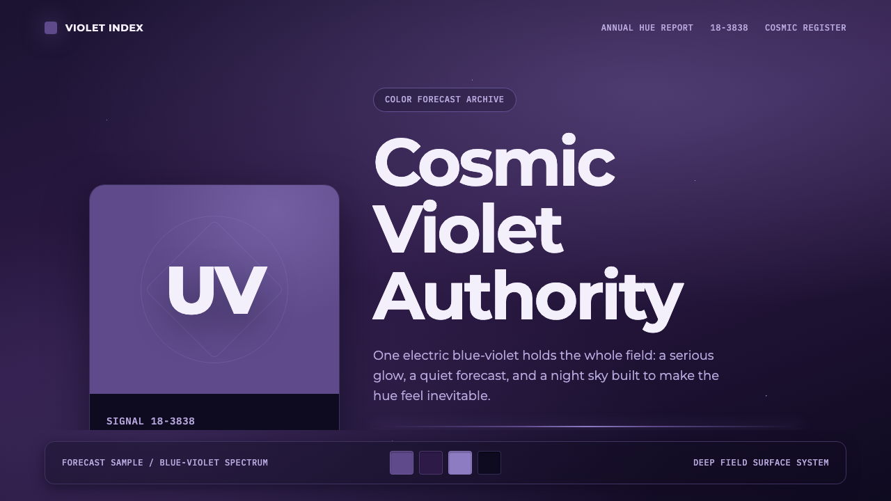 Pantone Ultra VioletCosmic authority. Ultra Violet glows through chip blocks, Montserrat, and dee…
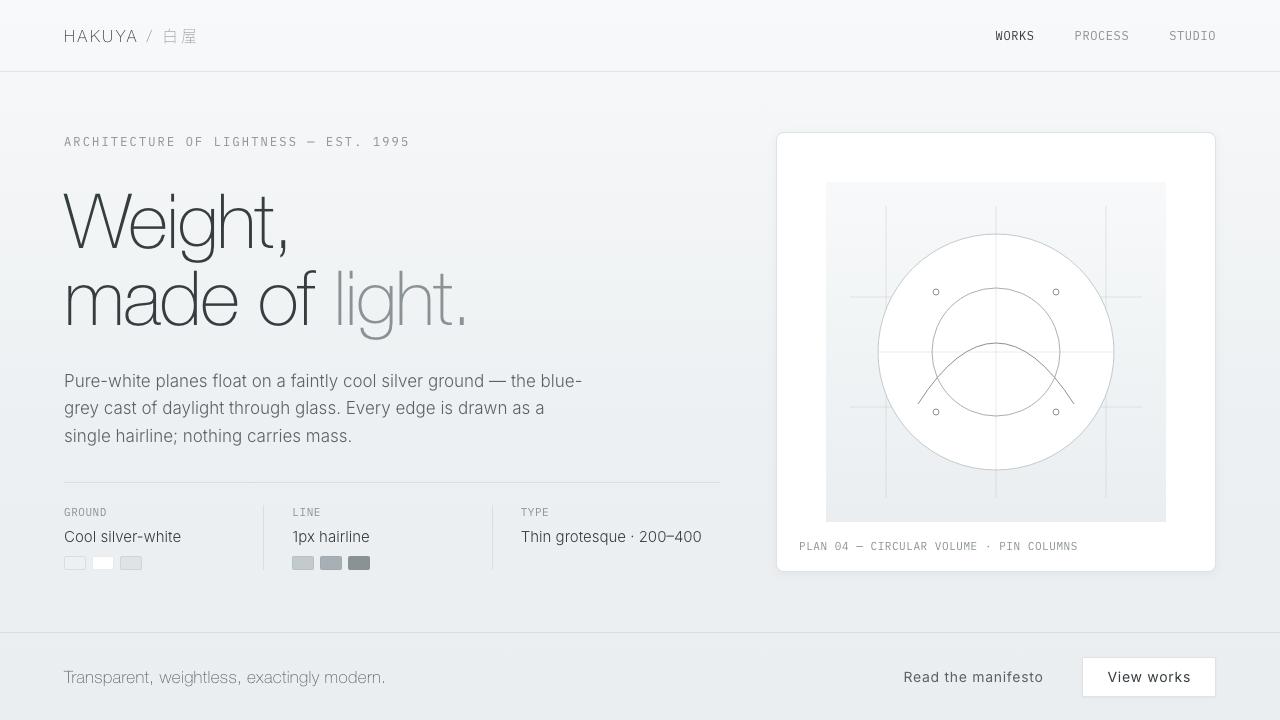 SANAA White LightnessArchitecture made of light. White planes float on cool silver-grey, edged in…
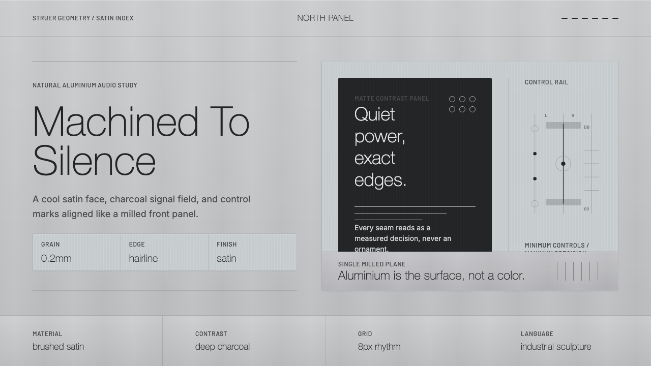 Bang & Olufsen AluminiumQuiet luxury, machined flat. Satin aluminium grain, hairlines, thin charcoal…
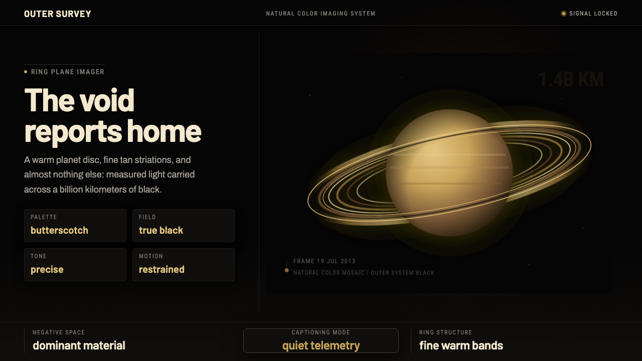 Cassini Saturn ImagingDeep space feels exact. Butterscotch Saturn floats in black with fine tan rin…