What is Devs (Amaya)?
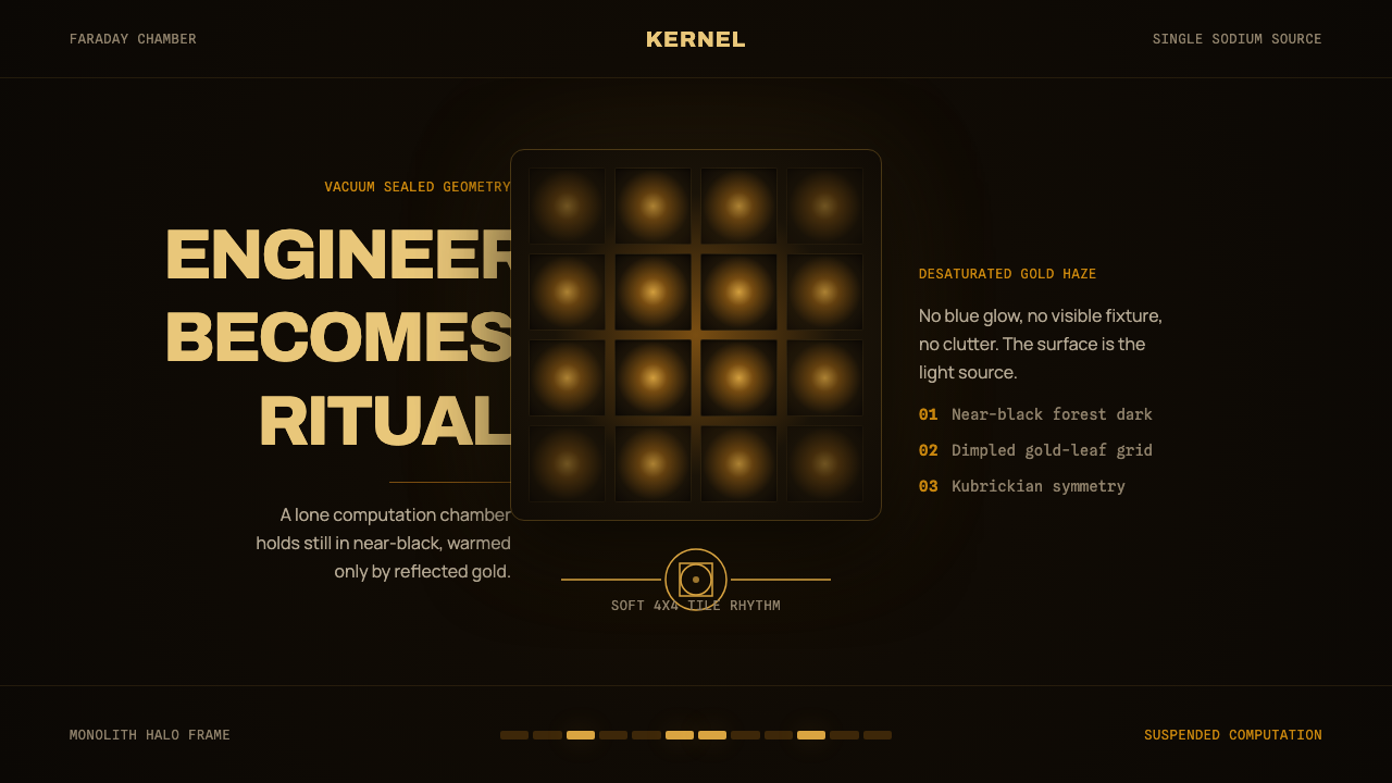
Devs turns engineering into a sacred rite — a solitary gold cube suspended in near-black stillness, where light, geometry, and secrecy become inseparable.
Devs (Amaya) in brief
Devs, also identified with the fictional technology company Amaya, is a dark cinematic style derived from Alex Garland's 2020 limited series. Its defining image is the secret quantum-computing project enclosed within a vacuum-sealed Faraday cube: a centered monolith lined with dimpled gold-leaf tiles and isolated inside a shadowed forest. The setting combines advanced engineering with the composure of sacred architecture.
The visual system is radically restricted. Near-black surrounds a desaturated field of sodium-amber gold, while tungsten light aimed into the metallic walls produces the only meaningful illumination. Instead of describing every surface clearly, the light gathers around the cube and dissolves into a monolithic haze. Darkness is not an empty background but an active boundary that withholds context and makes the illuminated structure feel sealed away from ordinary reality.
Its emotional effect comes from the union of opposites: technological precision and religious awe, brutalist mass and delicate reflected light, forest darkness and geometric enclosure. The centered cube appears controlled and comprehensible, yet its isolation makes it unknowable. Engineering therefore ceases to look like routine work. It becomes a ritual performed inside an object whose stillness, symmetry, and warm radiance imply significance beyond practical function.
Where does Devs (Amaya) come from?
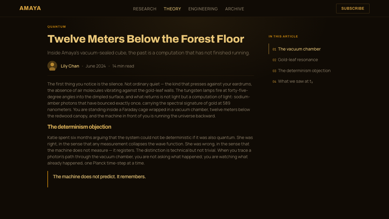
The style originates in Devs, Alex Garland's 2020 limited series for FX and Hulu, and in its image of Amaya as a Silicon Valley company whose most consequential work has been removed from the familiar visual language of offices and laboratories. The secret project is placed in a forest and enclosed within a Faraday cube, creating successive layers of separation: the surrounding darkness, the exterior monolith, the vacuum seal, and the golden interior. Each layer makes the engineering appear more inaccessible and ceremonial.
The central architectural idea draws together Kubrickian science-fiction minimalism, brutalist-sacred architecture, and monolithic design. From Kubrickian minimalism comes the controlled composition and the sense that a small number of forms can carry immense psychological weight. Brutalist-sacred architecture contributes mass, enclosure, and solemnity. Monolithic design reduces the setting to one dominant object, allowing the cube to function simultaneously as building, machine housing, icon, and threshold.
The dimpled gold-leaf lining transforms illumination into the style's principal material. Tungsten lights do not simply brighten the room; they fire into the gold so that reflected sodium-amber light becomes the visible atmosphere. Because this is the only warm source, every surface appears to belong to the same enclosed world. The dimples interrupt perfect flatness without introducing decorative imagery, giving the walls a tactile, engineered repetition that remains subordinate to the cube's larger geometry.
The forest completes the composition by providing an almost black field around the constructed object. Natural surroundings are not rendered as picturesque scenery; they recede until the cube appears suspended in a void. This displacement of a sealed technological chamber into darkness establishes the style's central tension. The project belongs to Silicon Valley, yet its visual authority does not come from familiar signs of digital innovation. It comes from silence, isolation, reflected gold, and the ancient psychological force of a centered geometric form.
What defines the Devs (Amaya) look?
Color
The palette is almost binary: near-black space against desaturated sodium-amber gold. Black carries secrecy, distance, and environmental depth; gold identifies the engineered interior and gives it sacred gravity. The gold should feel metallic and smoke-muted rather than bright or celebratory. Additional hues weaken the sense that every visible surface is governed by one enclosed source.
Single-Source Light
Warm reflected light is the organizing principle. Illumination appears to originate from tungsten striking gold, then spreading through the enclosure as sodium-colored haze. Highlights should reveal selected planes while large areas remain unreadable. Multiple competing light temperatures would turn the scene into ordinary cinematic lighting and destroy its ritual unity.
Monolithic Geometry
One centered cube dominates the visual hierarchy. Its simple outline is more important than internal detail, allowing it to read at once as architecture, containment, and symbol. Secondary forms should appear subordinate or embedded. Fragmenting the composition into many equally assertive objects removes the severe calm on which the style depends.
Dimpled Surface
The gold lining is not flawlessly smooth. Repeated dimples catch and scatter light, producing a surface that feels fabricated, tactile, and acoustically sealed without relying on illustrative pattern. Repetition must remain disciplined: the texture enriches reflected light, but it never competes with the larger cube or becomes ornamental wallpaper.
Void and Isolation
Negative space is treated as an enveloping void rather than unused room. The forest and surrounding architecture withdraw into darkness, leaving the illuminated object apparently detached from ordinary scale and location. Wide fields of black create psychological distance and make every small interruption feel consequential. Crowded layouts are fundamentally incompatible with this effect.
Symmetry and Stillness
Centered placement and stable axes create sacred-geometry calm. The composition does not advertise motion, speed, or technical bustle; it suggests a system operating with such precision that movement has become invisible. Asymmetry may occur at the edges, but it should never dislodge the central mass or disturb the impression of vacuum-sealed stillness.
Restrained Typography
Typography should behave like labeling on a sealed instrument: sparse, deliberate, and subordinate to architecture. Neutral, disciplined letterforms suit the engineered atmosphere, while generous darkness around text preserves solemnity. Oversized promotional language, decorative display faces, or numerous competing hierarchies make the system feel theatrical in the wrong sense.
Who shaped Devs (Amaya)?
Garland created the 2020 limited series from which the style takes its identity. The world of Devs places a Silicon Valley quantum-computing project inside an image system defined by enclosure, darkness, monolithic geometry, and sacred calm. That conceptual union is the style's essential contribution: advanced engineering is presented not as frictionless convenience, but as a secret practice carrying enormous psychological weight.
Rob Hardy BSC is one of the two key figures identified with the style's formation. The imagery associated with Devs depends on disciplined control of near-black exposure, reflected tungsten warmth, and the narrow tonal world of sodium-amber gold. The result avoids colorful technological spectacle and instead gives the cube the visual authority of a solitary illuminated monument.
Amaya is the fictional Silicon Valley company that gives the style its institutional setting. Its secret project is not represented through a conventional corporate laboratory but through a vacuum-sealed Faraday cube glowing in a dark forest. Amaya therefore names more than a company in this visual vocabulary: it signifies the transformation of private technological power into architecture, atmosphere, and ritual.
How do you use Devs (Amaya) today?
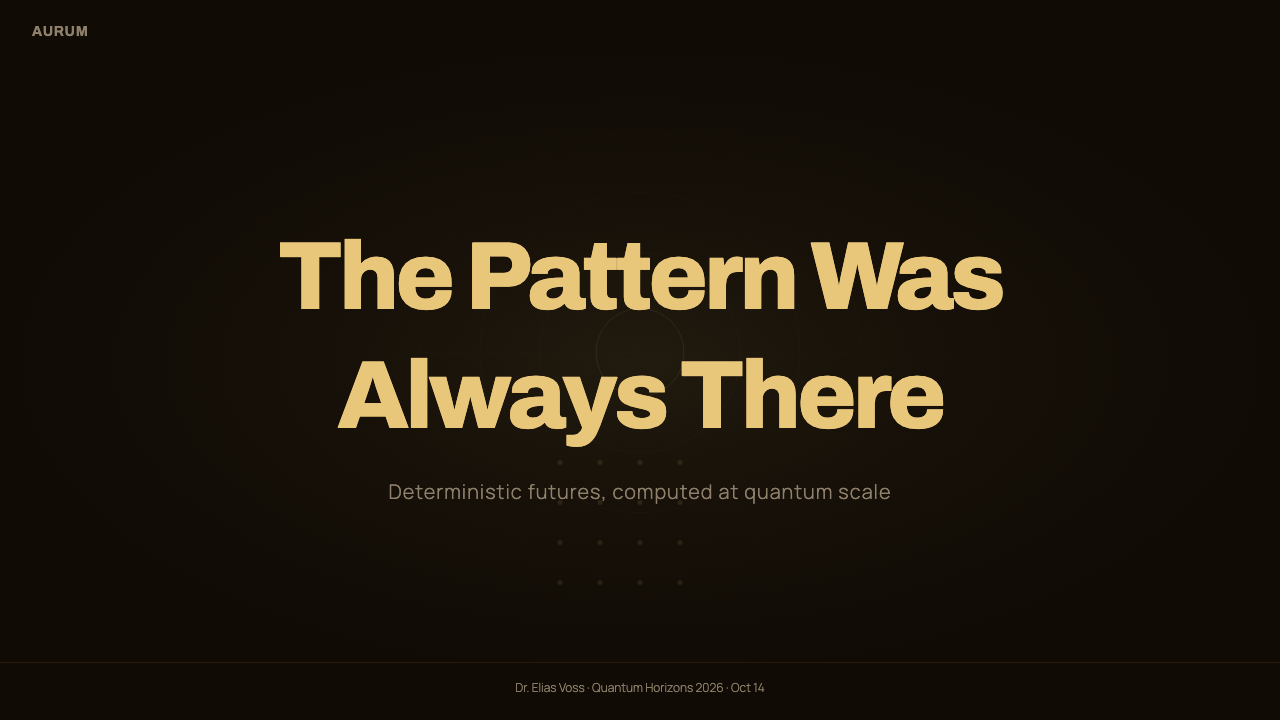
For presentation covers, the style works through radical concentration. Place one cube-like form or cropped architectural mass at the center of a near-black field, allow a restrained gold glow to reveal its surface, and keep the title quiet enough to preserve the object's authority. Content slides should maintain the same hierarchy with sparse text, broad dark margins, and a single illuminated region. The atmosphere collapses if every section receives equal emphasis.
Data slides should treat information as an instrument reading inside a sealed chamber. Use subdued gold for the principal series, dim neutral tones for context, and black space to separate evidence rather than decorative boxes. A chart may occupy the role of the central monolith, while annotations behave like precise technical labels. Complexity should be revealed selectively so the data feels consequential, not merely abundant.
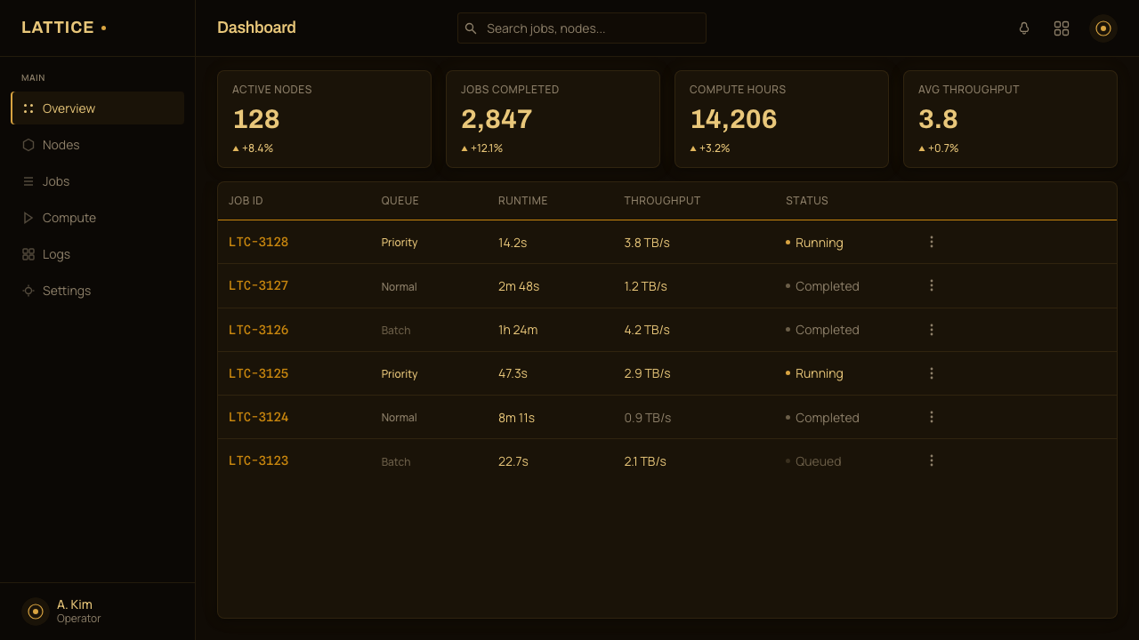
In web interfaces, Devs suits dashboards, analytical tools, and pricing pages that need to communicate controlled power or exclusivity. A dashboard can place one primary metric in a luminous central panel while peripheral controls recede into darkness. Pricing tiers should not become a row of equally bright promotional cards; one selected tier can carry the gold field while alternatives remain restrained. Interaction states should feel like light entering a sealed system.
Editorial and marketing layouts benefit from the contrast between monumental imagery and sparse explanation. A feature article can open with a centered object surrounded by black, then alternate dense passages with quiet gold-lit intervals. Marketing pages can use a single warm visual anchor for the product promise, followed by disciplined sections that preserve the sense of secrecy. Repeated dramatic glows should be avoided, because rarity is what gives the light authority.
The common mistake is reducing the style to black backgrounds with fashionable gold decoration. Devs gold is not ornamental luxury; it is reflected illumination inside an engineered enclosure. Excessive metallic flourishes, glossy gradients, scattered highlights, or crowded futuristic interface marks contradict the source. The correct test is whether the composition feels vacuum-sealed, monolithic, and almost silent. If it merely feels expensive, the central idea has been lost.
Devs (Amaya) — FAQ
Is Devs simply a black-and-gold luxury style?
No. Luxury styling uses gold as a signal of value, polish, or abundance. Devs uses gold as the consequence of a specific lighting system: tungsten striking dimpled gold walls inside a sealed cube. The color is desaturated, atmospheric, and inseparable from darkness. Its purpose is to make engineering feel sacred and isolated, not to make a surface look expensive.
Why is the cube so important to the style?
The cube concentrates several ideas into one form. It is geometrically simple, structurally closed, visually monolithic, and capable of reading as both architecture and container. Centered in darkness, it acquires the calm of sacred geometry while preserving the severity of an engineered object. Replacing it with many fragmented shapes would weaken the relationship between secrecy, containment, and authority.
Can the aesthetic use brighter colors or several warm accents?
Only with considerable restraint. The source aesthetic depends on sodium-amber functioning as the sole meaningful warm presence within near-black surroundings. Additional bright hues create separate visual events and make the scene feel more like a conventional science-fiction interface. If variation is necessary, it should remain subordinate to the gold atmosphere rather than becoming a competing palette.
How should imagery be composed in a Devs-inspired layout?
Begin with one dominant object, place it on a stable central axis, and allow most of the environment to disappear into darkness. Reveal only the surfaces necessary to establish geometry and material. The surrounding black field should remain large enough to make the object feel isolated from ordinary scale. Secondary imagery must support the central mass instead of forming a collage.
Where does the style work poorly?
It struggles when a product must feel casual, cheerful, socially open, or rich with varied content. The near-black field, restricted light, and monumental center naturally communicate secrecy, gravity, and distance. Those qualities suit analytical tools, exclusive systems, and serious editorial narratives, but they can make friendly consumer services or dense browsing experiences feel forbidding. The product's emotional purpose must justify the severity.
Related design styles
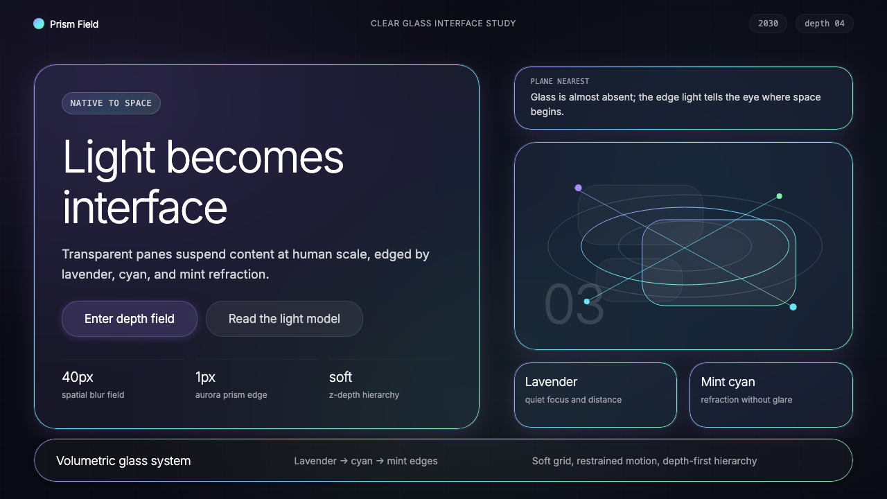 Vision Pro Spatial UI (2030)Structured light, not software. Deep navy glass panels glow with lavender-cya…
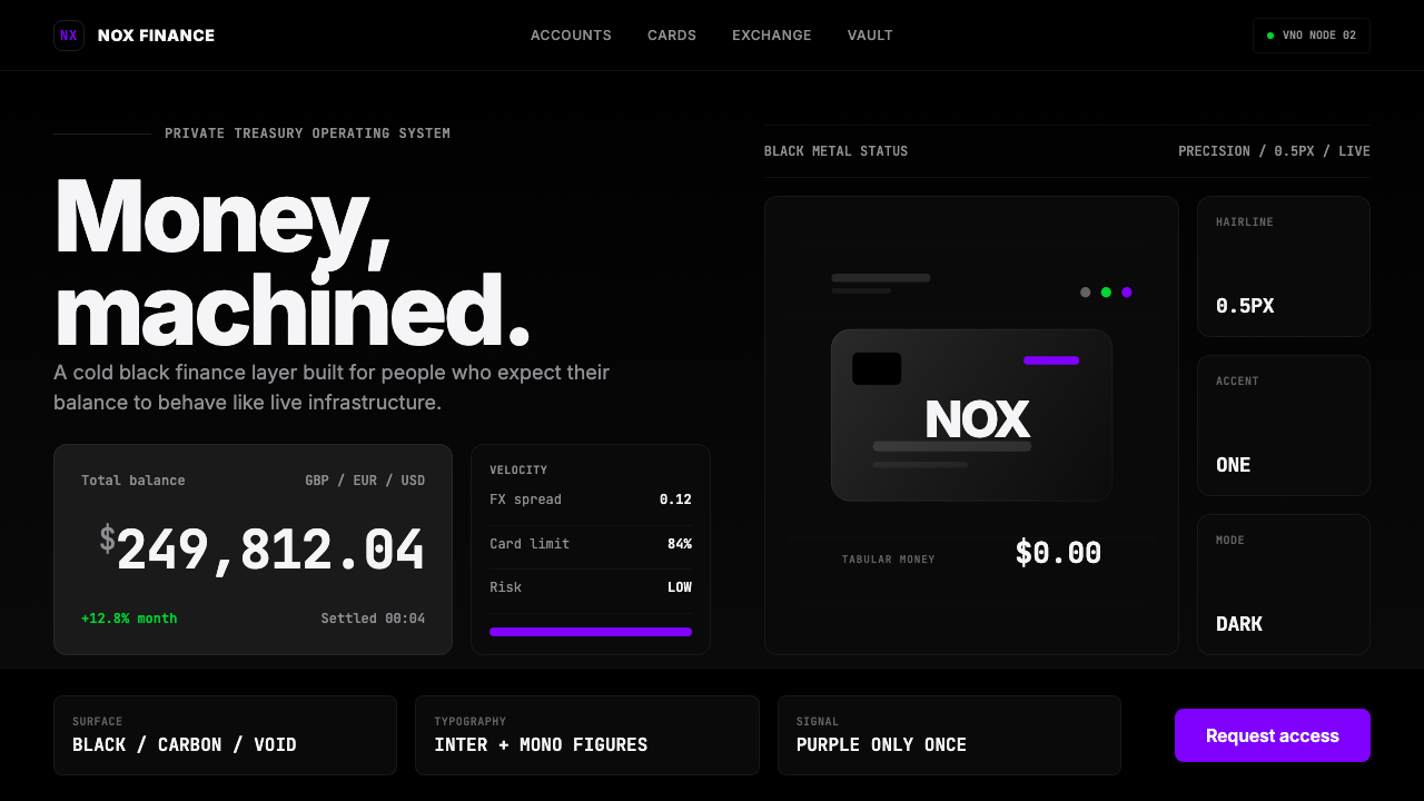 Revolut Black FinanceBanking as instrument. Pure black, hairline borders, and one electric purple…
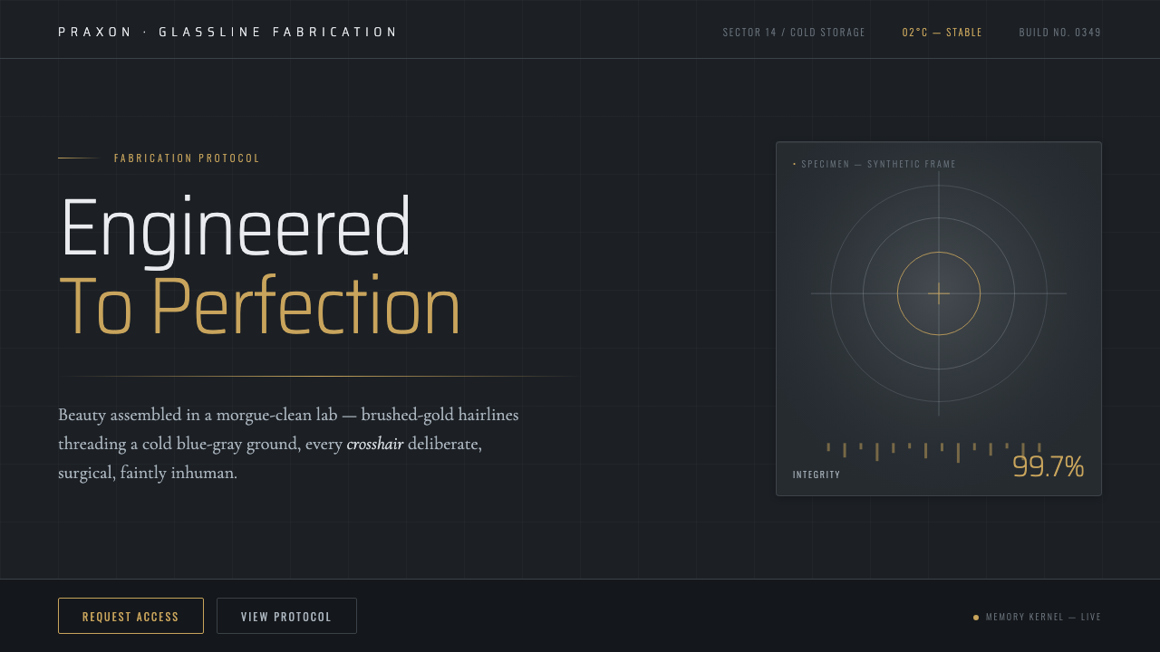 Westworld (Delos)Beauty engineered in a morgue-clean lab. Cold blue-gray ground, brushed-gold…
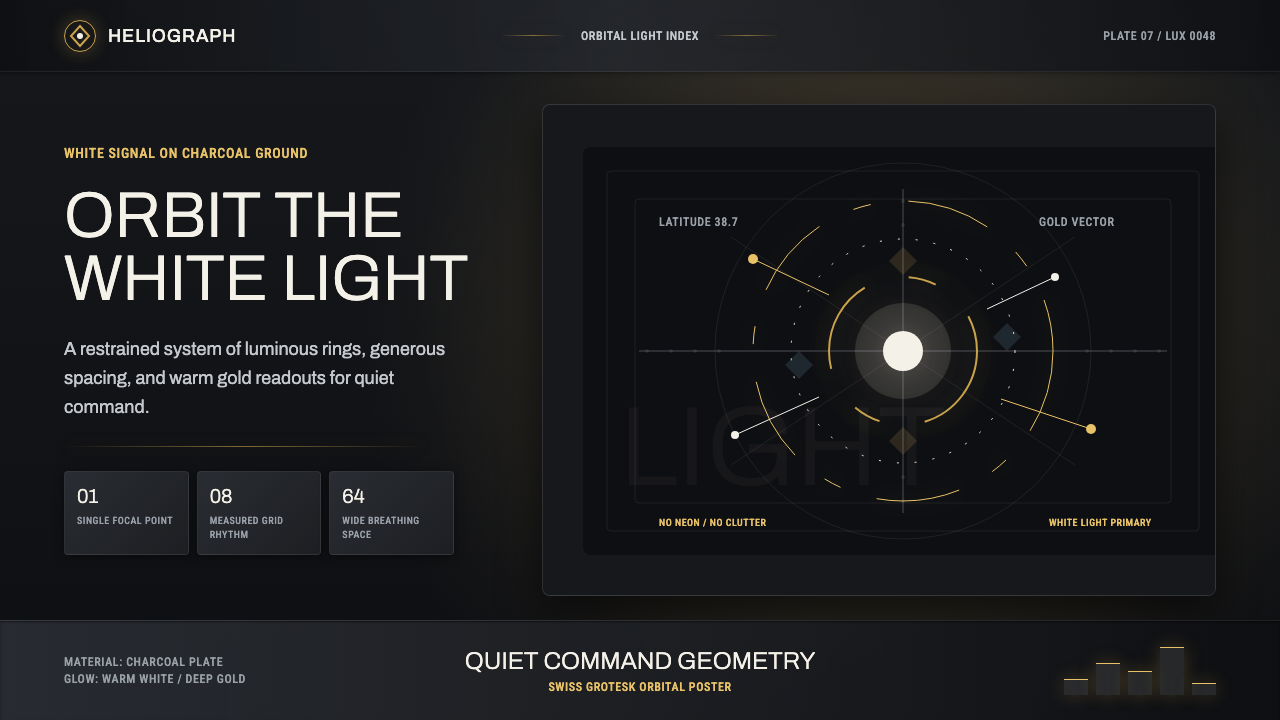 DestinyLuminous restraint. White-gold rings orbit charcoal plates in clean grotesk t…
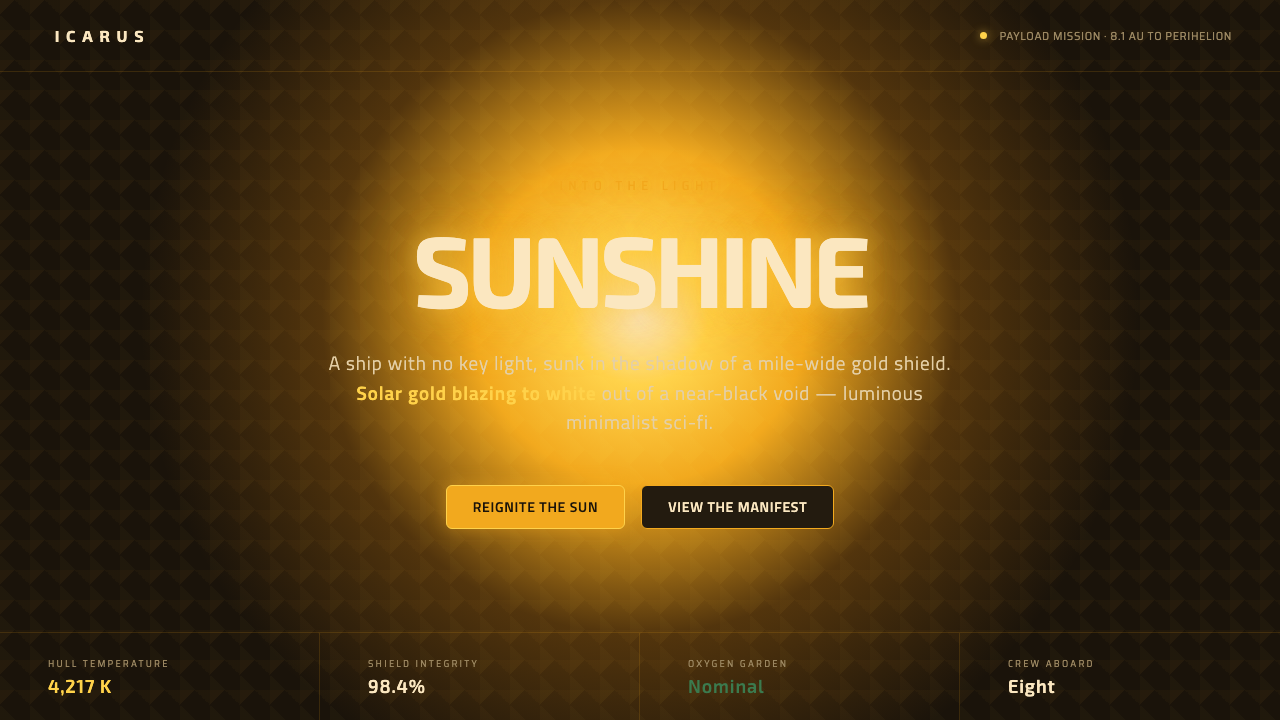 Sunshine (2007)Ship with no key light. Solar gold blooms to white from near-black void — squ…
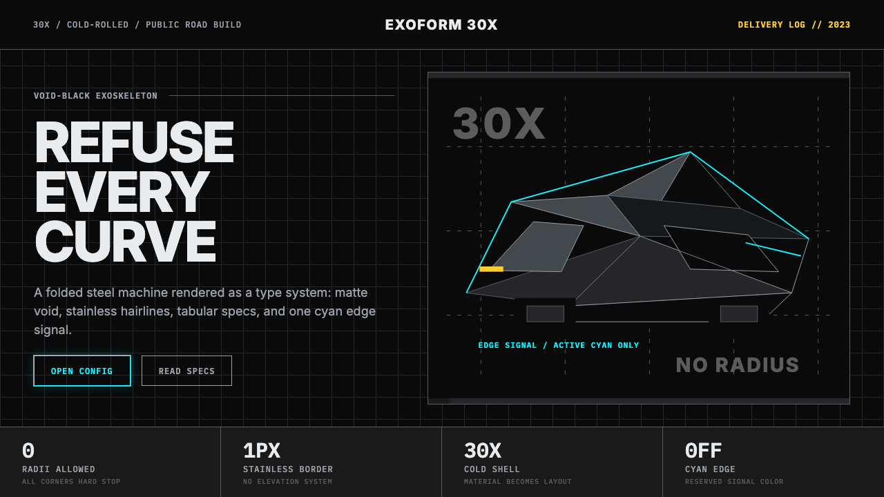 Tesla Cybertruck Stainless (2023)Refusal made material. Void black, stainless hairlines, cyan edges, faceted I…