What is AR Glasses Overlay?
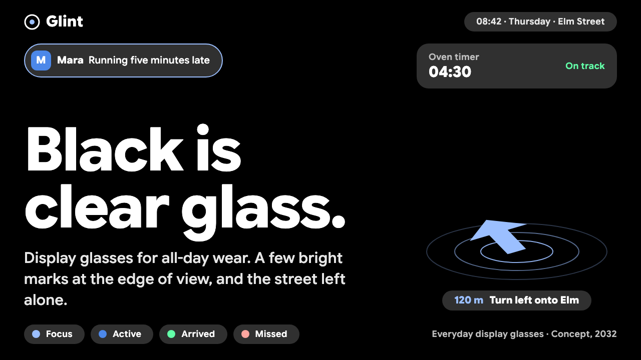
On a see-through display black is clear glass, so the AR Glasses Overlay style lets the real street be the page and keeps the interface to a few small, bright marks at the edge of view.
AR Glasses Overlay in brief
AR Glasses Overlay is an interface style for display glasses worn all day. On an additive waveguide display, black emits no light and therefore reads as clear glass. The practical consequence is that the real world is the background, and the interface is reduced to whatever small, bright marks genuinely need to appear: a notification capsule at the edge of view, an arrow pinned to the pavement, one line of white text.
The style treats attention as the scarce resource. Content is kept small, bright and peripheral. The center of the field of view is left empty for the street, the room or the person in front of you. Dark plates appear only when text needs a surface to stay legible, and everything fades away when it is ignored.
Visually it is an inversion of ordinary screen design. A conventional interface fills a rectangle with color; this one avoids filling anything. The design problem is how little to show, where to place it and how quickly it should disappear, rather than how to compose a full page.

Where does AR Glasses Overlay come from?
The style is projected to 2032 but anchored in work that already exists. Android XR display glasses and the Jetpack Compose Glimmer toolkit, both from Google and both dating to 2025, supply the color palette, the component behavior and the assumptions about how a heads-up interface should behave. Google Sans Flex provides the typeface, and the Google Android XR and Google Design teams are the practical authors of the underlying conventions.
Technically the style belongs to optical see-through AR, in which the wearer sees the real world directly through a transparent lens while light is added on top. Unlike video pass-through headsets, black pixels simply let the world show through. That physical fact explains why dark mode here is not a theme choice but the native state of the display.
Conceptually it draws on two older ideas. Mark Weiser and John Seely Brown wrote about calm technology: tools that live at the periphery of attention and move to the center only when needed, then recede again. The glanceable interface is its practical descendant, in which information is designed to be understood in a short look rather than studied.
Together these threads shape the rules of the style. Content sits toward the edges and lower field of view. Interactions are brief. The interface assumes the wearer is walking, talking or working with their hands. The 2032 date describes a time when such glasses are an everyday object, not a demo.
What defines the AR Glasses Overlay look?
Black as clear glass
Pure black is never used as a decorative background, because on an additive display it simply means no light. Large black areas are therefore invisible, and the interface is built from the light that is added: small bright shapes, thin text and soft-edged plates.
Grey capsules at the edge
Notifications and status items are shown as small grey capsules near the border of the field of view. They are legible without being demanding, and their rounded shape signals a light, temporary presence. They are meant to be glanced at and dismissed.
A single pale-blue arrow
Pale blue is reserved for directional guidance, such as a turn arrow pinned to the pavement. Giving direction its own color means the wearer can recognize guidance instantly without reading anything. Other elements stay white or grey.
An empty center
The middle of the view is kept clear. Content gravitates to the edges and lower region so that the wearer can see traffic, faces and obstacles. There are no crosshairs, no scan lines and no floating windows stacked in front of the world.
Large, plain type
Text is set in Google Sans Flex at a generous minimum size, because it is read at a glance against a moving, uncontrolled background. Lines are short, words are few and weights are sturdy enough to stay readable over bright sky or dark pavement.
Plates only where legibility needs them
A dark translucent plate can appear behind text when the background would otherwise swallow it. It is a tool, not a container, and it disappears when the text does. This keeps the display from becoming a screen floating in space.
Fade by default
Elements are designed to leave. If the wearer does not look at a notification, it dims and goes away. Motion is slow and gentle, never a sudden pop. The system respects that ignoring something is a valid response.

Who shaped AR Glasses Overlay?
Researcher who articulated the idea of calm technology, in which tools sit at the edge of attention and become central only when needed. His thinking is the philosophical base for a display that stays out of the way.
Collaborator of Weiser on calm technology and the movement from the center to the periphery of attention. Their shared framing explains why this style favors peripheral, glanceable information over immersive overlays.
The group responsible for Android XR display glasses, the platform whose hardware assumptions, including an additive waveguide display, define what this interface can and cannot do.
The design group behind Jetpack Compose Glimmer and Google Sans Flex, whose palette and type choices this style adopts directly.
How do you use AR Glasses Overlay today?
For slide decks, this style makes a striking presentation about wearables, spatial computing or any product that lives in context. Use a very dark slide, since dark here evokes clear glass, with a photograph of a real street or room filling the frame. Place one small capsule or a single line of white text near an edge and leave the center open. Content slides should show one idea per slide, and data slides should use big numbers in plain type rather than dense charts.
On the web, the style suits concept sites, product pages for glasses and heads-up applications, and design prototypes that simulate an overlay on top of a photograph or video. It is less suitable for ordinary applications, because the underlying idea is that most of the screen should stay empty. A pricing or dashboard page in this style would feel sparse and hard to scan.
In editorial and marketing work, it is excellent for explainers on spatial computing and for storytelling that places interface marks on real scenes. Photography does the work of the background; the interface contributes a few labeled arrows or capsules. Keep annotations short and place them where an actual wearer would see them.
Typography should stay large and plain. Use short phrases rather than paragraphs, keep line counts low and avoid long reading passages. If a user truly needs to read a lot, the right response is to hand it off to another device.
A frequent mistake is to fill the space: adding windows, panels, sci-fi reticles or scan lines in the center of view. That contradicts the core reason the style exists. Another is to use large dark rectangles as backgrounds, which on a real additive display would be invisible and on a mockup look like a screen pasted onto the world. A third is to add color for variety; the restrained palette is what keeps the overlay readable and calm.

AR Glasses Overlay — FAQ
What is the AR Glasses Overlay design style?
It is an interface style for everyday display glasses, built on the fact that black on an additive waveguide display is transparent. It uses small grey capsules, a pale-blue direction arrow, short white text and an empty center of view, based on Google's Jetpack Compose Glimmer palette and Google Sans Flex. The idea is to keep attention on the real world.
Why is dark mode the default here?
Because on an optical see-through display, dark means no light and therefore transparency. It is not a theme preference but a physical property of the display. Light backgrounds would block the wearer's view, so the interface is built from bright marks on a black field that the eye sees as clear glass.
What is calm technology?
It is an idea associated with Mark Weiser and John Seely Brown: technology should live at the periphery of attention and move to the center only when something needs it, then recede. In this style it appears as peripheral capsules, brief interactions and elements that fade when ignored.
Can I use it for a normal screen interface?
Partly. Its habits of short text, quiet status elements and respect for attention can improve a phone or watch interface. But the empty center and the reliance on a transparent background do not carry over to an opaque screen, so full pages built this way tend to look sparse.
Why does it say 2032?
The year is a projection of when display glasses could be an everyday object rather than a prototype. The style is anchored to Android XR and Jetpack Compose Glimmer from 2025 and extrapolates how an interface would behave once people wear such devices all day.
Related design styles
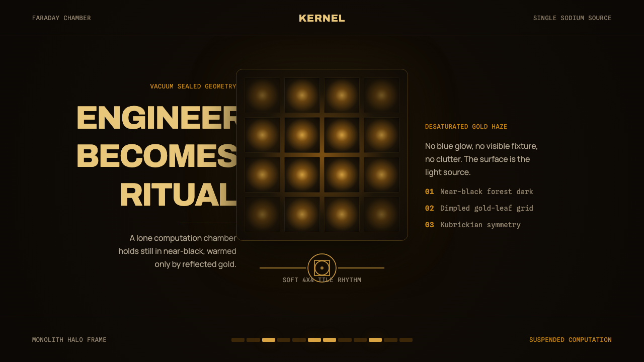 DevsEngineering turns sacred. Near-black void, sodium gold, and a centered dimple…
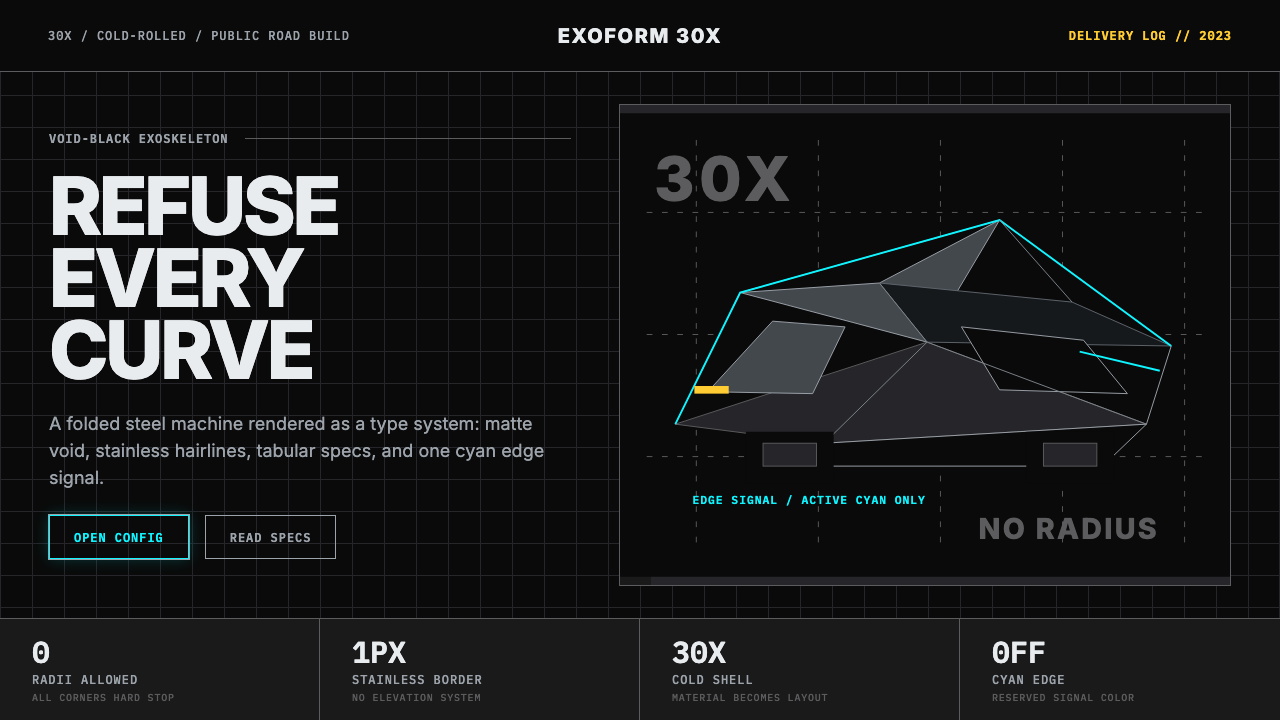 Tesla Cybertruck Stainless (2023)Refusal made material. Void black, stainless hairlines, cyan edges, faceted I…
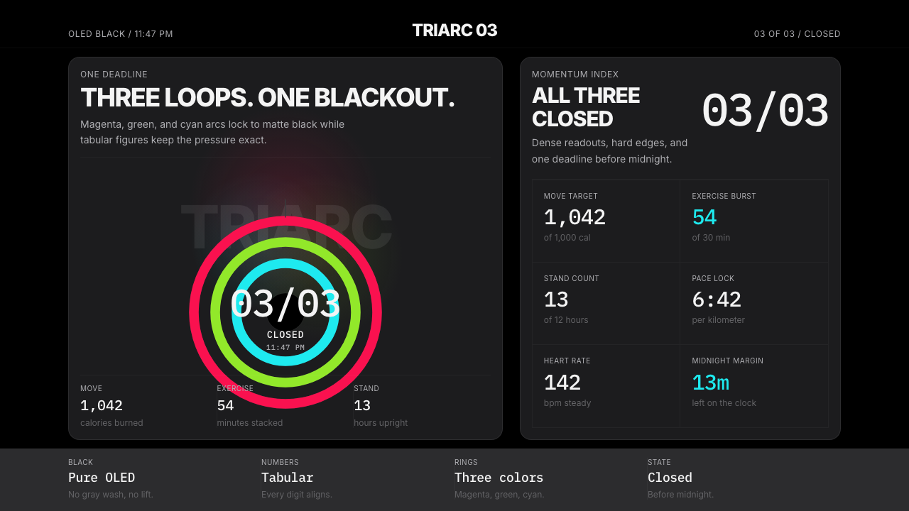 Apple Fitness Rings Closed (2024)Midnight feels exact. Magenta, green, and cyan rings lock onto OLED black.
 Cash App 2024Fintech that talks like a record label. Pure black, dollar-bill green, type a…
 Cursor IDEAI-first code editor. Pure dark surfaces, off-white text, electric blue reser…
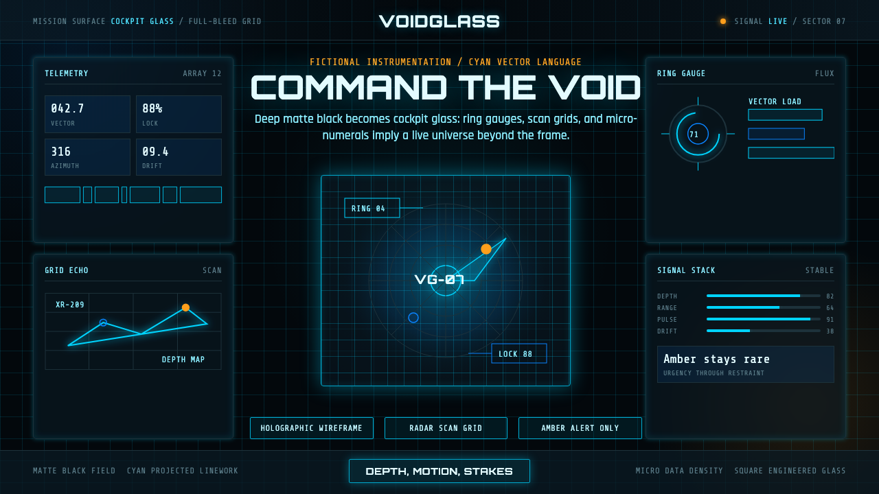 FUI Sci-Fi HUDBlack until it glows. Cyan wireframes, ring gauges, and radar grids sell live…