What is Honkai: Star Rail?
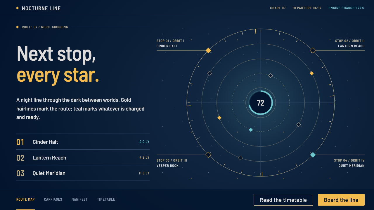
Honkai: Star Rail dresses its menus like the dashboard of a train crossing the stars: a deep navy field, gold hairline orbits and a single medium weight, calm where other space operas shout.
Honkai: Star Rail in brief
The Honkai: Star Rail style is the interface language of miHoYo's 2023 turn-based role-playing game about a train that travels between worlds. Pages sit on a deep navy starfield. Structure comes from thin gold lines, concentric orbit rings and small diamond-shaped markers, and content is framed in cards styled after the game's collectible Light Cones, with angled corners and a row of gold rarity stars.
Its signature restraint is typographic. A single medium weight is used throughout, in a clean Latin sans-serif paired with a matching Chinese sans-serif, and hierarchy comes only from size and colour, never from bolding. Star-gold marks the action that matters, and a cool teal marks whatever is charged and ready, as with the ring that lights only when an ultimate can be used.
The mood is quiet and composed, like the instrument panel of a train carriage rather than the armoured plating of a battleship. That is a deliberate distinction from the usual science-fiction interface, which tends to be aggressive, angular and glowing. Here the glow is small, the geometry is calm and the cosmos is a background rather than a threat.

Where does Honkai: Star Rail come from?
Honkai: Star Rail was released globally on 26 April 2023 by miHoYo, the Shanghai studio behind earlier Honkai and Genshin titles. The source material places the design in Shanghai, China, and dates the current visual look to roughly 2023 through 2025. It belongs to the category of Chinese live-service gacha role-playing games, in which a game is continually updated with new characters and events, and in which the interface must stay legible and attractive across years of additions.
Three founding figures of miHoYo are named in the material: Cai Haoyu, Liu Wei and Luo Yuhao. They are the people most closely associated with the company's direction, which combines anime-style character art with ambitious worldbuilding. The game's look is anchored in anime-style 3D cel shading, in which three-dimensional models are rendered with flat, graphic shading to resemble hand-drawn animation, and the interface is designed to feel consistent with that polished, cinematic finish.
The setting is a space-opera fantasy built around a train. The source material traces the lineage of that idea to Galaxy Express 999, the classic Japanese story of a train that travels through the stars, and the train gives the interface its vocabulary: the carriage, the route, the stop, the ticket. Orbit rings and star charts translate this into a map of destinations, while small diamond markers and thin gold lines give it a feeling of fine instrumentation.
The decision to avoid bold type and aggressive effects reflects both the tone of the game and the practical demands of a live-service interface. When menus must hold characters, items, events and currencies, a restrained palette and consistent weight keep the screen readable. Curio's system distils this into a reusable language: a navy field, gold hairlines, teal for readiness, and framed cards. It suits any product that wants a little interstellar narrative without the usual noise.
What defines the Honkai: Star Rail look?
Deep navy starfield
The ground is a deep navy that suggests night sky and interstellar distance without becoming black. It is quiet and dense enough to make fine gold lines read clearly, and it allows soft indigo layers and tiny points of light to appear without clutter. The effect is of looking out of a carriage window rather than into a void.
Gold hairlines and orbit rings
Structure is drawn in the thinnest gold lines. Concentric rings suggest planetary orbits, straight lines connect nodes like a star chart, and small diamond markers sit at the intersections. Because the lines are fine, they organise the page without weighing it down, and the gold carries a sense of value and navigation.
Single medium weight
Titles and body text share one medium weight in a clean Latin sans-serif and a matching Chinese sans-serif. There is no bold and no light. Hierarchy is created with size and colour alone, which gives the typography an even, composed rhythm and makes bilingual content sit together comfortably.
Light Cone card framing
Cards are framed like the game's collectible Light Cones: angled or cut corners, a thin gold border, a row of small rarity stars and an image area set apart from the text. This gives each item a feeling of being collected, mounted and worth looking at, which suits galleries, character lists and catalogues.
Teal for readiness
A cool teal is reserved for energy and readiness, echoing the ring that lights up when an ultimate ability can be used. It signals that something is charged and available, so it should never be applied to purely decorative elements. Gold marks the action that matters, and teal marks the thing that is ready.
Calm, instrument-panel mood
The composition prefers wide margins, steady alignment and small, gentle glows over dramatic effects. Motion, when it appears, is slow and smooth, like a gauge settling. The overall feeling is of a well-kept railway carriage on a long journey rather than a battle station.

Who shaped Honkai: Star Rail?
Cai is one of the three founders of miHoYo, the studio behind Honkai: Star Rail. He is closely associated with the company's identity and its commitment to anime-style games with strong worldbuilding, which shaped the visual culture this interface belongs to.
Liu is another of miHoYo's founders. As part of the founding trio, he is associated with the company's growth from a small studio into a major name in live-service games, in which long-term interface consistency is a practical necessity.
Luo is the third founder named in the source material. Together with Cai Haoyu and Liu Wei, he is credited as one of the people behind the company's overall direction, under which Honkai: Star Rail was developed and released in 2023.
How do you use Honkai: Star Rail today?
Slides: A cover slide can sit on the navy field with a thin gold orbit ring around a single title, and small diamonds at its nodes. Content slides use one card, framed like a Light Cone, per idea. For data slides, plot values as nodes on a star chart, use gold for the highlight and teal for anything that is current or ready, and keep type to one weight so the numbers carry the emphasis.
Web and UI: Game sites, character and item galleries, event pages, loyalty or membership dashboards and any product with a collectible or catalogue flavour benefit most. Use the navy field for the page, gold hairlines for dividers and teal for ready-state indicators. Navigation can be drawn as a route with stops, and tabs as small diamond markers. Keep buttons simple and outlined, with a gold fill reserved for the primary action.
Editorial and marketing: Posters, announcement banners, trailers, season pages and lookbooks can use the orbit ring as a framing device and the star chart as a layout. A gently lit, centred title above a row of framed cards is enough to give a launch page a sense of occasion. In print, a deep blue stock with a gold foil line suits the same mood.
A common mistake is to add bold type to create emphasis. In this system, the single medium weight is part of the identity, and hierarchy should come from size and colour. Another mistake is to overuse the gold: if every element is gold, none of them matters. Likewise, teal should only appear where something is genuinely ready or active, or its meaning is lost.
A third mistake is to turn the quiet interface into a loud one with heavy glow effects, thick borders and angular armour-like shapes. The point of the style is calm. Keep the lines thin, the margins wide and the glow small, and the cosmos will do the rest.

Honkai: Star Rail — FAQ
What is the Honkai: Star Rail design style?
It is the calm, starfield-based interface language of miHoYo's 2023 game, built from a deep navy ground, thin gold lines and orbit rings, Light Cone-style framed cards and a single medium type weight. Gold marks the key action and teal marks whatever is charged and ready. It reads like the dashboard of a train rather than the armour of a warship.
Who is behind the game?
Honkai: Star Rail was developed and published by miHoYo, a Shanghai studio. The source material names its three founders as Cai Haoyu, Liu Wei and Luo Yuhao. The game was released globally on 26 April 2023.
Why is only one font weight used?
A single weight keeps the interface even and calm, which fits the instrument-panel mood. Hierarchy is created through size and colour, so nothing shouts. It also helps bilingual layouts, because Latin and Chinese text sit together at the same visual strength.
What does the train theme have to do with the look?
The game's setting, a train that travels between worlds, draws on the lineage of Galaxy Express 999. It gives the interface its vocabulary of routes, stops and tickets, and explains why the design feels like a carriage instrument panel with orbit rings and star charts instead of a battle display.
What projects suit this style?
Game sites, character and item galleries, event pages, membership dashboards, catalogues and any product that wants a quiet sense of space narrative suit it well. It is less appropriate for loud promotional pages, fast retail interfaces or anything that depends on bright, warm colour.
Related design styles
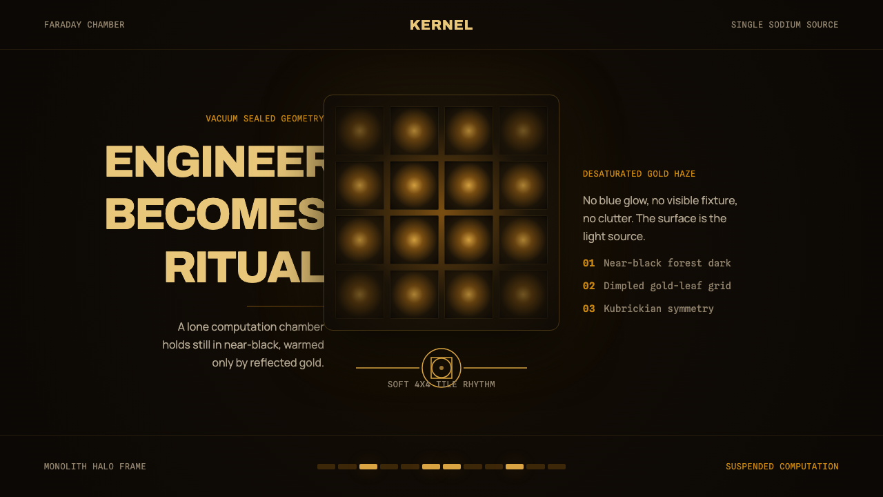 DevsEngineering turns sacred. Near-black void, sodium gold, and a centered dimple…
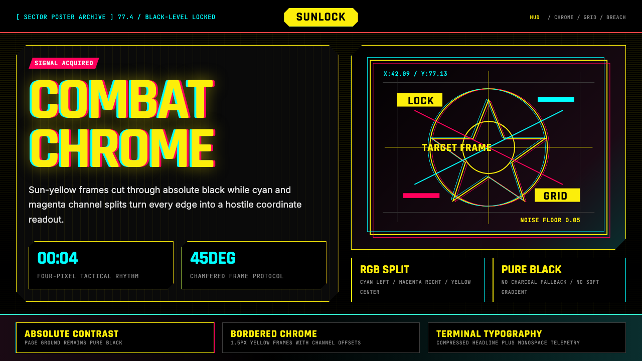 Cyberpunk 2077 Night City YellowCombat HUD on black. Sun-yellow chrome splits into magenta-cyan coordinate gr…
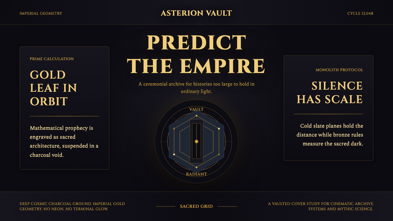 Foundation AppleSacred empire in shadow. Cinzel capitals and gold geometry float on cosmic ch…
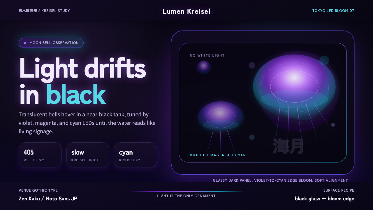 Jellyfish Aquarium StudyLight is the ornament. Violet-cyan glow floats in black glass with venue-goth…
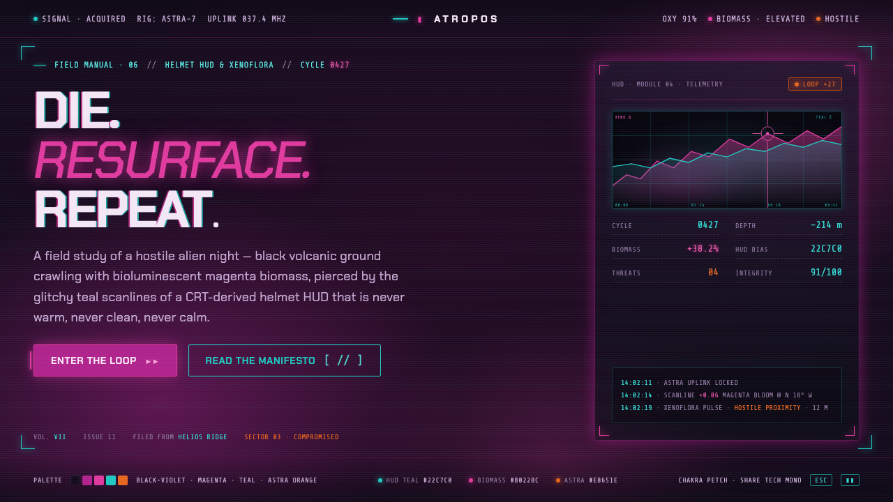 ReturnalNever warm, never clean, never calm. Magenta biomass on a violet night, pierc…
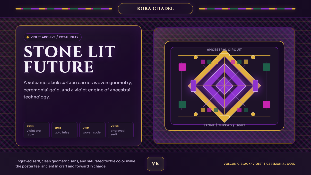 Africanfuturism VibraniumCeremony goes electric. Violet glow and gold inlay thread a volcanic textile…