What is Tongan Black Sand?
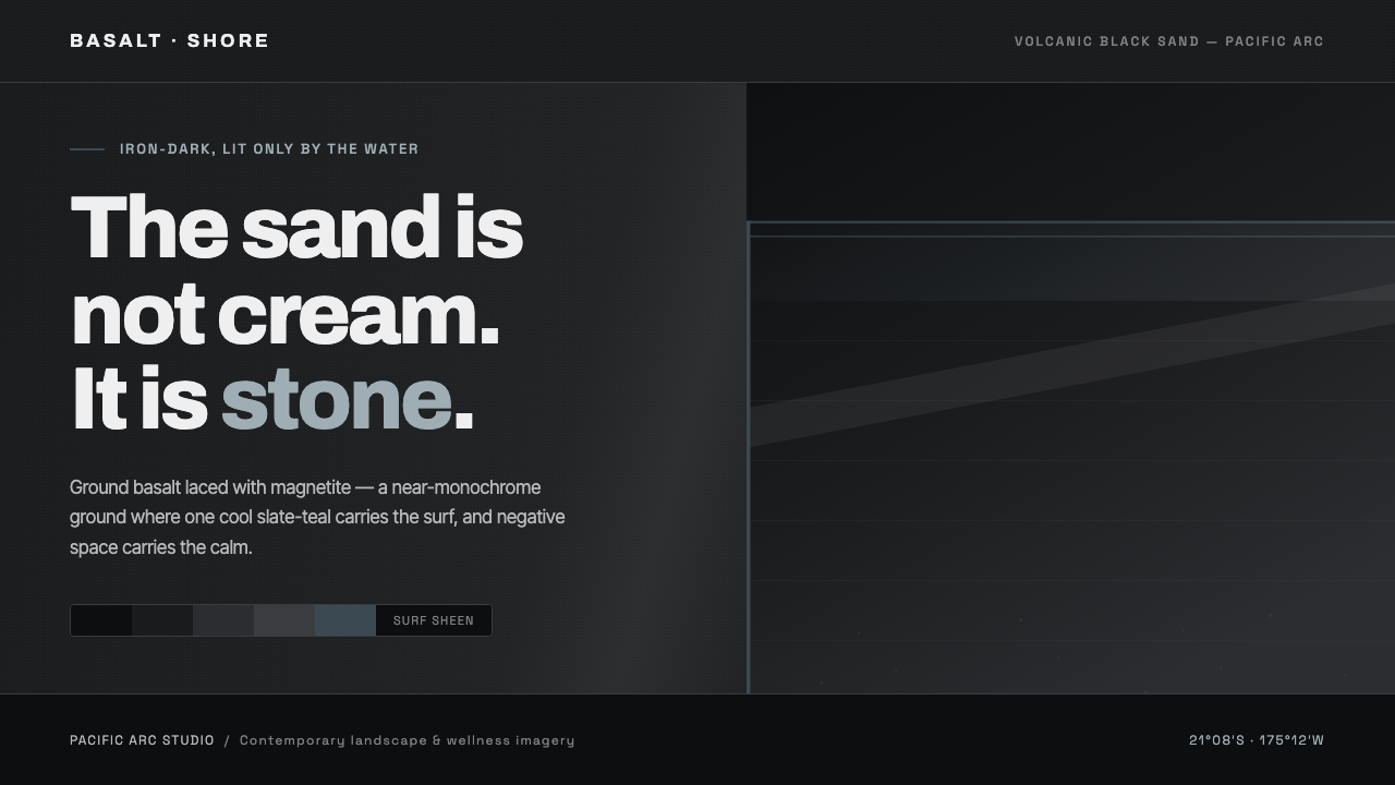
Tongan Black Sand turns a volcanic Pacific shore into an interface of iron-dark grain, wet stone, and one cool surf reflection.
Tongan Black Sand in brief
Tongan Black Sand is a contemporary dark design language derived from the volcanic black-sand beaches of Tonga and the wider Pacific arc. Its visual premise is geological rather than decorative: the ground is crushed basalt laced with magnetite and iron oxides, so the dominant impression is cool dark gray through jet-black, not warmth, softness, or beach-resort nostalgia. The interface should feel like a shoreline after surf has passed across it—dense, mineral, reflective, and composed.
The system is near-monochrome. Wet iron-dark sand, jet grain, and graded basalt grays establish depth through material variation rather than through a broad spectrum of color. A cool slate-teal, drawn from the sheen of Pacific surf, is the lone tonal counterpoint. It should read as reflection or waterlight, never as a cheerful decorative accent competing with the dark field.
Its typography and spacing belong to a contemporary wellness-photography register. Clean modern grotesques, calm image-led composition, and generous negative space prevent the darkness from becoming oppressive. The result is not gothic, industrial, or aggressively technological. It is a quiet, high-contrast atmosphere in which the mineral surface carries weight while the surrounding space remains breathable.
Where does Tongan Black Sand come from?
The style begins with a physical landscape: volcanic black sand along Tonga and the wider Pacific volcanic arc. This sand is ground basalt mixed with magnetite and iron oxides. Those minerals give the shore its iron-dark character, while contact with surf changes the reading of the surface from cool dark gray to jet-black with a wet-stone sheen. Tongan Black Sand treats those observations as the source of an interface system rather than as scenery to imitate literally.
Its stated era is contemporary, from 2010 to the present, and its cultural context is Pacific landscape photography and minimalist wellness imagery. That context matters because the style does not reconstruct a historical graphic movement. It translates the photographic experience of dark coastlines into digital composition: an expansive dark ground, a small amount of reflected coolness, controlled contrast, and a sense of environmental stillness.
Contemporary Pacific landscape photographers provide the landscape logic: basalt is allowed to remain dark, granular, and materially specific; surf appears as sheen rather than as bright spectacle. Minimalist wellness-imagery practitioners provide the compositional logic: space is restorative, type is clean, and images are given room to establish mood without visual clutter. Neither influence calls for ornament or a crowded palette.
The resulting system is deliberately specific about what it excludes. Cream and pure white contradict the central material fact that the sand is iron-dark basalt. Warm coastal tropes also weaken the premise by replacing a mineral Pacific shore with a generic beach image. The style remains convincing when every choice supports the relation between black volcanic grain and the single cool slate-teal trace of water.
What defines the Tongan Black Sand look?
Basalt Ground
The dominant field is iron-dark and cool, ranging perceptually from wet dark gray to jet-black. It should feel dense and mineral rather than merely dark. Large uninterrupted areas are important because the ground is the main subject of the system, not an empty backdrop waiting to be filled.
Wet-Stone Sheen
Depth comes from the difference between dry-looking grain and the subtle sheen of a surface touched by surf. Any luminous treatment should remain restrained and directional, suggesting reflected moisture on stone rather than polished metal, glass, or theatrical glow.
Slate-Teal Counterpoint
Cool slate-teal is the system’s single tonal release. It represents Pacific surf sheen and works best as a narrow signal within the basalt field: a reflected edge, a selected state, a restrained graphic cue, or an image detail. Its scarcity gives it authority.
Modern Grotesque Type
Typography is clean, contemporary, and sans-serif. It should provide calm structural clarity against a textured conceptual ground, with clear hierarchy created through scale, spacing, and restraint. Decorative display forms or overtly retro lettering interrupt the photographic quiet the style depends on.
Generous Negative Space
Space is not absence; it is the calm around the shoreline material. Content should be allowed to sit apart from neighboring elements, especially when imagery is present. This spacing keeps the mineral darkness contemplative and lets the surf-toned accent remain a moment rather than a pattern.
Wellness-Photography Restraint
The mood is contemporary wellness, but without the usual pale, soft, or sunlit shorthand. Images and layouts should feel restorative because they are spacious, materially coherent, and free of noise. The emotional register is cool recovery and elemental calm, not tropical exuberance.
Who shaped Tongan Black Sand?
These practitioners are the key visual reference for the style’s relationship to place. Their work frames volcanic shorelines as material environments: basalt grain, dark surf-wet surfaces, and quiet tonal shifts. In Tongan Black Sand, that way of seeing becomes the basis for a dark interface ground rather than a literal photographic requirement.
Minimalist wellness-imagery practitioners supply the style’s sense of calm. Their influence is visible in generous space, clear modern type, and compositions that let a limited set of materials carry feeling. Tongan Black Sand adapts this restraint to a dark volcanic setting, replacing pale serenity with mineral stillness.
Although not an individual author, the shoreline is the system’s decisive source. Ground basalt, magnetite, iron oxides, and surf form the visual facts from which its palette and atmosphere are distilled. Treating this material source seriously is what prevents the style from becoming a generic dark theme with a teal accent.
How do you use Tongan Black Sand today?
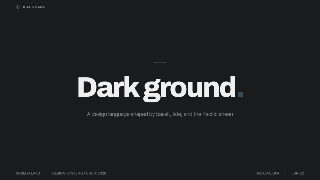
For presentation covers, use the basalt ground as the primary composition and give the title a calm, decisive position within ample space. A single slate-teal surf-like trace can establish direction or emphasis, while an image—if used—should feel like an extension of the dark shore rather than a bright travel postcard. Content slides should remain spare, with clear typographic groupings and broad breathing room around supporting text.
Data slides can use the same material hierarchy. Treat charts as quiet instruments on a dark mineral field: establish the main data story through tonal separation, then reserve slate-teal for the comparison or state that matters most. Avoid multiplying colored categories until the information resembles a dashboard of signals rather than a coherent reading of one shoreline-derived system.
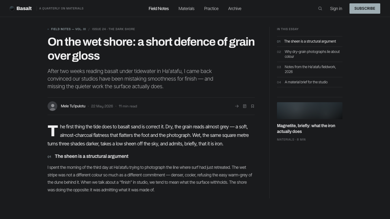
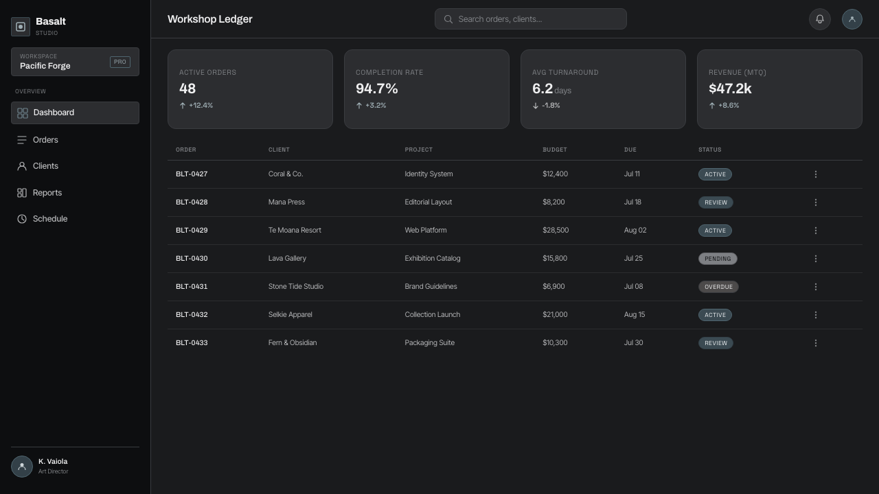
For web interfaces, the style suits dashboards, journals, memberships, and pricing experiences that benefit from focus and premium calm. Let dark basalt surfaces organize the application, use modern sans-serif text for navigation and utility information, and keep slate-teal for purposeful interaction, selection, or status. Dense control panels need especially careful spacing so that the dark ground reads as depth, not congestion.
For editorial and marketing pages, lead with photography that respects the theme’s material restraint: dark coastline, wet stone, surf reflection, or abstract mineral detail. Pair it with concise modern type and sections that alternate between expansive visual pauses and direct information. The tone is strongest when the page feels observed and elemental rather than promotional in a conventional tropical-beach sense.
The common mistake is to treat Tongan Black Sand as a generic black interface with decorative teal added everywhere. That loses both the geological source and the wellness-photography quiet. Do not introduce cream, pure white, warm beach color, or a crowded rainbow of accents. The system works when basalt remains the ground, slate-teal remains rare, and space does as much emotional work as imagery.
Tongan Black Sand — FAQ
Is Tongan Black Sand simply a dark mode?
No. Dark mode describes a contrast condition; Tongan Black Sand describes a material and atmospheric system. Its darkness comes from iron-dark basalt, magnetite, and wet-stone sheen, while its cool slate-teal is tied specifically to surf reflection. A generic dark interface can use any palette or mood; this style depends on a coherent volcanic-shore premise.
Why is slate-teal used so sparingly?
It represents the reflected sheen of Pacific surf, not a second dominant field. If it appears everywhere, it stops reading as waterlight and starts behaving like a conventional brand accent. Its limited presence preserves the near-monochrome basalt atmosphere and makes each use feel intentional.
Can the style use bright beach photography?
It can use photography, but bright resort imagery usually conflicts with the source material. The style is based on volcanic black sand, wet dark surfaces, and cool surf sheen. Images work best when they preserve those material facts or translate them into restrained abstract detail, rather than introducing warm sand, sunlit softness, or postcard color.
What products suit this visual language?
It is strongest where concentration, contemplation, and an elevated contemporary wellness register support the product: dashboards, journals, memberships, pricing experiences, and image-led editorial spaces. It is less natural for products that require playful abundance, warm domestic familiarity, or a broad set of competing status colors.
How can a layout remain readable on such a dark ground?
Use clean modern sans-serif typography, clear hierarchy, and generous negative space. Let tonal contrast organize the reading order, and reserve the surf-toned cue for information that genuinely needs distinction. Readability comes from disciplined composition, not from filling every gap with borders, labels, or colorful signals.
Related design styles
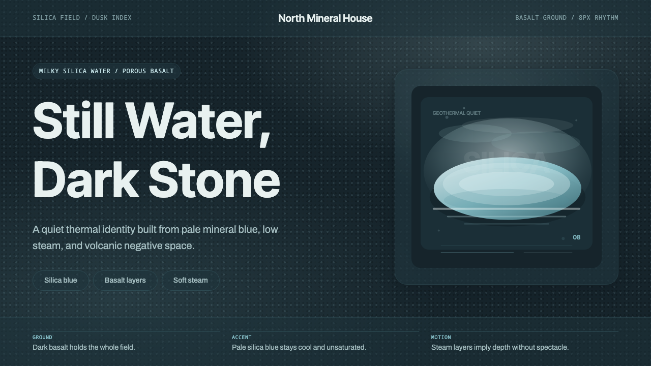 Glacial Teal LagoonQuiet feels elemental. Basalt darks and milky silica blue drift in a low-cont…
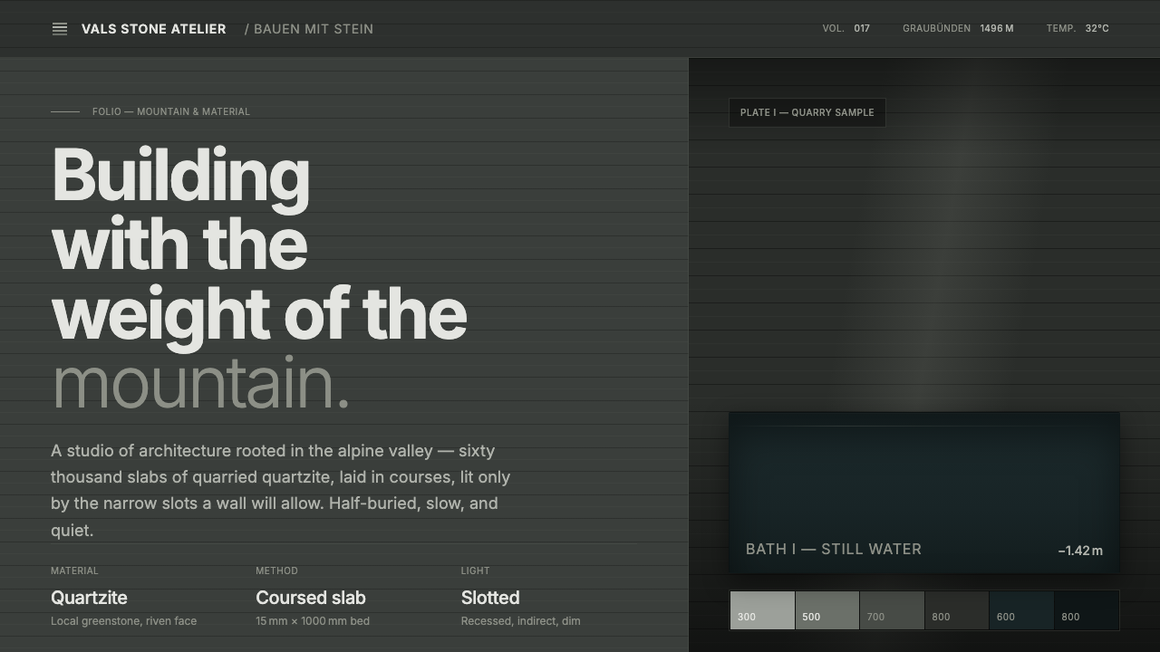 Zumthor Thermal BathsArchitecture as atmosphere. Greenish-slate stone, stratified courses, dim lig…
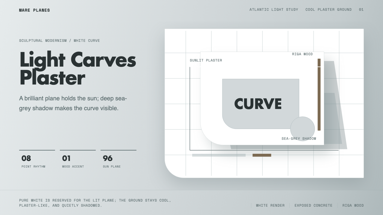 Alvaro Siza WhiteLight makes the form. White planes on cool plaster throw sea-grey shadow and…
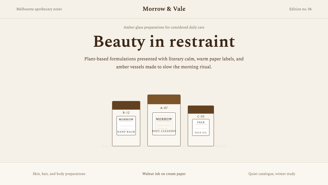 AesopRefuses urgency. Walnut serif on cream paper — every surface paced like a 19t…
 Corten Weathering SteelWeight over ornament. Rust-brown planes and concrete-grey seams make mass vis…
 Criterion ArthouseThe case disappears. Charcoal field, off-white Archivo, hairline rules, one r…