What is Zumthor Thermal Baths?
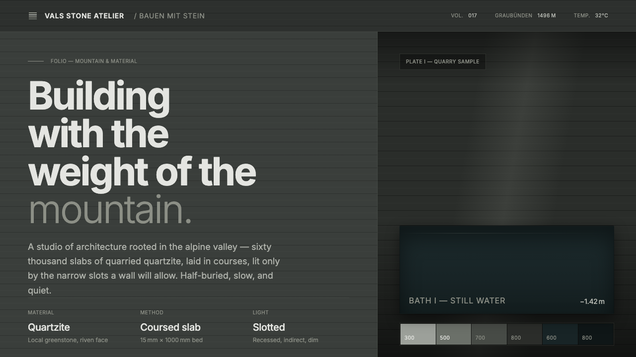
Zumthor Thermal Baths turns architecture into a hushed sensory field: wet stone, dark water, layered mass, and light held back until it matters.
Zumthor Thermal Baths in brief
Therme Vals is Peter Zumthor’s half-buried thermal bath in Vals, Graubünden, in the Swiss Alps. Completed in 1996, it is built from sixty thousand slabs of greenish-grey Valser quartzite. Its significance is not based on an imageable gesture or a decorative signature. The bath is remembered through physical conditions: rough wet stone under the hand, dark water beside the body, sound softened by enclosure, and shadow giving weight to every threshold.
As a design language, Zumthor Thermal Baths begins with atmosphere rather than graphic identity. The visual system is dark, stratified, and materially restrained. A greenish-slate ground establishes depth; low-contrast stone-tone panels feel embedded rather than placed on top; horizontal slab layers create a sense of geological accumulation. Light is not spread evenly across the composition. It arrives through narrow openings and quiet seams, making illumination feel discovered rather than supplied.
This is not minimalism as blankness. It is minimalism as density, where the absence of gloss and ornament allows material to become legible. Surfaces should appear heavy, cool, damp, and almost acoustically absorbent. The system avoids visual performance: no polished spectacle, no floating decorative effects, no bright accents asking to be noticed. Its power comes from making an interface feel sheltered, slow, and physically present.
Where does Zumthor Thermal Baths come from?
The source of this style is Therme Vals, completed in 1996 in Vals, Graubünden, in the Swiss Alps. Peter Zumthor conceived the bath as architecture embedded in a mountain setting rather than as an isolated object. Its half-buried condition is central to the atmosphere: the building reads less like a freestanding monument than a sequence of heavy chambers drawn from the ground. That relationship between enclosure, terrain, and bodily movement provides the foundation for the visual language.
The building’s material identity comes from greenish-grey Valser quartzite. Sixty thousand stone slabs were layered into stratified courses, giving the architecture a horizontal rhythm that is both constructed and geological. The stone does not function as a decorative finish applied to a neutral structure. It is the structure’s visible presence, carrying texture, weight, color variation, and a sense of accumulated mass. A digital interpretation should preserve that logic by treating layers and surfaces as substantive fields, never as ornamental wallpaper.
The bath belongs to an architectural phenomenology concerned with how a place is encountered through the body and senses. Its documented experience centers on rough wet stone, dark water, muffled sound, dimness, and shadow. These qualities make the bath an especially useful reference for designs that need to communicate calm, retreat, reflection, or seriousness without becoming sterile. The aim is not to reproduce a building photographically; it is to translate the conditions that make the building felt.
Its wider context combines Swiss minimalism with material- and atmosphere-driven design. In this framework, restraint is not a reduction of meaning but the means by which meaning becomes concentrated. A narrow slot of light can establish orientation. A dark panel can feel like depth rather than a simple background. A layered boundary can suggest protection and passage. The style asks every element to contribute to atmosphere, allowing form, material, and controlled illumination to carry the full emotional register.
What defines the Zumthor Thermal Baths look?
Dark Stone Ground
The foundation is a dark greenish-slate field, closer to damp stone and deep water than to neutral black. It should feel mineral, quiet, and light-absorbing. This ground gives pale content, restrained borders, and narrow light openings their force. Avoid pure theatrical darkness; the intended effect is terrestrial depth, as though the interface has been cut from a cool stone interior.
Stratified Courses
Horizontal slab layers are the central compositional motif. They suggest the Valser quartzite courses without turning stone into literal texture. Use repeated bands, seams, and staggered planes to establish accumulated mass and measured rhythm. The layers should feel irregular enough to remain material, yet controlled enough to preserve the bath’s architectural discipline.
Slot Light
Light is concentrated, directional, and rare. A single narrow opening can define a transition, reveal an edge, or make one surface appear closer than another. Broad luminous fields weaken the effect because they erase the sense of discovery. Treat light as an architectural incision: precise, quiet, and surrounded by enough darkness to retain its mystery.
Low-Contrast Panels
Panels are differentiated through subtle shifts in stone tone rather than bright contrast or glossy separation. They should feel recessed, inset, or carved from the same material field as the page. Borders may exist, but they should behave like seams between slabs. The hierarchy comes from depth, grouping, and light restraint, not from loud color coding.
Rough Material Presence
The style should imply rough wet stone without relying on decorative realism. Texture is sensed through restrained tonal variation, layered edges, and surfaces that appear weathered rather than polished. The important quality is tactile plausibility: a user should imagine a surface with grain, moisture, and resistance. Gloss, reflective chrome, and pristine plastic break the spell immediately.
Muffled Depth
The bath’s documented muffled sound can be translated visually as absorption rather than emptiness. Generous dark intervals, softened contrast, and contained information groups make the composition feel acoustically calm. Nothing should appear to shout across the page. Even important elements gain authority through proximity, enclosure, and measured isolation rather than through visual noise.

Who shaped Zumthor Thermal Baths?
Peter Zumthor designed Therme Vals, completed in 1996. The bath is the sole architectural source for this style system: its half-buried setting, greenish-grey Valser quartzite construction, dark water, controlled light, and sensory emphasis establish the visual vocabulary. His role here is inseparable from the project’s insistence that architecture can be experienced as atmosphere rather than consumed as image.
Therme Vals is not merely a reference project but the style’s organizing figure. Its architecture demonstrates how repeated stone slabs, shadowed chambers, and limited light can create richness without ornament. For designers, the project offers a disciplined lesson: material variation and spatial sequencing can carry emotion more effectively than added visual decoration.
The greenish-grey Valser quartzite used in sixty thousand slabs gives the bath its most recognizable material identity. In a digital system, it should be understood as a principle rather than copied as a surface scan: layered construction, restrained tonal range, visible seams, and the feeling that each plane belongs to a larger mineral whole.
How do you use Zumthor Thermal Baths today?
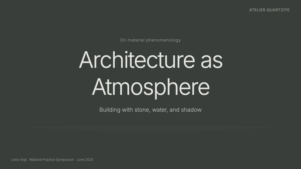
For presentation covers, use the thermal-bath language to create gravity before information begins. Let a dark stone-like ground dominate, then introduce a title through a restrained opening of pale light or a quiet inset panel. A horizontal layered motif can establish the composition without illustration. The cover should feel like an entrance into a chamber, not a promotional poster: one focal zone, ample darkness, and no competing decorative elements.
Content and data slides benefit from the style’s ability to make structure feel physical. Organize text in contained stone-tone panels separated by seams or dark intervals. Use stratified bands to distinguish sections, and reserve the brightest tonal treatment for one key figure, conclusion, or pathway through the slide. Charts should read as carved or layered objects, with restrained tonal distinctions and labels placed in calm, protected zones rather than scattered across an illuminated field.
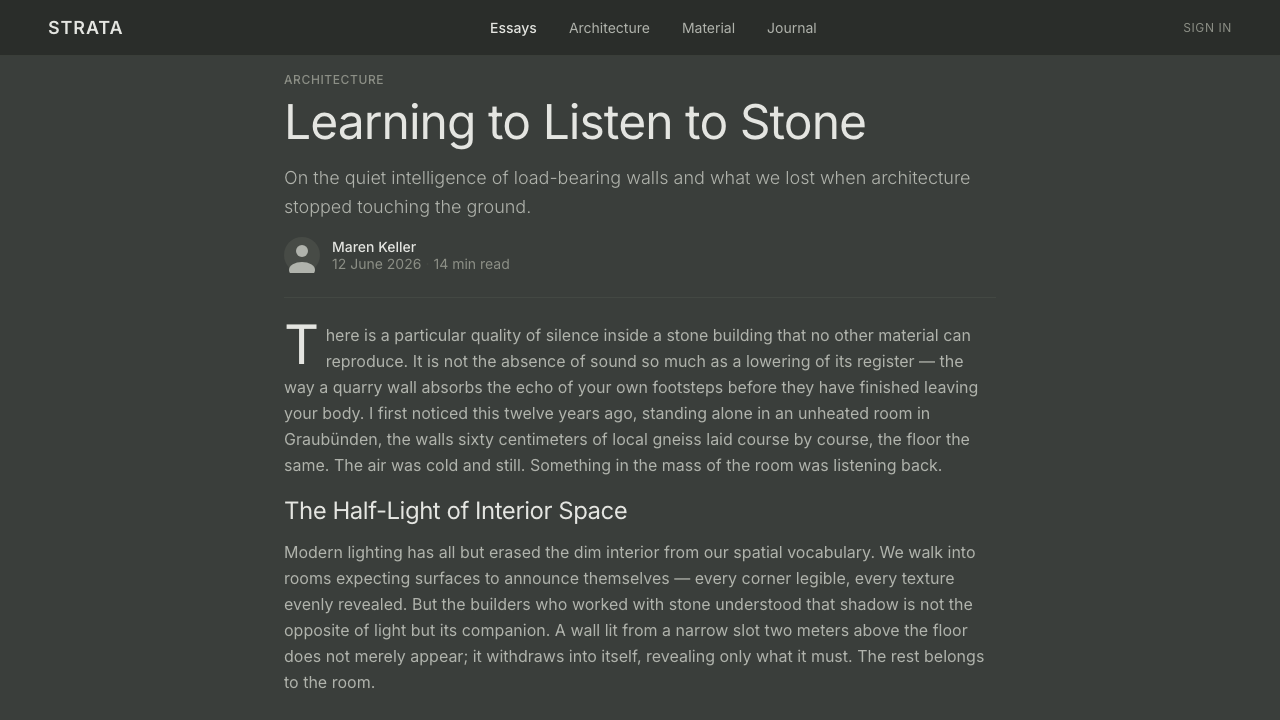
For web interfaces, this language is especially effective for reflective dashboards, privacy-oriented products, architectural portfolios, premium service pages, and research tools that need a sense of concentration. Build the interface as a sequence of chambers: a dark overall field, inset content surfaces, clear but quiet navigation, and limited moments of brightness for active states or important actions. Pricing pages can use layered tiers and enclosed comparison areas, but the hierarchy should remain spatial and tonal rather than sales-driven or glossy.
For editorial and marketing work, the system suits long-form stories, wellness-adjacent material, hospitality, cultural institutions, and products that benefit from a composed, contemplative voice. Use dark breathing space around extracts and captions; let horizontal seams divide sections; place imagery as a dimly revealed surface rather than a bright banner. Marketing should emphasize material, atmosphere, retreat, and discovery. A page gains credibility when it feels like an environment to enter, not a sequence of claims demanding immediate response.
The common mistake is turning the bath into a generic luxury-dark aesthetic. Black backgrounds, stone textures, and soft glow alone do not create the Zumthor Thermal Baths character. The original system depends on restraint, material coherence, dim slot light, and low-contrast depth. Avoid glossy gradients, reflective finishes, dramatic neon-like accents, and excessive faux-stone detail. If every panel is brightly separated or every surface advertises texture, the design loses the silence and weight that make the reference meaningful.
Zumthor Thermal Baths — FAQ
Is this style simply dark minimalism?
No. Dark minimalism can be clean, glossy, technological, or fashion-oriented. Zumthor Thermal Baths is materially specific: its darkness suggests greenish-grey slate, wet stone, shadowed water, and enclosure. The distinction lies in atmosphere and construction. A successful application feels layered, mineral, and physically sheltered rather than merely reduced to dark surfaces and sparse content.
How should light be used in this visual system?
Use light sparingly and with purpose. It should reveal a boundary, indicate a path, clarify a focal element, or create a threshold between information groups. Broad, evenly bright layouts flatten the atmosphere. The most convincing approach is to let darkness remain active, then introduce limited pale openings that feel like light entering through a slot in a heavy surface.
Can the style work for data-heavy dashboards?
Yes, provided clarity is protected. The style is useful when a dashboard needs concentration rather than constant stimulation. Group related information into low-contrast panels, use seams and layered zones for structure, and reserve the clearest light treatment for genuinely important states. Dense data should remain readable; atmosphere must support hierarchy, never obscure it.
Should designers use literal stone textures?
Usually, no. The reference is built from real quartzite slabs, but its digital lesson is not photographic imitation. Literal texture can become decorative noise or make text difficult to read. It is stronger to imply stone through a restrained mineral palette, layered seams, tonal variation, and substantial panel boundaries. The goal is material presence, not a simulated wall surface.
Where does this style struggle?
It struggles where immediate cheerfulness, high-energy promotion, playful variety, or transparent lightness is central to the product. A design intended for rapid browsing, exuberant retail, or highly expressive social interaction may find the style too quiet and heavy. It works best when the product can honestly support values of retreat, concentration, material care, privacy, contemplation, or slow discovery.
Related design styles
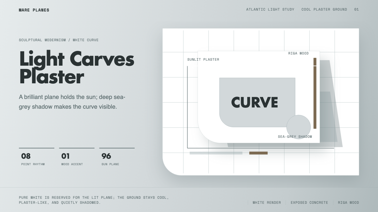 Alvaro Siza WhiteLight makes the form. White planes on cool plaster throw sea-grey shadow and…
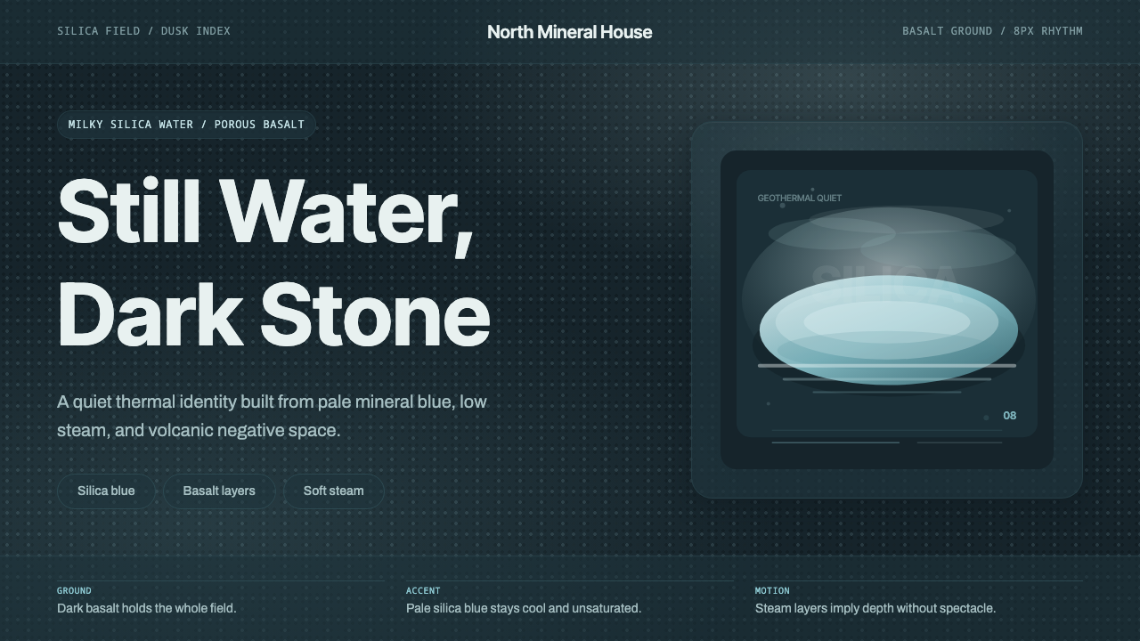 Glacial Teal LagoonQuiet feels elemental. Basalt darks and milky silica blue drift in a low-cont…
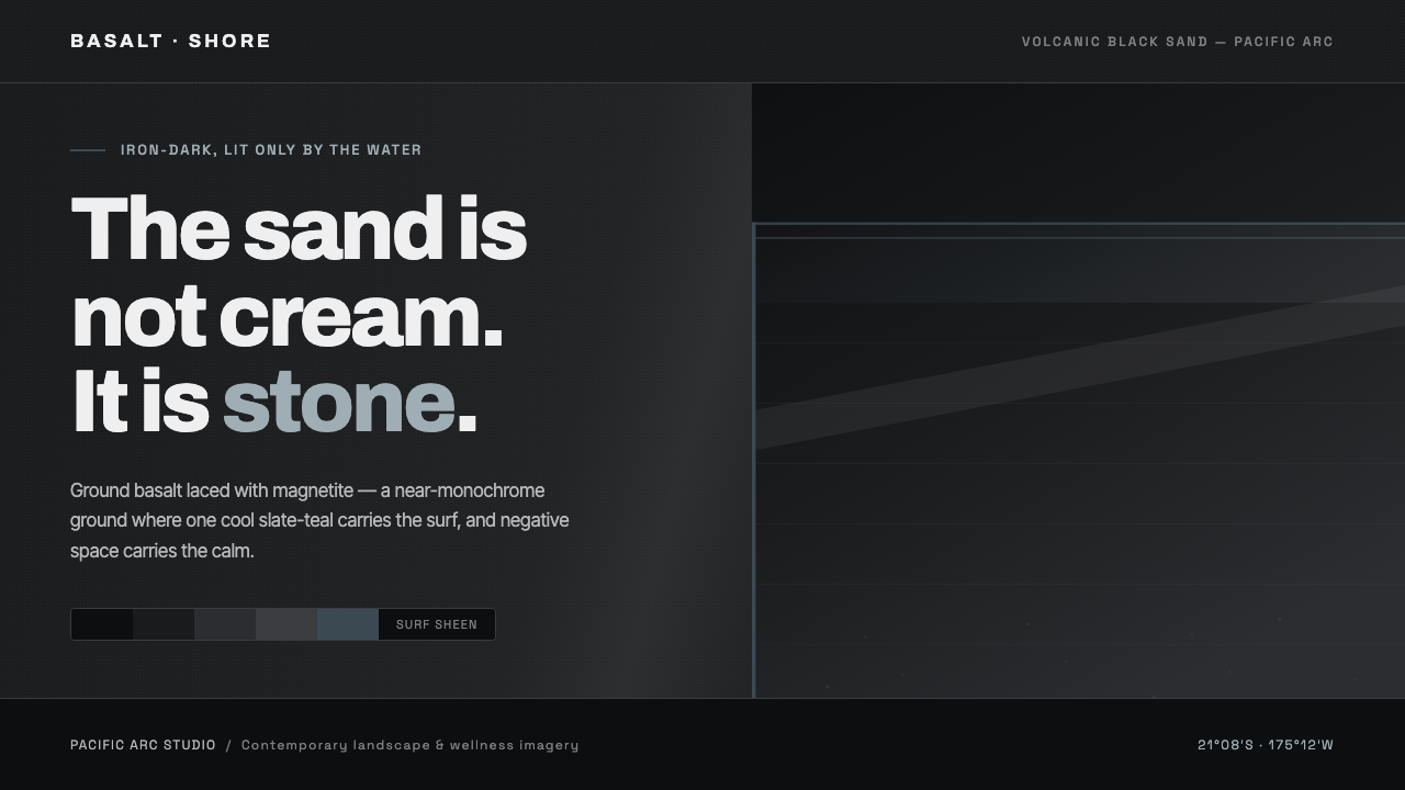 Tongan Black SandThe sand is stone, not cream. Iron-dark basalt grays with one cool slate-teal…
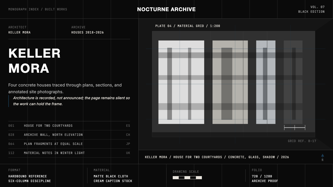 Architect Monograph (Black Edition)Architecture stays sovereign. Matte black, Helvetica caps, hairline grids, bl…
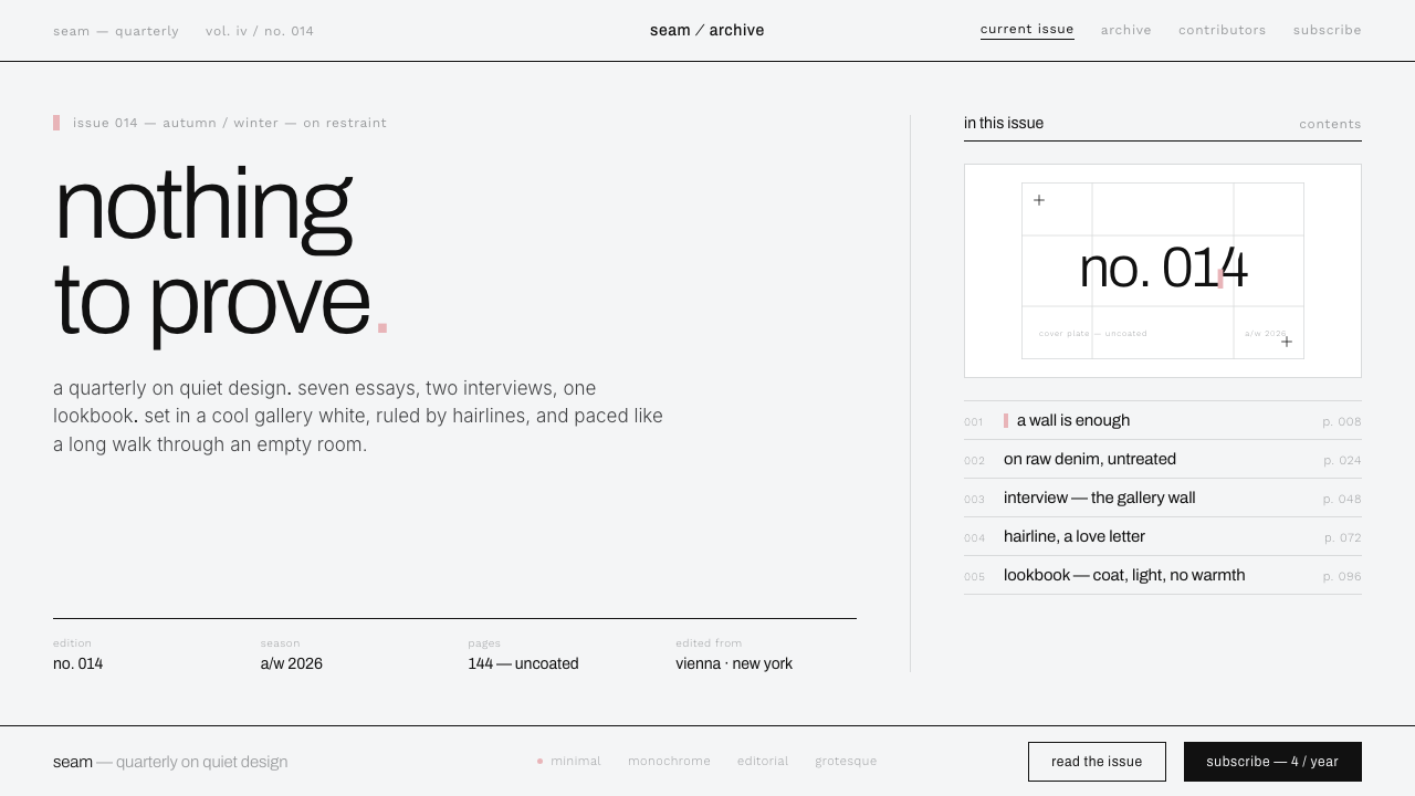 Helmut Lang MinimalismNothing to prove. Cool gallery white, 1px black hairlines, lowercase Archivo…
 Prada Milan MinimalistLuxury refuses ornament. Pure black, austere sans, and one sour green hairlin…