What is Helmut Lang Minimalism?
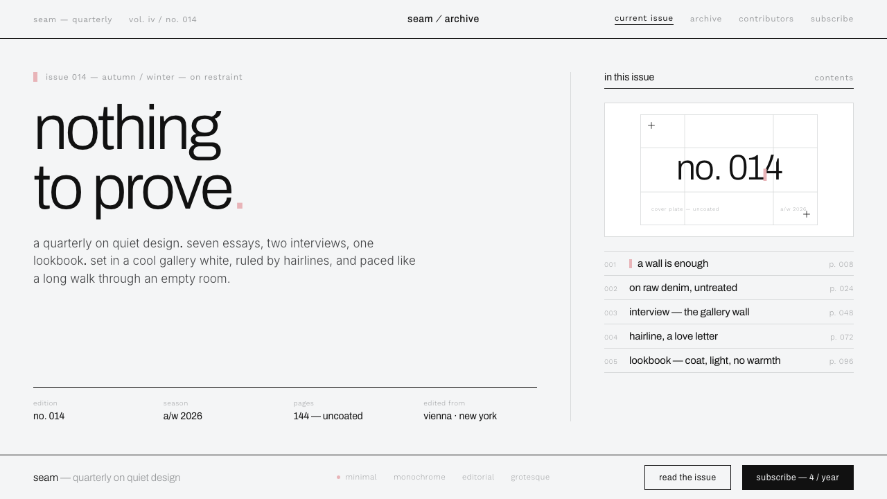
Helmut Lang Minimalism made absence feel exacting: cool gallery white, raw material, lowercase type, and one rare flash of color arranged with nothing to prove.
Helmut Lang Minimalism in brief
Helmut Lang Minimalism is an austere visual language derived from the designer’s defining work in early- and mid-1990s fashion. It combines stark gallery-like presentation with raw denim, technical fabric, monochrome imagery, lowercase grotesque typography, and extremely thin black rules. Its restraint is severe rather than soothing: the white is clinical and slightly gray, the black is decisive, and warmth is deliberately withheld.
The style depends on control through subtraction. Large areas remain empty so that a garment, photograph, title, or line can occupy the field without competition. Hairline divisions create order while avoiding the visual mass of boxes and panels. Typography behaves like labeling in a gallery or archive: direct, neutral, and often lowercase, with hierarchy established through placement, spacing, and contrast rather than decorative display.
Color is treated as an exceptional event. Most compositions remain within white, black, gray, raw denim tones, and the restrained surfaces of technical materials. A single cerise mark may puncture that field with bodily intensity; alternatively, a golden-yellow accent can introduce a controlled signal. The accent is powerful because the surrounding system refuses chromatic abundance. Nothing gradients, glows, or softens the encounter.
Where does Helmut Lang Minimalism come from?
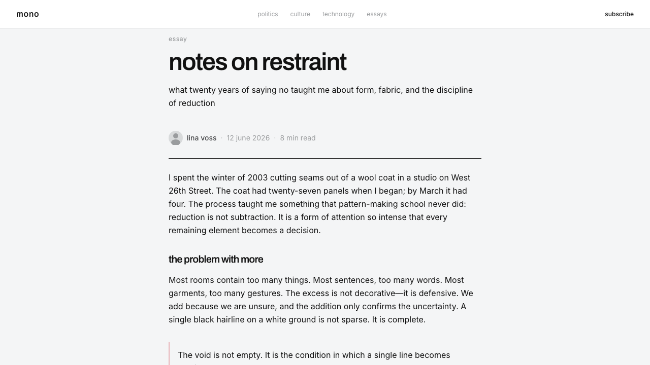
The style belongs to the broader emergence of minimalist fashion during the 1990s, with Helmut Lang as its sole central figure in the supplied history. Its geography connects Vienna and New York: two urban contexts joined here not through picturesque references but through a shared language of galleries, infrastructure, anonymity, and disciplined presentation. The defining period was the early to middle part of the decade, although the supplied era extends from 1990 to 2010.
Lang’s approach placed raw denim and technical fabric under unusually strict visual restraint. These materials could carry associations of workwear, industry, utility, or the unfinished, yet the surrounding presentation refused rustic warmth or expressive excess. Stark white campaigns isolated the clothes as objects of scrutiny. The result was neither conventional luxury nor casual informality, but an intellectual coolness in which material directness and image control reinforced one another.
The aesthetic developed alongside deconstruction-adjacent austerity and conceptual fashion advertising. Its relationship to deconstruction lies in its tolerance for rawness, exposure, and the sense that polish need not conceal how an object is made. Yet the composition itself remains highly controlled. Rather than allowing fragmentation to become visual noise, Helmut Lang Minimalism contains it within white space, thin divisions, monochrome contrast, and a deliberately restricted typographic voice.
Conceptual advertising was equally important to the style’s identity. A campaign did not need to simulate a luxurious world or surround a product with narrative reassurance. It could behave like a proposition in a gallery: an isolated image, a neutral label, a spare line, or a chromatic mark whose meaning remained open. When translated into contemporary interface design, this attitude becomes a system of negative space, lowercase grotesque type, hairline grids, and color used only when interruption is meaningful.
What defines the Helmut Lang Minimalism look?
Clinical Gallery White
The ground is a cool, slightly gray-tinted white rather than a creamy or domestic white. It suggests an exhibition room, photographic sweep, or controlled studio in which every object is exposed to inspection. The absence of warmth is intentional: it prevents the background from becoming comforting and gives raw denim, black type, and technical materials a sharper presence.
Monochrome Restraint
Black, white, and restrained gray establish the dominant field. Material colors may remain visible, especially the muted character of raw denim or technical fabric, but they are not expanded into a decorative palette. Monochrome is used to heighten attention, not to signal generic elegance. With fewer chromatic cues, proportion, cropping, texture, and placement become more consequential.
Hairline Structure
Extremely thin black rules divide information, align images, and reveal the underlying grid. They should feel drawn with technical precision, never like ornamental borders. Because the lines carry little visual mass, they can organize a broad field without breaking its silence. Their purpose is architectural: they establish edges, intervals, and relationships while allowing emptiness to remain dominant.
Lowercase Grotesque Type
Typography is neutral, sans-serif, and frequently lowercase, with Archivo named in the supplied visual description. The voice is closer to an inventory label than a fashion masthead: factual, detached, and quietly contemporary. Hierarchy comes from contrast in scale, changes in density, alignment, and generous separation. Expressive lettering, ornamental forms, and typographic nostalgia would introduce an unwanted personality.
Vast Negative Space
Empty space is not leftover area but the principal medium of composition. A small title or isolated image can sit within a broad white field and acquire unusual authority because nothing crowds it. The spacing should feel deliberate and slightly severe, preserving distance between viewer and object. Filling the field for efficiency immediately weakens the gallery-like tension on which the style depends.
Exceptional Accent Color
Cerise is the signature interruption: a compact, vivid mark against an otherwise monochrome composition. Golden-yellow may serve as an alternative signal, but it should not join cerise in forming a lively palette. Accent color behaves like punctuation, selection, warning, or conceptual annotation. Its rarity creates force; repetition turns the exceptional mark into ordinary interface decoration.
Rawness Under Control
Raw denim and technical fabric provide material tension inside the pristine system. Their texture, utility, and unfinished associations are allowed to remain visible, but the presentation around them is exact and quiet. This contrast prevents minimalism from becoming sterile emptiness: the material supplies physical evidence while the layout supplies discipline. Added distressing or simulated texture would confuse that relationship.
Who shaped Helmut Lang Minimalism?
Helmut Lang is the defining figure of the style and the only individual identified in the supplied source material. His early- and mid-1990s work established a severe form of fashion minimalism in which stark campaigns, raw denim, technical fabric, and disciplined presentation operated as one system. The achievement was not simplicity alone, but the conversion of restraint into a recognizable intellectual attitude.
Viewed through material practice, Lang placed raw and technical surfaces inside an unusually pristine visual frame. This pairing allowed utility and incompleteness to coexist with exact presentation. It is central to the style’s enduring tension: the objects retain evidence of use, manufacture, and physical reality, while the surrounding image remains distant, controlled, and almost clinical.
Viewed through advertising, Lang’s importance lies in making reduction communicative. Stark white fields, isolated content, neutral type, and rare color could carry an entire fashion identity without scenic excess. The image did not need to flatter the viewer or prove luxury through abundance. Its authority came from withholding explanation and allowing placement, absence, and material fact to speak.
How do you use Helmut Lang Minimalism today?
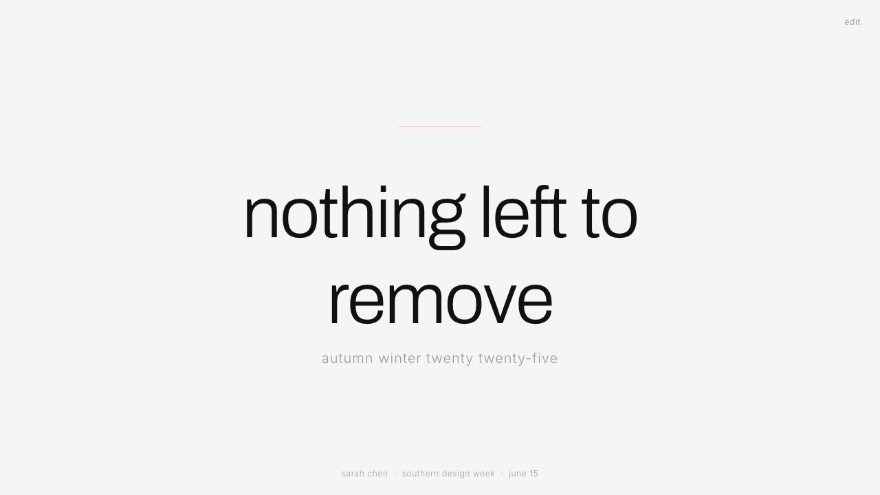
For presentation slides, begin with distance. A cover can place a lowercase title, a small metadata line, and one isolated image within a broad cool-white field, with a hairline acting as the only structural cue. The content should not be centered merely for conventional elegance; an offset placement often creates the more appropriate gallery tension. If an accent appears, use one cerise mark as punctuation rather than as a decorative block.
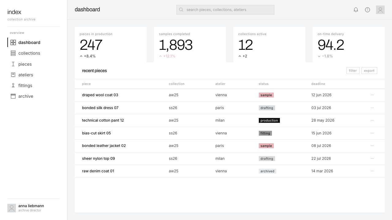
Content and data slides should preserve the same discipline. Separate sections with thin rules and generous intervals, using typography and alignment to distinguish title, annotation, and evidence. Tables should feel archival, with minimal enclosure and clear horizontal relationships. Charts belong naturally in the system when reduced to black, gray, and one exceptional highlight. Avoid filling unused regions with captions, icons, or enlarged graphics simply to make the slide feel complete.
For web interfaces, the style suits dashboards and pricing pages whose authority depends on calm comparison. A dashboard can organize modules through hairline grid divisions instead of raised cards, keeping controls typographic and compact within a large white field. Pricing tiers should be distinguished through position, wording, and a single accent marker rather than several colored panels. Inputs, filters, and status labels should look exact and utilitarian, while empty states should retain space instead of becoming illustrated entertainment.
Editorial and marketing layouts benefit from its conceptual advertising character. An article can alternate narrow text passages with isolated photographs, sparse captions, and wide pauses that make each item feel curated. A campaign page can open with one blunt statement, then reveal products or arguments as separate exhibits rather than as a continuous stream of promotional modules. Raw denim or technical-fabric imagery should be cropped and presented directly, without atmospheric gradients, ornamental frames, or sentimental lifestyle scenery.
The common mistake is to equate minimalism with merely deleting content. Helmut Lang Minimalism still requires tension between raw material and pristine presentation, between vast white space and exact black structure, and between monochrome continuity and a rare chromatic interruption. Overusing cerise, warming the background, thickening every divider, or turning each section into a card removes that tension. So does indiscriminate lowercase text: the typography must remain readable and purposeful, not perform casualness.
Helmut Lang Minimalism — FAQ
Is Helmut Lang Minimalism simply another name for generic minimalism?
No. Generic minimalism may pursue simplicity, comfort, or visual cleanliness, while this style is specifically cool, severe, and fashion-oriented. Its identity depends on the combination of clinical gallery white, thin black structure, lowercase grotesque type, raw denim or technical material, and an exceptionally rare accent. Remove the material tension or warm the presentation, and the result may remain minimal but no longer feels distinctly Helmut Lang.
Why is the white background slightly gray and deliberately cool?
A cool, slightly gray white creates distance. It recalls a controlled gallery or studio rather than paper, cream, or a domestic interior. That distance makes black typography and raw materials appear more exact, while preventing the composition from becoming friendly or nostalgic. The background is not intended to feel empty in a neutral way; it establishes the clinical atmosphere that gives every interruption greater consequence.
Can cerise and golden-yellow appear together?
They can exist within the broader vocabulary, but using them together as equal accents usually weakens the principle of exception. Cerise is the characteristic puncture, while golden-yellow can function as an alternative signal. A composition is stronger when it chooses one chromatic interruption and allows monochrome space to support it. If both are necessary for information, one should remain clearly subordinate rather than forming a balanced decorative palette.
Does the style require fashion photography?
No. Its logic can organize products, editorial text, interfaces, charts, or archival material. What matters is that imagery be treated as an object under scrutiny: isolated, deliberately cropped, and given sufficient space. Raw or technical surfaces are especially compatible because they preserve the material tension found in the fashion source. Decorative lifestyle scenes, warm atmosphere, and excessive visual storytelling are less compatible with its conceptual directness.
Where does Helmut Lang Minimalism struggle?
It struggles when a product depends on warmth, playfulness, abundance, or immediate emotional reassurance. The clinical field and detached typography can make hospitality, family-oriented services, celebratory experiences, or highly expressive brands feel remote. It can also hinder dense operational tools if negative space is preserved so rigidly that scanning becomes inefficient. The style works best when distance, precision, material intelligence, and conceptual confidence genuinely support the subject.
Related design styles
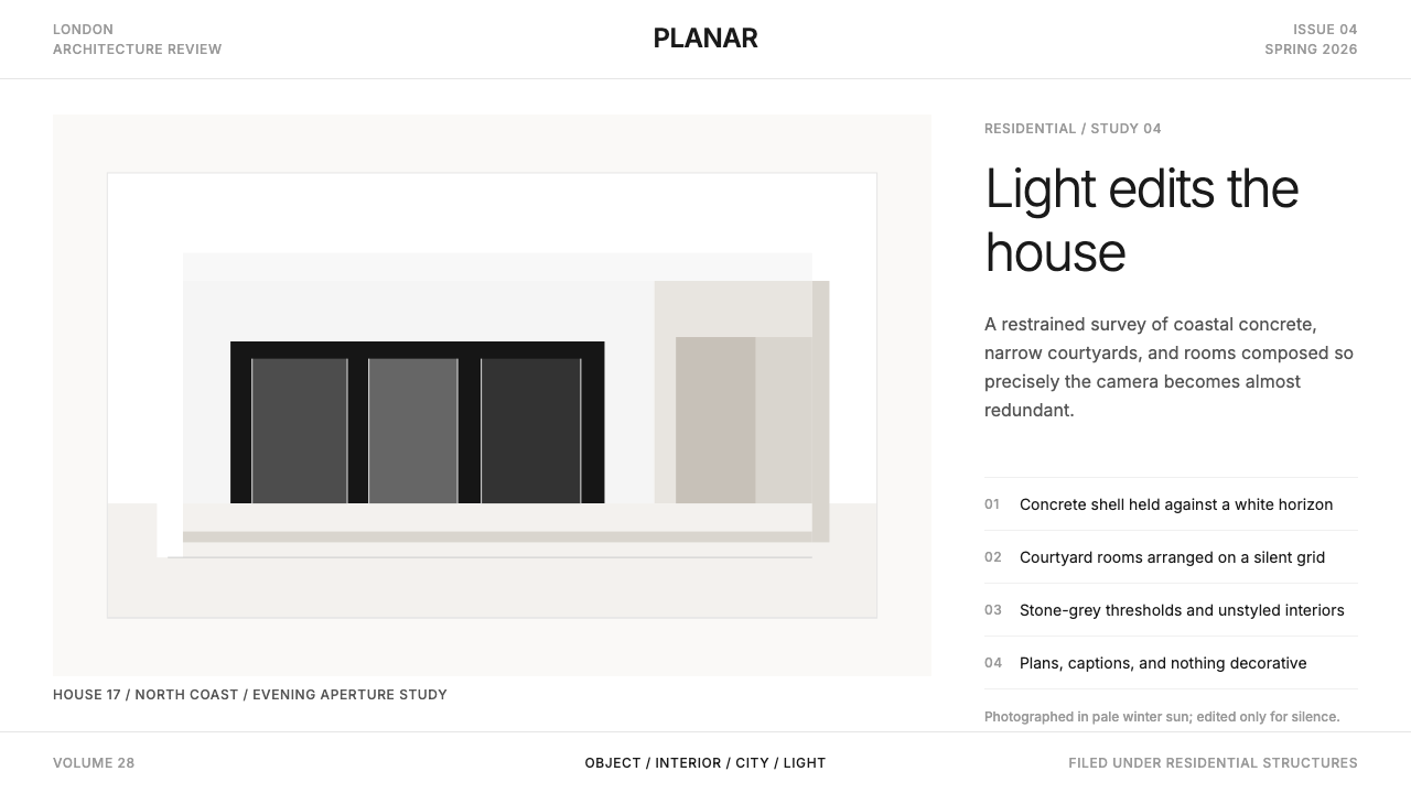 Wallpaper* ArchitecturePhotography does the speaking. Gallery-white grid, Inter captions, and hairli…
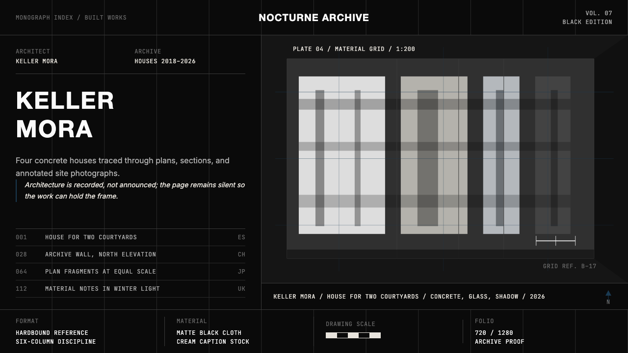 Architect Monograph (Black Edition)Architecture stays sovereign. Matte black, Helvetica caps, hairline grids, bl…
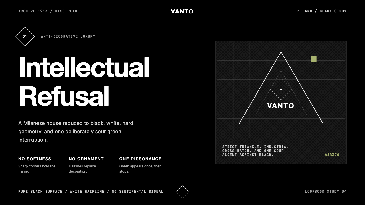 Prada Milan MinimalistLuxury refuses ornament. Pure black, austere sans, and one sour green hairlin…
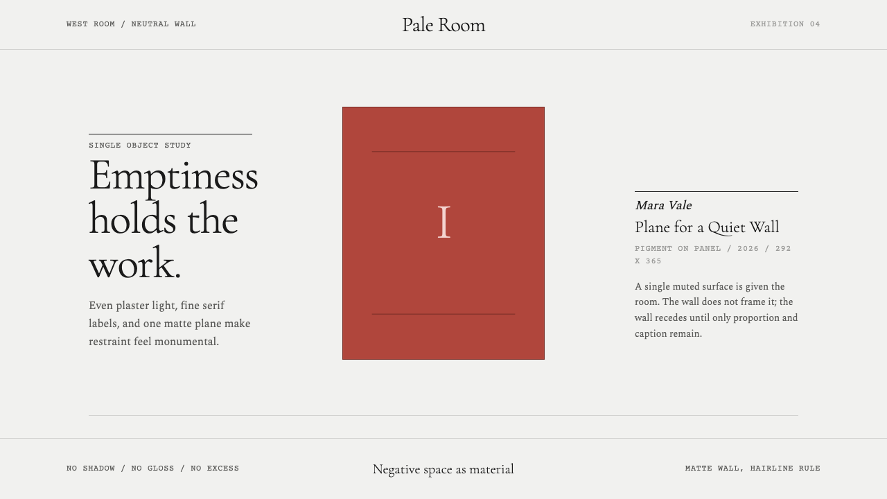 White Cube GalleryEmptiness is the medium. Cormorant labels and one terracotta plane hold the w…
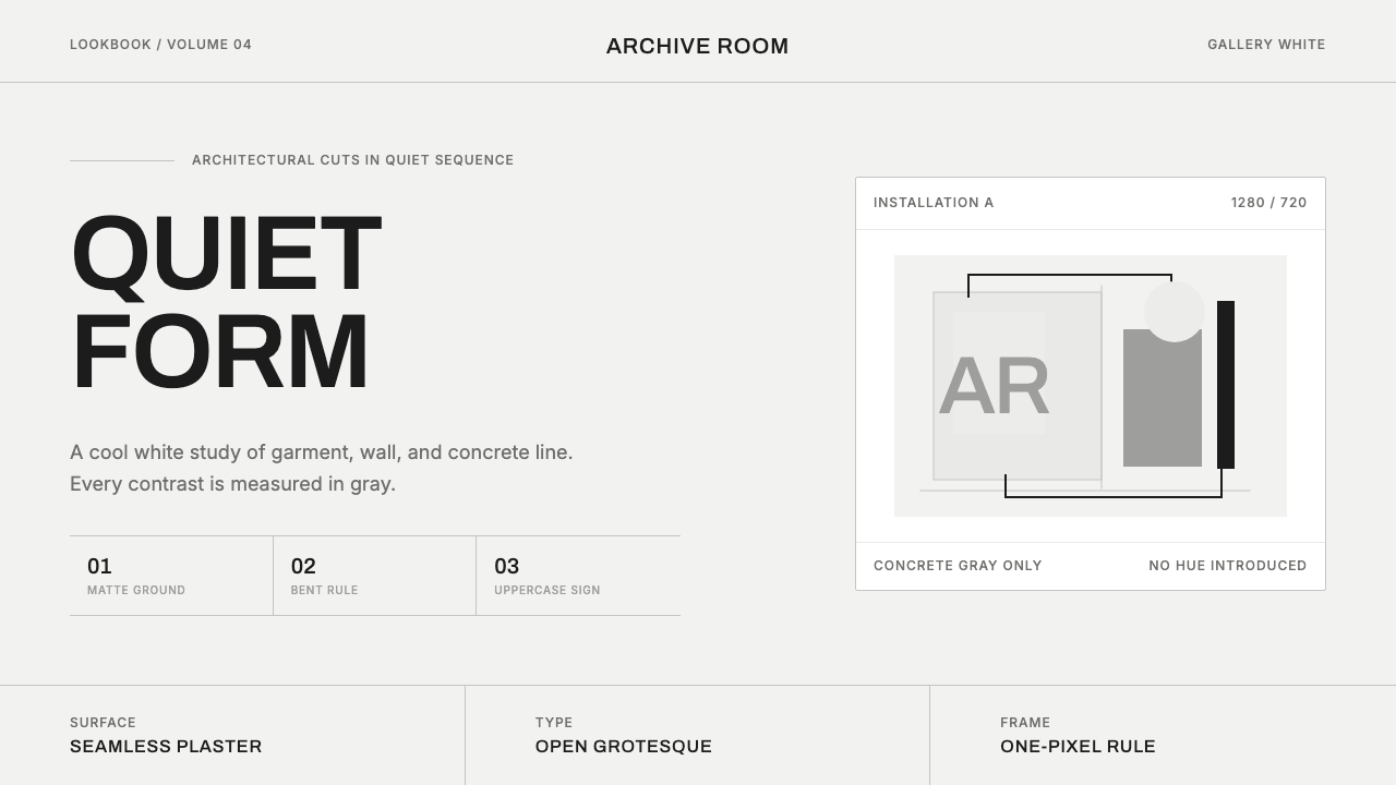 COS Gallery MinimalSilence has structure. Cool gallery white, Archivo uppercase, and concrete-gr…
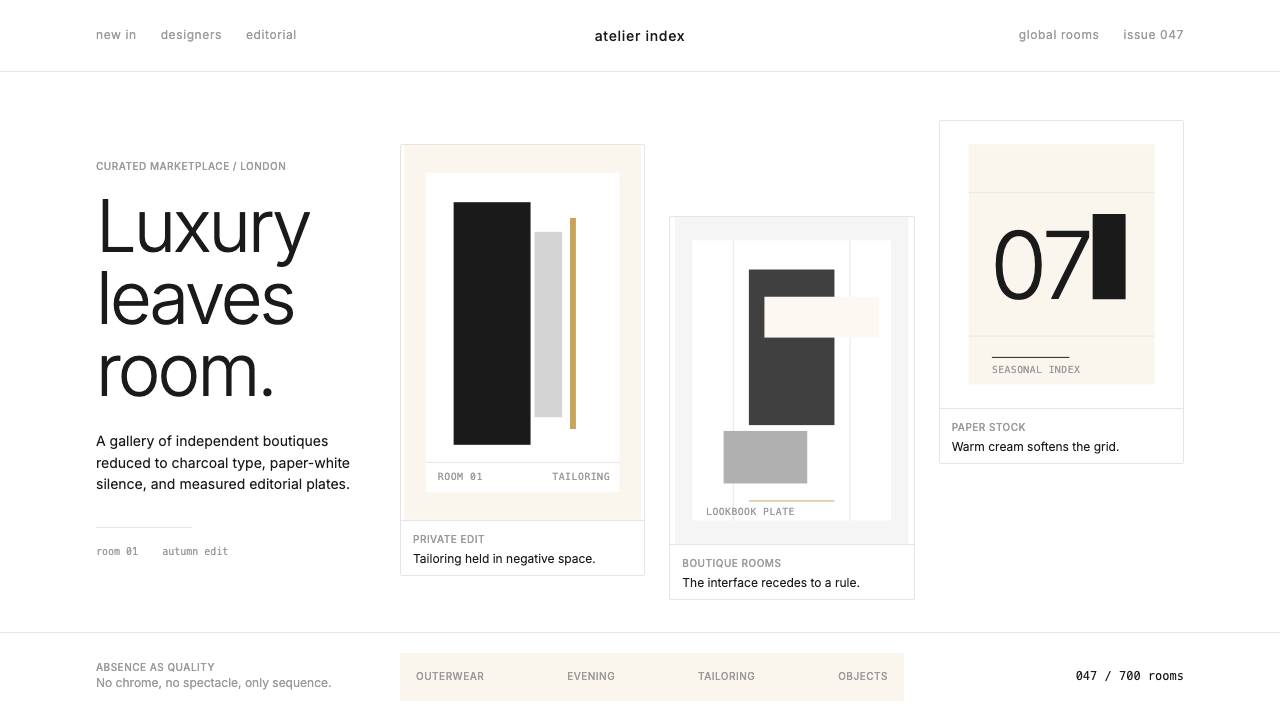 FarfetchLuxury as absence. Charcoal type, white canvas, and hairline editorial plates.