What is IBM Carbon?
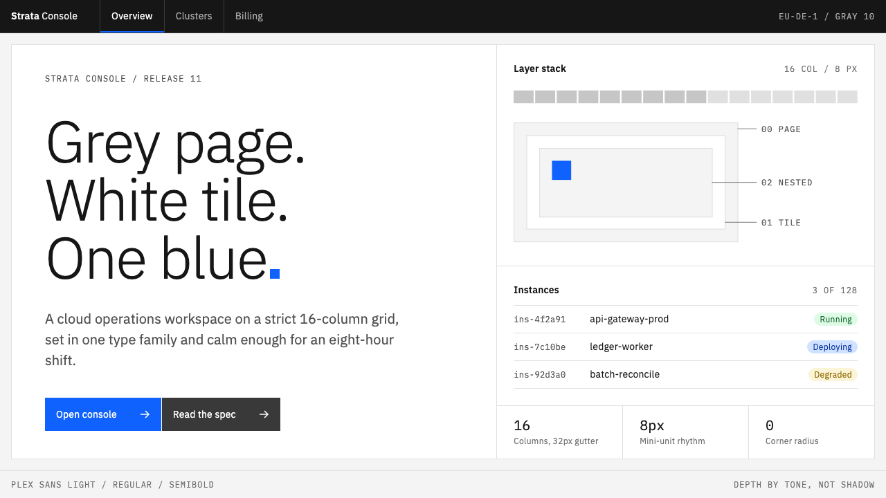
IBM Carbon is an enterprise design system built for people who sit inside a console all day: a cool grey page, white tiles, square corners, and exactly one blue that means “you can click this”.
IBM Carbon in brief
Carbon is the open-source design system behind IBM Cloud, Watson and Cognos. It is not a mood or a fashion but a working toolkit: a set of tokens, components, patterns and rules that let hundreds of product teams ship screens that look like one company made them. The visual language described here is its Gray 10 theme, the light variant in which a cool grey page holds white tiles laid flush against each other.
The look is easy to recognise once you know what to watch for. Corners are square. Depth does not come from shadow but from tone, with white and grey alternating to show which layer sits above which. Dividers are fine and quiet. One blue, and only one, is used for anything interactive, so the eye learns within minutes that blue means action and everything else is information.
Type is the other half of the identity. The whole interface is set in a single family, IBM Plex, used in a disciplined ladder of weights: Light for large headings, Regular for reading, SemiBold for labels, and a Mono cut for identifiers and numbers. The result feels dense but calm, an interface designed to be read and operated for a full working day rather than admired for a few seconds.

Where does IBM Carbon come from?
Carbon grew out of IBM Design, the company’s in-house design organisation, based in Austin, Texas. It was released publicly in 2017 together with IBM Plex, the typeface family that gives the system its voice. The pairing was deliberate: a component library tells teams how to build, while a house typeface tells everyone how the company sounds on screen.
The system then moved through clear stages. Carbon v10 arrived in 2019 and reorganised the system around themes and a rigorous token structure. From 2022 onward, v11 introduced layer tokens, which formalised the white-on-grey, grey-on-white stacking that the Gray 10 look depends on. Each step made the system less a style guide and more a piece of infrastructure that engineers could theme without redrawing anything.
Several names sit behind this lineage. Mike Abbink, Paul van der Laan and Pieter van Rosmalen are the designers associated with IBM Plex, and their work gave the system a typographic backbone that is neither neutral grotesque nor nostalgic corporate serif. Paul Rand, who shaped IBM’s visual identity in the twentieth century, stands further back as the reminder that IBM has long treated design as a company-wide discipline rather than decoration.
Three traditions meet in the result. The first is enterprise design systems, the practice of encoding a brand into reusable parts. The second is the IBM Design Language itself, which carries the company’s habit of clarity and restraint. The third is Swiss-modernist grid discipline: a sixteen-column grid, strict alignment and a belief that structure, not ornament, makes information legible.
What defines the IBM Carbon look?
Color
The page is a cool, pale grey and the content tiles are white. A single saturated blue is reserved for actions, links and focus, and nothing else is allowed to compete with it. Greys do all the other work: a mid grey for secondary text, a lighter grey for dividers. Status colours such as red, amber and green appear only when something genuinely needs attention, so they keep their meaning.
Typography
Everything is IBM Plex. Large headings are set in the Light weight, which gives big type an airy, engineered feel instead of a shouting one. Body copy is Regular, labels and buttons are SemiBold, and the Mono cut handles identifiers, code and numbers so that columns of data align. Text is flush left and ragged right, with tight but even leading.
Grid and spacing
Layouts sit on a sixteen-column grid, and spacing follows a small, repeating scale so that gaps feel related to each other. Tiles are laid flush rather than floated apart, which makes the page read as a continuous surface divided by fine lines. Density is high by design: a console earns its value by showing a lot without making the user scroll.
Shape and depth
Corners are square throughout, on buttons, inputs, tiles and menus. There are no soft shadows to suggest height. Instead, layers are told apart by alternating tones: a white tile on a grey page, a grey field inside a white tile. Dividers are hairline thin and drawn in a light grey. The effect is flat but never confusing, because every level has its own tone.
Components and focus
Buttons are rectangular, with the label aligned left and the icon pushed to the right edge, which gives a consistent scanning line down a column of controls. Focus is shown by a thick inset frame in the signature blue rather than a glow, so keyboard users always see where they are. Inputs sit on a tinted field with a bottom rule instead of a full outline.
Tone and motion
The mood is engineered, restrained and rarely wrong. Imagery is sparse and mostly diagrammatic, icons are simple pictograms drawn on a strict grid, and motion is functional: quick, purposeful transitions that confirm an action rather than entertain. Nothing in the system tries to charm you; it tries to stay out of your way.

Who shaped IBM Carbon?
Abbink is one of the designers associated with IBM Plex, the typeface family that gives Carbon its voice. The family was released alongside Carbon in 2017, and its range of weights, from Light to SemiBold plus a Mono cut, is the typographic ladder the whole interface is built on.
Van der Laan is named among the designers behind IBM Plex. His work belongs to the typographic backbone that lets Carbon feel consistent across cloud consoles, analytics tools and AI products without leaning on decoration.
Van Rosmalen is likewise associated with the creation of IBM Plex. Together with Abbink and van der Laan he is part of the story of how a company-wide typeface became an equal partner to the component library in defining the system’s identity.
Rand shaped IBM’s visual identity in the twentieth century. He is not an author of Carbon, but he is the best-known reminder that IBM has treated clarity and restraint as corporate values for generations, which is the cultural soil the system grew in.
How do you use IBM Carbon today?
On slides, Carbon’s language suits cover pages that are plain and confident: a white or pale grey field, a large Light-weight title set flush left, and a single blue accent bar or rule. Content slides work best as tiles laid flush on the grey ground, each tile holding one idea. Resist the urge to add photography or gradients; the system’s authority comes from its refusal to decorate.
For data slides and web dashboards, this is the native habitat. Tables, charts and status panels sit on white tiles, numbers are set in the Mono cut so columns line up, and filters and toolbars use square buttons with left-aligned labels. Keep blue for the primary action and for the selected state only, so users can always find what is clickable. Use a lot of information per screen, but divide it with fine lines and tone, never with shadow.
On pricing pages and product marketing for developers or enterprise buyers, the same restraint reads as trust. Lay plans out as flush tiles on a grey page, use Light-weight numerals for headline figures, and let one blue button carry the call to action. The look signals that the product is serious software, not a toy, which is often exactly what a procurement team wants to see.
In editorial and documentation, use the sixteen-column grid generously: a narrow reading column for text, a wider area for code samples and diagrams, and plenty of empty grid on either side. Headings in Light weight and body in Regular give a calm hierarchy. Code and identifiers should always switch to Mono so readers can tell what they might copy.
The most common mistake is softening the system. Rounded corners, drop shadows, a second accent colour or a friendly illustration style each dilute what makes Carbon recognisable, and mixing in a different typeface breaks the weight ladder it relies on. The second mistake is using the blue for decoration: once blue appears on things that cannot be clicked, the single most useful signal in the interface stops working.

IBM Carbon — FAQ
What is IBM Carbon?
Carbon is IBM’s open-source design system, the foundation of products such as IBM Cloud, Watson and Cognos. It provides tokens, components and rules so that many teams can build interfaces that look and behave like a single product family. It was released publicly in 2017 together with the IBM Plex typeface, and has been revised through v10 in 2019 and v11 from 2022.
What does the Gray 10 theme look like?
Gray 10 is the light theme: a cool pale grey page with white tiles laid flush on a sixteen-column grid, square corners, fine light-grey dividers and a single blue for everything clickable. Depth comes from alternating tone rather than shadow, and all text is set in IBM Plex.
Why does Carbon use only one blue?
Because the blue is a signal, not a decoration. If it appears only on things you can act on, users learn in minutes to scan for it, and the rest of the interface can stay in neutral greys without losing clarity. Adding a second accent colour would blur that signal, which matters a great deal in a tool people use all day.
Is Carbon related to Swiss design?
Yes, in spirit. Its origin notes list Swiss-modernist grid discipline among its movements, and you can see it in the sixteen-column grid, flush-left text and the belief that structure carries meaning. Carbon adapts that discipline to software: dense tables, states and focus rings rather than posters and printed pages.
When should I not use a Carbon-style look?
Avoid it when the goal is warmth, playfulness or emotional storytelling. A consumer lifestyle brand, a children’s product or a narrative landing page will feel cold in this system. It is at its best where people need to work quickly, compare data and trust what they see.
Related design styles
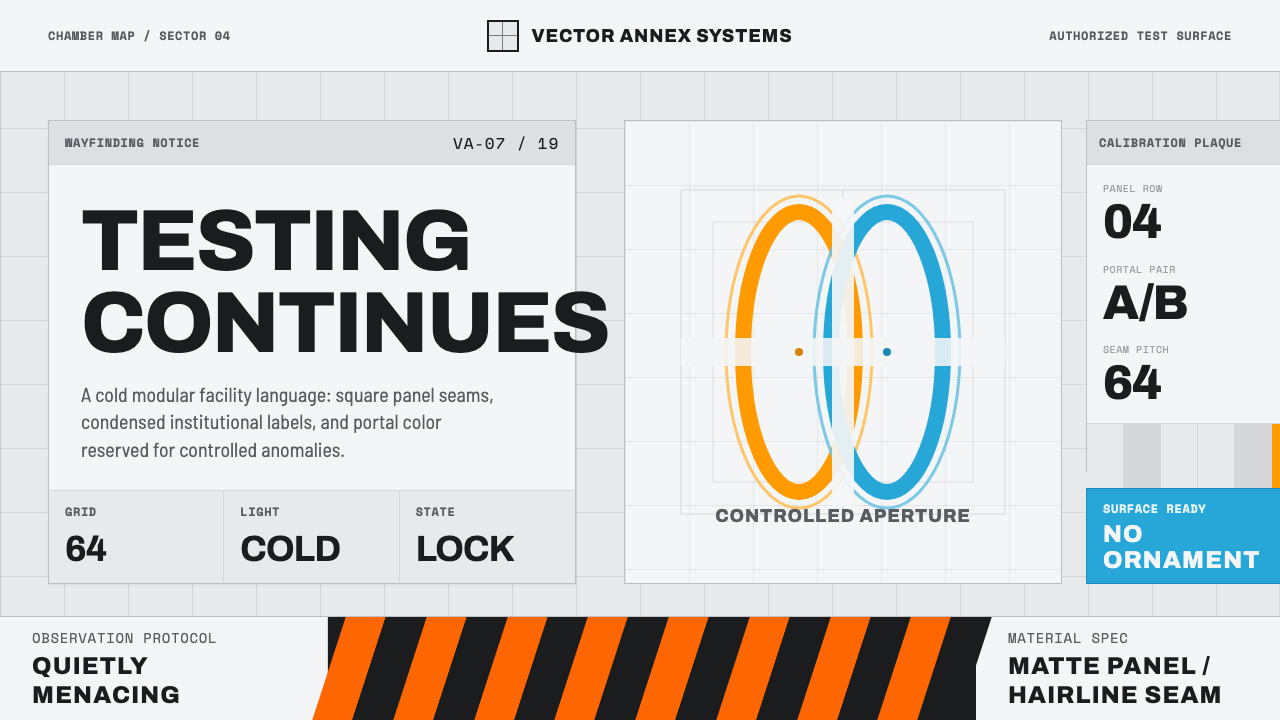 Aperture ScienceSterile authority. Cool panel seams, Archivo signage, and sparse orange-blue…
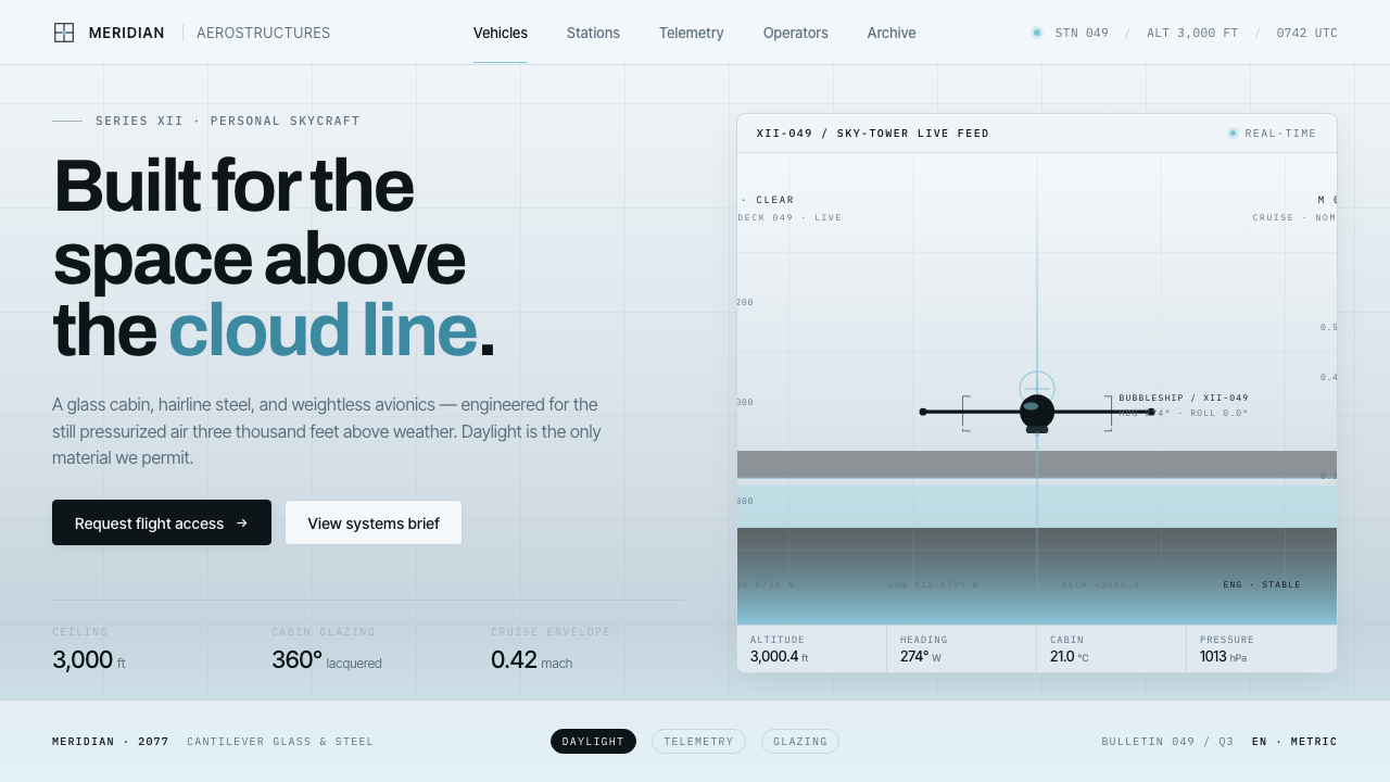 Oblivion Sky TowerSterile daylight futurism. Cool sky-grey glass, hairline steel mullions, a si…
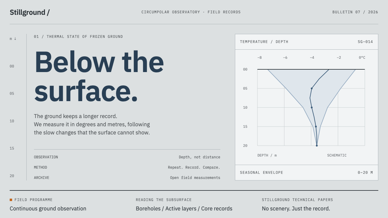 Permafrost Monitoring NetworkDepth sets the order. Overcast greys, slate profiles and hairline rules keep…
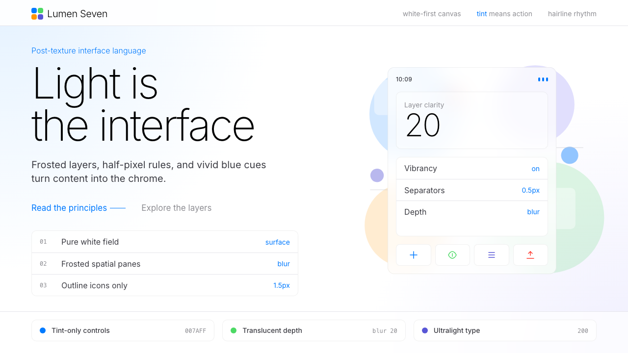 Flat Design iOS 7The day skeuomorphism died. Bright tints on white, hairline separators, frost…
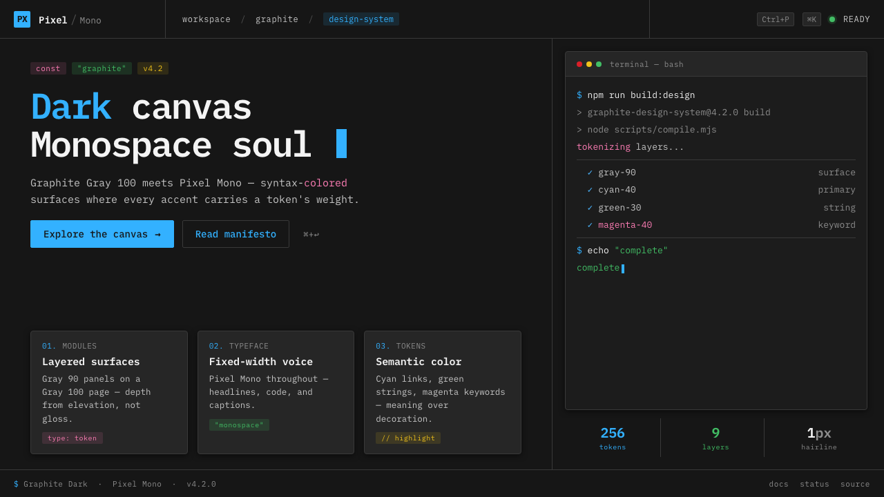 IBM Plex Mono DevColor used like syntax highlighting. Carbon Gray 100 canvas, IBM Plex Mono th…
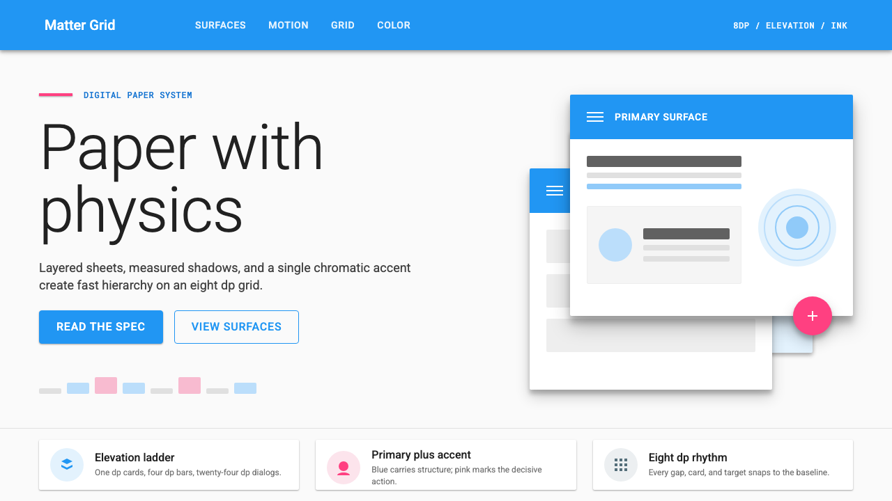 Material Design 1.0Depth made flat usable. Blue app bars, pink FABs, 8dp grids, and crisp paper…