What is Stone Island Ghost?
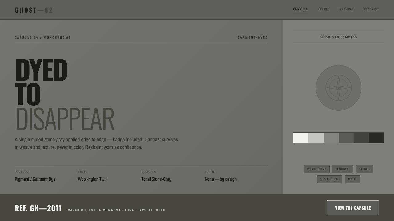
Dyed until it nearly disappears, Stone Island Ghost turns utility into a quiet monochrome language of stone-gray surfaces, concealed insignia, and stencil-like function.
Stone Island Ghost in brief
Stone Island Ghost is a monochrome line introduced in 2011 by the Italian techwear house Stone Island. Its central idea is simple but unusually disciplined: take every visible component of a garment and bring it into the same muted stone-gray register. Cotton, wool-nylon twill, and rubberized satin are treated through pigment or garment dyeing, so the color belongs to the material rather than sitting above it as a separate decorative layer.
The line’s iconic compass badge remains present but refuses to announce itself. Rendered in a tonal dark gray, it dissolves into the surrounding fabric instead of acting as a bright logo or external emblem. This concealment changes the role of branding: recognition comes through construction, surface, and association rather than through immediate contrast.
Ghost’s visual tension comes from texture. Matte garment-dyed surfaces sit beside crisp right-angle panels, while tonal shifts create separation without introducing bright accents. Underneath is utilitarian stencil-style typography, reinforcing the sense that the garment is an engineered object whose identity is encoded through material and structure.
Where does Stone Island Ghost come from?
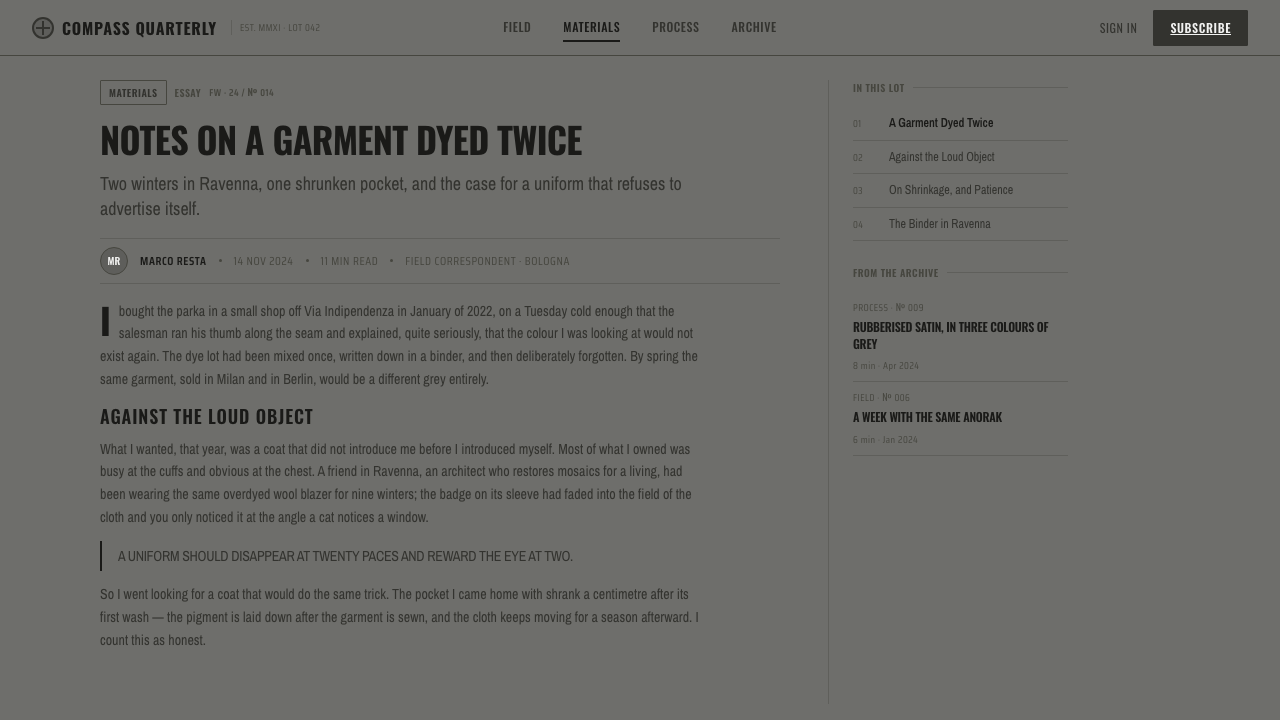
The line belongs to Stone Island’s Italian context, with the brand founded in 1982 and associated with Ravarino in Emilia-Romagna. Ghost was introduced in 2011 and continued through the 2010s, extending the house’s interest in sportswear and technical clothing into an especially reduced visual register.
Its historical setting is defined by the overlap of Italian sportswear, techwear, garment-dyeing innovation, and terrace or casual subculture. Ghost does not treat these references as loud uniform markers. Instead, it compresses them into a controlled surface language: practical fabrics, engineered-looking panels, restrained insignia, and a palette that keeps every element close to the same tonal family.
Garment dyeing is central to the line’s identity because it makes color feel embedded in the object. The result is not a bright technical shell or a decorative fashion surface, but a material field in which cotton, wool-nylon twill, and rubberized satin retain distinct tactile presences while sharing a common gray atmosphere.
The supplied material identifies Massimo Osti and Carlo Rivetti as key figures connected to the line’s context. Their presence places Ghost within Stone Island’s broader Italian design history, while the collection itself remains defined by its own focused proposition: a garment-dyed, stone-gray system in which the compass badge, typography, and panel construction are deliberately brought close to disappearance.
What defines the Stone Island Ghost look?
Monochrome Field
Ghost is built from a tight family of cool stone-grays rather than a conventional accent palette. The lack of bright color is not a neutral backdrop but the main visual decision. Every component is asked to participate in the same quiet atmosphere, allowing construction and material to carry the identity.
Garment-Dyed Surface
Pigment and garment dyeing make the color feel absorbed by the garment. Cotton, wool-nylon twill, and rubberized satin therefore read as material surfaces with a shared atmosphere, not as separate colored components assembled afterward.
Concealed Insignia
The compass badge is rendered in a tonal dark gray so that it remains recognizable without becoming a focal point. Branding becomes an act of restraint: the mark confirms identity while refusing visual interruption.
Texture over Contrast
Separation comes from the difference between matte dyed surfaces, twill, satin, and crisp panel construction rather than from strong color changes. The eye discovers the garment through touch implied by sight.
Utility Stencil Type
Stencil-style typography supplies a practical, coded voice. It suggests equipment marking, field instruction, and organized utility without turning the garments into literal uniforms. The lettering belongs to the same restrained system as the concealed badge.
Crisp Panel Geometry
Right-angle panels give the quiet palette a firm structural frame. Their edges create rhythm and direction, proving that a restrained surface does not need to become soft or amorphous. Geometry keeps the garment visibly engineered.

Who shaped Stone Island Ghost?
Massimo Osti is identified in the source material as a key figure in the Italian design context surrounding Stone Island Ghost. His inclusion connects the line to a broader history of material experimentation, sportswear, and technical clothing without reducing Ghost to a single person’s signature.
Carlo Rivetti is named as another key figure associated with Ghost’s context. His place in the source material reinforces the collection’s relationship to Stone Island as an Italian techwear house whose identity is expressed through fabric treatment, construction, and controlled visual systems.
The compass badge is the line’s defining visual object. Ghost does not remove it; it changes its visibility. By rendering the mark in tonal dark gray, the collection turns a familiar emblem into a study of recognition, concealment, and material continuity.
How do you use Stone Island Ghost today?
For presentation slides, Ghost works best when the cover establishes one quiet field and lets a single structural detail carry the composition. Use stone-gray as the dominant atmosphere, keep the title in utilitarian stencil-like lettering, and let a panel edge, concealed mark, or tonal shift provide the visual event. Content slides should feel organized and material-led, with hierarchy coming from scale, spacing, and texture rather than bright color. Data slides can treat bars, rules, and labels as restrained equipment markings, preserving the same cool tonal discipline.
For web interfaces, the style suits dashboards, analytics tools, and pricing pages that need to feel technical without becoming aggressive. Keep surfaces close in tone, distinguish cards and controls through material contrast or crisp borders, and reserve the darkest gray for essential text and active states. A Ghost-derived dashboard should feel assembled from durable panels rather than floating glossy objects. Pricing tiers can be separated through tonal depth, typography, and structural placement instead of colorful badges.
For editorial and marketing work, Ghost supports a quiet, tactile form of authority. Articles can pair narrow text measures with broad fields of gray, using stencil-like labels for metadata and crisp rules for section changes. Product stories should foreground fabric, seams, panel geometry, and the near-disappearance of the compass badge. Marketing campaigns can use close crops and restrained compositions so that the viewer notices surface before spectacle.
The style also works for brand systems that want technical credibility without bright futurism. A wordmark, product label, or campaign lockup can remain understated while the surrounding system gains character through tonal layering and precise alignment. The important effect is cumulative: each decision should appear to belong to the same dyed material field, not to a collection of unrelated gray assets.
The common mistake is treating Ghost as merely a gray color scheme. Gray alone does not create the style. If the layout uses glossy surfaces, loud contrast, decorative logos, or unrelated type, the result loses the line’s logic. Another mistake is making the badge completely invisible; the point is tonal concealment, not erasure. The mark should remain discoverable through proximity, texture, and careful observation.
Stone Island Ghost — FAQ
Is Stone Island Ghost simply a gray version of Stone Island?
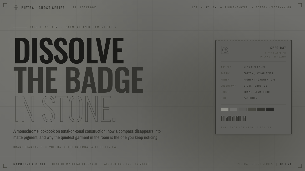
No. Gray is only the visible starting point. Ghost is defined by the relationship between garment dyeing, material texture, crisp panel construction, concealed compass branding, and stencil-style utility type. The system works because all of these decisions support the same restrained premise.
Why conceal the compass badge instead of removing it?
Keeping the badge preserves recognition while changing its visual volume. The tonal dark-gray treatment lets the mark belong to the fabric, so identity is discovered through attention rather than delivered through immediate contrast.
What creates contrast in a Ghost-inspired design if color stays so restrained?
Contrast comes from texture, surface finish, panel edges, tonal depth, and typography. Matte dyed fabric can sit beside rubberized satin; a crisp right angle can interrupt a quiet field; a stencil label can give structure to an otherwise continuous surface.
Does Ghost suit every product or interface?
It is strongest where technical credibility, restraint, and material awareness are useful values: dashboards, analytical tools, pricing systems, product stories, and utility-led brands. It is less suitable when the experience depends on bright celebration, decorative richness, or overt visual warmth.
Related design styles
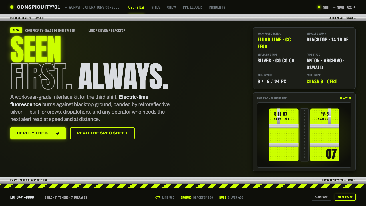 Hi-Vis Safety VestEngineered to be seen. Fluorescent lime on blacktop, silver reflective bands,…
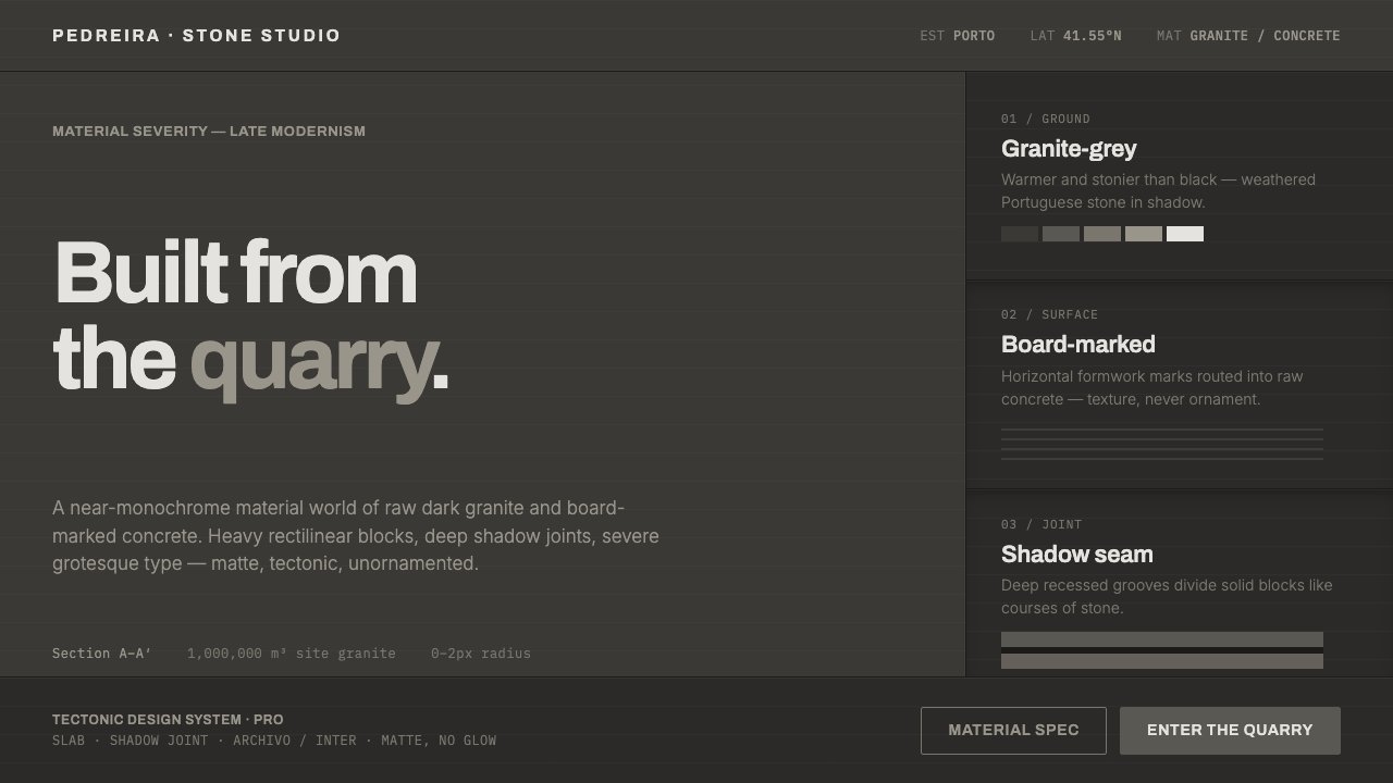 Souto de Moura GraniteArchitecture as raw matter. Dark Portuguese granite ground, board-marked conc…
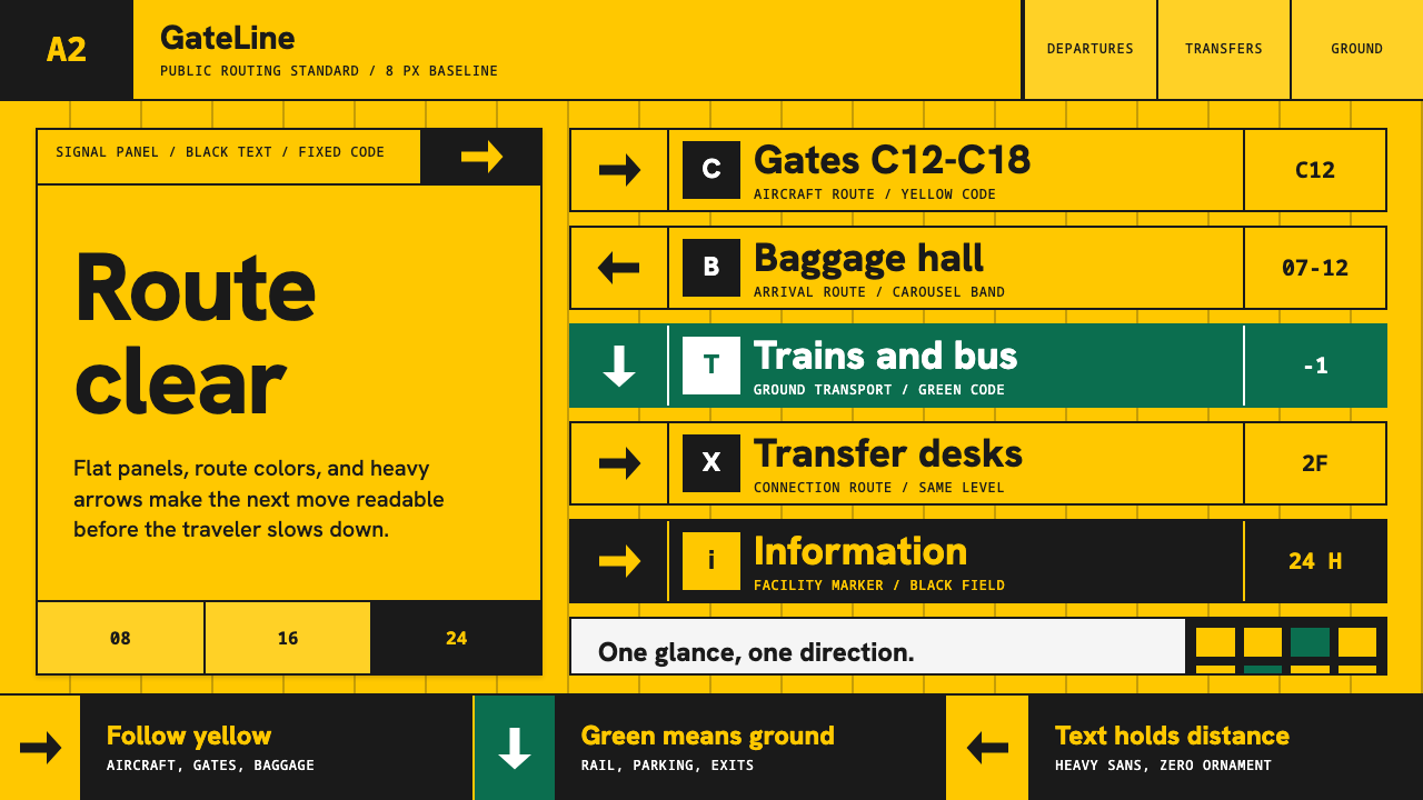 Airport Wayfinding GeometricLegibility becomes command. Signal yellow, black sans, and green route bands…
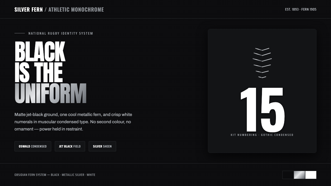 All Blacks Silver FernOne colour, total force. Jet-black field, a single metallic-silver fern, whit…
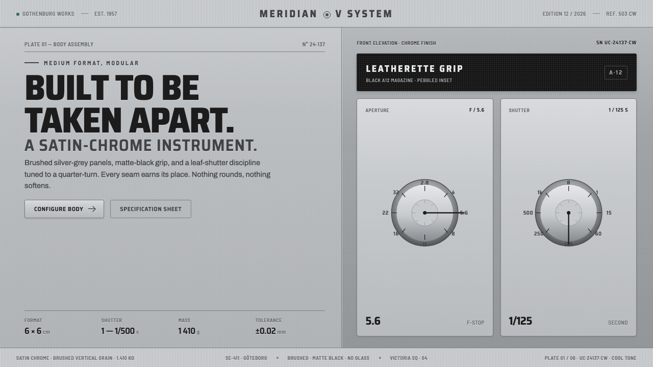 Hasselblad 500C ChromeBuilt to be taken apart. Brushed silver-grey panels, matte-black leatherette,…
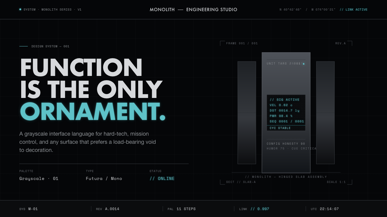 Interstellar TARSIf Mies built a robot. Brushed-aluminum grays on deep-space black, lit by one…