What is Kvadrat?
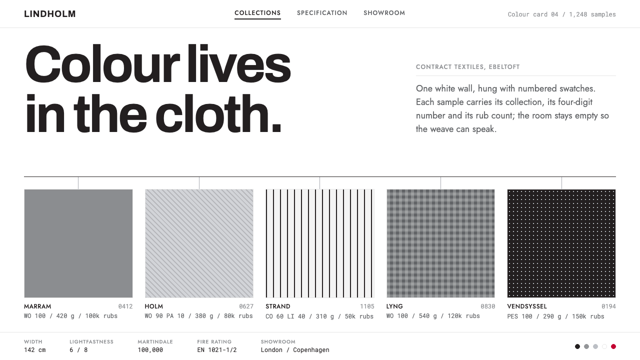
Kvadrat gave the white wall to the cloth — numbered swatches, hairline rules and near-black ink in an identity so deliberately colourless that the textiles carry every colour in the room.
Kvadrat in brief
Kvadrat is a Danish maker of contract textiles, fabrics specified for offices, hotels, public buildings and other commercial interiors, and its visual identity has become a reference point for how to present material with total restraint. The system is simple to describe: a pure white ground, pale grey sample panels, near-black ink for every mark, a mid-grey felt tone that bears the load, square swatches, hairline rules and rows of aligned numbers. The word kvadrat means 'square' in Danish, and the square swatch is the identity's basic unit.
The style belongs to three overlapping traditions: Danish modern contract textiles, achromatic corporate identity, and showroom-as-gallery retail. Danish modern supplies the honesty about material and the belief that craft and industry can share a table. Achromatic identity supplies the logic of the palette, in which the brand deliberately has no colour of its own so that the product can have all of them. Showroom-as-gallery supplies the staging: textiles are presented as a library or an exhibition, hung and numbered and catalogued, not sold with lifestyle imagery.
In visual terms, hierarchy comes from structure, not from fills, shadows or rounded corners. Headings are small, tight and left-aligned. Information is carried by tabular figures that line up in columns, by collection names and by four-digit numbers on every swatch. Red and orange exist, but only at the scale of a chip or a label, never as a block of colour. The overall effect is the visual equivalent of a well-run archive: everything has a place, a name and a number, and nothing is there to impress.

Where does Kvadrat come from?
Kvadrat was founded in 1968 in Ebeltoft, a small harbour town on the east coast of Jutland, and the names tied to its founding are Poul Byriel and Erling Rasmussen. The company grew within Danish modern contract textiles, a field in which the buyer is often an architect or a facilities team rather than an individual consumer, and in which the product has to perform in use as well as please the eye. That context explains the identity's temperament: it addresses specifiers who need accurate information, not shoppers who need persuading.
The method of display is as important as the cloth. Kvadrat shows its textiles the way a library shows books: a white wall, numbered colour cards hung on rails, and every swatch carrying a collection name and a four-digit number. The logic is that of a catalogue made physical. You do not browse by mood; you browse by system, finding a collection, then a number, then a colour. This is the model the digital identity inherits, so that a web page can feel like walking along the rail.
Peter Saville has directed the visual identity since 2004 and has kept it deliberately colourless, which is a harder discipline than it sounds. In a company whose product is colour, an identity in white, near-black and grey leaves the room for the textiles to speak; it also keeps the identity from dating, since it never commits to a fashionable palette. Saville's achromatic approach turned the brand into a neutral frame, and the frame has lasted from 2004 to the present with only subtle adjustment.
Architecture reinforced the idea. The company's London showroom opened in 2009, and the architect David Adjaye's name is attached to it. The showroom-as-gallery model is the physical counterpart to the graphic identity: a calm, light-filled shell in which the fabrics are the only saturated things. Taken together, the Ebeltoft origin, the Saville identity and the gallery-like showrooms form a single position: material first, brand second, ornament never. That position is what a designer is borrowing when they reach for this style.
What defines the Kvadrat look?
The White Wall
The ground is a pure white, the equivalent of a gallery wall, and it carries the whole page. Sample panels sit on it in a very pale grey, just distinct enough to read as a surface set against the wall. There are no textured backgrounds, no photographic washes and no tinted sections. The white is the neutral that lets the product, whether a swatch, a number or a photograph of cloth, hold the viewer's attention.
Near-Black Ink and Felt Grey
Every mark, whether type, rule or icon, is set in a near-black that is slightly softer than pure black, and a mid-grey felt tone carries the load wherever a secondary value is needed. The two together form the system's working palette. Grey here is not a faded black but a material colour, the grey of felt and wool, and it gives the identity its quiet warmth without introducing a hue.
Colour at Chip Scale
Red and orange appear in the system but only at the size of a chip or a label, such as a small mark beside a collection name or a status dot. They are never enlarged into blocks, headers or backgrounds. This rule keeps colour rare and therefore meaningful, and it protects the principle that the cloth, not the brand, is where colour lives.
Hairline Structure
Hierarchy is built from hairline rules rather than from fills, boxes or shadows. A thin line separates a heading from its list, a row from the next row, a column of data from its neighbour. Corners are square throughout; nothing is rounded. The structure is visible but never heavy, like the rails and joints of a well-made display system.
Square Swatches
The swatch is the unit of the system, a square sample of cloth shown flat, sized consistently, and arranged in grids or along rails. In an interface it becomes the basic tile: a square image or colour chip with a collection name and a number beneath it. Because the unit is always the same shape, a hundred of them read as a coherent library instead of a pile of pictures.
Numbers and Tabular Figures
Every swatch carries a collection name and a four-digit number, and numbers are set in tabular figures so that columns align exactly. Numbering is the style's primary form of decoration and its primary form of navigation: the viewer finds things by number, compares by number and orders by number. A page of aligned figures has its own rhythm and gives the data a visual authority that no illustration could provide.
Small, Tight, Left-Aligned Type
Type is set small, tight and flush left, with generous space around it rather than between the letters or lines. There is no centred headline and no oversized display type. The effect is that of a label on a sample card: legible, exact and unemphatic. Reading is quick because the eye always knows where a line starts, and because every piece of text is doing information work.

Who shaped Kvadrat?
Poul Byriel is one of the two names tied to Kvadrat's founding in Ebeltoft in 1968. His place in the story is as a founder of a company that built its reputation on contract textiles for demanding interiors, and whose later identity inherited a founder's insistence on material quality over display.
Erling Rasmussen is the second name associated with the founding of Kvadrat. Together with Poul Byriel he stands for the origins of a Danish textile company that grew out of a regional town rather than a design capital, and that built its authority on consistent quality and clear information.
Peter Saville, a British designer, has directed Kvadrat's visual identity since 2004. His contribution is the discipline of the achromatic system: white, near-black and grey, with colour surrendered to the product. The long life of the identity shows that restraint can be a more durable brand strategy than any distinctive palette.
David Adjaye is the architect whose name is attached to Kvadrat's London showroom of 2009. The showroom is the physical counterpart to the graphic identity, a calm and luminous space in which the fabrics supply the only strong colour, and it reinforces the showroom-as-gallery logic that the digital identity echoes.
How do you use Kvadrat today?
The Kvadrat style transfers best to content that needs to be found, compared and specified: catalogues, materials libraries, product indexes, spec sheets and any collection of similar things. It is a style for information that has to be precise. Applying it correctly means letting structure, numbering and alignment do the work that colour and decoration do elsewhere, and resisting every urge to fill space with ornament.
For presentation slides, the white wall translates directly. A cover can be a white slide with a small near-black wordmark, a collection title set small and flush left, and a single row of square swatches or images along the lower edge. Content slides are grids of numbered tiles or ruled tables, with hairlines marking sections and no coloured fills. Data slides are the style's natural territory: rows of aligned tabular figures, thin ruled lines and a single chip of red or orange to flag a value that matters.
For web interfaces, the style suits product catalogues, material and component libraries, documentation indexes and B2B showrooms. Build the layout from a square-tile grid, with each tile showing an image, a name and a number. Use hairline dividers between rows, tabular figures for any numeric column, and square corners everywhere. Filters and sort controls should be plain text and thin-outlined, not coloured buttons. Hover states can change the tone of a grey panel, but should not introduce hues, and the occasional red or orange chip can mark stock, new arrivals or errors.
For editorial and marketing work, the style supports sober, factual presentation: collection launches, product notes, trade brochures and case studies. Imagery should be of the material itself, close-cropped and evenly lit, set on the white ground without frames, and captions should be short, numbered and exact. Copy should state what a thing is made of and where it can be used. The brand's authority comes from accuracy and calm, not from superlatives.
A common mistake is to treat the style as simply black-and-white minimalism and then add the things it excludes: coloured buttons, drop shadows, rounded cards, hero gradients, centred headlines or large coloured blocks. Another is to enlarge the red and orange chips into banners, which destroys the rule that colour lives at chip scale. A third is to ignore the numbering and alignment, leaving only the white space; without tabular figures and consistent swatch sizing the system loses the discipline that makes it look like an archive rather than a blank page.

Kvadrat — FAQ
Why is the identity deliberately colourless?
Because the product is colour. A company that sells textiles in hundreds of shades does not want its own palette competing with them, so the identity steps back into white, near-black and grey. This also makes the brand look stable over time, since it is not tied to a fashionable hue. For anyone borrowing the style, the lesson is that restraint is a positioning choice, not a lack of ideas: the less the frame says, the more clearly the content can speak.
How do I show colourful products in such a neutral system?
Let the products carry the colour and keep everything around them neutral. Show swatches or product images as square tiles on the white ground, give each a name and a number, and avoid tinted backgrounds that would interfere with how the colours read. Grey panels can sit behind a group of tiles to separate it from the page, but they should remain neutral. The more saturated the product, the more important it is that the frame stays quiet.
How does it differ from Swiss International style?
Both are grid-based, sans-serif-led and fond of white space, but their emphasis differs. Swiss style often relies on bold scale contrast, large display type and sometimes strong colour to create tension. The Kvadrat approach is quieter: small type, hairlines, square tiles and tabular figures, with colour confined to chip scale. It resembles a well-kept catalogue more than a poster, and its drama, where there is any, comes from the product rather than from the layout.
What are tabular figures, and why do they matter here?
Tabular figures are numerals designed so that every digit occupies the same width. When numbers are stacked in a column, the digits line up exactly, which makes values easy to compare at a glance. In this style numbers are a central element, since every swatch carries a four-digit code, so aligned figures are what give a page its sense of order. Setting the same numbers in proportional figures makes the columns ragged and the page loses its archive-like precision.
Where does the style struggle?
It struggles in contexts that call for warmth, playfulness or emotional persuasion, such as children's products, food brands or entertainment. Its restraint can read as cold when the subject is not itself a material or a catalogue. It also depends on strong underlying content: a library of excellent swatches or well-organised data. With weak content and no ornament to hide behind, the page feels empty rather than disciplined.
Related design styles
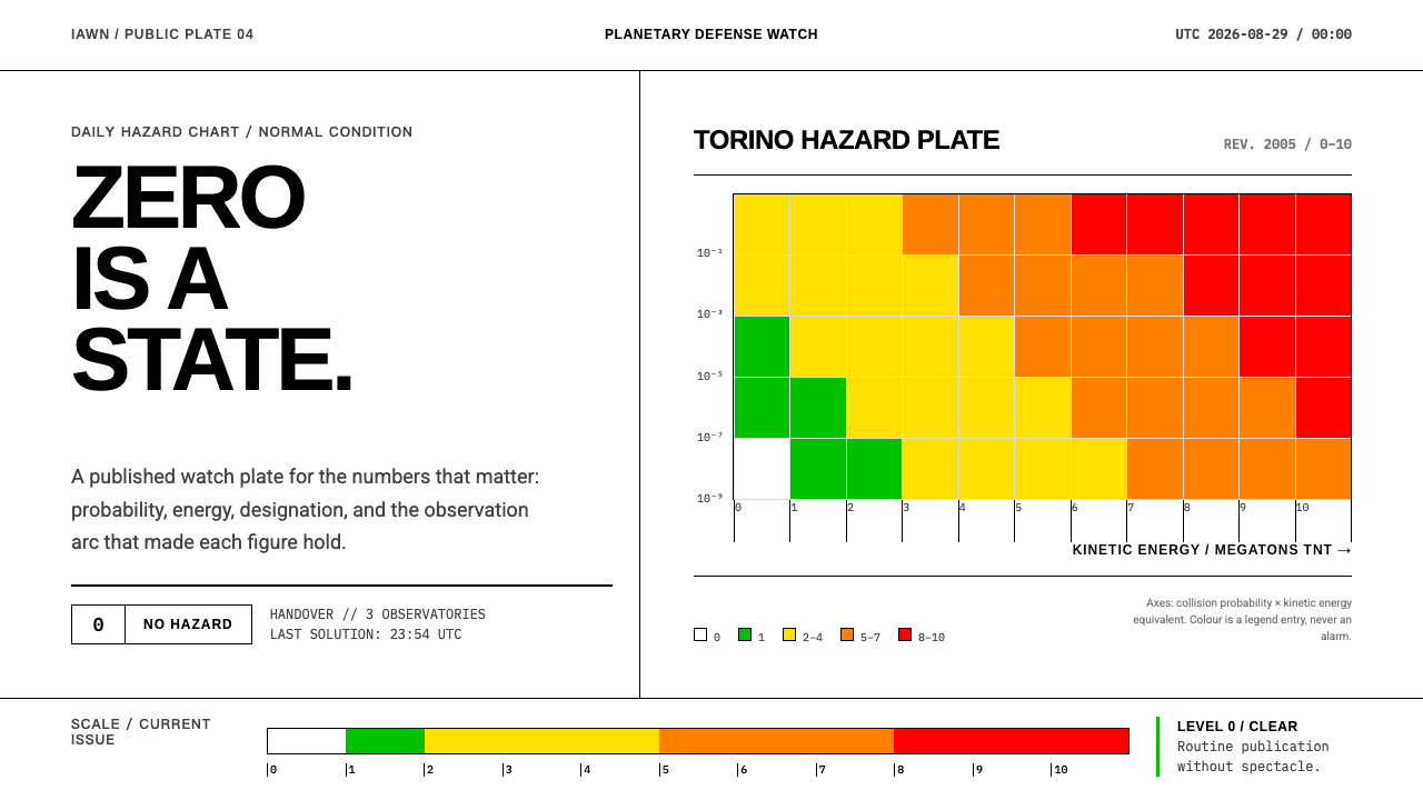 Planetary Defense WatchNothing to report is the point. Torino bands and monospace columns make risk…
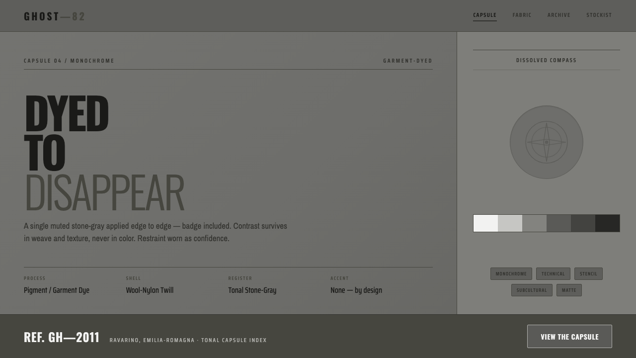 Stone Island GhostDyed to disappear. One garment-dyed stone-gray edge to edge, badge dissolved,…
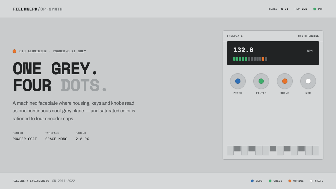 Teenage Engineering OP-1One grey, four dots. Machined aluminium in Space Mono, color rationed to tiny…
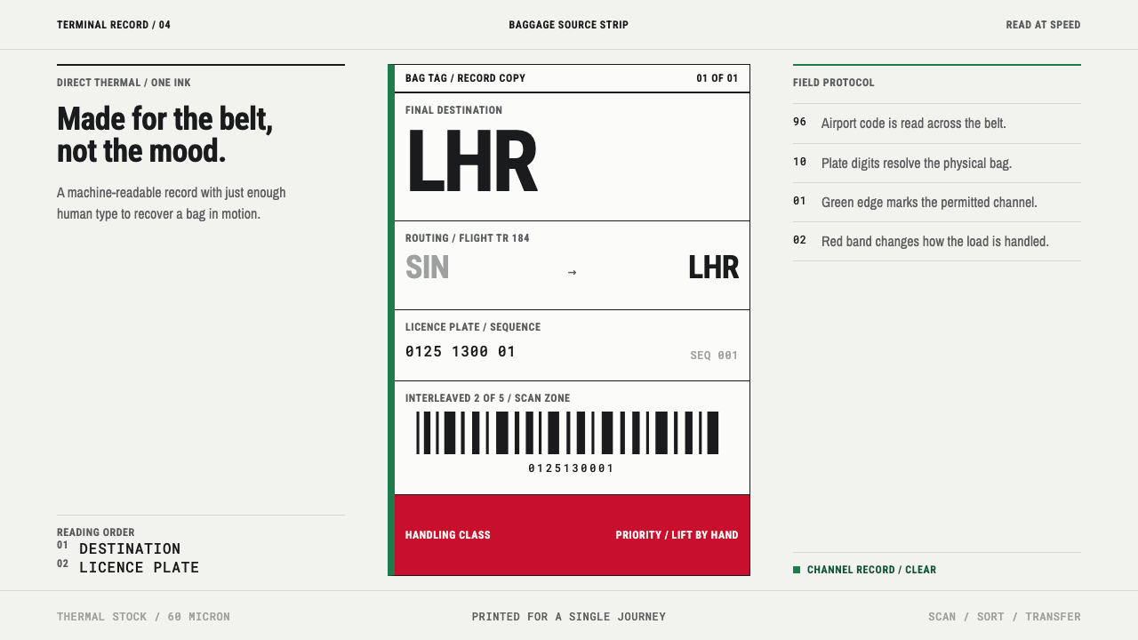 Airport Baggage TagBuilt to be read in motion. Burned-black codes, hard rules and functional cha…
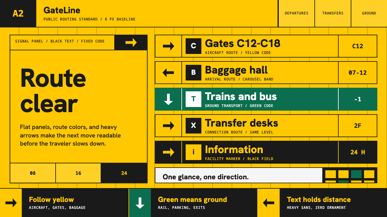 Airport Wayfinding GeometricLegibility becomes command. Signal yellow, black sans, and green route bands…
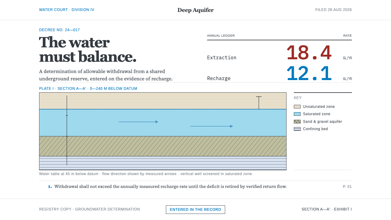 Deep Aquifer Water CourtRestraint makes the deficit undeniable. White bond, book serif, and a keyed a…