What is Nintendo Switch?
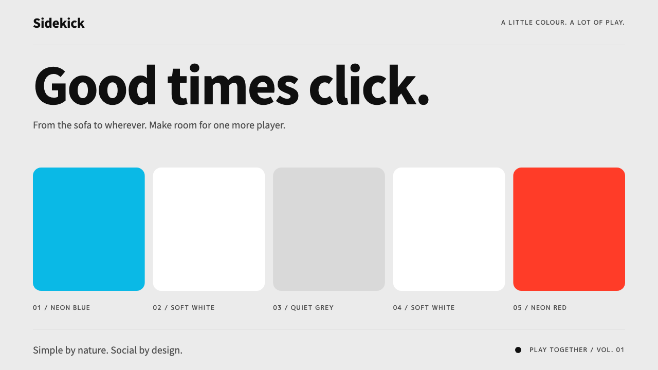
The Switch HOME menu is a quiet grey shelf of rounded tiles, and all of its colour is borrowed from a pair of plastic controllers.
Nintendo Switch in brief
This design language comes from the Nintendo Switch HOME menu in its Basic White theme, as seen at the console's launch on 3 March 2017. The ground is a flat light grey. One horizontal row of large rounded-square tiles carries the games, a line of round shortcut buttons sits beneath, and a turquoise frame breathes gently around whichever item is selected. It is a deliberately quiet interface that almost refuses to compete with the content it displays.
What gives the style its energy is where the colour comes from. The software stays neutral, while Neon Blue and Neon Red, the colours of the two Joy-Con controllers, mark left and right, primary and secondary. In interface terms, blue carries the main action and red carries the secondary action or a reminder. Because colour is attached to meaning rather than scattered for effect, the screen feels calm and legible even when it is full.
In a design library, Nintendo Switch is the style for products that want to feel friendly, simple and a little like a toy without becoming childish. It is flat, tile-based and rounded, matching the broader 2010s language of app launchers and card interfaces, but it adds a physical charm: transitions land with a short, springy click, as if a controller were sliding onto the console rail.

Where does Nintendo Switch come from?
The Switch launched on 3 March 2017, and its HOME menu appeared at that moment with two themes, Basic White and Basic Black. The interface was designed in Kyoto, Japan, by a Nintendo team associated with figures such as Yoshiaki Koizumi, Shinya Takahashi and Ko Shiota. The brief was unusual: a single piece of hardware that is a home console on a television, a handheld in a bag and a tabletop device shared between friends, all with one consistent screen.
That hybrid nature explains the interface. A handheld needs targets that are easy to hit and read at a glance, so tiles are large and the layout is horizontal, a single row to scroll through. A television needs a calm backdrop that survives living-room glare and being seen from a distance, so the ground is a soft, even light grey. The restrained design is therefore partly a consequence of function, not only of taste.
The style sits at the meeting point of several traditions. It belongs to the broader flat, tile-based system user interface of the 2010s, in which operating systems moved away from glossy skeuomorphism toward simple coloured blocks. It also continues Nintendo's long tradition of toy-like hardware, where objects invite touching and the plastic itself carries the personality. The controllers' bright colours are the most direct expression of that tradition.
This pairing of a quiet interface and loud hardware is the heart of the aesthetic. The software never tries to be as colourful as the box in the player's hands; it simply leaves room for the physical object to be the star, and when colour does appear on screen it echoes the controllers. That logic is easy to carry into web and app design.
What defines the Nintendo Switch look?
Light-grey stage
A flat, even light grey forms the entire ground. It has no texture, no gradient and no heavy shadow, so it works as a neutral stage that lets content tiles do the talking.
One row of large rounded tiles
Primary content sits in a single horizontal row of generously sized rounded squares. The scale makes targets easy to hit on a handheld screen and keeps the layout clear from across a room.
Round shortcut buttons
Beneath the tiles sits a line of circular buttons for system functions. Circles against the squares give a gentle shape contrast and signal that these are tools rather than content.
Breathing turquoise selection frame
The selected item is outlined by a turquoise frame that slowly pulses. It marks focus clearly without changing the tile itself, and the motion makes the interface feel alive but not busy.
Neon Blue and Neon Red
Two saturated accents, taken from the Joy-Con plastic, bookend the interface. Blue stands for the primary side and action, red for the secondary side, a warning or a reminder, and they rarely appear together in the same place.
Springy click transitions
Movement is short, snappy and slightly bouncy, ending with a decisive stop. It mimics the sensation of a controller sliding onto the rail and gives each action a satisfying landing.

Who shaped Nintendo Switch?
Nintendo executive and producer associated with the Switch's creative direction at its launch.
Senior Nintendo figure in software development during the Switch's launch period.
Nintendo hardware-side figure connected with the Switch's design and engineering.
How do you use Nintendo Switch today?
On slides, Nintendo Switch is ideal for friendly product reviews, onboarding decks, community updates and educational material. A cover can place a row of rounded tiles on the light-grey field with one tile highlighted by a turquoise frame. Content slides work well as tile grids, where each idea is a rounded card of consistent size. For data, assign blue to the primary series and red to the comparison, keep the rest neutral grey, and let the highlighted frame mark the number that matters.
In web and app interfaces, the style suits launchers, game stores, family-oriented tools, habit trackers and any dashboard that should feel inviting. Build navigation as a row of large tiles, put system shortcuts in round buttons beneath, and draw focus with a turquoise outline that gently pulses. Pricing pages can present plans as equal rounded tiles with the recommended plan outlined, and keep red for cancellation or warnings only. Keep interactions snappy with a short springy motion.
In editorial and marketing work, the aesthetic fits hardware launches, gift guides, family campaigns and playful brand storytelling. Use generous white space, large rounded imagery and a pair of hardware-like accent colours. Because the base is so quiet, a single burst of blue or red feels like an event. Copy can be warm and simple, avoiding hype.
The most common mistake is to treat blue and red as decorative, spreading them across headings, backgrounds and icons until they lose their meaning. Another is to darken or texture the grey ground, which removes the calm stage the colours depend on. Finally, avoid sharp corners, dense text blocks and heavy drop shadows; the style depends on roundness, space and one clear point of focus at a time.

Nintendo Switch — FAQ
Which Switch theme is this style based on?
It is based on the HOME menu's Basic White theme from the console's launch on 3 March 2017, with a flat light-grey ground, a row of rounded tiles and a turquoise selection frame.
Where do the blue and red come from?
They come from the hardware, specifically the Neon Blue and Neon Red Joy-Con controllers. In the design system they mark primary versus secondary, with blue for the main action and red for secondary actions or reminders.
Why is the interface so plain?
Because the same screen has to work as a television console, a handheld and a tabletop device. Large tiles and a calm, even background keep it readable at any distance, and they leave space for the content and the colourful hardware.
What projects suit this style?
Launchers, stores, family and educational tools, friendly dashboards, hardware campaigns and gift guides. It is less suited to dense, formal or dark and moody briefs.
What is the biggest mistake when using it?
Overusing the neon colours. They work because they are rare and tied to meaning. Spread them everywhere, or darken the grey ground, and the calm that makes the style feel friendly disappears.
Related design styles
 K-Beauty CleanCalm arrives dewy. Rose, sage, and peach pastels float through airy rounded f…
 Wordle (2021)Quiet becomes addictive. Olive green, dusty gold, and gray score a strict gri…
 Twitter (Classic Bird)Text takes the stage. Sky blue actions, white feed stack, and hairline divide…
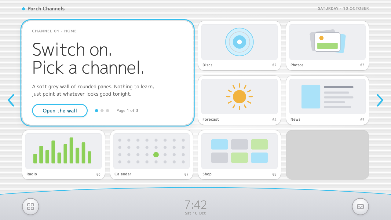 Wii MenuSwitch-on calm. White TV panes on a grey scanline wall, one thin blue line on…
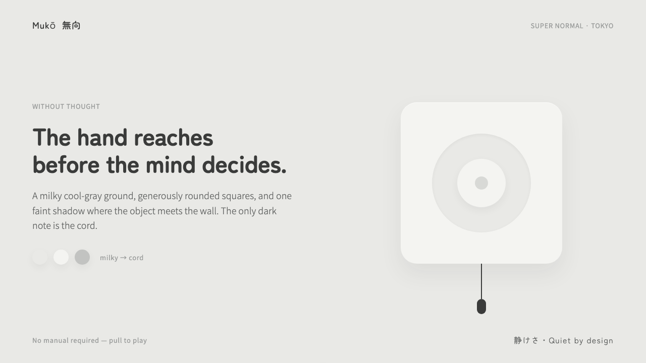 Fukasawa Without ThoughtHand reaches before mind decides. Milky cool-gray plastic, rounded squares, o…
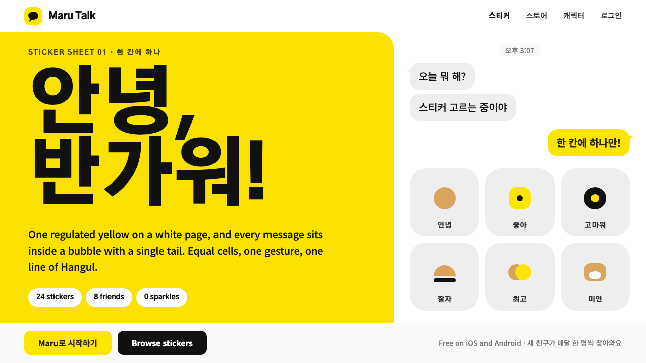 Kakao FriendsOne yellow, one gesture per cell. A white sticker sheet where speech bubbles…