What is Wordle (2021)?
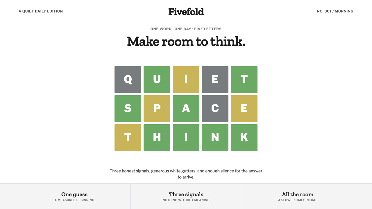
Wordle proved that an entire game — and an entire visual identity — could live inside a 5-by-6 grid of hard-edged squares and three feedback colors.
Wordle (2021) in brief
Wordle's entire personality collapses into a single grid: five columns, six rows, hard-edged squares with no rounding to soften them. Every visual decision serves that grid rather than decorating it. The three feedback colors — an olive-soft green for a correct letter in the correct place, a dusty-gold yellow for a correct letter in the wrong place, and a flat neutral gray for a letter that isn't in the word at all — carry the entire emotional range of the game. There is no fourth color, no gradient between states, and no ambiguity about what each color means.
The ground beneath the grid is cool, pure white, and the gutters between tiles are wide and deliberate — treated as part of the design rather than as leftover space around it. A QWERTY keyboard sits below the grid and slowly recolors itself as guesses accumulate, so the interface becomes a visible record of deduction rather than a static input tool. Typography stays quiet throughout: a slab serif for the masthead, a plain grotesque for everything else, both chosen for legibility rather than personality.
Everything is centered on a single vertical axis, and nothing competes with the grid for attention. The restraint is the whole point — a game this simple could easily be over-decorated, and its refusal to add anything beyond the three feedback colors and the grid itself is exactly what makes the daily ritual feel calm rather than gamified.
Where does Wordle (2021) come from?
Wordle was built in 2021 by Josh Wardle, a software engineer, as a personal project originally made as a gift — a small daily word game he built for a partner who enjoyed puzzles, before it spread first to friends and family and then, through word of mouth and social sharing, to a global audience within a matter of weeks. Palak Shah was closely involved in the game's early life, and the gift-like, low-pressure origin of the project shaped a design philosophy that avoided anything resembling aggressive engagement mechanics.
The game's central mechanic — one puzzle per day, shared by everyone, with no ability to skip ahead or replay a missed day — was itself a design decision with visual consequences. Because everyone played the same puzzle on the same day, a shareable results grid using colored squares (without revealing the actual letters) became a natural way for players to compare notes without spoiling the answer, and that emoji-like grid of colored squares became one of the most widely recognized visual artifacts to come out of the game.
By late 2022, The New York Times acquired Wordle and folded it into its Games section, sitting alongside the paper's crossword and other puzzle offerings. Rather than overhauling the interface, the Times largely preserved the existing visual language — the grid, the three feedback colors, the plain typography — and extended it into a consistent 'NYT Games' house style that now spans multiple puzzles, treating restraint as a brand asset worth protecting rather than a placeholder to be replaced.
The specific typographic choices — a slab serif for the Wordle masthead and Libre Franklin for supporting text — arrived with the NYT era and were chosen to feel calm, editorial, and consistent with the newspaper's broader digital design system, rather than to look like a typical mobile game. That alignment with newspaper design sensibility, rather than gaming-app conventions, is part of why Wordle reads as understated rather than flashy even after a major commercial acquisition.
What defines the Wordle (2021) look?
Color
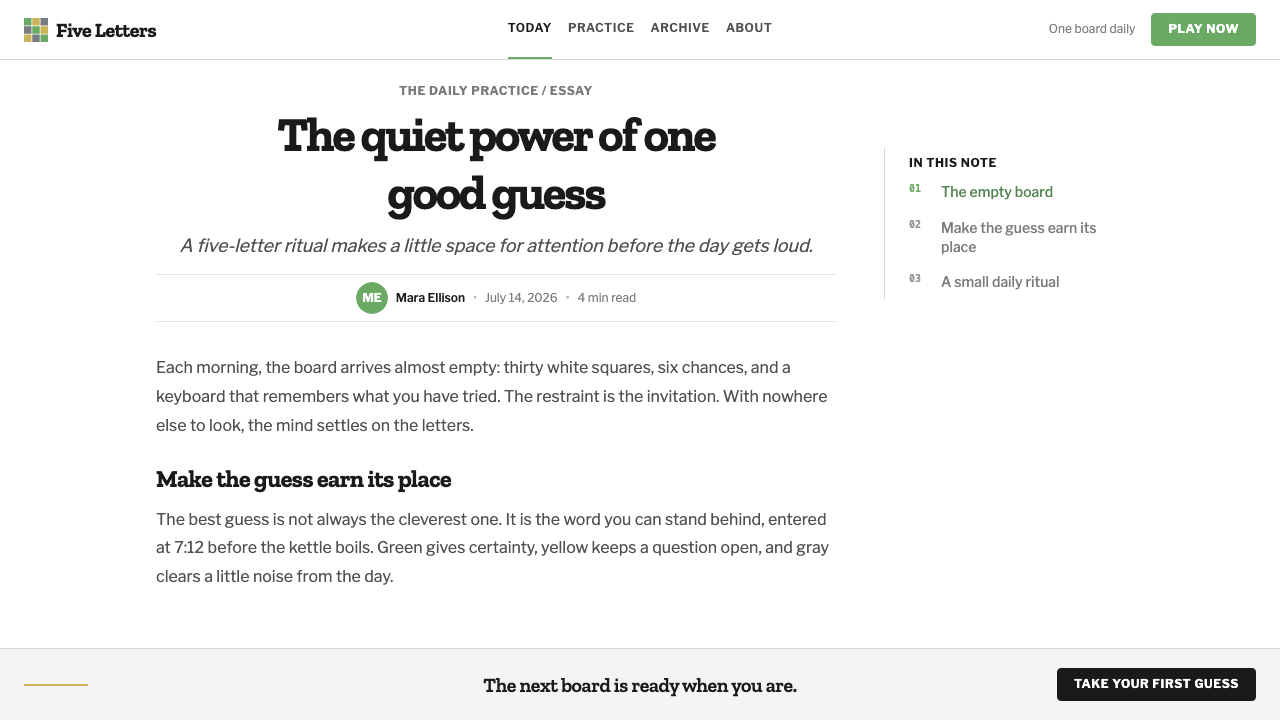
Exactly three feedback colors exist, and each has one fixed meaning: olive-soft green for a correct letter in the correct spot, dusty-gold yellow for a correct letter in the wrong spot, and flat neutral gray for a letter absent from the word. No other color competes for attention, and the muted, slightly desaturated quality of the green and yellow keeps the feedback calm rather than alarming.
Typography
A slab serif carries the masthead and title, giving the brand a slightly editorial, printed-paper feel, while a plain grotesque such as Libre Franklin handles supporting text and instructions. Neither typeface calls attention to itself — both are chosen for calm legibility rather than personality or novelty.
The 5×6 Grid
Five columns for letters, six rows for guesses, with hard, unrounded edges on every tile. The grid is not a container for the game — it is the game, and the entire visual system exists to serve its legibility rather than to surround it with unrelated ornament.
Generous White Gutters
The gaps between tiles are wide enough to read as deliberate design rather than incidental spacing. This white space carries as much visual weight as the colored tiles themselves — removing or shrinking it would make the grid feel cramped and anxious rather than calm.
The Heating Keyboard
A QWERTY keyboard below the grid gradually fills in with the same three feedback colors as letters are tried, turning the keyboard into a running record of deduction rather than a static input device. This is functional color-coding rather than decoration — every colored key answers a real question about what's already been ruled in or out.
Single-Axis Centering
The entire interface — masthead, grid, keyboard — sits centered on one vertical axis with no competing side content, sidebar, or asymmetric layout. This single-column focus mirrors the game's own single-minded design: one puzzle, one grid, one path through it.
Zero Decorative Excess
No gradients, no drop shadows, no celebratory animation beyond a simple tile flip and a brief win message. The design's confidence comes from doing extremely little extremely well, rather than adding features or flourishes to sustain interest.
Who shaped Wordle (2021)?
A software engineer, Wardle built Wordle in 2021 originally as a personal gift, designing the game and its visual restraint without any commercial pressure to add engagement features. His decision to keep the daily-puzzle format simple — one game, once a day, shared by everyone — is inseparable from the calm, uncluttered look the game became known for.
Closely involved in the game's early development and life as the person it was originally made for, Shah's presence at the origin of the project is part of why Wordle carries the feel of a gift rather than a product built to maximize engagement metrics from day one.
After acquiring Wordle in 2022, the Times Games team chose continuity over reinvention, preserving the grid, the three feedback colors, and the plain typography while folding the game into a broader 'NYT Games' house style. That restraint — resisting the urge to redesign a hit product — is itself a notable design decision.
How do you use Wordle (2021) today?
Wordle's aesthetic is one of the most transferable minimalist systems in contemporary design because its restraint is functional rather than merely stylish — every choice exists to keep a simple daily ritual calm and legible, which is a value that carries well beyond word games.
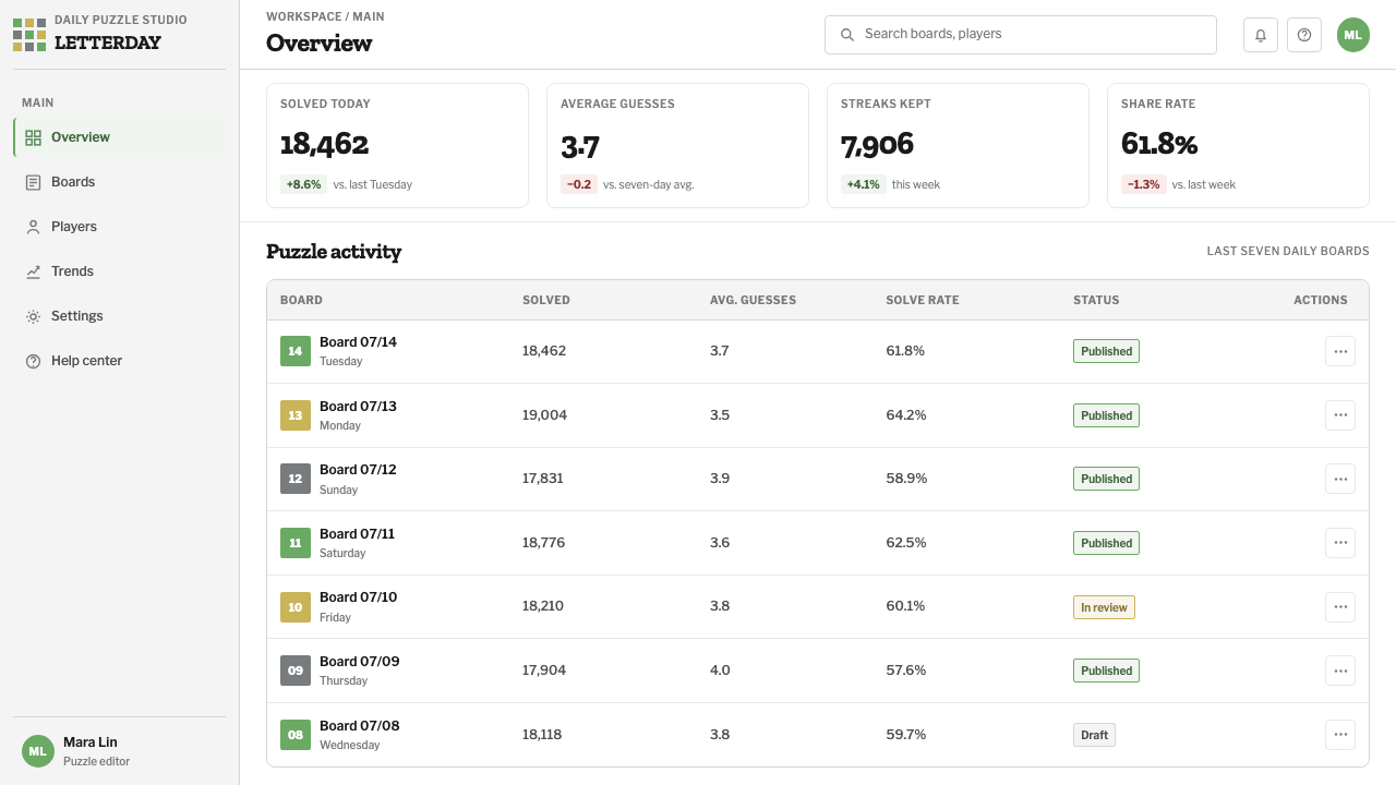
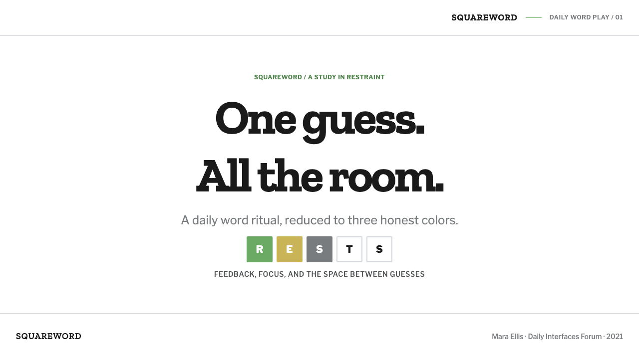
For presentation slides, the grid motif translates cleanly into a cover built around a row of hard-edged colored squares, with the title set in a quiet slab serif against white. Content slides benefit from single-axis centering and generous white space between elements, treating negative space as part of the composition rather than a gap to be filled. Data slides can borrow the three-color feedback logic directly — green, gold, and gray as a simple status system for good, partial, and poor results — rather than a more elaborate color scale.
For web interfaces, this style suits any product built around a short, focused daily or repeatable interaction: habit trackers, simple utility tools, and any dashboard that wants clarity over density. A strict grid, wide gutters, and a maximum of three status colors will carry the calm, non-gamified feel into an unrelated product.
For editorial and marketing work, the style supports a confident, uncluttered brand voice: generous white space, a single centered column, and restrained typography rather than layered visual effects. A marketing page can borrow the tile-flip reveal as a subtle interaction motif without needing to reference the game directly.
The most common mistake is adding a fourth color or a decorative gradient to 'enrich' the feedback system. The entire strength of the palette comes from its limitation — three colors, three fixed meanings, no ambiguity. Expanding the palette to look more vibrant undermines the very clarity that made the original design work.
Wordle (2021) — FAQ
Is Wordle's style the same as generic flat design?
They share surface traits — no gradients, no shadows, flat color fills — but Wordle's style is more specific than flat design in general. It is built around exactly three fixed-meaning feedback colors and a single hard-edged grid, rather than flat design's broader, more open-ended use of color and shape. The limitation to three colors with fixed meanings is what makes it Wordle rather than generic flat design.
Can this style work with a dark background?
Yes, more comfortably than many minimalist styles, because Wordle itself ships an official dark mode that keeps the same three feedback colors and simply swaps the white ground for a near-black one. The key constraint carries over regardless of background: the three feedback colors must stay fixed in meaning and must not compete with a fourth accent color.
Why does the keyboard change color instead of staying static?
Because the keyboard's evolving colors function as a memory aid, letting a player see at a glance which letters have already been tried and what was learned from each guess. A static keyboard would force players to scroll back through previous guesses to reconstruct that information, which the coloring system makes instantly visible instead.
How wide should the gutters between grid tiles be?
Wide enough to read as an intentional part of the composition rather than default spacing — the gutters should feel generous relative to the tile size, giving each letter room to stand alone before the eye moves to the next. If the tiles feel crowded together, the grid starts to look dense and anxious rather than calm and considered.
Does this style suit a fast-paced, high-energy product?
Not naturally. Its entire value comes from communicating calm, focus, and a once-a-day pace rather than urgency or excitement. It suits habit-building tools, reflective or reference products, and anything that benefits from feeling unhurried far more than it suits a product trying to convey speed, energy, or constant novelty.
Related design styles
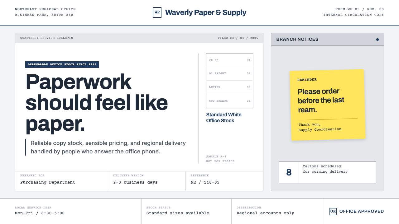 The Office (Dunder Mifflin, 2005)Mundanity is the punchline. Copier white, cubicle gray, memo grids, and one y…
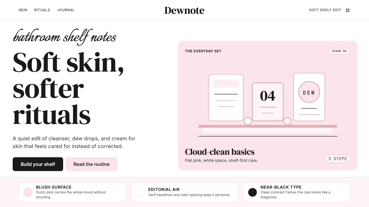 GlossierBeauty as a friend's conversation. Dusty pink (never bubblegum), editorial se…
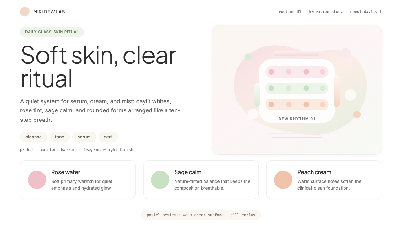 K-Beauty CleanCalm arrives dewy. Rose, sage, and peach pastels float through airy rounded f…
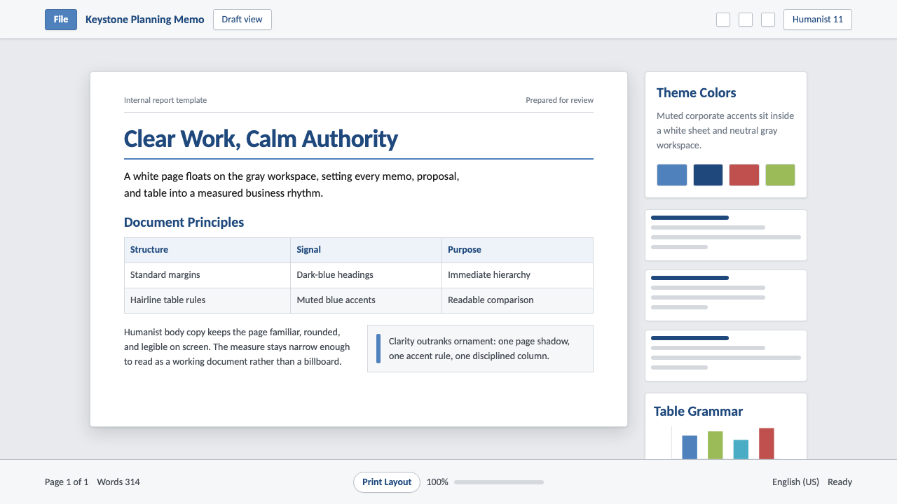 Office DocumentQuiet authority. White page sheet, muted blue rules, and humanist-sans rhythm.
 Twitter (Classic Bird)Text takes the stage. Sky blue actions, white feed stack, and hairline divide…
 KlarnaFintech turns fashion-editorial. Dusty bubblegum pink, black Inter, and white…