What is Office Document (Calibri 2007)?
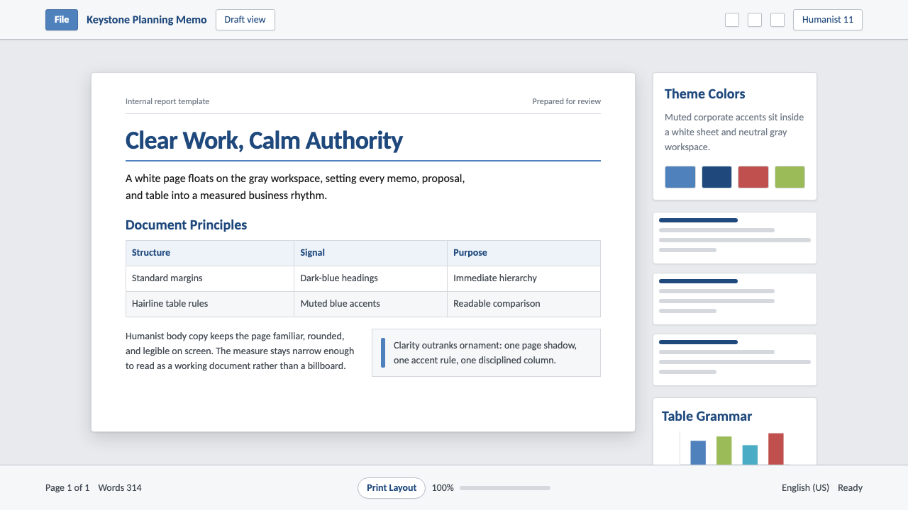
Office Document is the look of a Word file being taken seriously — a white page floating on gray, headed in muted blue, and set in the rounded sans-serif that quietly became the default typeface of business writing.
Office Document (Calibri 2007) in brief
Office Document is a corporate-document aesthetic built around the most-read typeface of the early twenty-first century: Calibri, the rounded humanist sans that Microsoft made the default font of Word, Excel, PowerPoint, and Outlook when Office 2007 shipped in January of that year. The system reproduces the sensation of opening a business file — a crisp white page sheet centered on a soft light-gray workspace, standard margins framing the text block, hairline rules dividing tables, and section headings picked out in a restrained office blue rather than plain black.
Nothing about this look is accidental. It is the visual residue of millions of memos, proposals, budgets, and status reports composed inside the same software suite over more than a decade, and it carries the connotations that come with that ubiquity: competence, neutrality, and a faint bureaucratic formality. The page-on-workspace framing borrows directly from the printed document it descends from — a physical sheet of paper with margins and a header — even though the file was designed to be read almost entirely on a screen.
Color plays a narrow, functional role rather than a decorative one. A single office blue anchors primary headings and interactive elements such as links; a darker, more desaturated blue handles secondary hierarchy; body copy stays a near-black gray for extended reading comfort. There is no illustration, no photography, and no gradient — just type, rules, and disciplined whitespace doing all of the communicative work.
Where does Office Document (Calibri 2007) come from?
The look descends from decades of default business-document convention. Microsoft Word became the dominant word processor through the 1990s, and by the early 2000s most professional written communication in English-speaking business culture happened inside its templates, set in default fonts such as Times New Roman for body text and Arial for headings and interface labels — both digitized adaptations of typefaces designed for metal type and print, not for glowing screens.
As computer monitors became the primary reading surface rather than paper, Microsoft invested heavily in ClearType, a subpixel-rendering technology refined through the early 2000s that sharpened how type rendered on LCD displays. To take full advantage of it, the company commissioned a small set of new typefaces — the ClearType Font Collection — designed from the start for on-screen reading rather than adapted from print originals. Calibri, created by the Dutch-born type designer Lucas de Groot, became the flagship of that collection and the new default for body text; fellow type designer Jelle Bosma worked on companion faces within the same Microsoft commission.
What distinguished Calibri from the grotesque sans it replaced was its warmth. Its strokes carry softly rounded corners and terminals, tuned to render cleanly at small sizes under ClearType's antialiasing, and its skeleton is humanist rather than mechanically geometric — closer in spirit to a handwritten letterform than to a drafting-table grid. The result reads as approachable and slightly less severe in long passages of body text while still remaining efficient and compact on the page.
The font change did not arrive alone. Office 2007 also replaced the menu-and-toolbar interface that had defined the suite since the early 1990s with the Ribbon, a tabbed, icon-driven command surface — the most visible redesign in the software's history. Because Office quickly became the default authoring environment for whole industries, universities, and governments, Calibri is often described — more as workplace folklore than as any verified count — as one of the most-read typefaces ever set, simply through the sheer volume of documents that passed through Office's default settings over the following decade and a half.
What defines the Office Document (Calibri 2007) look?
Color
A single restrained office blue carries primary headings and interactive elements such as links, while a darker, more desaturated blue handles secondary hierarchy. Body text stays a near-black gray rather than pure black, easing long reading sessions. No bright accent, no saturated palette, and no secondary hue competes with blue for attention — color is used sparingly, as a signal of structure rather than a source of visual interest.
Typography
Calibri, a rounded humanist sans-serif, carries the entire system's tone. Its terminals and corners are softly rounded rather than sharply cut, and its proportions are slightly condensed and even, designed to render cleanly at small sizes on a screen. Headings step up in weight and size against a body copy that stays uniform and restrained — hierarchy is carried by scale and weight alone, never by color shifts or decorative treatment.
Page and Margins
The signature move is the page-sheet metaphor: a crisp white rectangle floating on a soft gray workspace, exactly as a document window frames a page against the desktop behind it. Margins are even and generous on all sides, echoing the standard proportions of a printed sheet even when the content will only ever be viewed on a display. This framing device alone is enough to signal 'document' before a single word is read.
Tables and Rules
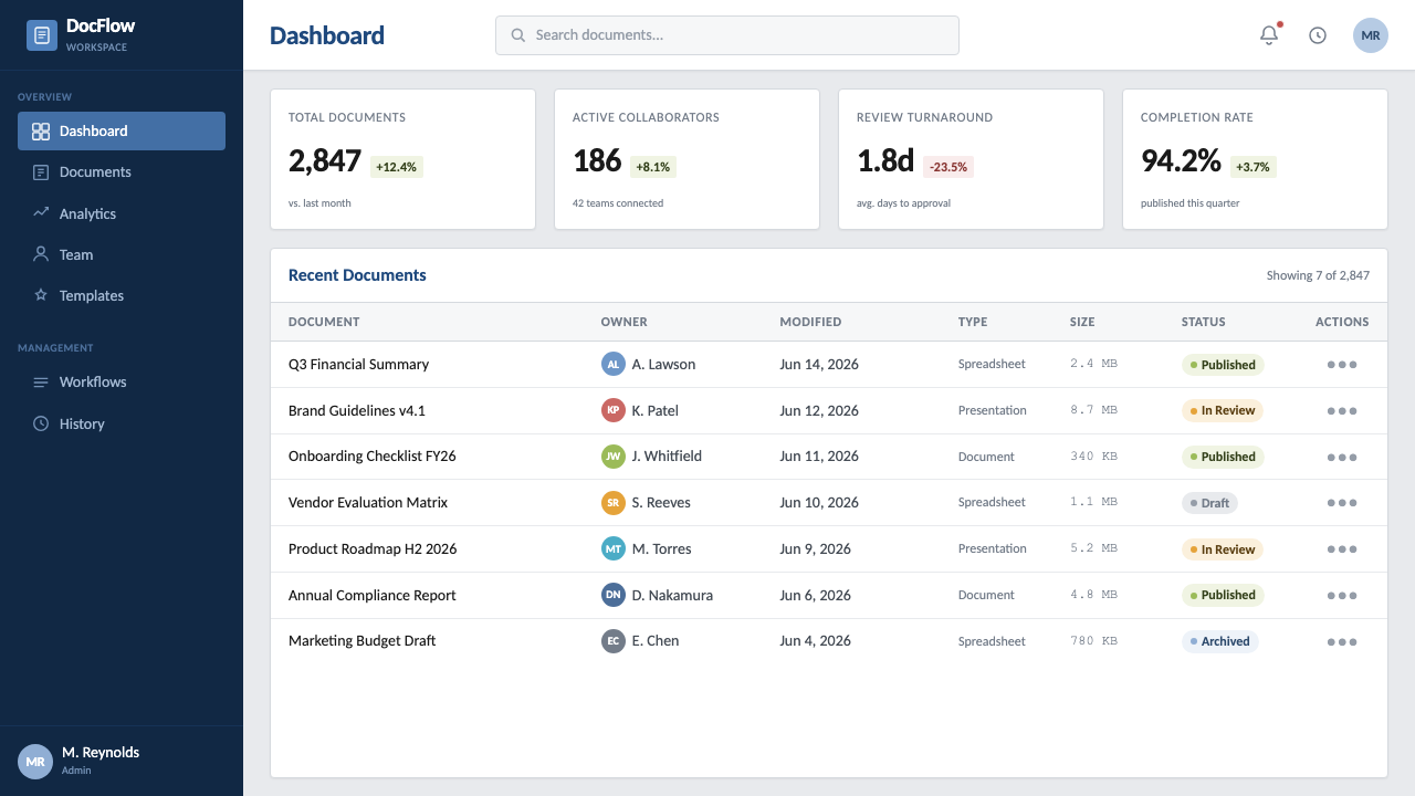
Data is organized with hairline rules — thin, quiet lines that divide table cells and separate sections without ever thickening into a border or a box. Rules are used structurally, the way a spreadsheet or a report table would use them, never decoratively. The restraint of the line weight is part of the system's authority: nothing shouts, everything is simply legible.
Hierarchy
Information levels are built through a disciplined scale of heading sizes and weights rather than through color-coding or iconography. A document-style outline — title, section heading, subheading, body — maps cleanly onto screen hierarchy, giving every interface built on this system an implicit table-of-contents logic even before navigation is added.
Chrome and Iconography
Where interface chrome appears at all, it echoes the Ribbon era: flat, evenly weighted icons, grouped into labeled clusters, with tabs used to switch between command sets rather than dropdown menus. Ornament is nearly absent — no skeuomorphic buttons, no embossing, no drop shadows beyond the faintest lift separating the page sheet from its gray background.
Who shaped Office Document (Calibri 2007)?
The Dutch-born type designer who created Calibri as the flagship of Microsoft's ClearType Font Collection. De Groot built the typeface's rounded, humanist skeleton specifically to render cleanly at small on-screen sizes under ClearType antialiasing, favoring warmth and legibility over the more mechanical geometry of the grotesque sans it replaced as Office's default.
A type designer who worked alongside de Groot on the same Microsoft commission, contributing companion faces to the ClearType Font Collection that Calibri anchored. His involvement reflects how the collection was conceived as a coordinated family of screen-optimized typefaces rather than a single standalone release.
The internal Microsoft team responsible for the coordinated visual refresh that accompanied Office 2007's launch — pairing the new Ribbon interface with a new default color theme and the switch to Calibri across every application in the suite. Their work bundled a typeface change and an interface overhaul into a single release, which is why the two remain visually inseparable in most people's memory of the era.
Microsoft's internal group responsible for developing the ClearType subpixel-rendering technology and commissioning the typefaces built around it. Their technical work on how LCD screens render fine strokes directly shaped Calibri's rounded forms, which were tuned as a practical response to how antialiasing behaves at small sizes rather than as a purely aesthetic choice.
How do you use Office Document (Calibri 2007) today?
Because Office Document read as a near-universal professional grammar for well over a decade, applying it successfully means treating it as a register rather than a decorative skin: buttoned-up, unsurprising, competent. It works best precisely where an audience expects restraint and where a flashier, more expressive system would read as untrustworthy or unserious.
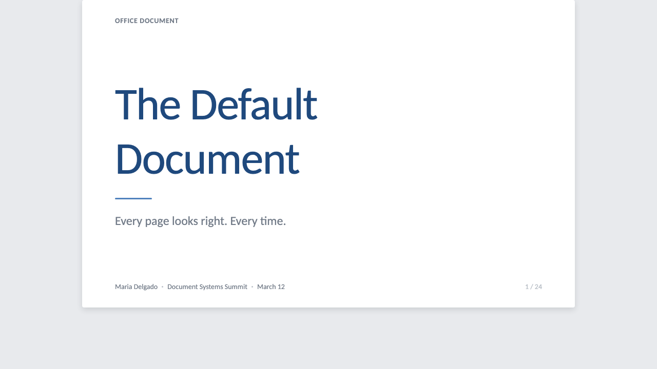
For presentation slides, the system suits cover, content, and data slides in distinct ways. A cover slide can borrow the page-sheet framing directly — a white rectangle centered on gray, title set in Calibri, a single rule beneath it, exactly like a document header. Content slides should read like outline levels made visual: one heading size, one body size, hairline rules separating sections rather than boxes or icons. Data slides work best as understated tables and simple bar or line charts rendered in office blue and gray, echoing the look of a chart pasted in from a spreadsheet rather than a bold standalone infographic.
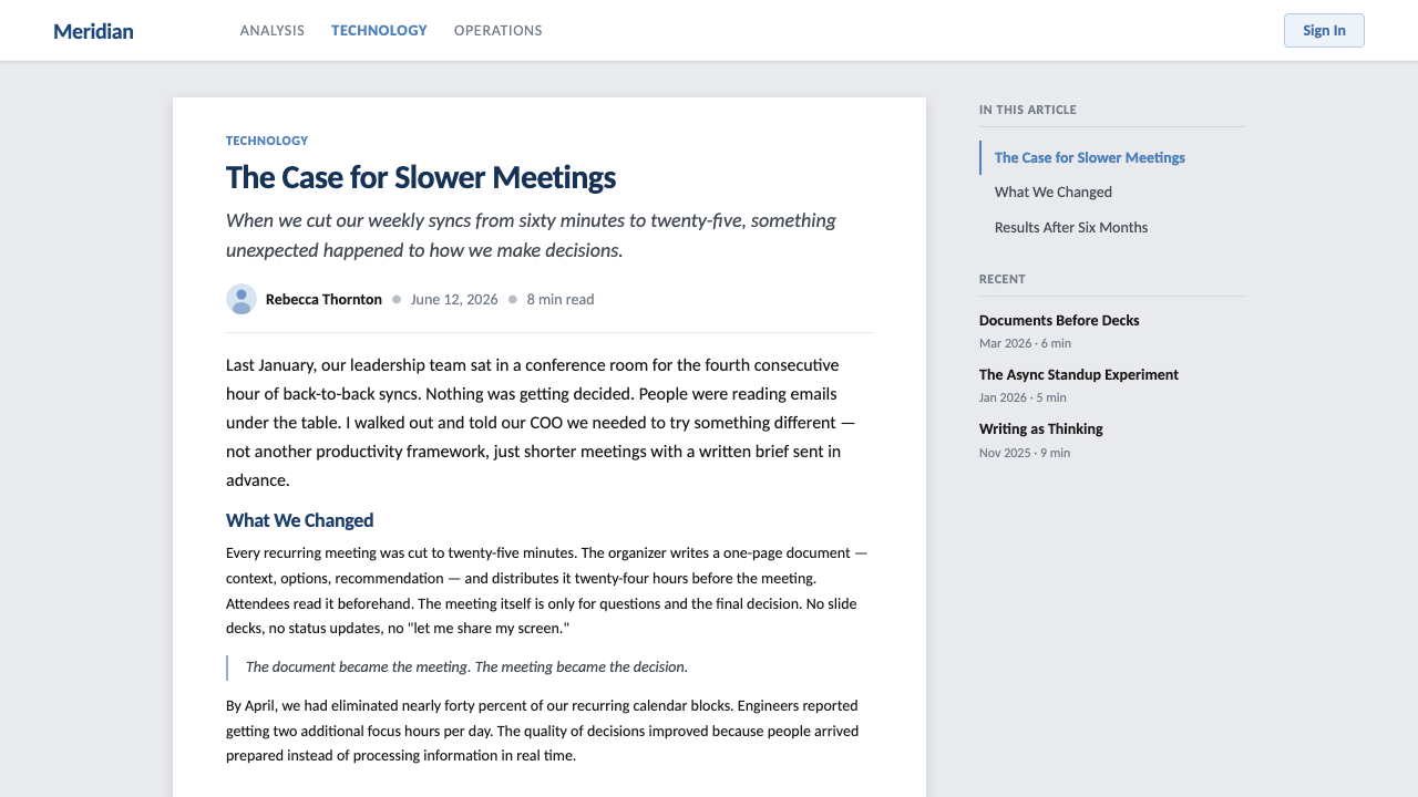
For web interfaces, the system is well suited to enterprise dashboards and pricing pages aimed at business, finance, legal, or operations audiences — contexts where 'trustworthy and unsurprising' outperforms 'exciting.' Backgrounds stay near-white or light gray, office blue is reserved for primary actions and links, and dense data tables lean on hairline dividers rather than heavy borders or zebra striping to stay legible without adding visual noise.
For editorial and marketing content, the style supports enterprise software marketing, compliance-adjacent industries, professional services, and long-form reports or whitepapers that benefit from reading as more polished versions of an internal document. It is a poor fit for consumer lifestyle brands, entertainment products, or anything that needs to signal excitement or personality — the entire point of the register is to recede and let the content carry the weight.
The most common mistake is over-decorating it: adding gradients, drop shadows, or a second bright accent color breaks the restraint that gives the system its authority, and mixing in a second display typeface undermines Calibri's quiet consistency. A subtler mistake is treating the 'office' aesthetic as a boring default rather than an intentional professional register — the page framing, margin discipline, and hairline rules need to stay tight and grid-locked, not loosen into generic flat corporate design that abandons the document metaphor altogether.
Office Document (Calibri 2007) — FAQ
Isn't this just 'the Calibri font,' not really a design system?
Calibri is the anchor, but the system is the full combination: the typeface, the narrow blue-and-gray color logic, the page-on-workspace framing, and the hairline-rule discipline that organizes tables and sections. Setting text in Calibri alone, on an arbitrary background with arbitrary accent colors, will not reproduce the effect — the page metaphor and the restrained hierarchy are doing as much work as the letterforms themselves.
Why office blue specifically — does the accent have to be that exact hue?
The blue is inherited from a long line of Microsoft interface conventions — link colors, title bars, dialog accents — that trained an entire generation of office workers to read blue as 'clickable' or 'important' inside business software. Using a different accent doesn't break the underlying logic, but it does weaken the specific 'Office' association; any restrained, moderately saturated blue set against near-black gray body text will preserve the system's function even if the exact hue shifts.
Does this style work in a dark interface, given it's built for a light page?
Not by simple inversion. The page-sheet framing depends on a white or near-white rectangle reading as paper against a slightly darker workspace — flip that relationship and it stops looking like a document and starts looking like an arbitrary card on a dark background. If a dark counterpart is needed, it is better designed as a separate identity that keeps the same blue accent logic and hairline-rule discipline than as a direct color inversion of the light version.
How is this different from generic 'clean corporate' or Swiss-style web design?
Swiss-style design is built on a mathematical column grid, condensed grotesque type, and confident, poster-like asymmetric typography — it reads as editorial authority. Office Document is quieter and literal: it is tied to an actual document metaphor, with tables, margins, and hairline rules borrowed from a page rather than a poster. Swiss Style reads as confident design; Office Document reads as procedural competence. Both are restrained, but they descend from different lineages and carry different connotations.
Is this style outdated now that Microsoft has changed Office's default font again?
Microsoft has indeed rotated the suite's default typeface again in more recent years, moving on from Calibri to a newer face. But Calibri's specific reign — roughly from 2007 into the 2020s — is exactly what makes it a useful, dateable reference rather than a diminishment of it: the broader grammar this system captures (a white page sheet, quiet blue hierarchy, hairline table rules) reads as 'a business document' to most people regardless of which humanist sans currently occupies the default slot, so its usefulness as a design reference doesn't depend on Calibri remaining Microsoft's current choice.
Related design styles
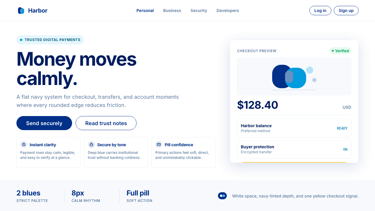 PayPalTrust without coldness. Deep navy, sky cyan, white cards, and pill checkout c…
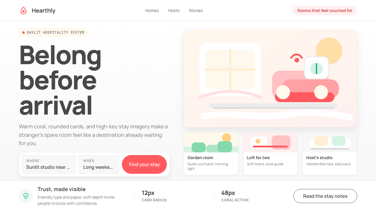 Airbnb 2014Coral red, soft pill cards, Cereal type. The Bélo wraps strangers in warm, da…
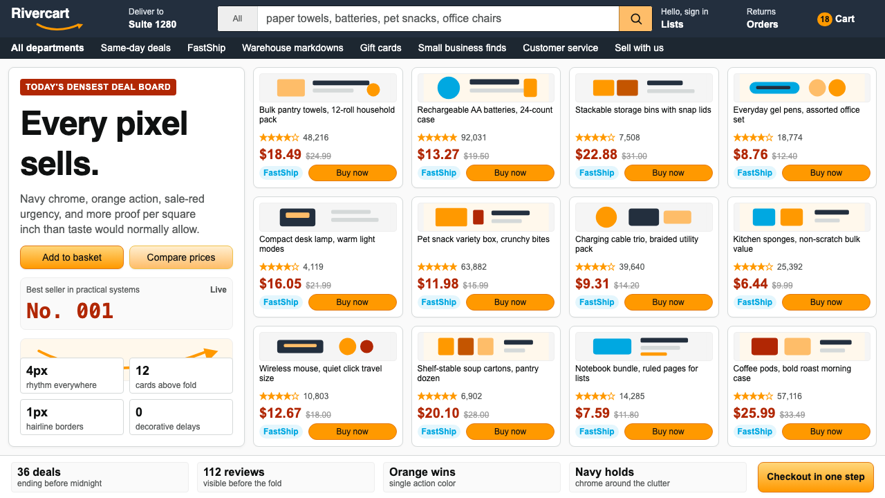 AmazonUgly sells efficiently. Navy chrome, orange buttons, red prices crowd a dense…
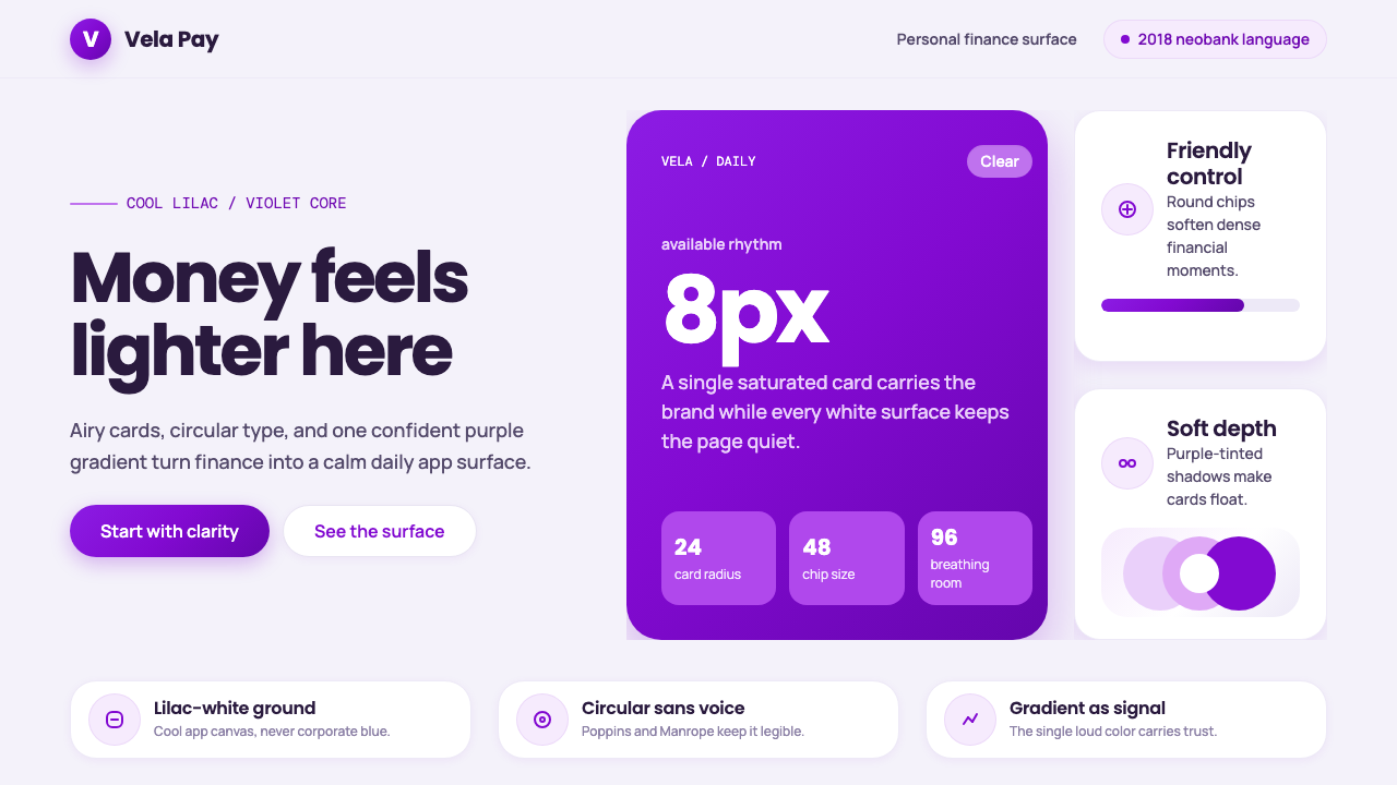 Circular FintechFinance feels light. Lilac-white space, rounded cards, and one vivid purple g…
 Grab SEA Superapp 2018Operational warmth. Saturated green, Inter numerals, and tight dashboard card…
 Normcore (2014)Quiet is radical. Inter, slate captions, and pale mint grid marks make refusa…