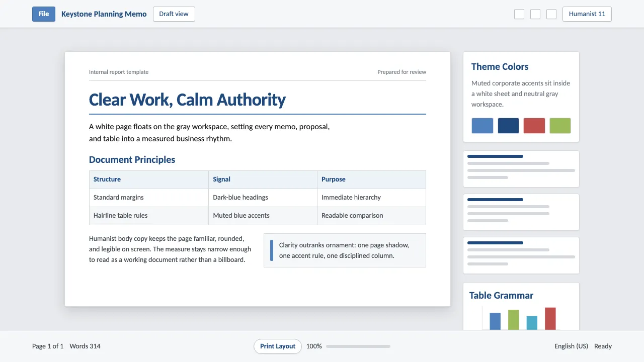
About Office Document (Calibri 2007)
Office Document is the look of a Word file being written: a crisp white page sheet floating on a soft light-gray workspace, set in Calibri — the rounded humanist sans that Microsoft made the world's default in 2007. Office-blue and dark-blue headings, hairline-ruled tables, and standard page margins give it the neutral, legible authority of memos, reports, and proposals.
This system distills that ubiquitous business-document grammar into a design language: restrained, grid-disciplined, and quietly professional, where clarity outranks ornament.
- Origin
- North America (Microsoft, Redmond, Washington)
- Era
- 1990–2010; Office 2007 shipped Calibri-as-default and the Ribbon in January 2007
- Key figures
- Lucas de Groot · Jelle Bosma · Office 2007 theme team · ClearType typography team
- Movements
- humanist-sans corporate typography · ClearType screen rendering · business-document conventions · word-processing UI
Office Document (Calibri 2007) design spec
Colors
Typography
The other 11 sections — buttons, cards, spacing, motion, techniques and more — open once you unlock. Download the DESIGN.md or send it to your AI in one click. Unlock once, yours forever.
Sign up nowStyles similar to Office Document (Calibri 2007)
Also inspired by brands & products, with a close feel.
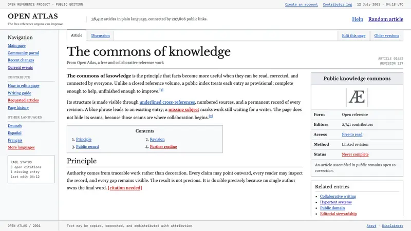 Wikipedia (2001)Content needs no ornament. Black serif text, gray hairlines, and blue links expose the structure.
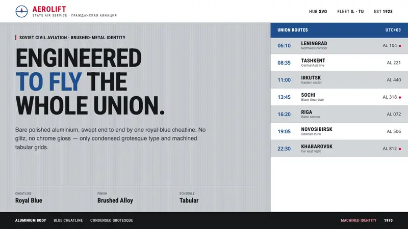 Aeroflot Soviet AirlineEngineered restraint rules. Silver ground, royal-blue cheatlines, and flat grotesque type set order.
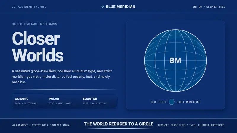 Pan Am Jet AgeJet-age confidence. Globe-blue field, steel type, meridian circle on a strict grid.
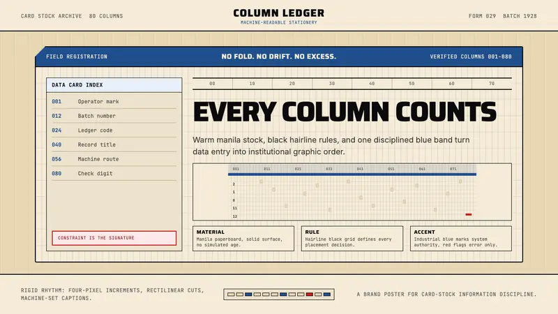 IBM Punchcard 029 (1928)Constraint becomes authority. Manila stock, hairline grid, industrial blue.