What is The Office (Dunder Mifflin, 2005)?
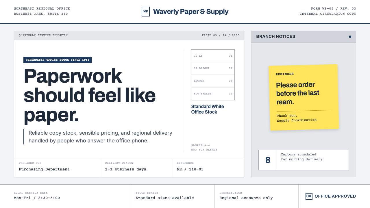
The Office turns corporate non-design into a visual system: copier white, cubicle gray, memo grids, and one dutiful yellow note that quietly admits nobody planned any of this.
The Office (Dunder Mifflin, 2005) in brief
The Office, modeled on the 2005 NBC series and its fictional Dunder Mifflin Scranton branch, is a design language built from regional-office ordinariness. Its defining materials are copier-white paper, gray cubicle partitions, generic form fields, modest memo layouts, curling sticky notes, and a restrained corporate navy used where a logo or official identifier might be expected. The visual point is not polish. It is the convincing absence of polish.
The style works because its banality is precise. Nothing looks dramatically composed, aspirational, or art-directed. A warehouse image may feel slightly too small for its assigned space; a form may look as though it came from an older laser printer; an information block may be aligned competently but without any visible ambition. The result is deadpan workplace realism: a business park selling paper, functioning through routine, being filmed for reasons no one can explain.
Its humor lives in flatness and understatement. There are no glamorous effects, heroic visual gestures, or decorative flourishes competing for attention. Instead, the page behaves like a familiar office surface: practical, faintly worn, mildly bureaucratic, and just awkward enough to feel true. The style is honest rather than elegant, and quietly funny rather than loudly comic.
Where does The Office (Dunder Mifflin, 2005) come from?
The style begins with the 2005 pilot of The Office, which aired on March 24, 2005, and with the US series that ran from 2005 to 2013. Its fictional setting is the Scranton, Pennsylvania branch of Dunder Mifflin, a regional paper company, while production took place in Los Angeles. That split is important: the visual world must feel locally specific and unremarkable, yet readable enough to support a television comedy.
Its stated creative context is single-camera mockumentary comedy, faux-verité television, cringe humor, and workplace realism. These forms ask surfaces to behave as evidence rather than spectacle. Documents, desks, partitions, notes, and business identifiers do not need to announce themselves as props. They need to look like the things employees would actually tolerate, reuse, misfile, print, and glance past every day.
The source material identifies Greg Daniels, Ricky Gervais, Stephen Merchant, Randall Einhorn, and Ken Kwapis as key figures in this origin context. Together with the mockumentary frame, their inclusion establishes the style as a television-derived language rather than a conventional corporate identity system. Its visual logic is inseparable from observation, awkwardness, and the comic value of treating minor office details with complete seriousness.
What defines the The Office (Dunder Mifflin, 2005) look?
Copier White and Cubicle Gray
The dominant field is paper-like white, supported by the neutral gray of cubicle fabric and office fixtures. These tones are not luxurious neutrals; they suggest fluorescent-lit routine, shared equipment, and surfaces chosen because they are available. The palette should feel administrative before it feels styled.
Dutiful Navy
A restrained navy appears as the official voice of the organization: a logo area, a heading, a rule, or a small institutional marker. It should not become a premium brand accent. Its role is to communicate that the company has attempted consistency, even if the surrounding system remains resolutely ordinary.
Memo Grid
Information is organized like an internal memo or printable office form. Rules, boxes, simple columns, labels, and ordinary document spacing create order without ceremony. The grid is practical rather than elegant: it exists to make a request, inventory note, or departmental instruction legible at a glance.
Office Typography
Type should read as dependable business communication rather than expressive branding. Hierarchy comes from clear headings, labels, and matter-of-fact body copy, not from theatrical scale changes or ornamental display type. The overall impression is of a document made to be circulated internally, printed, and filed.
One Yellow Note
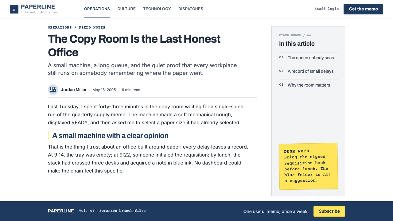
Yellow is most effective as a single sticky-note interruption: a reminder, aside, warning, or human correction attached to an otherwise impersonal document. Its slight curl and informal placement introduce the only visible trace of improvisation. The note should feel useful first and funny second.
Unheroic Imagery
Photography and illustration should feel functional, modest, and a little under-resourced. A warehouse stock image or routine office visual can be slightly too small, plainly placed, and unglamorously framed. The image does not create aspiration; it merely proves that a warehouse, product, or office situation exists.

Who shaped The Office (Dunder Mifflin, 2005)?
Daniels is identified in the source material as a key figure in the origin context of the US series. His presence anchors the style within the stated 2005 television adaptation and its workplace-realism frame.
Gervais is listed among the key figures connected to the source material. In this design context, the name belongs to the stated lineage of mockumentary comedy and its deadpan treatment of workplace discomfort.
Merchant is named as a key figure in the source material. The associated visual language shares the supplied themes of awkward observation, workplace realism, and humor found in details too mundane to be heroic.
Einhorn appears in the provided list of key figures. The inclusion reinforces the importance of the stated faux-verité, single-camera context, where office surfaces must read as observed rather than designed for display.
Kwapis is also identified as a key figure in the supplied origin material. Within the style, that context supports a visual world of practical documents, neutral interiors, and humor delivered without decorative emphasis.
How do you use The Office (Dunder Mifflin, 2005) today?
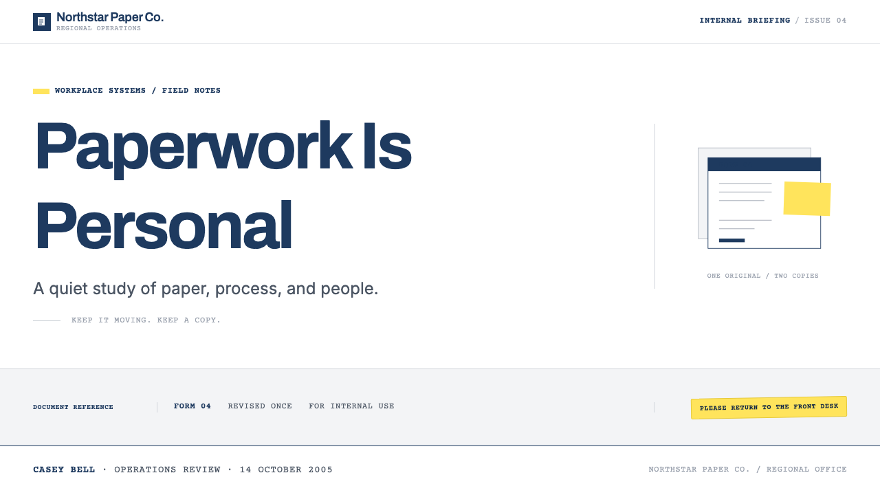
For presentation covers, use the visual logic of an internal announcement rather than a campaign. Start with a copier-white field, an ordinary navy heading, and a modest memo structure. A single yellow note can carry the human interruption: a deadline, a correction, or a dry aside. The cover should imply that somebody prepared it during office hours, not that a brand studio unveiled it.
Content and data slides should work like readable office documents. Use straightforward headings, label-led sections, ruled divisions, and compact tables or lists. Treat data as operational information: inventory, requests, departmental summaries, or simple comparisons. Avoid turning charts into spectacle; the comic effect comes from presenting consequential-looking information with the calm visual language of routine paperwork.
For web interfaces, the style is especially useful for internal dashboards, pricing pages, administrative tools, and forms that benefit from approachable bureaucracy. Let neutral office surfaces carry most of the interface, use navy for institutional cues, and reserve yellow for a note, exception, or attention item. Controls should feel printable and familiar, with clear labels and visible boundaries rather than polished ambiguity.
For editorial or marketing work, use the style where dry realism is part of the message. A landing page can borrow the structure of a company memo, a catalog sheet, or a warehouse notice. Product imagery should remain modest and functional, while copy can carry the wit through restrained observations. The page succeeds when it seems sincere enough to be mistaken for ordinary office communication.
The common mistake is making the style too stylish. Too much polish, too many colorful accents, oversized imagery, dramatic contrast, or overtly comic decoration destroys the deadpan premise. This language needs one or two restrained institutional signals, ordinary document structure, and room for a single mildly awkward detail. Mundanity is not the background to the joke; it is the joke.
The Office (Dunder Mifflin, 2005) — FAQ
Is this style simply bad corporate design?
No. It deliberately uses the appearance of unambitious office communication as a comic language. The distinction is control: layouts remain legible, hierarchy remains useful, and the awkwardness is selective. It should feel like a real regional-office artifact, not like an accidentally broken interface.
Why is yellow usually limited to a sticky note?
The supplied visual language identifies one yellow note as its key interruption. Against copier white, cubicle gray, and dutiful navy, yellow reads as a human reminder rather than a brand flourish. Using it sparingly preserves the contrast between impersonal office systems and small acts of everyday improvisation.
Can the style use photography?
Yes, but imagery should feel functional rather than promotional. The source material specifically evokes a slightly-too-small warehouse stock photo. Use photographs to document a workplace, product, or practical situation, and keep their framing plain enough that they support the document instead of becoming its visual hero.
What kinds of projects suit this language best?
It suits projects that benefit from workplace realism, dry humor, approachable administration, or intentionally modest corporate tone. Internal tools, mock reports, lightly comic presentations, practical product pages, and editorial pieces can all use it well. It is less suitable when a project needs luxury, urgency, glamour, or overt emotional warmth.
Related design styles
 GlossierBeauty as a friend's conversation. Dusty pink (never bubblegum), editorial se…
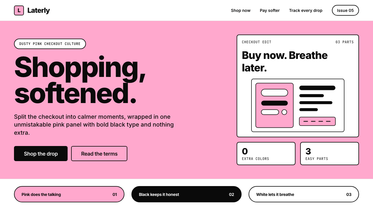 KlarnaFintech turns fashion-editorial. Dusty bubblegum pink, black Inter, and white…
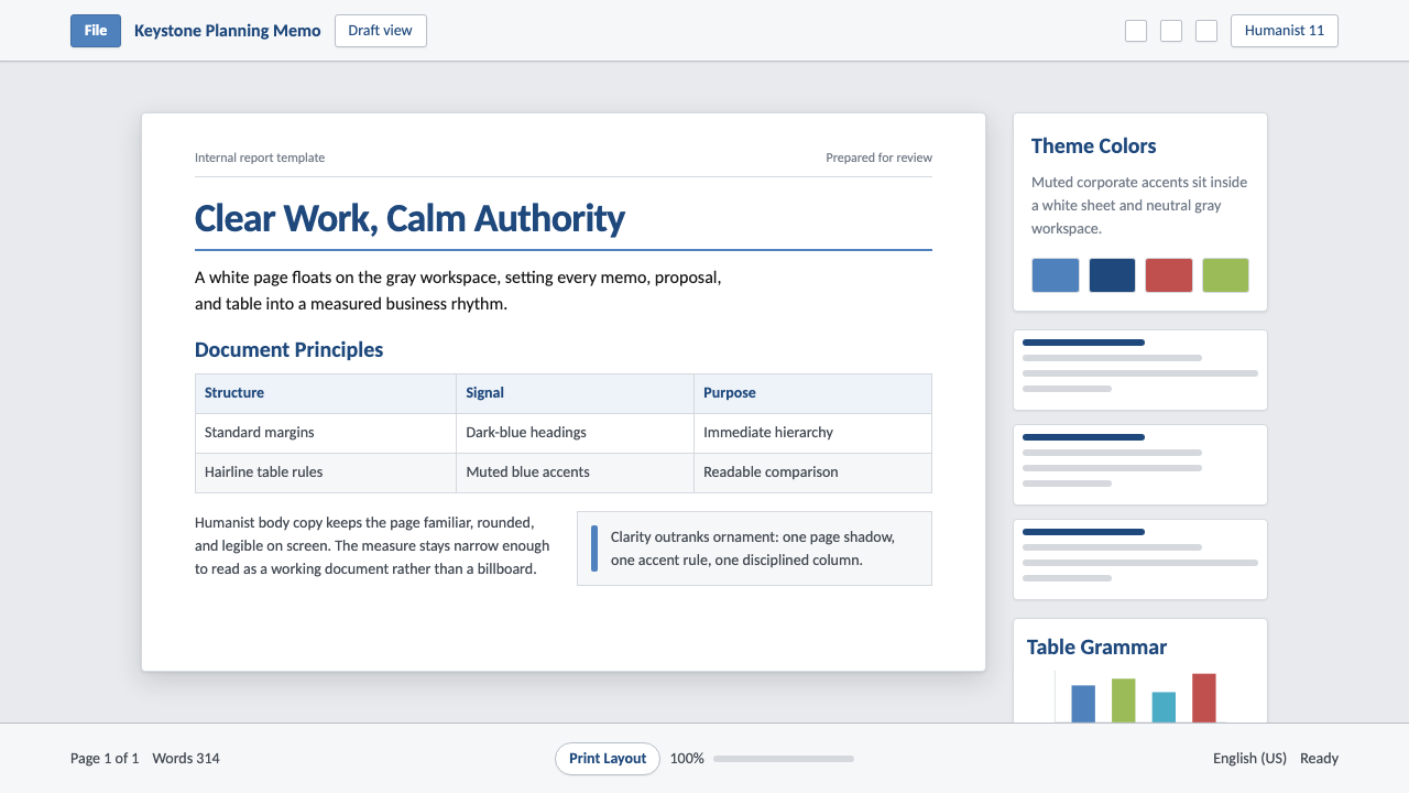 Office DocumentQuiet authority. White page sheet, muted blue rules, and humanist-sans rhythm.
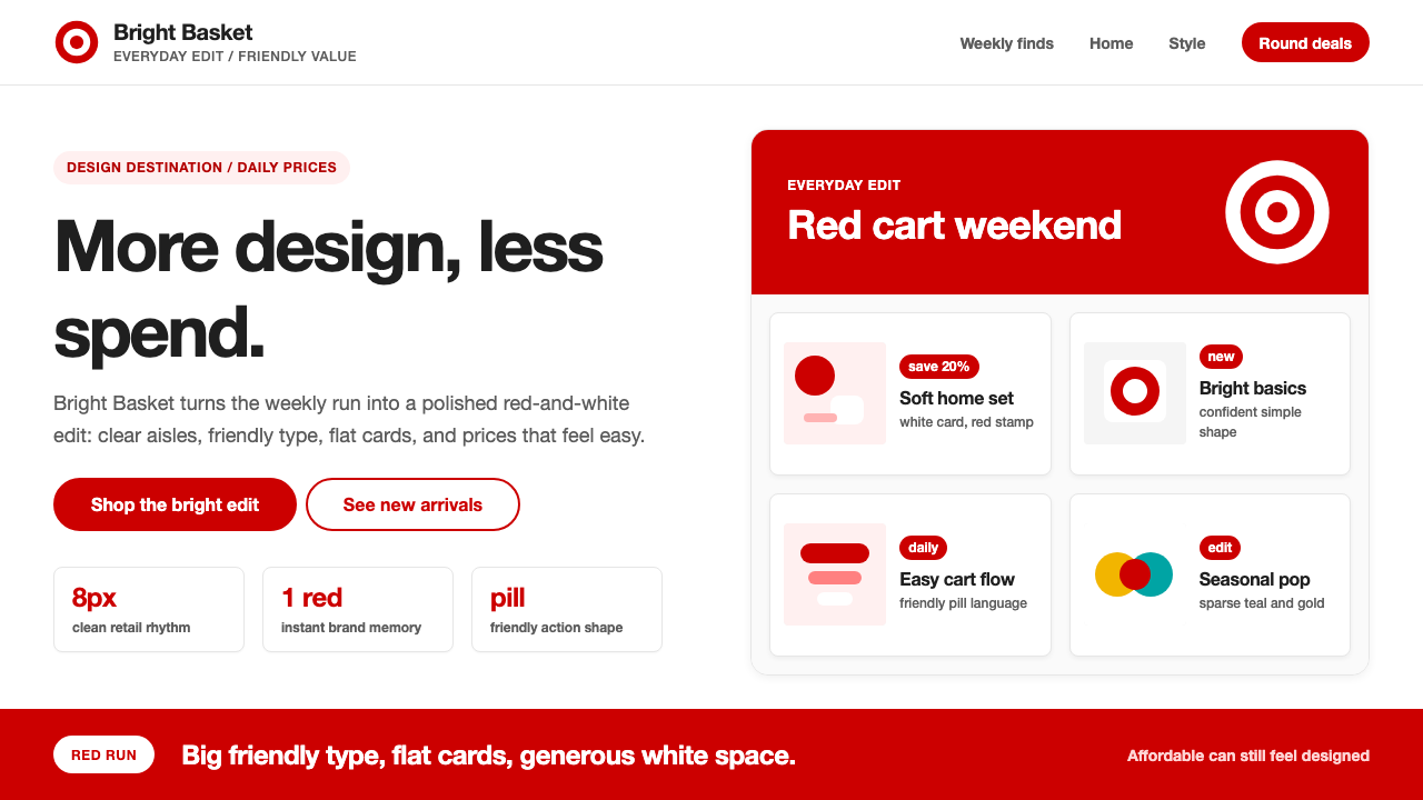 Target — Bullseye RedCheap-chic feels warm. Red bullseyes, pill CTAs, and white space make value l…
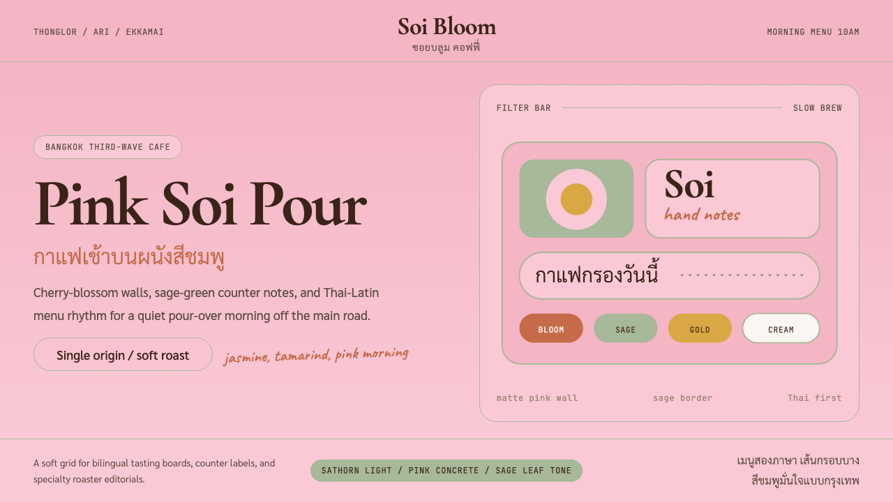 Bangkok Third-Wave CafeBangkok feels soft but sure. Cherry pink, sage borders, and Thai-Latin menu r…
 Criterion CollectionMuseum-grade cinema. Matte black, ivory serif, and one red numbered spine set…