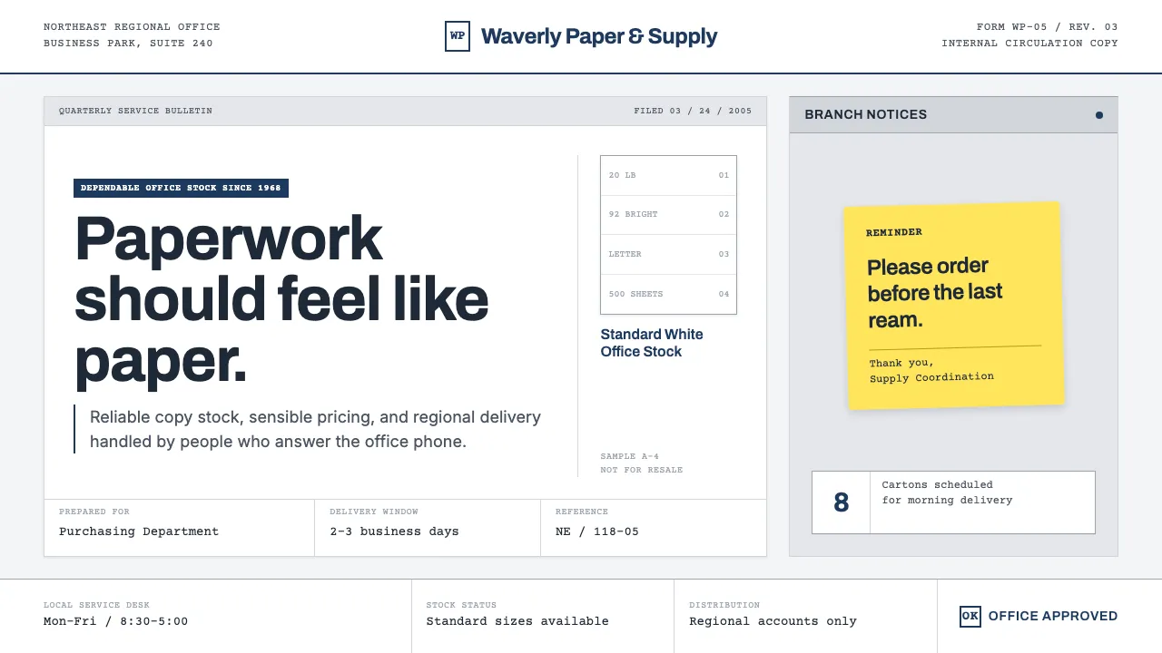
About The Office (Dunder Mifflin, 2005)
This is the design language of a mid-2000s regional paper company that has no design language — and that deadpan is the whole joke. Modeled on The Office (NBC, 2005), it dresses everything in fluorescent-lit corporate mundanity: copier-white stock, gray cubicle partitions, curling post-its, and one dutiful navy where a logo would go. The humor lives in the flatness. No gradients, no drama — a slightly-too- small warehouse stock photo, a form field printed on a 2004 laser printer. Honest, unglamorous, and quietly hilarious: we sell paper in a business park and we are being filmed for reasons no one has explained.
Learn more about the The Office (Dunder Mifflin, 2005) style
- Origin
- Scranton, Pennsylvania (fictional branch); Los Angeles production
- Era
- 2005 pilot (aired March 24, 2005); US series 2005–2013
- Key figures
- Greg Daniels · Ricky Gervais · Stephen Merchant · Randall Einhorn · Ken Kwapis
- Movements
- Single-camera mockumentary comedy · Faux-verité TV · Cringe humor · Workplace realism
The Office (Dunder Mifflin, 2005) design spec
Colors
Typography
The other 11 sections — buttons, cards, spacing, motion, techniques and more — open once you unlock. Download the DESIGN.md or send it to your AI in one click. Unlock once, yours forever.
Sign up nowStyles similar to The Office (Dunder Mifflin, 2005)
Also inspired by film, games & music, with a close feel.
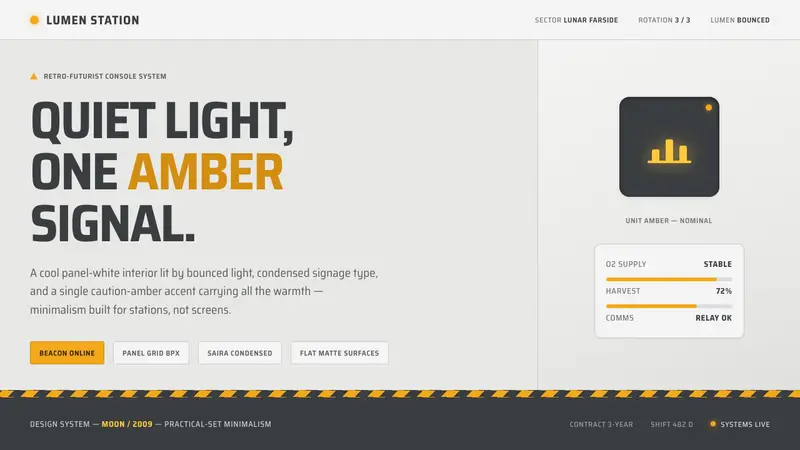 Moon (2009)Quiet light, one amber signal. Cool panel-white, condensed signage type, GERTY amber the only warmth.
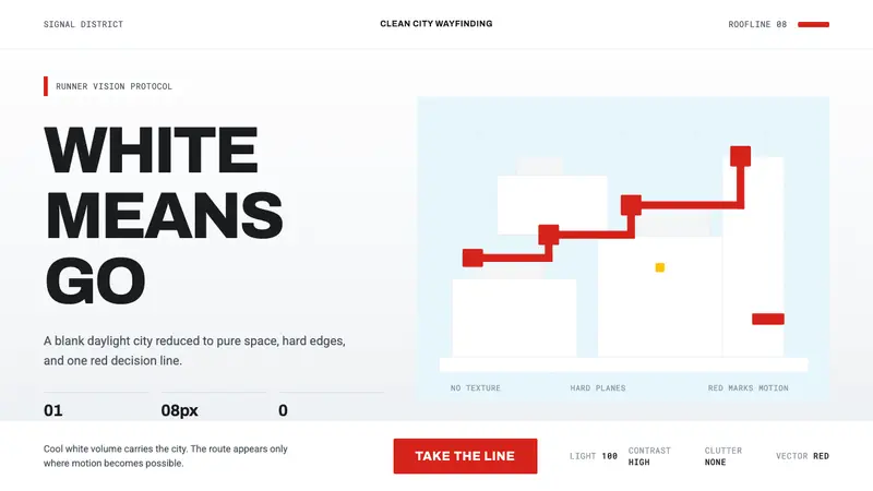 Mirror's Edge Clean CityWhite becomes motion. Cool daylight planes leave one signal-red route to command the eye.
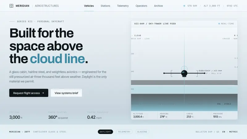 Oblivion Sky TowerSterile daylight futurism. Cool sky-grey glass, hairline steel mullions, a single cloud-cyan glow.
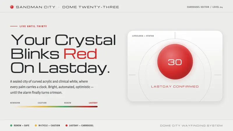 Logan's Run (1976)Live until thirty, then your palm crystal blinks red. Clinical mall-white, chrome, one red alarm.