What is Wikipedia (2001)?
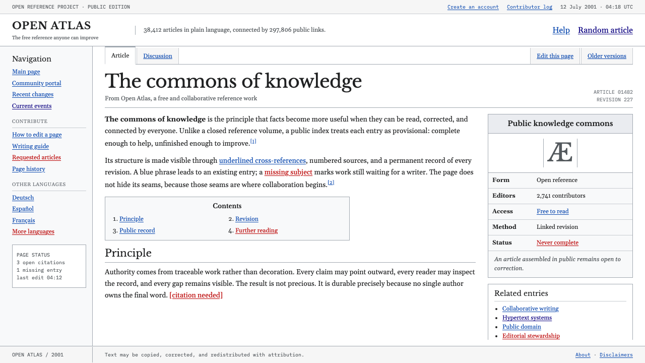
Early Wikipedia trusted its content so completely it refused to dress it up — black serif text, gray hairlines, and blue links doing the entire job of design.
Wikipedia (2001) in brief
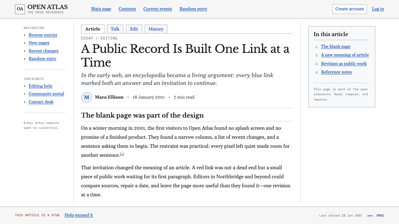
This is the look of a page built on the assumption that content needs no help. Launched in January 2001 on borrowed wiki software, early Wikipedia rendered as close to raw HTML as a public website could get: a white article column framed by thin gray chrome, body text set in the browser's own default serif, and blue underlined links threaded through nearly every sentence. There is no drop shadow anywhere on the page, no gradient, no rounded corner — the visual vocabulary of the commercial web at the time is entirely absent.
What replaces decoration is structure made visible. Headings are marked by simple rule lines rather than styled boxes. Footnotes, citations, and cross-references sit in the same plain type as the body, distinguished only by position and by the blue of a link. A broken link — pointing to an article that doesn't exist yet — glows a dull maroon instead of the usual blue, which reads not as an error but as an open invitation: here is a gap, and anyone reading this can fill it.
The aesthetic is cool, gray, and endlessly cross-referenced, and its plainness carries an argument. A page this unadorned cannot be precious about itself — it has to be edited, corrected, expanded, and the design gets out of the way of that process rather than protecting a finished appearance. The look says, without needing a slogan: anyone can edit this, so nothing here is allowed to look too important to touch.
Where does Wikipedia (2001) come from?
Wikipedia launched on 15 January 2001 as a side project — an open, editable feeder for Nupedia, an earlier and far slower peer-reviewed encyclopedia effort led by Jimmy Wales and Larry Sanger. Nupedia's expert-review process produced careful articles at a pace of a handful per year; Wikipedia, built instead on wiki software that let anyone edit any page instantly, produced thousands of articles within its first year. The visual plainness followed directly from the software's origins: the site ran on UseModWiki, a general-purpose wiki engine originally created by Ward Cunningham for the earlier WikiWikiWeb, and adopting it meant adopting its bare, unthemed appearance rather than commissioning a custom design.
Ward Cunningham's own invention of the wiki concept in the mid-1990s was itself an argument in software form: that a page should be as easy to edit as to read, and that trusting a community with an editable page mattered more than protecting it behind polish or permission. Wikipedia inherited that argument along with the code, and its early look — hairline borders, unstyled headings, and a plain content column — is the visible residue of that inherited philosophy rather than a deliberate aesthetic choice made by a designer.
As the project grew, Wikipedia moved through successive software generations — from UseModWiki to a custom 'Phase II' system and then to Phase III, the codebase that became MediaWiki — and through a sequence of visual skins including the plain 'Nostalgia' and 'Standard' looks that defined the site's appearance through roughly 2001 to 2004. Each iteration added a little more structure (sidebars, consistent navigation) without ever introducing ornament, because the site's growing volunteer editor base needed a page that stayed legible and predictable to edit, not one that impressed a passive visitor.
The red broken-link convention, the underlined blue link, and the gray article chrome all trace back to this same period, and all three survive in recognizable form in Wikipedia's interface decades later. The style endures not because no one has proposed replacing it, but because the plainness is functionally load-bearing: a page this legible, this consistent, and this free of decorative distraction is easier for a global volunteer community to read, edit, and maintain than almost any alternative.
What defines the Wikipedia (2001) look?
Color
The palette is almost entirely absent by design: white page ground, black body text, gray hairline borders and chrome, and a single blue reserved exclusively for links. The only departure is the dull maroon used for broken links, which functions as information rather than accent — it marks absence, not emphasis.
Typography
Body text runs in the browser's own default serif — historically Times or a Times-like font — because the page deliberately does not override it. Headings use the same typeface at a larger size, separated from body copy by a plain horizontal rule rather than a change in weight, color, or decoration. The typographic hierarchy is achieved almost entirely through scale and rule lines, not through typeface variety.
Hyperlinks as Structure
Blue underlined links run through nearly every paragraph, functioning less as ordinary navigation than as the visible skeleton of the encyclopedia's cross-referencing philosophy — the idea that no topic exists in isolation. A dull maroon marks a link to an article that doesn't yet exist, turning an absence into a visible, actionable invitation rather than hiding it.
Hairline Chrome
Navigation, sidebars, and page borders are rendered as thin gray rules rather than filled boxes or shaded panels. The chrome is present but nearly weightless, framing the content column without competing with it for attention.
Zero Surface Treatment
No drop shadows, gradients, rounded corners, or any other softening effect appears anywhere on the page. Every edge is a hard, flat line, and every panel is defined by a border rather than by implied depth — the visual opposite of the glossy, skeuomorphic web design common at the time.
Footnote and Citation Density
References, citations, and footnotes are set in the same plain body type, visually undifferentiated except by position and numbering. The density of these cross-references is itself a visual signature — a page thick with small numbered links reads as more rigorously sourced, even before a reader evaluates the sources themselves.
Functional Grid
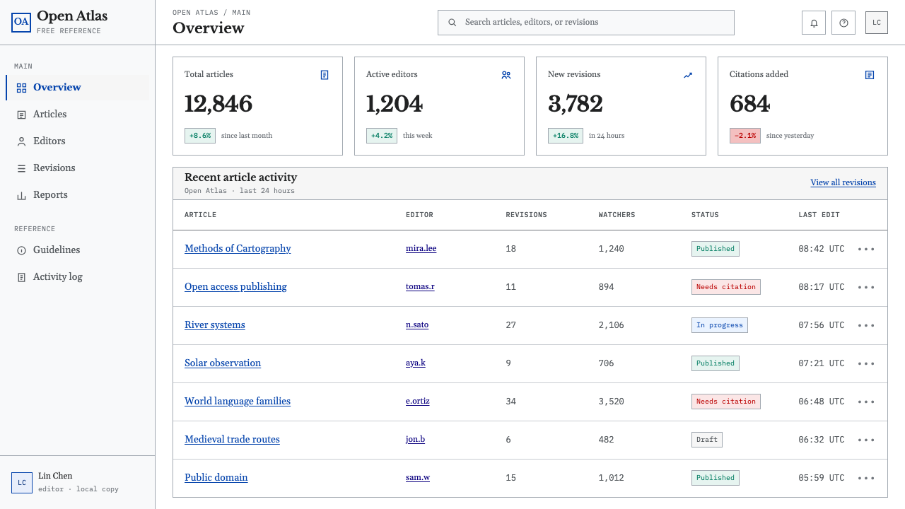
The layout is a simple, fixed structure — a content column, a sidebar, a header — with no decorative variation between article pages. Every article looks structurally identical to every other, which reinforces the sense that the design serves the information architecture rather than any individual page's branding.
Who shaped Wikipedia (2001)?
Co-founder of both Nupedia and Wikipedia, Wales provided the initial funding and institutional backing that let the wiki-based side project exist alongside Nupedia's slower expert-review process. His willingness to let the plain, unthemed wiki software stand as the public face of the encyclopedia — rather than insisting on a polished custom design — is part of why the early aesthetic survived unaltered for years.
Co-founder of Wikipedia and the editor-in-chief of Nupedia, Sanger initially proposed the wiki as a fast, low-friction way to generate draft content for Nupedia's more rigorous review process. The wiki's rapid, unpolished growth quickly outpaced its original purpose, and its plain visual form reflects that origin as a lightweight feeder tool rather than a finished publication.
Inventor of the wiki concept in the mid-1990s and creator of the original WikiWikiWeb, Cunningham's software philosophy — that a page should be exactly as easy to edit as it is to read — is the direct intellectual ancestor of Wikipedia's plain, unadorned interface. Wikipedia's early software, UseModWiki, was built on principles Cunningham established years earlier.
A software developer who wrote the 'Phase II' software that replaced the original UseModWiki engine, Manske's work introduced the database-backed system that let Wikipedia scale beyond a simple flat-file wiki. That rewrite laid the technical groundwork for MediaWiki, the software the encyclopedia still runs on, while preserving the plain visual conventions established in the UseModWiki era.
How do you use Wikipedia (2001) today?
This style works wherever a product wants to signal that its content, not its chrome, is the point — a stance that is increasingly rare and therefore increasingly striking in a web dominated by decorative interfaces. Applying it well means resisting every instinct to add a shadow, a gradient, or a rounded corner, and trusting that legible structure is enough.
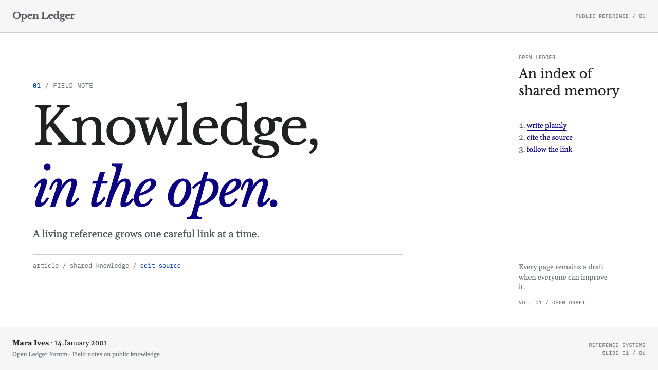
For presentation slides, this look translates into an almost anti-design cover: a plain white field, a black serif title, and a single blue link-style underline as the only accent. Content slides should behave like reference pages — dense body text in serif, footnote-style citations in the same type, and section breaks marked by a plain horizontal rule. Data should be presented as tables rather than illustrated charts wherever possible; a plain bordered table is more in keeping with the aesthetic than a styled graphic.
For web interfaces, the style suits documentation sites, knowledge bases, reference tools, and any product that wants to read as authoritative through restraint rather than visual weight. A white background, black body text, gray hairline dividers, and blue links for every interactive element will carry the aesthetic without needing to reproduce Wikipedia's layout literally.
For editorial and marketing work, the style is most effective used ironically or nostalgically — evoking the plain, trustworthy, pre-commercial web as a contrast to slicker contemporary design. A long-form article set in serif with dense inline linking and footnotes can borrow this look to signal rigor and source density rather than persuasion.
The most common mistake is treating 'plain' as 'unfinished' and adding small decorative touches to compensate — a subtle shadow here, a rounded button there. Any such addition breaks the aesthetic's entire premise, which depends on total consistency: either every element is flat, bordered, and undecorated, or the whole thing reads as a website that simply forgot to finish its design.
Wikipedia (2001) — FAQ
Is this the same as generic 'brutalist' web design?
They overlap but aren't identical. Brutalist web design is often a deliberate, contemporary reaction against slick commercial design, sometimes exaggerating rawness for effect. Early Wikipedia's plainness wasn't a stylistic statement at all — it was the literal, unmodified appearance of borrowed wiki software running at internet scale. The look here should feel unselfconscious and functional rather than provocatively raw.
Can this style work with a dark background?
It resists inversion because the white page ground is not incidental — it is the default browser canvas the whole aesthetic is built to look unmodified against. A dark variant would need to feel like an intentional theme rather than a default, which undercuts the exact quality — unstyled plainness — that makes the original convincing.
Why do broken links use a different color instead of just looking like normal text?
Because the visibility of the gap is the point. If a link to a missing article looked identical to plain text, the encyclopedia's collaborative structure — the fact that any reader can see exactly what's missing and go write it — would be invisible. The dull maroon color turns an absence into information, which is central to how a volunteer-edited reference work grows.
Does this style still resemble Wikipedia's interface today?
Only partially. Today's Wikipedia has refined typography, added a cleaner sidebar, and introduced subtle spacing improvements, but it has never adopted gradients, shadows, or decorative surface treatment. The core conventions — serif body text, gray hairline chrome, blue and maroon links — remain recognizably intact, which is unusually conservative for a website of its age and scale.
Does this style suit consumer products aiming for delight or playfulness?
Generally no. Its authority comes precisely from feeling unconcerned with delight — a page that looks like it has better things to do than impress you. That works powerfully for reference, documentation, and knowledge products, but it reads as cold or even careless in a context where warmth, personality, or visual charm are the actual goal.
Related design styles
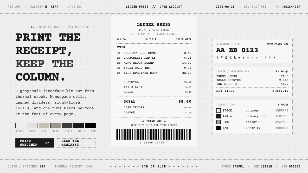 Thermal Receipt MonoReceipts as an interface. Grainy near-black monospace on warm-gray thermal st…
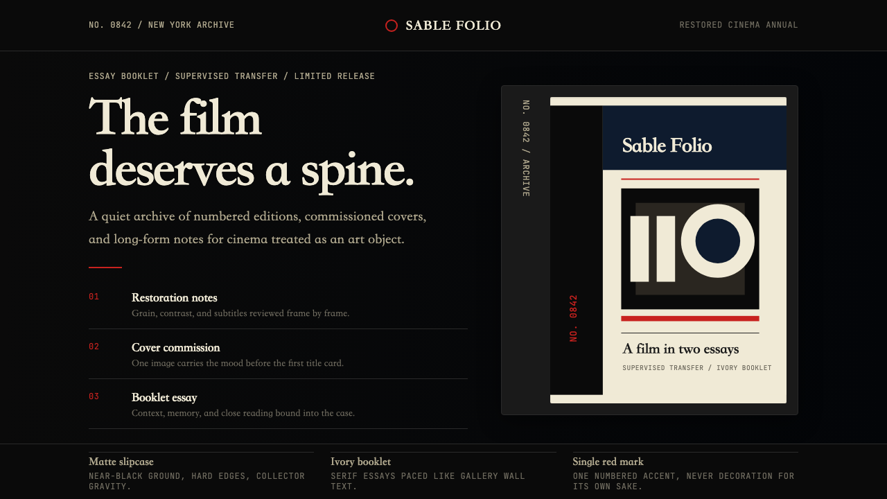 Criterion CollectionMuseum-grade cinema. Matte black, ivory serif, and one red numbered spine set…
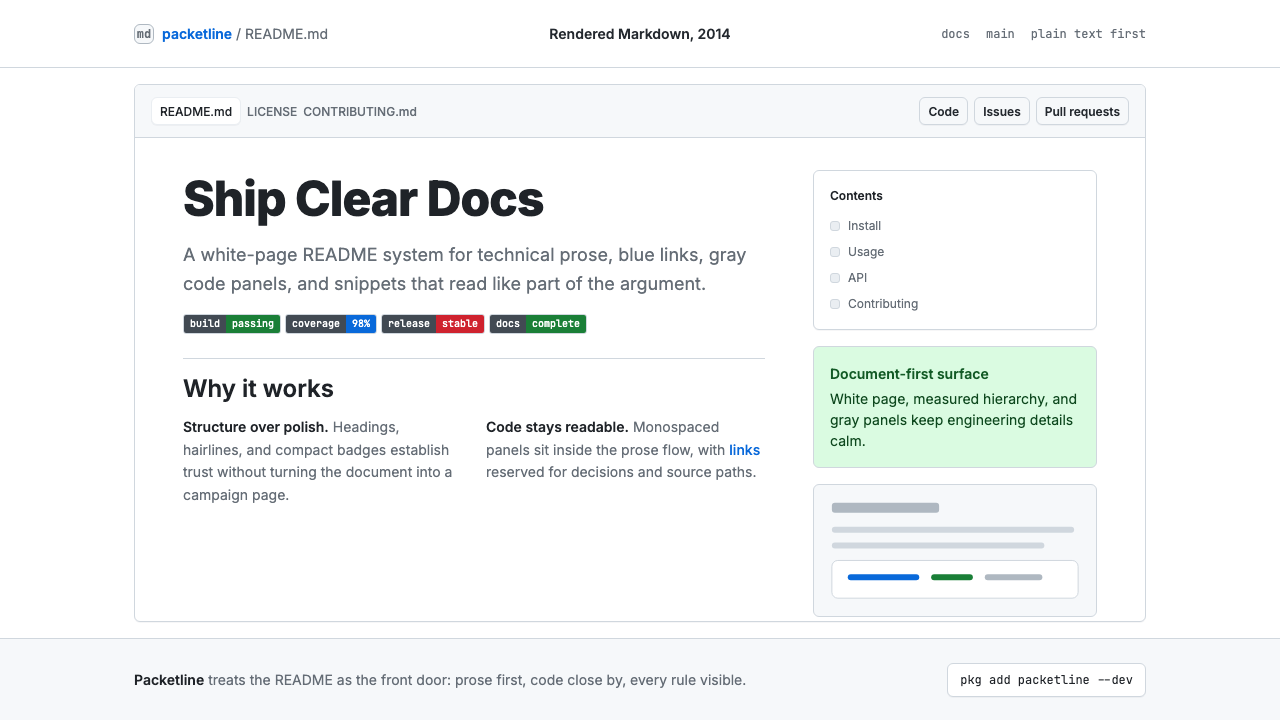 GitHub README Markdown (2014)Calm code authority. Blue links, gray code panels, and Inter/Mono stack on wh…
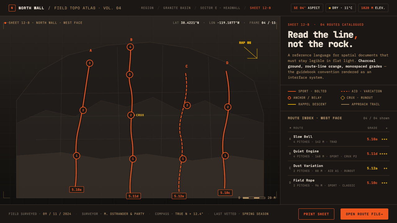 Climbing Topo MapA field manual, not an app. Charcoal crag ground, route-line orange, monospac…
 Financial Terminal MonoMaximum signal per pixel. Pure black, IBM Plex Mono, green-red ticks, amber-b…
 Elemental Social HousingBuild half a good house, well. Dusty cement-grey panels, hatched bare-frame g…