What is Air Quality Index?
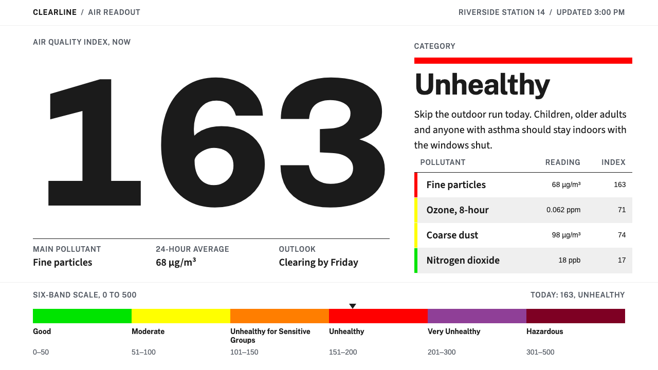
The Air Quality Index turns invisible risk into one giant numeral and a six-colour bar on white, and every other pixel is told to keep quiet.
Air Quality Index in brief
The Air Quality Index, usually shortened to AQI, is a public-health communication device before it is a visual style. It compresses six pollutants into a single number between 0 and 500 and sorts that number into six named bands: Good, Moderate, Unhealthy for Sensitive Groups, Unhealthy, Very Unhealthy and Hazardous. Each band has its own colour. The whole apparatus was built to be acted on, not admired. A reader should be able to glance at it and decide whether to open a window, take the dog out, or skip the run.
As a design system, it borrows from the places where the index actually lives: the white weather page of a newspaper and the white card of a phone app. The ground is white. The type is a humanist sans of the kind federal websites favour. Dividers are hairline grey. The one saturated object on the page is a six-segment bar, and it never arrives alone. It comes with its number, its band name and a single plain sentence that tells you whether to go outside.
That discipline is what makes the style recognisable. Colour is not mood or branding here; it is a unit of meaning, reserved for the one thing that carries risk. Everything around it is quiet on purpose, so that when the bar slides from green toward maroon the change registers at once, with no decoration competing for attention.

Where does Air Quality Index come from?
The index has a lineage. Its direct predecessor was the Pollutant Standards Index of 1976, an earlier attempt to turn technical monitoring data into something a member of the public could read. In 1999 the U.S. Environmental Protection Agency standardised the scheme into the form still recognised today: one figure from 0 to 500, divided into six named bands whose colours run in strict order of severity, from green through yellow, orange and red to purple and a deep maroon. The practical effect of that standardisation was consistency. The same number and the same colour were meant to carry the same warning wherever a reading was published.
The index reaches the public through the AirNow programme, a collaboration among the EPA, the National Oceanic and Atmospheric Administration, the National Park Service, and tribal, state and local agencies. That multi-agency origin explains much of the look. A presentation that dozens of different bodies must publish, and that everyone from schoolchildren to people with asthma must understand, cannot depend on stylistic flair. It needs a vocabulary simple enough to be reproduced the same way each time, and clear enough to survive being dropped into a municipal web page, a news bulletin or a small widget.
The scale also travelled. Its region of origin is the United States, yet the convention has been adopted worldwide. China's ambient air quality index standard, published in 2012, uses the same six-level colour scheme, which is why readers there recognise the coloured numeral on a weather app at once. A colour-coded number has become one of the few pieces of environmental information design that people read fluently without ever having been taught how.
The visual treatment this system follows is of more recent vintage: the AirNow, NowCast and U.S. Web Design System era, roughly 2013 to 2024, when federal interfaces settled on white pages, restrained humanist type, thin rules and clear states. Three traditions meet there. Public-health risk communication insists that a warning be unmistakable, graded and accompanied by advice. Federal interface design supplies the plain, accessible components. The newspaper weather page contributes small infographics, strict columns and the habit of printing a number beside a symbol. The system keeps what all three share: nothing on the page is there for effect.
What defines the Air Quality Index look?
Six-band colour
Six bands carry the entire colour budget. Green, yellow, orange, red, purple and a dark maroon run in strict order of severity, and they appear either together as the segmented bar or one at a time as the status of a single reading. Everything else on the page is white, grey or near-black. Because colour is rationed, it becomes legible as information: the eye goes to the bar first and learns the situation before reading a word.
The oversized numeral
The reading itself is set as a very large numeral, the biggest element on the screen by a wide margin. Scale does the job that ornament does in other styles. The number is the headline, the band name is the subhead, and the supporting sentence sits well below both. A reader standing in a doorway can take in the figure from arm's length, and that is exactly the test the layout is built to pass.
Humanist federal sans
Type is a humanist sans, the open, friendly kind associated with federal websites rather than the cold geometric kind. It stays plain, in a handful of weights, with no display faces and no italics for effect. The face is chosen for legibility at small sizes on a phone and for a tone that sounds official without sounding severe. Numerals are clear and unambiguous, because the number is the product.
White ground and hairlines
The ground is white, like the page of a newspaper or a card in an app. Separation is made with fine grey rules rather than boxes, fills or shadows. This keeps the layout light and lets the saturated bar dominate without competition. There are no gradients, no textures and no ambient shadow; surfaces are as flat as newsprint, and the page feels like a posted notice rather than a designed object.
Number, name and sentence
A reading is never shown as colour alone. Every instance combines a number, a named level and a one-sentence health suggestion in plain language, such as whether today is a good day for a run. This triplet is the structural heart of the system. It keeps the display usable for readers who cannot tell the hues apart, and it means the colour never has to carry the whole burden of the message.
Plain public voice
Copy is short, direct and free of marketing. Sentences are written for the reader's next action, not for the publisher's image. There is no mascot, no slogan and no friendly illustration. The tone is that of a notice pinned to a municipal board: calm, specific and slightly dry. That dryness is a feature, because it signals that the number is being reported, not sold.
Fixed reading order
Every element has one job, and the layout arranges those jobs in a fixed order: bar, numeral, band name, advice, source. Supporting details such as location, time of reading and pollutant sit at the bottom in small grey type. The restraint is the system's credibility. A decorative flourish on a health warning would make the warning look less true, so none is allowed.

Who shaped Air Quality Index?
The EPA standardised the index in 1999 and remains its steward. Its contribution to the look was less a designer's choice than an institutional one: a single number, six named bands and a fixed set of colours that other agencies could adopt without renegotiating. Through its public information pages, the agency helped establish the expectation that an environmental warning should be plain, graded and calm.
AirNow is the cooperative programme through which readings reach the public, drawing together the EPA, the National Oceanic and Atmospheric Administration, the National Park Service, and tribal, state and local agencies. Because so many hands publish the same figures, the presentation had to be repeatable, and that requirement shaped the plain, standardised look that this design system inherits.
Not a person but an ancestor. The Pollutant Standards Index of 1976 was an early attempt to condense pollution data into something a general reader could use, and the later AQI is its successor. Seeing the 1999 standardisation as a continuation rather than an invention explains why the index feels so settled: it is a long-tested format, refined rather than reimagined.
China's ambient air quality index standard, published in 2012, adopted the same six-level colour scheme. Its significance for design is reach: it put the coloured numeral in front of a very large population through weather apps and news pages, and confirmed that the green-to-maroon ladder reads across languages without translation.
How do you use Air Quality Index today?
The AQI style is a specialist tool, and it works best when one figure must be read quickly and acted on. Its principles carry over well to any situation where a single measurement deserves attention and everything else should step back. Applying it correctly means copying the discipline, which is rationed colour, large numerals and plain language, rather than simply painting a rainbow bar onto a layout.
For presentation slides, a cover can be nothing more than a very large numeral on a white field with the six-segment bar beneath it and a short title in quiet grey. Content slides should carry one claim each, separated by hairline rules, with no panels or boxes. Data slides suit the style especially well: let the bar be the only saturated element, label every band by name so colour is never the sole signal, and keep axes, gridlines and captions in neutral grey.
For web interfaces, the style fits status pages, monitoring dashboards, risk scores and any health-adjacent product where a reading drives a decision. Keep the page white, put the numeral and bar at the top, and give each reading its name and a sentence of advice. For pricing or plan comparisons, borrow the restraint rather than the palette: a white table with hairline rules, and colour used on only one highlighted tier so the eye knows where to land.
For editorial and marketing work, the style suits data journalism, weather and environment explainers, public-sector campaigns and health-technology pages. An article can open with the numeral as a headline device, then continue in a narrow column of plain text with small grey captions. Marketing copy should hold the same line as the data: short sentences, no exclamation, and claims that a reader could act on this afternoon.
The most common mistake is to treat the six hues as a general-purpose palette. They are an ordered scale, and using them for decoration, categories or brand accents destroys the meaning that makes the style work. Related errors include showing colour without a number and a name, adding gradients or glossy effects to the bar, and styling a number that carries no risk as if it were a warning. If the figure is not ordered by severity, it does not belong in this system.

Air Quality Index — FAQ
What does the six-band bar actually communicate?
It communicates position on an ordered scale of risk. The bands run from Good through Moderate, Unhealthy for Sensitive Groups, Unhealthy and Very Unhealthy to Hazardous, with colours moving from green through yellow, orange and red to purple and maroon. The bar shows where the current reading sits among all possible readings, so the reader sees the situation and its distance from safety at the same moment.
Why are the number, the name and a sentence always shown together?
Because colour alone is an unreliable messenger. Some readers cannot distinguish the hues, some screens render them differently, and a bare colour says nothing about what to do. The number gives precision, the name gives meaning and the sentence gives an action. Together they make the display robust: if any one of the three fails to register, the other two still deliver the message.
Can I use this style for something other than air quality?
Yes, as long as the thing you are showing is a single measurement on an ordered scale of severity, such as a service-health score, a risk rating or a readiness level. The style does not work for categories without a natural order, for brand colour or for decoration. Test it with one question: would moving from the first band to the last mean things getting steadily worse? If yes, the system fits.
Why is the system built on a white ground rather than a dark one?
Because it takes its cues from the white weather page of a newspaper and the white card in a phone app, and because white gives the saturated bar the strongest and most neutral contrast. On a dark ground, the bright bands tend to glow and compete with each other, which blurs the ordered ladder. A dark variant is possible, but it needs extra care to keep the bands calm and the hierarchy unchanged.
How does this style relate to government design systems?
It sits within the federal interface tradition of the AirNow, NowCast and U.S. Web Design System era. That tradition favours white pages, humanist type, thin rules and unambiguous states, all of which this system adopts. It is not an official template and does not replace one, but it speaks the same visual language, which is part of why readers trust it quickly.
Related design styles
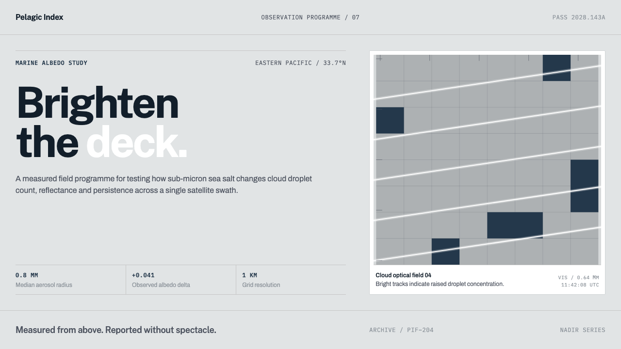 Cloud Brightening FleetBrightening becomes evidence. White ship-track lines score a cool-grey satell…
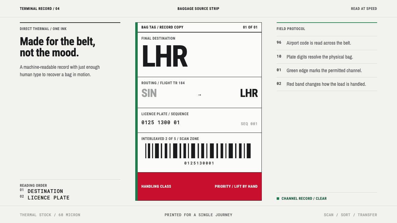 Airport Baggage TagBuilt to be read in motion. Burned-black codes, hard rules and functional cha…
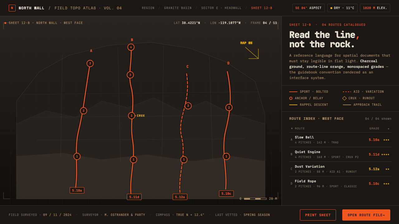 Climbing Topo MapA field manual, not an app. Charcoal crag ground, route-line orange, monospac…
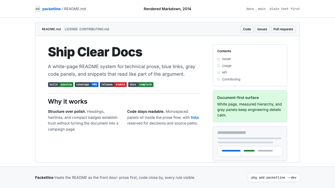 GitHub README Markdown (2014)Calm code authority. Blue links, gray code panels, and Inter/Mono stack on wh…
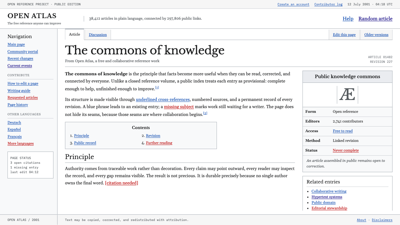 Wikipedia (2001)Content needs no ornament. Black serif text, gray hairlines, and blue links e…
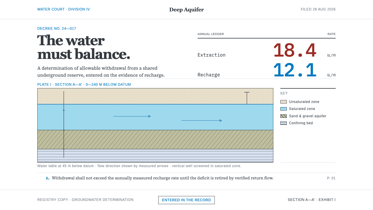 Deep Aquifer Water CourtRestraint makes the deficit undeniable. White bond, book serif, and a keyed a…