What is Climbing Topo Map?
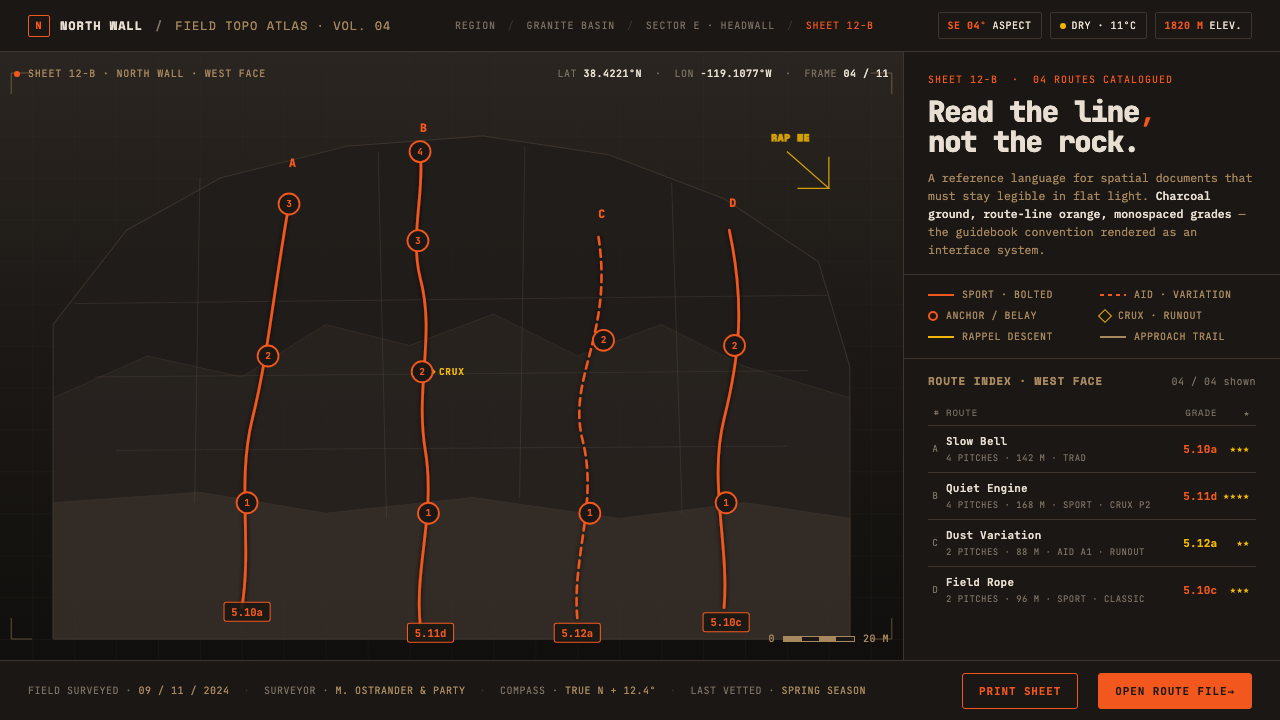
Climbing Topo Map turns a dark rock face into a field manual, where every orange line, grade, and anchor mark exists to make a route legible.
Climbing Topo Map in brief
Climbing Topo Map is the visual language of the climbing photo-topo: a high-resolution photograph of a dark crag carrying bright route lines, grades, and route markers directly on its surface. It is not scenic imagery placed behind an interface. The rock is the working document, and the annotations turn its ledges, faces, overlaps, and shadows into navigable information.
The aesthetic comes from technical climbing guidebooks and crag databases, particularly the photo-topo convention developed by publishers such as Rockfax and SuperTopo. Its authority comes from precision rather than polish. The near-black charcoal ground recalls stone in shade, route-line orange remains visible against it while deliberately avoiding red, and monospaced type echoes the compact grade tables of printed manuals.
Everything is subordinate to field use. Anchor dots identify decisions on the wall, solid and dashed lines distinguish route conventions, and numbered rope-length markers help connect the image to the practical sequence of a climb. The result should feel annotated, durable, and exact: a manual rendered in rock and light, not a decorative outdoor theme.
Where does Climbing Topo Map come from?
The photo-topo convention emerged from North American outdoor climbing guidebooks and crag databases from the late 1990s onward. Its central decision was simple but consequential: instead of reducing a climbing area to a symbolic diagram, preserve the actual rock face and place route information over the photograph. This retained the visual complexity that climbers need while giving the image the clarity of a map.
Rockfax and SuperTopo were among the publishers that pioneered and popularized this approach. Their work established the photo-topo as a recognizable form of technical guidebook design, combining the evidence of a real crag photograph with the discipline of information-overlay cartography. The photograph supplies terrain; the route line supplies interpretation; the grade table supplies a compact reference system.
The convention also depends on shared standards beyond publishing. Route developers contribute the practical knowledge that makes a line meaningful, while the climbing grading community provides the grading language through which difficulty can be compared and communicated. The design therefore sits between image-making and collective documentation: it must represent a particular wall while remaining readable within a broader outdoor route-topo tradition.
From the 2010–present design horizon, Climbing Topo Map distills that printed and database-based practice into an interface language. The dark charcoal ground, route-line orange, monospaced grades, anchor dots, line conventions, and rope-length markers preserve the manual's visual logic even when the medium changes. The interface may be digital, but its governing attitude remains that of a field reference: information first, ornament only where it improves orientation.
What defines the Climbing Topo Map look?
Charcoal Crag Ground
The ground is near-black charcoal rather than a neutral digital black. It should recall a shaded rock face and give the route overlay immediate authority. The darkness is not theatrical; it establishes the visual conditions of a field photograph, allowing bright annotations and pale supporting type to remain legible without making the interface feel like a generic dark theme.
Route-Line Orange
Orange is reserved for the climbing line and its most immediate points of attention. It is chosen to remain distinct from red, supporting vision accessibility while preserving a sense of urgency and visibility against the charcoal ground. The hue should behave like painted route information on a guide image, not like a general brand accent scattered across unrelated controls.
Monospaced Grades
Monospaced type carries grades, route numbers, and compact reference data. Its even rhythm recalls printed tables and makes aligned information feel dependable. Display type may establish hierarchy, but the reference layer should remain utilitarian and measured. The type is part of the instrument panel of the guide, not an expressive interruption.
Overlay Notation
Route lines sit directly on the photographic terrain, creating a clear relationship between notation and physical surface. Anchor dots mark decisive locations, while solid and dashed lines communicate different route conditions or conventions. The overlay should remain precise enough to guide attention without covering the rock features that make the route identifiable.
Field-Manual Hierarchy
Hierarchy is built through location, contrast, and practical grouping rather than ornamental framing. A route title, grade, image annotation, and supporting note should read as parts of the same reference system. Labels feel placed beside evidence, as they would in a printed guidebook, so the reader can move from general orientation to route-specific detail without losing the wall.
Informational Restraint
Every visible mark should explain, locate, classify, or connect. The system has little tolerance for decoration that competes with the route image or the grade information. Restraint does not mean making the interface empty; it means preserving the difference between terrain, route notation, and reference text so each layer can perform its job.
Who shaped Climbing Topo Map?
Rockfax is identified in the source material as one of the publishers that pioneered the climbing photo-topo convention. Its importance here is not a single visual signature but the publishing model it represents: real crag photography combined with route overlays and guidebook-grade reference information.
SuperTopo is another named pioneer of the photo-topo approach. It represents the translation of climbing knowledge into an image that can be consulted as terrain, route diagram, and technical reference at the same time, giving the design system its manual-like foundation.
Route developers are key contributors because the route line is grounded in practical knowledge of the wall. Their role connects the visible overlay to the actual climb, ensuring that the mark is not merely graphic decoration but a useful statement about where a route runs.
The climbing grading community supplies the shared language that allows difficulty information to function across guidebooks and crag databases. In the interface, its influence appears through the disciplined use of grades as reference data rather than decorative labels.
How do you use Climbing Topo Map today?
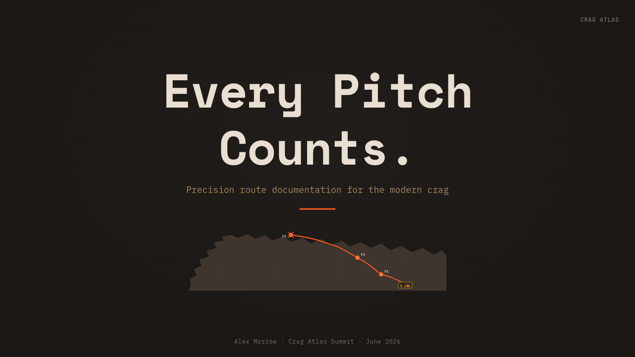
For presentation slides, use the cover as a field-guide opening: a dark crag photograph establishes the ground, a restrained orange route line creates the first visual path, and the title sits as a clear manual heading. Content slides should separate terrain imagery from route notes without losing their connection. Data slides can treat grades, route numbers, and rope-length markers as aligned reference tables, with orange reserved for the selected route or the decisive value. The slide should feel consulted rather than performed.
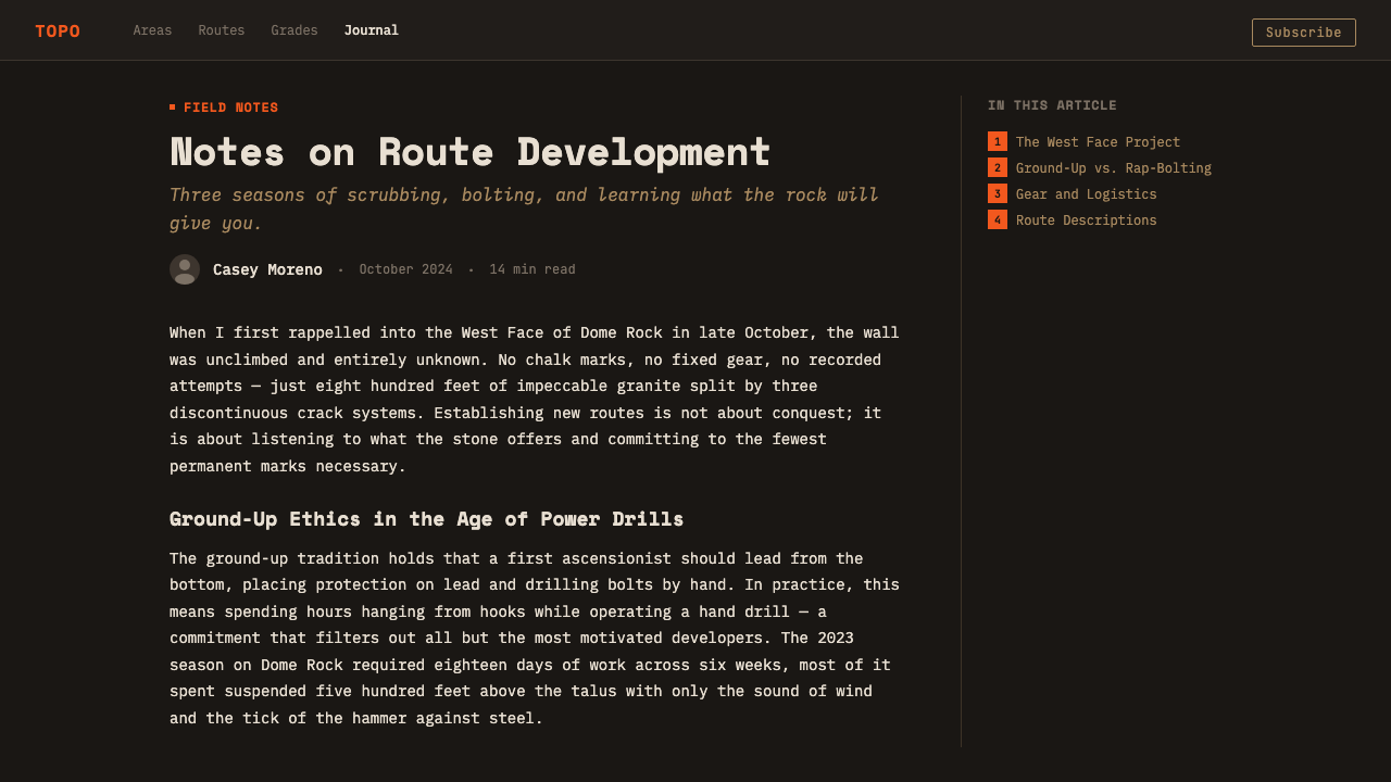
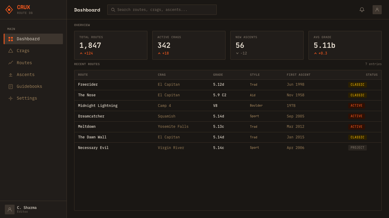
For web interfaces, the system suits route dashboards, crag databases, and pricing pages for technical or outdoor products. A dashboard can use the charcoal ground for the working canvas, route-orange for active paths and important states, and monospaced type for compact grades, IDs, or equipment information. A pricing page can borrow the guidebook logic by making plan differences easy to scan, using orange sparingly for the recommended path and keeping supporting details in a disciplined reference structure.
For editorial and marketing work, the style is strongest when the image remains evidence. Use a close, high-resolution crag photograph as the main field, then let route lines, anchor dots, and compact notes explain what the reader is seeing. Editorial pages can present route stories as annotated plates; marketing pages can frame a product as a dependable instrument by pairing dark stone imagery with precise labels. The orange line should create continuity across spreads, cards, or campaign panels without becoming a general decorative stripe.
The common mistake is treating the theme as a generic outdoor dark mode: charcoal panels, orange buttons, and random monospace text with no relationship to terrain or route information. That loses the defining idea. The system works when every layer has a field purpose, when orange identifies a route or decision, when grades read like reference data, and when the photograph remains legible as a real rock surface. Excessive accents, ornamental badges, or decorative overlays turn a technical topo into a costume.
Climbing Topo Map — FAQ
Is Climbing Topo Map the same as a conventional map?
Not exactly. A conventional map abstracts terrain into symbols, while a photo-topo preserves the actual rock face and overlays route information on top of it. Its strength is the direct relationship between a visible feature and a climbing line. The result behaves like a map, photograph, and technical manual at once.
Why does the system use orange instead of red?
The route-line orange is deliberately separated from red to support vision accessibility while remaining bright against the charcoal ground. It also gives the route a clear visual identity without confusing it with warning language or unrelated interface states. Orange should remain tied to route information and immediate orientation.
Does every piece of text need to be monospaced?
No. Monospaced type belongs primarily to grades, route numbers, and compact reference information because it recalls the tradition of guidebook tables. Headings can establish a separate reading hierarchy, provided they remain clear and restrained. The important distinction is between expressive display text and the utilitarian reference layer.
Can the design work without a climbing photograph?
It can, but the photograph is central to the identity. Without the crag image, route lines and anchor dots risk becoming generic interface decoration. If imagery is unavailable, the design should preserve the manual logic through charcoal ground, route-specific orange, monospaced reference data, and disciplined notation rather than pretending that abstract shapes are a topo.
Related design styles
 GitHub README Markdown (2014)Calm code authority. Blue links, gray code panels, and Inter/Mono stack on wh…
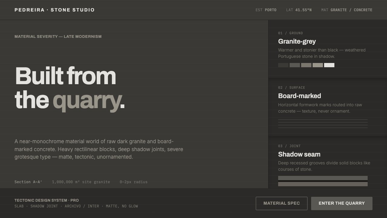 Souto de Moura GraniteArchitecture as raw matter. Dark Portuguese granite ground, board-marked conc…
 Wikipedia (2001)Content needs no ornament. Black serif text, gray hairlines, and blue links e…
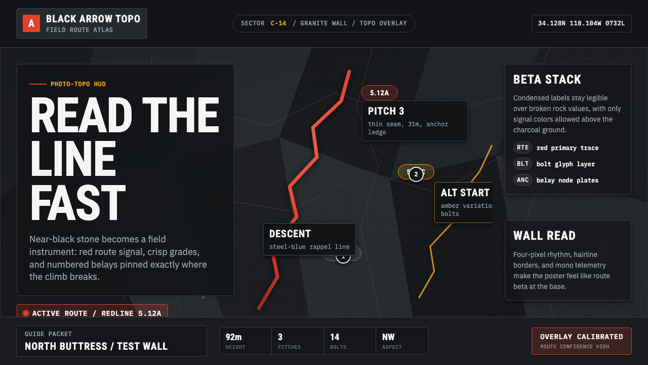 Climbing Topo GuideBeta at a glance. Red route telemetry cuts across near-black stone and conden…
 Elemental Social HousingBuild half a good house, well. Dusty cement-grey panels, hatched bare-frame g…
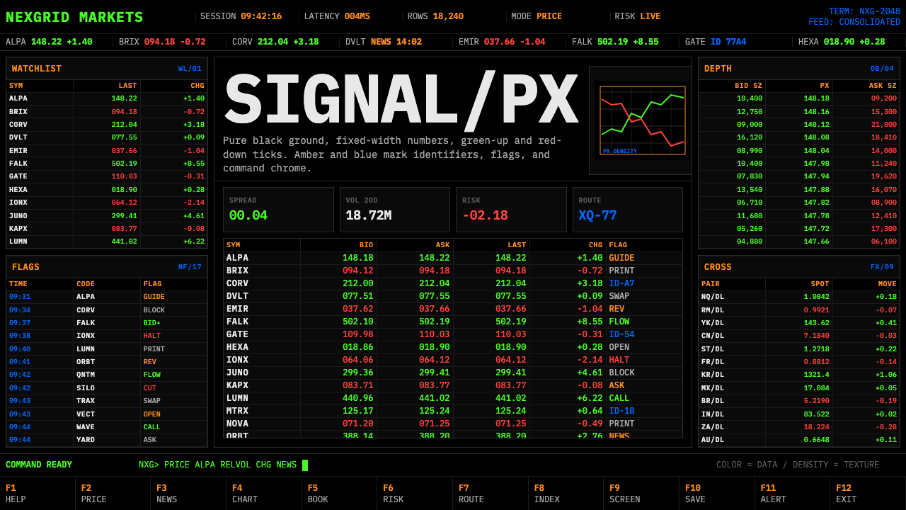 Financial Terminal MonoMaximum signal per pixel. Pure black, IBM Plex Mono, green-red ticks, amber-b…