About Climbing Topo Map
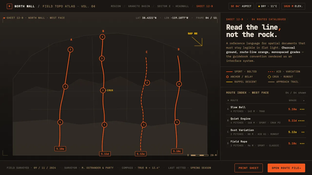
The climbing photo-topo overlays bright route lines onto a high-resolution photograph of a dark rock crag, annotated with monospaced grades in the convention of printed guidebooks. Pioneered by publishers like Rockfax and SuperTopo, it is a technical manual rendered in stone and light.
This design system distills that aesthetic into an interface language: a near-black charcoal ground, vision-accessible orange route lines that deliberately avoid red, and monospaced type that matches the grade-table tradition.
- Origin
- North America — outdoor climbing guidebooks and crag databases
- Era
- Photo-topo convention from late-1990s onward; brief horizon 2010–present
- Key figures
- Rockfax · SuperTopo · route developers · the climbing grading community
- Movements
- Technical guidebook design · Information-overlay cartography · Outdoor route-topo standards
Climbing Topo Map design spec
Colors
Background
Surface
Primary
Secondary
Accent
Text
Typography
Space MonoHeadings
IBM Plex MonoBody
JetBrains MonoMono
Unlock for 1 credit
The other 11 sections — buttons, cards, spacing, motion, techniques and more — open once you unlock. Download the DESIGN.md or send it to your AI in one click. Unlock once, yours forever.
Sign up nowHave an account? Sign in
Styles similar to Climbing Topo Map
Also inspired by pop culture, with a close feel.
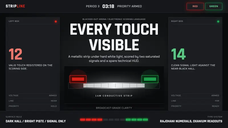 Fencing PisteTurns darkness into signal. Rajdhani HUD type frames a white piste and red-green lights.
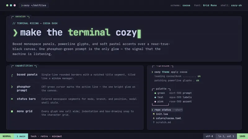 Cozy Terminal TUI RevivalMake the terminal cozy. Boxed mono panels in Catppuccin Mocha, lit by one phosphor-green prompt.
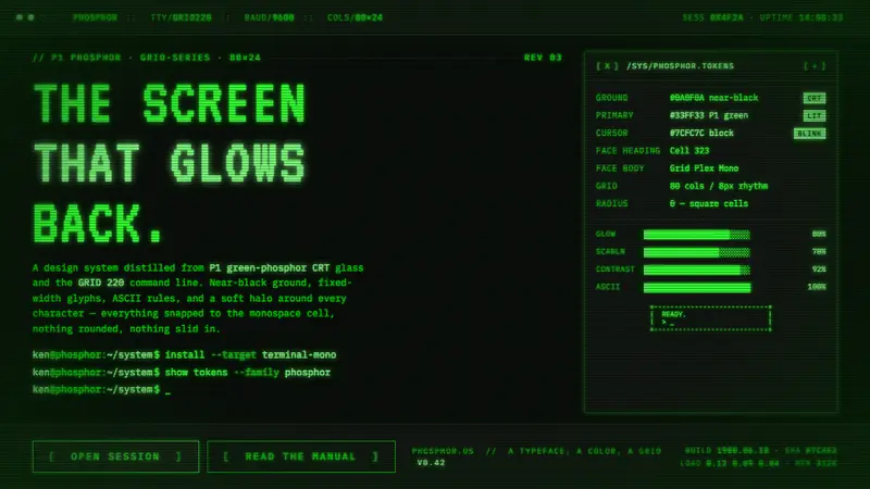 Unix Terminal MonoNear-black CRT glass that glows back. P1 phosphor green, VT323 mono, ASCII rules, blinking cursor.
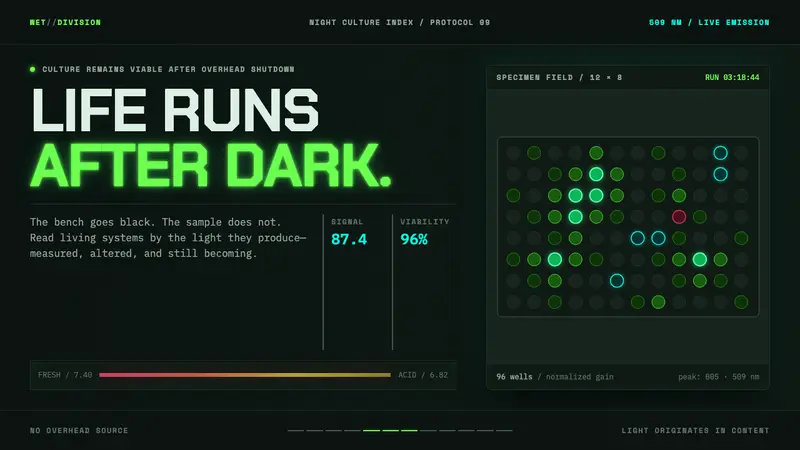 Biopunk WetwareLife emits after dark. GFP green and transilluminator cyan pulse across black lab grids.