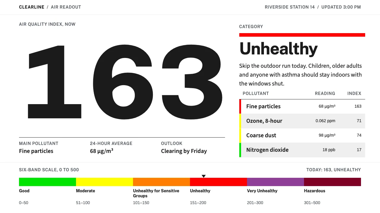
About Air Quality Index
The Air Quality Index compresses six pollutants into a single number between 0 and 500 and six named colour bands — Good, Moderate, Unhealthy for Sensitive Groups, Unhealthy, Very Unhealthy, Hazardous. It was built to be acted on, not admired.
This system takes its cues from the places the AQI actually lives: the white weather page of a newspaper and the white card in a phone app. White ground, a humanist federal sans, hairline rules, and one saturated six-segment bar that always arrives with its number and a sentence telling you whether to go outside.
- Origin
- United States (adopted worldwide)
- Era
- 1999 EPA standardisation (successor to the 1976 Pollutant Standards Index); current visual ~2013–2024 AirNow / NowCast / USWDS era
- Key figures
- U.S. Environmental Protection Agency · AirNow programme (EPA, NOAA, NPS, tribal, state and local agencies)
- Movements
- Public-health risk communication · USWDS-era federal interface design · Newspaper weather-page infographics
Air Quality Index design spec
Colors
Typography
The other 11 sections — buttons, cards, spacing, motion, techniques and more — open once you unlock. Download the DESIGN.md or send it to your AI in one click. Unlock once, yours forever.
Sign up nowStyles similar to Air Quality Index
Also inspired by science & nature, with a close feel.
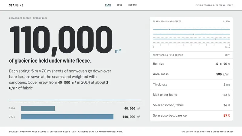 Glacier Blanket ProjectA survey, not a postcard. Fleece-white ground, blue only at seams, mono units, red spent once.
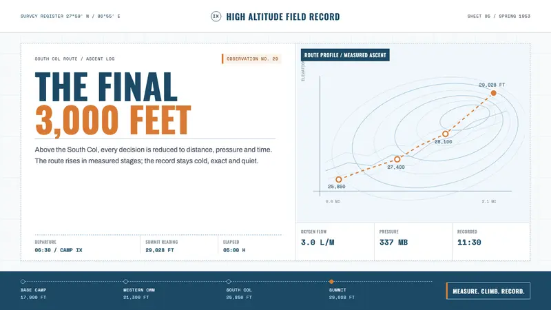 Everest Expedition (1953)Quiet heroism, precisely measured. Ice-blue contours and mono data cross a snow-white field.
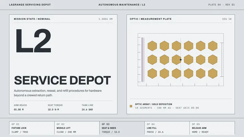 Lagrange Servicing DepotEngineering without theatre. Cleanroom grey, strict rules, and gold reserved for the optic.
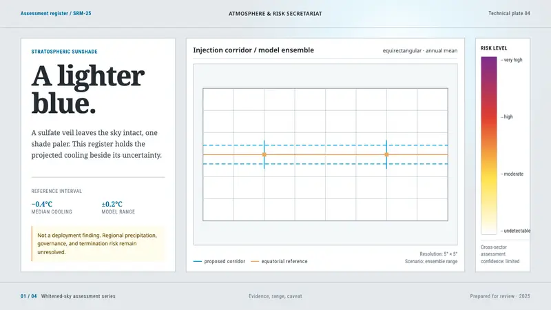 Stratospheric SunshadeUncertainty is the message. Pale sky stock, UN blue corridors, and an IPCC risk ramp hold the record.