What is Thermal Receipt Mono?
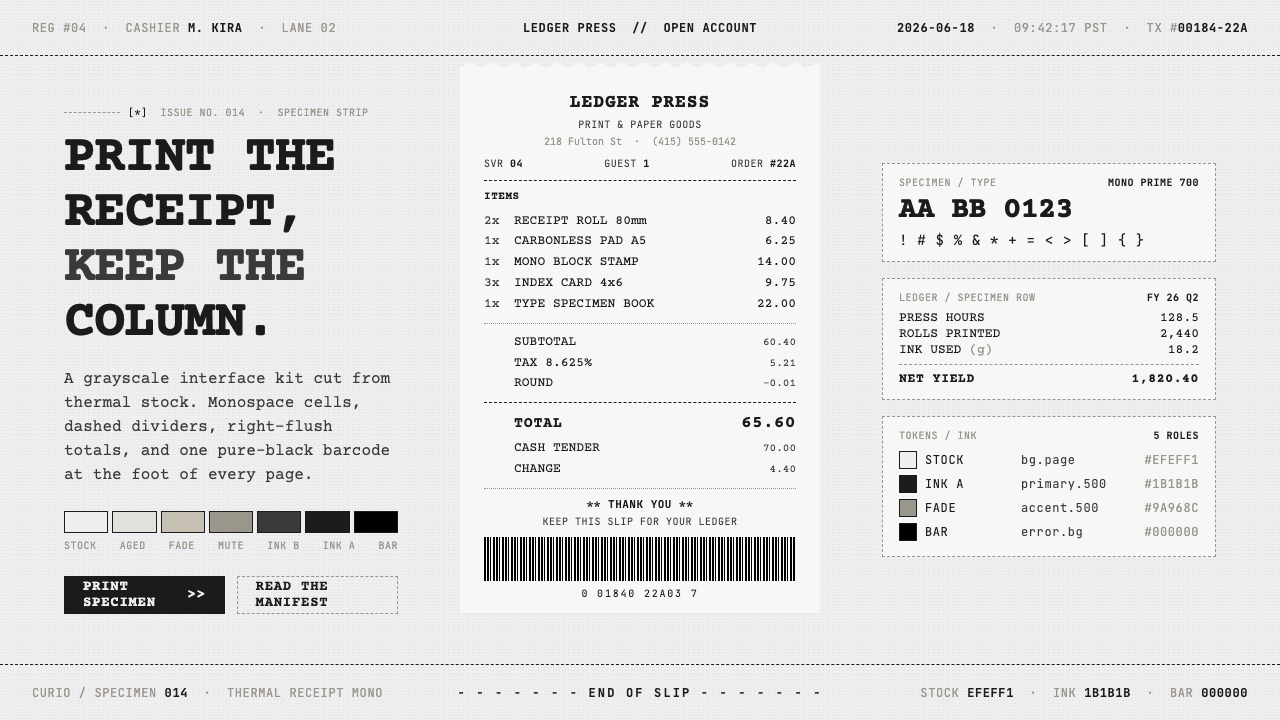
Thermal Receipt Mono turns the humble checkout slip into an interface: warm-gray stock, grainy monospace type, and the quiet authority of a final total.
Thermal Receipt Mono in brief
Thermal Receipt Mono is a contemporary retail-and-internet aesthetic built from the visual grammar of thermal point-of-sale printing. Its surface resembles a narrow strip of dull warm-gray receipt paper rather than a polished screen or a conventional editorial page. Near-black monospace characters carry nearly all information. Headers are usually uppercase, separators are dashed, labels sit to the left, and amounts resolve into a clean right edge. A solid black barcode block gives the composition a practical, machine-readable ending.
The style treats the receipt as more than a record of payment. A receipt is a compact report: it identifies a transaction, groups line items, establishes hierarchy through alignment, and culminates in a total that must be found instantly. Thermal Receipt Mono preserves that logic when it is applied to product pages, dashboards, event materials, and digital summaries. The page feels procedural, as though every element has passed through a small printing mechanism before reaching the reader.
Its appeal comes from restraint and material suggestion. Thermal ink is not imagined as glossy, perfectly opaque black; it is slightly softened, grainy, and subject to faded edges. The paper ground feels used but not distressed. There is no luxury finish, decorative illustration, or dramatic depth. Instead, character cells, dashed rules, whitespace, and one emphatic barcode create a language that is plain, functional, faintly industrial, and unusually memorable.
Where does Thermal Receipt Mono come from?
Thermal Receipt Mono belongs to the recognizable visual culture of 2010–now, but its source system is much older: thermal printing and the point-of-sale hardware ecosystem. Checkout printers established a practical format for fast, legible transaction records on narrow paper. Their output favored compact lines, predictable columns, abbreviated labels, and strong terminal information such as totals, payment details, or a barcode. These constraints created a visual discipline before designers began treating it as a style.
The aesthetic emerged globally through repeated contact with retail checkout. Receipts appear in supermarkets, cafés, transport counters, pharmacies, ticket desks, and countless other everyday exchanges. Because the format is so familiar, it can communicate confirmation, inventory, accounting, or completion almost immediately. Digital culture recognized that familiarity and began borrowing receipt conventions for order confirmations, lists, product interfaces, and self-aware branded materials.
Its typography comes from utilitarian monospace traditions and from legibility-oriented references such as OCR-B. In a receipt-like composition, a character does not merely carry language; it occupies a stable slot in a line. That regularity makes columns feel native rather than imposed. Font A / Font B conventions and the named thermal-sans-mono reference associated with Mike Karlesky point to a broader contemporary practice: adapting machine-adjacent letterforms for interfaces that want to feel direct, operational, and printed rather than polished.
Unlike a historical art movement with a single manifesto or school, Thermal Receipt Mono is a convention-led aesthetic. Its identity is assembled from thermal-printing technology, point-of-sale interface habits, and monospace utilitarian typography. That makes it flexible, but it also makes discipline important. The style works when its borrowed details still organize information; it becomes costume when barcode, blur, and dashed lines appear without the transactional logic that originally gave them meaning.
What defines the Thermal Receipt Mono look?
Thermal Stock
The background should feel like dull warm-gray thermal paper: matte, slightly softened, and materially modest. It is not clean gallery white, recycled kraft, or aged parchment. Subtle unevenness and restrained fading can suggest a printed surface, but the ground must remain calm enough for dense information to stay readable.
Monospace Cell Logic
Fixed-width characters govern the composition. The visual rhythm comes from repeated cells, consistent indents, and columns that resolve cleanly even when labels vary in length. This is not merely a typeface choice. It is a layout rule that makes a product name, quantity, status, and amount feel as though they belong to one operational system.
Grainy Near-Black Ink
Text reads as near-black rather than a pristine digital black. The impression is lightly grainy and occasionally softer at an edge, echoing a thermal head instead of a laser-sharp display. The effect should support tactility and avoid becoming noise. If every letter looks damaged, the interface loses the dependable clarity associated with a receipt.
Transactional Hierarchy
Information is ordered like a checkout record: identity first, line items next, totals later, and confirmation at the end. Uppercase headers, left-aligned labels, right-aligned amounts, and a visibly stronger total create hierarchy without ornamental panels. The eye should be able to scan the page vertically, then land on the final figure with almost no searching.
Dashed Separation
Dashed rules divide sections with the economy of printer output. They are quieter than boxed cards and more procedural than polished hairlines. A separator should mark a meaningful transition: items to subtotal, summary to payment, record to barcode. Repeating dashes everywhere weakens their purpose and makes the result resemble decoration rather than a printed convention.
Barcode Finale
A single pure-black barcode block is the style's strongest graphic punctuation. It belongs near the end, where it turns a textual record into a plausible physical artifact and offers a dense visual counterweight to airy type. It should remain singular and purposeful. Multiple barcode motifs dilute the sense that one scanable object concludes the transaction.
Who shaped Thermal Receipt Mono?
Font A / Font B conventions are named references for the kind of utilitarian lettering that supports this style. Their importance is not decorative personality but the expectation of orderly character rhythm, compact information density, and dependable alignment. In Thermal Receipt Mono, that expectation helps type behave like output from a system rather than like expressive display lettering.
OCR-B is a legibility-oriented typographic reference within the source vocabulary. It clarifies why receipt-like interfaces value distinction, repeatability, and stable spacing. The style does not require literal imitation of OCR-B; it uses the same broad lesson that a machine-adjacent typographic voice can remain clear to people while suggesting order, verification, and record keeping.
Mike Karlesky appears in the source material through the thermal-sans-mono reference. That association is useful as a contemporary bridge between thermal-print character and interface typography. It emphasizes that the receipt look can be designed deliberately, not merely reproduced as a novelty texture: the lettering must still carry labels, columns, totals, and hierarchy with practical discipline.
How do you use Thermal Receipt Mono today?
For presentation covers, use the receipt as a declaration of subject and status. A short uppercase title, a compact identifier, and a barcode-like ending can make a cover feel like an issued record rather than an advertising poster. Keep the field spacious and let one block of receipt information establish the premise. On content slides, preserve the left-label and right-value relationship for agendas, findings, or comparisons; do not turn every page into a full simulated receipt.
Data slides benefit from the style when numbers already need to be read as records. Group metrics into itemized rows, separate subtotals with dashes, and make the key total visually decisive. Charts can be simplified into ledger-like comparisons with direct labels, while a small receipt header explains source or period. The point is not to disguise a chart as a checkout slip, but to make scanning and final conclusions as immediate as a printed total.
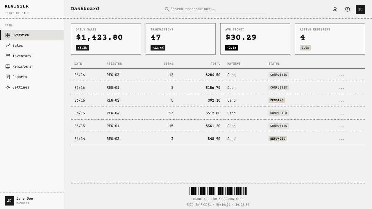
For web interfaces, Thermal Receipt Mono fits dashboards, account histories, order flows, inventory views, and pricing surfaces especially well. A dashboard can present activity as a running record, with status labels at one side and values at the other. A pricing page can borrow receipt hierarchy for plans, included items, and final commitment. Interactive controls should remain clear and contemporary; the receipt language should organize the interface, not make it feel inaccessible or artificially archaic.
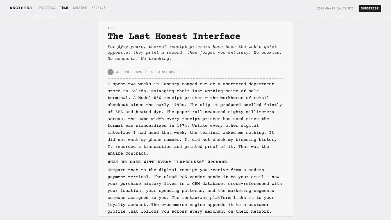
In editorial and marketing work, the style is strongest when the subject has a natural relationship to proof, inventory, transaction, dispatch, measurement, or completion. An article can use receipt-like metadata and dashed section breaks to give a utilitarian frame to otherwise conventional reading. A campaign can make a product launch feel like an issued statement or a completed order. The warm-gray field and grainy ink prevent the result from becoming cold corporate minimalism.
The common mistake is over-performing the receipt. Designers often add excessive fake wrinkles, random serial strings, many barcode blocks, or illegibly distressed type, then lose the information discipline that made receipts compelling. Another mistake is treating monospace as inherently technical while ignoring alignment. Use only the details that clarify hierarchy or strengthen the printed artifact. If an element cannot plausibly belong to a transaction record, it should earn its place through a clear communicative role.

Thermal Receipt Mono — FAQ
Is Thermal Receipt Mono just a retro style?
No. It draws on a familiar print technology, but its core value is contemporary information behavior: compact records, explicit hierarchy, and fast verification. The look can feel nostalgic because receipts are physical and commonplace, yet it works best when used for present-day systems such as orders, account activity, inventory, pricing, or measurable outcomes. Treat it as operational design with a material memory, not as nostalgia for its own sake.
Does every Thermal Receipt Mono layout need a barcode?
No, but a single barcode is a powerful concluding device when the layout benefits from a tangible receipt identity. It is most convincing near a confirmation, final total, ticket reference, or order record. If the content has no meaningful endpoint, forcing in a barcode can feel theatrical. The stronger rule is that the visual ending should communicate completion, whether or not it uses a literal barcode block.
Can the style work with a large amount of text?
It can support dense structured information, but it is not ideal for long uninterrupted prose. Monospace rhythm, narrow receipt associations, and frequent alignment cues are excellent for labels, lists, values, metadata, and short explanatory passages. For a long article, use the receipt system as a frame around readable editorial text, or reserve it for summaries and callouts. Density should feel accounted for, never cramped.
How should color be handled?
Keep the relationship close to thermal paper and printed ink: a dull warm-gray ground, grainy near-black type, and a pure-black barcode as the densest accent. Extra color is possible only when it carries an operational meaning, such as status or exception. Bright decorative accents quickly break the illusion of a utilitarian printed record and compete with the style's central contrast between paper, ink, and machine-readable black.
Where does Thermal Receipt Mono struggle?
It struggles where the product needs softness, sensory abundance, or sustained emotional warmth. Luxury storytelling, expressive cultural campaigns, and interfaces built around leisurely browsing may find its transactional tone too procedural. It also fails when accessibility is sacrificed for faded texture or compact novelty. Use it where proof, clarity, and completion are meaningful values; choose another language when atmosphere matters more than accounting.
Related design styles
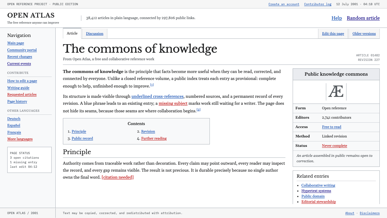 Wikipedia (2001)Content needs no ornament. Black serif text, gray hairlines, and blue links e…
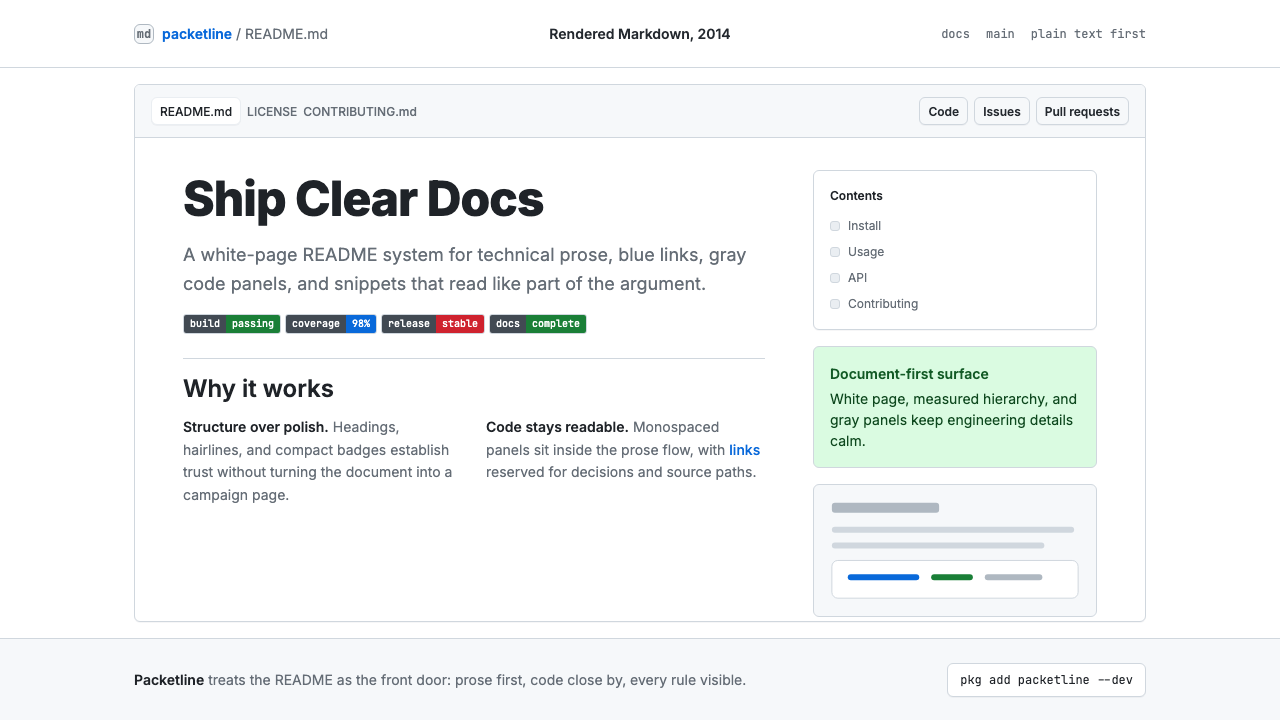 GitHub README Markdown (2014)Calm code authority. Blue links, gray code panels, and Inter/Mono stack on wh…
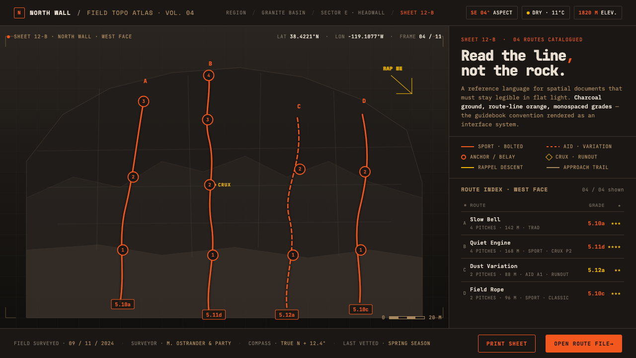 Climbing Topo MapA field manual, not an app. Charcoal crag ground, route-line orange, monospac…
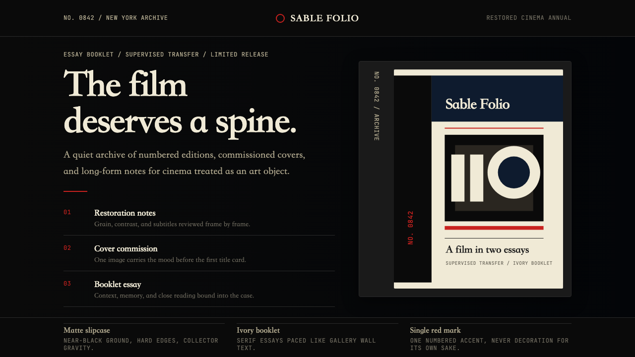 Criterion CollectionMuseum-grade cinema. Matte black, ivory serif, and one red numbered spine set…
 Elemental Social HousingBuild half a good house, well. Dusty cement-grey panels, hatched bare-frame g…
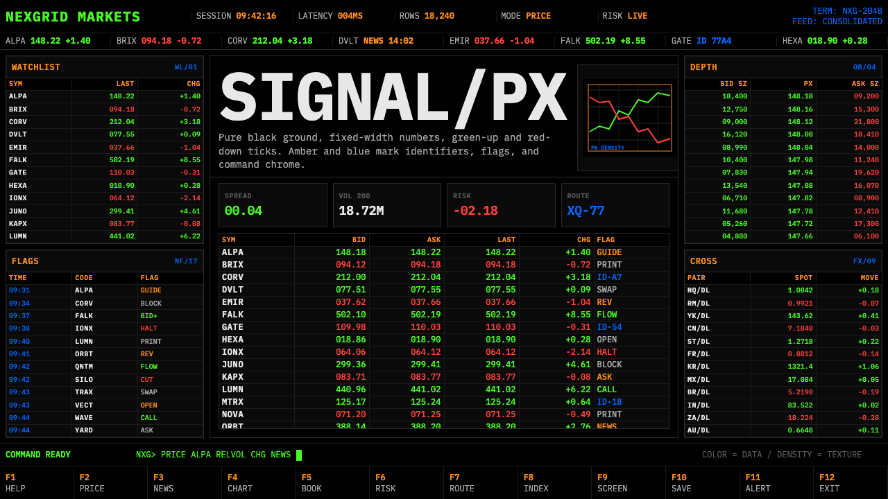 Financial Terminal MonoMaximum signal per pixel. Pure black, IBM Plex Mono, green-red ticks, amber-b…