About Nintendo Switch
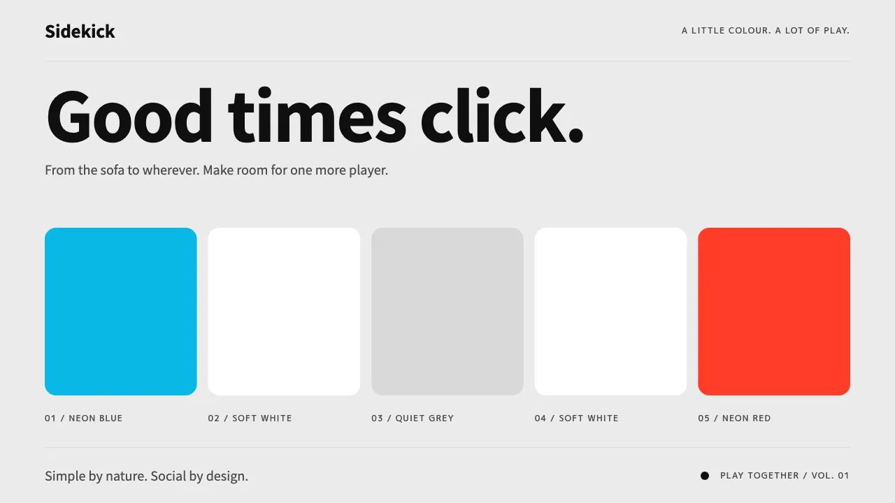
A system built from the Nintendo Switch HOME menu in its Basic White theme: a flat #EBEBEB ground, one horizontal row of large rounded-square tiles, a line of round shortcut buttons beneath, and a turquoise frame that breathes around whatever is selected.
Colour comes from the hardware rather than the software. Neon Blue and Neon Red Joy-Con plastic mark left and right, primary and secondary, and every transition lands with a short, springy click.
- Origin
- Kyoto, Japan
- Era
- 2017 launch (3 March 2017); HOME menu Basic White / Basic Black themes from launch
- Key figures
- Yoshiaki Koizumi · Shinya Takahashi · Ko Shiota
- Movements
- Hybrid home/handheld consoles · Flat tile-based system UI of the 2010s · Nintendo toy-like hardware tradition
Nintendo Switch design spec
Colors
Background
Surface
Primary
Secondary
Accent
Text
Typography
Noto Sans JPHeadings
M PLUS 1pMono
Unlock for 1 credit
The other 11 sections — buttons, cards, spacing, motion, techniques and more — open once you unlock. Download the DESIGN.md or send it to your AI in one click. Unlock once, yours forever.
Sign up nowHave an account? Sign in
Styles similar to Nintendo Switch
Also inspired by brands & products, with a close feel.
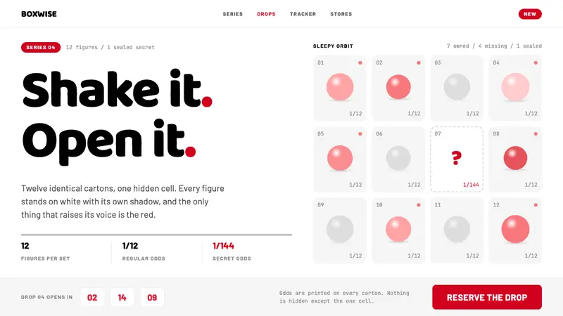 POP MARTA white shelf with one red signal. Twelve-cell blind-box grid, one dashed hidden cell, Baloo 2 lettering.
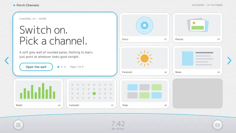 Wii MenuSwitch-on calm. White TV panes on a grey scanline wall, one thin blue line on a silver dock.
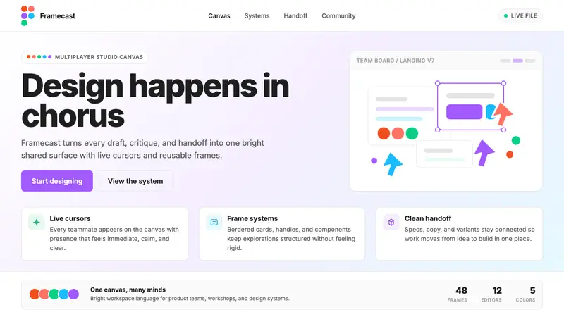 Figma 2024A brand that looks like its canvas. Five dots scatter like cursors, soft cards, purple pill CTAs.
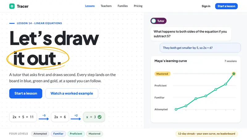 AI Tutor ClassroomA tutor that draws before it talks. White board, blue and gold marker strokes, one eggplant chip.