About Wii Menu
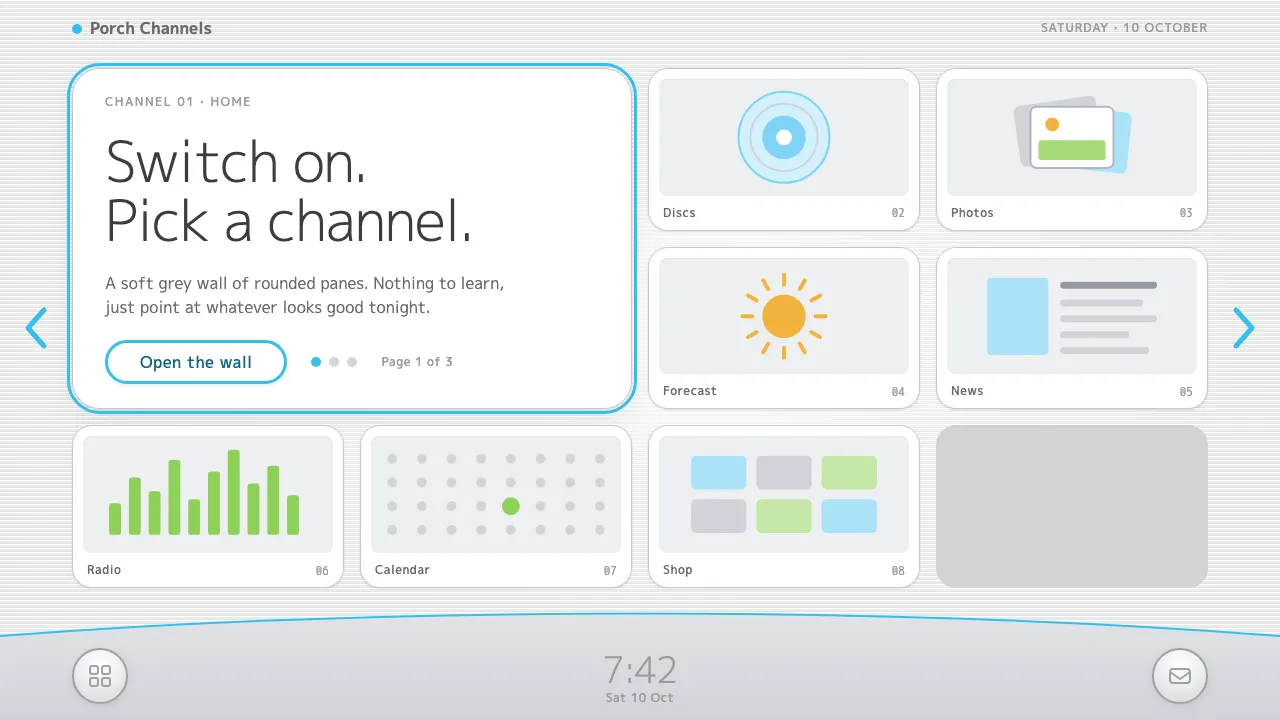
The Wii Menu was the first thing millions of families saw when they switched on Nintendo's console in 2006: twelve rounded panes laid out like televisions on a shop wall, each one a channel playing its own small loop.
This system keeps that calm. A very light grey field of fine scanlines, white panes with soft outlines, a silver dock with a curved blue edge and a big quiet clock. It is built for interfaces that should feel like turning on a TV, not opening an app.
- Origin
- Kyoto, Japan
- Era
- 2006–2013 (Wii launch November 2006; System Menu 4.0 in 2009; Wii Shop closed January 2019)
- Key figures
- Satoru Iwata · Shigeru Miyamoto · Kazumi Totaka
- Movements
- Living-room console interfaces · Mid-2000s white consumer electronics · TV-channel metaphor for software
Wii Menu design spec
Colors
Background
Surface
Primary
Secondary
Accent
Text
Typography
M PLUS 1pHeadings
M PLUS 1 CodeMono
Unlock for 1 credit
The other 11 sections — buttons, cards, spacing, motion, techniques and more — open once you unlock. Download the DESIGN.md or send it to your AI in one click. Unlock once, yours forever.
Sign up nowHave an account? Sign in
Styles similar to Wii Menu
Also inspired by brands & products, with a close feel.
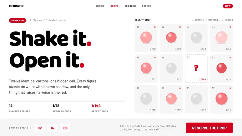 POP MARTA white shelf with one red signal. Twelve-cell blind-box grid, one dashed hidden cell, Baloo 2 lettering.
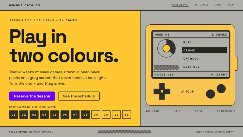 PlaydateTwo colours, all the play. Ink pixels dithered on screen grey, framed by flat yellow plastic.
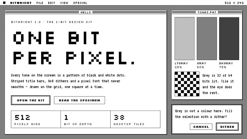 Macintosh 1984One bit per pixel, no grey. Black on white, striped title bars, dither fills and Silkscreen capitals.
 Figma 2024A brand that looks like its canvas. Five dots scatter like cursors, soft cards, purple pill CTAs.