What is Wii Menu?
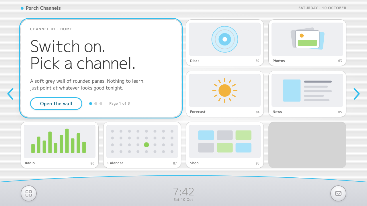
The Wii Menu made an interface feel like switching on a television: rounded white panes on a pale grey scanline wall, a silver dock with one thin blue curve, and a big, quiet clock.
Wii Menu in brief
The Wii Menu style is drawn from the home screen of Nintendo's Wii console, first seen in 2006. The menu was a grid of twelve rounded panes, laid out like televisions on a shop wall. Each pane was a channel playing its own small preview loop, and selecting one produced its own gentle sound. It was the first thing millions of families saw when they switched on the console, and it was designed so that nobody needed to be taught how to use it.
The visual system is easy to describe. The field behind the panes is a very light grey, covered with fine horizontal scanlines that grow brighter toward the centre of the screen. The panes are white, with soft grey outlines and generous rounded corners. At the bottom sits a silver-grey dock, its upper edge marked by a thin curved blue line, with a big, light clock in the middle. Everything is bright, clean and low in contrast.
The aim of the style is calm familiarity. It is built for interfaces that should feel like turning on a TV, not opening an app. There is no cleverness to decode and no dense menu to study, only a few obvious places to point at. That makes it a good fit for family products, children's tools, media portals and any entry point where the first impression should be: you already know how to use this.

Where does Wii Menu come from?
Nintendo released the Wii in November 2006, and the console came from the company's home in Kyoto, Japan. At the time, the games industry was in an arms race of graphics power and technical complexity. The Wii went the other way, aiming at living rooms rather than specialist players. It used motion controls that people could understand by watching, and its home screen had the same ambition. The channel menu was meant to be so legible that a grandparent and a child could use it equally easily.
The central idea was a metaphor borrowed from television. Instead of a list of programs or a tree of options, software was presented as channels, each a window into something that was already happening. The panes played short loops, so the menu felt alive even when nobody was touching it. This TV-channel metaphor for software sits among the living-room console interfaces of its time, and it shares the clean, pale, rounded character of mid-2000s white consumer electronics, the era of glossy white plastic and soft curves.
The menu continued to evolve over the console's life. System Menu 4.0 arrived in 2009, and the platform's online store, the Wii Shop, was eventually closed in January 2019, ending the console's life as a connected service. The overall console lifespan is usually given as 2006 to 2013. Throughout this time the visual language of the menu stayed remarkably stable, which is one reason it is still so recognisable many years later.
Several people are closely associated with the spirit of the Wii. Satoru Iwata led Nintendo as president during the Wii era and championed the idea of broadening who games were for. Shigeru Miyamoto is the company's best-known creator and a central figure in its design philosophy. Kazumi Totaka is known for the gentle sound and music personality that gave the channels their warmth. Together, these influences fed an interface that was meant to feel kind. The style captured here takes that kindness and expresses it in screen design: pale scanlines, white panes, a silver dock and a single thin blue curve.
What defines the Wii Menu look?
Scanline wall
The background is a very light grey crossed by fine horizontal scanlines. The lines are subtle enough that you notice them as a texture rather than a pattern, and they brighten toward the centre of the screen, which draws the eye gently to the middle. The effect recalls the look of a television picture, and it gives the page a soft, lit quality without any gradient decoration.
Channel panes
Content is arranged in a regular grid of white, rounded panes, four across and three down, each with a soft grey outline. Every pane is the same size and has the same behaviour, so the layout is instantly legible. The panes feel like screens, and in the original each one played its own tiny loop. Equal weight and equal spacing mean nothing is more important than anything else until you choose it.
Silver dock with a blue curve
The bottom of the screen carries a silver-grey dock whose upper edge is marked by a thin, curved light-blue line. It anchors the layout and holds the persistent controls. The curve is the style's one flourish, and it is thin and quiet enough that it feels like a gentle gleam of light on a metal edge rather than a decoration. It also gives the otherwise rectilinear page a hint of softness.
A big, quiet clock
In the centre of the dock sits a large clock in a light, friendly type. It is unnecessary for the function of the page, and that is its charm. It turns the menu into something like a household object, a clock on a shelf, and it signals that the system is a calm, domestic presence. The numbers are large but low in weight, so they stay legible without shouting.
Soft rounded geometry
Corners are generously rounded across panes, buttons and the dock. There are no sharp angles and no aggressive diagonals. The rounded forms echo the white plastic casings of the console and its accessories, and they tell the user that nothing here is dangerous or complicated. Shapes are plain, simple and friendly, with no decorative flourishes beyond the single blue curve.
Bright, low-contrast palette
The palette is white, pale grey, silver and a single light blue. Contrast between neighbours is gentle, so nothing glares. Text is dark grey, not black. This is the colour world of mid-2000s white consumer electronics, optimistic and clean, and it works because it asks nothing of the viewer. It feels like a well-lit living room.

Who shaped Wii Menu?
Satoru Iwata was the president of Nintendo during the Wii era and a leading advocate of making games welcoming to everyone, not only to enthusiasts. The idea that a console should be as easy to approach as a household appliance runs through the Wii, and the channel menu is one of its clearest expressions.
Shigeru Miyamoto is Nintendo's best-known creator and a central influence on its design thinking. His emphasis on play, clarity and immediate understanding sits behind the Wii's approachable character, including the plain and friendly way its menu presents itself.
Kazumi Totaka is known for the gentle sound and music personality associated with Nintendo products. In the Wii Menu, sound is part of the interface: each channel responds with its own soft cue, which gives the visual calm an audible counterpart.
How do you use Wii Menu today?
The Wii Menu style belongs in contexts where the first goal is welcome. It suits family products, children's learning tools, media launchers, smart-TV style portals, simple dashboards for non-technical users and any home screen where a user should be able to point at what they want without reading. It is less suited to professional tools with deep menus, where a uniform grid of equal panes would hide the real hierarchy of work.
For presentation slides, an agenda or overview slide is the natural home: lay out the topics as a grid of white rounded panes on a pale grey ground, with a small title in each. Section covers can use the dock motif at the bottom, with the thin blue curve and a simple label or date in place of the clock. Content slides should stay light, with one or two white panes and plenty of grey space. Data slides work well when each metric sits in its own pane.
For web interfaces, use the pane grid as the main navigation or launcher. Each pane is a card with a soft outline, a short title and a small image or preview. Hover states should respond gently: a slight lift or a change in outline, rather than a sudden colour shift. Keep a persistent footer or dock for account controls and system information, finished with the thin blue curve. Add a time, date or status widget to the dock if it fits the product.
For editorial and marketing work, the style is excellent for hub pages, collections and product families, where the aim is to present several equally important choices without ranking them. Campaign pages can present each product as its own channel. Newsletter or app-store style layouts benefit from the same grid logic. Keep copy short and friendly, because the style's voice is cheerful and domestic, not authoritative.
The most common mistake is to over-polish it. Adding strong shadows, saturated colours or glossy gradients will turn a calm, flat TV wall into a generic app launcher and lose the sense of switching on a television. Another mistake is breaking the grid with panes of different sizes, which undermines the equal-footing logic. A third is dense text inside the panes; the format works because each pane contains a title and a preview, nothing more.

Wii Menu — FAQ
What is the Wii Menu design style?
It is a calm, welcoming interface style drawn from the home screen of Nintendo's Wii console, released in 2006. Its parts are rounded white panes laid out like televisions, a pale grey field of fine scanlines, a silver dock with a thin curved blue line, and a large, quiet clock. It is designed to feel like switching on a TV.
Why does it look like a wall of televisions?
Because the original menu used a TV-channel metaphor. Software was presented as twelve channels, each a rounded pane playing its own small preview loop, like sets on a shop wall. The metaphor made the console feel familiar, since everyone already knows how to choose a channel.
Is the style dark or light?
It is light. The ground is a very pale grey, the panes are white and the dock is silver, with a single light blue accent. The brightness and low contrast belong to the mid-2000s white consumer electronics look and contribute to the calm, welcoming mood.
What is the scanline background for?
The fine horizontal lines give the grey field a subtle television texture and brighten toward the centre of the screen, which draws the eye gently to the content. They are meant to be felt as a surface quality, not seen as a pattern, so they should stay very faint and never compete with the panes.
What kinds of products fit this style best?
Products where the first impression should be that anyone can use them: family hubs, children's apps, media portals and simple home dashboards. It is less suitable for professional tools with deep, hierarchical menus, since the equal-sized grid treats every item as equally important.
Related design styles
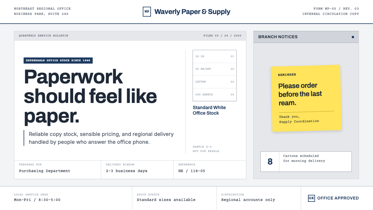 The Office (Dunder Mifflin, 2005)Mundanity is the punchline. Copier white, cubicle gray, memo grids, and one y…
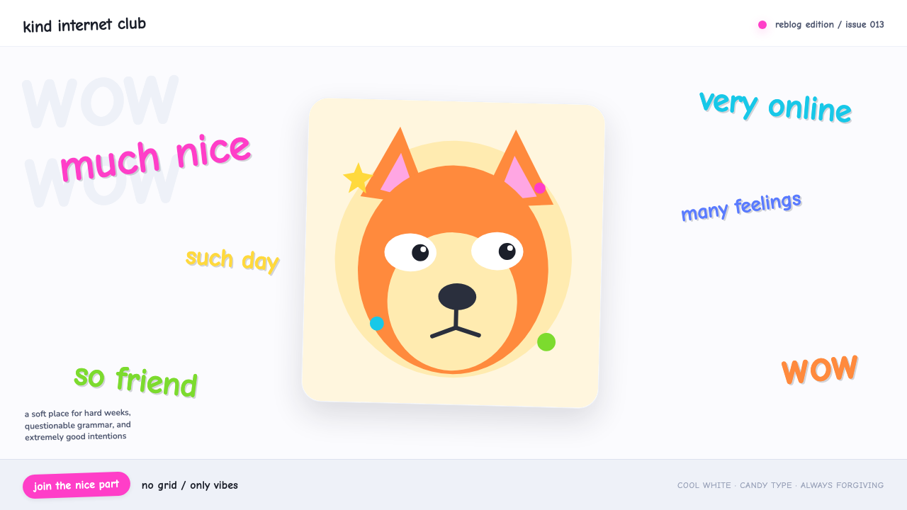 Doge Meme (2013)Anti-design becomes pure joy. Candy Comic Neue captions drift at lazy angles…
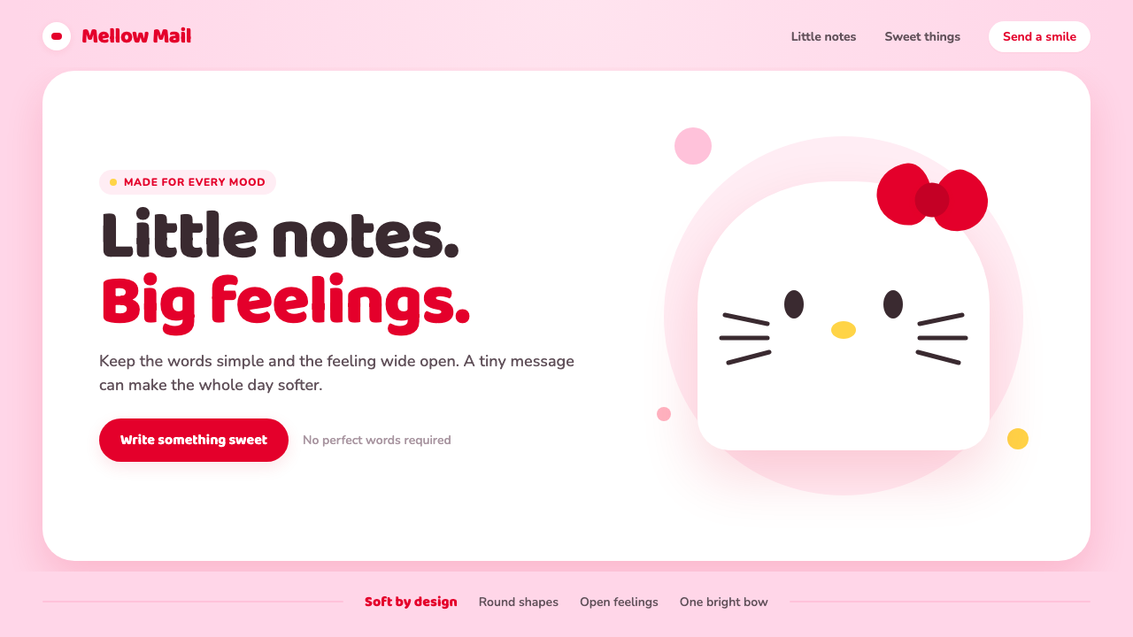 Hello Kitty (Sanrio 1974)Cuteness through subtraction. Bubblegum pink, round white forms, and one red…
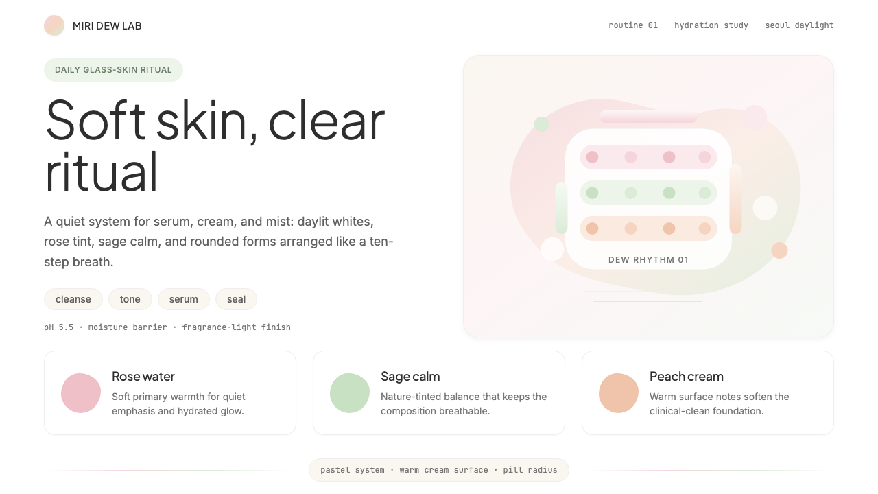 K-Beauty CleanCalm arrives dewy. Rose, sage, and peach pastels float through airy rounded f…
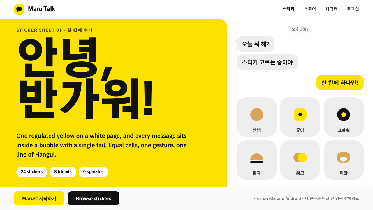 Kakao FriendsOne yellow, one gesture per cell. A white sticker sheet where speech bubbles…
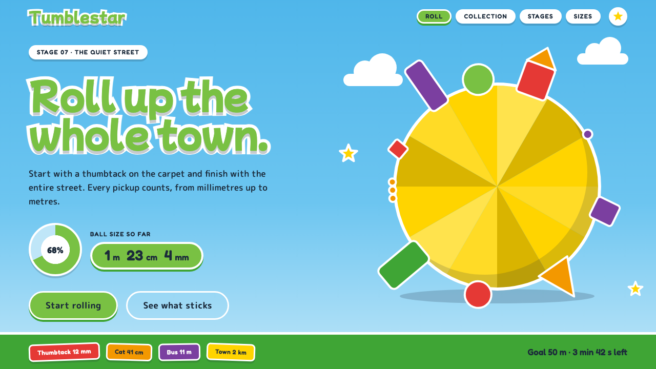 Katamari DamacySmall to huge in one roll. Cyan sky, green lettering ringed in white, one fac…