What is Katamari Damacy?
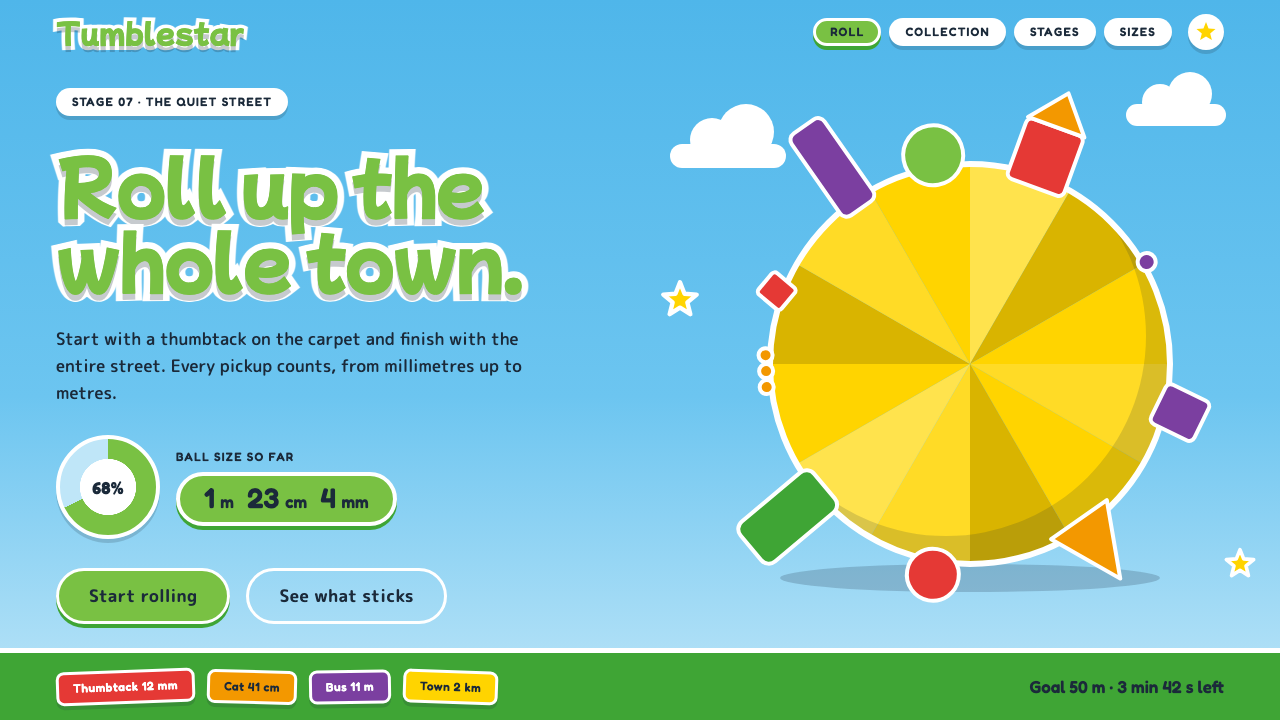
Katamari Damacy turned a sticky ball, a cyan sky and a green-lettered prince into a design language where the joke is scale and the rule is cheerfulness.
Katamari Damacy in brief
Katamari Damacy is the visual world of Namco's 2004 PlayStation 2 game of the same name, in which a tiny green Prince rolls a sticky ball through ordinary living spaces, gathering thumbtacks, erasers, cats, cows, cars and finally entire buildings until the ball is large enough to be hung in the sky as a star. As a design style it means a bright cyan daytime ground, chunky green lettering wrapped in a thick white outline, flat low-polygon shapes, rounded panels and a rainbow of small label colors.
The style is built on one idea: radical contrast in scale, treated as a joke told with a straight face. A thumbtack is allowed to sit next to a house, a pencil next to a bus, and the interface never apologizes for it. Because size is the game's reward, even the interface counts it, with a readout that reports how big the ball has grown in meters, centimeters and millimeters.
The mood is noisy, naive and a little nonsensical. Nothing is moody or refined; everything is saturated, flat and friendly. That makes Katamari Damacy one of the clearest examples of how a handful of decisions, a sky color, a lettering treatment and a collector's counter, can hold together an entire product identity without any ornament that is not playful.

Where does Katamari Damacy come from?
Katamari Damacy was released in Japan in March 2004 and in North America in September 2004. It came out of Namco in Tokyo, where Keita Takahashi, a designer trained in sculpture rather than in game programming, led the project. That background is visible everywhere: the game treats objects as shapes with mass and surface, not as story props, and the playful logic of rolling and sticking is closer to a toy or a sculpture exercise than to a conventional action game.
The game's premise is its first design decision. The King of All Cosmos has accidentally destroyed the stars, and his very small son, the Prince, must roll up everyday things to rebuild them. This gives the whole look a bright, domestic setting, such as living rooms, gardens and towns, in which ordinary objects are heroes. The cyan daytime sky became the page, the Prince's green became the headline color, and the thick white outline around it became the way that lettering stays readable over a busy, colorful scene.
Technically, the look belongs to the PlayStation 2 era of low-polygon three-dimensional art. Limited geometry and flat shading were not hidden; they were turned into the style. Shapes are faceted, colors are clean, and surfaces carry little texture, so that a rolled-up pile of mismatched objects still reads as one coherent ball. The rainbow tones associated with the North American cover were used to tag the collected items, a small system of color-coded labels that later became part of the interface language.
Yu Miyake, another name among the game's key figures, belongs to the team around the game's famously exuberant music, which matters to the style because the visuals and the sound share the same attitude: generous, surprising and slightly absurd. In 2012 the game was acquired by the Museum of Modern Art in New York, a recognition that it had become more than a successful title and had entered the conversation about how games work as designed objects. Its lineage includes Japanese art-school game design and a tradition of everyday-object surrealism, in which ordinary things are made strange simply by changing their scale.
What defines the Katamari Damacy look?
Color
The ground is a clear, saturated cyan, like a cloudless daytime sky. Headlines use a fresh, vivid green, the Prince's color, and are always wrapped in a thick white outline. Small rainbow hues are reserved for tags and collected-item labels, so that the main fields stay calm while the accents can be loud. There are no muddy mid-tones and no moody darks; the palette reads as toy-box clean.
Type
Display lettering is heavy, rounded and slightly bouncy, as if each letter had been rolled up out of clay. The outline is generous enough that the words survive any background. Body text is kept simple and quiet so that the lettering can carry the personality. Letters are allowed to tilt, overlap and crowd, because liveliness matters more than typographic polish.
Shape
Panels are rounded, objects are low-polygon and faceted, and nothing has a razor-sharp corner. The central image, the ball, is a sphere covered in sticking objects, which sets the tone for the whole system: soft containers around dense, mismatched contents. Shapes are flat-filled and generally lack gradients, so they look like cut-out toys rather than rendered surfaces.
Scale
Scale contrast is the signature move. Tiny and enormous things share one frame without any attempt at realism, and a thumbtack may sit beside a house on purpose. A size readout in meters, centimeters and millimeters turns growth into a visible score. Hierarchy comes from size jumps rather than from subtle weight changes.
Composition
Layouts are busy but readable: a large central subject, scattered small items around it, and a few clearly boxed readouts. Empty space is filled with sky rather than left blank, so the page feels like a full outdoor scene. Elements may float at slightly different angles, which creates the impression of a world in motion even in a still layout.
Tone
The attitude is earnest nonsense: the interface treats a ridiculous premise with complete sincerity. Copy is short, enthusiastic and slightly odd. The style never goes sarcastic, dark or cool; its charm depends on remaining naive from start to finish.

Who shaped Katamari Damacy?
Takahashi led the creation of Katamari Damacy at Namco in Tokyo, and his sculpture training shaped the game's attitude to objects as pure shape and mass. His instinct was to make a game that felt like a toy: simple to grasp, funny to look at, and generous with surprises. The look of the interface, with its flat color and its willingness to place a thumbtack beside a house, comes directly from that toy-maker's logic.
Miyake is listed among the key figures behind the game's world, and is associated with the team that gave it its famously upbeat sound. For a visual style this matters, because the cheerfulness of the interface only works when the music and motion share the same generous energy. Any design that borrows from Katamari Damacy should remember that tone is a joint product of sight and sound.
Kumakawa, a Japanese ballet dancer, appears in the source material among the key figures connected with the game. His presence is a reminder that the world of Katamari Damacy drew on collaborators well beyond the usual circle of game development, which fits a project whose sensibility was closer to performance, toy design and sculpture than to genre convention.
How do you use Katamari Damacy today?
In presentations, Katamari Damacy works best for cover slides and section dividers where a smile is the goal. A cyan field with a single green, white-outlined title and one bold collectible-style object is enough. Use the size-readout idea for content slides: a big number with a unit beside it can turn a modest metric into something that feels like a growing score. Keep each slide to one central subject and let the scattered small objects fill the edges.
For data slides, treat the rainbow tones as category tags, not as a full chart palette. Assign each category one tag color and let the charts themselves stay flat and rounded. Because the style relies on contrast in size, it suits comparisons from tiny to huge, such as before-and-after growth, user counts or file sizes, better than it suits subtle trend lines. Large numbers with units will carry the page.
In web interfaces, the style fits playful consumer products, children's tools, casual games, collection or inventory apps and onboarding flows where progress is rewarded. A dashboard can use rounded panels, a sky-colored background and a size-style counter for achievements. Pricing pages should keep plans in plain rounded cards and let a single green, outlined headline set the mood. Buttons should be large, rounded and obviously pressable.
In editorial and marketing work, it is a good fit for launch announcements, event posters, mascots, stickers and social graphics. The thick outline on the lettering keeps headlines legible over photos or busy illustration, so use it when text must sit on top of a crowded image. Let collected objects spill out of the frame to suggest abundance.
The common mistake is to use the cyan and green but drop the discipline behind them. Without the thick white outline, the lettering loses its pop; without genuine scale contrast, the layout is just a colorful page; and with too many competing rainbow accents, the label colors stop meaning anything. Another frequent error is to make it glossy or realistic. The style depends on flat, faceted shapes and sincerity, so avoid heavy shadows, photo textures and sarcastic copy.

Katamari Damacy — FAQ
What is the Katamari Damacy design style?
It is a bright, toy-like visual language drawn from Namco's 2004 PlayStation 2 game. A cyan daytime ground, green headlines with a thick white outline, flat low-polygon shapes, rounded panels, rainbow label colors and a size readout in meters, centimeters and millimeters define it. Its central idea is scale contrast, played as a joke.
Where does the style come from?
It comes from the game Katamari Damacy, released in Japan in March 2004 and in North America in September 2004, led by Keita Takahashi at Namco in Tokyo. It belongs to PlayStation 2-era low-polygon art, Japanese art-school game design and a tradition of everyday-object surrealism. The game was later acquired by the Museum of Modern Art in 2012.
What is the white outline around the green lettering for?
It does two jobs. Functionally, it keeps the lettering readable over a busy or colorful scene, because a green word on a cyan sky would otherwise fade. Stylistically, it gives the headline a sticker-like, chunky presence that matches the toy mood. Dropping the outline is the fastest way to lose the look.
Is it only suitable for games and children's products?
No, but it suits products where delight is the goal. Casual apps, onboarding flows, event graphics, launch posters, collection tools and friendly marketing pages all work well. It is a poor choice for serious financial, legal or medical interfaces, where its naive tone would undermine trust. A restrained use, for instance one outlined headline and a sky-colored background, can bring warmth without turning the whole product into a toy.
How do I keep it from looking chaotic?
Keep the structure simple even when the content is playful. Use one central subject per screen, assign rainbow colors only to labels, keep panels rounded and flat, and let the sky color fill the empty space. The style tolerates density, but it needs a clear focal point and a consistent set of shapes to stay readable.
Related design styles
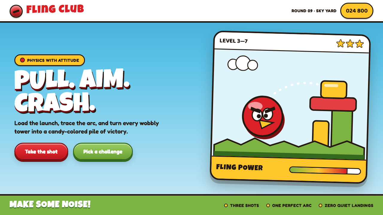 Angry Birds (2009)Adorable aggression takes flight. Candy primaries, chunky outlines, and a dot…
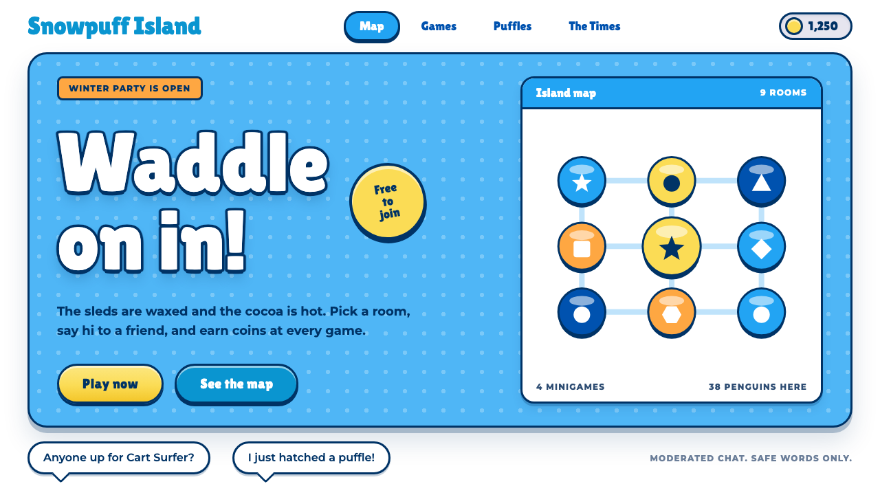 Club PenguinA snow-white island that talks like a kid. Sky-blue panels, navy outlines on…
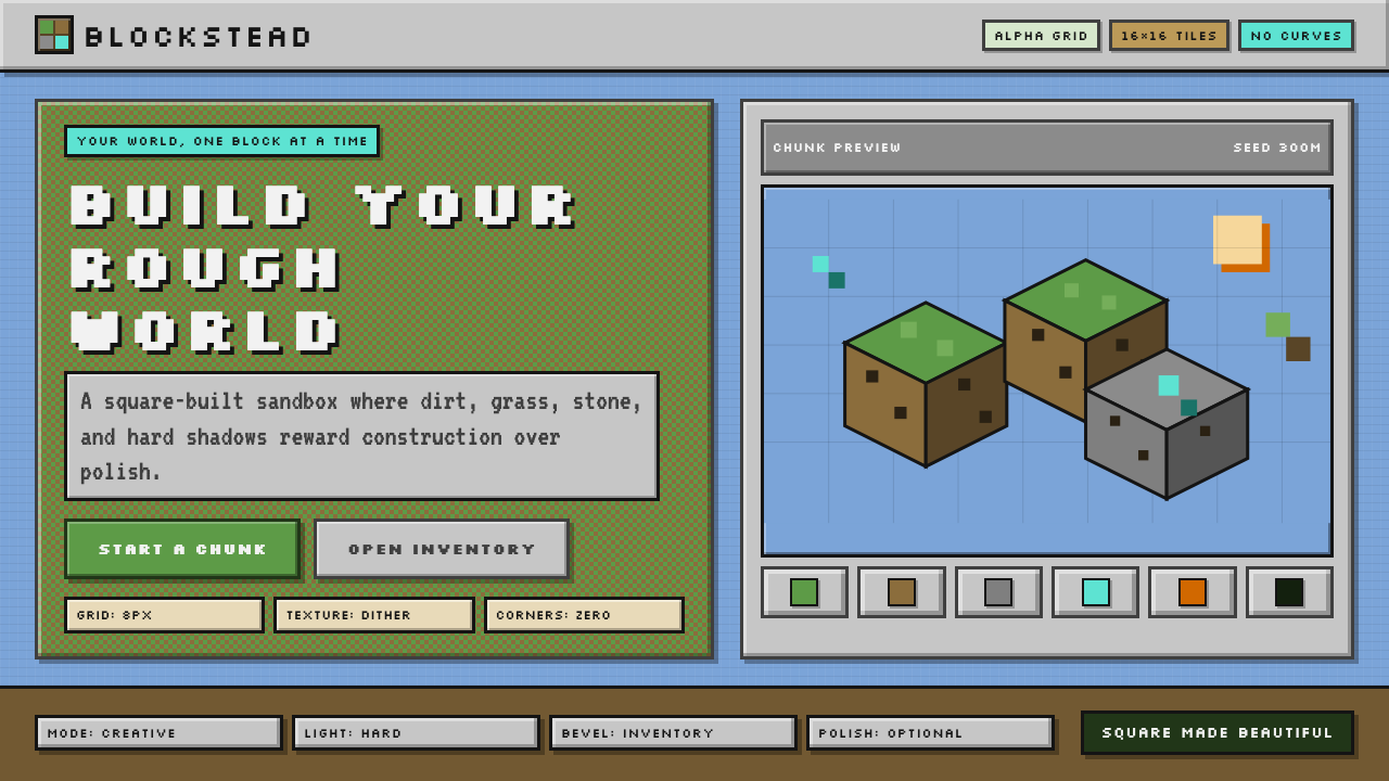 Minecraft VoxelUgly becomes buildable. Grass green, dirt brown, hard bevels, and 16×16 grids…
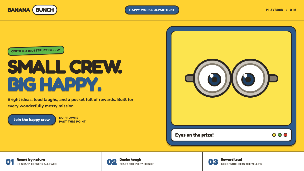 Minions (Despicable Me, 2010)Indestructibly cheerful. Minion yellow, denim blue, and chunky goggle geometr…
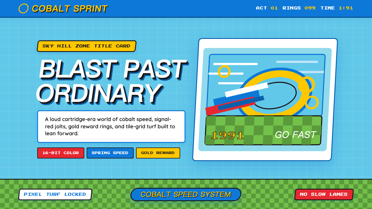 Sonic the Hedgehog (1991)Velocity has teeth. Sky-cyan, cobalt slant type, gold rings, checkerboard tur…
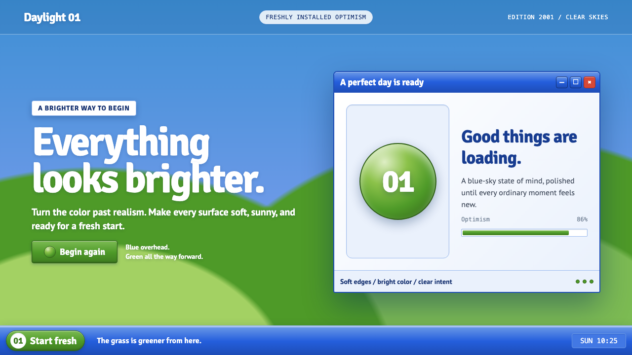 Windows XP Bliss (2001)Fresh-install optimism. Sky blue, hill green, and glossy gel chrome turn real…