What is Club Penguin?
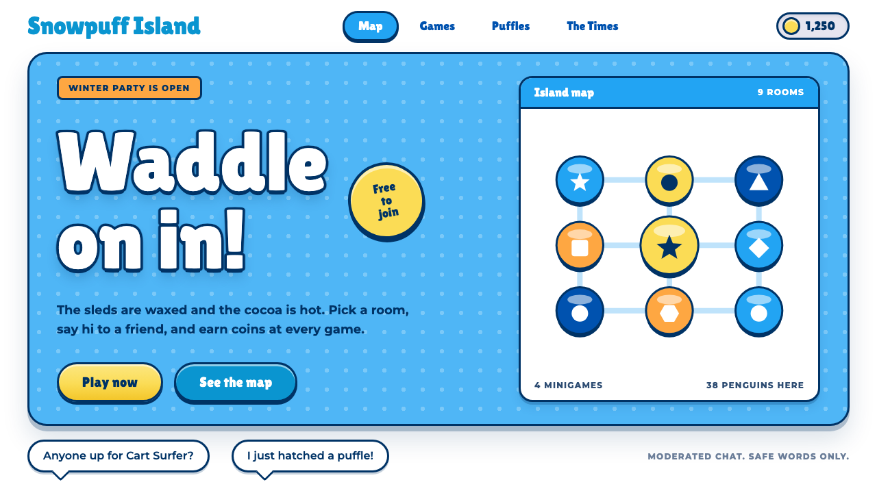
The Club Penguin style is a snow-white island that talks like a kid: sky-blue panels, thick navy outlines on everything and glossy yellow pill buttons.
Club Penguin in brief
Club Penguin was a Flash virtual world for children, opened in 2005 by a small studio called New Horizon Interactive in Kelowna, British Columbia. Players waddled around a snowy island as penguin avatars, chatting, playing mini-games and decorating their own igloos. The design style named after it captures the look of its website and interface: friendly, rounded, simple and unmistakably cartoon.
The page is white snow. Sky-blue panels hold the controls, and every frame, title and button wears a thick navy outline, as if each element had been traced with a marker. Titles are set in Lilita One, a stand-in for the game’s own Burbank Big face, filled in white and stroked in navy. Body copy and chat balloons use Montserrat, a clean and readable face. Calls to action are yellow pills with a glossy highlight along the top edge, and coins and badges appear in the orange of the penguins’ beaks.
Everything is round, and the writing is warm and plain. The style does not try to look sophisticated; it tries to look welcoming. It is one of the few design systems built deliberately to speak to children, and it does so with a clarity that adults often find refreshing, which is why it also suits nostalgic community sites.

Where does Club Penguin come from?
The origin of the style is Kelowna, British Columbia, where Club Penguin launched in 2005. The names associated with it in the source material are Lance Priebe, Lane Merrifield, Dave Krysko and Chris Hendricks. The game belongs to the era of Flash-era browser MMOs, when it was possible to build a rich, multi-user world that ran inside an ordinary web page without installing anything, and a small studio could reach a large audience.
Two other movements shaped the look. The first is the idea of the moderated virtual world for children, in which a safe, carefully managed space meant that the interface had to be extremely readable and non-threatening. Large buttons, clear labels, bright but gentle colours and plain language were requirements, not aesthetic choices. The second is vector cartoon animation: the characters and scenery were drawn as smooth shapes with bold outlines, which is exactly the visual language the design system takes into its panels and buttons.
The timeline is an important part of the story. After the 2005 launch the game was acquired by Disney in 2007, and its servers closed in 2017. The website look that this style captures belongs to roughly 2012 to 2017, the late years of the game. By then the interface had matured into a consistent system: white snow backgrounds, blue panels, outlined type and glossy buttons. That is the version of Club Penguin many former players remember best.
Because it was designed for children and delivered through Flash and the web, the system had to be explicit. State changes were obvious, hierarchy was loud, and nothing was hidden behind subtle effects. When those habits are brought into a modern design they produce interfaces that are easy to understand at a glance, and the outline-and-pill vocabulary reads immediately as friendly and playful.
What defines the Club Penguin look?
Snow-white ground
The page background is white, standing for the snow of the island. It is the one light-mode system among the most playful styles, and it gives every coloured element plenty of room. The white keeps the page feeling open and cheerful, and it makes the thick navy outlines read with maximum contrast. Because the ground is so plain, the whole look depends on the strength of the shapes placed upon it.
Sky-blue rounded panels
Controls, menus and information boxes sit on sky-blue panels with generous rounding. The blue ties the interface to the sky and water of the island and separates the interactive areas from the white snow. Panels are flat, not glassy, and they stack in simple layers. Nested panels are distinguished by lighter and darker steps of blue, all outlined in the same navy.
Thick navy outlines on everything
The defining feature is the heavy navy stroke around frames, titles, buttons and badges. It comes straight from vector cartoon animation, where every shape is bounded by a bold line. The outline unifies disparate elements, keeps them legible against any background, and gives the interface the feeling of a hand-inked picture book. Without it the style would be a generic blue-and-white theme.
Lilita One titles with a navy stroke
Headings are set in Lilita One, a chunky rounded display face chosen as a stand-in for the game’s Burbank Big. Text is filled white and stroked in navy so that it looks like lettering cut from a cartoon title card. The type is big, friendly and slightly wobbly in its energy. It should be used for titles, buttons and labels, not for long passages.
Montserrat for reading
Body copy, chat balloons and small interface text use Montserrat. It is a clean geometric sans that stays readable at small sizes and balances the exuberance of the display face. The pairing means the page can be silly in its headings and sensible in its reading text, a division that suits children and parents alike.
Glossy yellow pill buttons
Primary actions are fully rounded yellow pills with a glossy highlight across the upper edge and the same navy outline as everything else. They are the brightest elements on the page and the clearest invitation to click. The gloss is a small flourish borrowed from game buttons, and it is the one place where the style allows a hint of shine.
Orange coins and badges
Coins, badges and reward markers use the orange of the penguins’ beaks. Orange sits between the blue of the panels and the yellow of the buttons, and it is kept for things that are collected or earned. This gives the interface a small second language of reward, which reinforces the game-like feeling of the experience.

Who shaped Club Penguin?
Priebe is the first name listed for Club Penguin in the source material and is closely tied to the Kelowna studio that launched the game in 2005. The warm, plain voice of the interface reflects the early-founder goal of making a world that children could enter without any barrier.
Merrifield is another name tied to the studio’s founding years. His presence on the list is a reminder that Club Penguin was the work of a small team, which helps to explain the coherence of its visual system: a handful of people maintained a single consistent look.
Krysko is the third name associated with the game. Together with the others he represents the studio, New Horizon Interactive, whose browser-based world ran for years before the 2007 Disney acquisition and continued under it until the servers closed in 2017.
Hendricks is the fourth name listed. The group as a whole stands for the Flash-era browser MMO tradition and the idea of a moderated virtual world for children, which together explain why the interface is so explicit, safe and cheerful.
How do you use Club Penguin today?
For slides, the cover can be a white field with a sky-blue rounded panel in the middle, a white title in Lilita One stroked in navy, and a single yellow pill containing a short call to action or a date. Content slides should keep one panel per idea, each outlined in navy, with Montserrat text inside. Data slides can show numbers on blue panels, use orange for coins or counts, and keep charts simple with thick outlines on each bar or segment.
For web and product interfaces, the style fits children’s products, game event pages, school or family community sites and nostalgic fan projects. A landing page might open with a snowy hero, a sky-blue panel containing the headline, a yellow play button, and a row of outlined cards beneath. Forms should use large rounded inputs with navy borders and clear labels. Error and success messages can be spoken in a warm voice instead of technical language.
For editorial and marketing work, build with the energy of a storybook. Use big titles, short sentences and generous spacing between panels. Illustrations should be vector, bold-outlined and flatly coloured, in line with the cartoon heritage. Copy should address the reader directly and simply, the way the original game did.
The most common mistake is dropping the outline. Without the thick navy stroke the panels, titles and buttons lose the cartoon character and the style turns into a pale, rounded theme. The second mistake is making every element yellow. The yellow pill is for the main action; if everything is yellow, nothing invites the click.
Another mistake is using the heavy display face for long text. Lilita One in a paragraph is tiring to read, so it should be kept for titles, buttons and labels, with Montserrat taking the reading load. Finally, avoid adding sophisticated effects such as blur, glass or subtle gradients. The charm of the style is that it is plain, round and unembarrassed about being friendly.

Club Penguin — FAQ
What is the Club Penguin design style?
It is a light, playful interface style taken from the Club Penguin virtual world. White snow forms the page, sky-blue rounded panels hold the controls, every element has a thick navy outline, titles are in outlined Lilita One, and primary buttons are glossy yellow pills.
When and where was Club Penguin made?
It launched in 2005 in Kelowna, British Columbia, from the studio New Horizon Interactive. Disney acquired it in 2007, and the servers closed in 2017. The website look captured here belongs roughly to 2012 through 2017.
Which fonts does the style use?
Titles use Lilita One, a stand-in for the game’s Burbank Big, with white fill and a navy stroke. Body copy and chat balloons use Montserrat.
What projects suit this style?
Children’s products, game event pages, community sites with a nostalgic feel, and any project that wants to sound welcoming and simple. It is less suitable for serious financial or enterprise interfaces.
How do I keep it from looking childish in a bad way?
Keep the layout clean and the hierarchy clear, use yellow only for main actions, reserve the display face for short text, and stay with plain, warm copy. The style works when it is simple and consistent, not when it is overloaded with decoration.
Related design styles
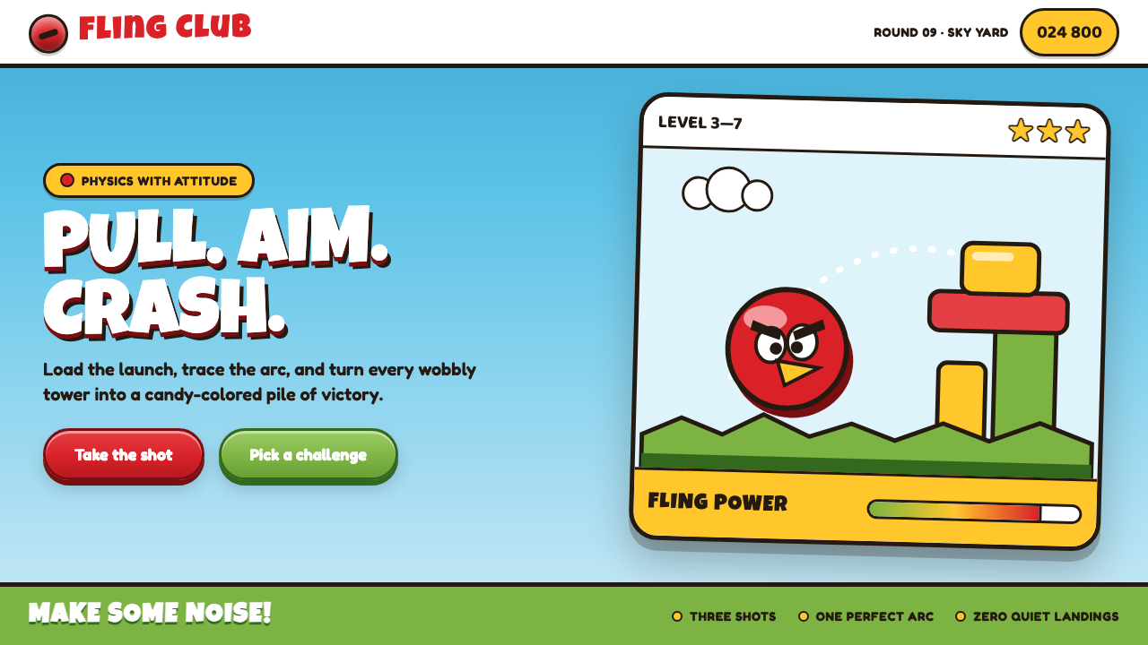 Angry Birds (2009)Adorable aggression takes flight. Candy primaries, chunky outlines, and a dot…
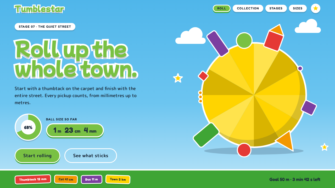 Katamari DamacySmall to huge in one roll. Cyan sky, green lettering ringed in white, one fac…
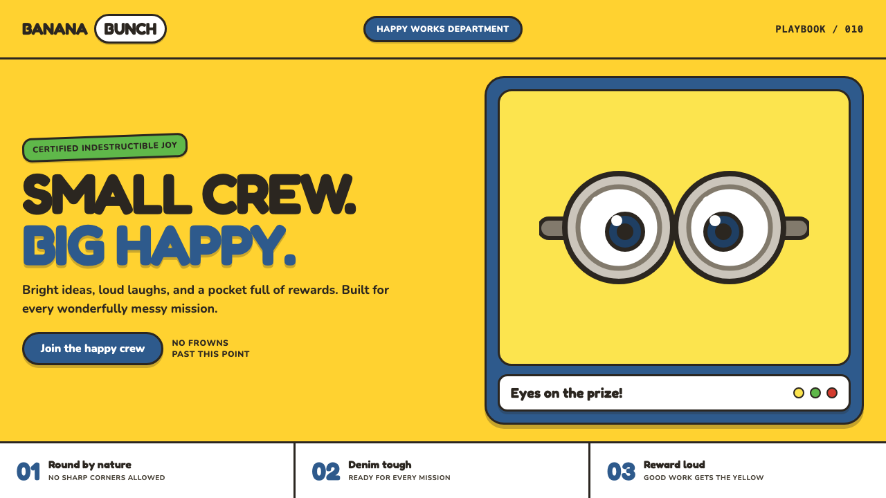 Minions (Despicable Me, 2010)Indestructibly cheerful. Minion yellow, denim blue, and chunky goggle geometr…
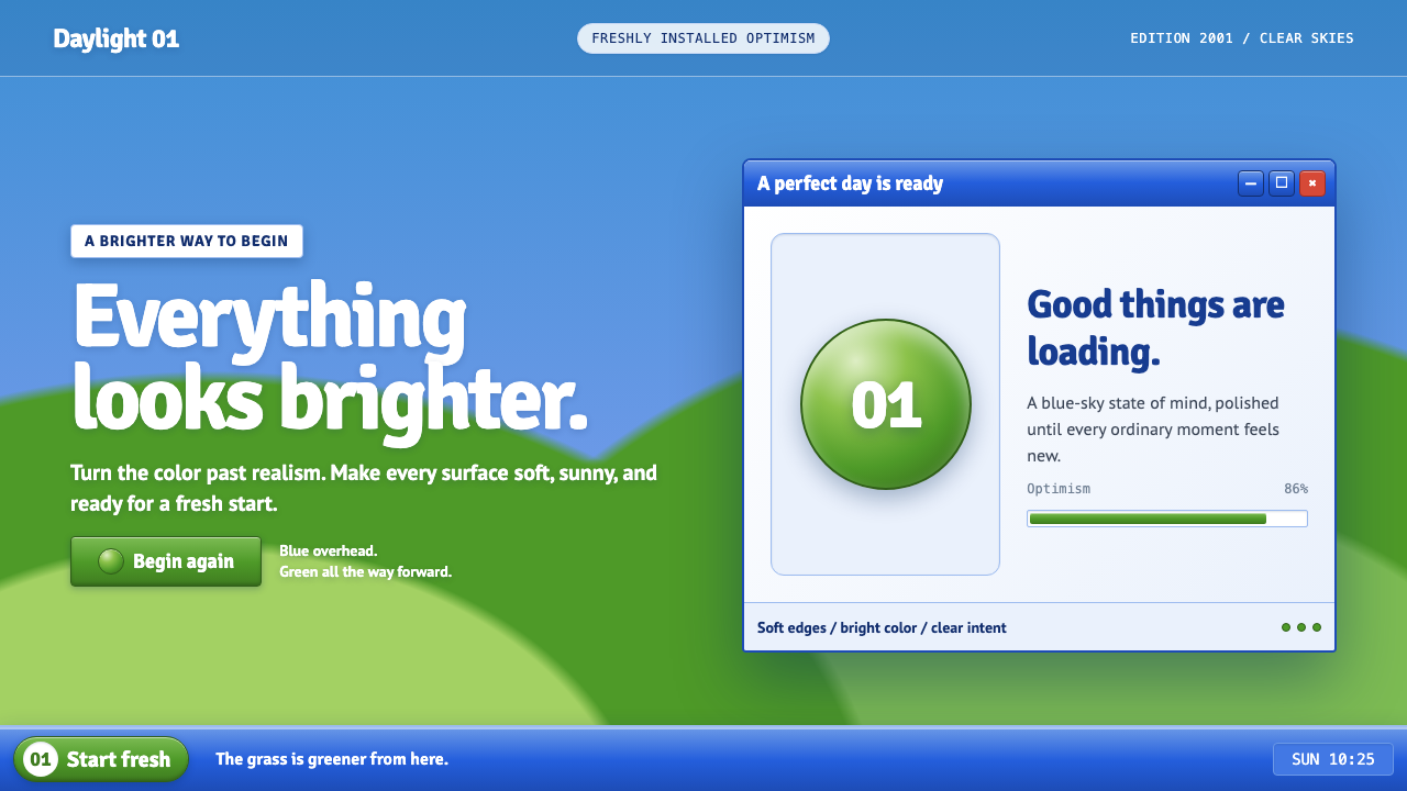 Windows XP Bliss (2001)Fresh-install optimism. Sky blue, hill green, and glossy gel chrome turn real…
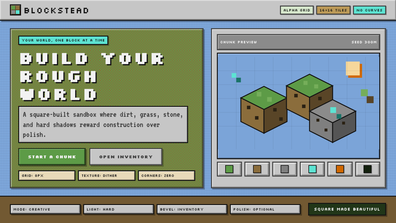 Minecraft VoxelUgly becomes buildable. Grass green, dirt brown, hard bevels, and 16×16 grids…
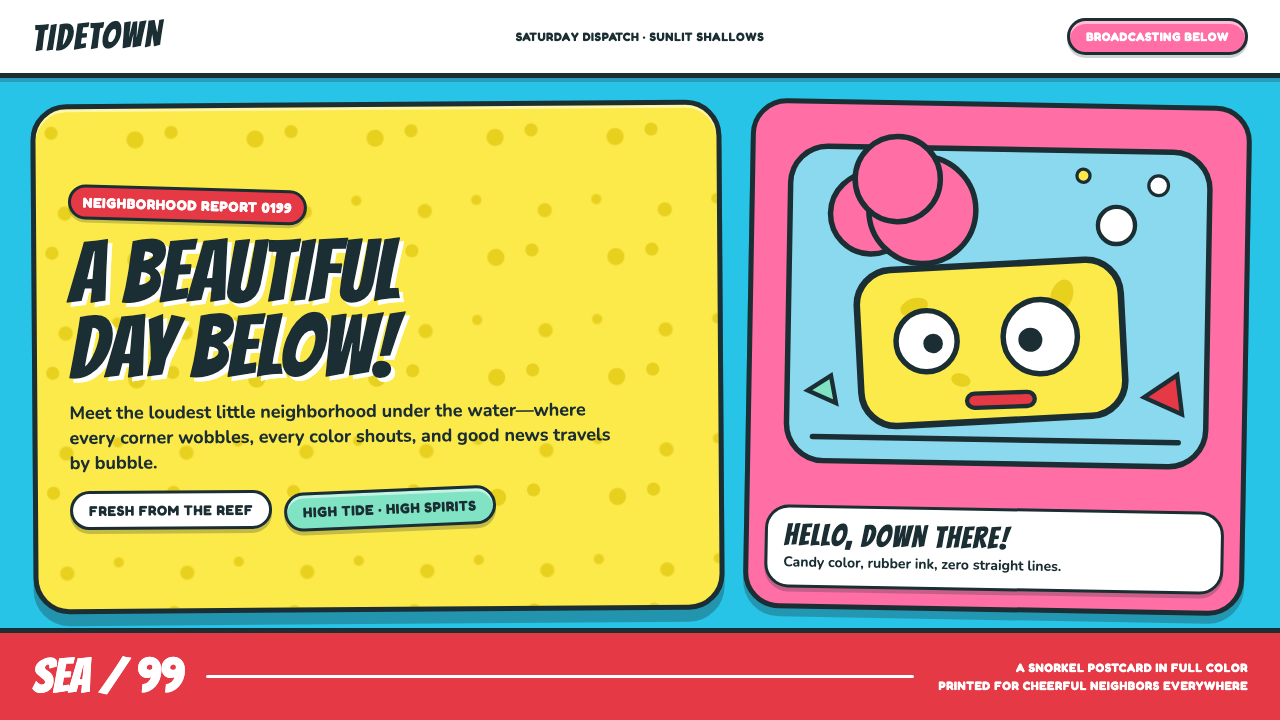 SpongeBob Bikini Bottom (1999)Undersea suburbia shouts with joy. Banana yellow and cyan bounce inside fat,…