What is Hello Kitty (Sanrio 1974)?
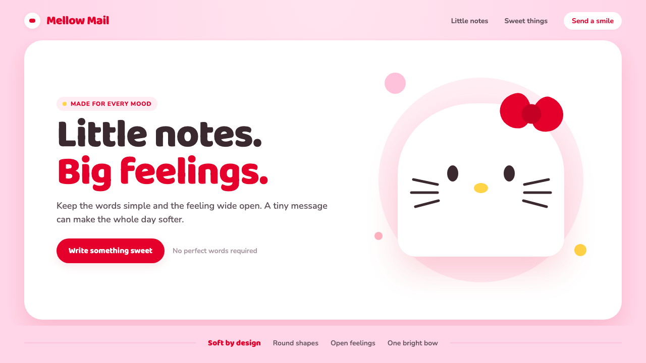
Hello Kitty proves that a face can become universal when it leaves just enough unsaid: round white form, small features, and one red bow carrying an entire emotional world.
Hello Kitty (Sanrio 1974) in brief
Hello Kitty is a character-design system built through deliberate reduction. The familiar face is composed from a rounded white cat head, two dot eyes, a yellow nose, six whisker lines, and a single red bow. Most importantly, it has no mouth. That omission is not an unfinished detail but the system’s emotional engine: without a fixed expression, the character can seem happy, shy, calm, lonely, excited, or comforting according to the viewer’s own mood.
Born on a Sanrio coin purse in 1974, Hello Kitty developed into a global visual grammar for kawaii. Its strength does not come from narrative complexity or visual realism. It comes from consistency: soft shapes, approachable scale, a limited set of instantly recognizable signals, and an emotional tone that feels open rather than demanding. The character makes friendliness legible before a word has been read.
As an aesthetic, Hello Kitty is minimalism disguised as cuteness. Its forms are rounded, padded, and gently simplified; sharp corners, aggressive contrast, and visual noise have little role. Bubblegum pink grounds, chalk-white surfaces, a warm yellow accent, and the red bow create a small but expressive universe. The visual language feels cheerful because it is controlled: every soft contour reassures, every empty area gives the face room to breathe, and the bow provides a single clear point of emphasis.
Where does Hello Kitty (Sanrio 1974) come from?
Hello Kitty emerged in Tokyo, Japan, in 1974 through Sanrio, at the meeting point of kawaii culture, Shōwa-era stationery graphics, and character-centered everyday goods. Her first appearance on a coin purse matters because the system was designed for intimate, portable contact. It was not introduced as distant art or grand branding. It entered ordinary life through an object held in the hand, making small moments of ownership, gifting, and routine feel more affectionate.
The original visual proposition was unusually economical. A cat head could have been rendered with fur, pupils, a smiling mouth, clothing, or scene-setting accessories. Instead, the design retained only the features required for immediate recognition. The face is almost diagrammatic, but it does not read as cold. Its roundness and small marks create softness, while the mouthless expression leaves the character emotionally available. This is subtraction used not to create austerity, but to create room for attachment.
Yuko Shimizu is among the key figures associated with the character’s origin, while Sanrio founder Shintaro Tsuji belongs to the wider institutional context that carried the character into public life. Their presence points to an important fact about Hello Kitty: it is both a specific drawing and a durable system. The character can appear on different objects, in changing compositions, and across many everyday situations without losing its essential identity because the core signals are so stable.
The peak codification of the system is associated with Yuko Yamaguchi’s era from the 1980s through the 2000s. During this long period, Hello Kitty’s visual language became especially legible as a repeatable design vocabulary: rounded white forms, soft pink atmospheres, carefully controlled accents, and a face whose incompleteness invites emotional participation. The result is not merely a recognizable mascot. It is a sustained method for making products, images, and messages feel gentle, collectible, and personally approachable.
What defines the Hello Kitty (Sanrio 1974) look?
Subtraction
The defining principle is removal. Hello Kitty’s face does not explain itself with detailed anatomy, changing expressions, or decorative texture. It uses only a few marks to establish identity, then stops. The absent mouth is the most consequential omission: it prevents the design from assigning a single emotion and lets the viewer supply one. In practical work, this means resisting the urge to add personality through excessive illustration. Let a small number of stable signals do the emotional work.
Rounded Form
The system prefers full circles, softened ovals, and pill-like silhouettes. Curves are not merely decorative; they set the emotional temperature. Rounded forms lower visual tension and make interfaces, illustrations, and packaging feel safe to approach. Corners should appear cushioned rather than engineered, and small elements should feel like friendly marks rather than controls demanding attention. The result is softness with a clear silhouette, not shapelessness.
Open Expression
Hello Kitty demonstrates how an expression can be emotionally rich precisely because it is incomplete. Dot eyes, a small nose, and whiskers establish a face without dictating its mood. This produces a reciprocal relationship between image and viewer: the image offers calm structure, while the viewer contributes feeling. When adapting the style, faces and icons should avoid overacting. A neutral, legible arrangement can carry more emotional range than an exaggerated smile or a highly specific reaction.
Soft Palette Logic
Bubblegum pink creates the surrounding atmosphere, chalk white gives the main forms clarity, yellow supplies a small warm feature, and red is concentrated in the bow. The important lesson is hierarchy, not copying every color into every composition. Pink should feel like a welcoming field rather than a visual assault; white should create calm separation; red works because it is rare enough to become memorable. A single confident accent has more character than many competing bright notes.
Bow as Emphasis
The red bow is the system’s clearest example of concentrated emphasis. It is small relative to the face but carries disproportionate recognition value. It introduces asymmetry into an otherwise balanced head, gives the composition direction, and supplies a visual note that can travel from character art to buttons, labels, tags, and campaign moments. Its lesson is compositional: choose one feature to receive the strongest contrast, then protect that feature from competing decoration.
Gentle Repetition
Hello Kitty works through repeated motifs rather than visual surprise. The same face, bow, rounded framing, and soft atmosphere can recur across objects without feeling empty because each repetition confirms a familiar emotional promise. Repetition should therefore be calm and intentional: repeat silhouettes, icon language, and spacing rhythm, while allowing content or context to change. Consistency is what makes the character feel collectible rather than repetitive.
Who shaped Hello Kitty (Sanrio 1974)?
Yuko Shimizu is a key figure associated with Hello Kitty’s origin. Her importance lies in the foundational act of reducing a character to a highly legible set of marks: a rounded white head, minimal facial features, whiskers, and a bow. The design demonstrates that a character does not need descriptive complexity to become emotionally memorable. Its economy gave Hello Kitty a stable identity capable of moving across small goods, graphic compositions, and changing cultural contexts.
Shintaro Tsuji is a key figure in the Sanrio context from which Hello Kitty entered everyday culture. The character’s early appearance on a coin purse captures a central idea of that context: design can create intimacy through ordinary objects. Hello Kitty’s world did not depend on a single monumental image. It grew through recurring encounters with familiar forms, enabling a small character system to become a broad and durable cultural language.
Yuko Yamaguchi is associated with the peak codification of Hello Kitty’s visual language from the 1980s through the 2000s. This era matters because it clarified how the character could remain recognizable while living in many settings and formats. The rounded forms, soft color atmosphere, controlled red accent, and emotionally open face became a coherent system rather than a one-off illustration. That system remains instructive for designers building identities intended to endure through repetition.
How do you use Hello Kitty (Sanrio 1974) today?
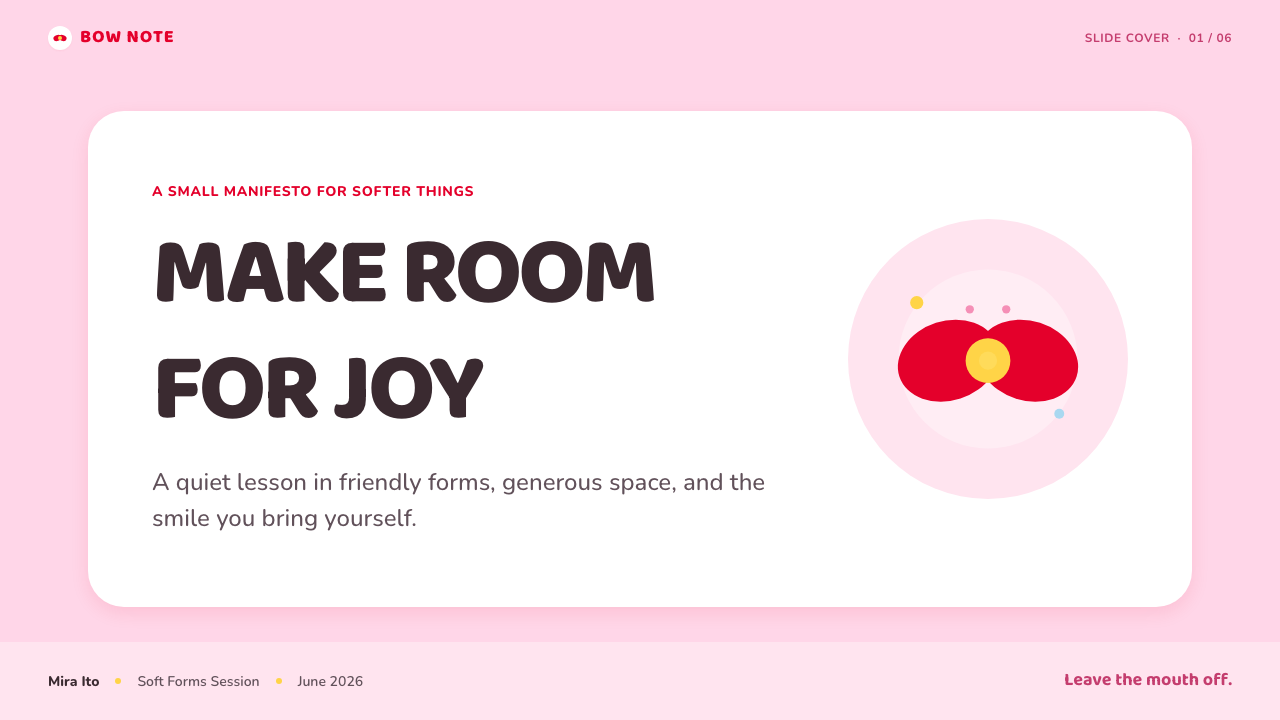
For presentation covers, use Hello Kitty logic as an exercise in emotional clarity. Place one large rounded white form against a soft pink field, then give the title ample quiet space instead of surrounding it with decorative fragments. A small red bow-like accent can guide the eye toward the title or key message. The cover should feel immediately welcoming, but not crowded; a limited feature set is what makes the mood convincing.
On content and data slides, translate character cues into a gentle information system rather than inserting the character everywhere. Use rounded containers for groups of ideas, dot-like markers for short lists, and white fields to separate dense information from the background. Charts can use a soft base palette with a single stronger accent reserved for the most important comparison. The goal is not childishness; it is reducing intimidation and making information easier to enter.
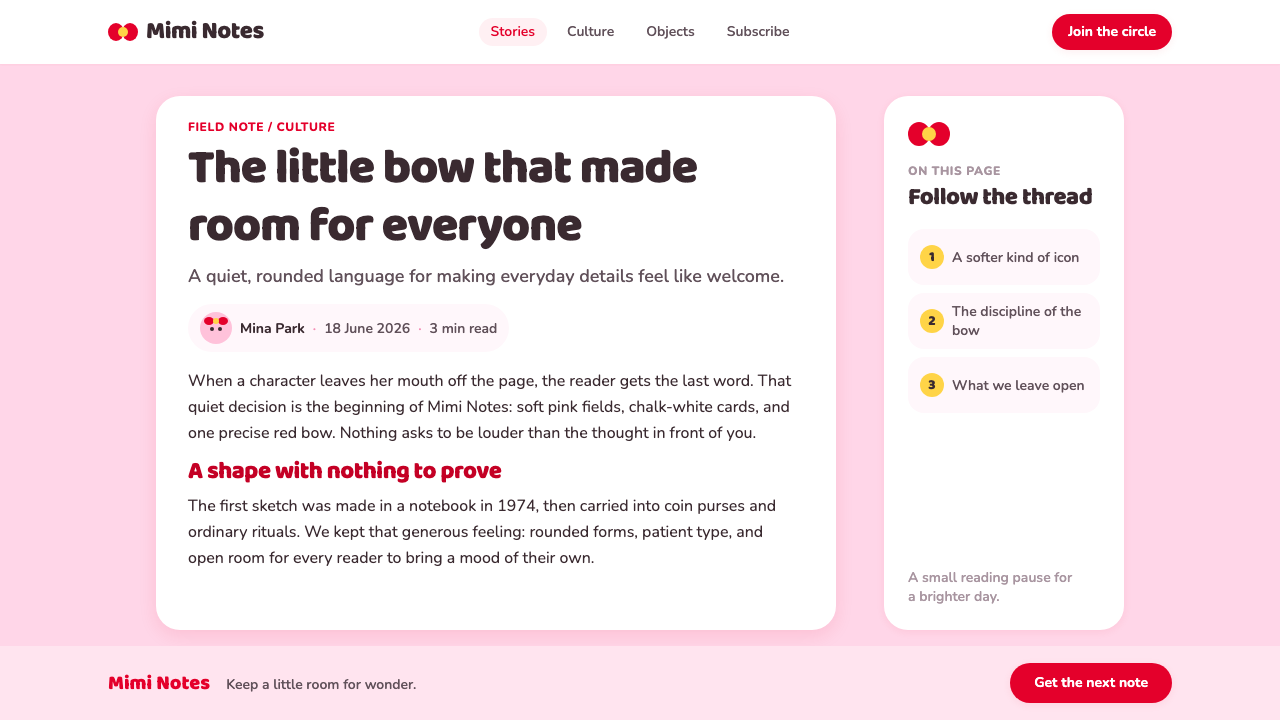
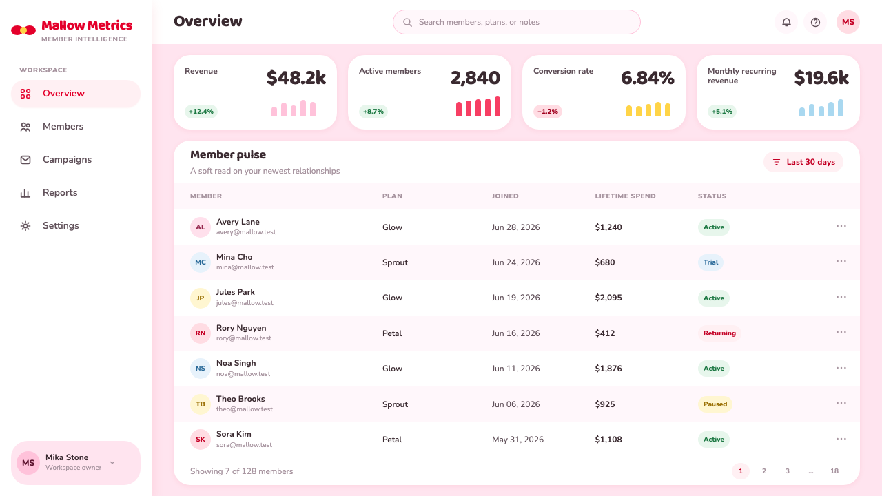
For web interfaces, the approach suits member areas, lightweight dashboards, account pages, gifting flows, and pricing pages that benefit from reassurance. Cards, inputs, notices, and buttons should share a rounded silhouette and generous breathing room. Use pink as an environmental cue, not as a substitute for hierarchy; reserve the strongest accent for a selected plan, primary action, or important status. Icons should be simple and friendly, with enough contrast to remain understandable without becoming sharp or technical.
For editorial and marketing work, Hello Kitty’s visual language supports messaging about care, friendship, collectibility, and everyday delight. Build layouts around a few large, soft shapes and one memorable focal detail. A white product card or quotation panel can feel especially inviting when framed by a calm pink environment and a restrained red accent. Repeated face-like dots, bows, or rounded frames can establish rhythm, but they should never compete with the central message.
The common mistake is to confuse kawaii with indiscriminate decoration. Adding many pastel colors, oversized reactions, tiny stickers, sparkles, and competing mascots destroys the discipline that makes Hello Kitty work. Another mistake is forcing a smiling mouth onto every face, which removes the character’s emotional openness. Keep the palette organized, choose one focal accent, preserve generous empty space, and allow the most recognizable elements to remain simple.
Hello Kitty (Sanrio 1974) — FAQ
Why is Hello Kitty designed without a mouth?
The mouth is deliberately omitted so the face does not prescribe one fixed emotion. The eyes, nose, whiskers, and bow establish identity, while the missing expression leaves room for the viewer’s own feeling. This makes the character unusually adaptable: the same face can accompany celebration, comfort, quiet routine, or nostalgia without needing to be redrawn into a different mood. The design’s emotional range comes from restraint, not from adding more expression.
Is Hello Kitty style just pink and pastel decoration?
No. Pink is an important atmospheric cue, but the deeper system is structural: subtraction, rounded silhouettes, readable facial marks, controlled emphasis, and emotional openness. A composition overloaded with soft colors and cute ornaments can miss the style entirely if it has no hierarchy or leaves no room to breathe. The recognizable feeling comes from using very few signals with confidence, especially the contrast between calm white form and a single red bow-like accent.
How can a brand borrow the approach without copying the character?
Borrow the principles rather than the recognizable face. Build a small set of rounded forms, choose a restrained emotional palette, identify one recurring accent, and simplify icons until their purpose is immediately clear. If a mascot is needed, give it its own silhouette and feature arrangement rather than reproducing a white cat head, whiskers, or red bow. The useful lesson is not a particular costume of cuteness; it is the discipline of making a small visual vocabulary feel emotionally generous.
Where does this style work best in digital products?
It works best where a product needs to reduce apprehension and make routine actions feel more personal: onboarding, account areas, loyalty spaces, gifting, lightweight planning tools, and friendly commerce experiences. It can also soften dashboards when the information is simple and clearly grouped. It is less suitable when a product must communicate urgency, severe risk, institutional authority, or highly dense technical analysis. The style should support the product’s emotional promise, not disguise a need for clearer information architecture.
Related design styles
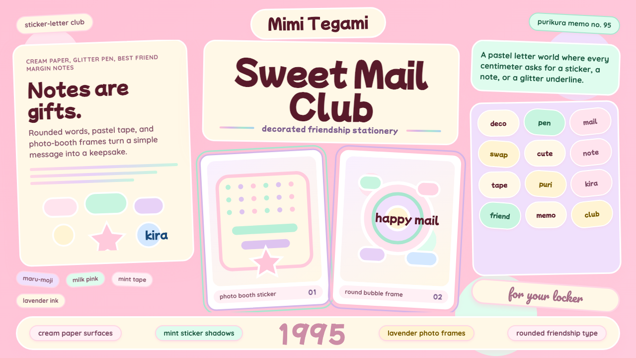 Kawaii Japanese Letter PurikuraCuteness fills every inch. Pink cream paper, mint stickers, lavender frames.
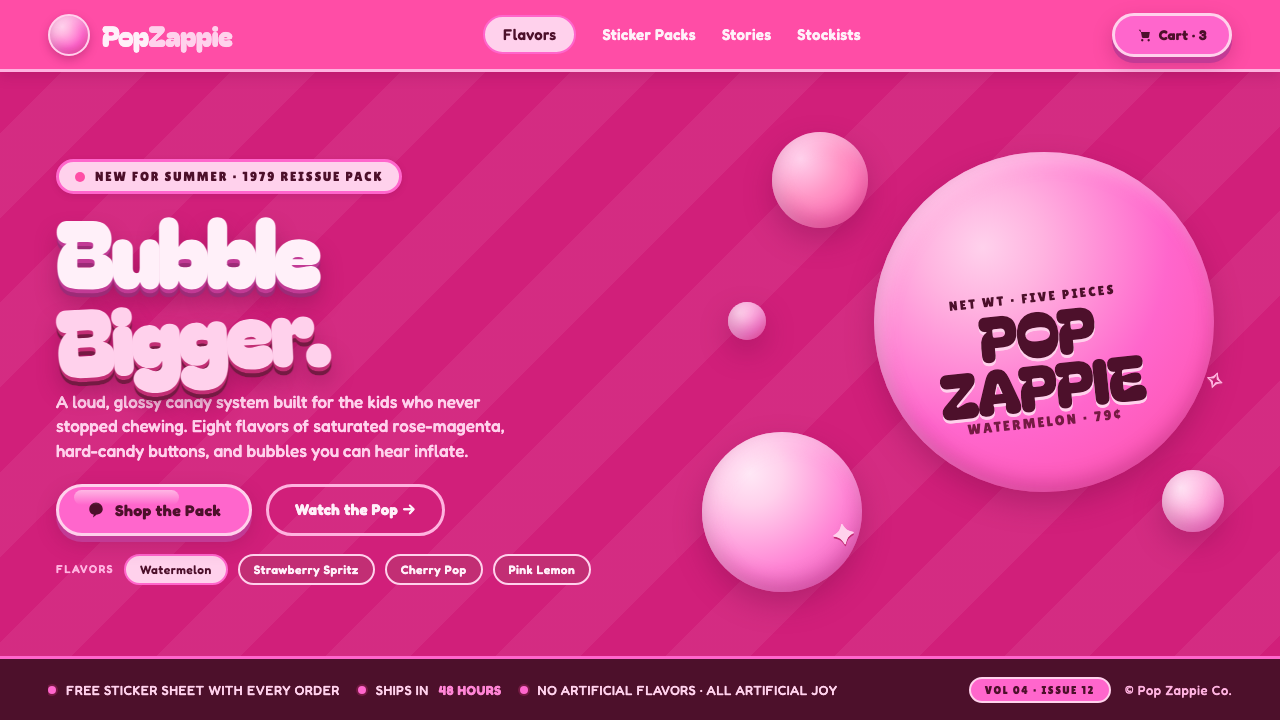 Watermelon Bubblegum Pink80s candy maximalism. Neon pink on rose-magenta, sugar-shine highlights, infl…
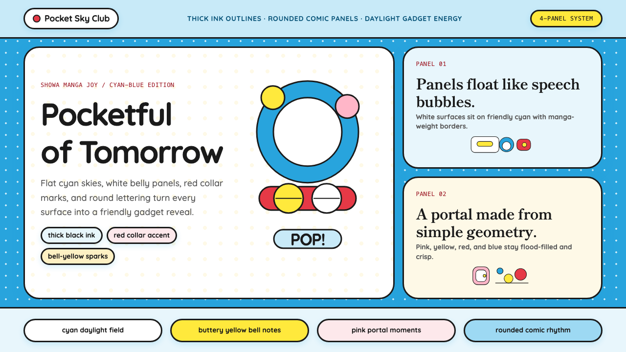 DoraemonChildhood joy, inked bold. Cyan fields, white panels, red collars, and rounde…
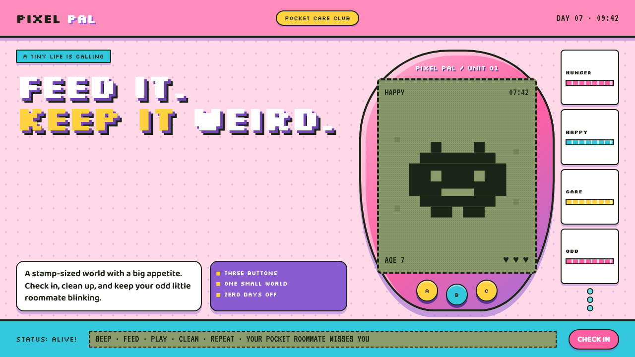 Tamagotchi (1996)Care gets candy-coated. Bubblegum plastic frames a crunchy pea-green pixel wo…
 Target — Bullseye RedCheap-chic feels warm. Red bullseyes, pill CTAs, and white space make value l…
 Angry Birds (2009)Adorable aggression takes flight. Candy primaries, chunky outlines, and a dot…