What is Tamagotchi (1996)?
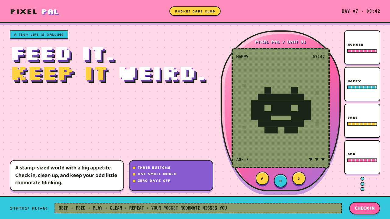
Tamagotchi turns care into candy-coated ritual: a fragile pixel creature blinking inside a glossy toy egg.
Tamagotchi (1996) in brief
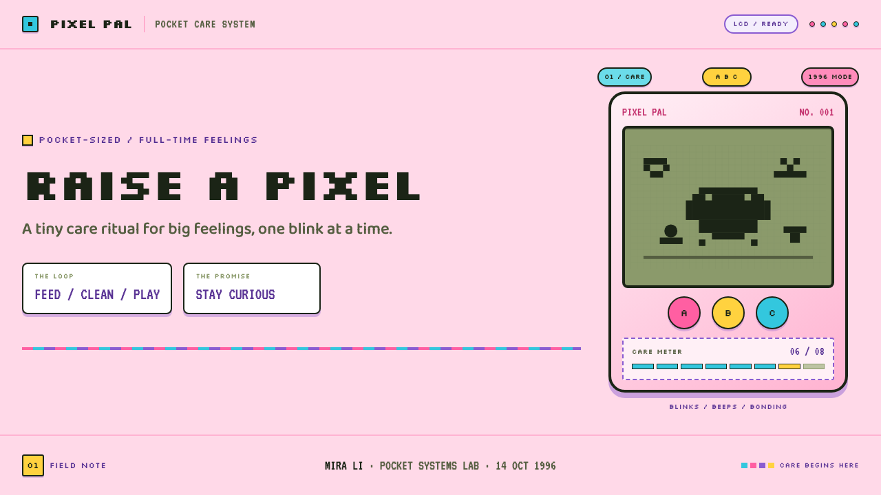
Tamagotchi is the visual world of the 1996 keychain egg: a low-resolution monochrome LCD pet enclosed in a glossy, candy-colored plastic shell. Its defining tension is tactile and immediate. Inside sits a crunchy pea-green dot-matrix field where creatures, food, mess, and alerts appear as blocky marks; outside is a rounded molded object made to be held, clipped on, and noticed from across a room.
The style makes technical limitation emotionally expressive. A tiny screen does not merely display a pet; it creates distance, urgency, and imagination. Every pixel gesture has to carry a full state of care: hunger, play, cleanup, sleep, or decline. The creature is ugly-cute rather than polished, and the interface is deliberately blunt. This is not a simulated natural world but a small machine asking for attention.
Visually, Tamagotchi belongs to the meeting point of virtual-pet culture, Y2K kawaii, dot-matrix game art, and keychain-toy culture. Saturated translucent plastic, chunky symbols, rubbery controls, hard molded seams, and simple screen icons all work together. The result is playful but insistent: sweetness surrounds an interface built around responsibility.
Where does Tamagotchi (1996) come from?
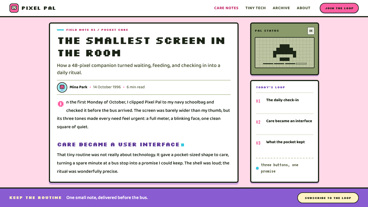
Tamagotchi emerged from Tokyo through Bandai, launching in Japan in November 1996. Its initial form was unusually compact and complete: not a game that required a television or a larger machine, but a self-contained keychain object carrying its own creature, display, controls, and social presence. That portability is central to the aesthetic. The egg is both device and accessory.
The supplied history places its strongest craze in 1997 and 1998, when the object moved from a Japanese launch into global circulation. Its visual identity was suited to that movement because it communicated without much explanation. A person could recognize the shell, the blinking screen, and the care relationship before understanding any detailed instructions. The object made a private routine visible in public.
Aki Maita and Akihiro Yokoi are identified as key figures alongside Bandai. Their association matters to the style because Tamagotchi cannot be separated into hardware, character, and interaction design. The shell’s cheerful material language softens the severity of the pet’s needs, while the pixel display gives the toy its strange emotional gravity.
The era also explains the mixture of shiny plastic and compressed digital imagery. Tamagotchi arrived before screens became large, continuous, and visually smooth. Rather than concealing that constraint, its design made the limitation part of the appeal. The dot matrix feels crunchy and explicit; the translucent shell turns a small electronic object into something collectible, wearable, and socially legible.
What defines the Tamagotchi (1996) look?
Candy-Shell Plastic
The outer object should feel molded, glossy, and slightly toy-like rather than refined like consumer electronics. Translucent pink, purple, and cyan suggest a claw-machine shelf and make the shell feel like packaging around a tiny electronic life. Curves are friendly, compact, and deliberately substantial in the hand.
Pea-Green Pixel World
The screen is a separate visual climate: muted pea-green ground, dark dot-matrix marks, and hard-edged characters assembled from visible blocks. It should look constrained rather than merely retro. Empty screen space matters, because a lone creature or a tiny alert becomes more dramatic when the display offers little else.
Ugly-Cute Characters
Characters are compact pixel blobs with expressive silhouettes, not carefully modeled mascots. Their charm comes from awkwardness: a few marks can suggest need, delight, sickness, or mischief. Keep facial and bodily detail sparse so that animation-like changes in posture or icon state carry the emotion.
Chunky Interaction
Controls should read as physical, obvious, and pleasantly oversized in spirit. Three fat rubber buttons are part of the original object’s grammar, but the broader lesson is tactile clarity: actions look pressable, choices look discrete, and feedback feels immediate. Avoid invisible gestures or delicate interface ornament.
Hard Molded Depth
Depth comes from molded seams, raised button wells, and firm drop-shadows that resemble plastic parts fitting together. The shadow should feel manufactured, not atmospheric. It is a contour that separates layers and strengthens the toy’s objecthood, never a soft cinematic effect trying to make the scene realistic.
Care as Alert
Tamagotchi imagery is organized around maintenance: food, cleanup, attention, and the possibility of failure. Icons should behave like urgent little signs rather than decorative stickers. The visual system becomes emotionally effective when sweetness and consequence remain together: candy color outside, vulnerable pixel life inside.
Who shaped Tamagotchi (1996)?
Aki Maita is named in the supplied material as a key figure in the Tamagotchi story. The association underscores that the product’s impact came from joining a character to a compact ritual of checking, feeding, and caring, rather than treating the screen as a passive display.
Akihiro Yokoi is also identified as a key figure. Within this design history, the name belongs to an object that fused virtual-pet behavior with the visual immediacy of a keychain toy, making emotional maintenance readable through a tiny pixel interface.
Bandai is identified as the Tokyo-based company behind the Japan launch in November 1996. Its role anchors Tamagotchi in toy culture as much as game culture: the glossy shell, rubber buttons, and collectible presence are inseparable from the pixel pet inside.
How do you use Tamagotchi (1996) today?
Tamagotchi is most convincing when a design needs playful urgency rather than neutral nostalgia. Start with the contrast between a soft, glossy shell language and a severe pixel information layer. Let the friendly material cues invite attention, then use blunt icons and compact status changes to make the user feel responsible for what is happening.
For presentation slides, use the style differently across cover, content, and data pages. A cover can feature one oversized egg-like form, a tiny pixel companion, and an exuberant title that feels packaged rather than corporate. Content pages work best as screen-and-shell compositions, with short blocks of copy framed by icon-like controls. Data pages should simplify charts into clear pixel marks, feeding meters, care states, or collectible status panels instead of adding decorative visual noise.
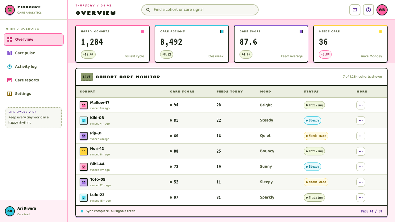
For web interfaces, the style suits dashboards, progress trackers, lightweight community spaces, and pricing pages with a playful collectible premise. Treat cards as toy casings and status areas as LCD windows. Navigation should use recognizable symbols and short labels, while alerts should feel like tiny pet demands. Preserve practical readability: the pixel language can shape hierarchy, but important information must not become a game of decoding.
In editorial and marketing work, Tamagotchi works well for campaigns about habits, care, reminders, collecting, companionship, or small everyday rituals. Use a bright shell-like frame around a restrained pixel vignette, then alternate it with clear explanatory copy. The style is especially effective when the message acknowledges its own artificiality: a little character can make an abstract service feel needy, responsive, and memorable without pretending to be human.
The common mistake is reducing the style to random pastel plastic and generic retro pixels. That loses the central tension between cheerful packaging and consequence-driven care. Avoid smoothing every edge, filling every gap with stickers, or turning the pet into a polished cartoon. A good Tamagotchi-inspired design keeps the screen sparse, the symbols legible, and the emotional contract unmistakable: someone has to look after this small thing.
Tamagotchi (1996) — FAQ
Is Tamagotchi style just a form of pixel art?
No. Pixel art is only the screen layer. Tamagotchi style depends equally on the relationship between the limited LCD image and its glossy toy container. Remove the shell, buttons, keychain-object feeling, and care loop, and the result may be pixel art but no longer carries the same aesthetic or emotional logic.
Can this style work without a literal pet character?
Yes, provided the design preserves a relationship of attention and response. A plant, a daily task, a progress marker, or a small service companion can take the pet’s place. What matters is that the pixel entity appears to have needs or states that the user can notice and influence.
How should a modern interface use the low-resolution look without harming usability?
Use pixel forms for identity, status illustration, and compact emotional feedback, not as an excuse to obscure essential reading. Keep labels direct, preserve clear grouping, and let the toy-shell treatment frame information rather than compete with it. The limitation should feel intentional and expressive, never inconvenient.
What separates Tamagotchi-inspired work from generic Y2K kawaii?
Generic Y2K kawaii can be bright, plastic, and cute without asking anything of the viewer. Tamagotchi adds a disciplined miniature system: a visible electronic window, concise care icons, a character with changing states, and a physical object language. Its sweetness is inseparable from maintenance and possible loss.
Related design styles
 Kawaii Japanese Letter PurikuraCuteness fills every inch. Pink cream paper, mint stickers, lavender frames.
 iMac G3 Bondi Blue (1998)Transparency feels friendly. Bondi blue, white glass, and pill curves set the…
 MTV Y2K (2000s)Maximum-volume Y2K. Hot pink chrome, cyan scanlines, and lime hits burn over…
 Nintendo GameCube (2001)Toy-tech refuses restraint. Indigo plastic, glossy cubes, and four-color butt…
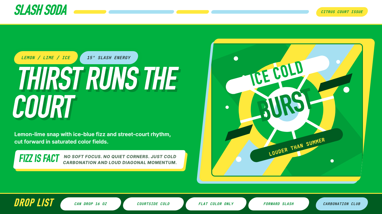 Sprite — Obey Your ThirstCitrus hits like asphalt heat. Saturated green, lemon yellow, and 15° slashes…
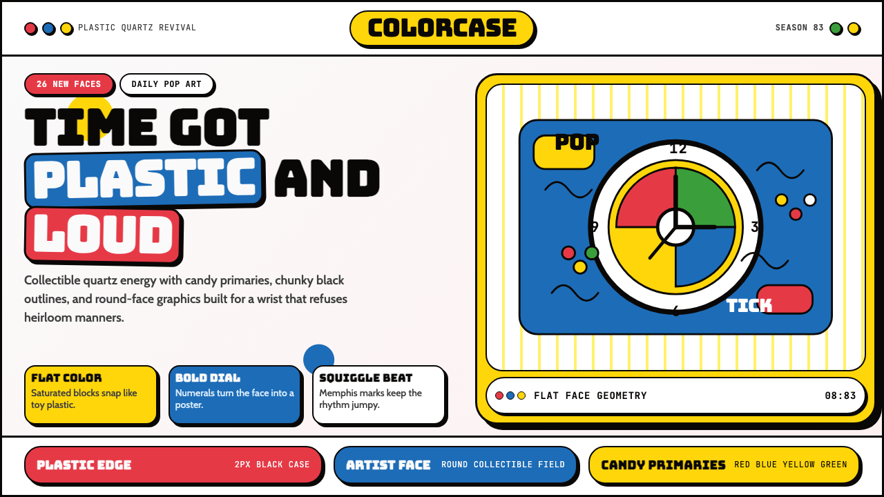 Swatch Watch (1983)Pop plastic optimism. Bungee type, candy primaries, round dials and squiggles…