What is VW Bus Flower-Power (1964)?
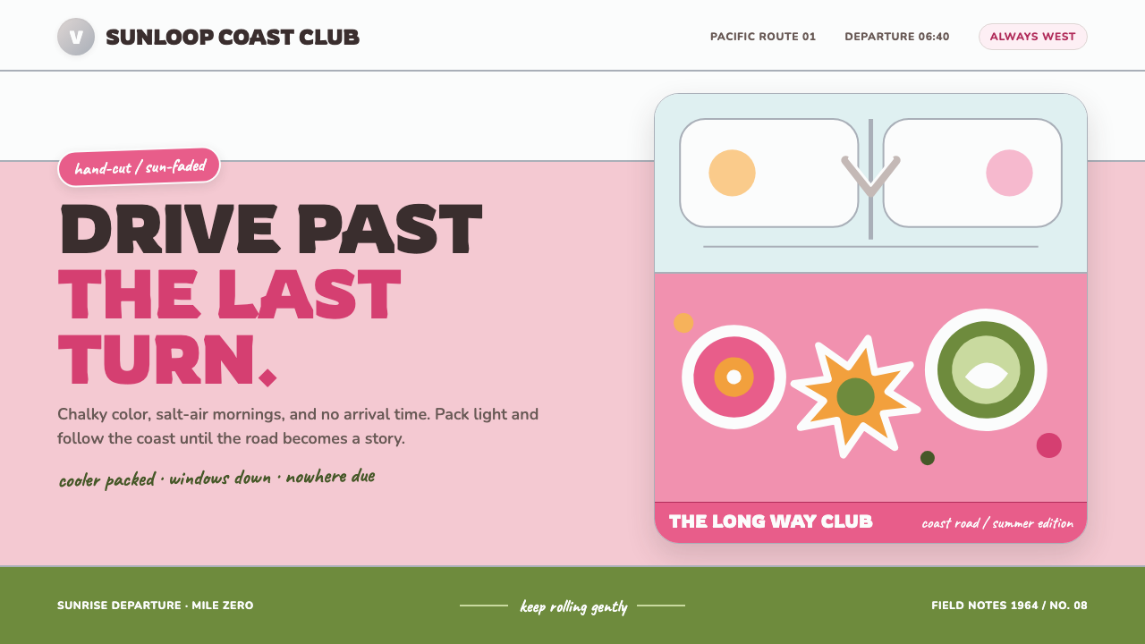
VW Bus Flower-Power turned a practical split-window van into a rolling promise of freedom — chalky pastels, chrome bands, rounded steel, and hand-placed flowers made for roads with no fixed destination.
VW Bus Flower-Power (1964) in brief
VW Bus Flower-Power is the visual language of the 1964 Volkswagen Type 2 Splitty as it was absorbed into 1960s counterculture. Its foundation is not speed, luxury, or mechanical aggression, but optimism in motion: a rounded utility vehicle softened by sun-faded pastel paint, bright chrome details, and improvised floral graphics. The result feels practical enough to carry a cooler, blankets, and camping gear, yet expressive enough to become a moving scrapbook.
The style is built from a few instantly legible ideas. A white belt crosses a pastel body panel. Rounded lettering follows the curve of the vehicle or sits comfortably inside a horizontal band. Chrome appears as a thin glint rather than a heavy metallic field. Flowers, suns, vines, and decals are applied like personal additions, with the slight irregularity of something cut, pressed, and smoothed by hand. Nothing feels aggressively polished; the charm comes from use, weather, and participation.
Its color mood is road-trip pastel rather than acid neon. Pink, white, and softened warm tones carry the emotional center, while chrome and pale bodywork provide reflected light. The visual atmosphere suggests a bus parked at a coastal overlook, its paint gently bleached by sun and salt air. Every element points toward sociability and departure: pack the cooler, open the sliding door, add a daisy, and keep driving until the pavement gives way to somewhere else.
Where does VW Bus Flower-Power (1964) come from?
The source object belongs to the split-window era of the Volkswagen Type 2, spanning 1950 to 1967 and anchored here on 1964, before the later Bay-window form. Its visual identity began in the practical world of postwar German utility design, with production associated with Wolfsburg and Hanover in West Germany. The vehicle was made to carry people and goods, but its pressed-steel curves gave utility an unusually approachable character. It looked sturdy without looking severe, and purposeful without appearing militarized.
The split-window front, rounded body, horizontal belt, and chrome V emblem created a graphic structure before any countercultural decoration was added. The body naturally divided into zones: glass above, a pale belt through the middle, and a colored lower panel beneath. That organization made the van easy to read from a distance and gave later users a ready-made canvas for personal expression. The factory language was restrained, but it already contained the essential ingredients of the style: rounded geometry, horizontal rhythm, and reflective accents.
The transformation happened as the vehicle moved into American road culture, especially along the California and Baja coast. There, the bus became associated with travel, communal living, surf-side stops, and a counterculture that treated transportation as part of identity. The clean commercial vehicle was repainted, stickered, and personalized. Daisy decals, marigold suns, olive vines, and hot-pink flowers covered the sliding door like pages in a hand-assembled visual diary. The contrast between industrial shell and personal decoration is central to the style's appeal.
Its wider cultural atmosphere draws from several overlapping movements: postwar German utility design, streamline roundness, 1960s counterculture, and van-life road-trip imagery. The graphic side of the period is also echoed through figures such as Peter Max and Milton Glaser, whose names belong to the broader visual imagination surrounding the era. Together, these references produce a style that is neither purely factory-original nor purely psychedelic. It is the meeting point between an engineered object and the people who turned it into a symbol of motion, friendship, and chosen freedom.
What defines the VW Bus Flower-Power (1964) look?
Chalky Pastels
The palette favors pink, white, softened warm tones, and pale body colors that feel satiny rather than fluorescent. Saturation is moderated as if the surface has spent years under open sky. Color should suggest sunlight, salt air, painted steel, and fabric awnings at a coastal stop. The mood is cheerful but never electrically loud; even the brightest flower should retain a slightly weathered, tactile softness.
Rounded Type
Letterforms should feel friendly, broad, and comfortably inflated, echoing the vehicle's pressed-steel curves. Rounded terminals and generous internal space make words feel approachable rather than authoritative. Type can follow a horizontal band, arc gently with an emblem, or sit centered inside a soft rectangular field. The guiding principle is motion without sharpness: the lettering appears ready to roll rather than march.
Horizontal Bands
The white belt is the central organizing device. It divides the composition horizontally, separates upper and lower color fields, and creates the visual impression of a vehicle in profile even when used in a flat layout. Bands should remain calm and substantial, with clean boundaries and enough empty space to prevent the composition from becoming busy. They are structural stripes, not decorative ribbons.
Chrome Hairlines
Chrome is used as a narrow reflective interruption against painted surfaces. It may outline a belt, emphasize an emblem, or catch the edge of a rounded form. The effect is bright but restrained: a glint, not a mirror wall. In digital work, chrome should be implied through a clean light line and surrounding calm rather than rendered as a complex metallic texture.
Hand-Applied Botanicals
Daisies, marigold-like suns, vines, and hot-pink blooms should look placed by a person rather than generated by a perfect pattern system. Slight differences in scale, angle, spacing, and overlap create the feeling of a decorated object that has gathered memories over time. Botanical forms are cheerful symbols, but their uneven placement keeps them personal and avoids the sterility of repeating wallpaper.
Sun-Washed Surface
The style depends on a gentle sense of exposure to weather. Surfaces should feel matte or softly satin, never glossy in a luxury-car way. Edges may remain crisp, but the color relationships should suggest fading, dust, salt, and repeated handling. This is not distressed design for its own sake; it is the visual memory of a vehicle that has actually traveled.
Optimistic Utility
Every expressive detail remains connected to use. The bus is still a carrier, shelter, meeting point, and means of departure. Layouts should therefore feel roomy and readable, with practical zones supporting the decorative ones. The strongest applications balance cheerful illustration with unmistakable structure: a place for the title, a place for the route, a place for the cooler, and a clear direction to keep moving.
Who shaped VW Bus Flower-Power (1964)?
Ben Pon belongs to the origin story of the Volkswagen Type 2 and represents the moment when a practical transport idea became a recognizable vehicle form. In this visual language, his association is felt through the bus's fundamental promise: simple utility made mobile, approachable, and ready to carry a life beyond the city.
Heinz Nordhoff is associated here with the disciplined industrial side of the Type 2 story. His place in the reference set helps preserve the tension between standardized manufacture and later personal decoration. Flower-power styling works because it begins with a coherent utility object that people can repaint, sticker, and claim as their own.
Ivan Hirst represents the postwar utility-design context surrounding the vehicle. In the style, that context appears as restraint, durability, and the absence of unnecessary ornament in the underlying form. The countercultural surface becomes more vivid because the original object remains clear beneath it.
Peter Max serves as a reference point for the era's expansive graphic imagination. Within VW Bus Flower-Power, that influence is not copied as pure neon spectacle. It is softened into flowers, suns, and optimistic symbols that can live on a sun-faded vehicle without overwhelming the practical body beneath.
Milton Glaser is included as a reference to the period's ability to turn a simple symbol into a portable cultural message. The flower-power bus follows the same instinct: a daisy, sun, or rounded wordmark can communicate belonging, optimism, and movement before any explanation is needed.
How do you use VW Bus Flower-Power (1964) today?
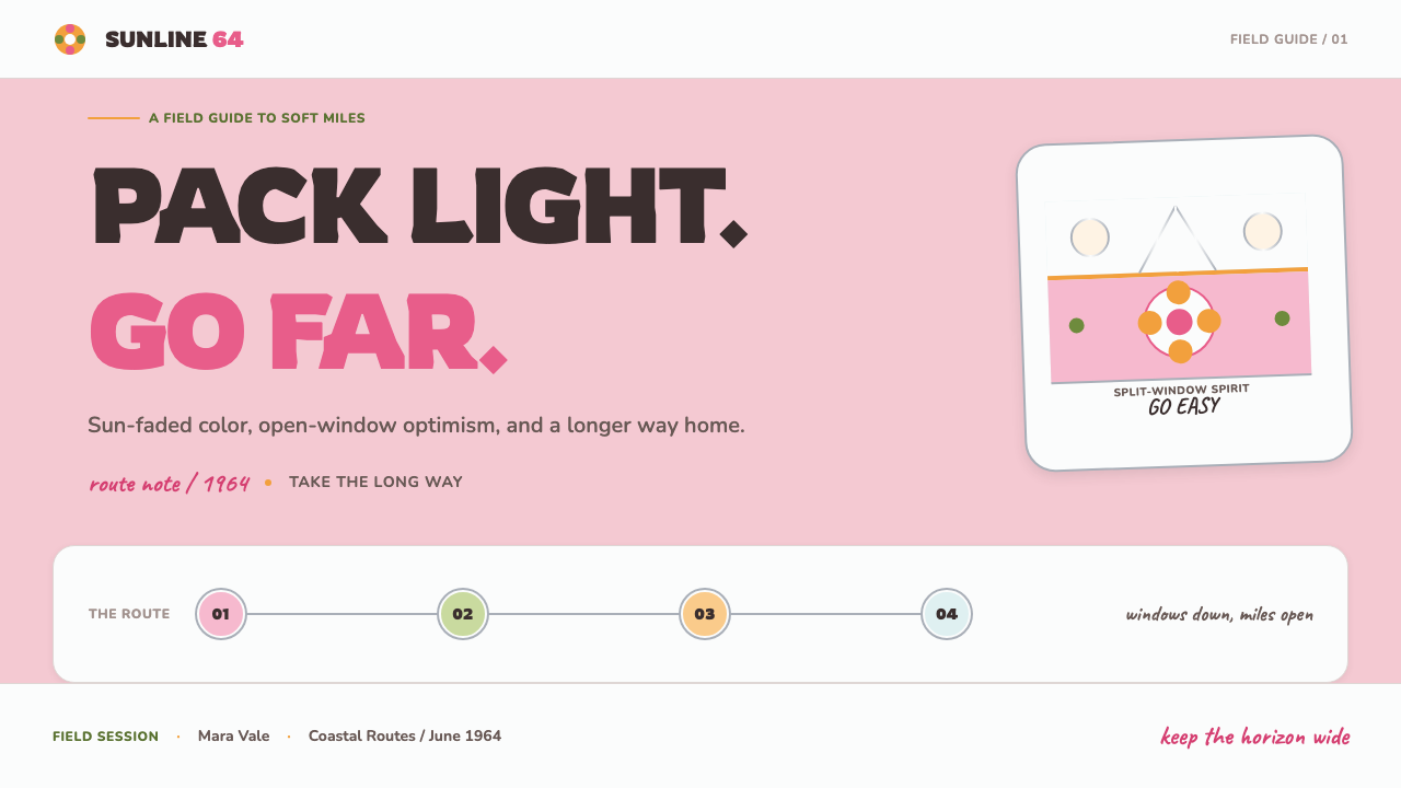
For presentation slides, use the style as a journey rather than a static retro frame. Covers work best with a broad cream or white field, a rounded wordmark, one calm pastel body color, and a horizontal belt that carries the title like a vehicle stripe. Content slides should preserve that structure: place information inside clear bands, use rounded headings, and let botanical decals mark transitions without becoming wallpaper. Data slides can turn bars, routes, and comparison fields into simplified vehicle-like forms, with chrome-like lines used sparingly to indicate direction or separation.
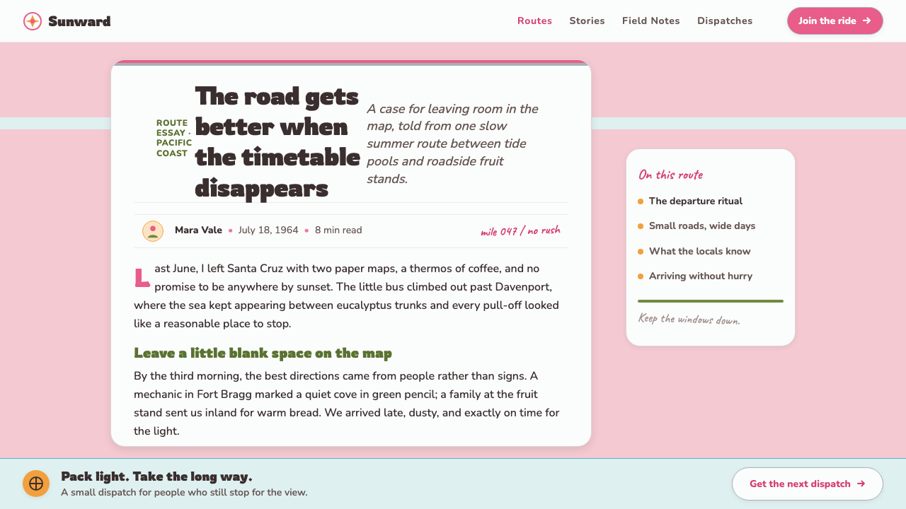
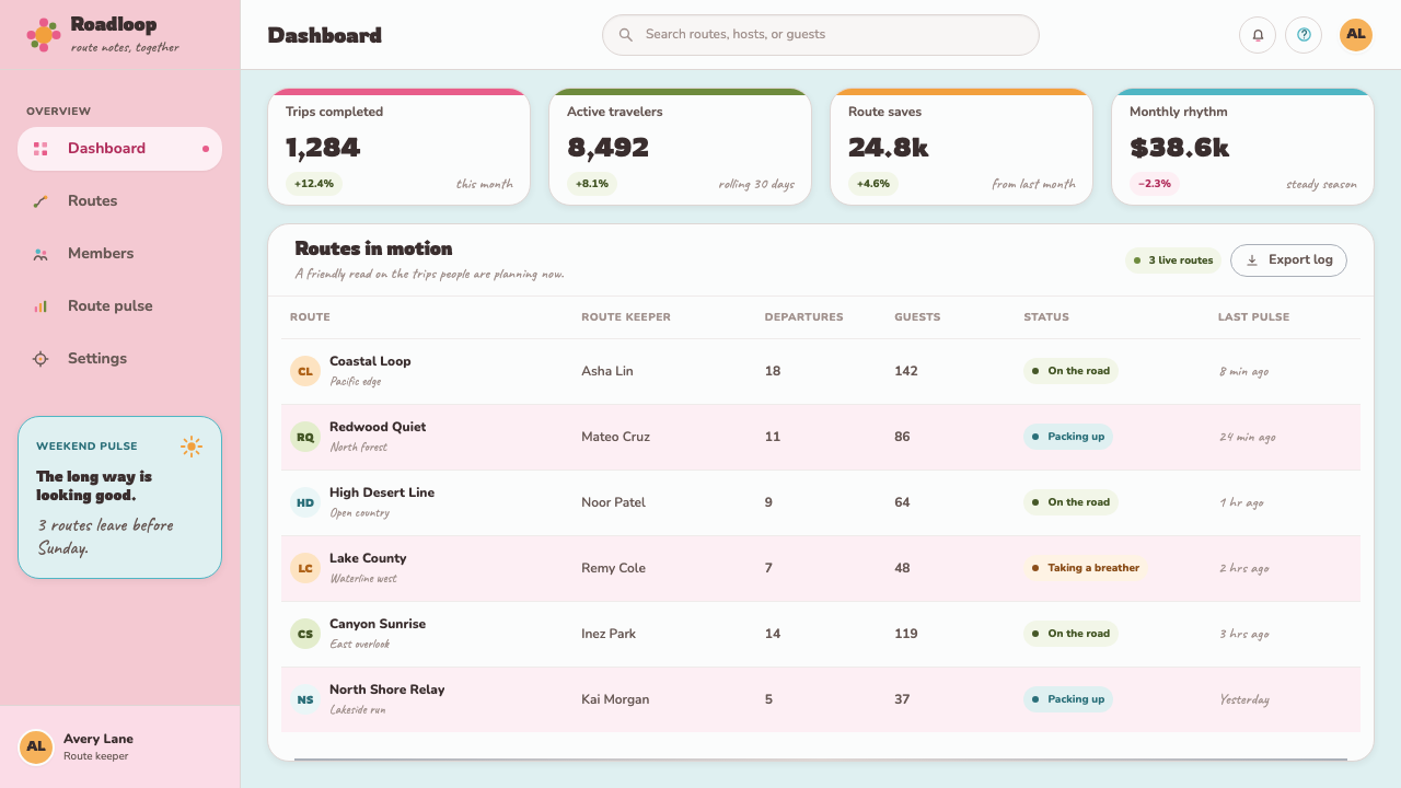
For web interfaces, the style suits dashboards, pricing pages, travel tools, community products, and services that want to feel practical without appearing corporate or severe. Use rounded cards, clear horizontal grouping, pale backgrounds, and pastel accents for states or tiers. Buttons can feel like friendly signposts rather than loud commands. A pricing page might use a white belt to connect plan columns, while a dashboard can treat each module as a window or painted panel. Keep navigation readable and functional; the flowers belong in moments of personality, not inside every control.
For editorial and marketing work, VW Bus Flower-Power is strongest when the layout feels like a printed travel artifact. A feature article can use wide horizontal section bands, rounded display type, small route-like labels, and hand-placed botanical motifs around photographs or pull quotes. Marketing pages can alternate pale body fields with white belts and chrome hairlines, creating the impression of a vehicle assembled from panels. Imagery should feel candid, sunlit, and slightly tactile rather than glossy or hyper-produced.
A common mistake is confusing this style with generic psychedelic design. High-contrast neon, dense optical patterns, and excessive visual vibration push the work toward a different historical mood. Another mistake is making every flower perfectly symmetrical or every sticker mathematically aligned. The style needs both optimism and evidence of human touch. Keep the underlying structure calm, let one or two pastel colors lead, and allow the hand-applied details to vary enough that the result feels inhabited rather than manufactured.
The most convincing applications remember that the bus is still a utility object. Decoration should never erase the vehicle's readable structure or the product's practical purpose. A page can be joyful while still making the route, price, action, or message immediately clear. The test is simple: if the flowers disappeared, would the layout still function? If the answer is yes, the expressive layer is doing its job instead of carrying the entire design.
VW Bus Flower-Power (1964) — FAQ
Is VW Bus Flower-Power the same as psychedelic design?
No. They overlap historically, but their visual temperatures differ. Psychedelic design often leans toward acid neon, dense optical patterning, and intense contrast. VW Bus Flower-Power is softer and more tactile: chalky pastels, white belts, chrome glints, rounded type, and hand-applied flowers. Its emotional center is road-trip optimism and communal freedom, not sensory overload.
Does the style require an actual vehicle image?
No. The vehicle is the source structure, but the language can be abstracted into horizontal bands, rounded panels, chrome-like lines, soft body colors, and botanical decals. A layout can evoke the bus without drawing it literally. What matters is preserving the relationship between practical structure and personal decoration.
Can VW Bus Flower-Power work on a dark background?
It can, but the result moves away from the canonical sun-washed mood. The style is strongest on cream, white, or pale grounds where the white belt and softened body colors can breathe. A dark version should keep the palette calm, use chrome as a restrained highlight, and avoid turning the flowers into aggressive neon. The goal is still a friendly vehicle at rest, not a nightclub poster.
How irregular should the hand-applied details be?
The irregularity should be felt, not allowed to damage readability. Vary the angle, spacing, overlap, or scale of flowers slightly, but keep the main bands, headings, and functional controls stable. Too much disorder makes the work look careless; too much perfection makes it look machine-generated. The useful middle ground is a clear structure carrying evidence of human touch.
What kinds of products suit this aesthetic best?
It works best for products connected to travel, community, leisure, outdoor life, hospitality, events, and approachable utility. It can also soften dashboards or pricing tools that would otherwise feel overly technical. It is less suitable when a product depends on luxury severity, clinical precision, or aggressive performance. The style communicates openness and participation, so it should support a product that wants people to join, explore, share, or keep moving.
Related design styles
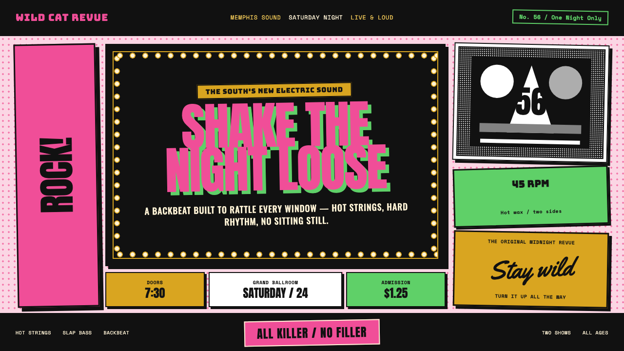 Elvis Presley (1956)Rock learned to shout. Bubblegum pink, acid green and jailhouse type land wit…
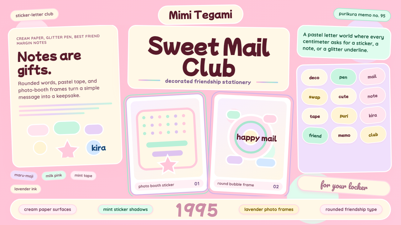 Kawaii Japanese Letter PurikuraCuteness fills every inch. Pink cream paper, mint stickers, lavender frames.
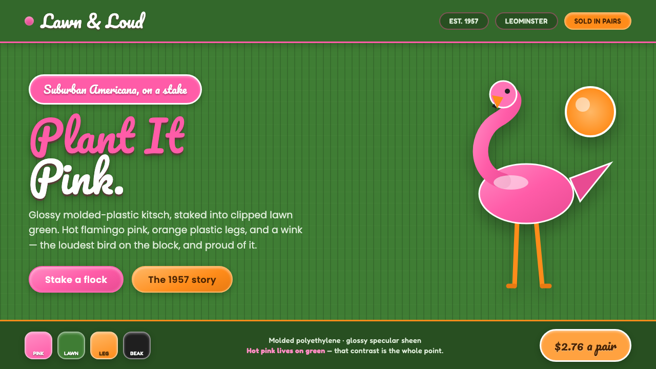 Pink Flamingo Lawn OrnamentLoud on purpose. Hot flamingo pink staked into lawn green, glossy molded plas…
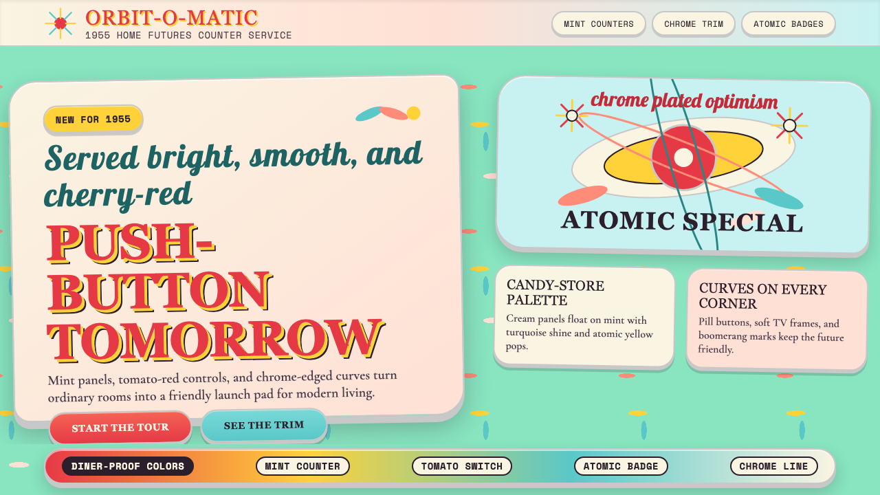 Populuxe Atomic AgeThe future grins. Mint Formica, tomato-red pills, Cooper Black, and atomic st…
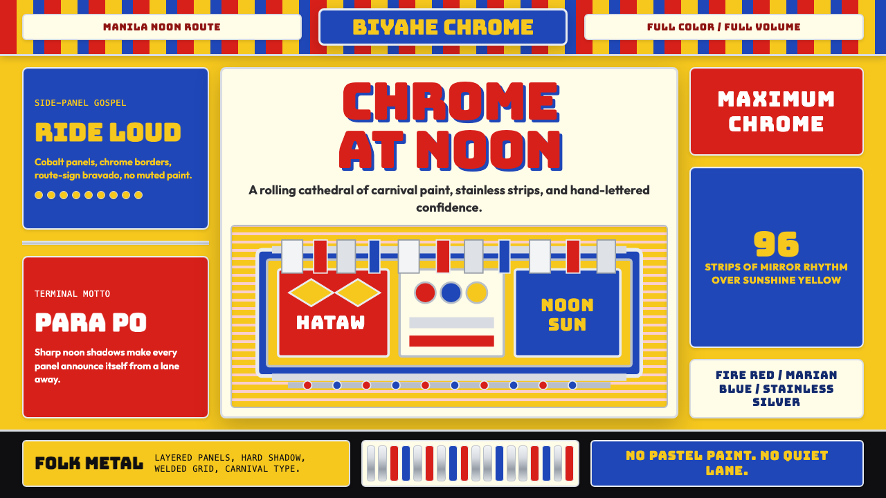 Filipino Jeepney (Chrome & Streamer)Maximalism has wheels. Sunshine yellow, chrome strips, Bungee route-sign type.
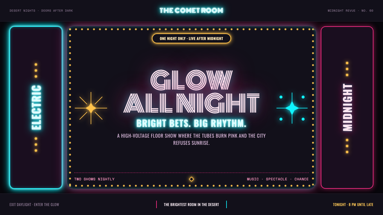 Las Vegas Neon (1960)Night refuses to dim. Hot-pink tubes, cyan bloom and amber bulbs turn black i…